Most bedrooms are designed by accident. A bed is chosen. Nightstands are added for practicality. Paint colour is selected because it worked in someone else’s house. The room functions, which is taken as evidence that it works. It rarely does.
The bedrooms that stay with you — the ones you remember years after staying in them, or the ones that make guests pause at the door — are built on intention. Real bedroom design inspiration doesn’t come from a single piece of furniture or a carefully curated mood board. It comes from understanding which decisions carry the most design weight, and then making each of them well. After twelve years writing about how the world’s best residential designers approach the bedroom, I’ve identified fifteen principles that separate rooms people are genuinely proud of from rooms that are merely functional. These ideas range from the architectural to the granular — because the bedroom rewards attention at every scale.
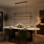
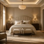
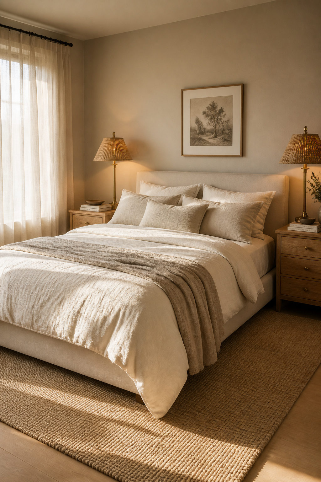
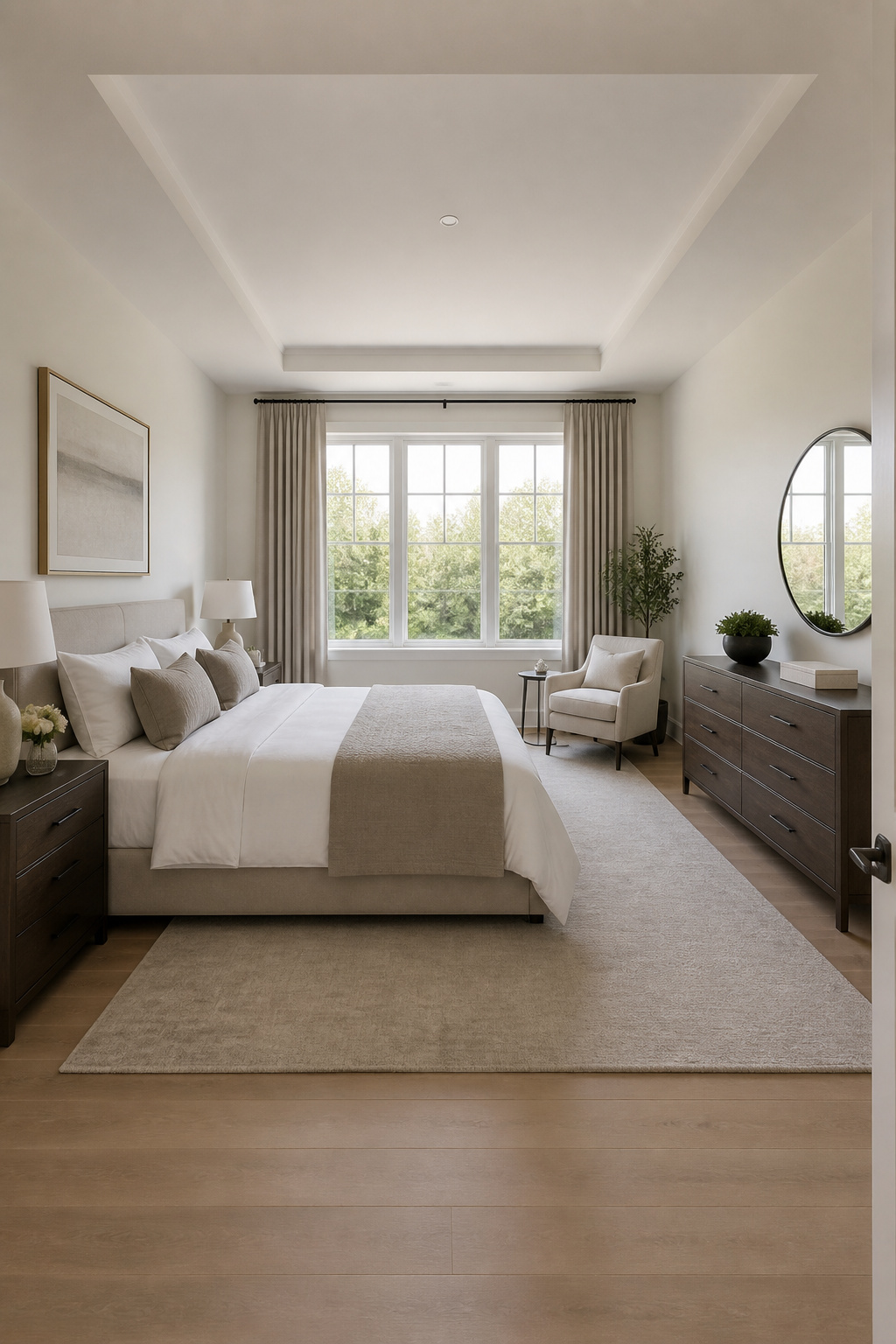
1. Soft Architectural Layers That Make a Bedroom Feel Designed
There is a quality that separates a designed bedroom from a furnished one, and it has nothing to do with price. It has to do with what the room does architecturally — how the ceiling, walls, and floor plane each contribute to the space before a single piece of furniture arrives.
This kind of bedroom design inspiration is rooted in architectural thinking rather than decoration, and it produces rooms of genuine authority. Wall panelling is the most accessible starting point: when done well, it adds depth, texture, and a finished quality that flat painted walls cannot replicate. Coffered ceilings — far more achievable with modern MDF profiles than their Ancient Roman stone originals — add dimension above and draw the eye upward, making rooms feel taller and more considered. Crown moulding placed at ceiling level creates that final line of detail that luxury hotels never omit.
The layering sequence: ceiling detail comes first. Then wall treatment — panelling, wainscoting, or a picture rail. Then the floor boundary, established by an area rug that defines the sleeping zone. These three elements create nested frames, each drawing the eye inward toward the bed. The bedroom style ideas that anchor the whole room can help clarify which architectural investments will have the greatest impact for your specific proportions. The hotel designer’s non-negotiable: the rug must extend 18-24 inches beyond the bed on three sides. An under-sized rug doesn’t anchor the furniture — it floats beneath it.
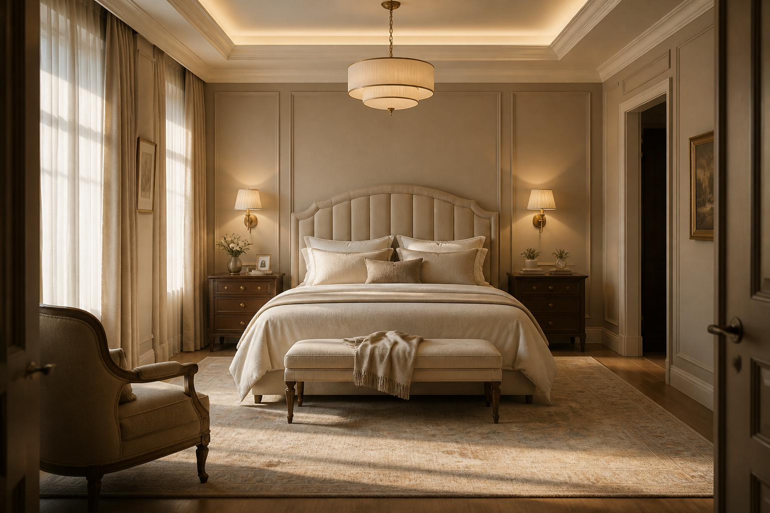
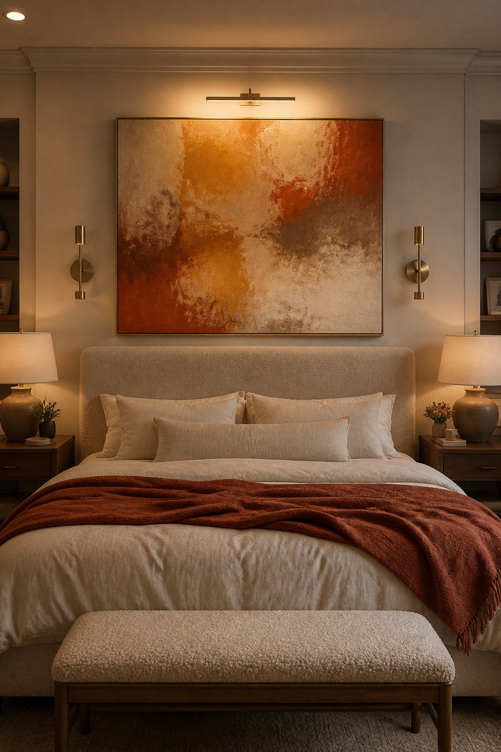
2. The Statement Headboard as Your Bedroom’s Defining Element
Walk into any bedroom that has been designed rather than assembled, and the headboard tells you everything. It is the first surface the eye finds, and it sets the design vocabulary for everything that follows — the scale of the lamps, the weight of the textiles, the formality of the art.
As bedroom design inspiration goes, the headboard is the choice that rewards the most deliberate consideration. The practical rules are specific. Width should match or slightly exceed the mattress — 2-4 inches wider looks intentional; anything narrower reads as an error. For queen beds, the ideal height is 48-54 inches from the floor: this places the visual centre of the panel at a comfortable reading height while commanding the wall. A king bed calls for something more substantial — 58 inches or higher above the floor creates the drama a larger room requires. One firm constraint: the headboard should never exceed three-quarters of the wall height. For a 9-foot ceiling, that means staying under 72 inches total.
Material choice communicates the room’s register. Upholstered headboards in linen or velvet bring warmth — they read as soft, considered, unhurried. Carved wood communicates tradition and permanence. Metal headboards work in smaller rooms where a lighter visual weight is needed, though they require more confident styling to avoid reading as sparse. The most common headboard error isn’t about style — it’s about sizing. A headboard chosen for its beauty but proportioned too narrow for the bed beneath undermines everything around it.
3. Warm Neutral Palettes: The Foundation of Timeless Bedroom Design
Every ten years or so, a bold bedroom colour trend arrives — saturated terracotta, deep forest green, burnt ochre — and designers embrace it enthusiastically. Then, a decade later, the rooms that have aged most gracefully turn out to be the ones that chose a warm neutral instead.
This isn’t an argument for timidity. It’s an argument for longevity. For bedroom design inspiration that holds up over decades rather than seasons, warm neutrals — shades with yellow, red, or orange undertones rather than blue or green ones — create cosy, inviting atmospheres that hold up across seasons, tastes, and varying natural light.
Specific shades that designers return to reliably: Drop Cloth from Farrow & Ball, which falls between beige and gray with enough gray tone to read modern rather than dated; Shadow White from the same range, a mellow off-white that responds to changing light with quiet elegance; and Stirabout, a pale neutral with just enough earthiness to avoid the blankness of pure white. From Benjamin Moore, White Dove and Shaker Beige HC-45 have become industry standards — neither too gray, too yellow, nor too pink, which is precisely why they work across so many room conditions.
The Shades That Stand the Test of Time
The layering principle: choose three values within the same undertone family — a warm off-white for the walls, a mid-tone for the primary textiles, and a deeper shade for the headboard or rug. This creates a palette that reads complete and considered rather than flat. For rooms with tight proportions, color schemes that make a bedroom feel expansive rather than constrained can help you understand where warm neutrals intersect with spatial illusion. And one firm rule: test any neutral in the actual room before committing. A shade that reads warm in a shop can turn cool in a north-facing bedroom by 3pm.
4. Bedroom Design Inspiration From the World’s Finest Hotel Suites
The best bedroom design inspiration doesn’t come from other bedrooms. It comes from the hospitality industry — specifically from the designers responsible for suites at Aman, Four Seasons, and Rosewood properties, who have solved the problem of a room that must feel both luxurious and restful for guests who arrive stressed and need to leave refreshed.
Their solutions are more specific than most homeowners realise. Symmetry is non-negotiable: matching nightstands, identical table lamps, the same shade on each side. This bilateral balance conveys order and harmony in a way that no single beautiful object can replicate. The mattress height is specified precisely, and the nightstand height is chosen to fall within 1-2 inches of it — an ergonomic relationship that becomes, in the best rooms, a visual one. Lighting is independently circuited and dimmed, always warm at 2700-3000K, always set to complement the room’s neutrals rather than flatten them.
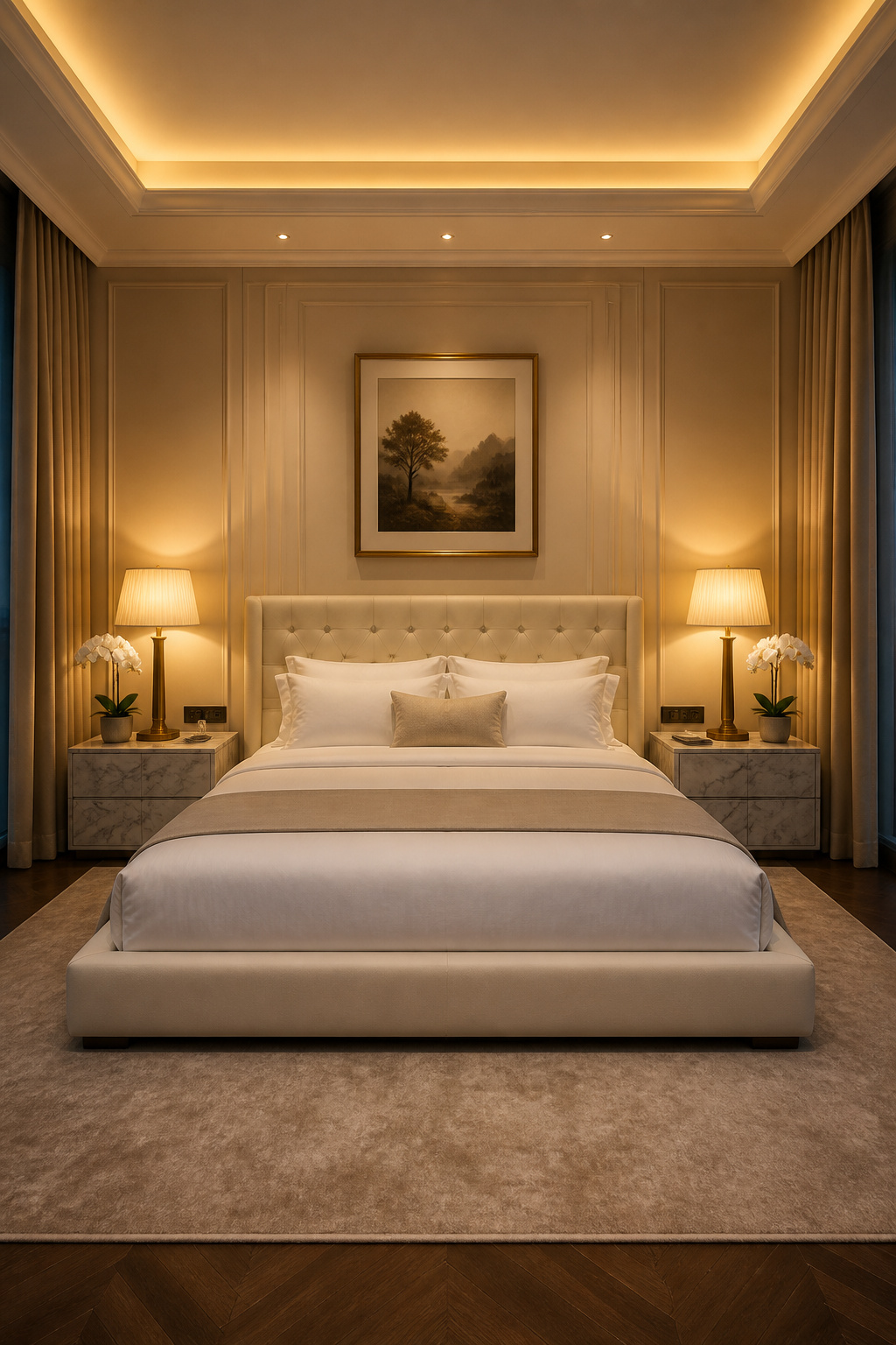
The detail most worth borrowing: hotel designers think about scent as a design element. A single fragrance — through a diffuser, a linen spray, or a specific candle — creates the psychological cue that signals sanctuary. It’s the layer almost never mentioned in bedroom design guides and almost always present in the hotel rooms people remember most. Translating hospitality thinking into a residential setting doesn’t require a renovation. It requires choosing symmetry over personality at the bedside, building independent dimmer controls into the electrical plan, and resisting the temptation to break the bed’s bilateral logic with a mismatched nightstand.
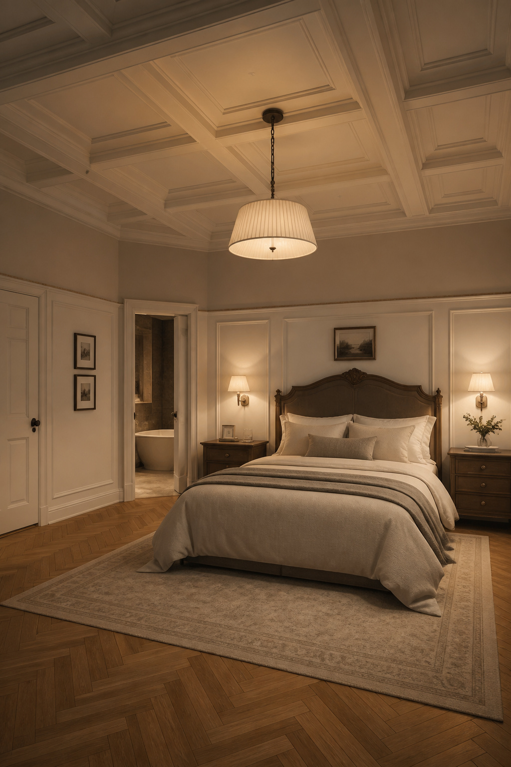
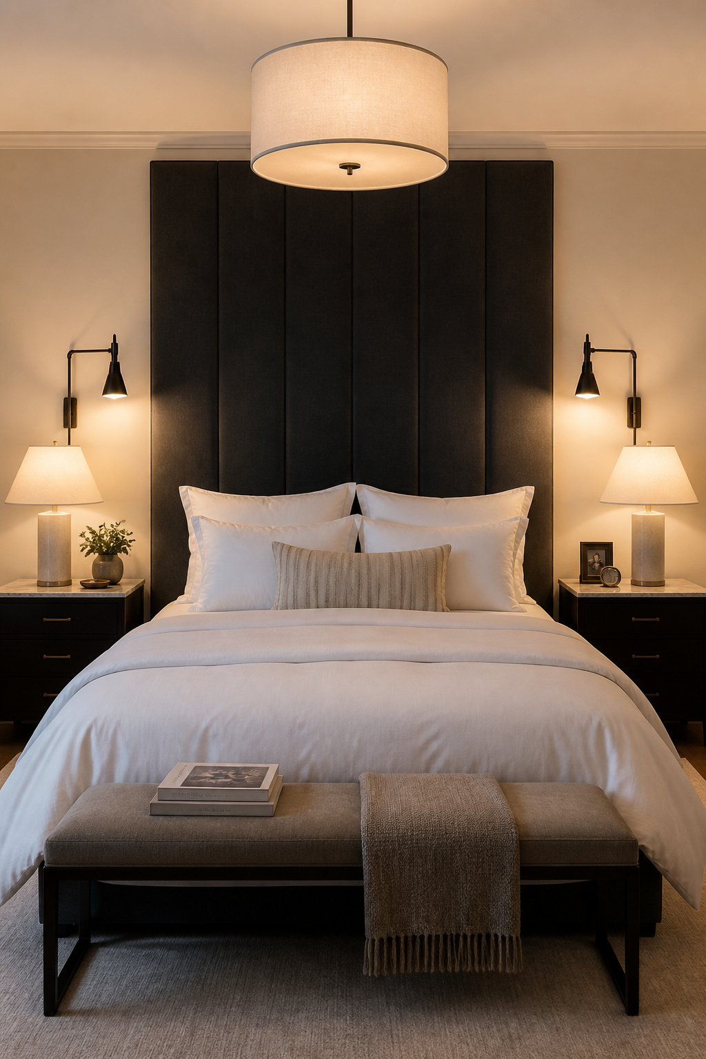
5. Layered Bedroom Lighting That Controls the Mood at Every Hour
The most correctable bedroom design mistake is also the most common: a single overhead fixture on a single circuit that is either on or off.
A bedroom has at least four distinct lighting needs across a day — waking, reading, getting dressed, and unwinding before sleep — and each requires a different quality and quantity of light. A single ceiling rose addresses none of them particularly well. Recessed downlights on full brightness create a flattening, quasi-commercial quality that works against everything else a good bedroom achieves.
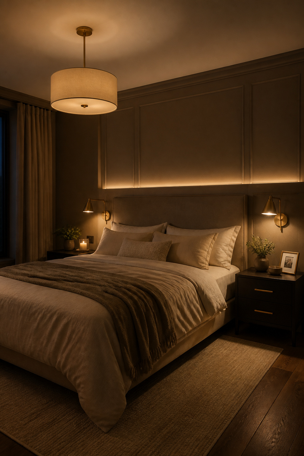
The three-tier system is the professional solution. Ambient lighting establishes overall illumination — a central pendant, a chandelier, or cove lighting on a dimmer. Task lighting delivers focused light for reading — wall-mounted sconces at bedside, positioned so the bottom of the shade sits at shoulder height when sitting up in bed. Accent lighting adds direction and visual depth after dark — a picture light over art, a strip behind a panelled headboard zone, uplighting at an architectural feature.
The electrical specification matters as much as the fixture choices: independent dimmers on each circuit, trailing-edge dimmers (which work better with LED bulbs), and a colour temperature of 2700-3000K throughout. Warmer than 2700K risks amber; cooler than 3000K reads as clinical. Aim for 3-5 light sources minimum — this isn’t extravagance, it’s the minimum for a room that works beautifully at every hour it’s used.
6. Linen, Silk, and Natural Textiles for Tactile Sophistication
Texture is the most sensory dimension of bedroom design, and the most underused. A room with rich textile variety — crisp cotton against a velvet cushion, a linen duvet beneath a cashmere throw — reads as more considered than a room with more expensive but uniform surfaces. The body registers it before the eye does.
The bedding decision is misunderstood by most people shopping for it. Thread count is largely a marketing fiction above 400. Manufacturers achieve inflated counts by measuring multi-ply threads as individual ones, and the resulting fabric is often less breathable and less durable than its number implies. What actually determines bedding quality is weave structure. If you’re approaching your bedroom as a genuine wellness environment, Bedroom Inspirations Master: Design Your Wellness Suite explores how the sensory details — from thread weave to ambient temperature — contribute to genuine restorative sleep.
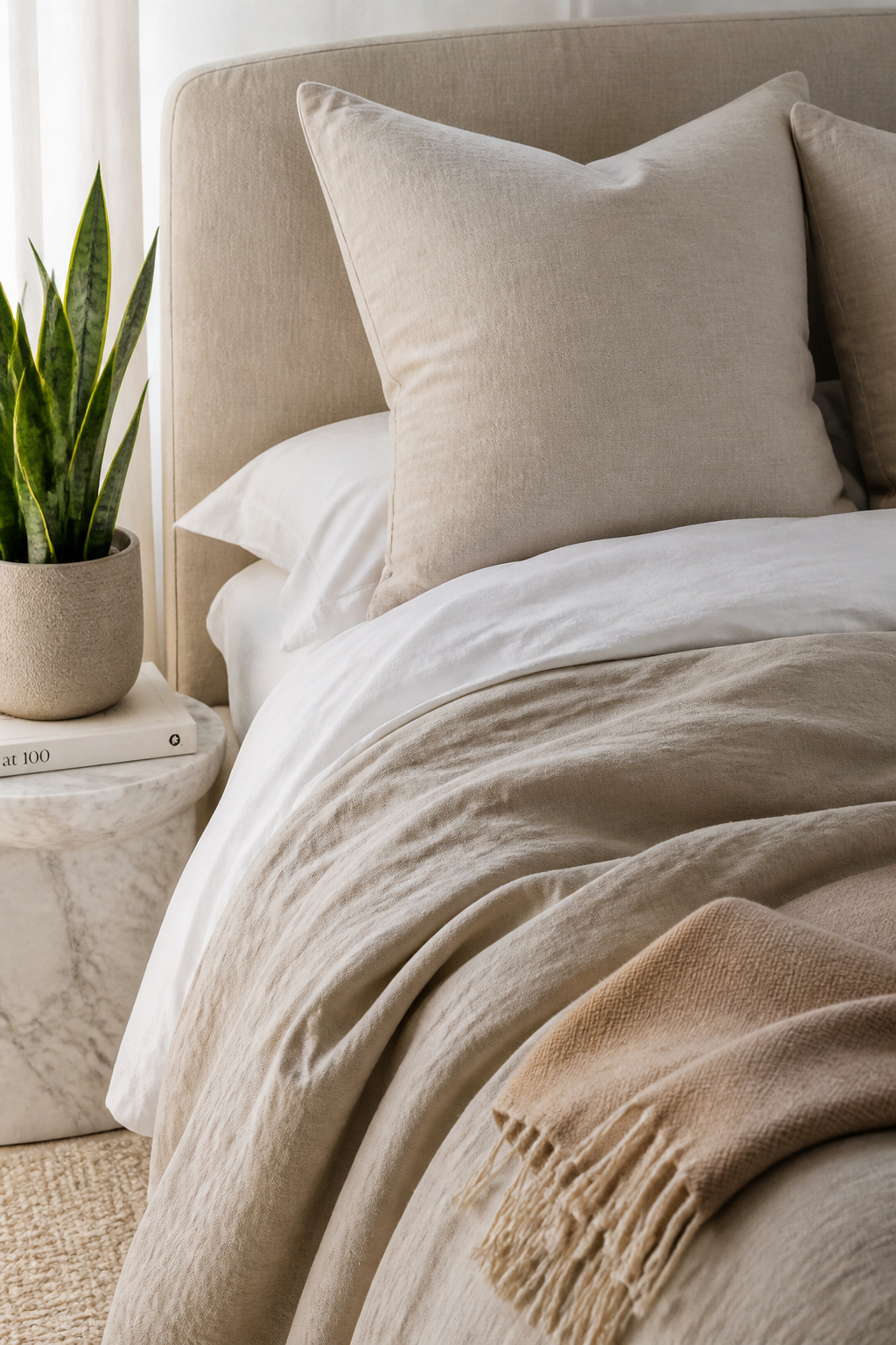
Percale uses a one-over, one-under weave that produces a matte, crisp surface finish — the look and feel of a well-laundered hotel sheet, getting better with every wash. Sateen uses a four-over, one-under weave that exposes more thread surface, creating a subtle sheen and a buttery feel from the first night. Both work best in the 200-400 thread count range, which is where 76% of luxury boutique hotels operate. Linen, which exists entirely outside the thread-count conversation, offers a natural slub texture, extraordinary durability (5-7 years of heavy use), and a drape that communicates relaxed confidence rather than hotel precision. The layering principle: percale or linen sheets, a sateen or velvet coverlet, a cashmere or merino throw at the foot. Each material earns its place through feel.
7. Bedroom Design Inspiration: Art That Turns a Wall Into a Statement
Art choice reveals more about a person’s design sensibility than any furniture decision. Every other choice can be rationalised — the bed was the right size, the nightstand practical, the rug the right colour. Art is chosen because it resonates, and that resonance is personal in a way nothing else in a bedroom is.
The technical rules for hanging are precise and frequently ignored. The standard hang height: centre of artwork at 57 inches from the floor. This is not a suggestion — it is the established gallery standard, refined for good perceptual reason. In rooms with ceilings above 9 feet, this shifts to 60 inches. For art above a headboard, the rule adjusts: position the bottom edge 6-8 inches above the headboard top, creating a hand’s-width of breathing room rather than the cluttered look that comes from art placed too close.
Placement Rules That Most Homeowners Skip
Scale is where most bedroom art decisions fail. The piece should fill at least half to two-thirds the width of the furniture below it — a small print above a king bed reads apologetic rather than designed. For bedroom design inspiration that consistently works, calm subjects outperform stimulating ones: landscapes, abstract works with soft tonal ranges, and botanical studies are perennially effective. Portraiture and high-contrast graphic work can create unintended alertness in a sleeping space. Textile wall art — woven pieces, tapestries — adds dimensional quality and acoustic absorption that flat framed work doesn’t provide. If your wall has particular architectural character, consider how bedroom wallpaper as a textural backdrop for art changes your approach to what you hang and how.
8. Bespoke Built-Ins and Millwork That Become Part of the Architecture
Custom bedroom millwork does something freestanding furniture cannot: it eliminates the visual seam between furniture and architecture. A floor-to-ceiling fitted wardrobe with inset doors and shadow-gap reveals doesn’t look like a wardrobe installed in a bedroom — it looks like the bedroom was built around it.
This distinction is not primarily about cost. It’s about intent and detail. The qualities that separate high-end joinery from its less considered alternatives are visible only at close range but felt immediately upon entering the room. Shadow gaps — the controlled negative space between adjacent panels — should be consistent at around 12mm. Reveal width, where door fronts sit within the frame, should be standardised at 3-6mm. These are small numbers with outsized visual consequences: inconsistent reveals create visual noise; precise reveals create crispness and depth.
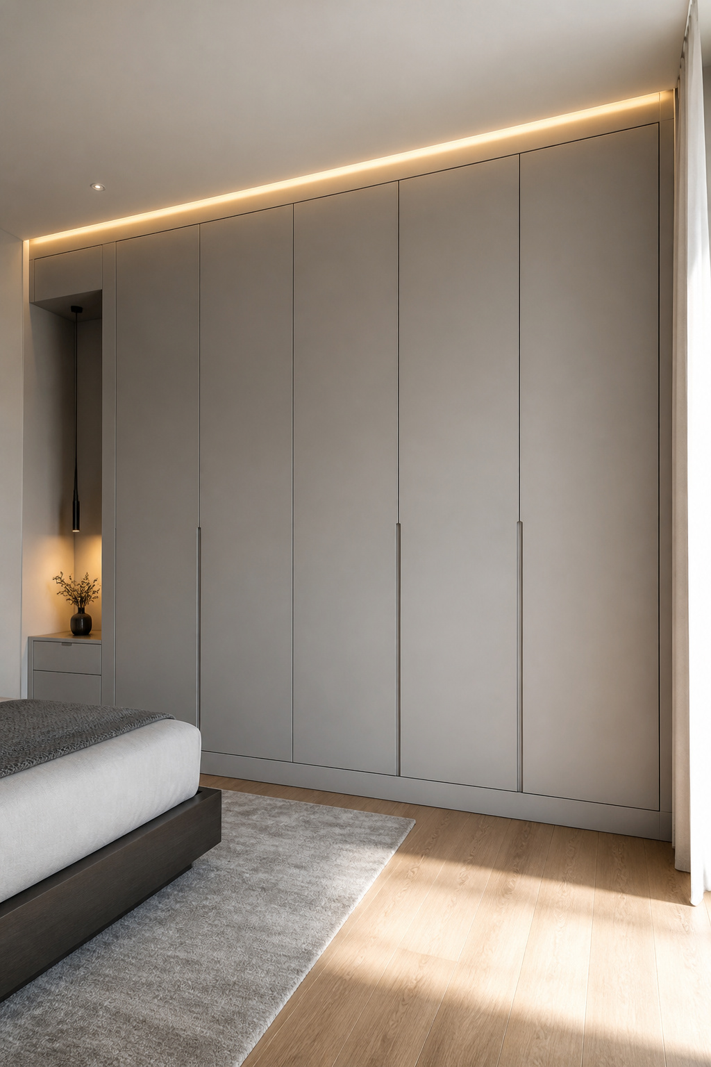
Inset construction — doors and drawer fronts flush within the cabinet frame — represents the highest level of wardrobe craftsmanship. It requires more precise measurement and better joinery, which is why it commands a premium and why the result looks categorically different from overlay construction. For bedroom organisation ideas that work with the space rather than against it, the interior specification matters as much as the exterior profile: integrated LED lighting within wardrobe interiors, adjustable shelving, and compartments for shoes, folded items, and different hanging lengths transform storage into a system that sustains the room’s order. Budget context: bespoke fitted wardrobes range from £3,000-£5,000 for quality tailored work to considerably more for luxury custom joinery.
9. Dark, Moody Color Schemes That Create Sanctuary-Level Comfort
Dark bedrooms are the design decision that generates the most hesitation and, when executed correctly, the most satisfaction. The cocooning effect that deep colour creates — the sense that the walls are closer, the ceiling lower, the room more intimate — is not a drawback. It is exactly the quality that makes a bedroom feel like sanctuary rather than passage.
Some of the most compelling bedroom design inspiration comes from rooms that take colour seriously and commit fully. The colours that work best are deep shades with a strong gray undertone rather than highly saturated pigments. Hague Blue from Farrow & Ball is the standout example: a deep blue-green with yellow and green undertones that prevent it reading cold despite its depth. It works especially well in north-facing rooms, where the green note keeps the colour alive in cooler light conditions.
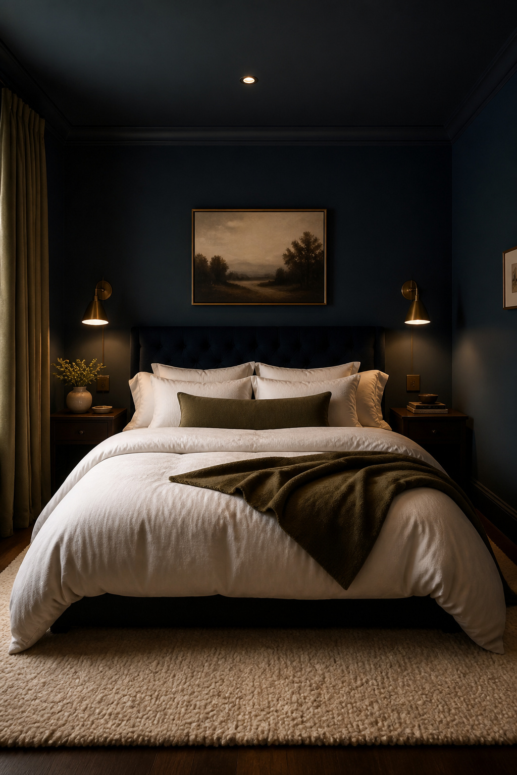
Other reliable dark bedroom shades: Down Pipe from Farrow & Ball, a sophisticated charcoal-gray; Wrought Iron from Benjamin Moore, a near-black blue with extraordinary depth; Inkwell from Sherwin-Williams, a dark navy-black that reads sophisticated rather than oppressive when lit correctly. Against dark walls, white or cream linen creates the most effective visual counterpoint. Warm-toned metals — unlacquered brass, antique gold — sit better than cool-toned chrome. And the lighting scheme is non-negotiable: the three-tier approach described earlier becomes a requirement rather than a recommendation. Painting four walls dark without increasing lighting quality produces oppression. Getting it right produces something genuinely restorative.
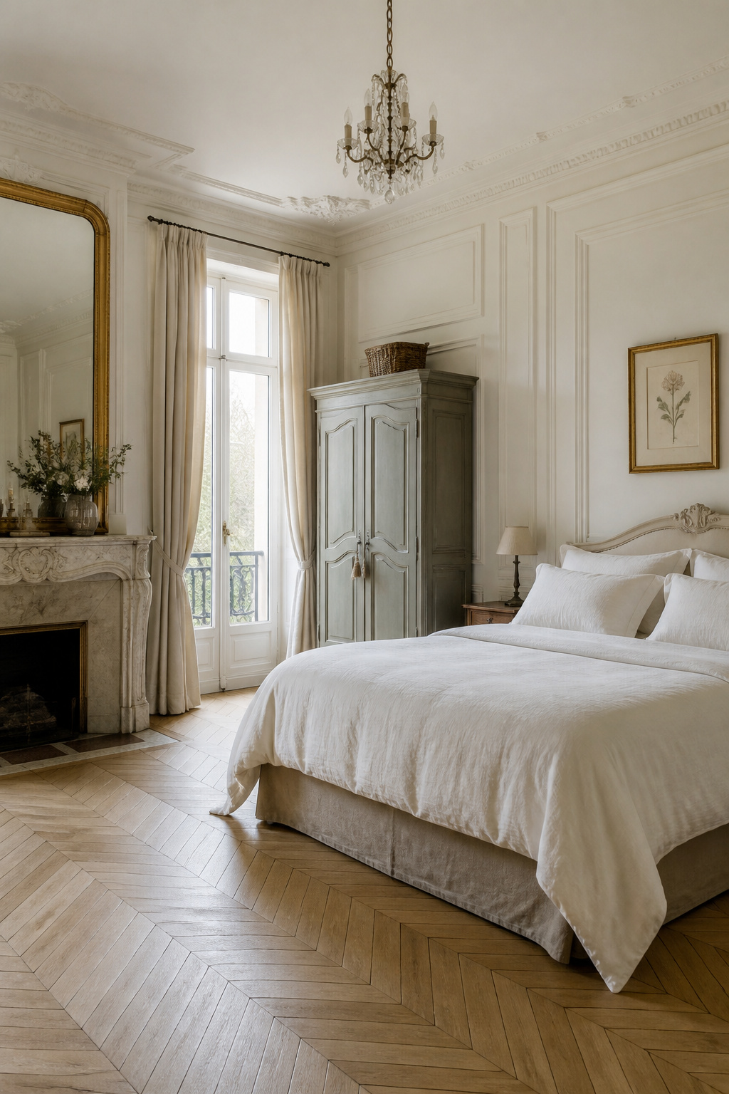
10. Bedroom Inspiration Drawn From European Interior Tradition
European residential design traditions are unified by a principle that runs counter to much contemporary decorating advice: invest in the bones of a room rather than its contents. The floor, the wall treatment, and the ceiling detail matter more than the furniture, because furniture can be changed and architecture cannot.
French chambre particulière design brings intricate ceiling moulding — boiserie in its carved form, or its clean-lined modern interpretation — parquet flooring in herringbone or Versailles patterns, and a preference for a few significant pieces over many unremarkable ones. The French edit, ruthless in its preference for quality over quantity, produces rooms of extraordinary authority.
Scandinavian tradition takes a different route to the same outcome: neutral palette, light-coloured woods (pine and birch), natural textiles of wool and linen, and the hygge principle that warmth is cultivated through material quality rather than decorative quantity. Italian tradition integrates contemporary style with timeless elegance through clean lines and an absolute commitment to craftsmanship as the measure of luxury. The universal lesson: wherever the European tradition originates, it shares a philosophy of restraint. One quality armchair rather than three decorative objects. The living room design inspiration that follows the same European principles translates directly — the edit that defines a considered interior applies in every room it touches.
11. The Art of a Composed Nightstand — the Room’s Most Overlooked Detail
Most bedroom design inspiration focuses on the large decisions — the bed, the headboard, the colour. The nightstand is the most-used furniture surface in a bedroom and the least considered. It is touched multiple times every day, and its proportion, height, and the objects it holds communicate the room’s level of intention in an intimate, daily way that a headboard or rug never quite achieves.
Height is the first criterion: the nightstand top should be within 2-4 inches of the mattress top. The standard range is 23-28 inches, which pairs well with most contemporary mattresses at 24-25 inches. Deviation beyond 4 inches in either direction — a nightstand too low requiring a downward reach, or one so tall it towers — breaks the horizontal unity that makes a bed arrangement read as composed rather than accumulated.
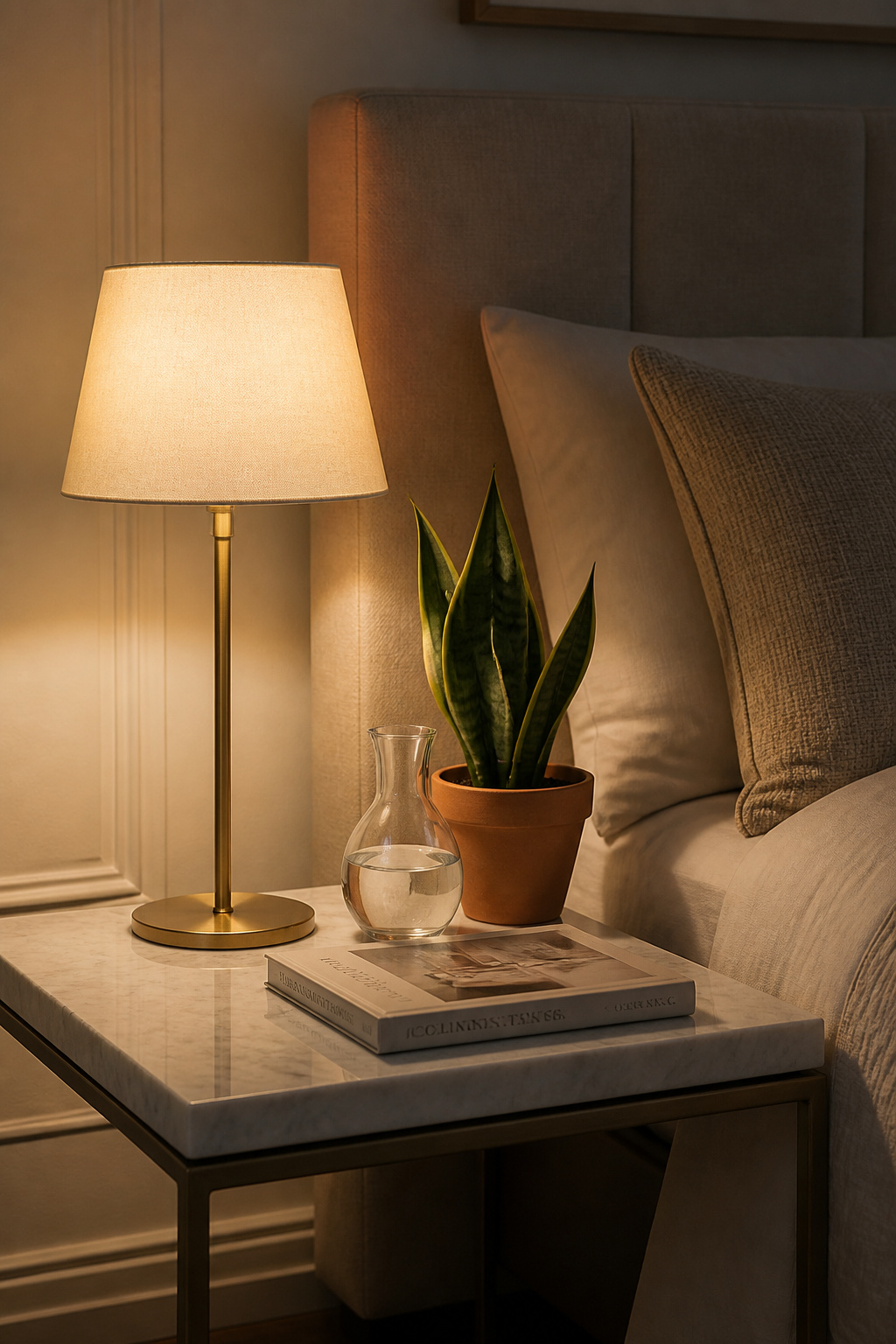
Width and material follow from bed size: a 20-inch nightstand works well with a queen bed; a 25-inch table balances a king. The material should complement rather than match the bed — a stone or metal nightstand beside a wood bed creates more interest than two pieces sharing the same finish, while remaining coherent if the tones are aligned. The styling maximum: a lamp (shade bottom at shoulder height when sitting up), one book, one personal object, and a discreet charging solution. Everything else belongs in the drawer. That edit is the difference between a nightstand that reads as composed and one that reads as a landing zone.
12. Floor-to-Ceiling Drapes and the Drama of Getting Them Right
No single change to a bedroom shifts perceived quality more dramatically than installing curtains correctly. The height of installation — where the pole sits relative to the ceiling — is the window treatment decision with the most design weight, and it is botched in the majority of residential bedrooms.
The rule is simple: mount the pole at the ceiling, or within 4-6 inches of it. Not at the window frame. Not at the top of the window reveal. At the ceiling. This creates a vertical line from floor to ceiling that elongates the room’s proportions and makes the window appear larger than it is. Hanging curtains at window frame height — the most common residential choice — makes the ceiling feel lower and the window smaller. It is the single most damaging window treatment error.
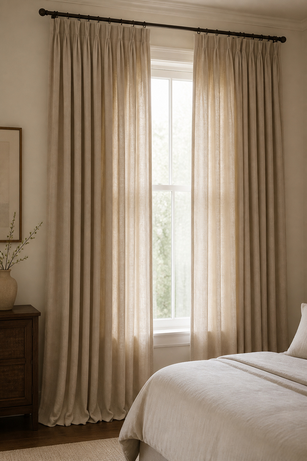
Heading Styles and Installation Details
Extend the pole 6-12 inches beyond the window frame on each side: this allows panels to stack entirely off the glass when open, maximising daylight. Pinch pleat and goblet pleat headings read most polished — structured and deliberate, they’re the appropriate heading style for formal-length panels. Interlining (a layer of flannel-weight batting between face fabric and lining) gives curtains genuine body and helps them hang in disciplined folds. For length, the most precise and modern option is 6-12mm clearance above the floor. A slight puddle adds formality. Curtains hovering several inches above the floor — as though cut to standard sizing rather than measured to ceiling height — undo the entire effect.
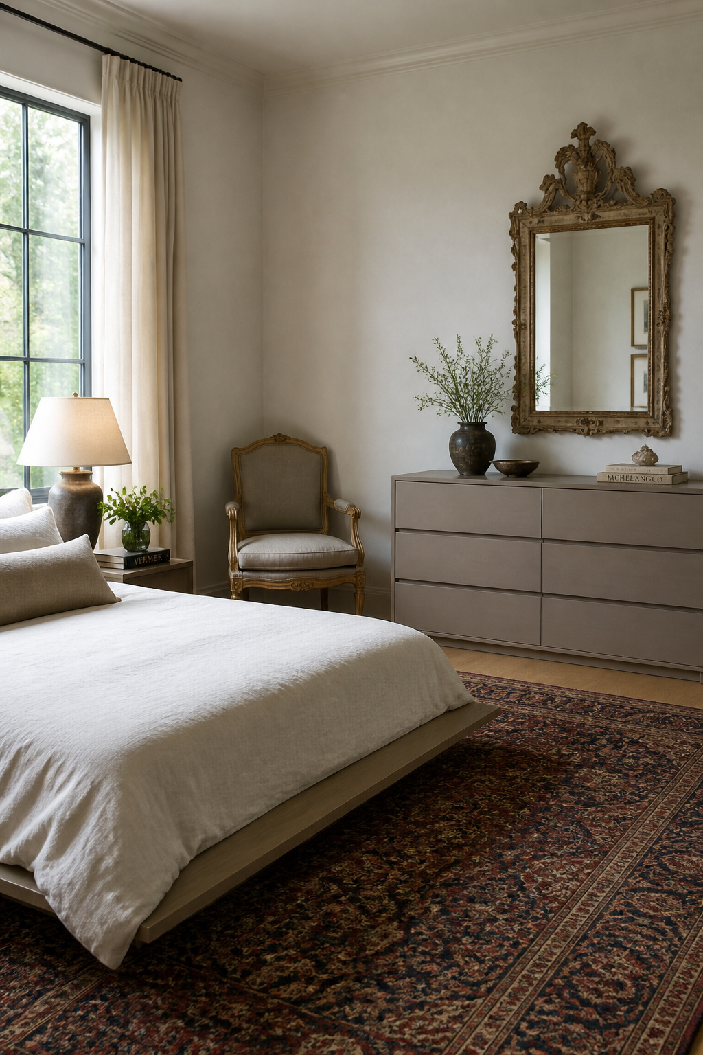
13. Mixing Antique and Contemporary Pieces for Rooms With Real Depth
There is a quality to a room furnished entirely from new purchases — an evenness, a sense that everything arrived simultaneously — that reads as shallow even when the individual pieces are beautiful. All-new rooms feel assembled rather than evolved. One quality antique changes this because it introduces evidence of time: a specific material patina, a scale that production furniture rarely matches, and a story that lifts every contemporary piece around it.
The professional framework is the 70/30 rule. Seventy percent of the bedroom’s visual language should be contemporary or neutral — the bedding, wall colour, flooring, and primary furniture that establishes a clean, current foundation. Thirty percent should be heritage: perhaps an antique writing table in the corner, a Georgian mirror above the dresser, or a chest at the foot of the bed whose provenance gives it a presence no new chest quite replicates.
Sourcing Antiques and Evaluating Pieces
The period choices that mix most cleanly with contemporary bedrooms: Gustavian (Swedish 18th-century, painted in pale tones, clean-lined despite its age), Georgian English (mahogany, restrained proportions, quiet authority), and mid-century modern (the period that most naturally bridges historical and contemporary registers). Avoid mixing multiple heritage periods in the same room — the 30% should come from one coherent direction. For sourcing, established antique dealers provide authentication; auction houses, including regional ones, offer access at varying price points; estate sales occasionally yield pieces at prices with no relation to their design merit. The vintage bedroom ideas that blend heritage and modern elements show what successful period mixing looks like in practice before you commit to a purchase.
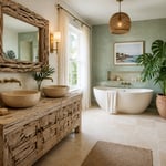
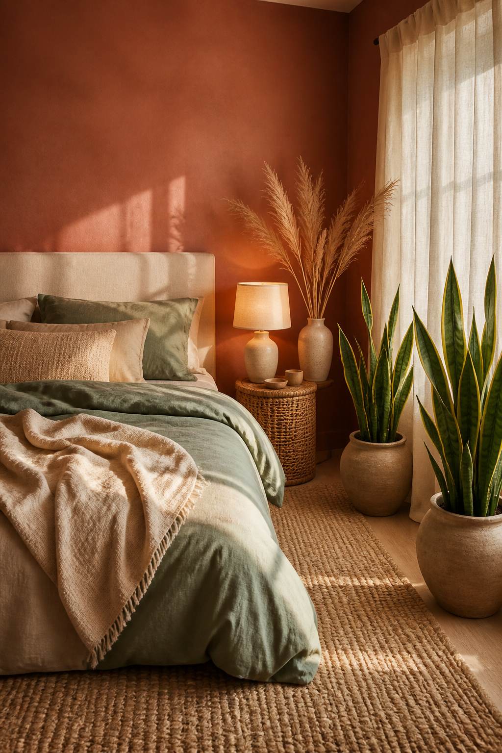
14. Bedroom Decor Inspiration: Nature’s Palette Brought Indoors
Biophilic design in bedrooms isn’t a trend. It’s a response to research showing that environments incorporating natural forms, palettes, and materials measurably reduce cortisol and promote better sleep. The bedroom, which exists to support rest, is the room where these principles apply most directly.
For bedroom decor inspiration rooted in nature, the palette of natural environments — muted terracotta of clay, soft gray-green of lichen, warm ochre of stone, cool blue-gray of coastal sky — translates beautifully into bedroom colour. These are not flat colours. They have mineral complexity: they shift with the light, reading differently in morning sun and evening lamplight, with an organic quality that synthetic pigments don’t achieve.
Keeping Biophilic Refined Rather Than Rustic
Clay and mineral-based paints — including Earthborn’s range, virtually VOC-free and eco-certified — produce a soft, slightly uneven surface finish that creates a relaxed glow rather than the flat reflectivity of standard emulsion. The most effective biophilic bedroom palette works in sequence from light to dark: a warm sand or stone white at the ceiling, a mid-tone sage or clay on the walls, deeper tones in the textiles and rug. The distinction between biophilic and rustic is about finish, not material. A sleek linen headboard against a clay-painted wall is biophilic; the same headboard against rough-hewn timber panelling is rustic. Refined profile with natural material is the criterion. Plants — Sansevieria and Pothos — work best positioned at natural light sources, where they contribute to air quality as well as aesthetics.
15. Proportion and Scale: The Invisible Force Behind Every Great Bedroom
The best bedroom design inspiration won’t compensate for a bed that overwhelms its room, or a rug that reads as a bath mat beneath a king-size frame. Scale is the least discussed and most consequential variable in bedroom design, and the hardest to correct once decisions are made.
The simplest definition: scale compares the size of one element to the space that contains it. A king bed is right for a 14×16-foot room. The same bed in a 10×12-foot room is proportionally wrong — not stylistically, but objectively — regardless of the bed’s individual beauty. The bed should occupy roughly 40% of the bedroom’s visual weight in the full furniture arrangement. Beyond that threshold, a room stops feeling like a sanctuary and starts feeling like a storage problem.
Practical Rules for Rug and Furniture Sizing
For rugs: Twin bed, 5×8 rug; Full, 6×9; Queen, 8×10; King, 9×12. Each size should extend 18-24 inches beyond the bed on the three exposed sides. At least one-third of the bed’s base should sit on the rug — the rug anchors the bed, not the other way around. For furniture relationships: the nightstand top within 2-4 inches of mattress height. A bedside lamp’s shade bottom at shoulder height when seated in bed. Secondary furniture — an armchair, a bench — should relate to the bed in roughly golden-ratio proportions: 0.618 or 1.618 times the bed’s measurement. A useful self-test: stand at the bedroom door and cover one eye. Without binocular spatial processing, any piece genuinely out of scale reveals itself immediately. The closed-eye view removes the brain’s habituation to familiar spaces and shows scale relationships as they are.
How to Develop Your Personal Bedroom Design Inspiration
The design problem most people face isn’t lack of ideas — it’s an excess of them, drawn from too many sources and insufficiently filtered. The genuinely difficult work of bedroom design isn’t choosing what to include. It’s knowing what to leave out.
Start by collecting references consistently for 2-3 months before making any significant purchases. Save images without filtering — rooms, hotels, fabric samples, materials — and review the collection at the end of the period. The pieces that appear repeatedly, across very different rooms and contexts, represent your actual bedroom design inspiration. Most people discover they have a narrower, more specific taste than they assumed: a consistent attraction to 3-4 defining characteristics that appear in every room they find compelling.
Once you’ve identified that thread, the edit becomes easier. Every proposed addition to the bedroom should pass two tests: does it serve a function, and does it feel right in the context of the other pieces? The second question eliminates most impulse decisions.
The final 10% of a bedroom’s design — the art hung at precisely the right height, the nightstand objects edited to the essential few, the cushion arrangement that reflects rather than contradicts the room’s character — takes longer than the first 90% and matters just as much. This is where bedroom design inspiration moves from aspiration to realisation. The rooms people are genuinely proud of are not the ones with the largest budget or the most dramatic gesture. They are the rooms where the editing was honest, the choices were specific, and the intention was present in every decision — from the cornice to the cushion.