The kitchen floor works harder than any other surface in the house. It takes the traffic, the dropped pans, the cooking oil drips, the chair legs scraping morning after morning — and most people spend less than ten minutes deciding what goes there. That decision, rushed or considered, determines how the entire floor reads for the next decade or two.
Your kitchen floor tile is not just a background material. It sets the visual temperature of the space — defines whether the kitchen feels minimal or layered, industrial or artisanal, expansive or intimate. Get it right and the tile disappears into the room’s logic. Get it wrong and nothing else you do will fix it.
Having spent years evaluating how materials perform in real kitchens rather than showroom lighting, I’ve narrowed this to fifteen options that actually deliver — technically and aesthetically. Some are practical choices that survive heavy use without demanding maintenance schedules. Others are statement choices that commit to a design language and reward that commitment with a floor that looks genuinely considered.
Here is what each of these fifteen options requires of you, and what each one gives back.
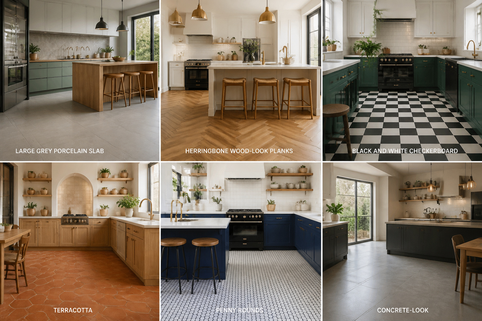
1. Large-Format Porcelain Slabs That Open Up Your Kitchen Floor
The single most effective way to make a small kitchen feel larger isn’t paint color or cabinet height — it’s reducing the number of grout lines per square foot. Large format porcelain, starting at 24×24 inches and scaling up to 32×32 and beyond, does exactly this. The eye reads a continuous surface rather than a tiled grid, and that visual rest genuinely expands the perceived space.
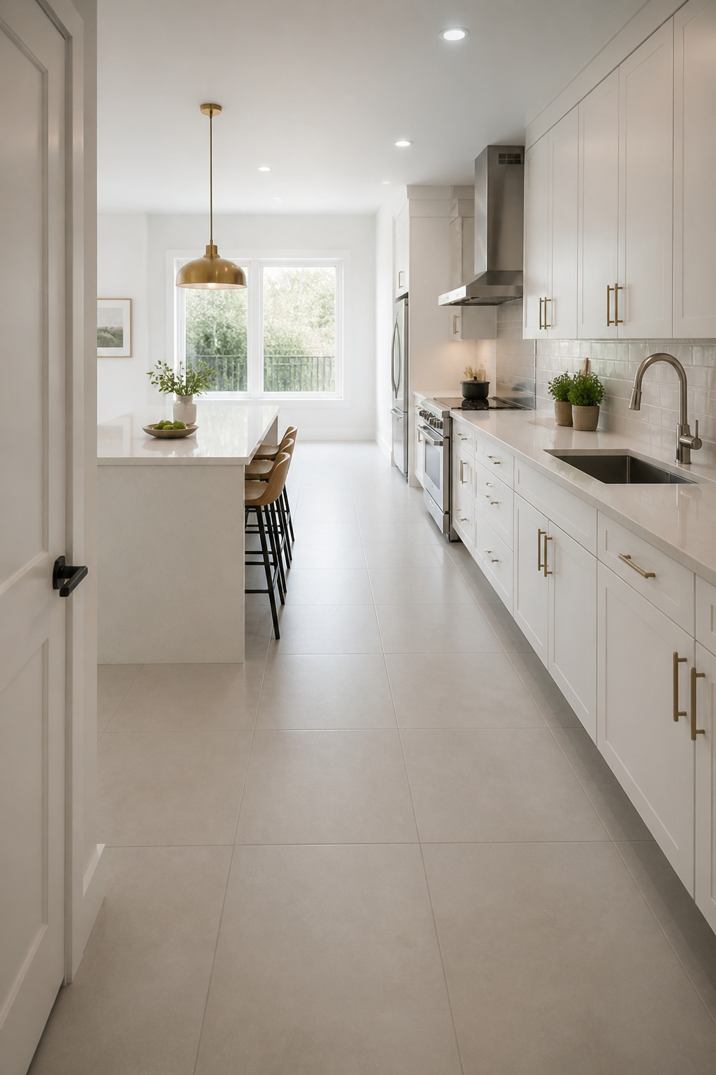
The material specification matters before you fall in love with a slab on a retailer’s display wall. Kitchen-grade porcelain should have water absorption at or below 0.5% — tiles meeting ANSI A137.1 classification as porcelain often achieve 0.10% or less. You want a PEI rating of 3 minimum for residential kitchens, PEI 4 if the kitchen sees heavy use. Check the DCOF (Dynamic Coefficient of Friction) wet rating: 0.42 is the minimum for wet interior floors, but 0.60+ is the realistic target for a cooking space where oil occasionally hits the floor.
Installation Notes
The piece most homeowners skip is subfloor preparation. ANSI A108 tolerates a maximum 1/32 inch of lippage between adjacent tile edges on flush-set installations — a tolerance that assumes a genuinely flat subfloor. For large format tiles, even minor undulation becomes visible. Self-leveling underlayment adds $2-4 per sq ft to the project but is often non-negotiable. If you’re pairing this with contemporary kitchen cabinets, plan tile joint directions so they align with the cabinet’s vertical lines — the coherent geometry is worth the layout time.
2. Classic White Subway Tile Laid Flat Across the Kitchen Floor
Subway tile belongs on kitchen floors as much as walls — but the floor-spec version and the wall version are different products that should not be interchanged. This is the most consistently misunderstood point in kitchen floor tile specification, and it leads to floors that fail within a year.
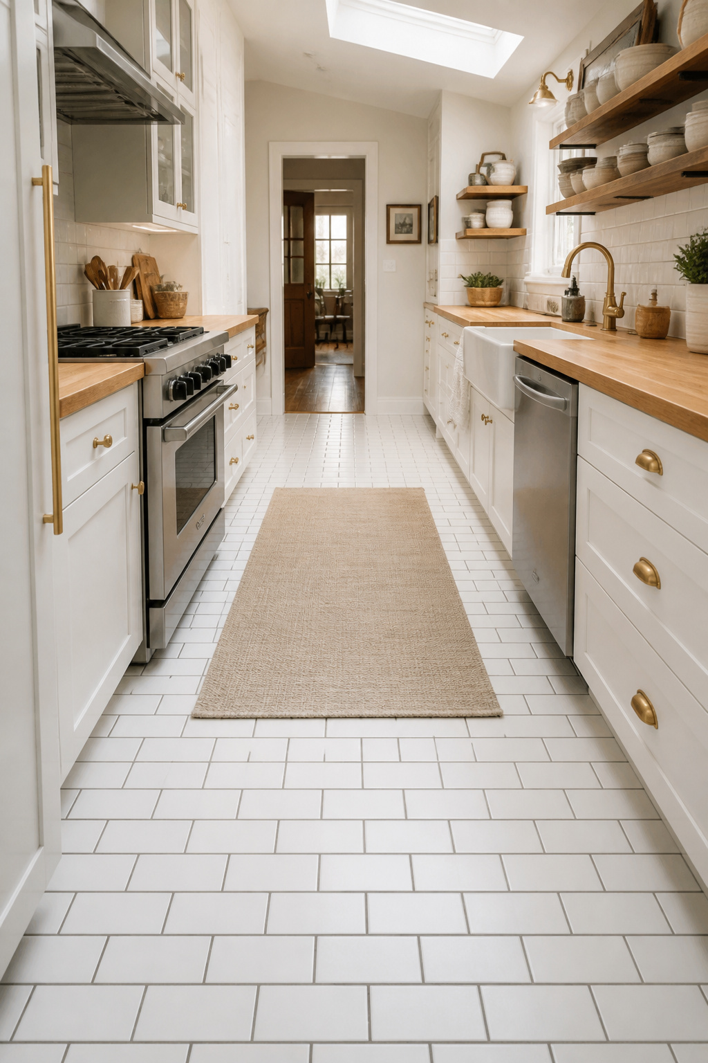
Wall subway tile runs 6-8mm thick with a glaze rated PEI 0-1 — designed for vertical surfaces that see no foot traffic. Floor-spec subway tile is 10-12mm thick (3/8 to 1/2 inch) with a PEI 3-4 glaze and a COF of 0.42+ wet. The increased thickness handles floor flex; the harder glaze handles foot traffic and chair legs. Sourcing floor-rated subway tile from a proper tile distributor rather than a big-box home store is the practical move.
Grout Color and Format Decisions
The aesthetic decision that matters more than the tile itself is grout color. Bright white grout creates the classic diner-bakery look but shows wear and cooking residue quickly. Mid-grey grout is the pragmatic choice: it hides kitchen grime, complements stainless steel, and reads as intentional rather than aged. Charcoal and black grout create graphic contrast that anchors the floor.
The 3×6 versus 4×8 format question: standard 3×6 produces a higher density of grout lines and reads as more vintage, more textured. A 4×8 covers 30% more area per tile, reducing grout exposure and reading as more contemporary at floor level. In a narrow galley kitchen under 8 feet wide, 3×6 laid horizontally elongates the space. In wider kitchens, 4×8 with a 1/3 offset is the cleaner choice.
3. Encaustic Cement Tiles for a Handcrafted Kitchen Floor Look
Encaustic cement tile is not glazed. The pattern is a 3-4mm layer of white Portland cement, marble powder, fine sand, and natural mineral pigments, hydraulically compressed into the tile’s face and becoming structurally part of it. The color cannot chip off because it is the tile, not a coating on top of it.
High-quality producers — Cement Tile Shop, Granada Tile, Avente Tile — use only mineral-based pigments that won’t fade. Retail prices run $8-18 per sq ft domestically; artisan imports from Jatana or Moroccan sources reach $20-35 per sq ft.
Sealing Protocol
Sealing discipline is non-negotiable for encaustic tile. Seal the tile before grouting — not after. Unsealed encaustic absorbs grout pigment instantly and permanently. Allow the tiles to dry completely before sealing; trapped moisture causes dark patches and hairline cracks. Reapply penetrating sealer 1-2 times per year, and never clean with vinegar, lemon juice, or acid-based cleaners — they etch the cement surface and destroy the pattern layer.
The design pairing that works best: encaustic’s handcrafted imperfection against flat-front cabinetry creates intentional tension. That contrast is the move, not a mismatch. Limit encaustic to the kitchen zone and use plain porcelain in adjacent open-plan areas so the pattern has space to register.
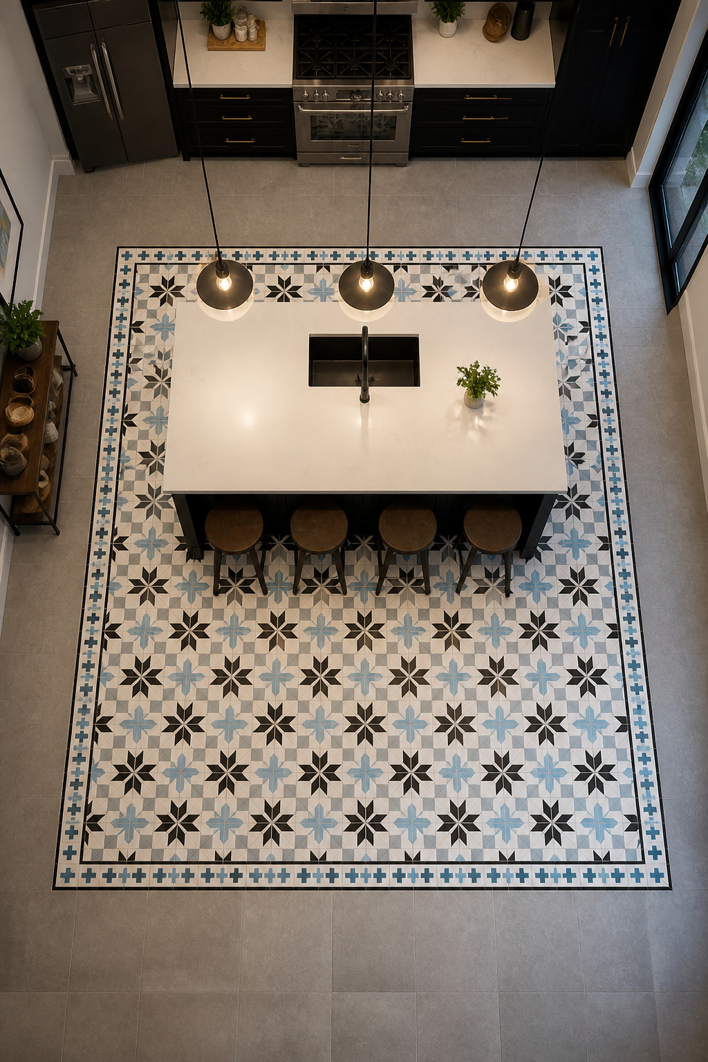
4. Black and White Checkerboard Kitchen Floor Tile Done Right
The checkerboard kitchen floor tile has run continuously from the 1920s through the present, surviving every trend cycle because the logic behind it is simple: it’s graphic, clean, and works with almost any wall and cabinet colour. The variables that determine whether it reads as retro diner or classic architecture are scale and material.
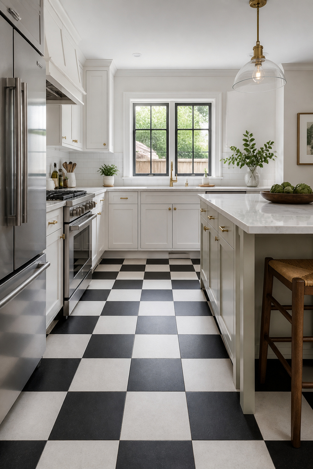
Four-inch tiles produce a dense grid with lots of grout lines — the classic vintage diner reference, playful and mid-century. Twelve-inch tiles create a strong, bold graphic with fewer grout lines and more visual weight — architectural rather than decorative. For kitchens under 100 sq ft, 8×8 or 12×12 is the practical maximum. Larger spaces handle 18×18 without the pattern competing with itself.
Material and Layout Trade-offs
Porcelain ColorBody tile is the practical choice — through-body color means a chip shows no contrast, no sealing required, COF-rated for kitchen floors, and priced accessibly. Marble is beautiful but requires annual sealing and etches from cooking acids. Honed finish is the appropriate specification for any marble kitchen floor — it hides scratches and etching better than polished and the COF is safer. Luxury vinyl checkerboard runs $3-7 per sq ft installed and suits renters or anyone who needs comfort underfoot.
A straight grid creates formal symmetry and suits classic kitchens. A diagonal layout (45°) draws the eye along the points and makes a room read as longer or wider — but it requires 10-15% more tile for edge cuts. When choosing kitchen backsplash ideas to coordinate with this floor, keep in mind that a checkerboard already carries the pattern load — the backsplash should be quiet.
5. Herringbone Pattern Wood-Look Tile That Adds Movement to the Kitchen
Wood-look porcelain has closed the aesthetic gap with real hardwood to the point where most people cannot tell the difference at normal viewing distance. The practical case is clear: Mohs hardness of 7-9 (most hardwoods sit at 1-3 on the Janka scale), water absorption under 0.10%, and no periodic sanding, staining, or sealing. Kitchen spills wipe up with no consequence.
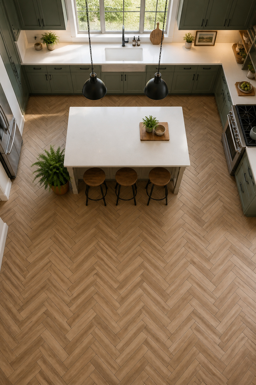
The herringbone layout adds directional energy a straight plank cannot achieve. Each tile’s end meets the adjacent tile’s side at 90° — the staggered joint creates a zigzag that directs the eye and adds apparent length. This is herringbone. Chevron is the visually similar but technically different version: tiles cut at 45° on both ends meet point-to-point. Chevron requires precision-cut tiles and significantly more installation skill. Herringbone uses standard rectangles and is the choice for most residential installations.
A 2:1 length-to-width ratio is the classic herringbone proportion: 3×6, 4×8, or 6×12 tiles all produce the traditional pattern scale. Longer planks (4×16 or 4×24) create something more architectural and contemporary. The budget note that often surprises people: a herringbone pattern requires 15-20% more tile than a straight lay due to diagonal cuts at walls and doorways. Order accordingly. For a fuller look at kitchen flooring ideas that balance style and durability, herringbone wood-look belongs near the top of the consideration list.
6. Natural Stone Tile for an Earthy, Organic Kitchen Floor
Natural stone tile carries something no manufactured tile can replicate: actual geological history in the surface. The variation, the color shifts, the occasional fossil inclusion in limestone — these exist because the material is what it is, not because a digital print was applied to a clay body. For a certain kind of kitchen, this authenticity is worth every maintenance requirement.
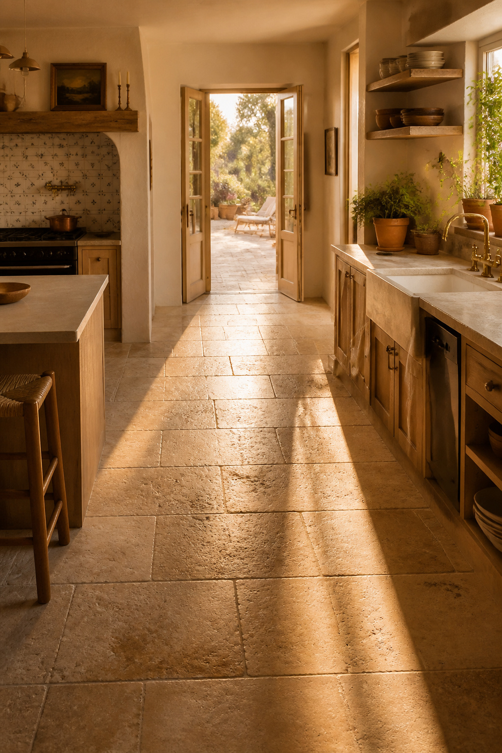
Travertine, slate, and limestone are the three most kitchen-appropriate natural stones. Travertine offers warm beige-cream tones with characteristic voids (filled for a smoother surface, unfilled for a more rustic one), $6-16 per sq ft before installation. Slate is dense, dark, and resilient — the most forgiving natural stone for kitchen use because its density means less porosity. Limestone is harder than travertine, more color-uniform, $3-10 per sq ft, and suits kitchens where the floor is meant to recede rather than lead.
Finish and Sealing
The finish choice matters more than the stone type for kitchen safety. Polished stone looks exceptional but COF values often drop below 0.42 wet — a genuine slip risk in a cooking space. Honed finish (matte or satin) is the correct specification for kitchen stone floors: better grip, better hiding of scratches and etching, and the right feel for a working room. Brushed or antique finishes add micro-ridging that maximizes traction.
Sealing discipline applies to all three: travertine and limestone need sealing before and after grouting, and annual reapplication based on use. Slate is more forgiving but still benefits from a penetrating sealer. Domestic stone carries a much lower transportation footprint than imported Italian marble — for a kitchen floor where the material footprint matters, locally sourced slate or limestone is the natural stone choice that holds up to scrutiny.
7. Penny Round Mosaic Tile as a Kitchen Flooring Statement
Penny rounds are one of the few tile formats that are inherently high-grip because of their format: the density of grout lines per square foot provides traction that exceeds what any large smooth tile can achieve. The COF advantage is structural, not a glaze choice. This makes penny rounds technically solid for kitchen floors that most people consider only for bathrooms.
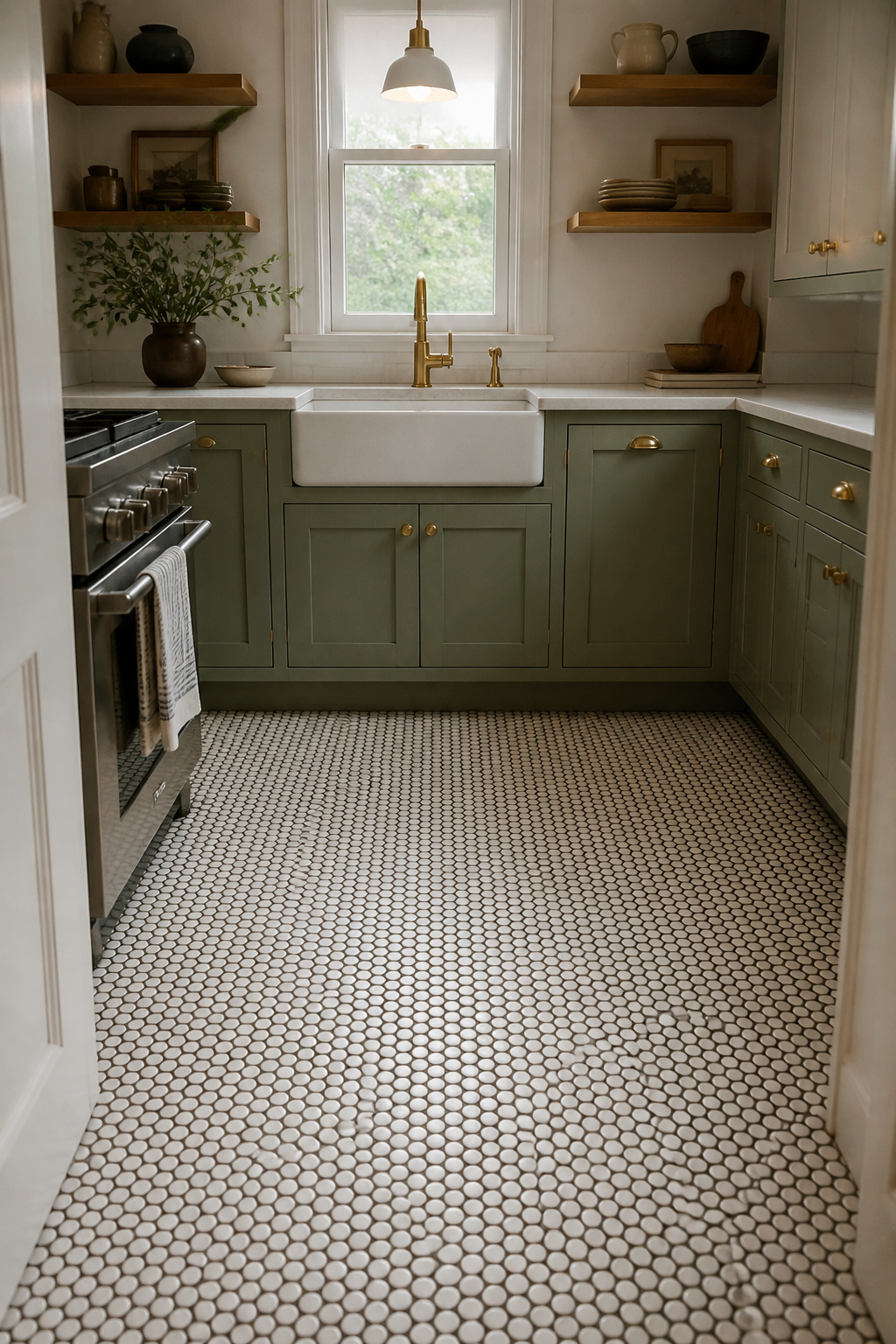
The visual effect at floor level is different from what you expect seeing penny rounds on walls. From standing height at floor level, the surface reads as texture rather than individual circles. The pattern is absorbed into a surface quality — fine and slightly irregular. Grout color determines whether this texture is subtle (matching grout in white-on-white) or graphic (contrasting grout in charcoal-on-white, where every circle gets a dark outline).
Factory mesh-backed sheets set the grout joint at 1/16 inch. The critical installation note: use unsanded grout for joints this small. Sanded grout has coarse particles that will permanently scratch porcelain tile surfaces during grouting. Press the sheets with a rubber mallet and wood block to embed fully — any flex left in the sheet creates high spots that crack under foot traffic.
Color mixing works completely differently at floor scale than in a sample photo. Solid single-color fields are the failsafe choice. Two-tone combinations with a plain border work well. Ombre gradients require precise pre-laying and are a professional installation choice.
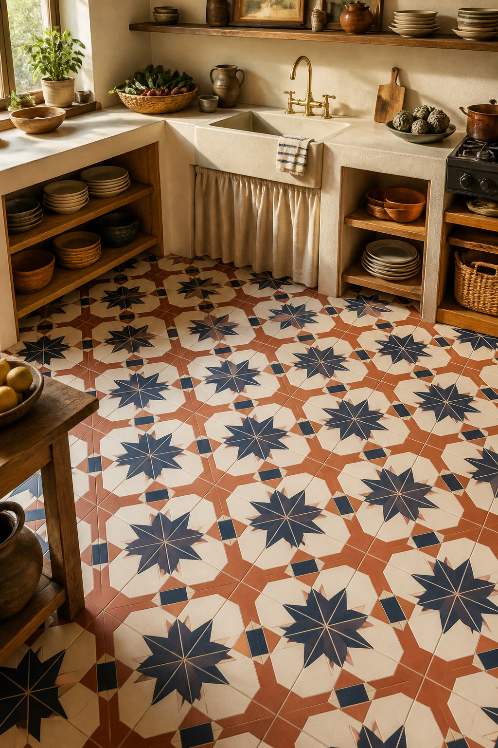
8. Geometric Patterned Tile That Makes the Kitchen Floor a Feature
Bold geometric tile on the kitchen floor — star-and-cross, arabesque, elongated hex — is for kitchens where the floor is the design statement. The constraint is space: geometric patterns have repeating units that need room to complete their logic before hitting a wall, and in a small kitchen, the unit gets cut off and the pattern reads as incomplete.
Star-and-cross patterns work best in kitchens over 150 sq ft. Arabesque (the pointed oval lantern shape) is more forgiving because its scale can be adjusted from 2×4 to 6×12 and still read as complete. Elongated hex sits between classic hex and plank tile — geometric without the retro hex association, suited to contemporary kitchens that want pattern without period reference.
Handmade vs Printed, and Zoning the Pattern
The handmade versus digitally printed distinction is real. Handmade geometric tile from Clé, Fireclay, or Mercury Mosaics has natural variation in color, surface texture, and edge — each tile differs subtly, creating visual life. It requires an experienced installer who understands how to manage that variation in a laid surface. Digitally printed porcelain geometric tiles are perfectly consistent, cheaper ($4-15 per sq ft vs $18-40 per sq ft for handmade), and faster to install, but the uniformity can read as flat.
The most effective way to use bold geometric tile in a larger kitchen: as an accent field defined by a plain border tile — the area under a kitchen island, the threshold strip at the entry, or the run between breakfast bar and range. Plain porcelain in adjacent areas of an open-plan kitchen keeps the geometric floor tile from competing with everything else in the room.
9. Textured Slate-Look Porcelain for High-Traffic Kitchen Floors
Natural slate varies from very dense and resilient to quite soft and prone to spalling — there’s no reliable way to know which category a particular slate belongs to until it’s installed and aged. Slate-look porcelain eliminates this variable entirely. Consistent hardness across every tile, controlled surface texture that reads as cleft stone, and no sealing requirement.
The COF specification for this tile format is its technical strength. The DCOF minimum for wet interior floors under ADA guidelines is 0.42, but the professional recommendation for kitchen floors — where cooking oil occasionally hits the ground — is 0.60+. Textured slate-look porcelain with cleft or riven surfaces typically achieves 0.60-0.75 DCOF wet. Check the product spec sheet specifically for wet DCOF, not dry — many retailers list only the dry figure, which is irrelevant for kitchen floor safety.
Inkjet printing at up to 360 DPI produces 4-8 different tile face variations within a production run, randomized to prevent any pattern from repeating in a grid. Shade variation codes: V1 is nearly uniform, V4 is highly varied. Slate-look porcelain is typically V3-V4. Always order and view a minimum 6-10 tile sample display board before committing — a single tile in a retailer’s rack doesn’t represent the full installed variation range.
10. Zellige-Style Handmade Tile Bringing Depth to a Kitchen Floor
Authentic zellige is Moroccan terracotta tile, hand-molded, hand-cut, and hand-glazed using metallic oxide pigments applied this way for centuries. The result is a glaze with real depth and iridescence — a surface that shifts in tone as light angle changes through the day. No digital inkjet print replicates this optical behavior. Porcelain zellige-look tiles approximate the visual well, but the light responsiveness requires the authentic material.
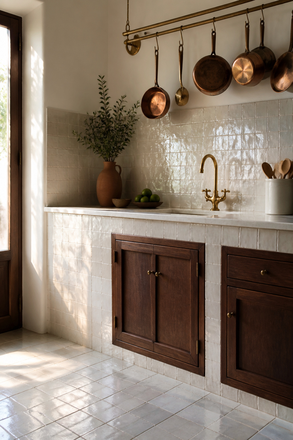
Here is the honest functional assessment: authentic zellige terracotta is not right for a high-traffic cooking floor. The terracotta base is relatively fragile; walking on it in shoes will, over time, chip and abrade the surface. Authentic zellige is best suited to a backsplash, a lower wall section, or a low-traffic decorative floor zone. For the main kitchen floor surface, zellige-style porcelain from Clé, Stone Tile Depot, or similar suppliers gives the visual benefit with the durability kitchen floors actually require.
The installation challenge with authentic zellige is finding a contractor who has set it before. The tiles are not dimensionally consistent — lippage is expected, not a defect — and most general tile contractors have never worked with this material. The importers (Clé, House of Anouar, Mosaic House) maintain installer referral lists for a reason. Zellige-style porcelain sets like any rectified tile.
The color behavior: authentic zellige under warm 2700-3000K kitchen lighting brings out amber and bronze tones. Under cooler 4000K task lighting it shifts toward silver and blue-white. This light responsiveness is the aesthetic argument for the material.
11. Terrazzo-Look Porcelain Kitchen Floor Tile for Modern Interiors
Poured terrazzo — marble or glass chips set in a cement matrix, ground and polished in place — is seeing a serious residential return, but poured terrazzo at $15-35 per sq ft installed requires specialist contractors and in-place grinding. Terrazzo-look porcelain delivers the aggregate-in-matrix visual for $4-12 per sq ft installed with standard tile installation. For most residential projects, the porcelain version is the decision that makes sense.
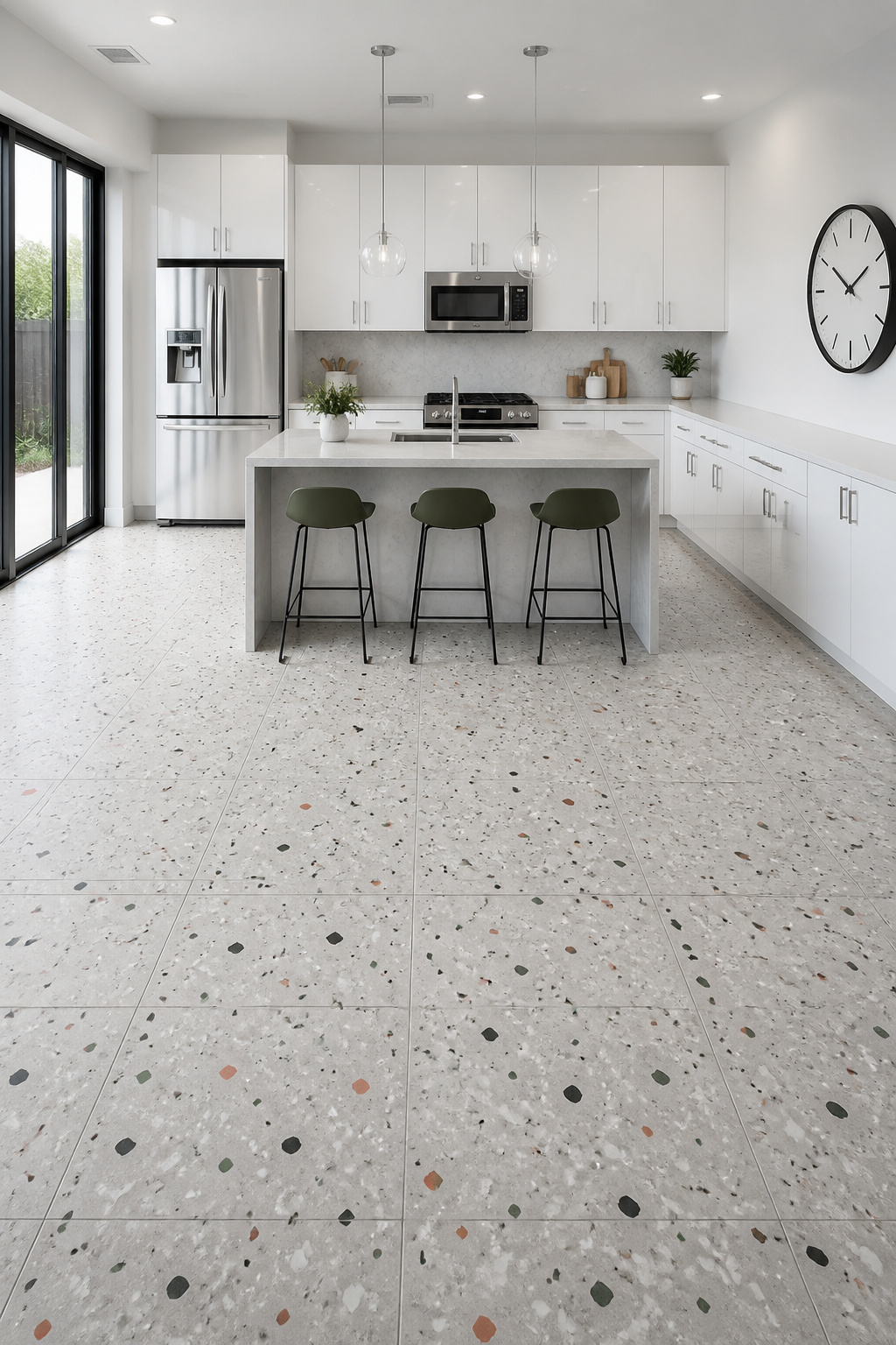
The digital printing technology behind this tile format has improved substantially. Inkjet at 360 DPI captures random chip distribution, varying aggregate sizes, and matrix color variation convincingly. Marazzi’s 2025 Curation collection is a current benchmark — 24×48, 24×24, and 12×24 formats in ColorBody porcelain, matte and polished options. The matte finish carries the slip resistance appropriate for kitchen floors; the polished version is for walls and backsplashes.
Scale and Format Selection
Aggregate pattern scale is the specification decision that most affects the visual outcome. Fine aggregate (chips 2-5mm) produces a delicate, textile-like surface that suits small to medium kitchens. Coarse aggregate (chips 10-20mm) needs a large kitchen or open-plan space to read as intended — in a galley, the large chips read as clumsy rather than bold. If you’re planning a modern kitchen renovation, terrazzo-look porcelain in a fine aggregate matte finish is one of the stronger material arguments right now. For context on the full kitchen picture, exploring modern kitchen design ideas alongside the floor choice helps keep the material palette coherent.
12. Warm Terracotta Tiles That Define a Mediterranean Kitchen Floor
Terracotta is one of the oldest building materials on record, and its continued presence in kitchens is not nostalgia — it’s the genuine warmth of fired clay in a space that benefits from it. No manufactured tile produces the same color depth. The tradeoff is maintenance discipline, and it’s worth being specific about what that means before committing.
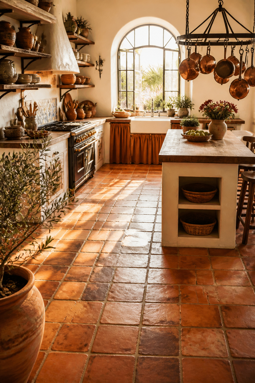
Saltillo (handmade Mexican terracotta) is sun-dried and low-fired, with absorption rates that can exceed 15%. That’s extremely porous — it absorbs spills, cooking oils, and grout almost instantly unless properly sealed. Machine-pressed terracotta tiles are higher-fired, with absorption rates of 3-8%: more manageable but still demanding. The visual reward for either is genuine: the uneven color depth and surface texture of handmade terracotta tile cannot be replicated by anything denser.
Sealing and Color Choices
The sealing choice determines how the floor looks and performs for the long term. Topical sealers sit on the surface and create the traditional glossy Mexican aesthetic. Penetrating/impregnating sealers absorb into the tile body and leave the surface looking natural and matte while still repelling water. Miracle 511 Impregnator Porous Plus is the professional recommendation for high-porosity Saltillo; apply in thin coats — one coat covers approximately 400 sq ft on pre-sealed tile.
The dark grout rule with terracotta is practical, not aesthetic preference. Light grout adjacent to unglazed terracotta will absorb orange-red pigment during the first cleaning cycle, and it will not come out without full grout removal. Charcoal, brown, or black grout defines each tile individually and handles kitchen staining without showing it. Traditional Mediterranean styling pairs these floors with white lime plaster walls and open wooden shelves — a palette that is warm, earned, and has nothing to prove. Terracotta is one of those tile choices that rewards research — the more you know about what the installation actually requires, the clearer the decision becomes.
13. Concrete-Look Porcelain Tile for Industrial Kitchen Floors
Poured concrete floors look compelling in industrial kitchens. In practice, poured concrete requires periodic sealing with penetrating impregnators to prevent staining — in a kitchen where coffee, wine, and cooking oil hit the floor regularly, an unsealed slab will absorb stains within months. Concrete-look porcelain delivers the aesthetic without any of this: waterproof, stainproof, scratch-resistant, and requiring only routine damp mopping.
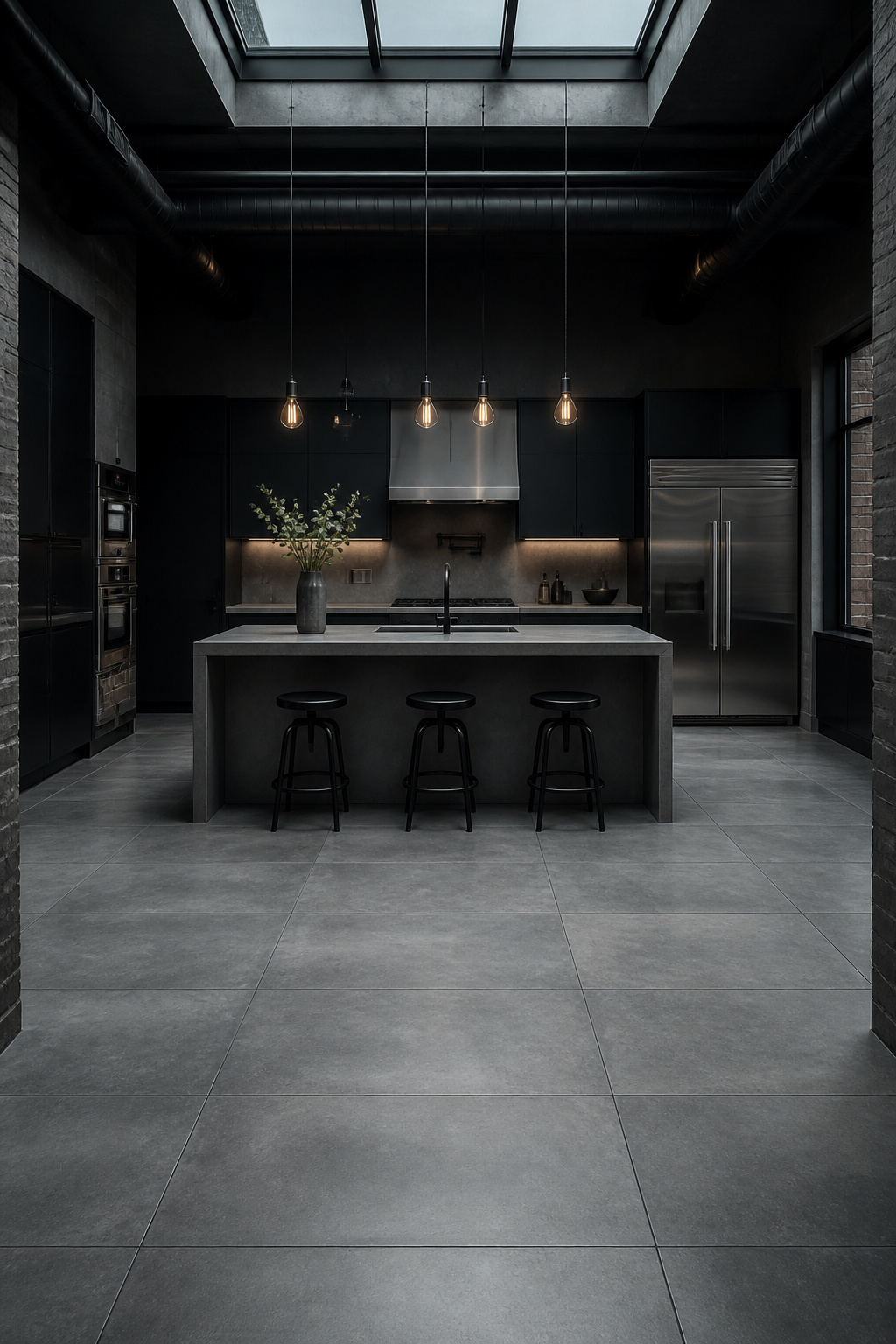
Florim is the benchmark for large-format concrete-look porcelain. Their concrete-effect porcelain slabs reach 63×126 inches, designed specifically for the continuous-surface effect that makes poured concrete compelling. The practical benefits of large format matter more in a kitchen than elsewhere — fewer grout lines mean easy cleaning and minimal grout maintenance.
Tile Specification and Color Tone
Rectified large format tiles with 1/16 inch grout joints and matching grey grout create the seamless slab appearance. Epoxy grout is worth considering for this type of installation — it’s stain-proof and doesn’t require the periodic sealing that cement grout demands. Given that the whole appeal of this tile type is low-maintenance replication of a high-maintenance material, stain-proof grout is consistent with the premise.
Color tone matters under kitchen lighting. Cool concrete tones (blue-grey, mid-grey) recede under warm 2700K kitchen lighting and can make a kitchen feel colder than intended. Warm concrete tones (sand-grey, beige-grey, taupe) read more neutrally and suit industrial kitchens with black steel, walnut, or copper elements better. For kitchens where durability is the primary brief, flooring options for busy kitchens consistently ranks concrete-look porcelain at the top.
14. Large Hexagon Kitchen Floor Tiles With Statement Grout
Hexagon tiles have been scaled up significantly over the past decade. The classic 2-inch penny-adjacent hex of vintage bathrooms now sits alongside 6-inch, 12-inch, and 24-inch formats that bring the same geometry at architectural scale. The visual effect changes completely with size, and so does the appropriateness for different kitchen dimensions.
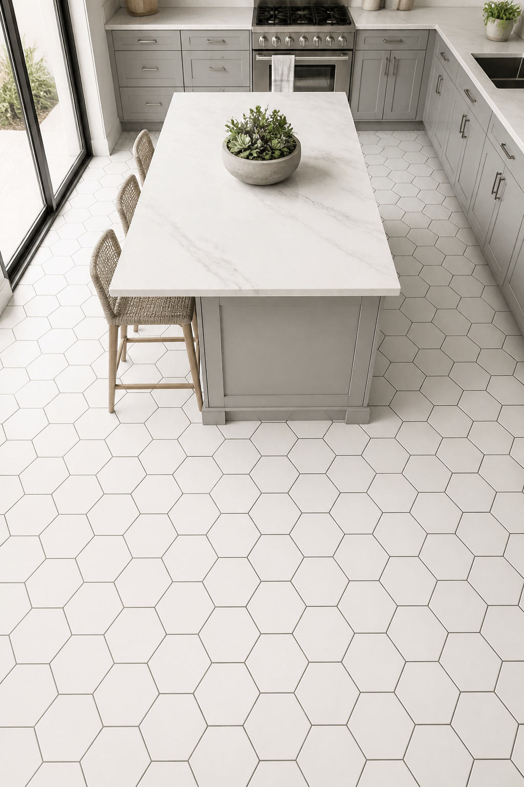
Six-inch hexagons read as refined geometric texture — from normal viewing distance, the pattern registers as surface character rather than individual shapes. Twelve-inch hex is the current residential sweet spot: large enough to read clearly from across a kitchen, small enough for standard-sized rooms. Twenty-four-inch hex tiles are an architectural commitment that requires an open-plan space — in a galley kitchen, you’d encounter 2-3 full hexagons and multiple cut edges at every wall.
Grout Strategy and Edge Profiles
Grout joint for hexagon tile: 3/16 inch is standard; 1/8 inch is achievable with rectified tiles and an experienced setter. Contrasting grout (black tile with white grout, white tile with charcoal) outlines each hexagon and becomes equal in visual weight to the tile. Tone-on-tone grout lets the hex pattern register only in certain light, creating a subtler surface texture.
The flat edge versus beveled edge distinction: flat edge reads contemporary and minimal. Beveled hex adds a chamfered edge that creates a slight V-joint between tiles — more artisanal, more depth, and more forgiving of minor lippage during installation. Start your hex layout from the room’s center point, not a wall. Hex patterns started from a wall invariably produce awkward half-hexagons at the opposite wall and in doorways — a planning mistake that’s baked in before the first tile is set.
15. Mixed-Width Plank Tile That Convincingly Reads as Hardwood Kitchen Flooring
The reason most wood-look tile installations in kitchens fall short isn’t tile quality — it’s the uniform format. A consistent 6×36 plank grid looks neat and contemporary, and looks unmistakably like tile. Real hardwood floors use 3-5 different plank widths in a randomized pattern because that’s how old-growth timber was milled: the sawyer took what the log gave, not a uniform dimension. The brain reads variation as authentic.
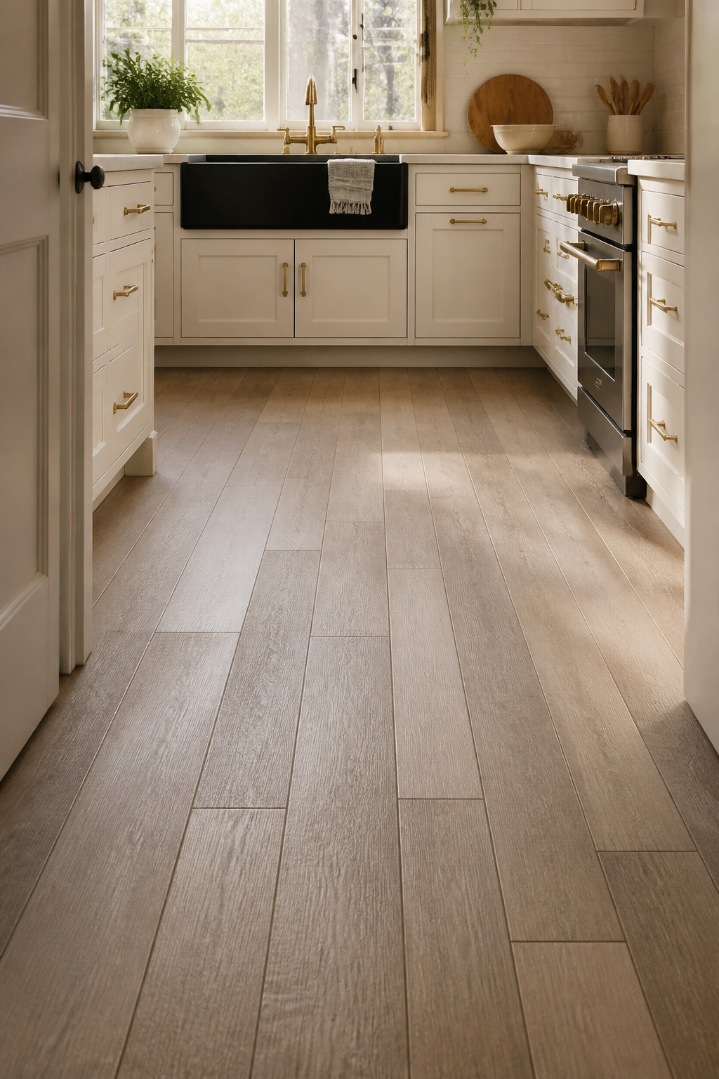
Mixed-width plank porcelain (combining 4, 6, and 8-inch widths, or 3, 5, and 7-inch combinations) randomized in the laying plan produces a convincing hardwood appearance in kitchen floors that survives close inspection. Daltile, MSI, and Shaw all produce collections in this format. High-quality inkjet printing in these collections includes realistic grain direction shifts and varied knot placement across tiles — essential for avoiding the repeating pattern that appears in lower-quality wood-look porcelain.
Species, Finish, and Laying Direction
For kitchens with white or grey cabinetry, grey-toned ash finishes create a contemporary monochromatic palette. For warm-toned or wood cabinets, a darker walnut finish provides contrast; lighter oak offers a safer complementary warmth. The laying direction is a room-proportions decision: planks parallel to the longest wall elongate a kitchen; planks running perpendicular to cabinets draw the eye into the space from the doorway.
The stagger offset matters practically: MSI recommends a 33% offset rather than the common 50% (brick-bond) pattern. With long planks, a 50% offset creates an obvious H-joint pattern — four corners meeting at a single point in a visual grid that immediately reads as tile rather than timber. For high-traffic kitchens where the floor takes serious use, durable kitchen flooring that lasts consistently ranks porcelain plank above real wood for kitchen applications on performance grounds, regardless of aesthetic preference.
How to Choose the Right Kitchen Floor Tile for Your Space
The right kitchen floor tile matches three things simultaneously: the room’s scale, the traffic it takes, and the design language already established by your cabinetry, countertops, and walls. Missing any one of these produces a floor that works against the room rather than completing it.
On scale: small kitchens under 100 sq ft should lean toward minimal grout — large format porcelain, mixed-width plank, or concrete-look slabs. Reducing the grid read makes the space feel larger. Kitchens over 200 sq ft have room to carry geometric patterns, checkerboard, or penny rounds without the pattern competing with itself. For a kitchen floor tile that needs to pull double duty — looking right in a small space while surviving heavy use — large-format matte porcelain is the most reliable answer.
On traffic: porcelain beats natural stone in any high-use kitchen, not because stone fails aesthetically but because the maintenance discipline it requires in a real cooking environment is rarely sustained over years. If you choose travertine or terracotta knowing exactly what the sealing commitment looks like, that’s an informed decision. Most people don’t know going in, and the floor suffers for it. For any kitchen where cooking oil, acidic food, and heavy foot traffic are constants, specify kitchen floor tile with DCOF 0.60+ wet and a surface that doesn’t require annual sealing.
On budget: tile material cost is typically one-third to one-half of the total installed price. Installation labor, subfloor preparation, leveling compound, and grout together often exceed the tile cost itself. Budget for the installed price, not the per-square-foot material cost. Add 10-15% for pattern cuts in herringbone, geometric, or diagonal layouts — these waste factors are real and cannot be recovered with leftover tile returns. The kitchen floor tile you choose at $8 per sq ft material, installed well on a properly prepared subfloor, will consistently outperform the floor chosen at $15 per sq ft material rushed onto an unlevel slab.
The best kitchen floor tile is the one you won’t be replacing in five years. Choose the material whose maintenance requirements match your actual life, and the aesthetic takes care of itself.