There’s a widespread belief that choosing a white kitchen remodel is the safe, noncommittal option — the design equivalent of ordering the house salad. After fifteen years photographing residential interiors and writing about contemporary kitchen design, I’d push back on that hard. White kitchens are among the most technically demanding projects you can undertake precisely because white reveals everything: every proportion decision, every grout line, every undertone mismatch, every material that doesn’t belong. Done well, a white kitchen remodel is the most photogenic and enduringly satisfying space in a home. Done carelessly, it reads as flat and finished before it started.
These 18 ideas aren’t an invitation to pick your favourite tile and order cabinets. They’re a framework for understanding the decisions — from the undertone of your paint colour to the PVD coating on your hardware to the direction of your floor tile — that determine whether your white kitchen remodel looks designed or just completed.
1. Pure White Shaker Cabinets as the Remodel’s Non-Negotiable Foundation
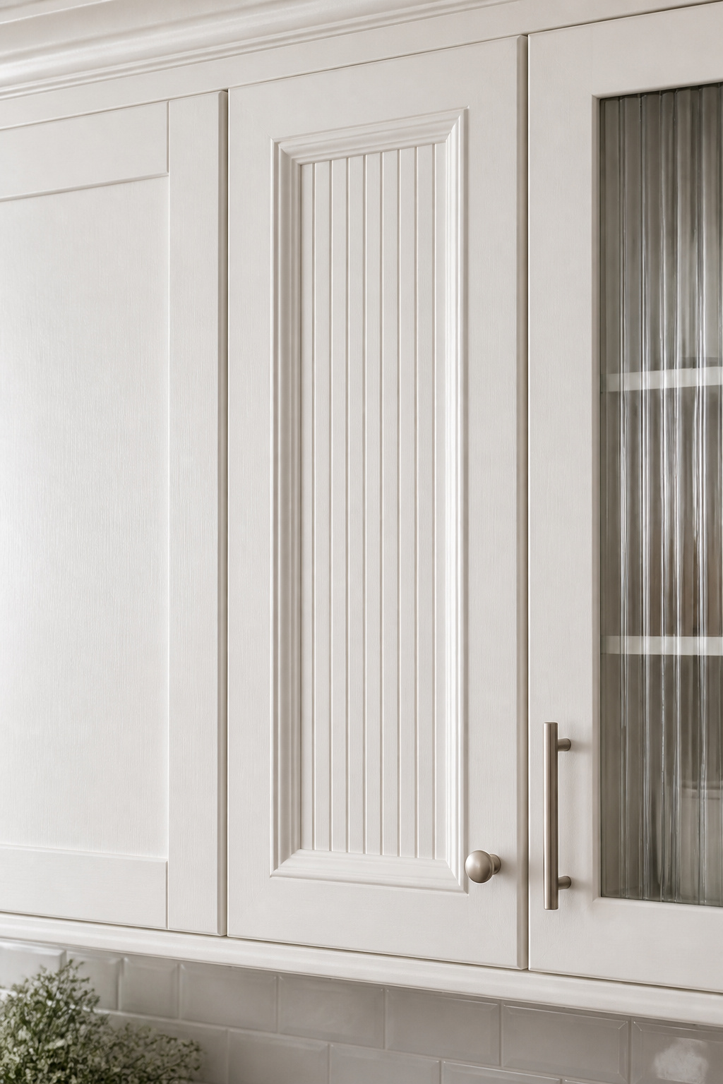
The Shaker cabinet door has been in continuous production since the 19th century for a straightforward reason: it works. The five-piece construction — two vertical stiles, two horizontal rails, one floating centre panel — allows the door to expand and contract with humidity without cracking. That structural logic, applied to kitchen cabinetry that experiences significant heat and steam, is why Shaker outlasted every period style that claimed to replace it, from Victorian ornament to mid-century minimalism.
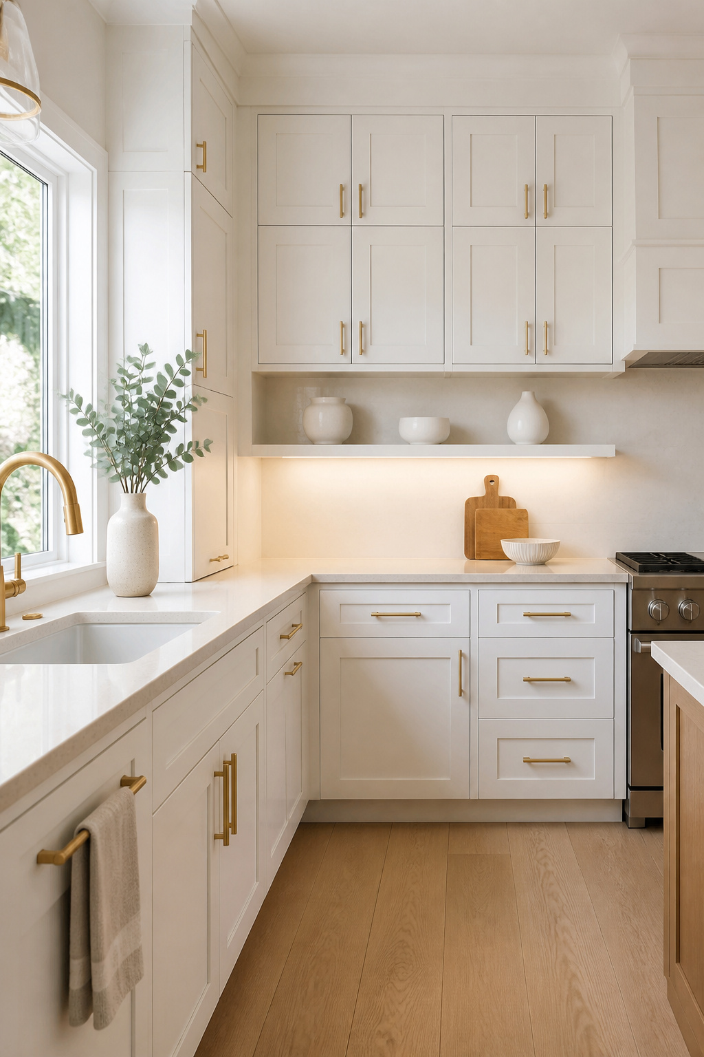
What most homeowners don’t realise is that in 2026, the Shaker door profile is neutral enough to read as contemporary, farmhouse, or transitional depending entirely on the hardware and finish choices around it. The door itself isn’t making a style statement — it’s creating a surface for other decisions to land on.
Hardware That Completes the Shaker Look
The paint choice is where the character enters. Benjamin Moore Chantilly Lace (OC-65) is the true bright white — minimal undertones, consistent under both natural and artificial light. White Dove (OC-17) reads creamier, with a warm yellow undertone that softens under incandescent light and works naturally with warm-spectrum countertops. Sherwin-Williams Alabaster (SW 7008) is warmer still — closer to cream than true white, the specification most associated with farmhouse and transitional kitchens with brass hardware. In 2026, the trend is toward warmer whites precisely because they create depth through warmth rather than stark minimalism.
Hardware is where Shaker reveals whether a kitchen was designed or assembled. Bar handles — flat, horizontal, typically 5-8 inches in length — align with the visual geometry of the door rail and signal contemporary intent. Brushed brass on White Dove reads warm and considered. Matte black on Chantilly Lace delivers high-contrast contemporary clarity. The wrong call here isn’t a wrong finish. It’s the right finish installed at the wrong scale.
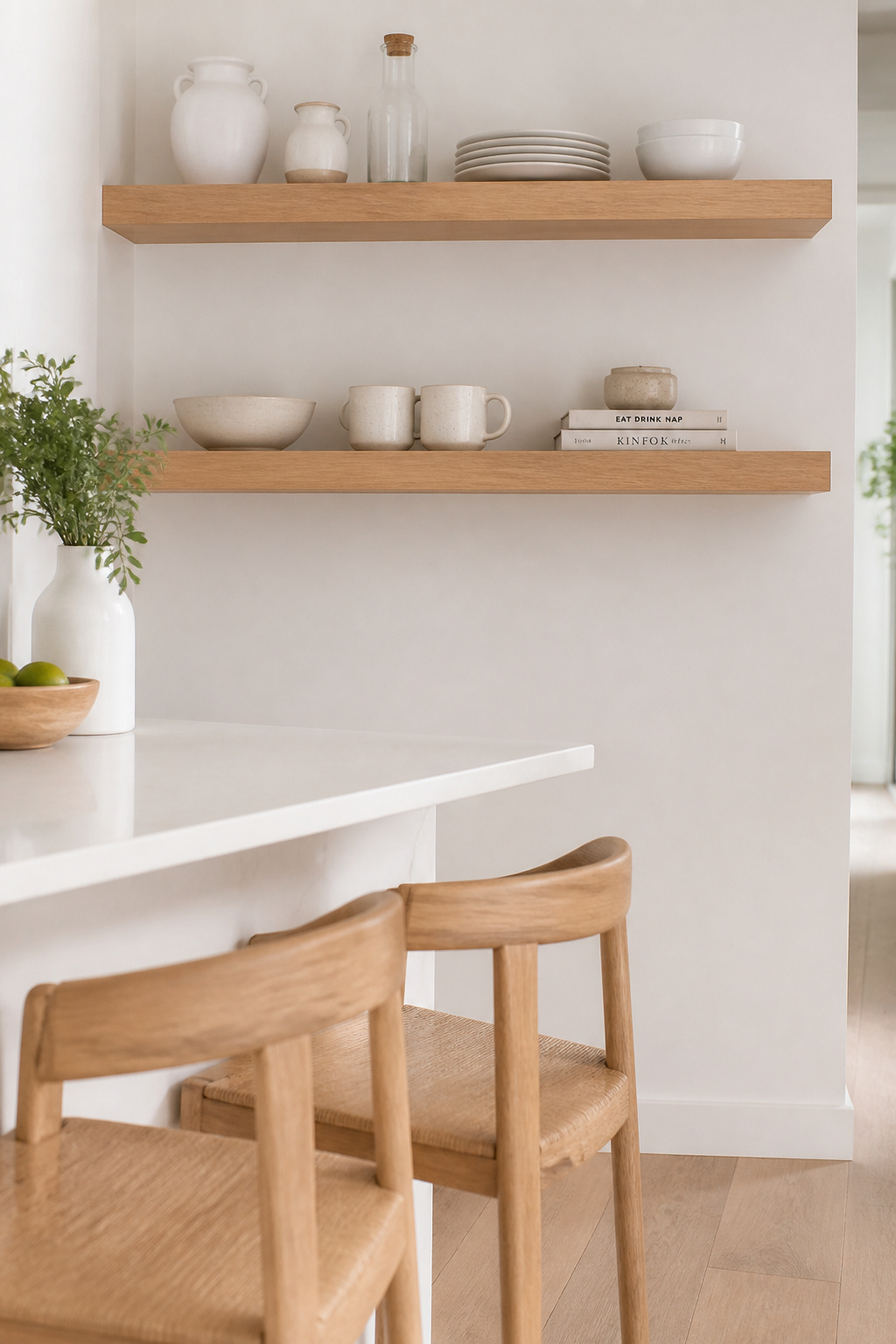
2. White Kitchen Remodel With Open Floating Shelves That Balance the Cabinet Load
Before specifying open shelving in a white kitchen remodel, be clear about the trade-off: you’re exchanging storage capacity and visual calm for a display obligation that lasts the life of the kitchen. Open shelves look extraordinary in the first week after styling. They require genuine discipline to maintain that appearance through daily cooking and grocery deliveries.

That said, when they work, they work. The visual relief of breaking a solid wall of cabinet doors — particularly in a white kitchen where every surface is the same material — creates depth and variation. White oak floating shelves at 1.5-inch thickness, with hidden rod hardware rated to 50 lbs per bracket, are the current specification: the closed grain resists moisture, the neutral tone works with both warm and cool whites, and the material reads as considered without being showy.
Styling Shelves for the Long Term
Depth matters more than most people acknowledge. A 10-inch shelf shows everything clearly without requiring a reach to the back. A 12-inch shelf is more useful but buries items. For shelves holding everyday dishware, 10-12 inches is the practical range. The styling rule that prevents open shelves from becoming chaotic: 70-80% functional items used daily, 20-30% decorative. White and neutral ceramics maintain the palette. Odd groupings — three, five, seven items — look more intentional than even ones.
If you don’t want to think about this every time you put the dishes away, reeded glass-front uppers give you the visual lightness of open shelves with the practicality of closed storage.
3. Calacatta Quartz Countertops That Deliver Marble Drama Without the Upkeep
Real Calacatta marble from Carrara, Italy, is one of the most beautiful countertop materials available. It is also porous, reactive to acid, and requires sealing every 6-12 months. Citrus, coffee, and most commercial kitchen cleaners will etch an unsealed marble surface permanently. I’ve photographed hundreds of kitchens with natural marble countertops; the ones that look as good at year five as at installation are the ones where the owners treated their countertops as a maintenance project, not a surface.
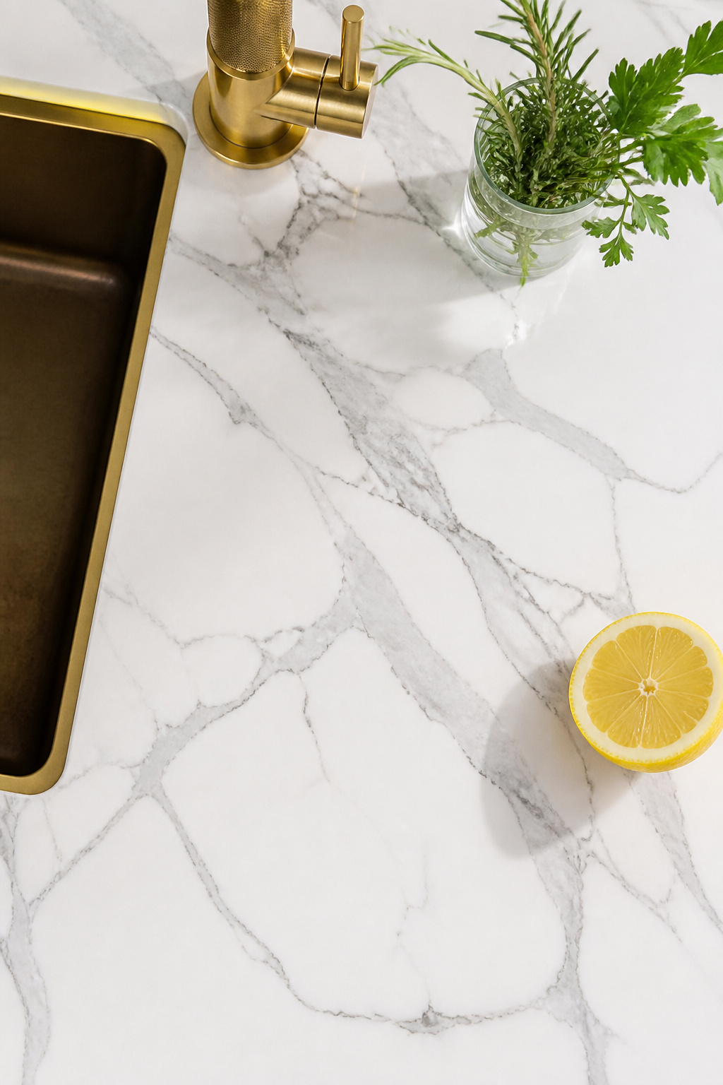
Calacatta quartz resolves most of the marble problem. The material — engineered stone comprising roughly 90-94% crushed quartz bound with resin — is non-porous, requires no sealing, and resists the same substances that damage marble permanently. The quality of veining printing has improved enough that the difference between quartz and real stone is most apparent at close range, on cut edges, and in the subtle three-dimensional depth that natural stone has and engineered stone doesn’t quite replicate. In daily use, the maintenance difference is significant.
Choosing the Right Calacatta Quartz for Your White Kitchen Remodel
Silestone Calacatta Gold runs $75-$120 per square foot installed; Caesarstone and MSI offer comparable options at $60-$100; high-end custom fabrication reaches $140+. Edge profile affects both cost and character: an eased edge is the contemporary default at no premium; a mitered waterfall edge adds $50-$100 per linear foot but creates the full slab-to-floor island visual that makes finished kitchen photographs memorable.
In a white kitchen specifically: match veining intensity to cabinet tone. Heavy dramatic veining needs warmth elsewhere to prevent the result from reading clinical. Pair bold Calacatta options with White Dove or Alabaster rather than pure bright white. Quieter veining works more universally and is easier to combine with backsplash tile without visual competition.
4. Subway Tile Backsplash Choices That Define the Whole White Kitchen Remodel
The subway tile backsplash occupies more visual real estate than any other surface in a kitchen except the cabinet doors — which makes it the most consequential single specification in a white kitchen remodel after cabinet paint colour. Most homeowners spend significantly more time selecting the tile than it deserves, and significantly less time on the decision that does the real design work: the grout.
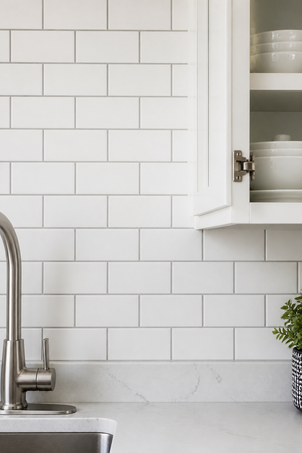
White subway tile with white grout creates a near-seamless surface — minimal texture, maximum light reflection, very clean. It also shows kitchen grease faster than any other combination, and white cement grout in a kitchen will need aggressive cleaning or periodic re-grouting within five years. Light grey grout (Mapei Warm Gray is the most-specified product here) is the practical solution: enough contrast to define the tile pattern, warm enough not to read institutional, and forgiving of everyday cooking residue.
For more on how backsplash material choices interact with the rest of the kitchen, the options covered in these kitchen backsplash ideas from subway tile to mosaics are worth reviewing before committing to a direction.
The Tile Format and Installation Pattern Decision
Dark charcoal or black grout transforms white subway tile into a deliberate design choice — the graphic grid it creates reads as contemporary and confident. It hides discolouration well. The limitation: in smaller kitchens with limited natural light, a dark grout grid can make the backsplash feel heavy. Reserve it for kitchens with substantial windows or open-plan layouts.
On format: the 3×6 classic reads as traditional. Moving to 4×8, 4×12, or 3×12 reduces grout line frequency and shifts the look toward contemporary. Stacked vertical installation — tiles aligned in columns rather than the standard horizontal offset — moves subway tile from traditional to modern without changing the tile itself.
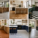
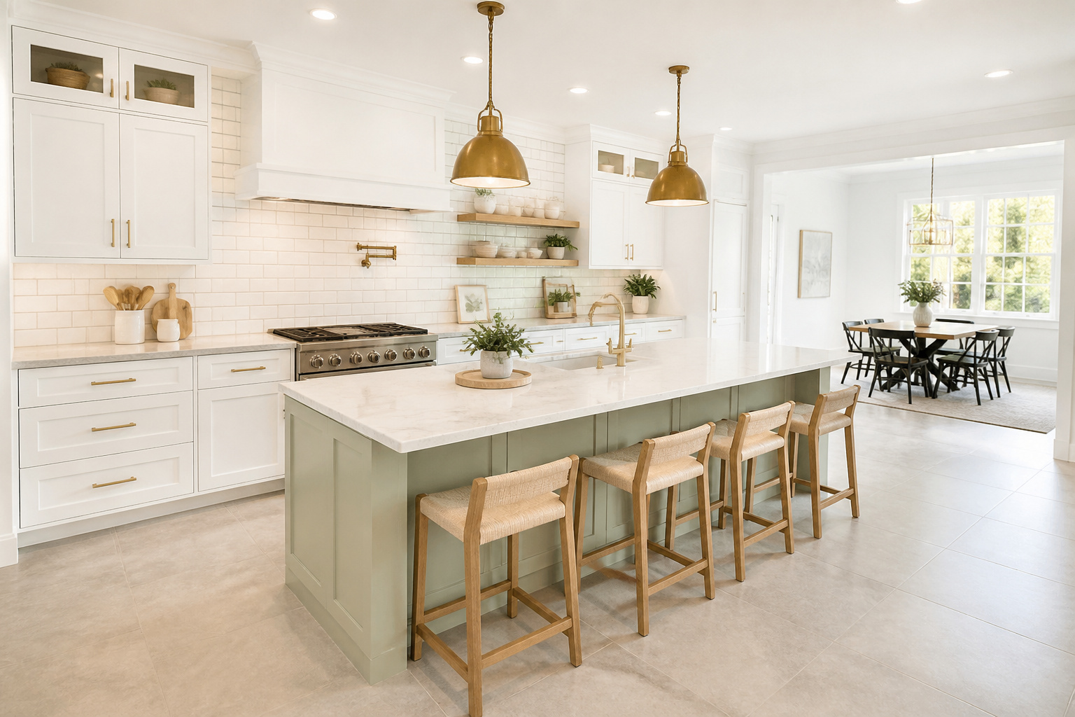
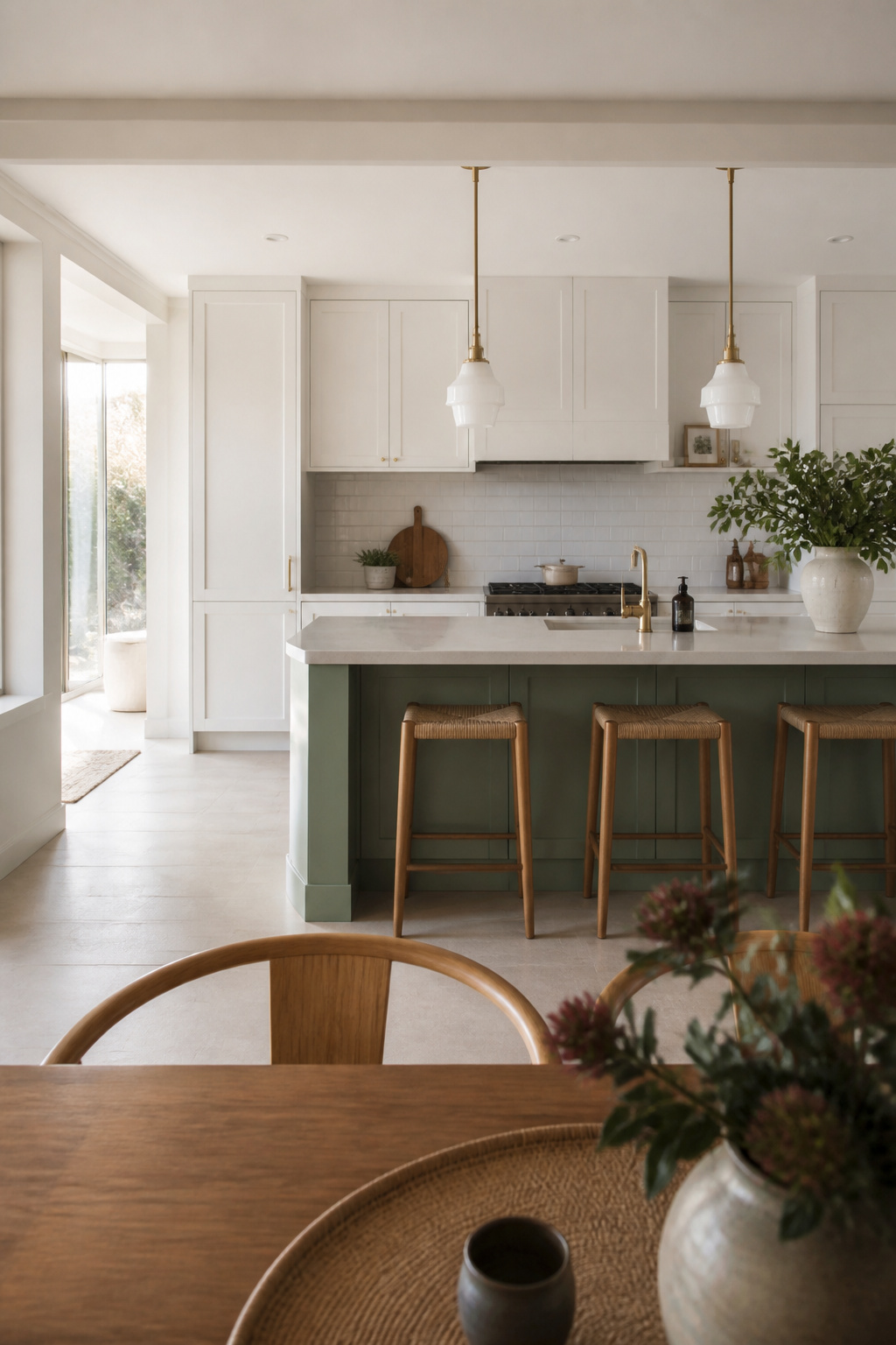
5. White Kitchen Renovation With a Contrasting Island That Anchors the Room
A contrasting island in a white kitchen renovation functions as an anchor — the single element that gives the space a focal point and prevents the all-white palette from reading as undifferentiated. It also allows a design choice that doesn’t commit every surface to a single colour, which is exactly why the two-tone kitchen has remained relevant across multiple design cycles.
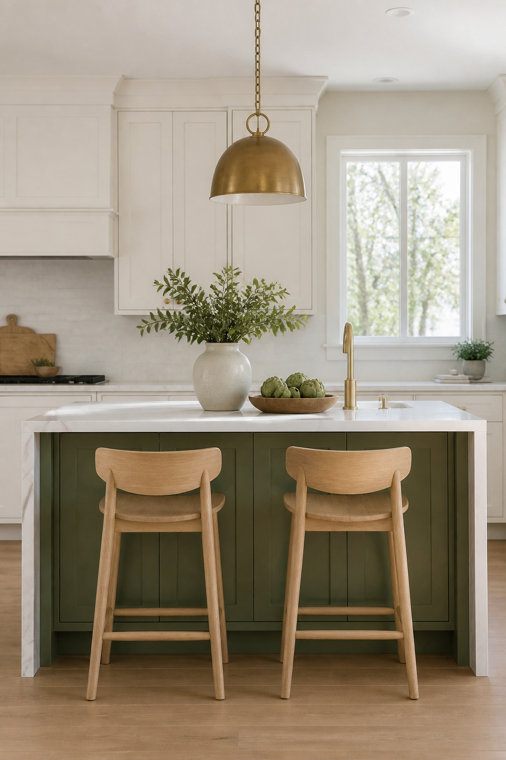
Deep sage and forest green are 2026’s most requested island colours. They read as sophisticated against white perimeter cabinets, pair naturally with brass or unlacquered hardware, and photograph particularly well because the value difference between island and cabinet white is legible even in flat light. Charcoal and near-black islands are the more architecturally conservative choice — they read as permanent and structural rather than colour-forward, and the white-on-dark contrast is perennially strong.
Island Dimensions That Actually Work
The kitchen island design ideas worth studying aren’t the ones with the most elaborate details — they’re the ones where the island proportion is right. Standard counter height is 36 inches; bar seating height is 42 inches. Allow 12-15 inches of overhang for knee clearance when seating is planned, 24-27 inches of linear space per stool, and 42-48 inches of clearance on all working sides. Below 36 inches of clearance, two people cannot work on opposite sides simultaneously.
The waterfall edge — running the island countertop slab vertically to the floor — is visually dramatic and photographs exceptionally well. It adds $800-$2,000 per waterfall side to the countertop budget. Specify 3cm slab thickness (not 2cm) for a waterfall configuration — the mitered corner join is the structural vulnerability, and it will take daily traffic from people leaning against it.
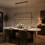
6. Pendant Lighting Over the Island That Does More Than Just Illuminate
Kitchen island pendant lighting has two jobs: task illumination for food preparation and visual punctuation for the space as a whole. The second job matters more to the room’s experience because the island pendants are visible from adjacent living and dining areas, and they set the decorative register from a distance.

The sizing formula that most homeowners get wrong: pendant diameter should be approximately equal to the island width minus 12 inches, divided by the number of pendants. For a 48-inch wide island with two pendants, each pendant should be no wider than 18 inches. Going larger creates crowding; going smaller produces pendants that look incidental rather than deliberate. Single large pendants suit islands up to about 48 inches wide; two pendants from 48-72 inches; three at 72 inches and above.
Hanging height: 30-36 inches from the countertop surface to the bottom of the pendant is the standard range. Below 30 inches, pendants begin to obstruct sight lines across the island. Above 42 inches, they stop functioning as task lighting and read as floating ornamental objects.
Pendant Finishes in a White Kitchen Renovation
Matte black is the most versatile finish against white cabinetry — it creates clear contrast that suits contemporary and transitional kitchens equally. Brushed brass and unlacquered brass warm a white kitchen and connect naturally to brass hardware elsewhere. Avoid polished chrome in combination with matte hardware finishes; the reflectivity difference reads as inconsistency rather than intentional layering.
One element that must be resolved before cabinet installation begins: pendant rough-in. The junction box location in the ceiling needs positioning relative to the island centre line, which locks in once base cabinets are installed. Change it after the fact and you’re opening finished ceiling.
7. Mixed Metal Hardware That Stops a White Kitchen Remodel Looking Sterile
Hardware is the detail that most reveals whether a white kitchen remodel was executed with intention or assembled from defaults. The cabinets, countertop, and tile are large-surface decisions; the hardware is the jewellery — small in scale, disproportionate in impact, and immediately legible to anyone who knows what to look for.
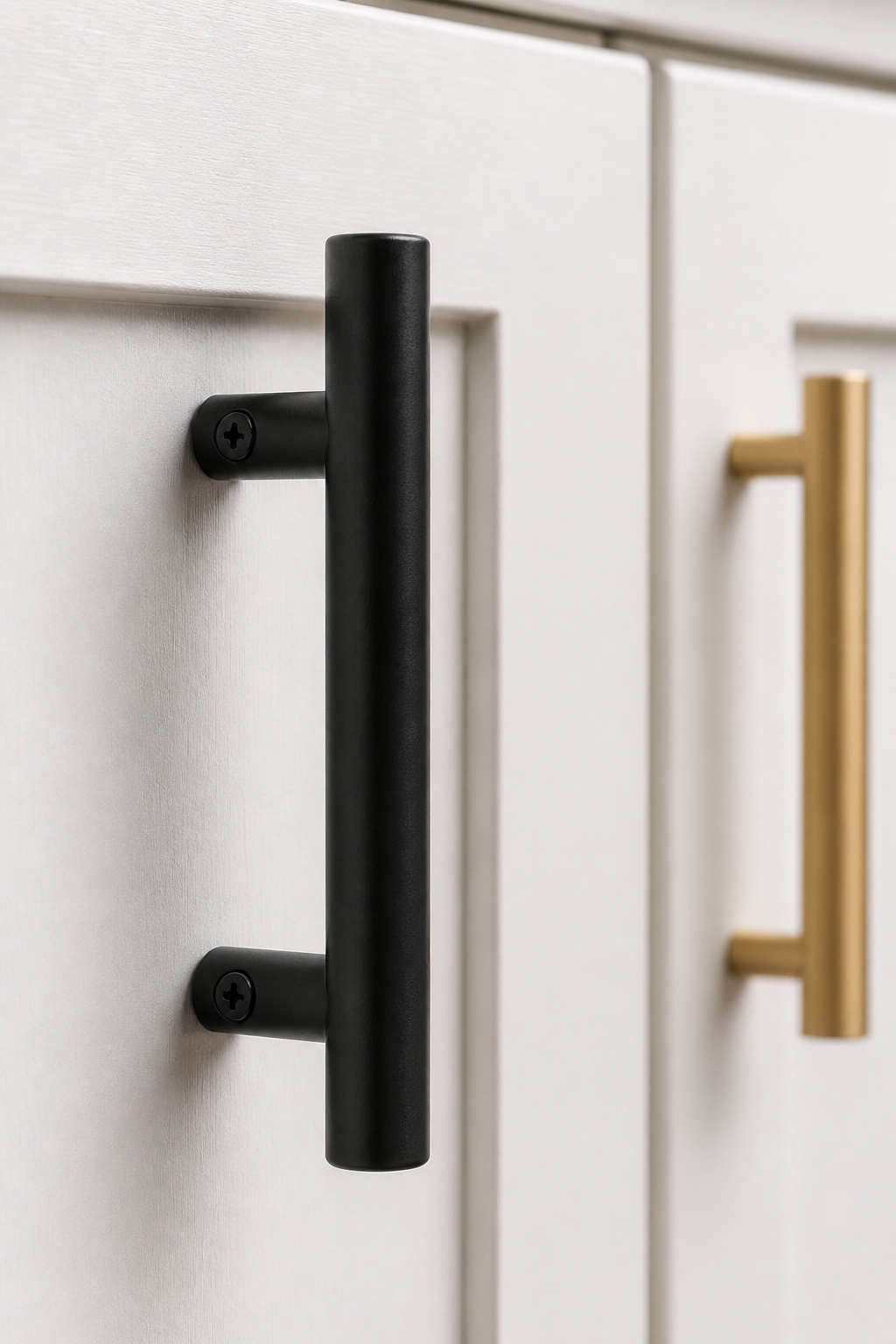
PVD (Physical Vapor Deposition) coating is the finish technology that changed residential hardware. It applies a molecular-level layer that resists corrosion, scratching, and tarnishing at a level no lacquer or electroplated finish can match. PVD matte black and PVD brushed brass are now standard at mid-to-high price points. Unlacquered brass is the other option worth knowing: it develops a natural patina uniformly rather than wearing through at contact points the way lacquered brass does. It gets better with age rather than worse — and in a white kitchen that’s meant to look considered, that distinction matters.
For a deeper look at what’s actually holding up in high-use kitchens, timeless kitchen cabinet hardware trends covers the durability data across finishes with the specificity that matters when you’re choosing something you’ll touch fifteen times a day.
Knobs, Pulls, and the Ergonomic Case
The two-tone approach — different finish for cabinet pulls versus faucet and fixtures — works reliably when tones are closely related in warmth. Matte black pulls with a brushed brass faucet is the most requested combination currently. What doesn’t work: polished chrome mixed with matte finishes, because the reflectivity difference reads as indecision rather than layering.
Bar pulls are ergonomically superior for drawers — a full-hand grip pulling straight back rather than the wrist rotation required by a knob. Knobs suit doors where the opening motion is rotational. Mixing the two — knobs on upper doors, bar pulls on lower drawers — creates visual hierarchy that reads as considered rather than arbitrary.
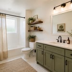
8. Warm Wood Accents in a White Kitchen Renovation to Counter the Clinical Feel
The risk in an all-white kitchen renovation isn’t colour — it’s sameness. When every surface is the same material and finish, the eye has nowhere to rest and the space reads flat regardless of how many elements are technically correct. Wood solves this more effectively than any other material because it introduces warmth, natural variation, and texture without introducing a new colour.
White oak is the specification that dominated contemporary kitchen design in 2025 and shows no sign of retreating in 2026. Its closed grain resists moisture absorption better than open-grain species like red oak; its mild golden-grey tone works with both warm and cool whites without clashing; and its straight, tight grain reads clean rather than rustic, making it compatible with modern cabinetry in a way that darker walnut sometimes isn’t. Roughly 51% of professional kitchen specifications called out white oak in recent surveys — that level of consensus is rarely accidental.
Wood Species and Maintenance
Where you integrate wood matters more than how much you use. Structural integration has the strongest impact: a white oak island base or continuous floating shelf at the overhang height, white oak floating shelves on the upper wall, or a butcher block section at one end of the countertop run. Decorative integration — bar stools, a cutting board propped on the shelf — adds warmth without structural commitment.
Maintenance honesty: white oak floating shelves are low-maintenance (seal before installation, re-coat every 2-3 years). White oak countertops require oiling every 3-6 months and polyurethane re-coating annually to two years. The beauty is genuine; so is the ongoing commitment. I’d specify the shelves for most clients without hesitation. The countertop is a conversation.
9. Appliance Integration Behind Cabinet Panels for a Seamless Kitchen Facade
The difference between a white kitchen that looks designed and one that looks like a collection of appliances in a white box often comes down to whether the appliances are integrated or exposed. Panel-ready dishwashers, refrigerators, and wine columns accept custom cabinet-matched panels that allow the appliance to disappear into the facade — producing a wall of cabinetry rather than a wall interrupted by stainless steel doors at regular intervals.
The appliances that accept panels: dishwashers, single-column refrigerators and freezers, wine columns, and some warming drawer configurations. Brands that do this well in residential kitchens include Bosch, Fisher & Paykel, Gaggenau, and Miele. Fisher & Paykel’s single and double-drawer dishwashers are particularly suited to this approach — the drawer configuration means the panel is on a smaller, lighter door, easier to manage mechanically and less demanding visually than a full-height refrigerator panel.
The Cost Trade-Off in a White Kitchen Remodel
This decision must be made at the design stage, before cabinet drawings are finalised. Panel-ready dishwashers require a rough opening of approximately 24″W × 34.5″H × 24″D, and the custom panel adds thickness to the door swing calculation — allow 3/4″ for panel material plus 1/4″ for clearance. Built-in refrigerator columns require floor-to-ceiling cabinetry on both sides for a truly integrated appearance, which affects the entire upper cabinet run layout.
The dishwasher is the highest return-on-investment panel application. It sits adjacent to the sink, visible from adjacent living areas, and the visual impact of a continuous cabinet facade at that location is immediately apparent. The column refrigerator is worth the premium in open-concept kitchens where it’s visible from dining and living areas; it’s a harder case to make in a galley kitchen facing a wall.
10. White Kitchen Remodel That Extends Into a Butler’s Pantry for Real Functionality
A butler’s pantry extension is the decision that separates a white kitchen remodel designed for daily life from one designed for photography. The main kitchen can read beautifully with countertops clear and open shelves styled — the butler’s pantry is where the coffee machine, the toaster, and the everyday visual clutter lives, allowing the main kitchen to maintain its composed appearance during actual use.
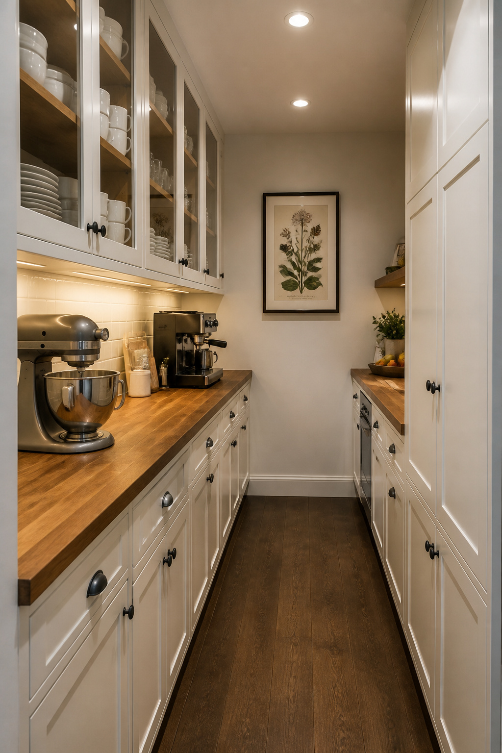
The pass-through layout — cabinetry on both sides of a corridor connecting kitchen to dining room — is the most functional configuration in homes where the pantry also serves as an entertaining staging zone. Minimum functional aisle width is 42 inches for one person working; 48 inches is the standard for two-person access. Below 36 inches, the space functions as a storage closet rather than a working pantry, regardless of how it’s styled.
Electrical and Cabinetry Details
A dedicated 20-amp circuit for small appliances is the baseline — the standard outlet cluster is insufficient when a coffee machine, kettle, and toaster are running simultaneously. Under-cabinet lighting is as important here as in the main kitchen, often more so — butler’s pantries are frequently interior spaces without windows.
The cabinetry should match the main kitchen exactly: same door profile, same paint, same hardware. Any deviation reads as a renovation add-on rather than a planned feature. The countertop, however, can differ intentionally. A butcher block in the pantry against quartz in the main kitchen is a coherent material hierarchy. The floor should continue without a transition strip — continuity signals that the pantry was designed as part of the kitchen.
11. Glass-Front Upper Cabinets That Break the Block of White Without Disrupting It
A solid run of white upper cabinet doors creates visual weight that can make even a spacious kitchen feel monolithic. Glass-front uppers break that weight while preserving the clean facade — they let light through, create perceived depth behind the door plane, and give a white kitchen somewhere that isn’t a flat surface at eye level.
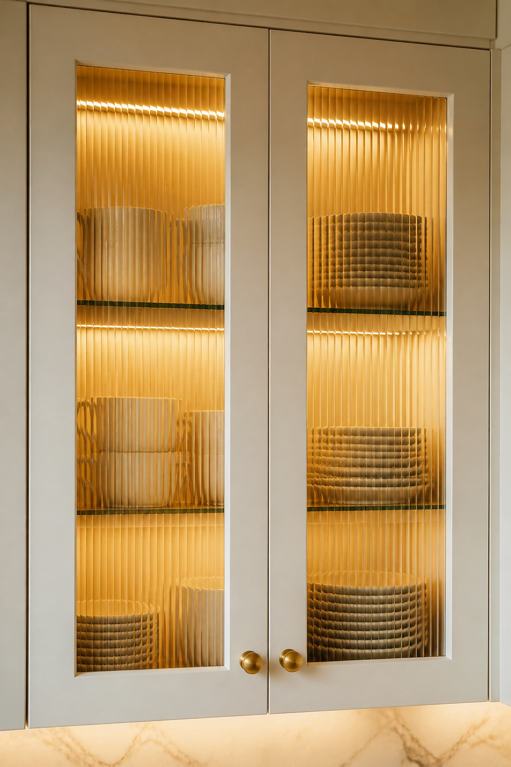
The glass type determines the style register more than the frame profile. Reeded glass — with vertical ribbing that diffuses what’s behind it while allowing light transmission — is the 2025-2026 specification of choice. It reads contemporary enough for modern kitchens but warm enough for transitional and farmhouse settings, and its diffusing quality means storage behind the door doesn’t need careful curation at all times. Clear glass in a full-view frame (no mullion) is the contemporary alternative; clear glass with a divided-light (mullion) frame reads as traditional or country.
Interior Lighting and Curation
If using clear glass, you need a commitment to maintaining what’s behind the door as a curated display indefinitely. Matching dishware sets, coordinated glassware, all-white ceramics — anything where visual consistency is maintained regardless of what you’re actually storing. Reeded glass eliminates this entirely.
Interior cabinet lighting converts glass-front uppers from a feature into a design element. LED puck lights or strip lights mounted inside the cabinet create a soft ambient glow through the glass during evening hours. Specify warm white (2700-3000K) at CRI 90+ — the warm tone flatters white ceramics and complements wood accents rather than making the cabinet interior look clinical.
12. White-on-White Layering: Texture Variation as the Real Design Strategy
An all-white kitchen doesn’t have to be monotonous — the most sophisticated ones never are. The strategy is surface variation: different materials at different scales create depth and rhythm that reads as considered rather than spartan. Every element contributes texture; no element contributes colour.
Paint sheen is the most underestimated variable. Matte cabinet doors (no sheen) are the most contemporary specification for 2025-2026 and hide surface imperfections well; the trade-off is that they require gentle cleaning. Satin finish (roughly 25-35 gloss units) is the most practical choice for high-use kitchen cabinets — durable enough to clean with a damp cloth, still refined enough to avoid the plastic quality of semi-gloss. Interior cabinet box surfaces benefit from semi-gloss: the higher reflectivity improves visibility into deep base drawers. Mixing sheens between exterior and interior is standard practice; it just rarely gets discussed.
Coordinating Surfaces in a White-on-White Kitchen Remodel
Cabinet door profile adds another layer. Beaded inset profiles — a thin raised bead around the door perimeter inside the Shaker frame — add a shadow line that reads as detail without complicating the overall design. V-groove doors create a slightly coastal or Scandinavian character; the grooves catch light directionally and produce texture that changes throughout the day.
The countertop-to-tile-to-floor coordination strategy: different surface types at different scales. A smooth quartz countertop, a reeded subway tile backsplash, and a large-format porcelain floor tile are three distinct textures at three scales — the eye moves through them rather than landing on undifferentiated whiteness.
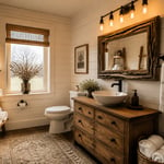
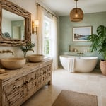
13. Farmhouse-Inspired White Kitchen Remodel With an Apron-Front Sink as the Centrepiece
An apron-front sink is visible from across the kitchen — from the dining room, from the living area, from the moment someone enters the space. Along with the range and the island, it’s one of the three focal elements that guests register immediately. That visibility makes it the most consequential fixture decision in a farmhouse-inspired white kitchen remodel, and the one most worth spending correctly on.
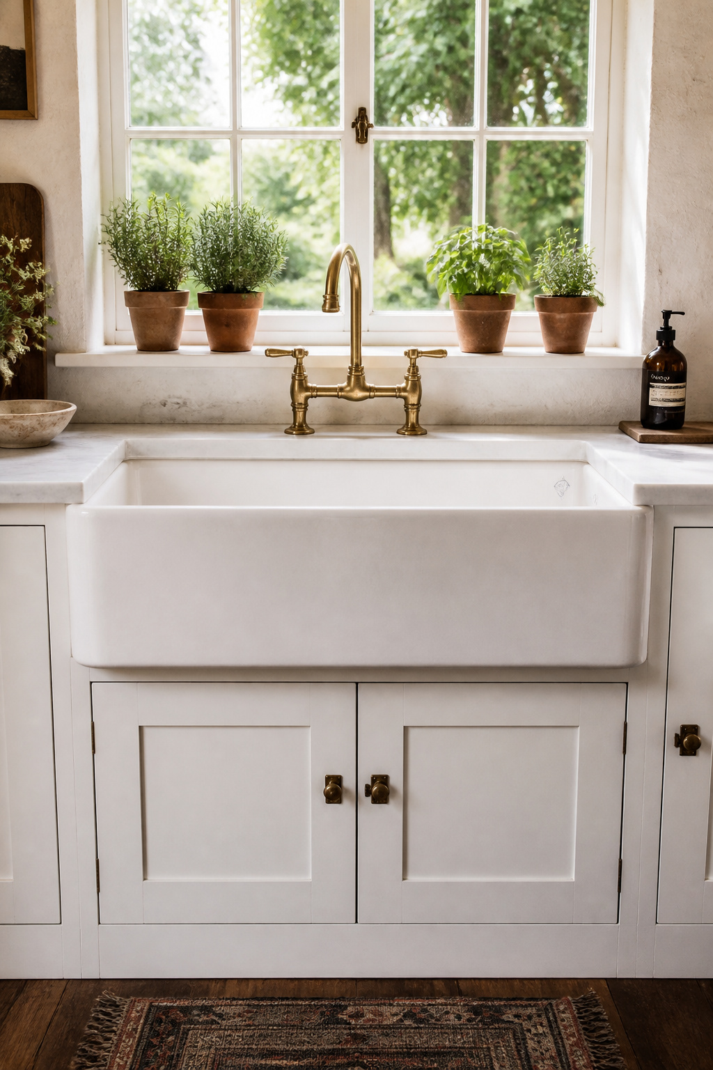
Fireclay is the authentic material choice. Rohl’s Shaws line — manufactured in England since 1897 — produces fireclay apron sinks with a matte white surface, slight tonal variation, and a dense mass that reads as genuine rather than manufactured. The Shaws Shaker model comes in 30-, 33-, and 36-inch widths; the 30-inch model requires a 33-inch minimum cabinet opening. This dimension cannot be adjusted on site — the base cabinet modification must be specified at the time of the cabinet order. Rohl’s installation documentation specifically notes that cabinet makers should wait until the sink is physically delivered before finalizing the cut-out, because ±2% dimensional variation is standard.
Faucet Pairing and Installation Notes
BOCCHI is the other fireclay brand worth knowing: Italian-made, competitive pricing to Rohl, available in a wider range of apron profiles. Composite granite apron sinks (Blanco, Elkay) are the practical alternative — durable, scratch-resistant, available in matte white, and priced $700-$1,400 versus $1,200-$2,500 for premium fireclay.
The faucet pairing that completes the farmhouse register without tipping into costume: a bridge faucet in unlacquered brass or brushed nickel. The two-handle bridge configuration reads as period-informed rather than literal. A single-handle gooseneck suits a more transitional reading of the farmhouse aesthetic — easier daily use, cleaner visual profile, less explicitly period-specific.
14. Under-Cabinet Lighting That Transforms a White Kitchen After Dark
During daylight hours, a white kitchen operates on natural light bouncing off cabinet faces and countertops. After dark, the quality of the kitchen’s atmosphere is determined almost entirely by artificial lighting — and under-cabinet lighting, which most homeowners treat as an afterthought, is the element that does the most work in converting a functional daytime space into somewhere that looks and feels genuinely good in the evening.

LED strip lights are the specification for under-cabinet task lighting. Applied in an aluminium channel that diffuses the individual LED points, they provide continuous, even illumination across the full width of a cabinet run without the scalloped light pattern that puck lights create. Hardwired installation produces the cleanest result — no cords, no plug conflicts. Plug-in systems are a practical retrofit option but require outlets roughed into the upper cabinet run, which isn’t always standard in older kitchens.
Colour Temperature and Smart Controls
Colour temperature is the decision that most affects daily experience. 2700K (warm white) is the right specification for under-cabinet lighting in a white kitchen — it flatters white surfaces, makes countertops read as warm and inviting, and creates atmosphere appropriate for evening cooking and dining. Avoid 4000K and above under cabinets: cool daylight temperature makes white quartz countertops look grey and white cabinets look yellow — precisely the clinical aesthetic the white kitchen remodel was trying to avoid. CRI should be 90+ across all kitchen lighting.
For kitchens integrated into smart home systems, Lutron’s Lumaris LED tape delivers 0.1% smooth dimming and tunable white capability, allowing under-cabinet lighting to shift from bright task illumination during cooking to a softer ambient setting during dinner. The specification and wiring requirements need to be in the original electrical plans — roughing in for smart lighting after the kitchen is built requires opening finished walls.
15. Remodeling a White Kitchen’s Floor: Tile Patterns That Don’t Fight the Cabinets
The kitchen floor in a white remodel has a specific challenge: it needs to hold its own visually without competing with the countertop, the backsplash, or the cabinetry above it. It is the largest horizontal surface in the room and the one that sets the tonal foundation everything else sits on. Getting it wrong — a pattern too busy, a scale too small, a grout too dark — creates a floor that fights the room rather than supports it.
Large-format porcelain — 24×24 or 24×48 — is the specification driving contemporary kitchen floor design in 2025-2026. Fewer grout lines mean a more continuous surface reading, visually enlarging the space and reducing the primary maintenance burden of tile (grout cleaning). Large-format tile requires a perfectly flat subfloor — any variation greater than 3/16″ over 10 feet will cause lippage between tiles; this is the installation condition that most budget-focused remodels get wrong. Proper subfloor preparation adds labour cost that’s easy to cut until the result is apparent.
These kitchen floor tile ideas for every style cover the full range of format options and how each reads in different kitchen contexts — a useful reference before settling on a direction.
Grout Width and Material Selection
Herringbone in a medium-format tile (3×12 plank) adds movement and directional energy. It’s more complex to install, generates more tile waste, and the labour premium is real. In a kitchen large enough to support the scale, the result justifies it.
Grout colour in a white kitchen: warm grey with warm-white cabinets, cool grey with cool-white. Match the grout undertone to the cabinet undertone, not to the tile itself. Consider epoxy grout for the floor — harder to install, significantly more stain-resistant, never requires sealing, and resists the cooking grease that compromises standard cement grout within a few years of heavy kitchen use.
16. White Kitchen Remodel Storage: Pull-Out Systems and Drawer Inserts That Change Daily Life
The interior fittings of a kitchen cabinet — the runners, the insert systems, the pull-out mechanisms — have more impact on daily kitchen experience than almost any visible element. You see the cabinet doors; you use the hardware inside them fifteen times a day. A white kitchen remodel that invests in premium exterior finishes and cuts the interior fitting budget produces a beautiful room that’s frustrating to actually cook in.
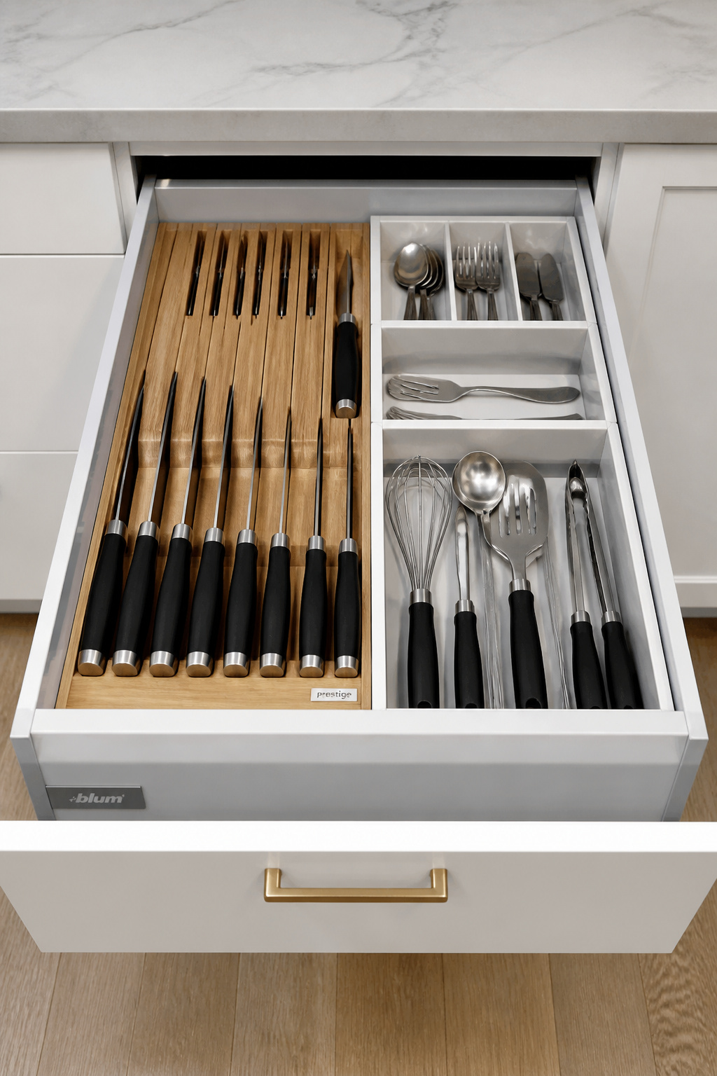
Blum’s Tandembox Antaro is the industry benchmark for residential kitchen drawer systems. The system has a dynamic load rating of 75 lbs, full-extension motion providing access to the full drawer depth, and integrated Blumotion soft-close rated to 100,000 opening and closing cycles — roughly 30 years of daily kitchen use. The Tandembox’s self-adjustment mechanism compensates for drawer weight automatically, preventing the progressive degradation in closing performance that cheaper systems exhibit within two to three years.
For a practical breakdown of what actually works in high-traffic kitchen drawers, organizational hacks for kitchen drawers provides the use-based insight that specification sheets don’t cover — what fails, what holds up, and what makes the difference between a drawer you’re satisfied with and one you’re still thinking about six months later.
Budget Allocation for Interior Fittings
The three base drawers adjacent to the cooktop are the highest-use storage location in any kitchen. Full-extension soft-close at this location is non-negotiable. The corner base cabinet is where the investment case for a full-extension magic corner ($300-$500 versus a standard lazy Susan at $80-$150) is strongest — the magic corner recovers 85% of corner cubic footage; the lazy Susan recovers 65%. Under-sink base cabinets benefit from a pull-out double-tray system that navigates around the drain pipes and converts what is usually an awkward dead zone into organised storage.
17. White Kitchen Remodel: Planning the Transition Into an Adjacent Dining or Living Space
In any open-concept floor plan, the white kitchen remodel doesn’t end at the kitchen’s footprint — it extends visually into every adjacent space from which it can be seen. Designing these elements in isolation, without regard for how the kitchen reads from outside its own boundaries, produces a kitchen that looks composed in plan and disconnected in reality.
Upper cabinet runs visible from adjacent spaces should terminate at a vertical element — a wall column, a peninsula return, a defined cabinet end panel — rather than stopping against open drywall. An abrupt cabinet stop with plain drywall beside it reads as an incomplete remodel from fifteen feet away. The back wall of the kitchen visible across the island deserves the same compositional attention as the main cabinet run; a continuous upper cabinet facade reads cleaner than a back wall broken by appliances and objects at random heights.
Flooring Continuity and Boundary Decisions
Continuing the same tile or hardwood from the kitchen through the dining area without a transition strip is the strongest visual strategy for an open plan that feels designed. If a material change is necessary, use a flush T-moulding at a logical break point — a doorway threshold or island edge — rather than a raised threshold that announces the change loudly. For more on the spatial and programmatic decisions that determine whether an open-plan kitchen actually works during a dinner party, creating an open-concept kitchen for entertaining is worth reviewing before walls come down.
A half-wall at the kitchen boundary is worth reconsidering rather than reflexively removing. At 36-42 inches high, it defines the kitchen edge, provides a visual anchor for bar seating, and provides meaningful acoustic and odour separation from adjacent spaces during cooking — without closing off the sight lines that make open-plan layouts desirable.
18. Painted vs. Factory-Finished Cabinets: The White Kitchen Decision That Affects Long-Term Performance
The finish on your white kitchen cabinets is the surface you’ll touch, clean, and judge by its appearance every day for the next decade or more. It is also the specification decision most commonly made without adequate information — homeowners compare door profiles and paint colours, and assume finish quality will be consistent across cabinet suppliers. It is not.
Factory-finished cabinets are finished in a controlled environment — precise temperature, controlled humidity, zero dust — with spray equipment that achieves a surface smoothness impossible to replicate on a renovation site. The premium factory specification is catalyzed lacquer: a two-component finish where a catalyst hardens it chemically rather than through evaporation alone. The result is harder, more uniform, and more resistant to impact and moisture than any brush or roller-applied paint. On MDF door construction, factory catalyzed lacquer on properly sealed MDF is the most durable white kitchen cabinet finish available.
Site painting is the conventional approach for painting existing cabinets or for custom work where factory lead times are prohibitive. Quality is entirely dependent on the painter’s preparation and materials.
Site Painting: Primer and Surface Preparation
The step most commonly skipped is surface preparation: degreasing and lightly abrading the existing surface before priming. Kitchen cabinet surfaces accumulate invisible cooking grease film that prevents paint adhesion — a primer applied over uncleaned surfaces will peel within a year regardless of product quality.
Shellac-based primer (Zinsser BIN is the most widely used) is the professional standard for site cabinet painting — it seals stains, bonds to difficult surfaces including previously varnished or factory-finished cabinets, and provides the adhesion that water-based primers on glassy factory surfaces don’t reliably achieve. A quality alkyd or water-based enamel over a proper BIN prime base outperforms an expensive topcoat over inadequate prep by a wide margin. The honest durability comparison: premium factory-finished cabinets from high-end manufacturers are still performing at year twenty. Premium site-painted cabinets done properly last 10-15 years. The deciding factor is less the method and more the quality tier.
How to Plan Your White Kitchen Remodel: From First Budget to Final Reveal
Budget setting for a white kitchen remodel requires a realistic framework before any design decisions are made. At builder grade — stock cabinetry, laminate or entry-level quartz, standard fixtures — expect $100-$200 per linear foot, with total kitchen budgets typically in the $15,000-$35,000 range. Mid-range, with semi-custom cabinets, quartz countertops, tile backsplash, and quality appliances, runs $250-$450 per linear foot — $45,000-$80,000 for a standard kitchen. Full custom, with bespoke cabinetry, premium stone, integrated appliances, and smart lighting systems, starts at $500 per linear foot and commonly reaches $100,000-$200,000 in high cost-of-living markets.
The decision sequence that protects a remodel from expensive mid-project changes: appliances first, before cabinet drawings are finalised. Appliance rough opening dimensions drive cabinet layout; changing an appliance selection after cabinet shop drawings are approved means redrawing — and repricing — the affected cabinet run. Countertop material second, before backsplash tile is selected. Lighting, in-floor heating, and under-cabinet electrical rough-in before drywall is closed — these items are disproportionately expensive to retrofit into a completed kitchen.
The white kitchen remodel’s particular strength is its adaptability over time. A white kitchen with warm wood accents and brass hardware in 2026 can absorb updated stools, new pendant lighting, or a changed backsplash in ten years without requiring a full renovation. The palette works as a backdrop for changes; a highly coloured kitchen doesn’t. That long-term flexibility, more than the visual purity or the photography, is the real case for white.