I’ve photographed hundreds of kitchens over fifteen years. The ones that stop you cold share a quality that’s hard to name but immediately visible: every element is there for a reason. Not because someone chose the right tile. Because the designer resolved the spatial logic before touching a single finish. The kitchens that disappoint usually follow the opposite sequence — a striking countertop picked first, everything else negotiated around it, functional problems papered over with expensive materials.
Modern kitchen interiors work when the underlying decisions are made in the right order. Specifically, the finish, the hardware, the lighting are responses to a spatial framework. They’re not the framework itself. That sequence is the difference between a kitchen that photographs well at 10 a.m. and one that functions well at 6 p.m. on a Tuesday.
These 15 elements appear consistently in the kitchens that get it right. Some are structural decisions made at the framing stage. Others are finish-level choices with outsized visual impact. All of them reward understanding before you sign a contract.
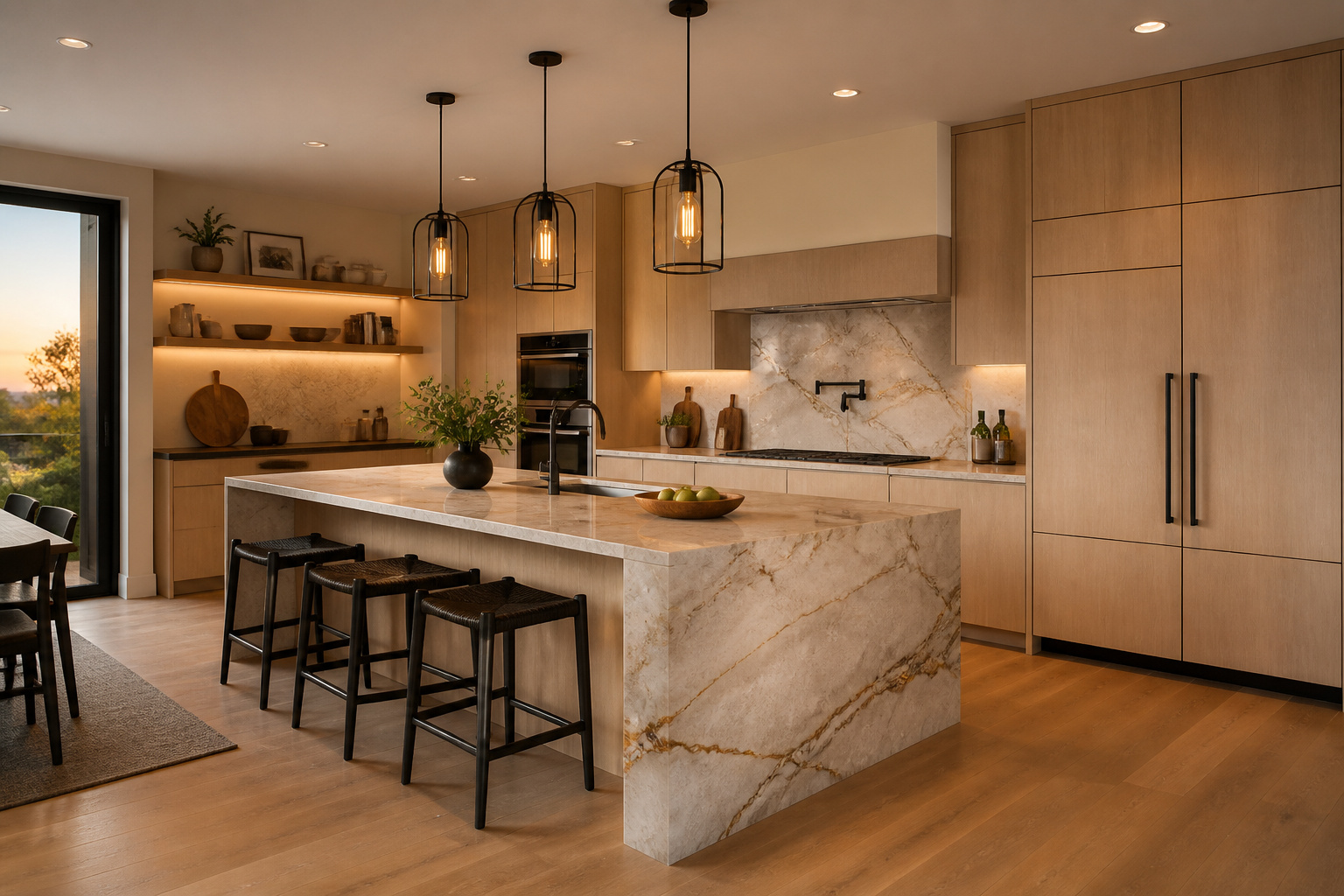
1. Waterfall Island Countertops That Double as Design Statements
The waterfall countertop edge replaces a functional boundary with an architectural one. A standard island terminates at a cabinet side panel — a transition that always reads as furniture. Instead, the waterfall edge continues the stone surface vertically to the floor, turning the island into a single monolithic form. No panel, no visible edge.
The Mitre Joint and Material Choices
The technical execution is a 45-degree mitre joint where horizontal meets vertical. Two pieces of stone are cut at matching angles and bonded with structural epoxy and steel reinforcement brackets. When correctly done, the connection is stronger than the surrounding stone. Veining makes or breaks this. A vein-matched waterfall requires sourcing sequential slabs from the same block, adding 30–50% to material cost. That premium is worth paying on quartzite with strong movement.
In contrast, quartz is more forgiving than natural stone because the pattern repeats consistently. That makes the mitre line less visible if alignment drifts slightly. Ultra-compact surfaces like Dekton are also increasingly common here — UV-stable, heat-resistant, zero sealing required — but fabrication demands diamond tooling and a specialist. Standard quartz waterfall installations add $600–$1,200 in cutting and labour. Vein-matched natural stone can reach $4,000 in additional cost above the slab.
Overhang and Structural Limits
Unsupported quartz overhangs should stay under 15 inches. Natural stone, 12 inches. Beyond those thresholds, a steel bracket concealed inside the island cabinetry is required. The waterfall-edge island is one exception where the vertical stone panel acts structurally as a leg. It supports a full seating overhang without visible brackets — a practical advantage beyond the visual.
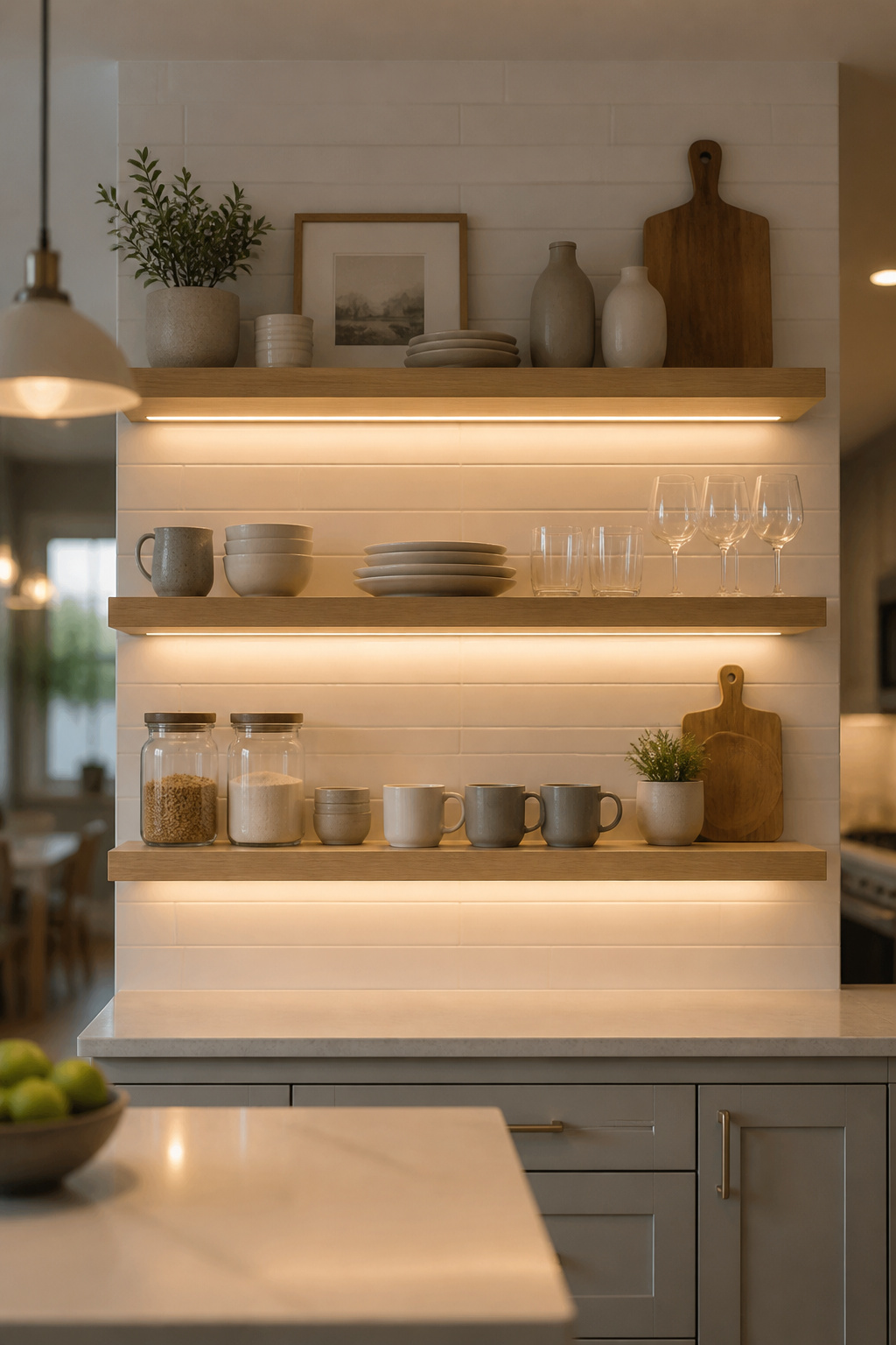
2. Open Shelving as the Core of a Modern Kitchen Interior
Open shelving divides opinion almost entirely based on discipline. In a modern kitchen interior, it works for a specific reason: the aesthetic demands ruthless editing. Every object must earn its place visually. That standard imposes an organisation requirement that closed cabinets never require. You can’t accumulate behind closed doors.
Structural Requirements
Standard depth for kitchen open shelving is 10–12 inches. However, brackets must anchor into wall studs or solid masonry — drywall anchors compromise load capacity, especially near cabinet door vibration. Standard steel rod brackets handle around 20 lbs per stud anchor. Custom hidden rod systems raise that to 50 lbs, which matters when stacking ceramic plates. For shelf material, solid wood at 1.5-inch thickness won’t sag over a 48-inch span. MDF floating shelves will develop visible sag within a few years under dishware weight. This is one place where the appearance of quality and actual quality are the same thing.
Lighting the Display
LED strip lights under the shelf above should sit at the front edge of the cabinet. Not centred. Not rear-mounted. Front-edge placement throws light forward onto the display. In contrast, centred placement throws light down the wall behind the objects — the display looks interrogated rather than illuminated. Warm white (2700K, CRI 90+) is the right temperature: it reads cohesively with pendant light and avoids the retail-display quality that 4000K can produce. For a broader look at how open shelving integrates with modern kitchen design elements, the relationship between storage visibility and spatial clarity is worth thinking through before committing.
3. Handleless Cabinet Systems for a Clean, Uninterrupted Look
The clean line of a handleless cabinet door looks simple. The mechanism that makes it functional is not. Choose the wrong system and you’ll find reasons to avoid your own kitchen.
The Three Mechanisms
J-pull is the most reliable option because there’s nothing mechanical to fail — just a recessed groove routed into the door edge. No moving parts, no maintenance, no maximum door weight. Push-to-open (Blum Tip-On BLUMOTION) uses a spring-loaded piston in the cabinet side wall. Press the door face and it springs open with integrated soft-close. The practical ceiling is about 33 lbs per door — above that, the mechanism struggles to overcome inertia. In contrast, Servo-Drive (Blum’s electrical system) handles heavier doors automatically with a light touch. However, it requires a transformer and electrical rough-in planned from the framing stage.
Where Each System Fits
J-pulls work at any door weight. However, they require clear space above or below the door, which can conflict with countertops adjacent to upper cabinets. Push-to-open suits standard door and drawer weights — don’t specify it on pantry doors or heavy appliance panels. Servo-Drive is worth the cost on drawers accessed dozens of times daily. For low-frequency cabinets, the electrical infrastructure isn’t justified. The full range of contemporary kitchen cabinet options covers how these mechanisms integrate with different cabinet styles.
The Hinge Detail Most Installers Skip
Blum Clip-top BLUMOTION hinges offer six-way adjustment that allows doors to sit flush with sub-millimetre precision. Without a handle to draw the eye away from alignment, that precision matters. Hinge torque (opening tension) is adjustable and almost never adjusted post-installation, despite being the primary factor in whether Tip-On fires reliably. Settle in, test every door, and demand adjustment before the installer leaves.
4. Integrated Smart Appliances That Disappear Into the Cabinetry
Panel-ready appliances do one thing: they accept a custom front panel that matches surrounding cabinetry. The result is a surface visually continuous with the cabinet face. However, the tolerances determine whether this actually works.
Depth Tolerances and Panel Specs
The custom panel is typically 3/4-inch thick with a maximum weight of 33 lbs. Specifications vary slightly by manufacturer but hold approximately across brands. The reveal tolerance around the door perimeter is typically 1/8 inch. That means cabinet installation must be plumb and square to within that margin. A cabinetry installer working to 1/4-inch tolerances will produce visible gaps or binding panels. Specify the tolerance requirement explicitly in the installation brief.
Which Appliances Integrate Cleanly
Refrigerators integrate most impressively — the panel covers the entire door face and the visual effect is dramatic. True integrated models (Miele, Liebherr, Sub-Zero BI series) require a specific opening height, typically 84 inches, and installation precision closer to fine furniture than general contracting. In contrast, dishwashers are more straightforward. Bosch, Miele, and Fisher & Paykel all have well-engineered panel systems. Panel-front microwaves are the most problematic — door weight causes panels to sag and bind over time on cheaper units. Drawer microwaves (Sharp, Miele) are the cleanest integration solution.
Ventilation Clearances Builders Routinely Miss
Counter-depth refrigerators need a minimum 1-inch gap on sides and top for heat dissipation. Block those clearances with tight panel installation and compressor life drops — also, energy use increases 15–20%. Built-in wall ovens require a deliberately open gap at the base of the oven tower for cooling airflow. The gap many homeowners mistake for poor fitment is engineered, not accidental.
5. Contemporary Kitchen Concrete Finishes With Warmth and Texture
Concrete’s appeal in a contemporary kitchen interior comes from its opposite quality to polished stone: it absorbs light rather than reflecting it. That matte, grounded quality creates a calm that lacquer cabinetry or high-gloss countertops can’t provide. In a kitchen already heavy on hard, reflective surfaces, concrete becomes the counterpoint that makes the whole space feel considered rather than cold.
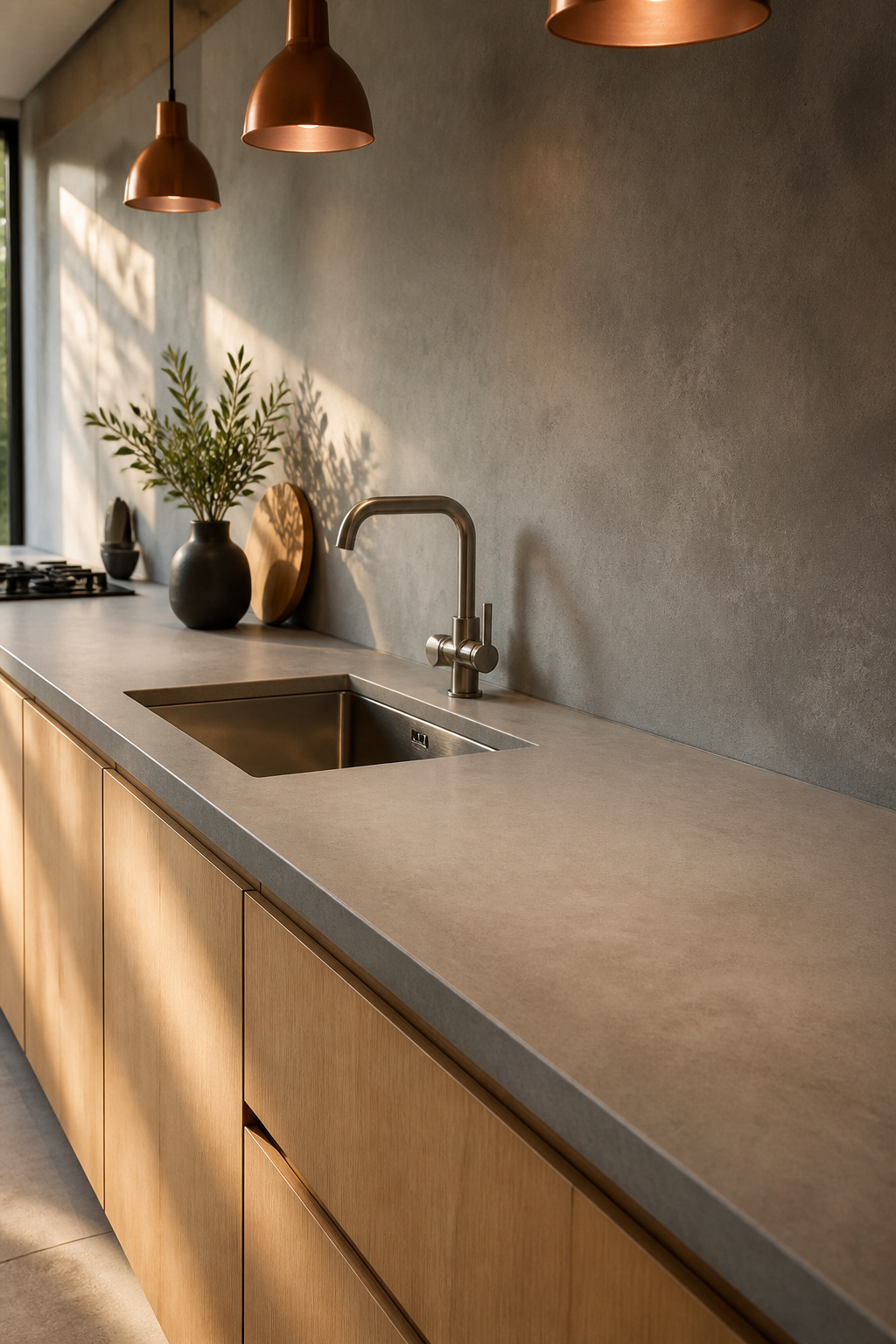
What “Concrete” Actually Means in Residential Kitchens
Genuine poured concrete countertops are increasingly rare. Most of what reads as concrete in modern kitchen interiors is either micro-topping or concrete-look porcelain. Micro-topping is a 1–3mm polymer-modified cement overlay applied over an existing substrate. Also, it doesn’t require removing existing countertops, which makes it renovation-friendly. Cost runs $14–$30 per square foot. However, most contractors require a $3,500–$4,000 mobilisation fee for smaller jobs. The critical maintenance requirement: micro-topping is highly porous without sealer. Oil, wine, and coffee will permanently stain within hours of contact on an unsealed surface. Penetrating sealers maintain the matte appearance and need reapplication every 1–3 years. For high-volume kitchens, that discipline is often unrealistic.
The Case for Concrete-Look Porcelain
Concrete-look porcelain slabs (Atlas Concorde, ABK, Lapitec) convincingly replicate the matte texture. Unlike micro-topping, they’re non-porous, scratch-resistant, and require zero sealing. At $60–$120 per square foot installed, material cost is higher, but lifetime maintenance cost is effectively zero. Large-format slabs (1200mm × 2800mm) eliminate grout lines entirely. That extends the seamless quality that makes concrete-look surfaces compelling in the first place. For kitchens with heavy daily use, porcelain is usually the more honest answer.
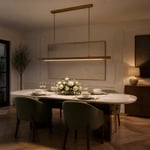
6. Pendant Lighting Clusters as the Kitchen’s Architectural Anchor
Pendant lighting over an island is where most kitchen lighting decisions happen late and get executed poorly. The specification is simple — 30 to 36 inches from the bottom of the fixture to the top of the counter. But that range is routinely ignored in favour of visual guesswork. The result: pendants that float disconnected from the island they’re meant to anchor.
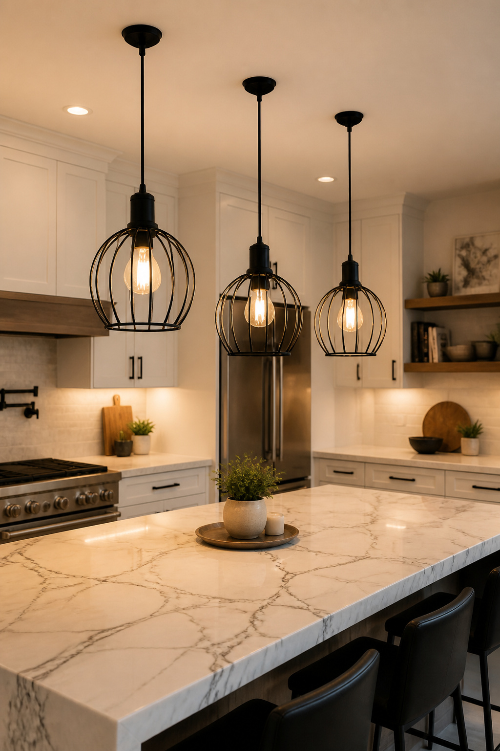
The 30–36 Inch Rule and Ceiling Adjustments
The 30–36 inch rule assumes an 8-foot ceiling. For ceilings above 8 feet, add 3 inches per additional foot: a 10-foot ceiling calls for 36–42 inches above the counter. Still, this adjustment is the one most installers skip. The result is pendant clusters that look appropriately scaled on paper but swim in a kitchen with a vaulted or high ceiling. For pendant sizing, space each fixture 24–30 inches apart. Terminate the cluster 6 inches from each end of the island, and target 700–800 lumens per pendant for task coverage.
CRI and Color Temperature
CRI measures how accurately a light source renders colour on a 0–100 scale. In a kitchen — where you’re evaluating whether something has caramelised correctly or judging the colour of raw ingredients — a 90+ CRI bulb renders food colours as they actually are. A CRI 80 bulb produces a perceptible flatness, especially with produce and proteins. So, color temperature of 3000K–3500K is the right range: warm enough not to read clinical, cool enough for task accuracy. There’s substantially more worth knowing about the full system in this kitchen lighting design guide.
7. Mixed Material Countertops: Quartz, Stone, and Butcher Block Zones
The logic behind multi-material countertops comes directly from professional kitchens: different surfaces suit different tasks. Stone resists heat and provides visual weight. Wood is forgiving on knife edges and adds warmth that prevents an all-stone kitchen from reading as sterile. Quartz handles daily use without maintenance fuss. Residential modern kitchen interiors borrow this zoning logic at a smaller scale. The combination reads as considered rather than inconsistent.
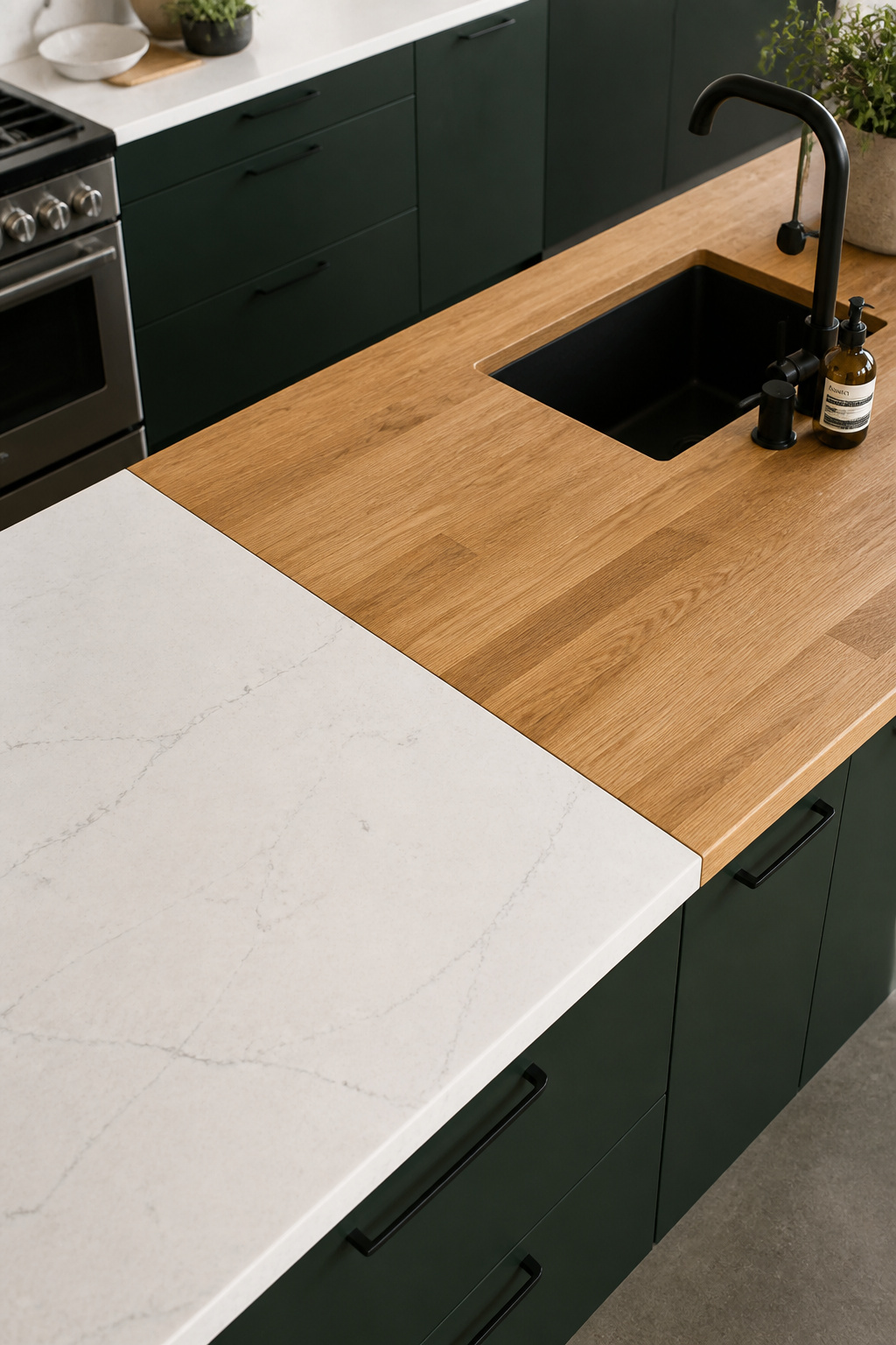
Functional Zoning Logic
The typical layout: continuous quartz on the perimeter for consistency and low maintenance, butcher block as a dedicated prep section for warmth and tactile quality, stone as a feature zone for visual weight. Each material contributes what the others don’t. The technical challenge is the transition between them.
Transition Details and Seam Profiles
Three seam profile options exist. Flush (both surfaces at identical height) is the cleanest look but hardest to execute — even a 1–2mm differential becomes a physical edge that catches when sliding objects. Stepped (one material sits slightly higher) creates a defined break and is easier to execute. T-bar (a metal strip divides materials) is the most forgiving, but it reads as furniture rather than architecture.
Wood Species Near Sinks
Teak is the right choice for butcher block near sinks — its natural oils make it inherently moisture-resistant and significantly reduce sealing frequency. Hard maple (Janka 1,450) is excellent for cutting, but it requires monthly mineral oil treatment for the first year near water, then quarterly. White oak is the practical middle ground: more moisture-tolerant than maple, looks excellent in modern kitchens, and costs less than teak. Keep cherry, walnut, and pine away from sink zones entirely. They’ll cup and crack within two years of consistent water exposure.
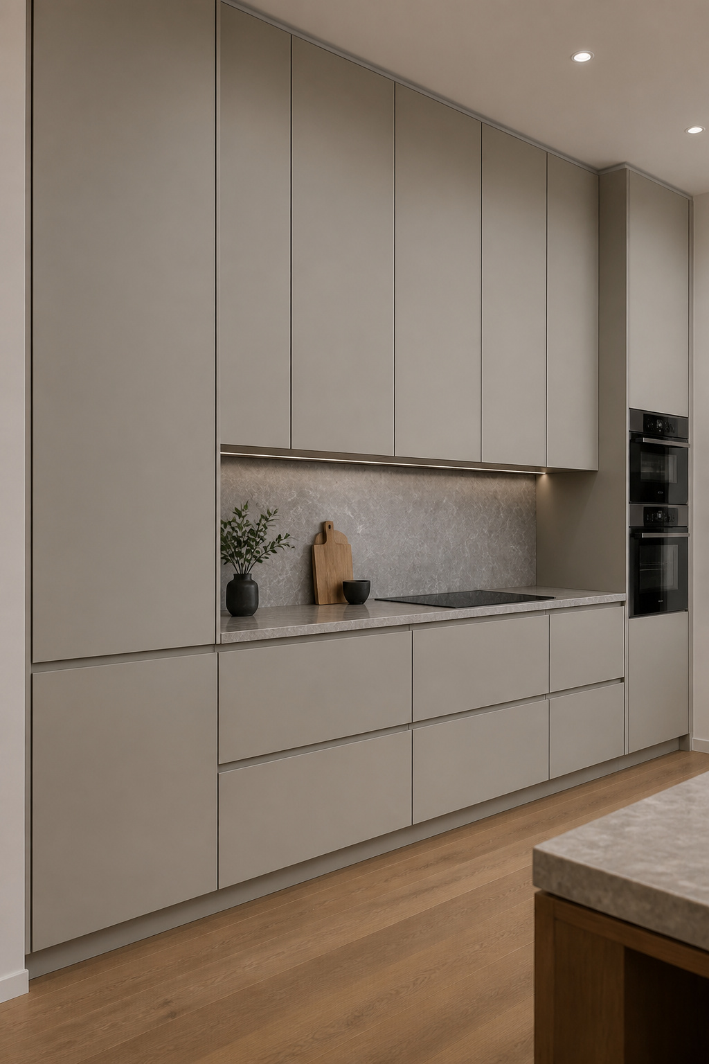
8. Modern Kitchen Design With Concealed Range Hood Ventilation
A visible range hood can be a design feature or an intrusion, depending on the kitchen’s visual language. In modern kitchen design, where the language is about clean planes and horizontal continuity, the architecture of a visible chimney-style hood often fights the overall composition. Concealed ventilation solves this without compromising performance.
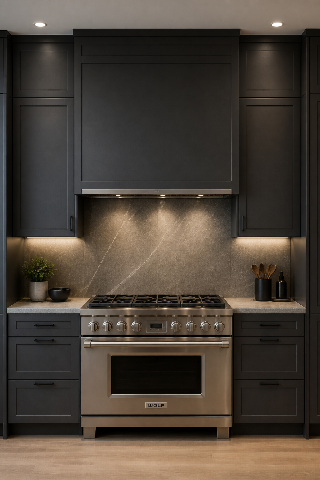
CFM Sizing and Make-Up Air
The standard rule: 1 CFM per 100 BTU of total burner output. For example, a standard 4-burner gas range at 48,000 BTU needs minimum 480 CFM. For island installations without a wall to contain airflow, increase calculated CFM by 20–25%. The 400 CFM threshold is an important inflection point in most jurisdictions. Above it, a mechanical make-up air system is typically required by code. In a well-sealed modern home, a hood pulling over 400 CFM depressurises the house faster than natural air infiltration compensates. Symptoms — back-drafting water heaters, difficulty opening exterior doors — typically appear the first winter, not during the renovation.
The Box Soffit Method for Concealed Ductwork
A framed, drywalled soffit runs from above the hood to the ceiling or exterior wall, housing the duct inside. Clad in matching cabinet material, it reads as a tall upper cabinet rather than exposed ductwork. Round duct (6–10 inches) is preferred over rectangular — better airflow efficiency and less noise at high CFM. Every 90-degree elbow costs 7–10 CFM in lost efficiency. So, minimise bends and upsize the blower one tier for duct runs over 12 feet.
9. Floor-to-Ceiling Pantry Walls That Read Like Custom Architecture
The space between the top of standard upper cabinets and the ceiling — typically 12–18 inches above the 96-inch cabinet line — is one of the most reliably mediocre details in residential kitchen design. It makes ceilings feel lower. Cabinetry feels like furniture rather than architecture. And it creates a ledge that collects grease and forgotten objects.
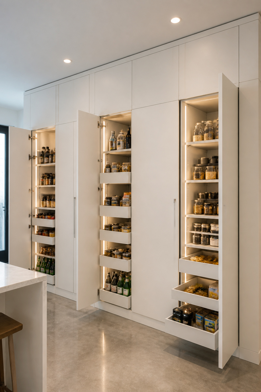
The Ceiling Integration Detail
Floor-to-ceiling cabinetry eliminates the dead zone entirely. The visual effect is immediate: the ceiling appears higher, the room feels resolved. The integration detail at the ceiling line determines whether it looks custom-built or assembled. Specifically, a scribing strip — a thin piece of matching material filling the gap between cabinet top and ceiling — creates a seamless built-in appearance. Crown molding at the cabinet top reads as period-specific and conflicts with the horizontal language of modern kitchen interiors. The scribe strip is both technically correct and more appropriate.
Interior Organisation Systems
Full-extension pull-out shelves (Häfele, Blum Tandembox, Rev-A-Shelf) outperform fixed shelves significantly in deep pantry cabinets. With a 24-inch deep base cabinet on a fixed shelf, roughly 40% of the rear volume is effectively inaccessible without reorganising. Full-extension pull-outs bring every item completely forward. Furthermore, combined with door-mounted racks for small daily-use items and sensor-activated LED strips on the vertical front edge of each shelf, a floor-to-ceiling pantry becomes a system. Allocate the uppermost section — anything above 70 inches — to infrequently used items. The accessible zone between knee height and 70 inches is where organisation investment pays every day.
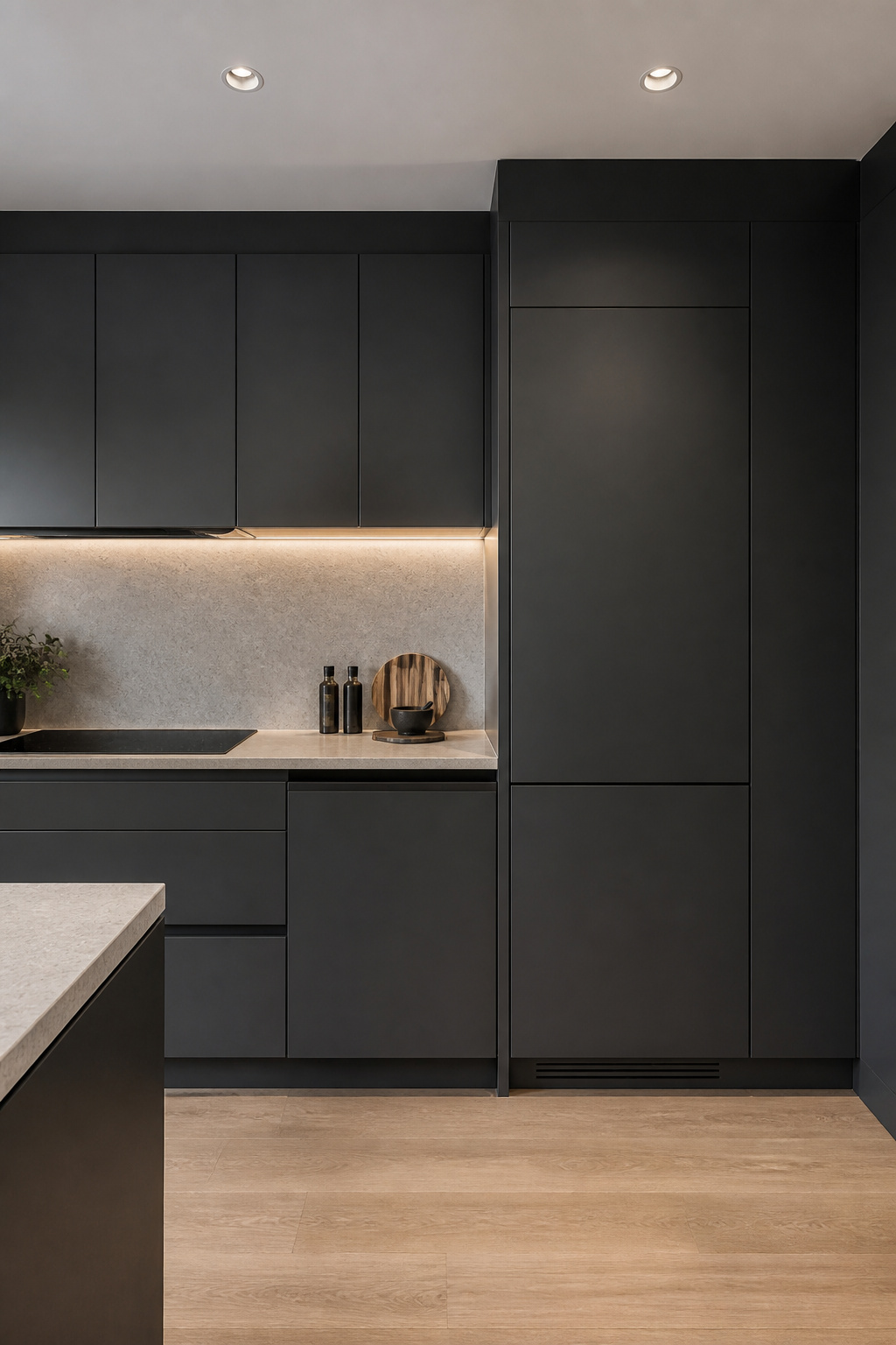
10. Matte Black Hardware as a Modern Kitchen’s Unifying Design Thread
Hardware is the specification that touches every cabinet in the kitchen. Get it right and the run reads as cohesive. Get it wrong — or mix finish types mid-project — and no expensive stone or careful lighting can pull the design back together.
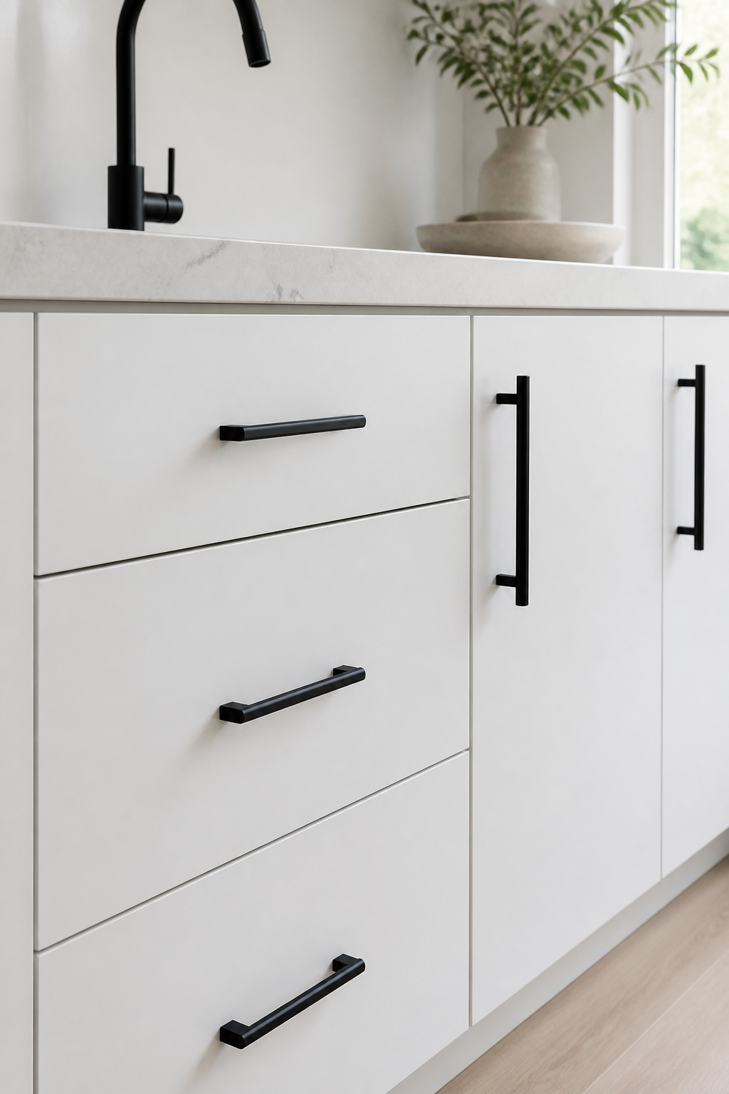
Finish Quality: PVD vs Powder Coat
Matte black draws no attention to itself and lets cabinet joinery and material become the focal point. That’s why it works in modern kitchen interiors that rely on surface quality rather than ornament. PVD (Physical Vapor Deposition) is the premium process — the coating is applied at a molecular level, producing a surface harder and more resistant than the underlying metal. PVD matte black is UV-stable and effectively impossible to scratch under normal kitchen use. Powder coat is the accessible alternative. It’s reapplicable if damaged and adequate in most kitchens where hardware isn’t directly UV-exposed. That said, cheaper powder-coated finishes can develop a chalky grey cast over 5–10 years of direct sunlight from a skylight — worth knowing before specifying. Exploring timeless kitchen hardware choices helps clarify where to spend and where the standard option is sufficient.
Sizing, Placement, and Finish Consistency
Pulls should be approximately one-third the width of the drawer or door face. A 24-inch drawer front takes an 8-inch pull. A 36-inch cabinet door takes a 12-inch pull. Knobs belong on doors, not drawers — applying knobs to heavy drawers creates uneven pull force that racks the slide over time. Finish consistency also matters beyond the cabinets. In practice, matte black reads cohesive when matched to the faucet and perhaps one fixture element. Adding it to appliance trim, light fixtures, and window hardware simultaneously creates a heavy, low-contrast space. The finish works best as a thread, not a total commitment.
11. Modern Kitchen Interiors Built Around a Statement Backsplash
The backsplash is the most designable major surface in a kitchen — it carries no structural load, doesn’t affect cabinetry function, and can be replaced without touching the counter or floor. In practice, that design latitude in modern kitchen interiors is typically spent in one of two directions: large-format tile that reads as an architectural surface, or a continuous slab that extends the countertop material up the wall.
Full-Height vs Standard-Run Installations
Standard backsplash runs 18 inches from countertop to the underside of the upper cabinet. It’s functional, but the visible breaks above and below create a compartmentalised look. Full-height backsplash (from countertop to ceiling) eliminates those breaks and reads as a continuous wall treatment. In kitchens without upper cabinets, a full-height statement backsplash becomes the primary architectural surface in the room. Large-format tiles (600mm × 300mm and above) also reduce grout line count significantly. A standard 300mm × 300mm installation produces 10–12 horizontal grout lines in an 18-inch zone. A single 1200mm × 600mm tile spanning the full height may have just one visible joint.
Slab Backsplashes and Installation Challenges
Continuous slab backsplash — same material as the counter continuing up the wall — requires mechanical fastening to wall framing. Adhesive alone won’t hold: 3cm stone weighs approximately 18–20 lbs per square foot, and drywall adhesive will fail over time. Outlet placement is the biggest layout challenge. Electrical outlets interrupt the continuous slab surface. The cleanest solution is relocating outlets into the upper cabinet zone or using pop-up countertop outlets. Understanding the kitchen tile backsplash installation process before specifying any premium large-format or slab option prevents mid-project surprises.
Grout Selection
Epoxy grout (Laticrete SpectraLOCK, Mapei Kerapoxy) is the correct choice for kitchen backsplashes — non-porous, stain-proof, no sealing required. It’s harder to work with: shorter working time, requires thorough cleanup during installation. But it outperforms cement grout on every functional metric. Color-matching grout blends with the tile body and makes the surface read as continuous. Contrasting grout makes the individual tile grid visible — right for graphic tiles, wrong for large-format stone-look surfaces.
12. Undermount Sinks and Integrated Drainage for a Seamless Surface
The undermount sink has been standard in modern kitchen design long enough that the visual effect is expected rather than surprising. However, what’s often still underspecified is the reveal type — and the increasingly compelling workstation format that extends the prep zone significantly.
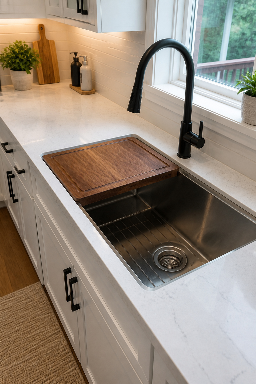
Reveal Types and Clip Systems
Three reveal options define how the countertop edge relates to the sink rim. Zero reveal (flush with the inside of the sink) is the cleanest but hardest to execute. Positive reveal (sink rim slightly visible) is the traditional undermount look. Negative reveal (countertop overhangs approximately 1/8 inch past the sink rim) is the modern preference — crumbs and water sweep directly into the basin without catching on an edge. Negative reveal is also the most hygienic. In addition, installation uses a clip-and-epoxy system: construction adhesive at the perimeter, mounting clips at corners and at 10-inch intervals along the sides. For stone countertops, reinforce the inside corners of the sink cutout. They are stress concentration points that chip during installation and cannot be repaired cleanly.
Workstation Sinks
Workstation sinks include integrated ledge rails on the inside sink walls that accept slide-in accessories: hardwood cutting boards, stainless colanders, roll-up drying mats. The entire prep-rinse-drain sequence happens over one basin. Installation requires a zero-reveal cutout so ledge rail accessories clear the countertop edge. RUVATI (Workstation series), Kraus (Kore series), and Bocchi (Contempo series) are the reliable brands. All are available in 16-gauge stainless — a specification worth confirming, because 18-gauge is noticeably less rigid and significantly louder under running water.
13. Kitchen Island Seating Designed as Furniture, Not an Afterthought
Island seating that functions well requires three interdependent dimensions to be correct simultaneously: overhang depth, seat height, and clearance behind the stools. In fact, most problems trace back to specifying these three independently rather than as a system.
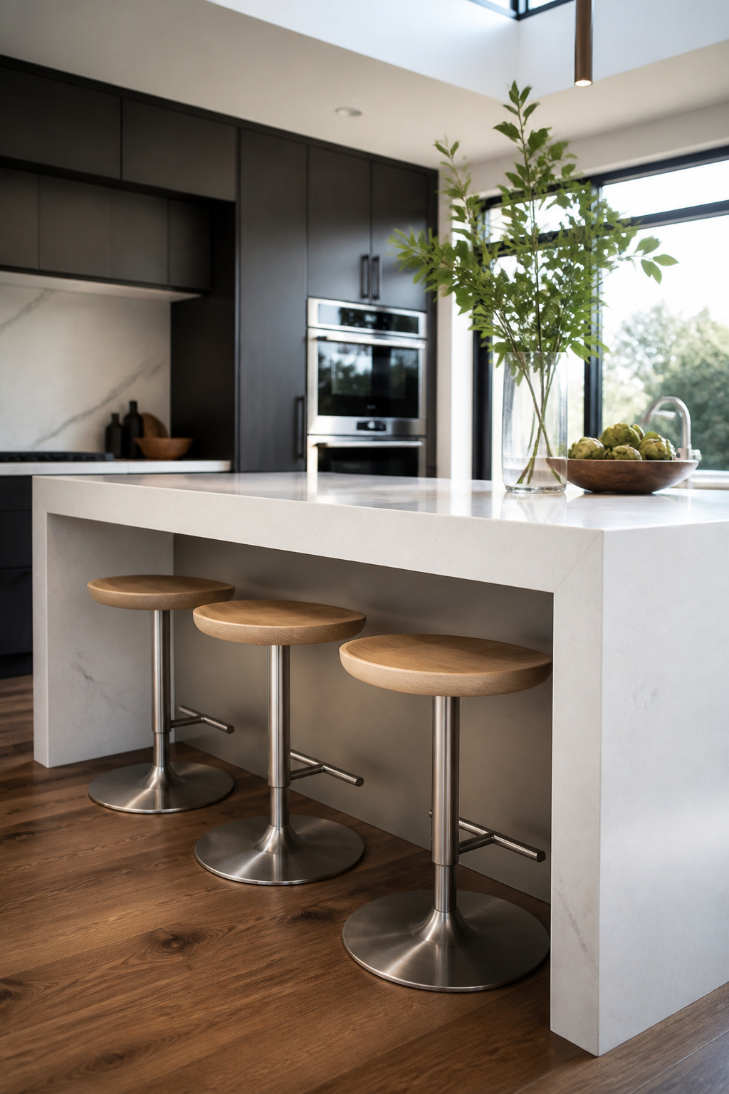
The Overhang and Knee Clearance System
Standard counter height is 36 inches, requiring 24–26 inch stool seats. Minimum overhang for counter-height seating is 12 inches from the island cabinet face. At 15 inches, long-term comfort improves noticeably. Below 12 inches, seated diners can’t get knees under the countertop and sit back from the surface. Knee clearance — 10–12 inches from the top of the stool seat to the underside of the countertop — is the interdependent dimension most often overlooked. If the island cabinet extends to full island width, the cabinet face sits right at the overhang start. It will contact a seated person’s knees at any overhang under 15 inches. Allow 36 inches of clearance from the back of occupied stools to any wall or obstacle (the NKBA minimum). If the island also serves as a circulation path, 42–48 inches is a better target.
Stool Selection and Structural Support
Swivel stools with a low-profile base are the modern default — they store completely under the overhang and allow someone to face the island or the rest of the kitchen without repositioning. Footrest placement at 10–12 inches from the floor for a 36-inch counter prevents leg fatigue within 20–30 minutes on stools without this spec. Stone countertop overhangs can safely cantilever 12–14 inches without additional support for standard 3cm slabs. However, beyond 14 inches, a steel bracket concealed within the island cabinet is required. The kitchen island storage solutions incorporated into the base will also affect which cabinet configuration works at the seating side — worth thinking through early.
14. Contemporary Kitchen Interior Lighting Zoned for Work and Atmosphere
Kitchen lighting is typically specified in two layers: overhead ambient and pendant. That covers perhaps half of what a properly designed contemporary kitchen interior lighting system does. The missing half — task and accent — determines whether the kitchen functions well during the hours it’s most heavily used.
The Four-Layer Model
Four layers: ambient (general ceiling illumination on a dimmer), task (under-cabinet LED strips illuminating the work surface), accent (interior cabinet lighting, toe-kick LED strips), and decorative (pendants and sconces that serve visual interest more than function). Most kitchen renovations install ambient and decorative — and skip task entirely. As a result, the kitchen looks beautiful in photographs but casts shadow across the cutting board when the cook blocks the overhead light with their own body. Under-cabinet LED strips on the front edge of the cabinet above the work zone solve this completely. In fact, they also cost less per linear foot than almost any other upgrade in the kitchen.
Task Lighting Specs and Placement
Target 300–500 lux on the counter surface for food prep. A quality LED strip producing 400–500 lm/ft positioned at the front edge of the cabinet undershelf achieves this consistently. CRI should be 90+ for accurate food colour rendering. Color temperature of 3000–4000K works best for task strips — slightly cooler than the pendant light overhead, which reinforces the functional distinction between task and ambient modes. Task lighting should always run on a separate circuit from ambient recessed lights.
Dimmer Compatibility
LED dimming methods (TRIAC, PWM, 0–10V) are not interchangeable between drivers and dimmers. Lutron’s Caséta and Diva dimmer lines publish compatibility lists covering hundreds of LED driver manufacturers. Specifying from that list eliminates the flicker and buzz that plagued early LED dimmer combinations — and still plague mismatched installations today.
15. Integrated Pull-Out Storage That Replaces Upper Cabinets Entirely
Upper cabinets are a compromise that many modern kitchen interiors have decided isn’t worth making. The comfortable reach zone for a standing adult runs from about 28 inches (knee height) to 70 inches — the zone where you can see what you’re reaching for, extend your arm without elevating your shoulder, and retrieve items without excavating a deep shelf. Standard base cabinets and drawers cover this zone exactly. Upper cabinets begin at approximately 54 inches and run to 84 inches. Most of their volume sits above shoulder height. Furthermore, at 12–13 inches of depth, they’re less efficient per cubic foot than base drawers.
The Full-Extension Drawer System
Blum Tandembox is the industry benchmark: full extension, BLUMOTION integrated soft-close, weight ratings to 88 lbs for the Antaro series, and a 3D-adjustable front that allows precise alignment correction after installation. The drawer box construction matters as much as the slide. Steel-sided Tandembox drawers are more rigid than wood-sided boxes at the same price point. They also won’t rack under heavy loading — a cast iron Dutch oven repeatedly pushed to the back of a wood-sided drawer eventually produces sag at the front corners. Furthermore, undermount drawer slides (Blum Tandem) mount to the base of the drawer box and are invisible from the interior. The result is a completely flat floor that’s easy to clean.
Organisation Inserts That Make the System Work
A spice drawer insert beside the range (3–4 inches deep, jars lying flat so labels face up) replaces a countertop spice rack and removes one category of visual clutter. A knife drawer insert built into the base cabinet beside the primary cutting zone is both safer and more hygienic than a countertop knife block. Custom utensil drawer dividers sized to the longest utensil in the collection — rather than specified generically — prevent the common problem of spatulas that won’t lie flat and drawer fronts that won’t close fully.
The one structural caveat: a premium drawer system is only as stable as the cabinet carcass it mounts in. Tandembox in a poorly constructed cabinet box will develop alignment issues that even a 3D-adjustable front can’t fully correct. The carcass quality floor and the drawer system quality ceiling are the same thing.
Choosing the Modern Kitchen Interior Style That Fits Your Home
The fifteen elements here aren’t equally weighted. Some — range hood CFM calculation, electrical circuit planning for lighting zones, plumbing rough-in position for undermount sinks — must be resolved at the framing stage. Leave them until later and they become expensive mid-project changes. In contrast, others — hardware finish, backsplash tile, pendant selection — are finish-level choices that can be refined over time.
The practical sequence: resolve the spatial and mechanical framework first. Specifically, ask: what’s the cooktop BTU output? Does it cross the 400 CFM make-up air threshold? Is the lighting rough-in planned for four independent circuits? These aren’t interesting questions, but every expensive finish decision sits downstream of them.
Three Decisions Before the Spec Sheet
Three decisions should precede everything else. First, choose the primary countertop material, since every other finish responds to it. Second, lock in the cabinet mechanism before manufacturing begins — handleless systems and interior organisation strategy are expensive to change post-installation. Third, plan the lighting system as a complete four-layer design rather than adding fixtures reactively.
From there, the material and finish decisions are where personal expression belongs. Matte black hardware, concrete-look porcelain, statement backsplash tile — these are the elements where one modern kitchen interior diverges from another. They’re the right place for personal taste precisely because they’re also the most feasibly updated when that taste evolves. The spatial logic and mechanical infrastructure underneath should be built to last.