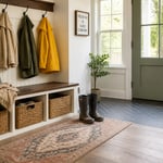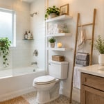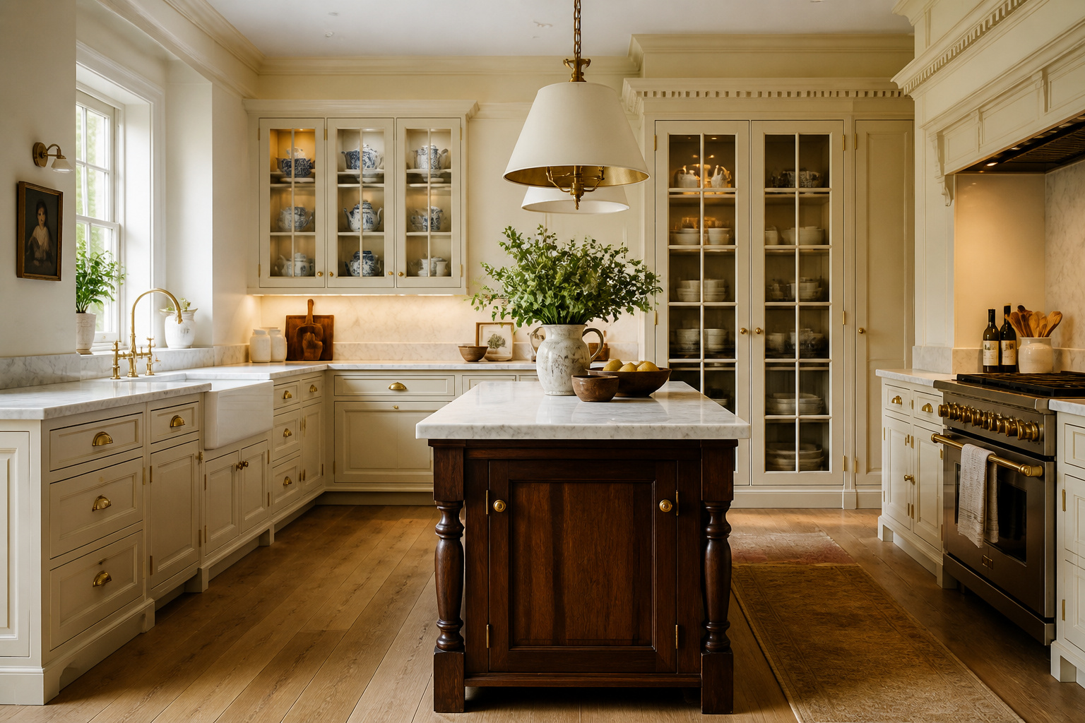
For over three centuries, the same design principles that shaped Georgian manor house kitchens have defined the most coveted cooking spaces in the world. Walk into a kitchen fitted with raised panel doors, inset construction, and crown moulding that meets the ceiling. Add cup pulls in unlacquered brass. You understand immediately that this kitchen was built to last — not to be ripped out when the trend cycle turns. As someone who has spent 12 years helping clients invest in spaces that reward them over decades rather than seasons, I’ve learned that traditional kitchen cabinets aren’t a style choice. They are a decision about permanence. These 18 approaches cover everything from the foundational (the raised panel door, the inset frame) to the nuanced (plate rails, furniture feet, unfitted design philosophy). I return to them consistently because they deliver on the most important promise in interior design: they get better with time.
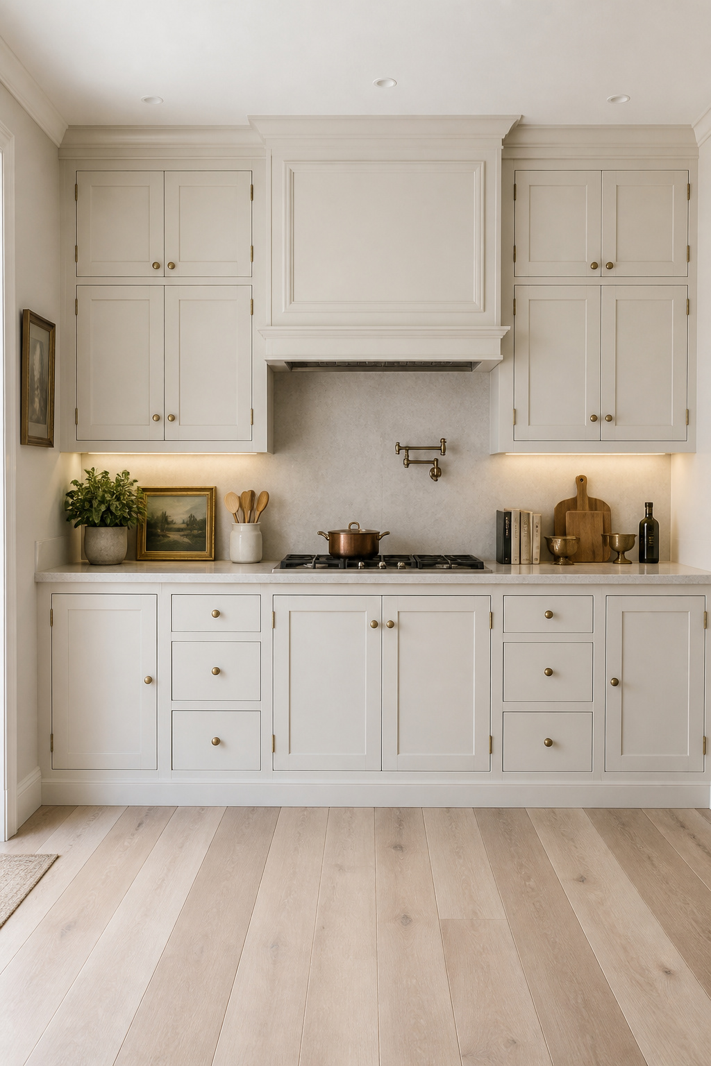
1. Raised Panel Doors: The Defining Detail of Traditional Kitchen Cabinets
Raised panel doors have appeared in every era of quality kitchen design from the Georgian period to the present. The reason is structural as much as aesthetic. The raised center panel — a beveled field that lifts slightly from the surrounding frame — creates a three-dimensional depth that flat-panel and Shaker doors cannot replicate. In raking afternoon light, those shadow lines are the difference between a cabinet run that looks custom-built and one that looks like a box.
The construction method matters as much as the profile. Cope-and-stick joinery, where the frame members are shaped to interlock rather than simply butted and glued, has been the cabinetmaker’s standard for centuries. It produces a joint that is structurally sound and visually refined. Look for it in any cabinet described as quality traditional work. Cherry, quarter-sawn oak, and birch are the most appropriate species. Cherry develops a rich reddish-brown patina as it ages. Quarter-sawn oak has ray fleck patterns that read as premium across the room. Birch takes paint beautifully with a fine, consistent grain.
Profile selection is where character gets made. The ogee — an S-curve profile running along the panel edge — is the most formally classical option, appropriate for Georgian and Colonial Revival kitchens. The cove, a concave scoop, is more understated and versatile. A simple bevel edges toward transitional. For additional context on how door profile shapes overall architectural character, the relationship to traditional kitchen design principles is worth understanding before you commit.
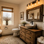
2. Inset Cabinet Doors With Exposed Hinges for a Furniture-Grade Finish
The single detail that separates a kitchen that looks premium from one that actually is: inset door construction, where the door sits flush within the face frame rather than overlapping it. It is also the most demanding and expensive method of making traditional kitchen cabinets. A thin reveal line, typically 1/8 inch, remains visible around each door. That reveal is what gives a fitted kitchen the look of furniture.
Overlay doors sit on top of the frame. Full overlay nearly hides the frame; partial overlay leaves a consistent reveal. Both are more forgiving of out-of-square installation and cost 15-25% less than inset equivalents. For a formal traditional kitchen — particularly one with inset hardware, crown moulding, and pilasters — the savings come at a visual cost that undermines the entire investment.
The hinge choice solidifies the aesthetic. Butt hinges in solid brass, specified at 2.5 inches for standard cabinet doors, are the most historically correct option. They are visible on the door exterior and become part of the decorative language rather than something to be concealed. H-hinges reference colonial American joinery and suit painted inset cabinets in an Americana character. In either case, the hinge finish must match the pull hardware exactly. Wood expands and contracts with humidity. Inset doors cut to precise tolerances in winter can bind in humid summer months. A quality cabinetmaker accounts for this by sizing the door slightly undersize and planning the reveal accordingly.
3. Crown Moulding That Bridges Your Cabinets to the Ceiling With Authority
Without crown moulding, a run of cabinets reads as furniture placed against a wall. With the right profile, installed at the correct angle, that same run becomes architecture — a built-in feature that appears to have been designed into the room rather than added to it. This is not a minor distinction. Crown moulding transforms how the entire kitchen is perceived.
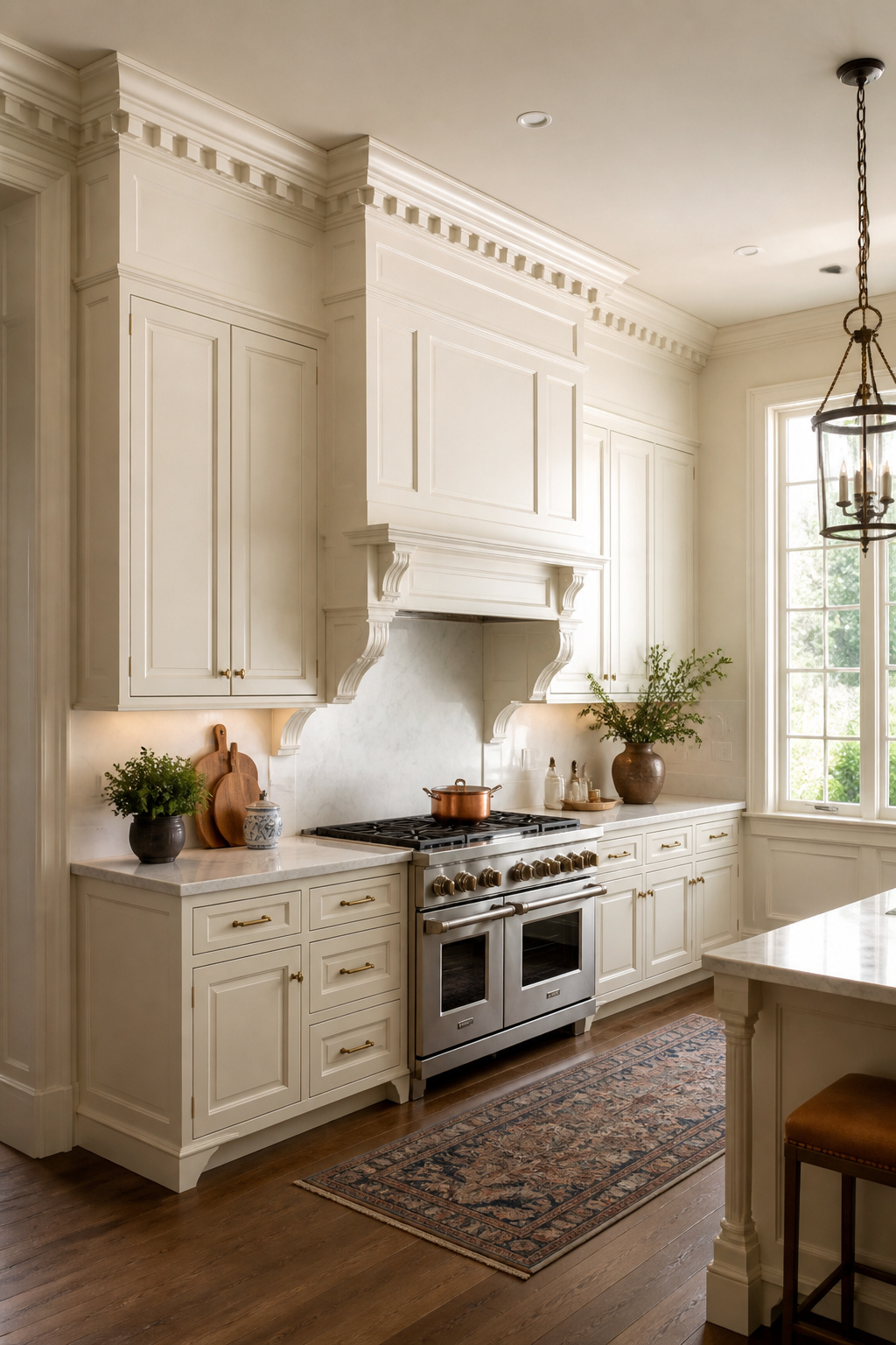
The profile choice is a period decision. Dentil moulding — small evenly spaced rectangular blocks tracing their lineage to ancient Greek temple cornices, in continuous use since roughly 500 BC — is the most formally correct option for Georgian and Colonial Revival kitchens. The individual blocks cast distinct shadows that photograph beautifully and read as genuinely architectural from across the room. Cove moulding, with its concave profile, transitions gently from cabinet to ceiling. It works in formal and relaxed traditional kitchens equally. For kitchens with 10-foot or taller ceilings, stacked moulding — layering a cove, a flat bed mould, and a small ogee — creates a cornice of genuinely imposing scale.
The installation angle is 45 degrees against both the ceiling and the cabinet top. This creates the characteristic shadow profile that defines crown moulding’s visual effect. For vaulted ceilings, rigid one-piece crown cannot follow the slope and must be mitered at custom angles calculated per degree of pitch — a job for a skilled carpenter, not a weekend project. The sizing rule: crown height should be 1/2 to 3/4 of the face frame stile width. A 3-inch stile gets a 1.5 to 2-inch crown. Scale too large and the detail looks heavy; scale too small and it looks like an afterthought.
4. Beadboard Panels: A Classic Kitchen Cabinet Detail Worth Reviving
Beadboard arrived in American homes in the 1860s and became widespread by the 1880s. It was an inexpensive utility material used in kitchens, back halls, and service spaces — chosen because it was easy to install and hardwearing. Its current status as a sought-after design detail is one of those satisfying reversals in which the material’s original humility becomes its elegance.
On cabinet door faces, beadboard replaces the flat center panel with grooved boards, typically 1.5 to 2 inches wide. This creates a layered texture that reads as distinctly period-authentic in Victorian, cottage, and Craftsman-influenced kitchens. On island end panels and toe kick boards — the surfaces most visible from across a room — the vertical grooves catch light and make solid wood surfaces look more refined. The pairing of beadboard with other period materials is consistently one of the most referenced approaches in heritage kitchen design.
The material choice matters for longevity. Solid pine or poplar beadboard is the authentic material and holds paint well over decades. However, it expands and contracts with humidity, so seams can show slight gaps over years in climates without consistent humidity control. MDF routed to simulate beadboard is dimensionally stable, takes paint without grain raising, and is a practical match for solid wood in painted cabinet applications. The preparation sequence before painting beadboard on cabinets is exacting: caulk all joints, fill nail holes with painter’s putty, seal any knots with shellac, prime, then two coats of satin or semi-gloss enamel. Skip the shellac step and tannin bleed-through will appear through your paint within months.
5. Antique White Paint That Ages More Beautifully Every Year
Bright white — that crisp, blue-undertone white that reads as clinical in showrooms — is a poor match for traditional kitchen cabinets. Paired with warm wood floors, aged brass hardware, and natural stone countertops, it creates visual tension rather than harmony. The cabinet reads as if it was installed after everything else, rather than being the designed starting point.
Why Undertone Matters More Than the Colour Chip
Antique whites with cream or yellow undertones bridge the warmth of the room’s other materials. Benjamin Moore Swiss Coffee is described by designers who use it repeatedly as a creamier warm white — the quality white oil paint takes on after years of aging. That is precisely the character it brings to a traditional kitchen. Ballet White OC-9 is another consistent recommendation: a soft cream-white with yellow undertones that reads warm in natural light and avoids the greenish cast some greige whites develop under LED lighting.
Farrow & Ball’s Off-White No.3 has a painterly, slightly aged quality that works particularly well on textured surfaces. It is often referenced alongside its natural material partners — warm stone and aged brass — rather than as a standalone choice. That is the correct way to think about any paint colour for a traditional kitchen. The undertone test before committing: hold paint chips against your dominant warm element — wood floor, stone countertop, or brass hardware. The correct antique white will appear warmer and brighter by contrast. The wrong choice will appear yellower or cooler than it does in isolation. As for finish, full gloss was historically correct — Georgian and Victorian painted woodwork was always high gloss — but satin or eggshell is the practical contemporary choice: durable, wipeable, without the plastic quality of semi-gloss in certain light.
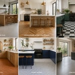
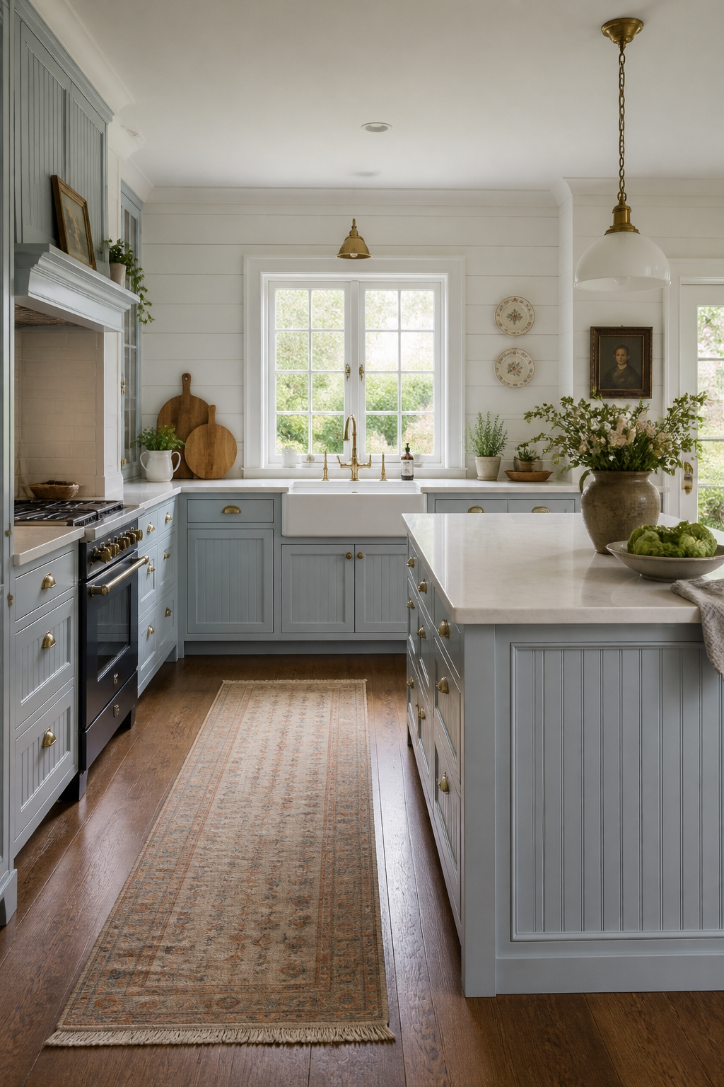
6. Two-Tone Cabinetry With Darker Lowers and Lighter Uppers
The convention of darker lower and lighter upper surfaces in a room traces to principles older than kitchens as we know them. Visually heavier elements naturally sit at floor level to create a grounded, stable feeling. Lighter elements above feel airy and proportionate. Applied to kitchen cabinetry, it produces one of the most satisfying and long-lived arrangements in interior design.
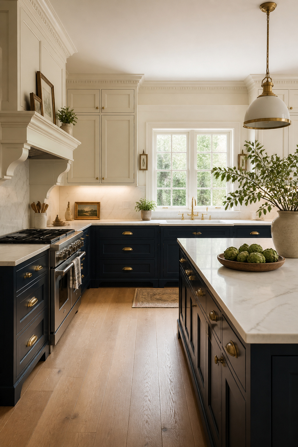
The pairing options are well-established. Navy lower cabinets with cream or antique white uppers is perhaps the most traditional combination — navy was a common kitchen colour in Georgian England, and the contrast is strong without being aggressive. Forest green lowers with off-white uppers references English country house kitchens of the late 19th century. Farrow & Ball Calke Green or Mizzle on the lowers with All White or Pointing on the uppers is one of the most photographed contemporary interpretations of this tradition. The principle of paired undertones is worth understanding before making a final choice: upper and lower cabinet colours with different undertones — a warm gray lower with a cool gray upper, for instance — create visual discord even when the shades appear well-matched in isolation.
The standard design ratio is 60% lighter (uppers and walls) to 40% darker (lower cabinets and island). In open-plan kitchen-living spaces, darker lower cabinets anchor the kitchen zone visually. Lighter uppers blend into the room height, softening the transition to the adjacent living area. The transition detail at the countertop line is critical. The countertop should bridge the two tones, which is why neutral countertops with warm veining — marble, quartzite, butcher block — work better than high-contrast black stone in two-tone schemes.
7. Glass-Front Uppers: The Traditional Kitchen Cabinet Style That Invites Display
A continuous run of solid cabinet doors, however beautifully detailed, lacks visual rhythm. Glass-front upper sections — whether one cabinet or three in a row — create a breathing point in the composition and reference the kitchen dresser tradition that defined British domestic interiors for centuries. They also force a degree of curation that improves the kitchen. For a broader look at what makes this style endure, timeless ideas for traditional kitchen cabinets is worth exploring alongside your own planning.
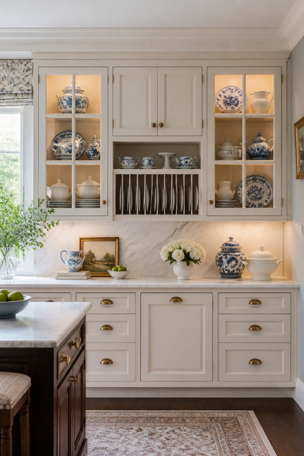
The glass type is the character decision. Seeded glass — clear glass with embedded air bubbles that distort and soften what’s inside — is the most period-appropriate choice for Victorian, cottage, and Arts and Crafts kitchens. It provides privacy over display contents while still creating the visual rhythm of glass fronts. Leaded glass with cameing (the metal lines that divide panes) is the most formally architectural option, appropriate for Edwardian and Georgian Revival kitchens; the cameing can be specified in brass to match cabinet hardware. Mullion-divided glass uses wood moulding strips dividing a single pane into sections — a prairie-style nine-pane grid suits Craftsman kitchens, while a two-over-two division suits transitional-traditional settings.
Inside the cabinet, restraint is everything. A curated collection of one consistent material — all white porcelain, all clear crystal, all blue-and-white transfer ware — reads beautifully behind glass. Everyday mismatched crockery should be relocated to closed-door cabinets adjacent to the glass fronts. The visual chaos of different mug handles and bowl sizes undermines the effect immediately. Under-shelf LED tape lighting at 2700-3000K, installed at the front edge of each shelf, illuminates the items below with a soft continuous glow and makes the display visible from across the kitchen even in daytime.
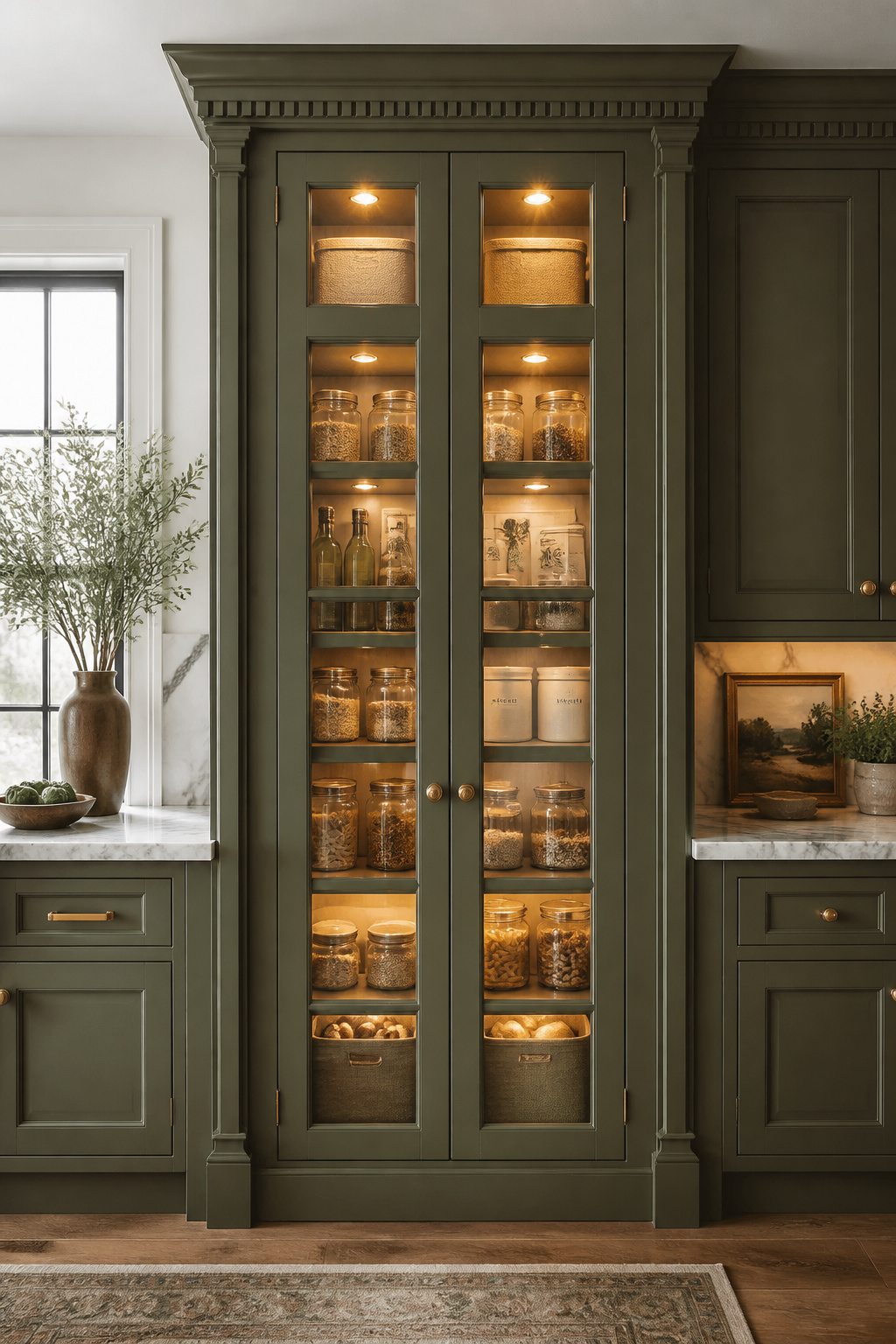
8. Plate Rack Inserts That Turn Upper Cabinets Into Elegant Display Storage
The kitchen dresser — a piece combining a closed base cupboard with an open plate-display rack above — was the centrepiece of English and Welsh kitchens from the 17th century to the early 20th. Antique pine examples from the 1880s with original plate rack sections fetch £1,500 to £8,000 at auction. That price reflects genuine design value, not just age. Installing a plate rack insert into an upper cabinet section brings this tradition into a contemporary fitted kitchen without requiring the full dresser footprint.
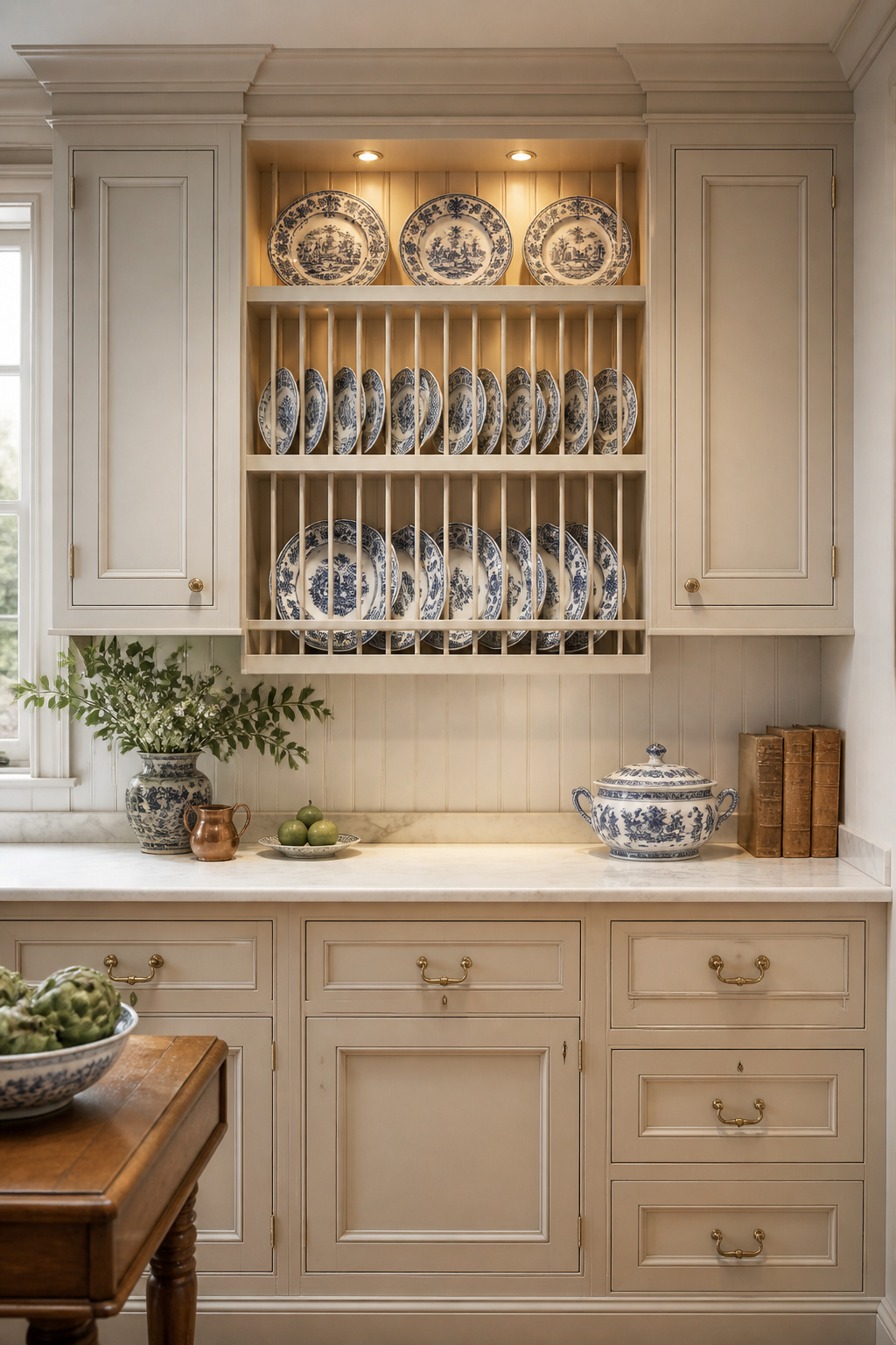
The depth requirement is specific: a plate rack section needs a minimum shelf depth of 12 inches to accommodate standard dinner plates (10-12 inches in diameter). The groove cut into the shelf should be 3/8 inch deep and 3/8 inch wide. Position it so that plates lean back against a support lip, with a front dowel or bead moulding safety rail 4 inches forward of the groove — this prevents plates from falling forward. Kitchen storage ideas for well-organised traditional spaces often overlook this dimensional precision, but it is the difference between a plate rack that functions confidently and one that always feels slightly precarious.
Directional spots fitted at the top of the plate rack section cast light down across the face of displayed plates. This creates highlights on the glaze and shadows in the profile, making even simple white plates look decorative under evening lighting. Warm white (2700K) suits antique or hand-painted china; slightly cooler (3000K) works better with contemporary white porcelain. Routing the wiring through the cabinet back and concealing it within the frame is the detail that separates a well-executed installation from a DIY-looking one.
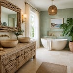
9. Furniture-Footed Base Cabinets for a Freestanding, Unfitted Feel
The fitted kitchen — continuous wall-to-wall cabinetry on a standard plinth — became dominant only in the 20th century. Before that, kitchens were furnished the way living rooms were: individual pieces that happened to coexist in the same room. Furniture feet on traditional kitchen cabinets restore that visual history. They transform a fitted run into something that appears inherited rather than installed.
Bun feet (round, slightly flattened turned feet, typically 3-4 inches in diameter and 4-5 inches high) are the most common and effective choice for kitchen base cabinets. They provide floor clearance similar to a standard toe kick while visually lightening the cabinet base. The space between the floor and the bottom of the cabinet — created by the bun feet — is the signature of the effect. Applied to a painted island in a contrasting colour to the perimeter cabinets, furniture feet reinforce the reading of the island as a separate, freestanding piece. That is precisely the effect Plain English and DeVol kitchens are designed to emphasize.
Bracket feet — the curved or scrolled corner brackets used on Georgian and Regency furniture — are the most formal alternative and suit kitchens with strong architectural character. Turned legs are best reserved for island pieces or kitchen table sections intended to read as freestanding furniture. A full run of perimeter base cabinets on turned legs requires careful structural planning to ensure adequate toe-kick clearance and alignment with adjacent appliances. One practical note: ensure dishwasher height compatibility before specifying bun feet. Standard dishwashers require a 34.5-inch opening height, which can be compromised if the feet are too short.
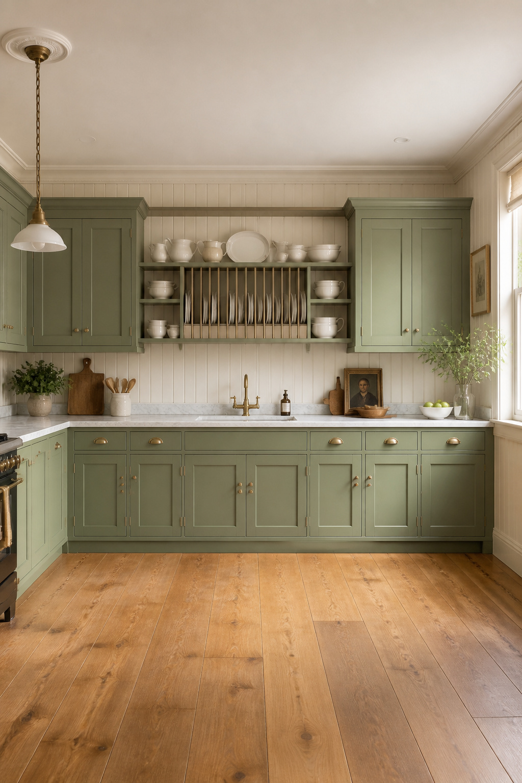
10. Painted Sage and Forest Green: Traditional Kitchen Cabinetry in Nature Tones
Green has been a traditional kitchen colour for well over a century. Its current prominence in design media represents a return to Victorian convention rather than a new departure. Early synthetic pigments in the 1800s made reliable greens available at the mass market level for the first time. They appeared throughout domestic interiors of the Victorian and Edwardian periods. Farrow & Ball’s Calke Green was, in fact, originally found in the breakfast room at Calke Abbey, a National Trust property in Derbyshire — a direct connection to that period.
Reading Green in Different Light
The spectrum from sage to deep hunter changes the kitchen’s character entirely. Farrow & Ball Mizzle — a gray-green with significant blue undertone — is one of the most complex and atmospheric cabinet colours available in south-facing rooms with warm afternoon light. In north-facing kitchens, however, it can read as cold and flat. Kitchen colour palettes for traditional homes consistently distinguish between paint behaviour in different orientations, and this is nowhere more important than with green. Calke Green (F&B No.34), a rich warm sage with balanced warm and cool content, performs well across all light conditions. Studio Green (F&B No.93) is a near-black deep green appropriate for very large, light-filled kitchens where the designer wants the cabinetry to recede into atmosphere.
The natural partner for green cabinets is unlacquered brass hardware. The warm metal tones complement the yellow undertones in most sage and olive greens without competing with the dominant hue. White or cream marble countertops — Calacatta or Carrara — reference the English country kitchen aesthetic most directly. The white stone reads as clean and cool against the green, preventing the combination from becoming visually heavy. Wide-plank oak or pine floors in an oiled finish ground the combination. Always test green paint against the actual hardware and countertop materials, not against a white card. Undertones that appear compatible in isolation can clash dramatically in the installed context.
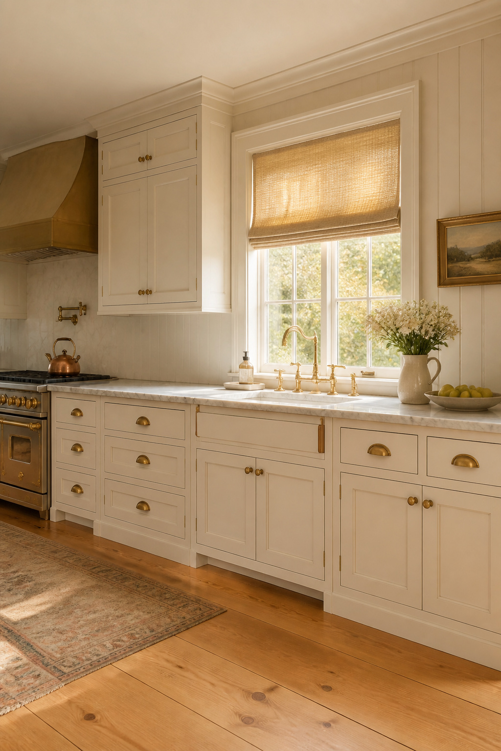
11. Brushed Brass Hardware That Adds Period Warmth Without Feeling Costume-y
Cast brass hardware has been produced for furniture and cabinetry since the Georgian period — the early 1700s. The forms that persist today (cup pulls, escutcheon plates, bin pulls, ring handles) have changed remarkably little in 300 years. This is not nostalgia; it is the market’s ongoing verdict on what works. Brass resists corrosion, ages to a warm patina rather than rusting, and the mechanical weight of a well-made cup pull in solid brass is an immediate sensory signal of quality.
The finish choice determines how the hardware ages and how formal it reads. Unlacquered polished brass develops a natural patina over years of handling. Fingerprints and oils darken the high points while recessed areas lighten, creating the depth you see on antique hardware. This is the most authentic choice, but it requires acceptance of ongoing tonal change. Brushed (satin) brass shows fingerprints less and maintains a more consistent appearance. The lacquer on most high-street hardware holds the finish static until it wears through, at which point the hardware starts patinating unevenly. Antique brass is factory-distressed to simulate age — what you see at installation is what you get in 20 years, which is both a limitation and a benefit.
Matching Hardware to Cabinet Style
For cabinet hardware that elevates traditional kitchen cabinets, the most consistent advice from designers is to spend more than you think is necessary. Cup pulls are the most traditional option — appropriate for Georgian, Federal, and Victorian-style cabinetry. Backplate knobs (a knob mounted on an oval or circular decorative plate) are the most formal option and suit painted inset-door cabinets in a Georgian or Regency-style kitchen. One firm rule: do not mix brushed and polished brass in the same kitchen. The two finishes clash under most lighting conditions even though they share the same base material.
12. Built-In Pantry Cabinets With Mullion Glass and Interior Lighting
Before the modern fitted kitchen, the larder was considered essential in any well-appointed house. As domestic architecture contracted over the 20th century, the larder became the tall pantry cabinet. In premium traditional kitchen design, it remains one of the most valued features. Nothing else creates a focal point of the same architectural authority.
A floor-to-ceiling pantry cabinet at 84 to 96 inches tall, given matching crown moulding and detailed side panels, becomes the anchor piece that the rest of the cabinetry is arranged around. French door pantry configurations — two doors meeting at the center, each with glass mullions — are the most traditional and visually balanced option. They reference armoire and linen press furniture forms. The glass selection should match the upper cabinet glass type elsewhere in the kitchen to maintain visual consistency: seeded glass throughout, or clear mullion throughout.
Interior organisation is where the investment is justified in daily use. Pull-out shelf systems from Blum (Tandembox Antaro) allow the full depth of a 24-inch pantry to be accessed without reaching. Adjustable gliding shelves are a significant functional upgrade over fixed shelves, particularly for heavy jar and bottle storage. The difference between a pantry that gets used well and one that becomes a dumping ground is almost entirely in the interior organisation hardware. Interior lighting — LED tape or in-shelf puck lights at 2700K — transforms storage into display.
13. Unfitted Traditional Kitchen Cabinets: The Approach That Looks Most Authentic
An unfitted kitchen is a collection of freestanding and semi-freestanding elements — worktables, larder cupboards, dressers, Belfast sink stands — that appear to have accumulated in the room over decades rather than been designed in one pass. Before the 20th century, this was simply how kitchens existed. There was no concept of continuous wall-to-wall cabinetry on a standard plinth. The kitchen was furnished the way a living room was, with individual pieces.
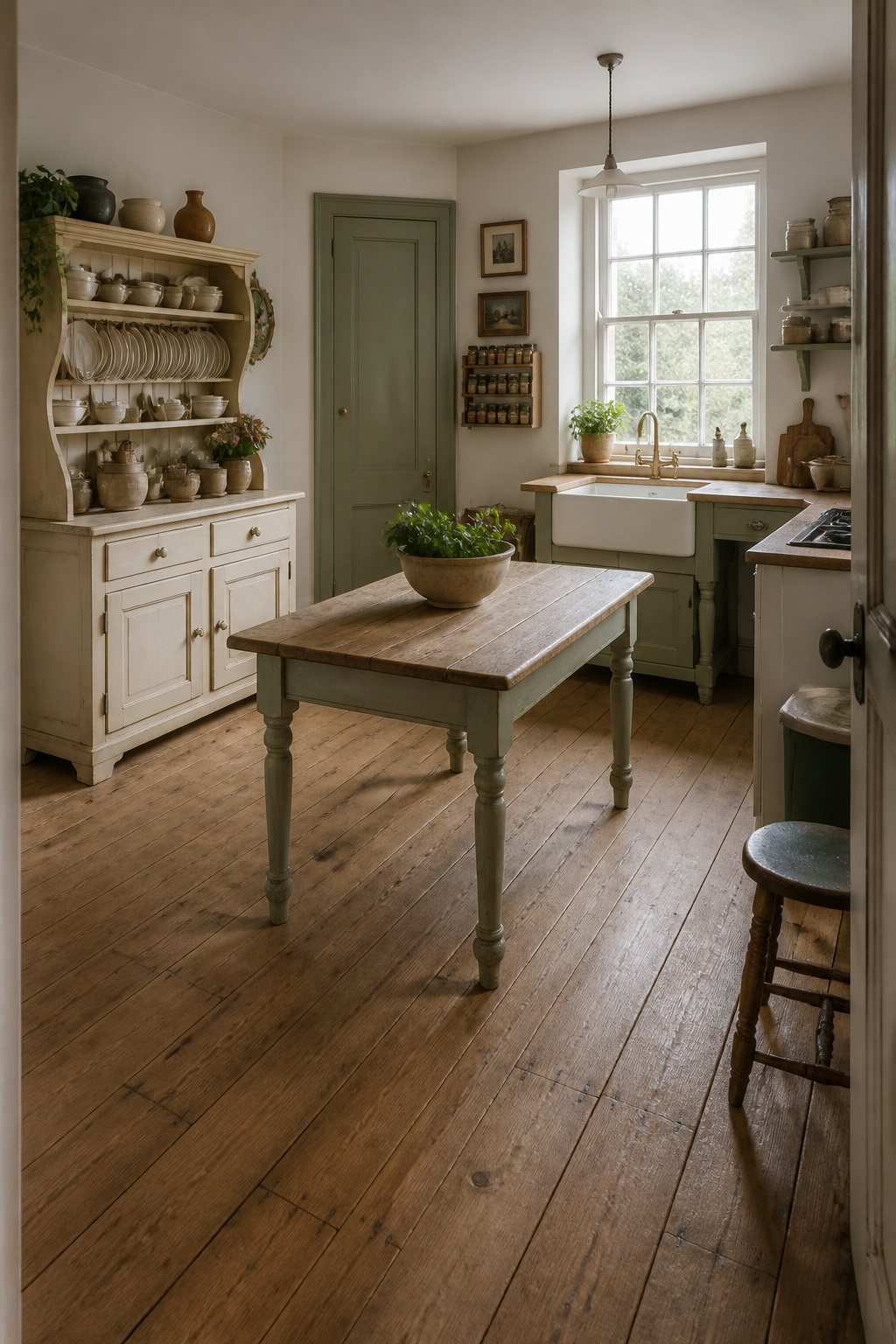
Plain English, founded in Suffolk 30 years ago and taking Georgian architecture and traditional craftsmanship as its starting point, has made this approach the defining visual language of what is now recognised internationally as the English kitchen. Their pieces — tall larder cupboards, painted oak freestanding units, Belfast sink stands on turned legs — are designed to appear as if they predate fitted kitchens entirely. The same visual quality was pioneered by Mark Wilkinson. In the late 1970s, when minimalist fitted kitchens were fashionable in London, Wilkinson began making kitchens in pine and oak, stating explicitly: ‘I hate all this Minimalist stuff, I want more friendship, more fun, more love and more laughter.’
Making the Unfitted Look Work
The practical approach for most homeowners is a hybrid: fitted upper wall cabinets combined with freestanding or furniture-footed lower pieces. The key visual trick is varying the depth and height of adjacent pieces. A freestanding dresser at 500mm deep and 1800mm tall creates a break in a run of standard 600mm/870mm base cabinets that reads as an authentic collection rather than a fitted run. Vintage pieces can be incorporated — a pine farmhouse dresser, a painted wardrobe used as a larder. One caveat: attempting the unfitted look with mass-market RTA cabinetry consistently fails. The proportions and material quality of standard box cabinets undermine the freestanding reading regardless of what detail is applied to the exterior.
14. Fluted Pilasters and Decorative Corbels for Real Architectural Depth
A pilaster is a flat rectangular column projection applied to a surface — in cabinetry it appears at the ends of runs, at corners, and flanking the range hood. It mimics the columns that articulate formal architectural rooms. A corbel is the bracket-form support applied under overhangs and range hood mantels. Together, they are the detail that elevates traditional kitchen cabinets from well-made furniture to genuine architectural interior.
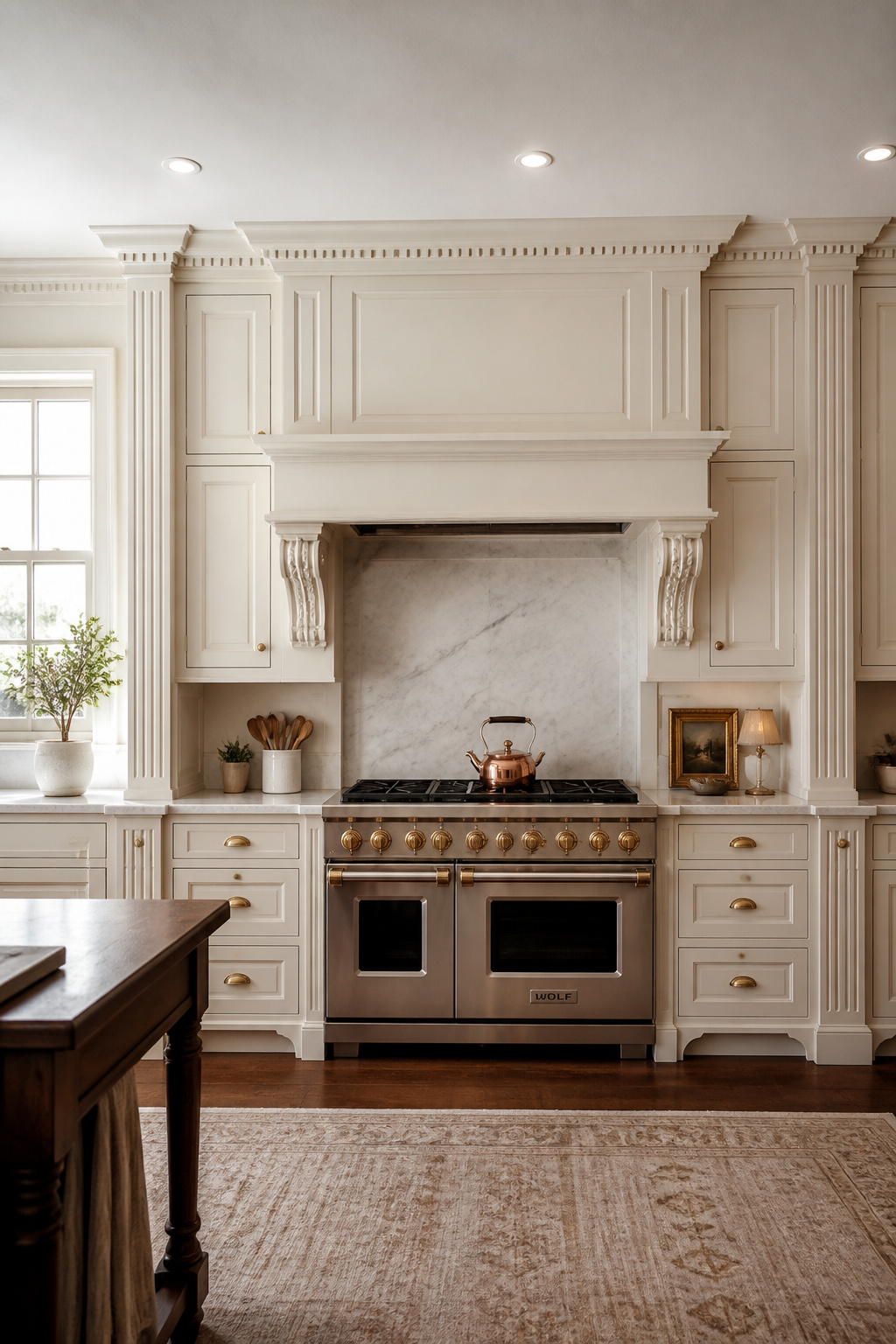
Fluted pilasters — with vertical grooves running their length — reference the Greek Ionic and Corinthian orders and are the most directly classical option. Corner pilasters appear at the junction of two perpendicular cabinet runs, masking the mitered corner and providing the visual fullness that a properly terminated architectural element requires. Without them, corners look like two cabinets meeting. With them, the composition reads as a continuous designed element. Range hood corbels should be scaled to the hood: a 48-inch hood can carry 6-inch corbels; a 36-inch hood looks better with 4-inch corbels. Island end panels with pilasters transform a box island into a piece of architectural furniture.
Proportion and Restraint
The classical rule of restraint applies absolutely here: choose one prominent decorative element per visual zone. Fluted pilasters or carved corbels or dentil crown, but not all three in the same section of cabinetry — or the result becomes theatrical. Pilaster width should be roughly 1/10 to 1/12 of the span it terminates. For a 72-inch cabinet run, a 6 to 7-inch pilaster is appropriately scaled. The finish of all decorative moulding must match the surrounding cabinetry exactly. Any colour or sheen difference between a pilaster and its adjacent cabinet panel makes the decorative detail read as applied ornament rather than integral architecture.
15. Open Plate Rails and Display Ledges Between Cabinet Runs
The plate rail — a narrow shelf with a groove to hold plates upright and a front safety dowel — is one of the most useful and visually effective details you can integrate into traditional kitchen cabinets without major structural commitment. It breaks the visual monotony of a continuous upper cabinet run and references the Welsh dresser and kitchen dresser tradition that defined British domestic interiors for three centuries.
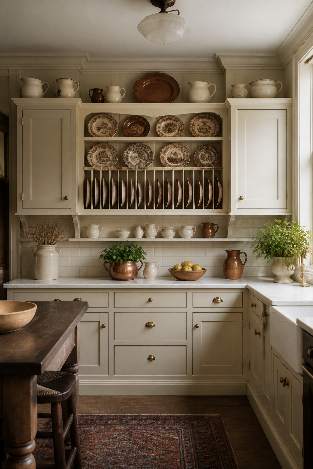
The most effective placement is on the wall section between two upper cabinet groups. A 24 to 30-inch section of open shelf with a plate rail at the back reads as the open-shelf section of a traditional dresser. The display ledge — a narrow shelf, typically 3 to 5 inches deep, running continuously above a countertop — serves a similar function at a smaller scale. It accommodates a row of plates standing upright or a continuous line of small objects that brings colour and character to the wall between cabinets and countertop.
Dimensions require attention. The back groove should be 3/8 inch deep and 3/8 inch wide. Too shallow and plates don’t sit securely; too deep and removing plates requires uncomfortable tilting. The front safety rail should be 4 inches forward of the groove, positioned to allow plates to lean back at a stable angle without blocking the plate face. When positioned above a countertop, the plate rail should be at least 18 inches above the work surface. The strongest displays are monochromatic or limited-palette: all blue-and-white transfer ware, all white ironstone, all copper lustre pottery. Seasonal rotation — replacing pottery in one palette with another as the year progresses — takes 20 minutes and refreshes the entire kitchen’s character.
16. Marble and Butcher Block Countertops That Complete the Traditional Look
Before laminate arrived in the 1950s and engineered stone in the 1990s, kitchen countertops were made from cut stone for wet areas and hardwood for prep surfaces. Both materials survive in antique kitchens to this day. That is the most persuasive argument for why they remain relevant. Marble was prized for pastry and bread work because its naturally cool surface temperature — typically 3 to 5 degrees below room temperature — prevents butter from softening and dough from sticking.
Calacatta marble, quarried near Carrara in Italy, has a bright white background with bold, dramatic veining in gray, gold, and beige — the most visually striking and most expensive option, with premium slabs reaching £200 to £300 per square foot installed. Carrara is more widely available: a light gray background with fine, feathery veining that reads as appropriately understated in traditional kitchen cabinets with aged brass hardware and antique white paint. For trending countertop materials in traditional kitchens, the consistent advice is to specify honed (matte) marble rather than polished — it pre-empts the etching conversation and actually looks more authentically aged.
Maintaining Both Materials Over Time
Both marble and butcher block require maintenance that homeowners initially resist and then come to embrace as part of the material’s character. Marble needs a professional-grade impregnating sealer every 6 to 12 months. Acidic substances — lemon juice, vinegar, wine — should be wiped up within minutes. Butcher block in maple, walnut, or teak develops a personality with use: knife marks, oil stains, and circular patterns from pots accumulate into a surface with genuine character no engineered material replicates. Apply food-safe mineral oil every 1 to 3 months to prevent drying and cracking. Avoid olive or vegetable oil, which can become rancid.
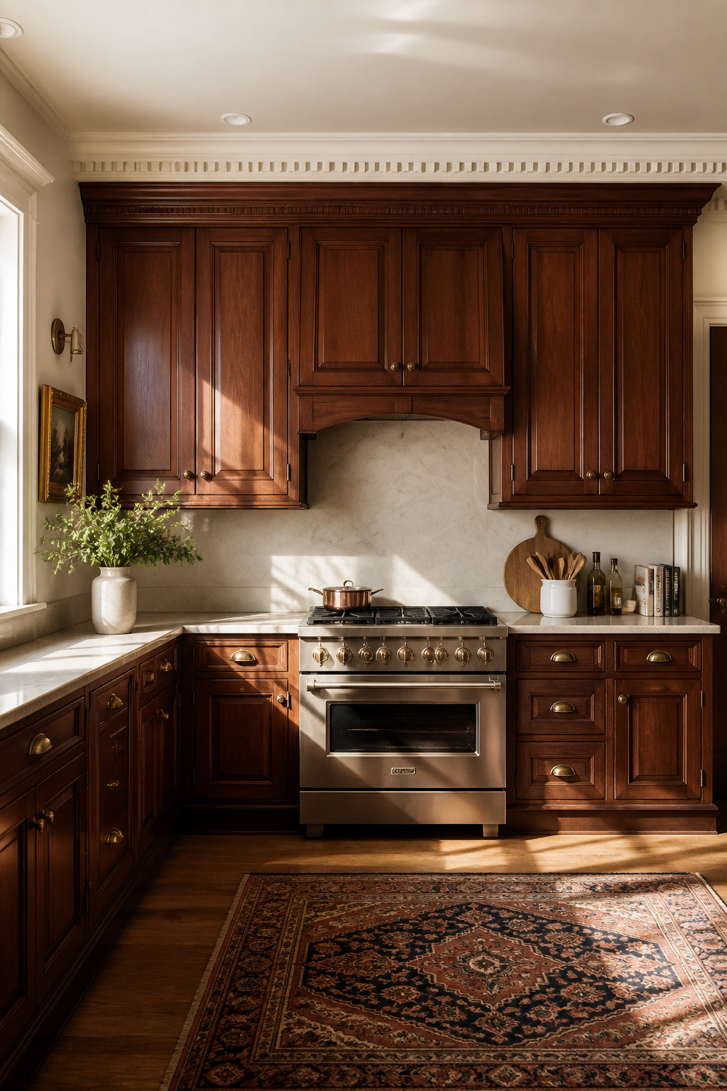
17. Dark Walnut Stain: Rich Traditional Cabinet Styles for Warming a Modern Space
Dark stained wood cabinets bring warmth and visual grounding to a kitchen in a way that painted cabinets, however beautifully coloured, cannot replicate. They reference Georgian mahogany furniture, Victorian oak, and the heavy-timbered kitchens of English manor houses — a visual connection that reads subconsciously as permanence and quality, even in entirely contemporary homes.
Choosing the Right Wood Species
American black walnut is the most prestigious domestic hardwood for cabinetry. Its natural colour — a rich chocolate brown even without staining — means a clear or lightly tinted finish is often more appropriate than a heavy dark stain. Cherry is the most amenable to dark staining because its fine, open grain structure accepts stain evenly without blotchiness. Its natural reddish undertone means dark stains warm to a mahogany-like depth that references Georgian furniture directly. Quarter-sawn white oak takes dark stain better than flat-sawn oak because the ray fleck pattern shows through even under dark stains. This creates a complex textured appearance — Varathane Dark Walnut is consistently recommended as the most reliable stain formula for quarter-sawn oak cabinetry.
In contemporary open-plan homes, dark lower cabinets anchor the kitchen zone visually and prevent the space from floating into the adjacent living area. The rule with these rich traditional cabinet styles is simple: light everything else. Use white or cream walls, light stone or marble countertops, and natural light-coloured flooring. Under-cabinet lighting is not optional here — it is essential. LED strip lighting under wall cabinets illuminates the countertop work surface that would otherwise sit in deep shadow. Also, brass hardware on dark stained wood is the correct material pairing. Chrome or stainless on dark stained wood creates an incongruous contrast that tends to date the design. Plan the under-cabinet lighting at design stage; retrofitting it after installation is possible but significantly more expensive.
18. Shaker Versus Raised Panel: Choosing the Right Traditional Cabinet Profile
Both Shaker and raised panel profiles have genuine traditional credentials — but they reference different traditions. Choosing between them requires clarity about which tradition your kitchen is actually serving.
The Shaker movement, founded in England and established in America in the 1780s, produced cabinetry characterised by extreme simplicity: no ornamentation, perfect proportions, exceptional craftsmanship concealed within plain surfaces. Shaker kitchen cabinets — a flat recessed center panel with square-edged rail and stile — are technically traditional. They reference a 240-year-old design tradition. But they are more minimalist than most formal traditional kitchens. They bridge traditional and contemporary, which explains their dominance in design media: they work in almost any setting. The practical advantage is significant too. Raised panel doors can cost up to twice the labour of comparable Shaker doors, and the recessed moulding profile collects grease and dust in a working kitchen.
Raised panel is the better choice in formally traditional kitchens — those with dentil crown moulding, pilasters, fluted corbels, and inset door construction. The profile complexity of the door needs to match the architectural complexity of the room. A formal kitchen fitted with raised panel doors and Shaker hardware reads as inconsistent. A formal kitchen with Shaker doors and ornate moulding reads as under-designed. The most interesting approach is mixing profiles within the same kitchen: raised panel on perimeter cabinets and Shaker on the island creates the impression of pieces acquired at different times — the visual quality the unfitted aesthetic pursues. The condition for success: consistent finish and hardware throughout. When the paint colour, hardware finish, and moulding details are unified, mixed door profiles read as intentional. When those elements also vary, the kitchen reads as unresolved.
How to Choose and Invest in Traditional Kitchen Cabinets That Last a Lifetime
The conversation about traditional kitchen cabinets inevitably becomes a conversation about budget. Genuine traditional quality has a cost, and understanding what that cost is buying clarifies the decision.
Stock cabinets (pre-manufactured in standard sizes, available off-the-shelf) offer traditional profiles at the lowest price point. They come with limited profile depth, wood species options, and finish quality, however. They are appropriate for a rental property or temporary residence. Semi-custom cabinets — manufactured to standard dimensions but with custom finish, wood species, and profile options — represent the sweet spot for most homeowners. Expect to pay 30 to 50% more than stock for a significantly better visual result. Fully custom cabinetry from a specialist maker delivers the authentic traditional quality that only handmade proportions and site-specific detailing can achieve. The budget difference is significant (typically 2 to 4 times semi-custom pricing), and so is the result.
The detail that separates a kitchen that looks traditional from one that truly is comes down to moulding profiles, hardware weight, and finish quality. The curve of a cove, the spacing of dentil blocks, the depth of a raised panel — these are the signatures of quality that a trained eye reads immediately and that honest photography captures without flattery. Hardware is the tactile test: hold a cup pull from Rejuvenation, House of Antique Hardware, or Nanz against a mass-market equivalent and the weight difference is unmistakable. The former is cast brass. The latter is hollow-stamped. This difference shows up every time a drawer is opened for the next 40 years. Traditional kitchen cabinets, done properly, are among the most lasting investments in a home — not because they are fashionable, but because they were never designed around fashion.