The kitchen is more than just a place to prepare meals—it’s the heart of your home where family gathers, conversations flow, and memories are made. And yet, so many of us overlook the transformative power of paint in this essential space. The right color choice can completely reinvent your kitchen without the hefty price tag of a full renovation.
Whether you’re looking to brighten a small space, add drama to a modern kitchen, or create a cozy farmhouse feel, paint offers endless possibilities at a fraction of the cost of other updates. From cabinets to walls, islands to trim, a thoughtful paint selection can breathe new life into tired spaces and highlight your kitchen’s best features.
In this guide, I’ll walk you through 22 kitchen paint inspirations that range from timeless classics to bold statements, each with practical insights on how to incorporate these ideas into your own home. You’ll discover how different colors can affect the mood and functionality of your kitchen, along with professional tips for selecting the perfect shade for your unique space.
Let’s explore how a simple can of paint can become your most powerful tool for kitchen transformation!
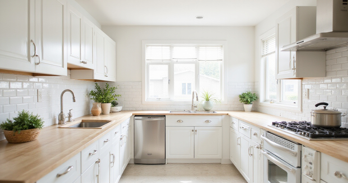
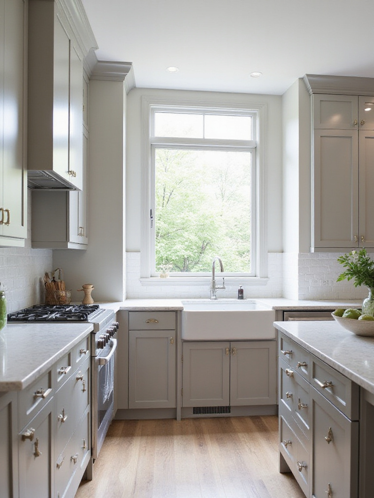
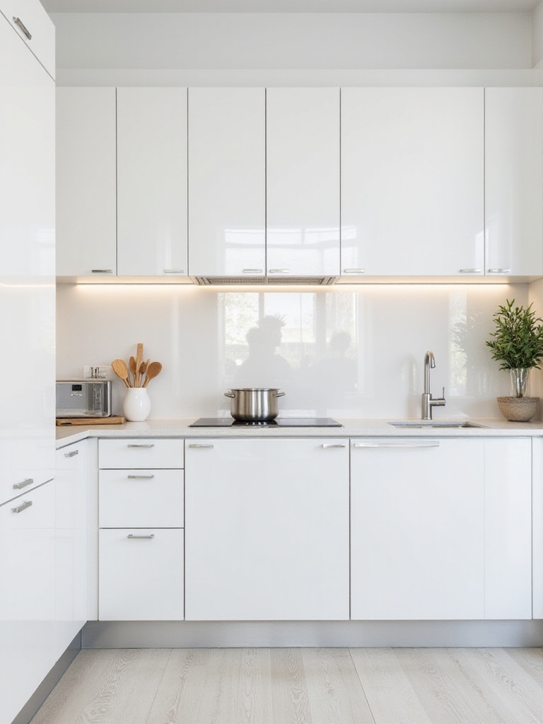
1. Timeless White: Classic and Bright Kitchen Palette
White kitchens never go out of style, and for good reason! The clean, bright canvas creates an instant feeling of spaciousness while reflecting light throughout the room. In smaller kitchens especially, white paint can work wonders to open up tight quarters and make the space feel airy and inviting.
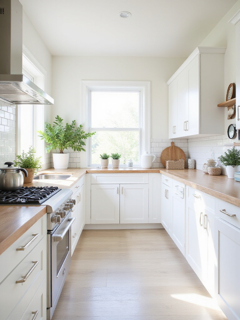
What I love about white is how it lets your other kitchen elements shine. Those gorgeous cabinet pulls, that stunning backsplash, or your collection of colorful cookware all pop against a white background. Plus, you can easily update the look with seasonal accessories without committing to a whole new paint job.
Here’s where it gets interesting – white doesn’t have to be boring! Try mixing different textures like shiplap walls, subway tile, and cabinets with varying sheens to create depth and visual interest while maintaining that clean, cohesive look.
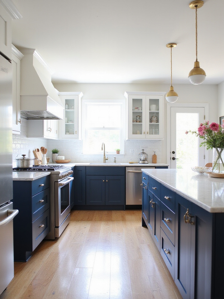
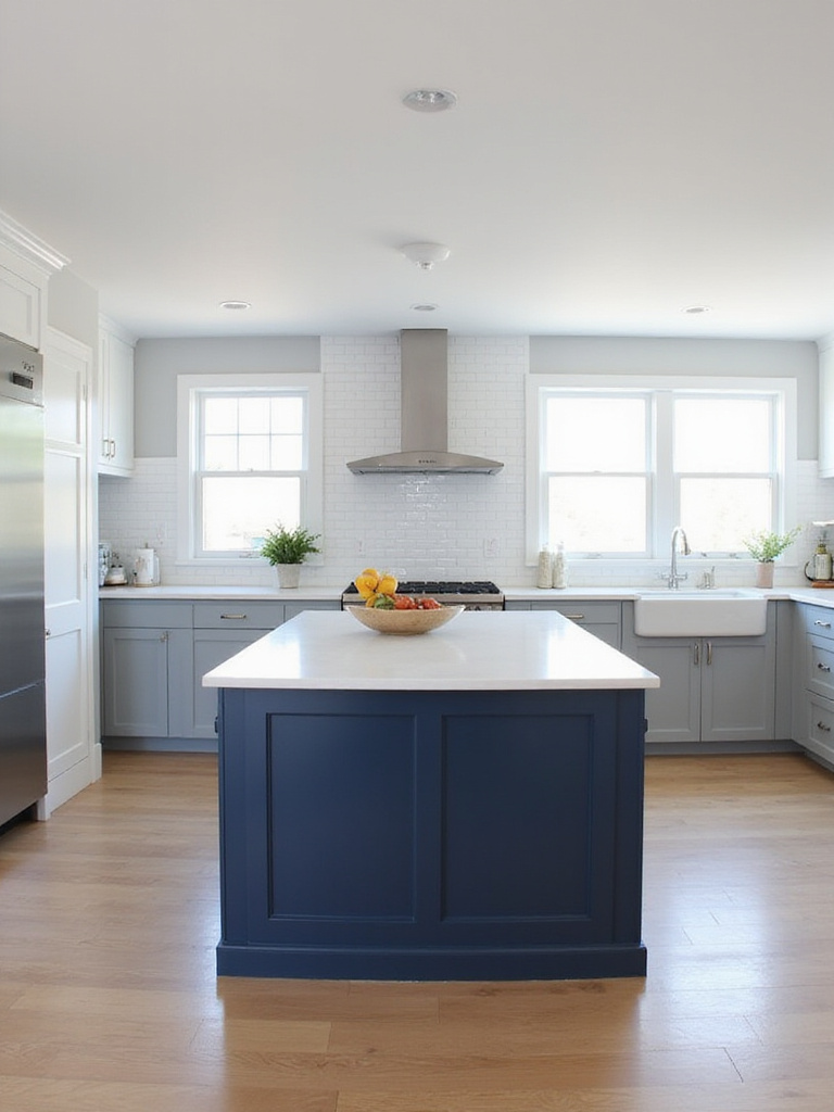
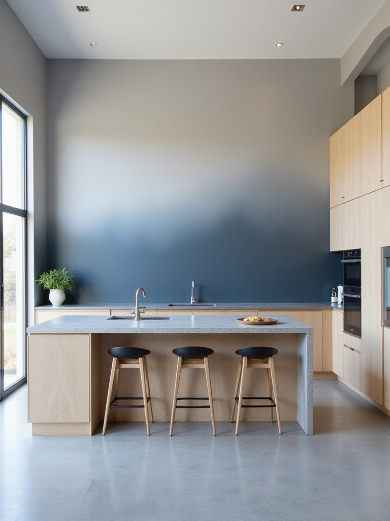
2. Bold Navy Blue: Sophistication and Depth
Navy blue has stolen my heart as a kitchen paint inspiration. This rich, deep hue instantly elevates any kitchen with a dose of drama and sophistication. I’ve seen it transform even the most basic spaces into magazine-worthy kitchens that feel both classic and current.
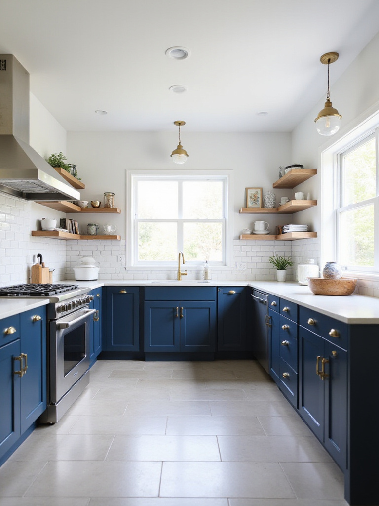
The magic of navy is in its practicality too. Unlike lighter colors that show every fingerprint and cooking splatter, navy blue graciously hides minor messes between cleanings. It creates beautiful contrast with white countertops or backsplashes, making those elements pop while grounding the overall design.
Let me paint you a picture… Imagine navy lower cabinets paired with white uppers, brass hardware gleaming against the deep blue backdrop. It’s a look that manages to feel both timeless and on-trend, giving your kitchen serious style points without going overboard.
3. Earthy Greens: Nature-Inspired Hues
I’ve watched countless clients fall in love with their kitchens again after introducing earthy green tones. These nature-inspired hues instantly create a sense of tranquility that’s so welcome in the heart of the home. Whether you choose a muted sage, a rich olive, or something in between, green connects us to the natural world in a way that feels both grounding and refreshing.
What makes green such a versatile kitchen paint inspiration is how beautifully it plays with other materials. It complements wood tones, makes stainless steel pop, and pairs gorgeously with both light and dark stone countertops. The versatility is incredible! Plus, green naturally promotes feelings of wellness and health – perfect for a space where you prepare nourishing meals.
The heart of the matter is that green kitchens feel alive. They bring the outdoors in and create a space that feels both trendy and timeless. If you’re hesitant about a full green kitchen, try painting just an accent wall or island to test the waters.
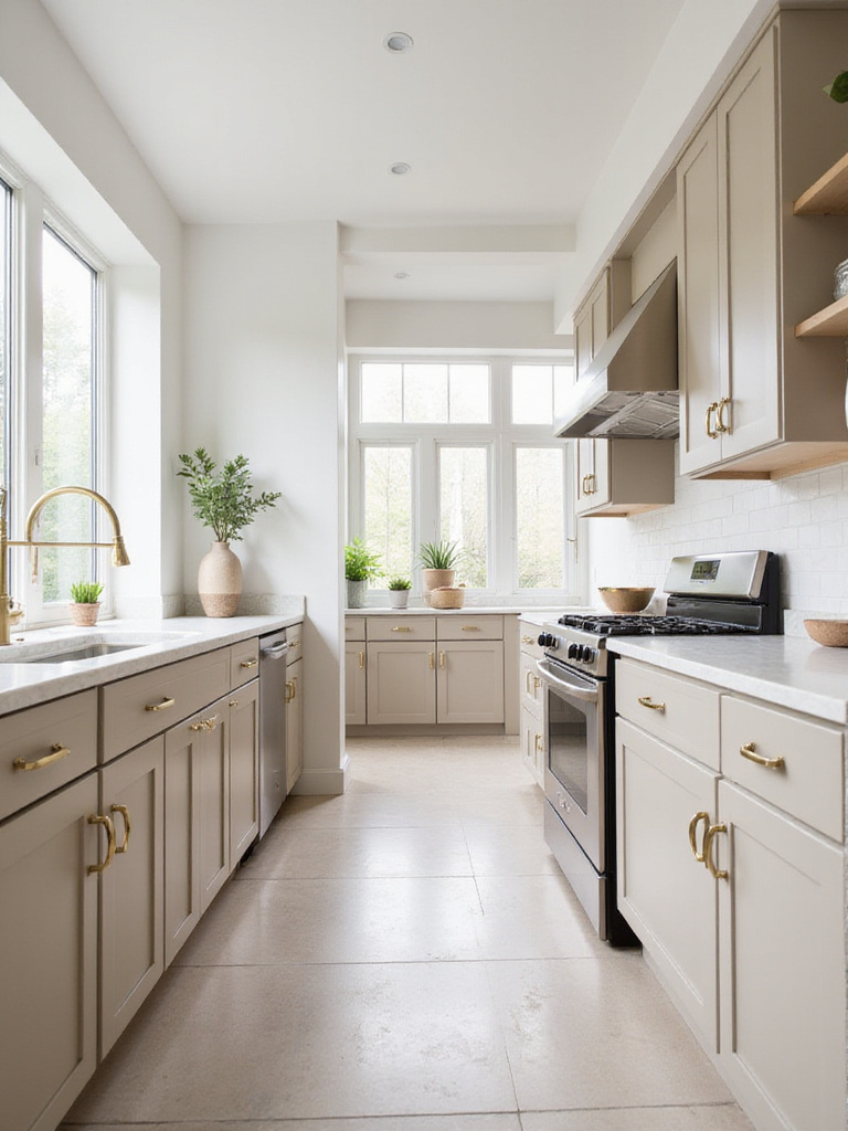
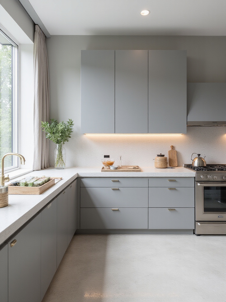
4. Warm Gray Tones: Modern and Versatile Ambiance
Warm gray is the chameleon of kitchen paint inspirations – it shifts and adapts beautifully to different lighting conditions and design elements. Unlike cool grays that can sometimes feel stark or industrial, warm grays have subtle undertones of beige, brown, or even purple that create a cozy yet sophisticated vibe.
I recommend warm gray for clients who want a modern look without the starkness of white or the commitment of a bold color. It’s incredibly forgiving on walls, disguising smudges and imperfections while providing a neutral backdrop that works with virtually any cabinet color, countertop material, or flooring choice.
What complicates this choice is finding the right warm gray for your space. The undertones can dramatically change how the color appears in different lighting. Always test several samples directly on your kitchen walls and observe them throughout the day before making your final decision.
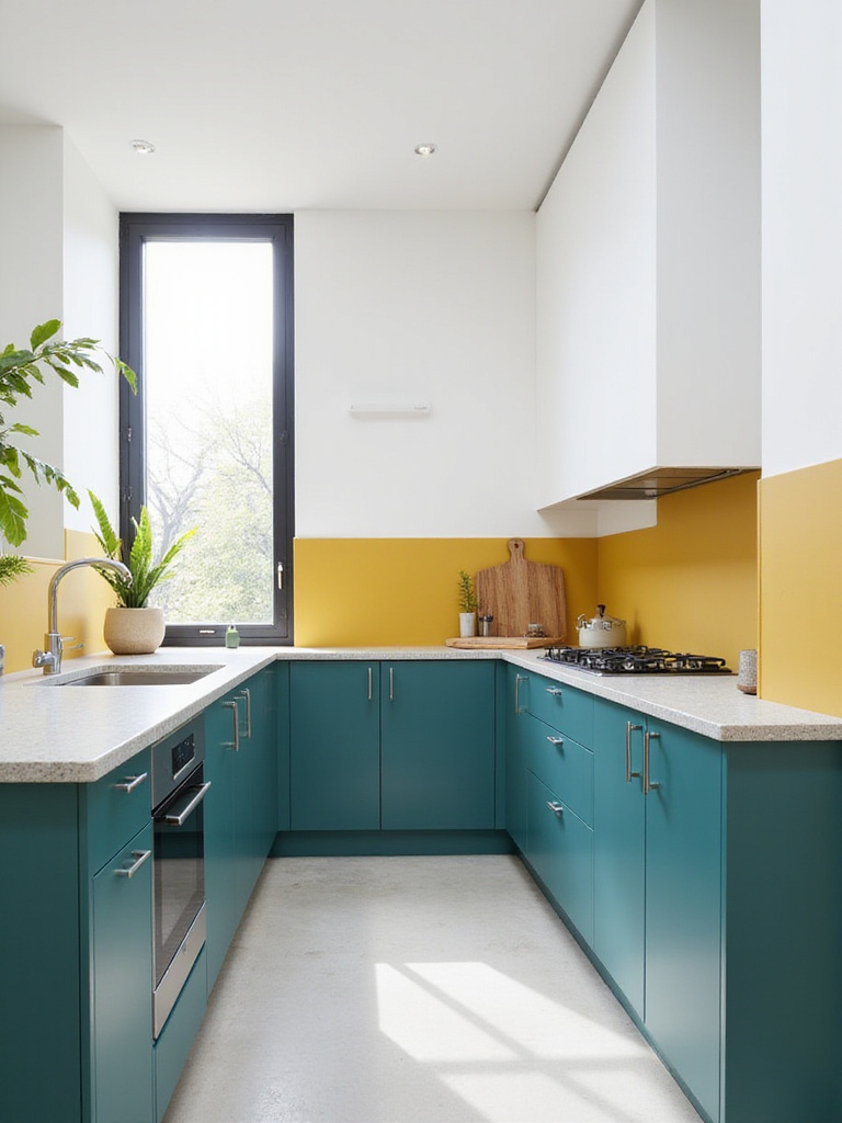
5. Sunny Yellow Accents: Energy and Cheerfulness
Yellow is like sunshine for your kitchen – it instantly boosts the mood and energy of the space! I’ve found that even small doses of yellow can transform a kitchen from bland to brilliant. The key is choosing the right shade – butter yellows and creamy tones create warmth without overwhelming the senses.
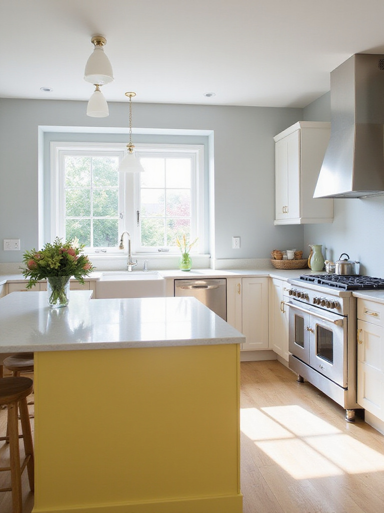
When working with yellow, consider using it strategically rather than covering every surface. A yellow island makes a joyful focal point, while yellow lower cabinets paired with white uppers creates balance and visual interest. Even a yellow backsplash or single accent wall can provide that perfect pop of happiness.
“Yellow is capable of charming God.” – Vincent Van Gogh
The game-changer happened as I worked with a client who was initially resistant to color. We painted just her kitchen island a soft buttercream yellow, and it completely transformed the space from forgettable to fabulous. Now it’s the first thing guests comment on when they visit!
6. Soft Pastel Shades: Gentle and Airy Retreat
Pastel kitchens have a special place in my heart. These gentle hues – soft blues, mint greens, blush pinks, lavender – create a kitchen that feels like a breath of fresh air. They’re subtle enough to live with long-term but still inject personality that plain white can’t deliver.
I’ve found pastels work beautifully in kitchens with lots of natural light, where they can really show their complexity and depth. They create a sense of tranquility that’s perfect for making your morning coffee or unwinding while preparing dinner after a hectic day. Plus, they’re forgiving of imperfections, which is always a bonus in a hard-working kitchen.
The tricky part is finding the right pastel that complements your existing elements. Before committing, look at your countertops, backsplash, and flooring. The undertones in these elements should harmonize with your chosen pastel to create a cohesive look that feels intentional rather than accidental.
7. Dramatic Black Cabinets: Bold and Unforgettable
Black cabinets make a statement that whispers luxury and confidence. They anchor a kitchen with sophisticated drama that feels both timeless and thoroughly modern. I’ve transformed countless kitchens with black cabinets, and the results never fail to impress.
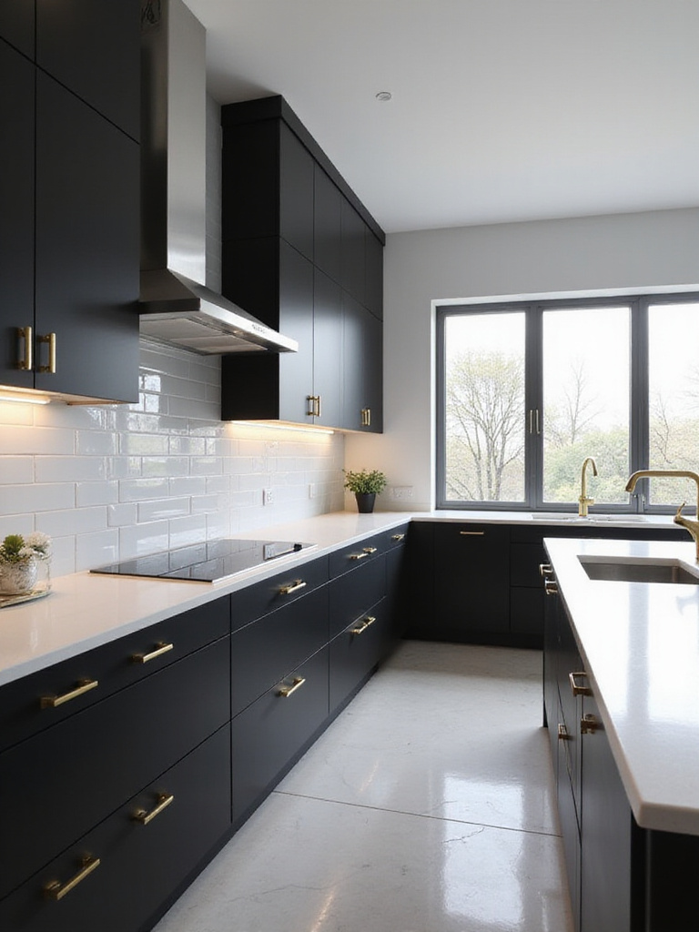
The surprising part is how practical black cabinets can be. They hide cooking splatters and fingerprints better than lighter colors, making them surprisingly low-maintenance for busy families. Black also creates a striking backdrop for hardware, making even simple knobs and pulls look like jewelry against the rich, dark surface.
My experience went like this: A client was terrified of going dark but trusted my vision for black lower cabinets with white uppers. When we finished, she couldn’t believe how much larger and more designed her kitchen looked. The contrast created depth while the black grounded the space perfectly. Now I recommend this approach frequently as a gateway to dramatic kitchen paint inspirations.
8. Two-Tone Cabinets: Visual Interest and Modern Flair
Two-tone cabinets are my go-to recommendation when clients want something more interesting than a single-color kitchen but aren’t ready for bold, all-over color. This approach instantly adds architectural interest and creates a custom, thoughtfully designed look that elevates the entire space.
The most successful two-tone kitchens follow a simple formula: lighter colors on top, darker colors on the bottom. This creates visual balance and prevents the kitchen from feeling top-heavy. Some winning combinations I’ve used include white uppers with navy lowers, cream uppers with sage green lowers, or light gray uppers with charcoal lowers.
- Light uppers/dark lowers: Creates balance and makes ceilings appear higher
- Contrasting island: Makes the island a focal point and conversation piece
- Same color family in different shades: Subtle sophistication with depth
- Complementary colors: Bold statement that still feels cohesive
You might be wondering if this trend will quickly date your kitchen. The beauty of two-tone cabinets is their flexibility – you can always repaint one section if you want a refresh without tackling the entire kitchen.
9. Chalkboard Paint Wall: Functionality and Fun
I absolutely love suggesting a chalkboard paint wall to families with kids or avid home cooks. This practical kitchen paint inspiration creates a dynamic surface that’s as functional as it is stylish. Imagine jotting down grocery lists, meal plans, or letting the kids doodle while you cook – all on a wall that also serves as a striking design element.
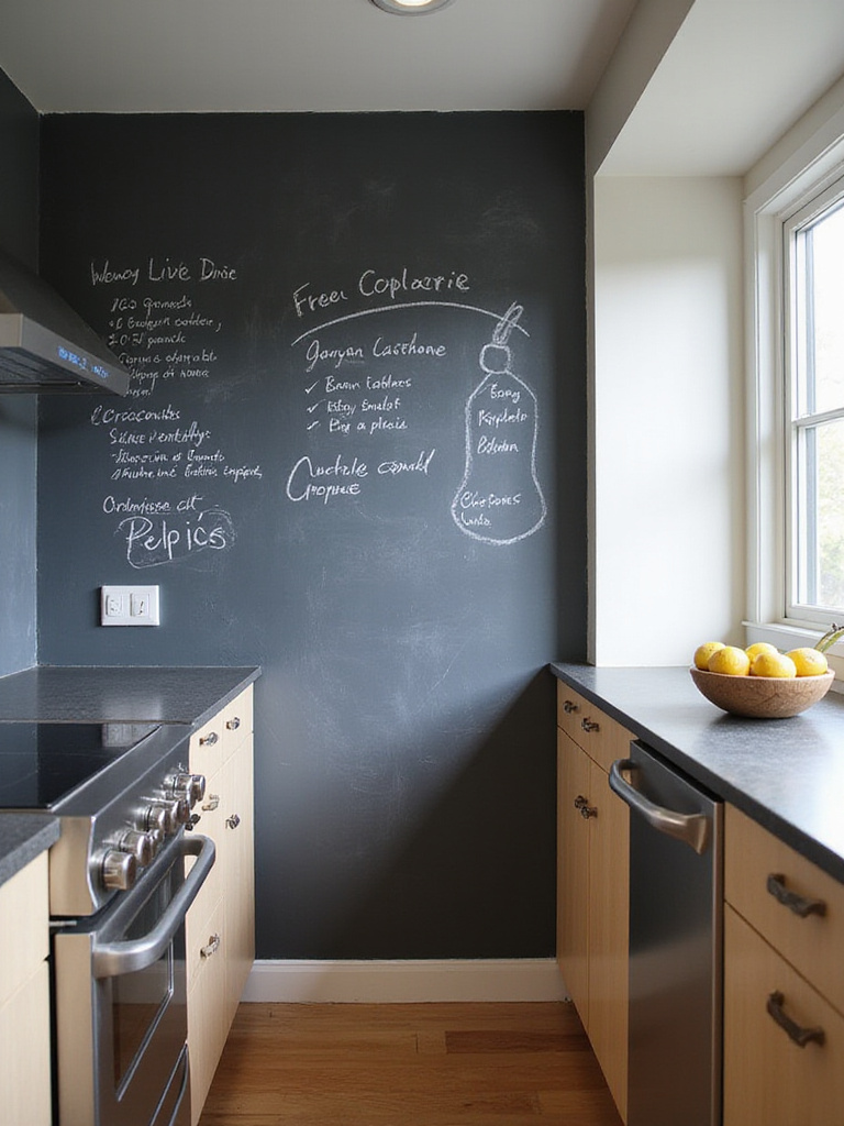
The best spot for a chalkboard wall is typically near the refrigerator or pantry, where it can serve as command central for your kitchen activities. I recommend using true chalkboard paint rather than regular dark paint for the best writing and erasing experience. And don’t worry about it looking too classroom-like – styled properly, it adds an industrial-chic vibe that works with many design aesthetics.
Picture it this way: A deep black or charcoal chalkboard wall paired with white cabinets and warm wood accents creates a modern farmhouse look that’s both practical and stylish. Add some vintage-inspired chalk holders and pretty script, and you’ve got a feature wall that earns its keep in both form and function.
10. Rustic Farmhouse Hues: Cozy Charm
Creamy whites, soft beiges, and warm taupes form the backbone of farmhouse kitchen paint inspirations. These gentle neutrals create a welcoming canvas that feels simultaneously fresh and lived-in – exactly the vibe that makes farmhouse style so enduringly popular.
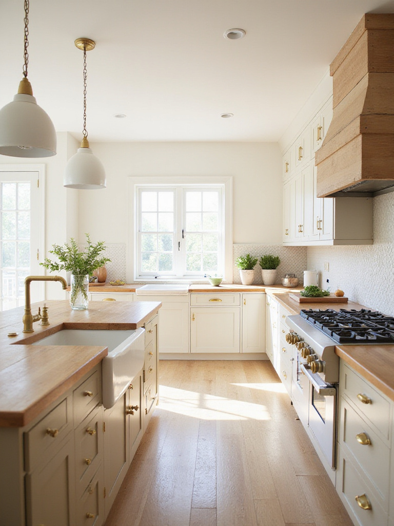
What makes these hues work so beautifully in farmhouse kitchens is their subtle warmth. Unlike stark whites, these creamier tones have yellow or pink undertones that complement natural materials like wood beams, butcher block countertops, and ceramic sinks. They create a soft glow that makes everyone want to gather in the kitchen.
Do you see how huge that is? These colors don’t just look good – they actually affect how people feel in your space. A kitchen painted in rustic farmhouse hues invites lingering conversations over coffee and creates the perfect backdrop for making memories. It’s about creating a feeling as much as a look.
11. Coastal Blues and Greens: Relaxing Seaside Vibe
There’s something instantly calming about walking into a kitchen painted in coastal blues and greens. These ocean-inspired kitchen paint inspirations transport you to breezy beach days and create a refreshing escape right in your home. I often recommend these hues for busy families who want their kitchen to feel like a retreat from hectic daily life.
The key to nailing the coastal look without veering into theme territory is choosing muted, slightly grayed versions of blue and green. Think weathered sea glass, faded beach umbrellas, and misty ocean horizons rather than bright tropical waters. These subdued tones create sophistication while still evoking that relaxed seaside feeling.
My breakthrough came when working with a stressed-out client in a landlocked state. By painting her kitchen cabinets a soft seafoam green and the walls a pale sky blue, we created a daily vacation spot that genuinely lowered her blood pressure. The transformation wasn’t just visual – it changed how she felt in her space.
12. Greige Perfection: Ultimate Neutral Blend
Greige – that perfect marriage of gray and beige – has become my secret weapon in kitchen design. This chameleon-like neutral adapts to different lighting conditions and complements virtually any accent color or material. It’s sophisticated without being cold, warm without being dated, and provides the perfect backdrop for both modern and traditional elements.
What I love about greige as a kitchen paint inspiration is its forgiveness. It hides imperfections better than pure gray or white while creating a more current look than traditional beige. It works beautifully with both cool and warm metal finishes, making it ideal for kitchens with mixed hardware or appliances in different finishes.
Let me show you another perspective: While white kitchens dominate design magazines, greige kitchens actually tend to photograph less impressively but live much better. They don’t show every smudge, they create a cozier atmosphere, and they provide more depth and interest than plain white. Sometimes the best choices aren’t the most photogenic but the most livable.
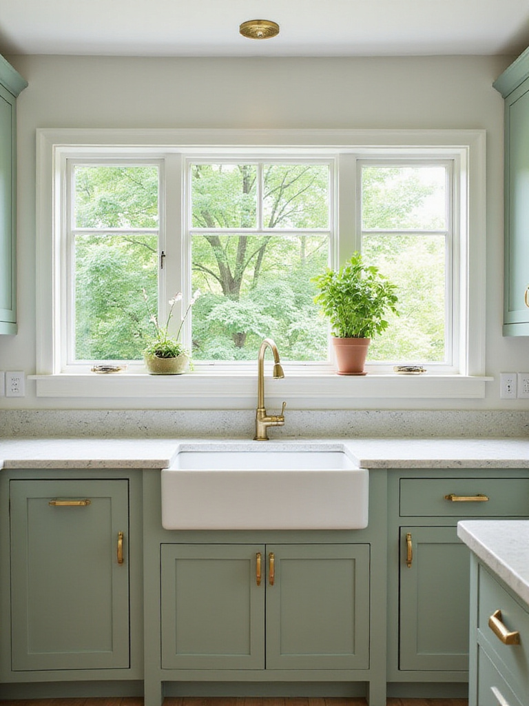
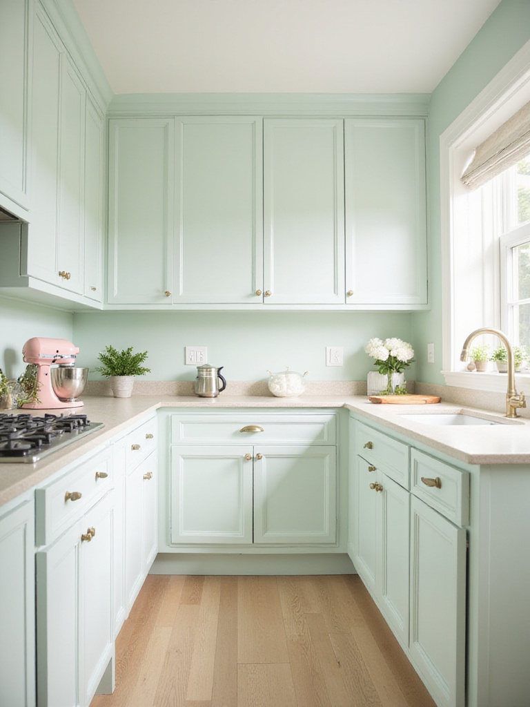
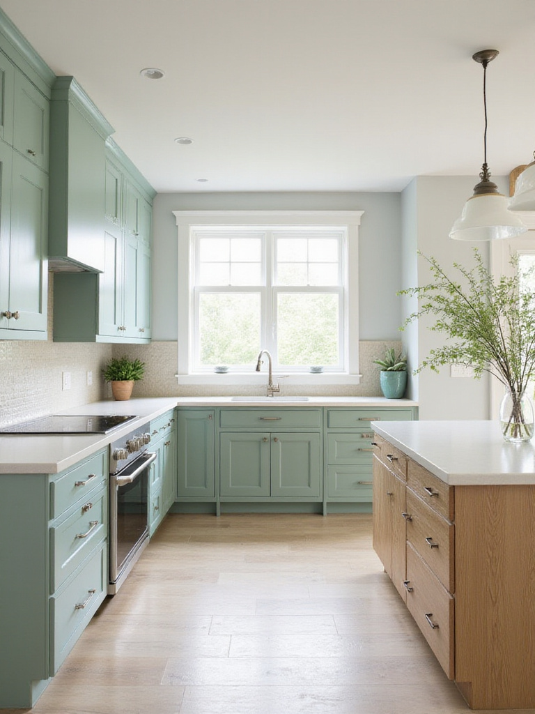
13. Sage Green Serenity: Calming and Organic
Sage green has stolen my heart as one of the most versatile kitchen paint inspirations. This muted, grayish green brings the tranquility of nature indoors while maintaining a sophisticated, timeless quality that won’t quickly date your kitchen. I’ve used it on cabinets, walls, and islands with consistently beautiful results.
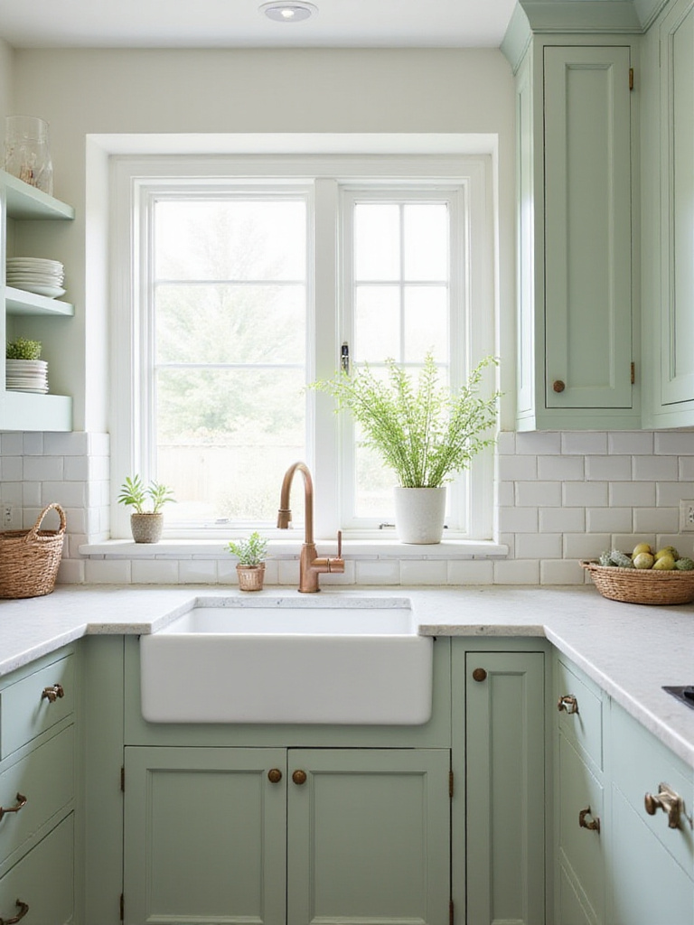
What makes sage green special is its chameleon-like quality. In north-facing kitchens, it reads cooler and more gray; in south-facing spaces, its warmth emerges. It pairs beautifully with natural wood tones, white marble, black accents, and brass or copper fixtures. This adaptability makes it perfect for kitchens that need to coordinate with open-concept living spaces.
The stumbling block is finding the perfect shade of sage. Too gray and it loses its organic quality; too yellow and it veers into avocado territory. I recommend testing several samples in your actual kitchen and observing them throughout the day before making your final choice. The perfect sage should feel fresh in morning light and cozy when evening comes.
14. Terracotta Warmth: Mediterranean Flair
Terracotta brings the sun-baked warmth of Mediterranean climates straight into your kitchen. These earthy reddish-brown tones create an instant sense of hospitality and warmth that makes everyone want to gather around your table. As a kitchen paint inspiration, terracotta connects us to culinary traditions and creates spaces that feel authentically lived-in.
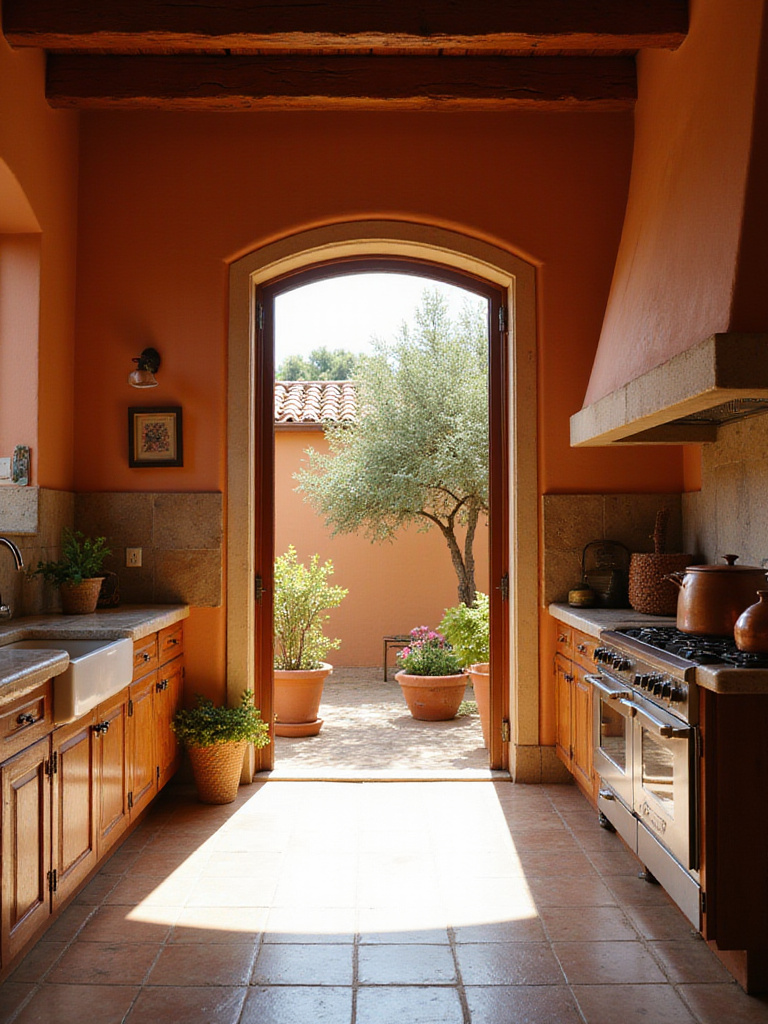
I find terracotta particularly effective in kitchens that lack natural light or face north. The warm undertones counteract cool lighting and inject warmth that makes the space feel cozy rather than cold. It pairs beautifully with natural materials like wood, stone, and handmade tiles, creating a kitchen with soul and character.
It’s similar to adding a sunset to your kitchen walls – that golden-hour glow that makes everything and everyone look more beautiful. If you’re hesitant about going all-in with terracotta, try using it as an accent color on a single wall or painted furniture piece to add warmth without overwhelming the space.
15. Metallic Accents: Touch of Glamour
Metallic paint accents add unexpected luxury to kitchen spaces. I’m not talking about painting entire walls gold (though I’ve seen it done beautifully!) – rather, strategic touches of metallic paint that catch the light and add dimension to your kitchen. Think cabinet interiors that flash gold when opened, a silver-leafed range hood, or copper-toned ceiling medallions above pendant lights.
The key to successful metallic kitchen paint inspirations is restraint. Use these special finishes as jewelry for your kitchen – accent pieces that complement rather than dominate. Too much metallic can quickly veer into gaudy territory, but thoughtful applications create sophisticated drama that elevates the entire space.
- Ceiling medallions or coffers highlighted with metallic paint
- Inside of glass-front cabinets painted in soft gold or copper
- Range hood treated as a statement piece with silver leaf
- Metallic paint on the back of open shelving for subtle shimmer
The ripple effects are enormous when you add even small touches of metallic paint. These reflective surfaces bounce light around the room, adding brightness and creating visual interest that changes throughout the day as natural light shifts.
16. Color Blocking Walls: Striking Visual Impact
Color blocking has moved from fashion to kitchen paint inspirations, and I’m here for it! This technique uses two or more colors in geometric arrangements to create architectural interest even in the most basic spaces. It’s a budget-friendly way to add major visual impact without changing your actual kitchen layout.
My favorite approach is using color blocking to define functional zones within the kitchen. For example, painting the cooking area in one color and the dining or prep area in another creates natural delineation in open concept spaces. You can also use color blocking to highlight architectural features or create them where none exist.
The breakthrough came when I helped a client with a plain, builder-grade kitchen transform it through color blocking. We painted the lower third of the walls in a deep teal and kept the upper portion light gray. The result looked intentional and custom, even though we hadn’t changed a single cabinet or countertop. That’s the power of strategic paint choices!
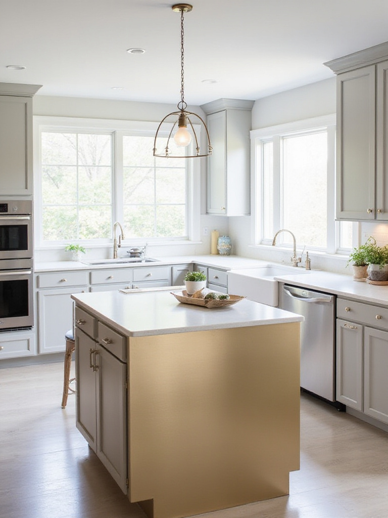
17. Accent Island Pop: Contrasting Paint Color
Kitchen islands are the perfect canvas for bold kitchen paint inspirations! As standalone pieces, they can wear a color that might be overwhelming on all your cabinets but makes a perfect statement in smaller doses. I’ve painted islands everything from cobalt blue to emerald green to bright coral, depending on the client’s personality and the kitchen’s overall design.
The contrast between island and perimeter cabinets creates a layered, collected look that feels more custom and less cookie-cutter than matching everything. It also allows you to introduce trendy colors without committing to them throughout the entire kitchen – much easier to repaint an island when trends change than to tackle all your cabinetry.
You may have noticed that painted islands have become almost standard in new kitchen designs. That’s because designers have discovered what I’ve long known – this simple technique adds tremendous value visually while requiring relatively little investment. It’s one of the highest-impact changes you can make with a single can of paint.
18. Matte Finish Magic: Modern and Non-Reflective
The shift toward matte finishes represents one of my favorite trends in kitchen paint inspirations. These velvety, non-reflective surfaces create a sophisticated, modern look that feels both current and timeless. Matte paint absorbs light rather than reflecting it, creating depth and richness that glossier finishes can’t match.
What many people overlook is how forgiving matte finishes can be in a busy kitchen. Unlike high-gloss surfaces that highlight every imperfection, matte finishes minimize the appearance of wall texture issues, cabinet dents, and other small flaws. They create a soft, uniform look that’s especially beautiful in natural light.
Things took an interesting turn when paint manufacturers developed washable matte formulations specifically for high-traffic areas like kitchens. These technological advances addressed the primary drawback of traditional matte paint – difficulty cleaning – while preserving the aesthetic benefits. Now you can enjoy the luxurious look of matte without sacrificing practicality.
19. High-Gloss Shine: Reflective and Luxurious
There’s nothing quite like the mirror-like finish of high-gloss paint to make a kitchen feel luxurious and light-filled. I love recommending high-gloss for smaller kitchens or spaces with limited natural light because the reflective surface bounces light around the room, creating an airier, more expansive feel.
The practical benefits of high-gloss finishes in kitchens shouldn’t be overlooked either. These surfaces are incredibly easy to clean – just a quick wipe with a damp cloth removes most cooking splatters and fingerprints. For busy households, this durability makes high-gloss an excellent choice for cabinets especially.
My discovery began when I used high-gloss navy on lower cabinets in a tiny galley kitchen. The client was worried dark color would make the space feel smaller, but the glossy finish actually expanded the visual space by reflecting light from the window opposite. It transformed what had been a dark corridor into a jewel box of a kitchen.
20. Ombre Effect Walls: Gradient Color Transition
Ombre walls bring artistic flair to kitchen paint inspirations. This gradient effect, where one color gradually transitions into another, creates visual movement and unexpected depth that plain painted walls simply can’t match. I’ve used this technique to make low ceilings appear higher, narrow spaces feel wider, and basic kitchens look custom.
Creating an ombre effect does require some technique, but it’s absolutely achievable for DIYers willing to invest a little time. The key is working while the paint is still wet and using a paint extender to slow drying time, allowing colors to blend seamlessly. The result is a watercolor-like effect that’s both subtle and striking.
Let that sink in for a moment… With just paint and some basic techniques, you can create a custom wall treatment that looks like it required a professional artist. It’s one of those kitchen paint inspirations that makes visitors ask, “Who did that for you?” – and you get to proudly say you did it yourself!
21. Consider the Trim: Baseboards, Door Frames, and Casings
Trim is the unsung hero of kitchen paint inspirations. While everyone focuses on wall and cabinet colors, the baseboards, door frames, and window casings quietly define the space and frame your color choices. I always encourage clients to give trim thoughtful consideration rather than defaulting to basic white.
Contrasting trim creates architectural definition and visual interest. White trim against colored walls is classic, but don’t be afraid to reverse it with white walls and colored trim for an unexpected twist. Black trim creates dramatic definition that works beautifully in modern spaces, while trim painted the same color as walls creates a seamless, sophisticated look that can make ceilings appear higher.
You might be wondering if colored trim will make your kitchen feel smaller or busier. In my experience, thoughtfully chosen trim colors actually create more cohesion and intentionality. The key is considering your trim as an integral part of your color scheme rather than an afterthought.
22. Test Paint Samples: Try Colors in Your Kitchen’s Lighting
My breakthrough moment as a designer came when I realized just how dramatically lighting affects paint colors. Now I never let clients choose kitchen paint inspirations without testing samples in their actual space. What looks perfect in a store, online, or even in your neighbor’s kitchen can look completely different under your specific lighting conditions.
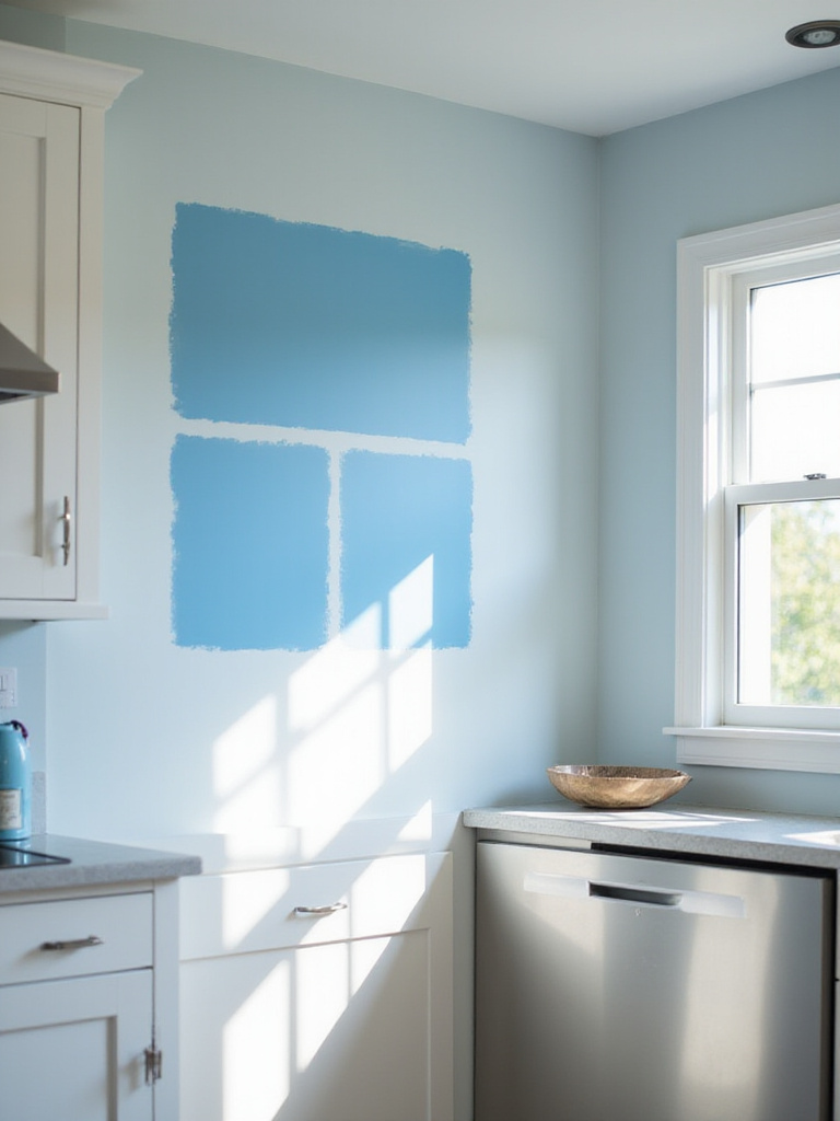
Paint colors have undertones that aren’t always obvious until they’re on your walls. A white that looks crisp and clean in the store might read yellow in your north-facing kitchen. That perfect greige might suddenly look purple when your LED under-cabinet lighting hits it. Testing eliminates these surprises and ensures you’ll love the final result.
- Paint large swatches (at least 2’x2′) on different walls
- View samples at different times of day
- Look at them under both natural and artificial light
- Observe how they interact with your cabinets, countertops, and flooring
- Live with them for at least 48 hours before deciding
This changes everything, doesn’t it? Taking this extra step before committing to kitchen paint inspirations can save you from expensive mistakes and disappointment. The perfect color for your kitchen isn’t necessarily the one that looks best on a tiny paint chip – it’s the one that looks beautiful in your unique space, under your specific lighting conditions.
Bringing It All Together
Kitchen paint inspirations are more than just color choices – they’re about creating a space that reflects your personality while supporting how you live and cook. Whether you’re drawn to the timeless appeal of white, the dramatic impact of navy, or the organic warmth of sage green, paint offers the most affordable way to transform your kitchen.
Remember that the perfect kitchen color should make you happy every time you walk into the space. It should complement your existing elements, work with your lighting conditions, and create the mood you want for this hardworking heart of your home. Take your time with samples, consider how colors make you feel, and don’t be afraid to trust your instincts.
The most successful kitchen paint projects start with inspiration but end with personalization. Use these ideas as jumping-off points, then make them your own. Your perfect kitchen color is out there – grab a brush and bring it to life!