Many homeowners believe that designing a space using minimalist bedroom ideas is simple. They often assume it just involves removing décor or choosing cheap, basic furniture. Consequently, this design style is frequently dismissed as cold, sterile, or merely a budget option. However, viewing a space through an architectural lens reveals a different reality. True minimalism is not about absence; rather, it is about rigorous precision.
Indeed, the famous maxim “less is more” by Ludwig Mies van der Rohe signifies clarity, not cheapness. Therefore, achieving a calm visual field actually requires an “economy of means” using exacting materials. Without ornamentation to hide structural flaws, every joint must be flawless. Thus, the “effortless” look is actually the result of intense, hidden effort.
This design philosophy applies specifically to the engineering of human rest. For instance, reducing visual noise lowers the brain’s cognitive load to help alleviate anxiety. This directly impacts how a minimalist bedroom can improve your sleep. Furthermore, the physical space relies on complex mechanical engineering hidden from sight. We will examine how push-to-open hardware creates seamless, monolithic surfaces. This guide explores why an unadorned room requires the highest level of design. Ultimately, you will discover why true simplicity often costs more in thought and craftsmanship.
The Myth: Most homeowners believe minimalism means white walls and an empty room.
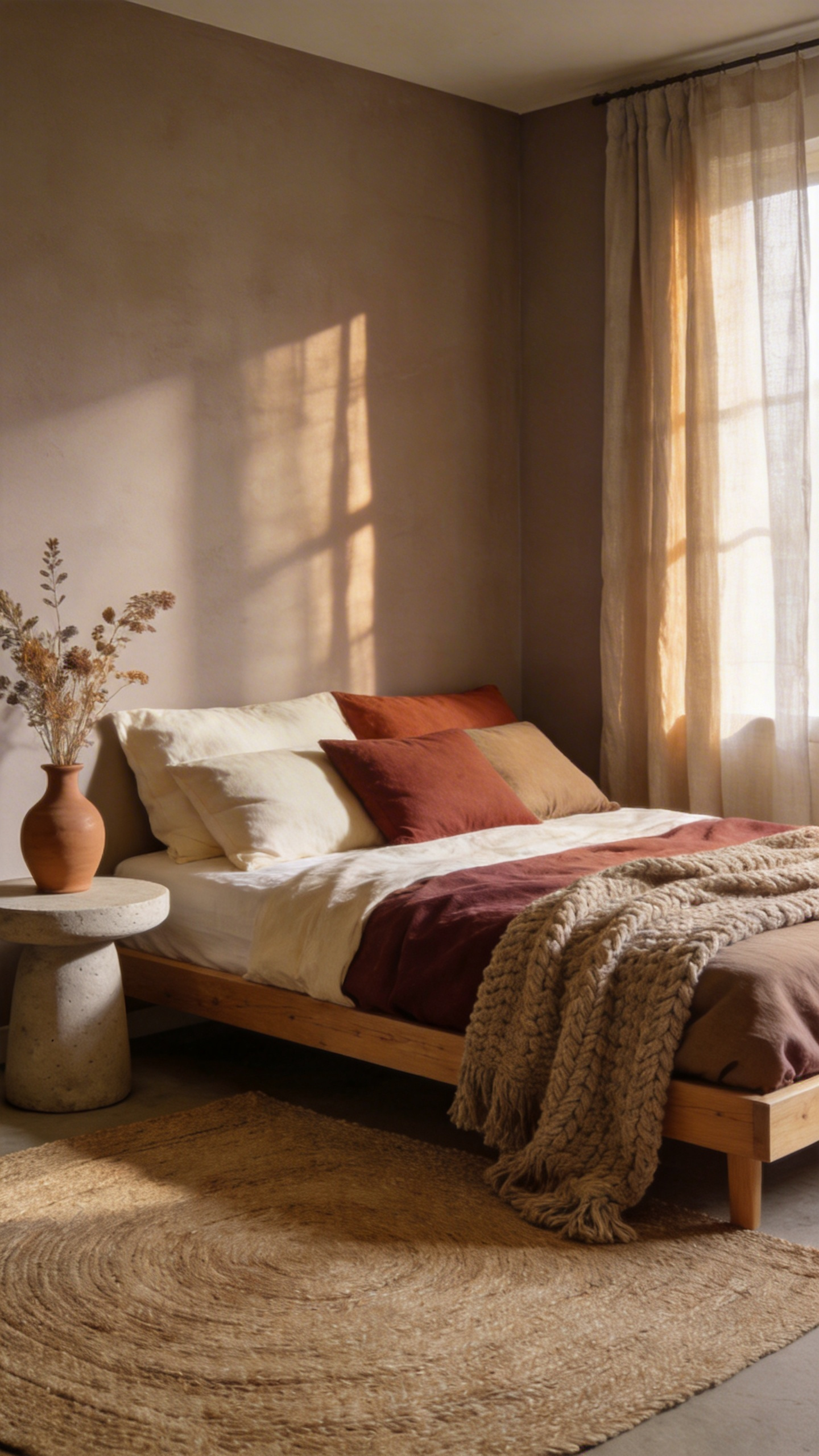
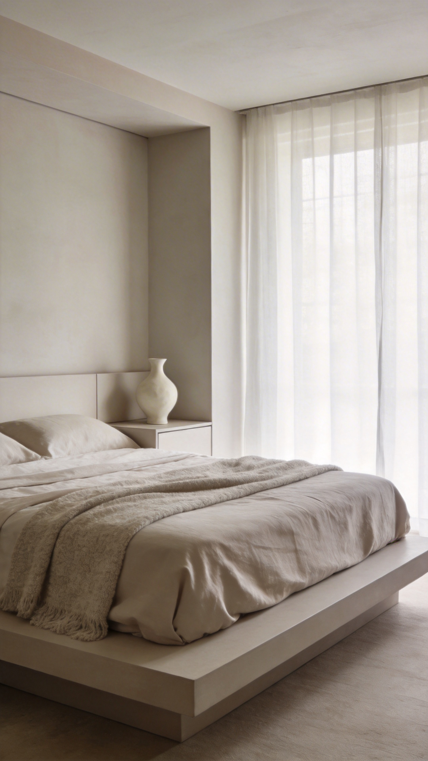
Historically, minimalism conjured images of stark, clinical aesthetics from the mid-20th century. Specifically, people imagine blinding white walls and empty, soulless spaces. However, the contemporary reality of bedroom design is far more inviting. In fact, the movement has pivoted dramatically toward “Warm Minimalism.” Instead of sterility, designers now embrace soft, earthy tones like taupe and cream. Consequently, these colors evoke tranquility rather than boredom.
Furthermore, true minimalism is not about deprivation. Rather, it centers on intentionality. Philosophically, the goal is to curate items that strictly support rest. Therefore, empty space is not a lack of furniture. It is actually *Ma*, a Japanese concept referring to the meaningful void between objects. This negative space allows specific pieces, like a sculptural chair, to breathe.
To avoid a flat look, texture replaces clutter. Specifically, visual interest comes from materiality. For example, layering rough linen against smooth walnut creates sensory depth. Thus, the room feels rich without adding distinct “stuff.” Finally, lighting acts as functional art, highlighting these organic forms.
The Reality: True minimalism is the rigorous application of space optimization and intentionality.
Through my lens, I often see homes that look minimalist but feel hollow. However, true minimalism is not merely a trend. Rather, it is the rigorous application of intentionality. Specifically, it distinguishes itself from “Aesthetic Minimalism,” which prioritizes pristine surfaces over living. Conversely, “Lifestyle Minimalism” operates on a strict functional framework. Therefore, the primary goal is removing “visual noise” that distracts from the room’s purpose.
This rigor draws heavily from the Japanese concept of *Danshari*. Essentially, this practice elevates decluttering into three mental stages. First, refuse what is unnecessary. Next, dispose of what weighs you down. Finally, separate from the attachment to desire. Additionally, true optimization relies on the “meaningful void.” In design terms, this empty space allows objects to “breathe.”
Architecturally, this aligns with the Bauhaus principle that “form follows function.” Consequently, every object must serve a practical purpose. If it lacks utility, it is clutter regardless of its beauty. Therefore, we rely on engineering hidden utility to achieve visual simplicity. For example, floor-to-ceiling built-ins utilize the full vertical plane. Furthermore, “Material Honesty” eliminates the need for decoration. Instead, the inherent texture of wood provides the necessary depth.
Phase 1: Architectural Foundations & Spatial Planning
True minimalism extends far beyond tidiness. Instead, it treats space and light as primary architectural materials. Specifically, this approach relies on negative space, often called *Ma*. For those interested in creating a minimalist bedroom, this “visual silence” allows the mind to rest. To achieve this, try pulling furniture away from the perimeter. This simple move creates “breathing room.” Therefore, the room feels like an expansive canvas rather than a box.
However, visible clutter quickly threatens this clean plane. The most effective solution is integrated storage. Specifically, utilize floor-to-ceiling, flush-mount cabinetry. By finishing these units in the same material as the walls, they disappear. As a result, you create a “hidden architecture” where function remains invisible. Thus, the structure itself maintains a sense of calm order.
Finally, you must refine the sensory experience of light. Avoid using flat, uniform wash lighting. Instead, employ “grazing” techniques to highlight texture. For example, position concealed LEDs close to slat wood or stone surfaces. This acute angle creates depth through shadow. Additionally, strictly prioritize warm color temperatures between 2700K and 3000K. Ultimately, this amber glow signals the brain that it is time to sleep.
1. Mastering Negative Space: Viewing Empty Floor Areas as Active Design Elements
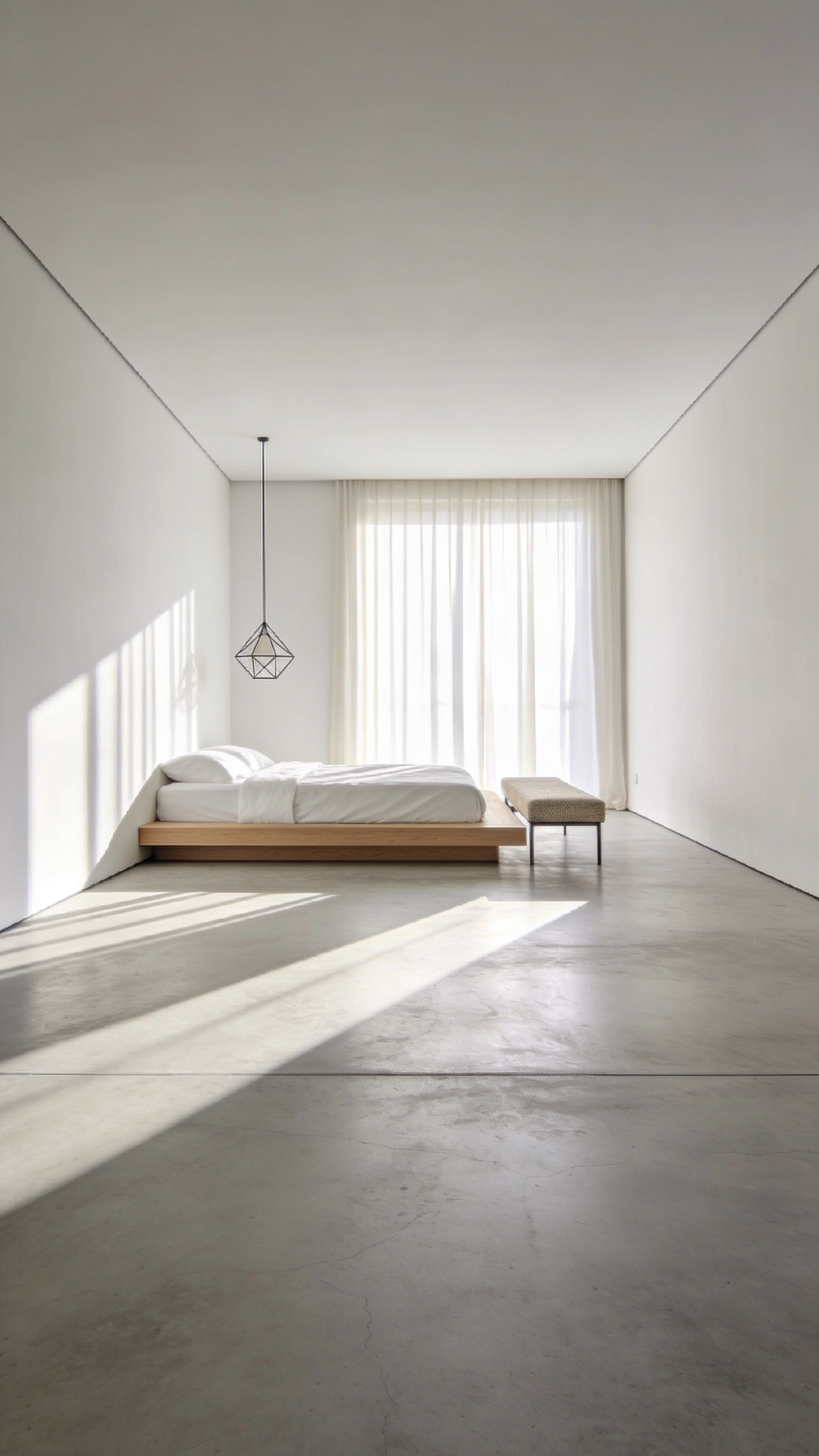
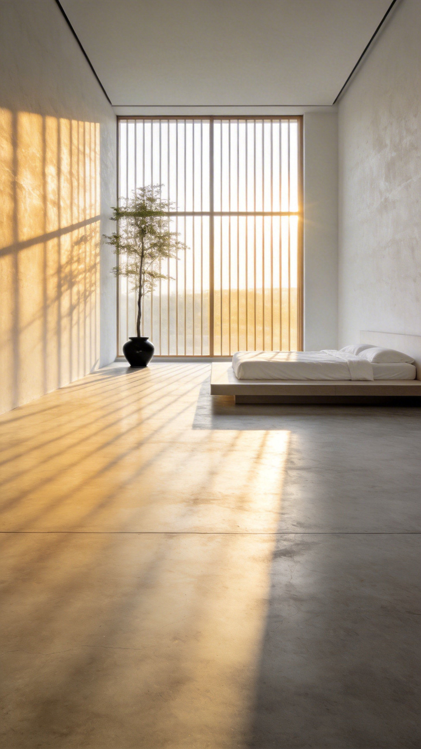
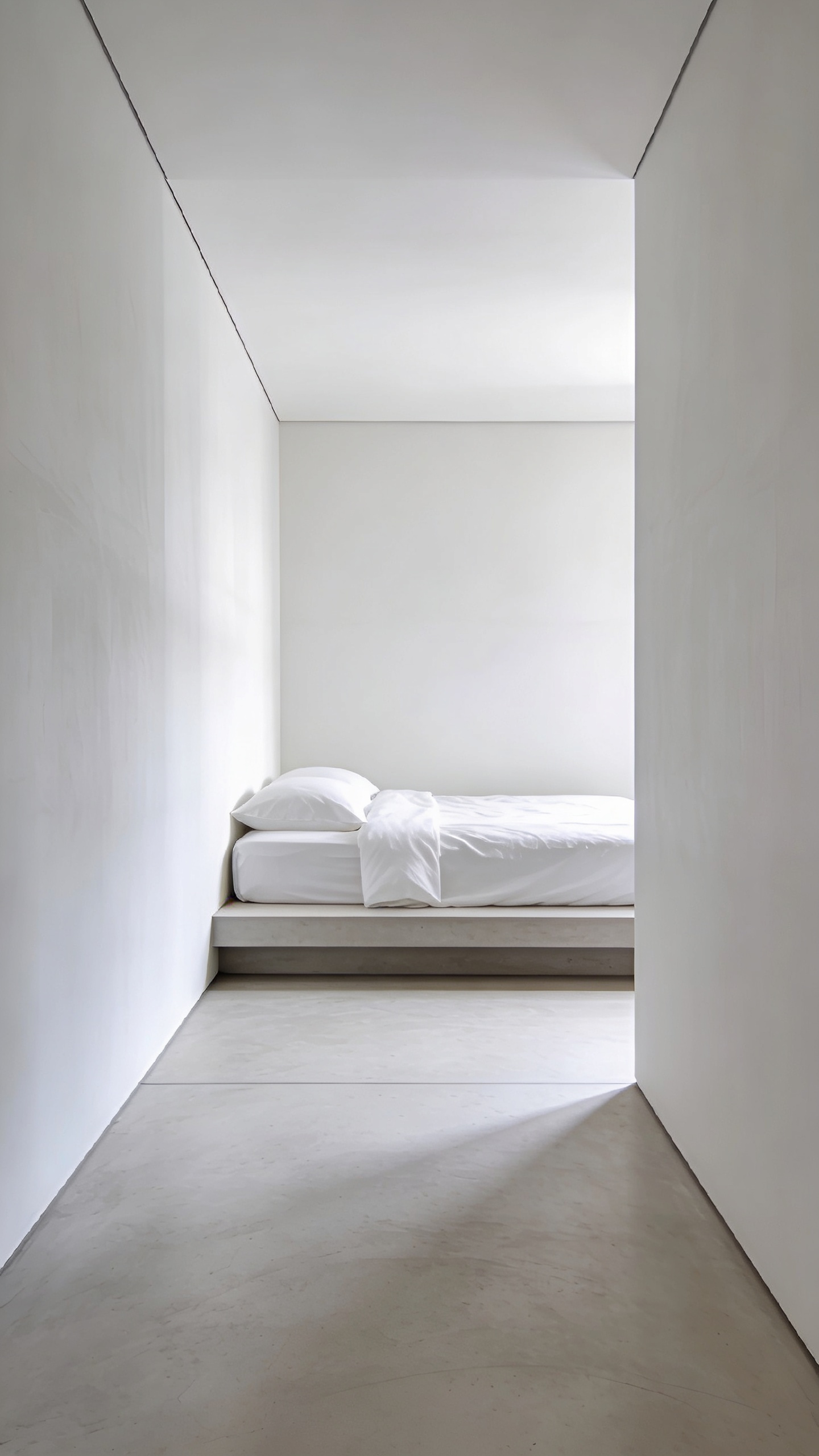
In architectural photography, negative space defines the composition. Similarly, empty floor areas are not wasted square footage. Instead, they are active ingredients in the room’s atmosphere. This approach mirrors the Japanese principle of *Ma*. Specifically, this concept treats emptiness as a dynamic “pause” rather than a void. Consequently, the floor becomes a stage for light and shadow.
Beyond aesthetics, this openness serves a psychological purpose. In fact, large expanses of flooring act as a “visual deep breath.” Research suggests that excessive visual stimuli increase cognitive load. Therefore, eliminating floor clutter directly soothes the mind. The brain is no longer forced to categorize scattered objects.
Furthermore, negative space creates a clear visual hierarchy. By isolating a bed or chair, you transform furniture into sculpture. The empty area directs the eye to these essential pieces. Ultimately, this emptiness communicates a sense of high-end luxury. It signals a confident choice to prioritize flow over storage. Thus, the room feels deliberate and undeniably serene.
2. The Monochromatic Palette: Using Tonal Variance Instead of High Contrast
Ideally, a minimalist bedroom offers a sanctuary from chaos. Therefore, the design must minimize visual noise to reduce cognitive load. Instead of relying on jarring high-contrast schemes, effective minimalism utilizes tonal variance. This approach substitutes the drama of contrast for the restorative flow of gradation.
Specifically, this often involves a technique known as the “color bath.” Here, ceilings and trim are painted in lighter tints of the wall’s main undertone. Consequently, the occupant feels encompassed by a unified atmosphere. However, a single color can easily feel flat. Thus, success relies on orchestrating the “triad of value.” By layering tints and shades, you create visual highs and lows. Much like music, these subtle shifts add depth.
Since color contrast is absent, texture must serve as the differentiator. In fact, texture becomes a tactile counterpoint. For example, place a raw wooden table against a matte wall. Similarly, layer a chunky wool throw over lightweight linen. Ultimately, natural light interacts with these surfaces to “sculpt” the room. Through this interplay, the space gains emotional resonance without bold colors.
3. Visual Weight Reduction: Choosing Low-Profile Furniture to Maximize Vertical Volume
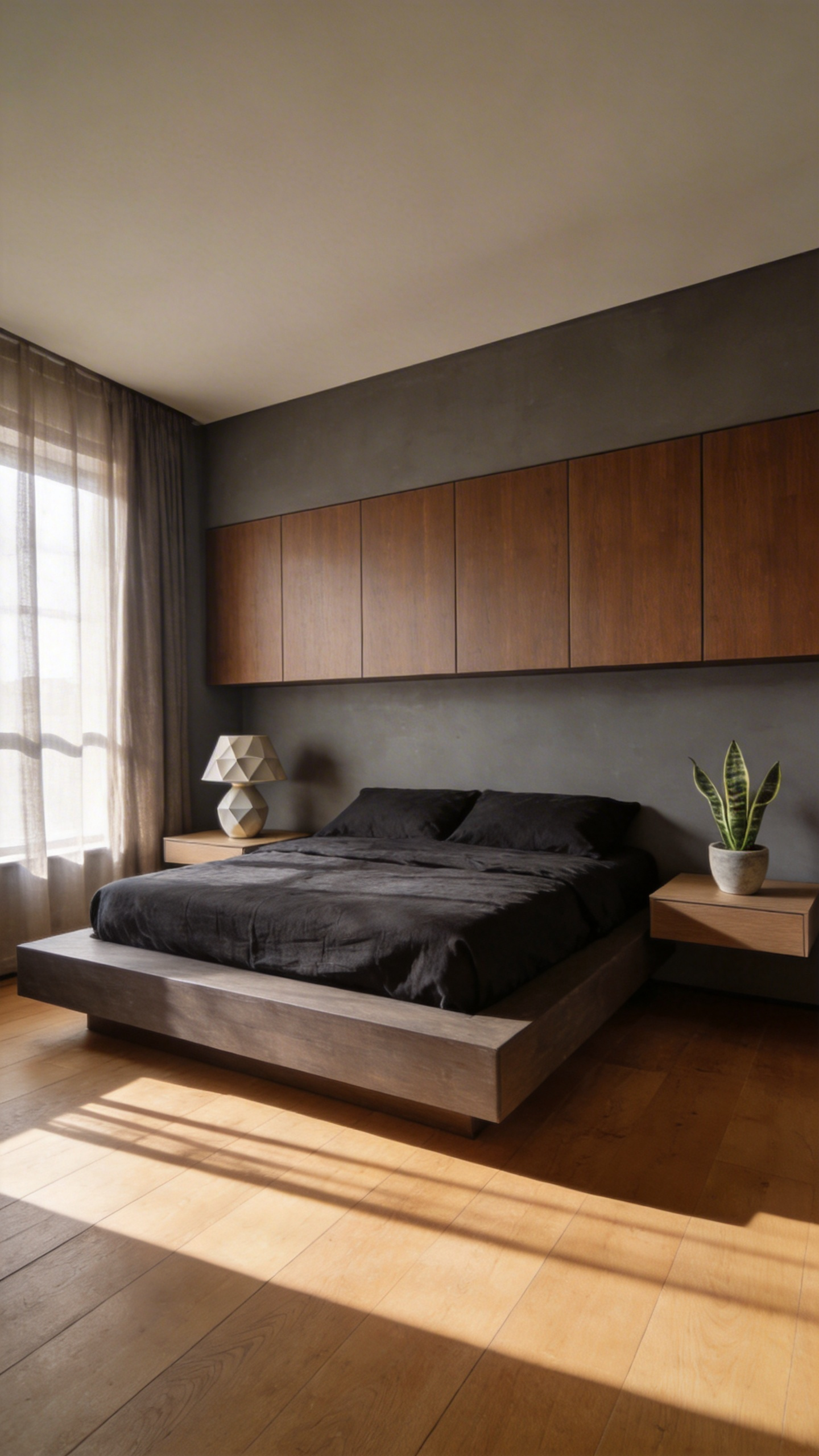
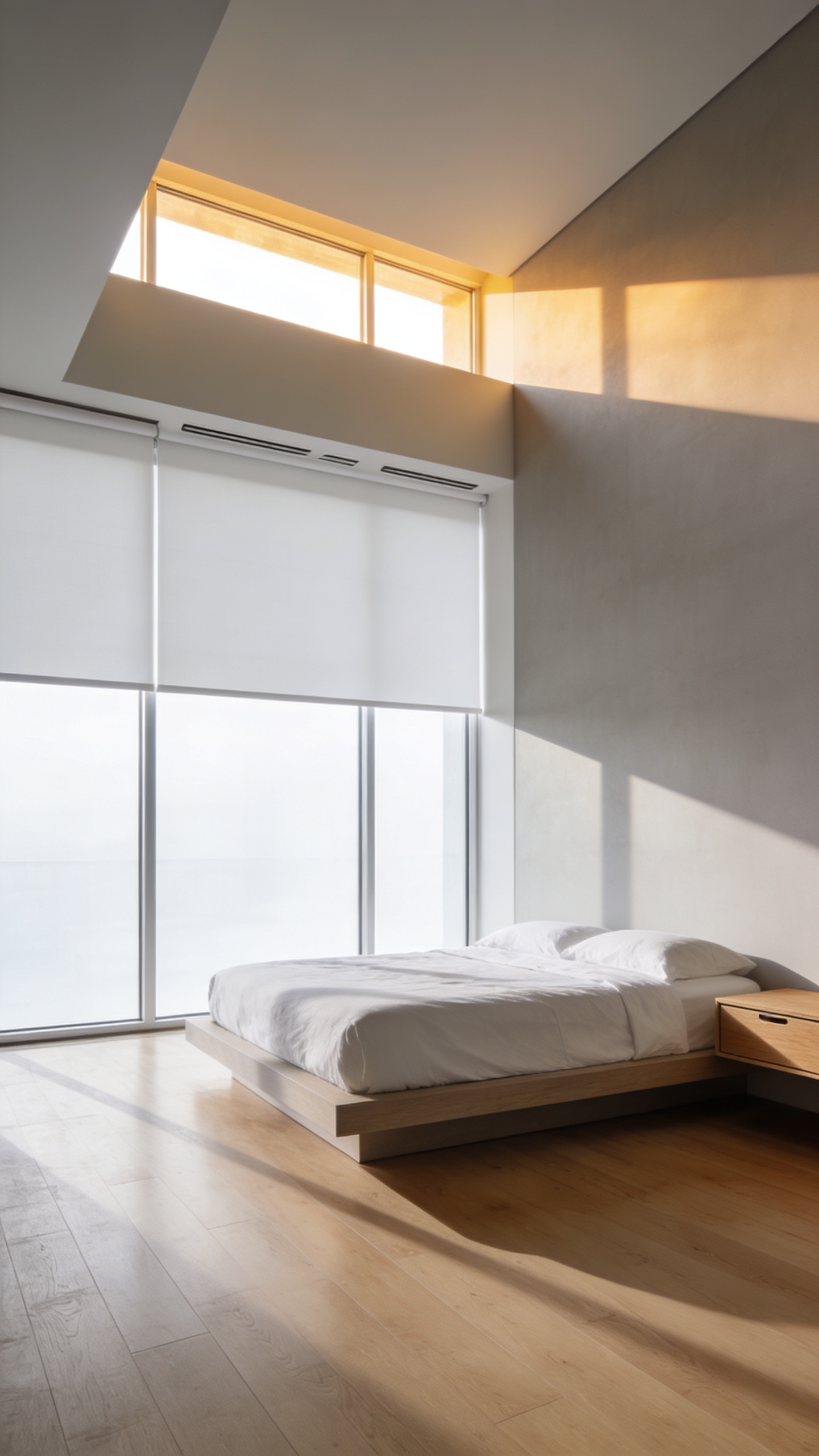
Through the lens of photography, furniture placement strictly dictates how we perceive volume. Specifically, low-profile furniture manipulates the eye’s horizon line. Tall armoires often act as barriers, segmenting the vertical space. Conversely, a low platform bed establishes a grounded plane. Consequently, the upper two-thirds of the room remain uninterrupted. This creates a massive “air column” above the furnishings. Thus, the brain interprets this expanse as increased ceiling height.
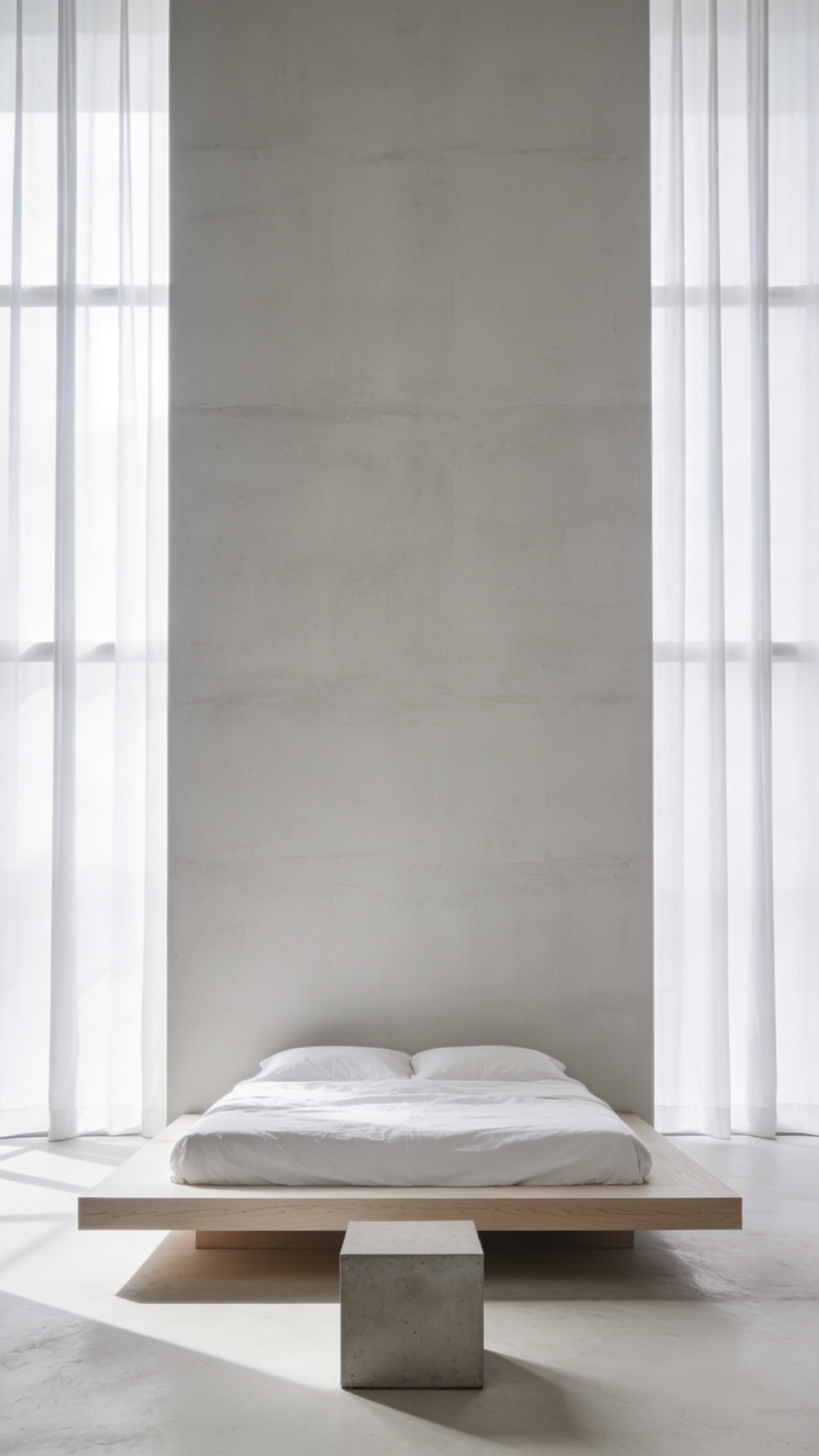
Historically, this approach is rooted in distinct cultural philosophies. For instance, Japanese *washitsu* design emphasizes living close to the floor to foster “groundedness.” Similarly, Mid-Century Modern designers utilized low-slung profiles to maintain clear sightlines. To replicate this, select pieces with raised legs. These allow light to pass underneath the furniture. Therefore, the mass appears lighter, enhancing spaciousness.
Ultimately, this reduction in “visual weight” fosters deep calm. Heavy, ornate objects naturally demand cognitive attention. In contrast, sleek items require less processing power. Consequently, the bedroom becomes a place of rest. When visual weight is distributed near the floor, the environment feels stable. In fact, this balance is essential for reducing anxiety.
4. Structural Purity: Eliminating Crown Molding and Baseboards for Cleaner Lines
Historically, heavy trim served a practical purpose by concealing messy joints. However, modern minimalism rejects this cover-up in favor of “structural purity.” This choice aligns directly with the architectural maxim that “less is more.” Consequently, the focus shifts entirely to the wall and floor planes. Achieving this look requires impeccable craftsmanship, as there is no molding to hide imperfections.
Specifically, this seamless aesthetic is often created through a “shadow gap.” This technique uses a recessed metal bead to create a channel between surfaces. Therefore, the walls appear to float, separated by a sharp shadow line. Alternatively, flush baseboards sit on the same plane as the drywall. Notably, this eliminates the dust-collecting ledge found on traditional skirting.
Ultimately, removing these visual boundaries alters how you experience the space. Traditional molding often acts as visual noise. Conversely, seamless transitions allow natural light to wash uninterrupted. This continuous flow generates a “luminous ambiance.” Furthermore, the absence of frames fosters “visual silence.” Your eye travels vertically without interruption. Thus, the architecture itself promotes deep calm.
Phase 2: The Infrastructure of Light & Tech
True minimalism requires more than just decluttering surfaces. Specifically, it demands achieving “visual silence” by eliminating electronic noise. Consequently, technology must shift from the foreground to the background. We refer to this concept as “Invisible Technology.” In this context, the sensory effect remains, but the source disappears.
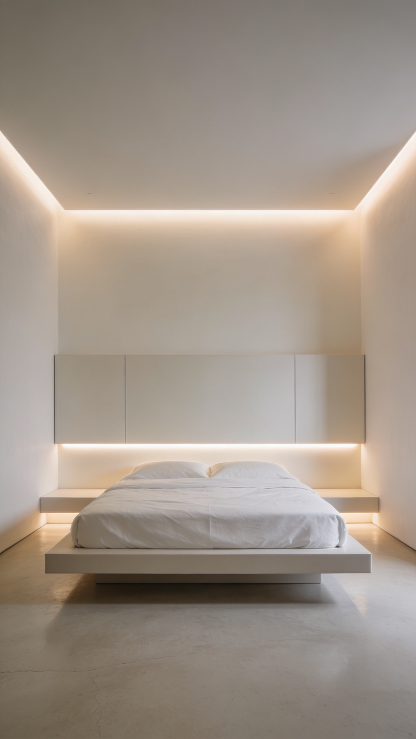
For instance, view lighting as an architectural form rather than a fixture. Modern LED profiles can be recessed directly into drywall. Ideally, utilize trimless downlights that sit perfectly flush with the ceiling. Furthermore, prioritize COB (Chip on Board) LED strips to create a seamless glow. This prevents individual diodes from reflecting on polished surfaces. Crucially, ensure a Color Rendering Index (CRI) of 90+ to render wood grains accurately.
Beyond aesthetics, this infrastructure supports wellness. Essentially, smart systems automatically mimic the sun’s natural cycles. They transition from cool tones to warm hues at night. Simultaneously, hide practical necessities like chargers inside nightstand drawers. Ultimately, this removes daily friction, allowing true rest to prevail.
5. Layered Illumination: Moving Beyond the Central Pendant to Cove and Recessed Lighting
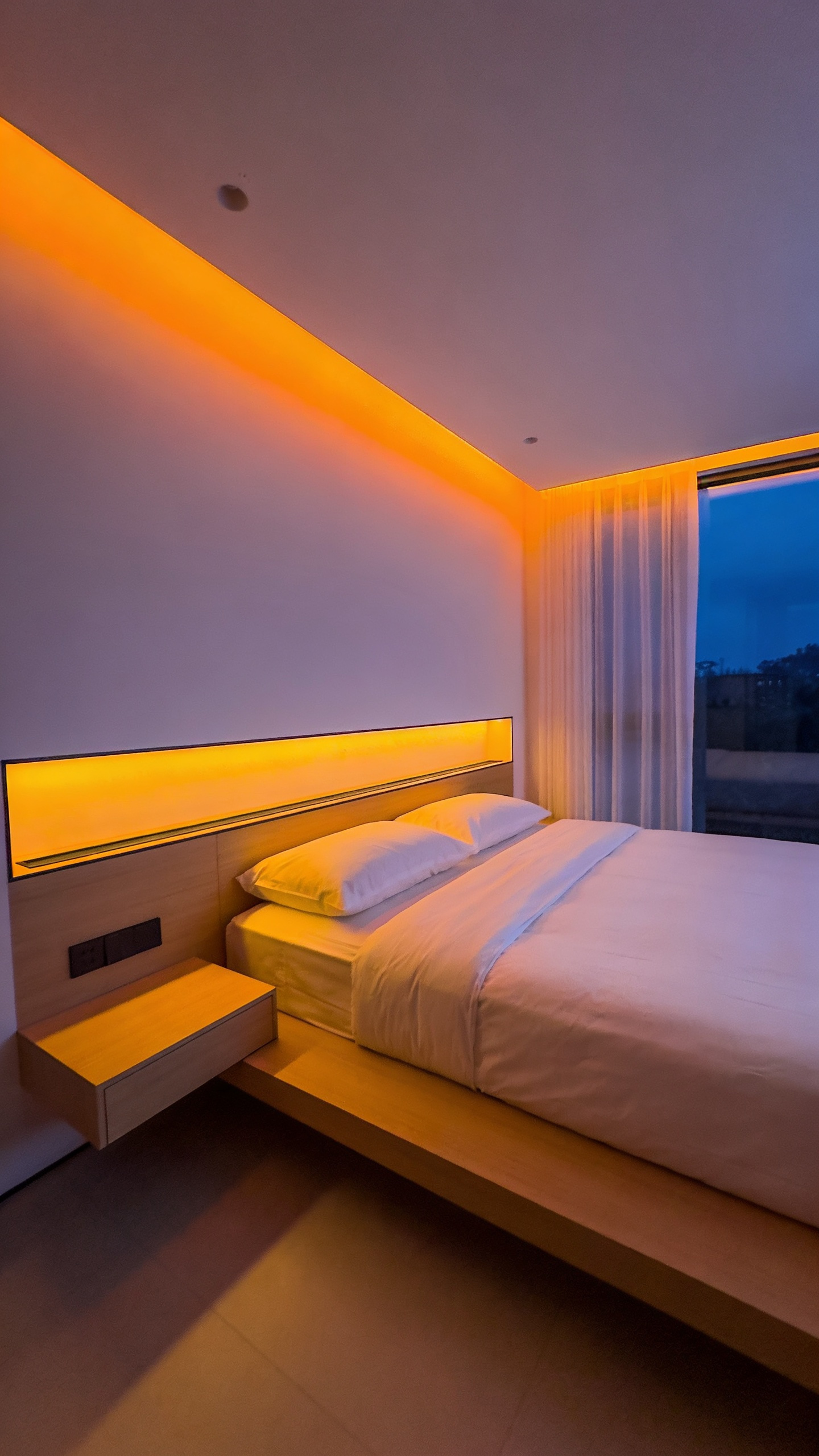
Bedroom design has often centered around a solitary statement pendant. However, in modern minimalist interiors, such fixtures can create visual noise. Consequently, designers are shifting toward “visual silence” through layered illumination. Specifically, this approach utilizes recessed lighting to prioritize spatial perception. By concealing the actual fixtures, light itself becomes the primary element.
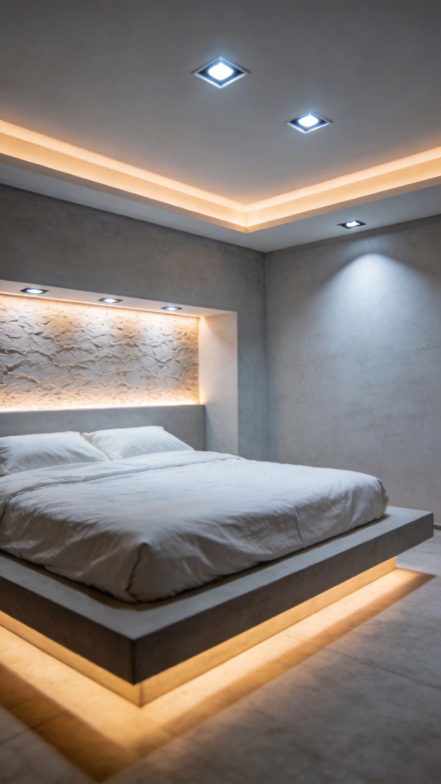
Furthermore, this technique skillfully manipulates architectural depth. For instance, cove lighting directs a glow upward to bounce off the ceiling. As a result, this interaction creates a “floating” effect. Ideally, this trick produces an illusion of expanded vertical space. Therefore, the room feels significantly airier without physical objects.
Moreover, moving away from overhead lighting supports circadian wellness. Unlike the harsh glare of a bulb, indirect light offers a relaxing diffusion. Specifically, this gentle glow mimics the setting sun to aid the sleep cycle. For the best results, select a warm white temperature between 2700K and 3000K. Additionally, installing smart dimmers provides flexibility. Ultimately, this layered approach transforms a basic room into a restorative sanctuary.
6. Invisible Infrastructure: Advanced Cable Management and Tech Hiding Strategies
Silence is visual in minimalist design. Consequently, tangled cables create “visual noise” that distracts the eye. Research suggests this clutter causes cognitive overload. Therefore, it actively disrupts the tranquility required for sleep. Essentially, the simpler a room appears, the more sophisticated its hidden infrastructure must be.
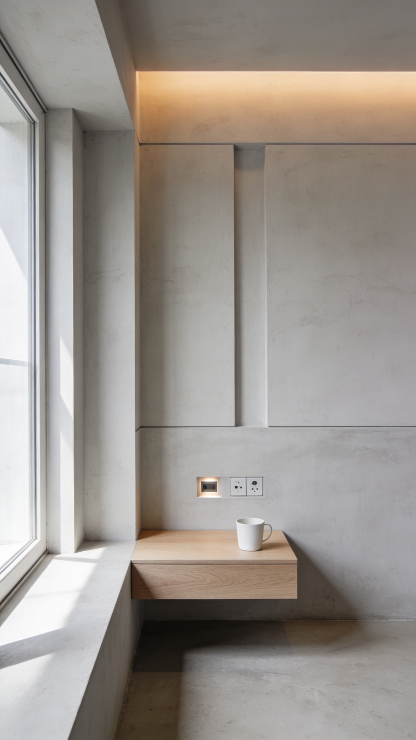
Truly, the ultimate goal is architectural concealment. For instance, “Seeless solutions” recess outlets directly into the drywall. As a result, bulky trims disappear completely. Furthermore, running data lines behind walls eliminates trip hazards.
However, major renovations aren’t always feasible. Thus, your furniture must serve as a disguise. Specifically, select nightstands featuring internal compartments for power strips. These hubs contain charging bricks effortlessly. Additionally, utilize tools like the “Cable Turtle” to spool up excess cord length.
Finally, address unavoidable wiring with camouflage. Ideally, install shallow raceways along your baseboards. Once painted to match the wall, they recede into the architectural lines. Ultimately, technology should function as an invisible servant to your design.
7. Smart Shade Integration: Automating Natural Light Control Without Clunky Hardware
True minimalism demands the absolute absence of visual noise. Therefore, traditional cords and bulky wands inevitably disrupt the serene aesthetic. Smart shades offer a sophisticated alternative known as “Quiet Automation.” Specifically, they eliminate physical clutter by concealing the motor entirely.
For new construction, the ultimate solution involves hardwiring power directly through the window jamb. Consequently, no wires are ever visible to the eye. However, retrofits can successfully utilize lithium batteries hidden within the roller tube.
Beyond aesthetics, this technology actively supports wellness. In fact, programmed schedules can synchronize your environment with circadian rhythms. For instance, shades can crack open at sunrise to wake you gently. Conversely, they lower automatically at sunset to encourage melatonin production.
Finally, a sanctuary requires acoustic minimalism. High-end motors now operate below 38 decibels, which is quieter than a whisper. Furthermore, “soft start” engineering eliminates the jarring mechanical clack. Thus, the technology remains completely invisible to both the eye and the ear.
8. Circadian Lighting Design: Using Smart Bulbs to Mimic Natural Daylight Cycles
Circadian lighting aligns perfectly with the core philosophy of minimalism. Specifically, it offers complex functionality via an almost invisible form. A single smart bulb effectively replaces the need for multiple light sources. Consequently, the physical space remains clean, outsourcing complexity to automation. This setup creates atmospheric lighting that feels far cozier than standard fixtures.
Biologically, this design choice provides a critical health benefit. Beyond visual processing, the retina contains cells called ipRGCs. These receptors are highly sensitive to the blue-enriched light found in daylight. Therefore, smart systems deliver cool white light (4000K–6500K) during the morning. This suppresses melatonin and signals alertness.
In contrast, the system automatically shifts later. Specifically, it transitions to a low-intensity amber spectrum (under 3000K). This change minimizes biological responses, preparing the body for sleep. Furthermore, this mimics the “daylighting” architects have sought for a century. Historically, builders used prism glass to channel sunlight indoors. Now, smart LEDs provide an adaptive solution. Ultimately, this technology allows a minimalist bedroom to function as a restorative retreat.
Phase 3: Functional Furniture & Storage
True minimalism anchors itself in the Modernist principle where form follows function. Consequently, every piece in your bedroom must serve a purpose to justify its existence. This intentionality reduces visual noise, creating a sanctuary for a clear mind. For more inspiration, explore our guide to chic and clutter-free master bedroom decor ideas. Visually, this results in clean lines and a deliberate lack of ornate details.
To achieve this calm, storage often blends into the architecture. For example, custom wardrobes create a monolithic surface that generates breathing room. Similarly, floating nightstands free the floor to maximize openness. However, in smaller spaces, furniture must act as a double agent. Specifically, storage beds utilize dead space for bulky items. Furthermore, a sleek bench at the foot of the bed hides clutter.
Nevertheless, functional design should never feel sterile. Instead, you must rely on quality materials to introduce warmth. For instance, natural wood grain prevents the room from feeling like a clinic. Ultimately, when surfaces remain clear, the material becomes the decoration itself.
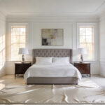
9. The Floating Nightstand: Expanding Perceived Floor Space Through Wall-Mounting
Preserving floor space is paramount in minimalist design. Consequently, the floating nightstand serves as a crucial architectural tool. For those dealing with compact environments, these are essential minimalist bedroom ideas for small spaces. By anchoring directly to the wall, it creates an unbroken sightline along the floorboards. This continuous view effectively tricks the eye. Specifically, it makes rooms register as significantly larger. Furthermore, this design introduces essential “negative space” beneath the unit. Through a photographer’s lens, this void allows light to travel unhindered. Thus, the furniture appears to defy gravity.
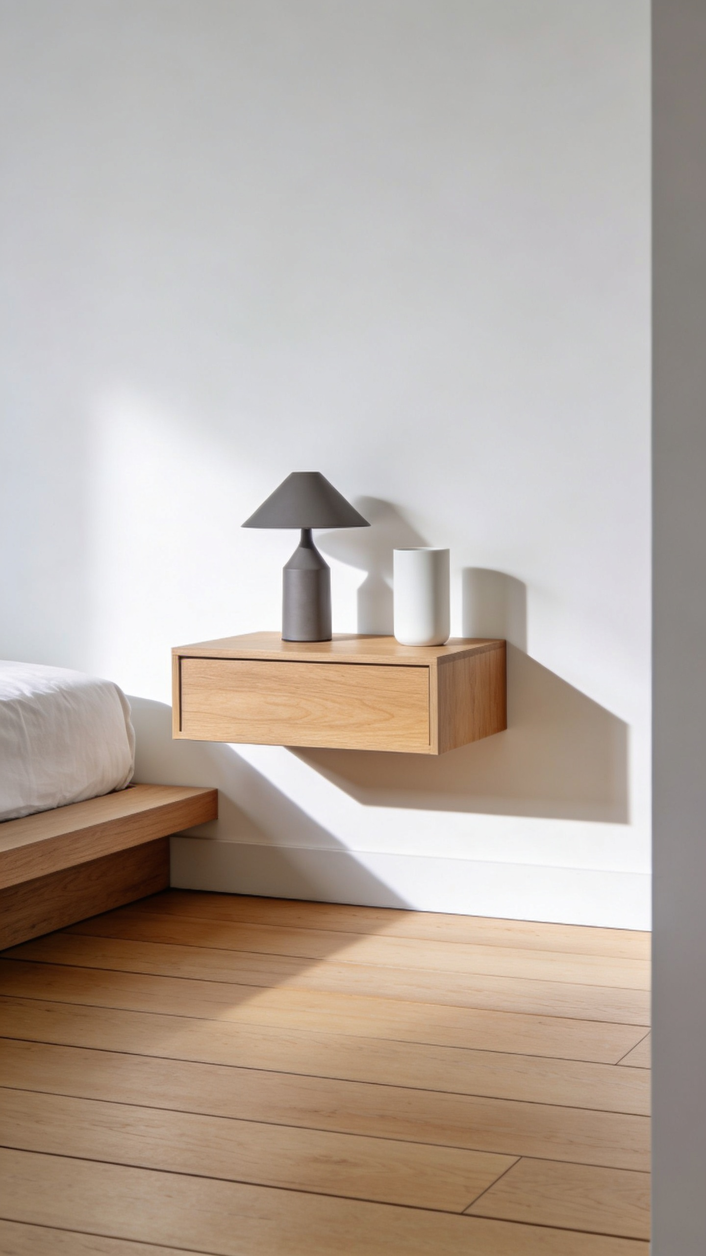
Beyond aesthetics, wall-mounting offers superior customization. Unlike fixed-leg furniture, you can install these units at the perfect height. Therefore, essentials remain within comfortable reach. Moreover, modern iterations prioritize a clutter-free existence. Many designs utilize hidden French cleats for invisible support. Additionally, integrated cable channels manage cords, ensuring the sleek look isn’t ruined by wires. Ultimately, this approach successfully merges functionality with visual freedom.
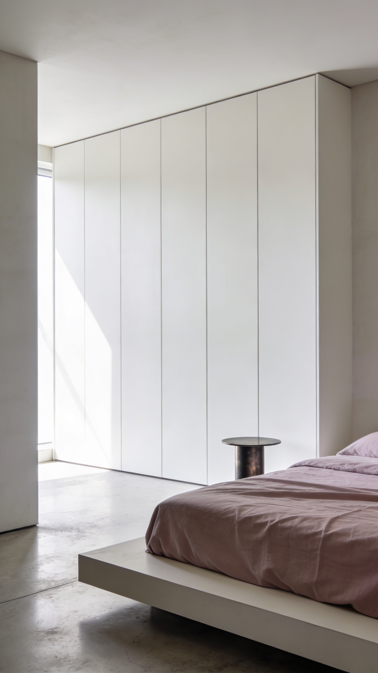
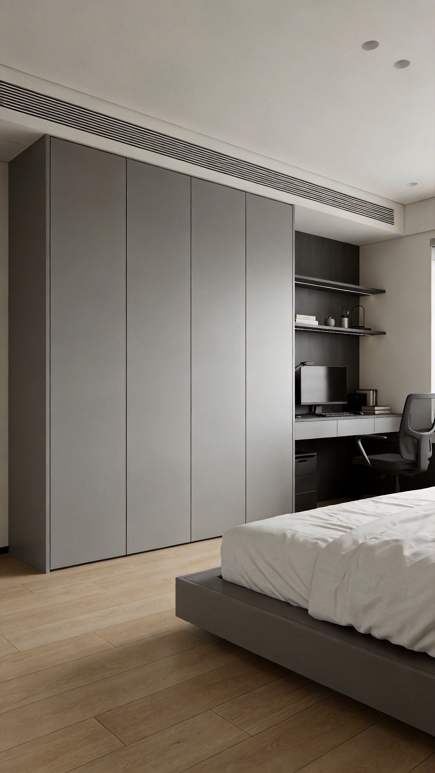
10. Hardware-Free Joinery: Utilizing Push-to-Open Mechanisms on Wardrobes
Hardware-free joinery represents the ultimate expression of the “less is more” philosophy. Consequently, this approach transforms a wardrobe into a seamless plane. By eliminating protruding handles, the “slab front” doors recede into the wall. Therefore, visual noise is significantly reduced. Ideally, this creates a monolithic effect that enhances tranquility.
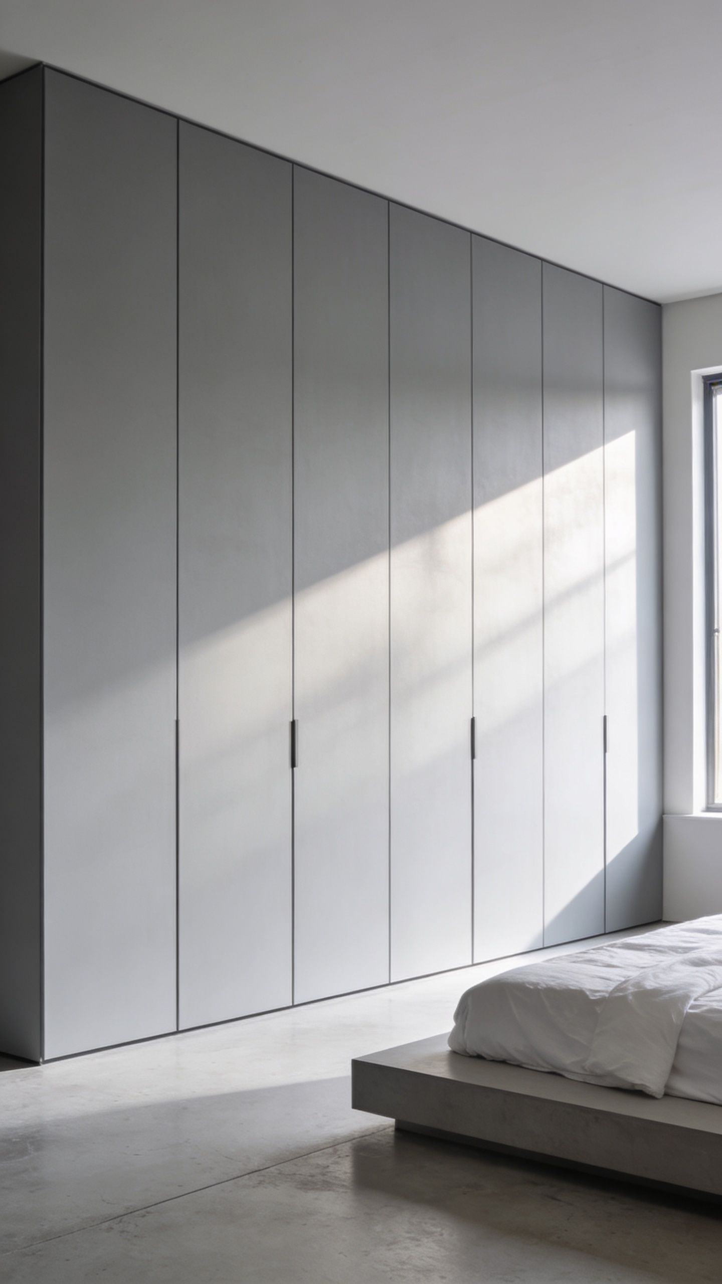
Functionally, this aesthetic relies on push-to-open mechanisms. Specifically, a spring-loaded system stores energy when the door is closed. A gentle press activates the latch, causing the door to pop open. For a premium experience, electric “touch-to-open” systems offer near-silent operation. Thus, the user experiences a satisfying, subtle interaction rather than a heavy pull.
However, this contact-based method introduces a challenge. Inevitably, touching the door attracts fingerprints. Therefore, success depends heavily on material selection. Notably, designers mitigate this by utilizing ultra-matte or “soft-touch” laminates. These high-tech finishes absorb light to hide smudges. Ultimately, this combination preserves the pristine luxury of the space.
11. The Platform Bed with Concealed Storage: Maximizing Utility Without Visual Bulk
The platform bed acts as a secret weapon against visual clutter. Fundamentally, visible mess functions as a constant to-do list for the brain. Consequently, this “cognitive load” restricts the mind’s ability to rest. By replacing bulky dressers, the bed removes distinct visual noise from your sanctuary. Additionally, the low profile keeps furniture mass near the floor, effectively enlarging the room vertically.
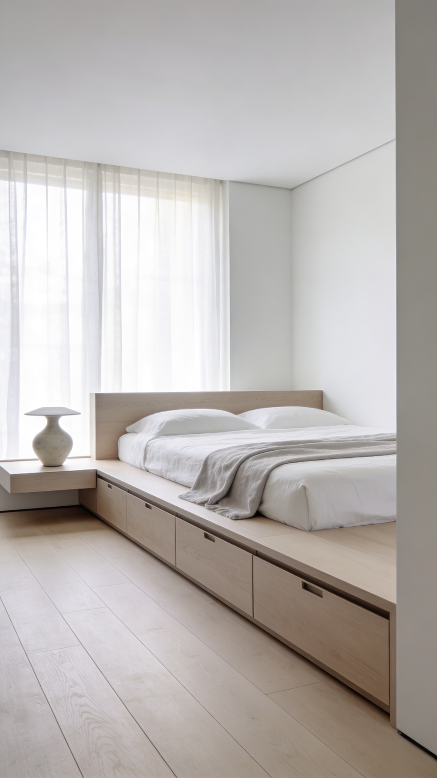
Structurally, these beds are defined by a lack of hardware. Specifically, designs utilize push-to-open drawers or integrated channels to maintain a seamless form. Furthermore, hydraulic lift mechanisms often transform the base into a deep, invisible chest. This cavity easily accommodates bulky items like luggage. Surprisingly, a platform base often matches the capacity of an eight-drawer dresser.
Historically, this integration is not a modern innovation. In fact, Ancient Romans crafted beds with similar hidden compartments. However, modern versions apply sophisticated engineering, such as gas pistons. Ultimately, this ensures furniture serves two functions without sacrificing aesthetic.
12. Multifunctional Zones: Designing a Home Office That Disappears After Hours
In minimalist design, the bedroom must remain a sanctuary. However, a constant view of a workspace creates “visual permanence.” Consequently, seeing work materials continuously correlates with increased cortisol levels. Therefore, a disappearing office becomes a critical health strategy, not just a stylistic choice.
Interestingly, this concept follows a rich historical lineage. Specifically, the 18th-century *secrétaire* pioneered this functional fusion. These antique pieces concealed writing slopes within elegant chests. Thus, they prioritized aesthetic continuity, appearing as furniture rather than tools.
Today, we achieve this through sophisticated engineering. For instance, modern units often utilize pneumatic counterbalance systems. These mechanisms allow heavy surfaces to lift with minimal effort. Furthermore, they prevent uncontrolled drops. Additionally, effective design rigorously manages cables. Hidden internal pathways ensure wires never compromise the view. Ultimately, when the cabinet closes, the office vanishes. The room instantly returns to its primary function: deep rest.
Phase 4: Textural Warmth & Detail
Pure minimalism risks feeling emotionally flat or sterile. Therefore, texture acts as the “quiet hero” in your bedroom design. This phase transitions a clean structure into a livable sanctuary. In fact, designers often term this approach “Warm Minimalism.” Essentially, you are replacing visual clutter with tactile depth. The goal is creating an environment that feels irresistibly tactile.

- *To achieve this, apply the “Yin and Yang” technique of contrast. Specifically, pair sleek furniture with coarse materials. For example, place a lacquer nightstand beside a bouclé pillow. Similarly, a woven rug softens polished floors. Furthermore**, embrace materials that celebrate imperfection. Raw walnut or unglazed ceramics add necessary grounding.
- *Consequently, the bed becomes your primary canvas for layering. Utilize breathable fabrics like linen for structural softness. Next, consider how light interacts with finishes. For instance, contrasting matte walls with brass creates visual relief. Ultimately**, this interplay adds dimension without introducing mental noise.
13. Industrial Materials: Incorporating Concrete and Matte Black Metal for Edge
Incorporating concrete and matte black metal brings a refined aesthetic to a minimalist bedroom. Historically, this style celebrated raw strength. However, in a domestic setting, we translate this into deep texture. Specifically, consider using microcement for accent walls. These finishes retain visual weight but feel smoother to the touch. Consequently, the concrete acts as an anchor without seeming harsh.
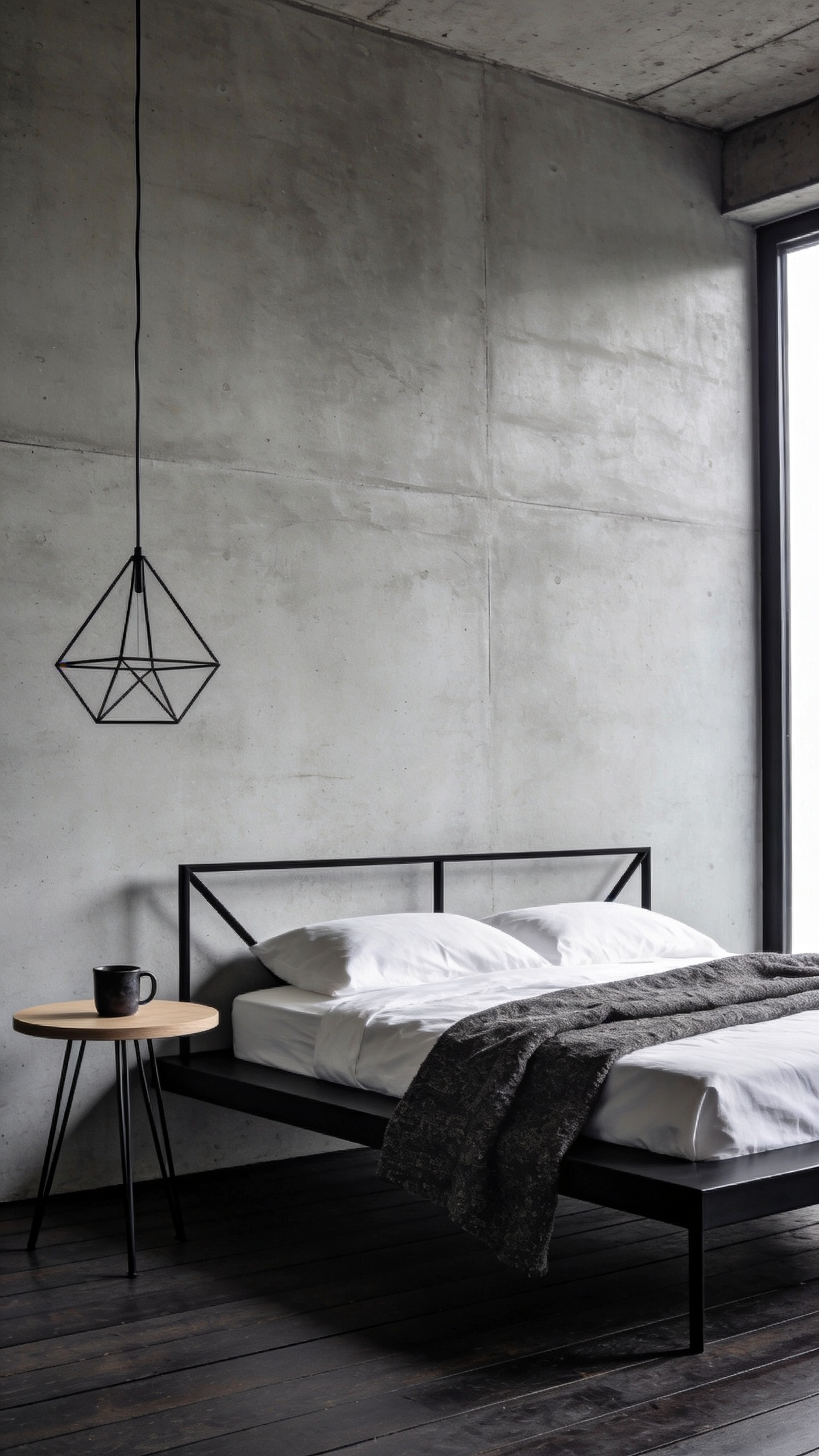
Next, introduce matte black metal as a “visual silencer.” Unlike glossy chrome, this finish absorbs light rather than scattering it. Therefore, it significantly reduces visual noise. When used in bed frames, black metal creates a stabilizing effect. Furthermore, it provides stark contrast against cool grey tones.
Crucially, you must balance these hard materials to maintain livability. Industrial elements can inherently feel cold. To prevent this, layer in organic textures. For instance, incorporate thick wool rugs or linen bedding. Ultimately, the tension between hard structure and soft fabrics creates the desired “edge.” This combination transforms the room into a sophisticated sanctuary.
14. Organic Softening: Using Linen and Wool to Counteract Stark Geometry
Minimalist design often relies on stark geometry. Consequently, a bedroom can inadvertently feel clinically cold. To counteract this, linen and wool serve as critical biophilic counterpoints. Specifically, introducing linen provides a layer of effortless imperfection. Unlike synthetics, linen features natural knots known as slubs. Therefore, the fabric never lies perfectly flat. This irregularity disrupts the monotony of polished surfaces. Furthermore, linen offers a matte finish that diffuses light. This effect gently rounds sharp architectural edges.

Conversely, wool introduces necessary mass. While linen feels airy, wool feels dense. Practically, its structure creates a high-performance acoustic buffer. In fact, wool rugs effectively dampen echoes caused by hard flooring. This absorption restores quiet focus to the room. Additionally, wool acts as a light sink, absorbing glare. Ultimately, these fibers prioritize comfort over perfection. The contrast of rumpled bedding adds authenticity. Thus, the space feels lived-in rather than sterile.
15. The Single Statement Piece: Why One Large Artworks Beats a Gallery Wall
In a minimalist bedroom, visual silence is the goal. However, a gallery wall creates “visual noise.” Specifically, the eye must traverse multiple frames to establish a connection. This process increases cognitive load, hinting relaxation. Conversely, a single, oversized artwork reduces this mental activity. It shifts the experience to passive meditation. Consequently, this focus evokes a sense of awe, helping the brain switch off.
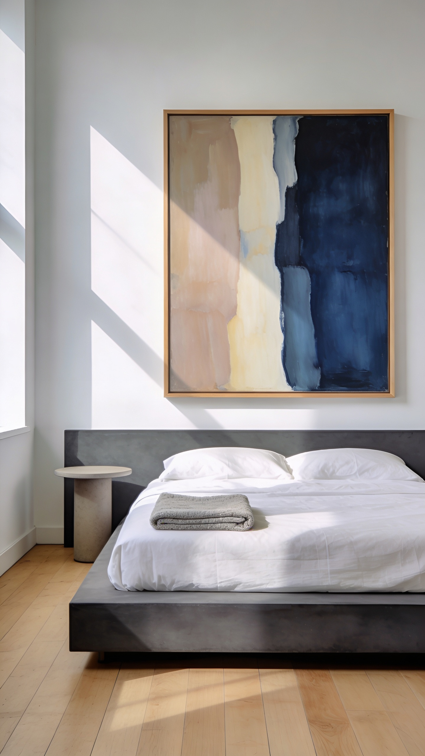
Furthermore, a large canvas acts as a visual anchor. It organizes the room by grounding the furniture beneath it. In fact, relying on one piece maximizes negative space. While a gallery wall feels dense, a statement piece allows the room to breathe. Moreover, a singular work invites appreciation of texture. For instance, large scales reveal subtle gradients that small prints lose. Therefore, the wall gains a “luxury feel.”
Ultimately, selecting one piece is a philosophical statement. It prioritizes a “strong choice” over clutter. Thus, a single statement piece embodies the core minimalist principle of intentionality.
16. Biophilic Precision: Positioning Architectural Plants as Living Sculptures
In minimalist design, biophilia is often misinterpreted as scattering plants. However, true precision requires a shift in perspective. Specifically, it involves treating a single plant as living architecture. Therefore, instead of clustering small pots, select one magnificent form to serve as the room’s sculpture.
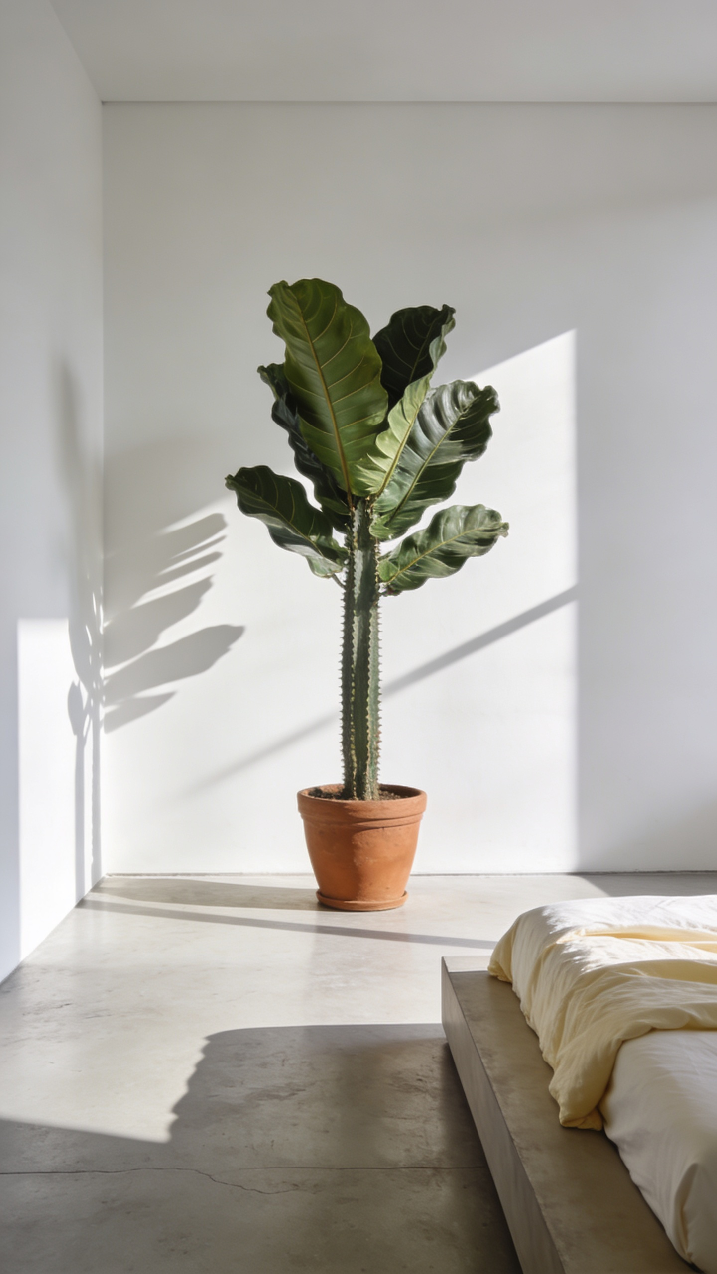
This approach utilizes negative space to frame the foliage. Consequently, the empty walls elevate the plant to a focal point. Ideally, choose species with structural shapes. For instance, the Bird of Paradise offers sweeping leaves. Alternatively, a Sansevieria provides clean verticality.
These organic forms introduce softness to geometric rigidity. Furthermore, this placement creates a clear hierarchy. Design experts note that one element feels calmer than a collection. As a result, the bedroom remains a sanctuary.
Historically, this concept echoes Zen garden principles. Yet, the modern application prioritizes practicality. Thus, resilient specimens like the Raven® ZZ Plant are preferred. Ultimately, positioning plants with such intent transforms a sleeping space.
Conclusion: From Renovation to Calibration – Maintaining the Minimalist Standard
Ultimately, true minimalist bedroom ideas aren’t merely a renovation project. Rather, they represent a psychological system built for clarity. You move from the initial purge to constant calibration. Consequently, your bedroom transforms into a mental white space. In fact, by reducing visual noise, you combat decision fatigue. Therefore, the goal is not just an empty room, but a quiet mind.
Looking forward, this standard demands an ethical shift. Specifically, choose fewer, better things that age gracefully. Eventually, maintenance becomes second nature, protecting your sanctuary. To start, audit your nightly routine rather than your closet. Simply commit to a five-minute “micro-reset” tonight. Thus, you ensure your space remains a restorative backdrop.
Frequently Asked Questions (FAQ)
Why is minimalist design often more expensive?
True architectural minimalism demands perfection. Since there is no ornamentation or clutter to mask flaws, every structural joint, wall finish, and material transition must be impeccable. The cost often lies in the hidden engineering—such as custom built-in cabinetry, seamless structural purity (removing visible trim), high-end hardware-free joinery, and integrated lighting systems. This intense precision and reliance on flawless materials drive the investment higher than conventional decor.
What is “Warm Minimalism” and how does it prevent a sterile look?
Warm Minimalism is the contemporary evolution of the style, prioritizing sensory comfort and tactile depth over stark, clinical aesthetics. It is achieved by replacing high-contrast white with a monochromatic palette of soft, earthy neutrals like taupe, terracotta, and bone white. Crucially, warmth is introduced through texture, such as layering natural, organic materials like rough linen, chunky wool, and raw wood grain, ensuring the space feels inviting rather than cold.
How do professional designers conceal clutter and technology in a minimalist bedroom?
Professional design relies on “invisible infrastructure” and strategic concealment. Clutter is hidden using floor-to-ceiling, flush-mount, handleless cabinetry finished in the same material as the walls, making it disappear visually. Technology is hidden through advanced cable management, recessed outlets, and integrating lighting (like cove or trimless fixtures) directly into the architecture. The goal is removing visual noise completely, often through custom joinery solutions.