Most articles about kitchen decoration ideas tell you to buy a new fruit bowl or swap your curtains. Interior design blogs repeat this advice. Home improvement content has been saying the same things since 2015. Here’s what they’re mostly not telling you. After fifteen years of photographing and writing about residential kitchens, I’m certain of this: the decoration choices that make a measurable visual difference are almost always structural. The backsplash, the lighting, the cabinet color — these move the needle. Small accessories layer on top. But a $12 set of new knobs on poorly-designed cabinets still looks like poorly-designed cabinets with new knobs.
These fifteen kitchen decoration ideas are organized around visual impact, not price. Some cost almost nothing. A few require a weekend. But each one addresses something real about how a kitchen reads. Work through the ones most relevant to your space, or use this as a diagnostic tool for what’s actually missing.
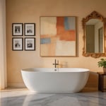
1. A Statement Backsplash: The Most Impactful Kitchen Decoration Idea
The backsplash is typically the largest uninterrupted decorated surface in a kitchen. Behind the range alone, you’re often looking at 12–18 square feet of pure visual real estate. That’s more square footage than most pieces of wall art. And it’s positioned exactly where the eye travels when facing the main work zone. So the first of these kitchen decoration ideas is also the most impactful: choose the backsplash with real intention.
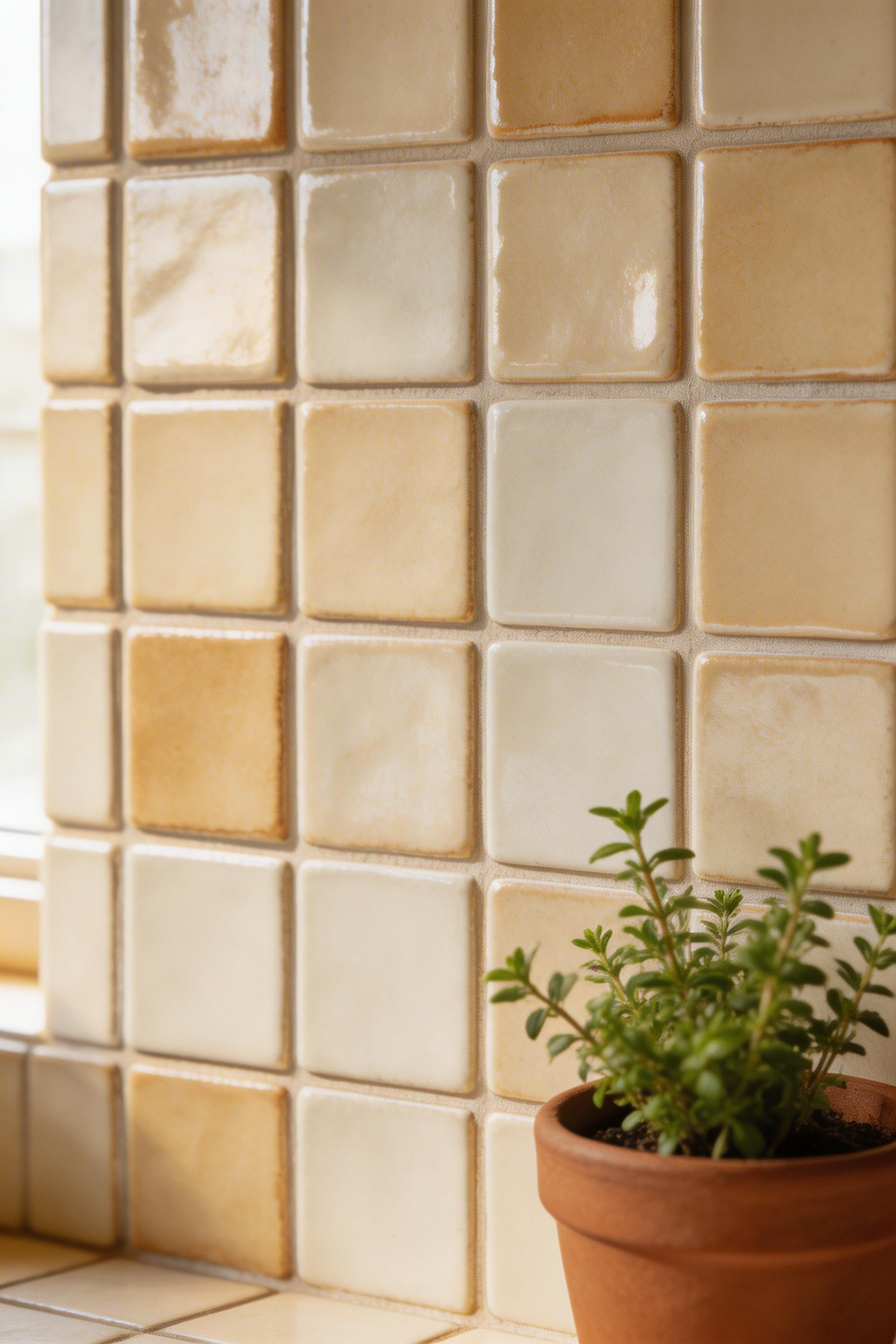
Subway tile remains the top-selling tile format in North America, and it earns that position because it works. But the grout color is the decision most people underestimate: white grout reads clean and seamless, while dark grout reads structured and deliberate. The same white subway tile with charcoal grout and with white grout are essentially two different design choices. Charcoal grout anchors the room. White grout disappears into the wall.
Backsplash Tile Options for This Kitchen Decor Upgrade
Zellige tiles are handmade Moroccan clay. They cost $15–$35 per square foot and have irregular surfaces that catch light at different angles throughout the day. Fireclay Tile’s Beveled Subway line ($8–$14/sq ft) comes in 145 colors and is made in the USA. It offers more finish control than most alternatives. For a budget approach, Merola Tile Zellige Artisan Beige at Home Depot ($12/sq ft) gives a reasonable approximation of the handmade look.
One technique that consistently earns its place: run the backsplash full-height, to the underside of the upper cabinets or all the way to the ceiling. It makes the room feel taller. Also, it removes the awkward painted strip most kitchens have above their standard 4-inch backsplash. That strip always reads as an afterthought.
A photographer’s note before you choose: shoot your backsplash area in morning light and again under your kitchen’s evening lighting before committing. The grout color you pick reads completely differently under warm incandescent light than in daylight. I’ve watched clients choose a warm grey grout that goes noticeably orange at night. That’s not a recoverable mistake.
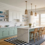
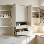
2. Open Shelving Styled with Purpose
Open shelving works when there is a system behind it. Without a system, it becomes the most efficient way to make a kitchen look busier and smaller than it actually is. But with the right approach, it is one of the kitchen decoration ideas professional designers reach for most consistently. It adds warmth, personality, and legibility to a room that otherwise reads as closed cabinetry with no variation.
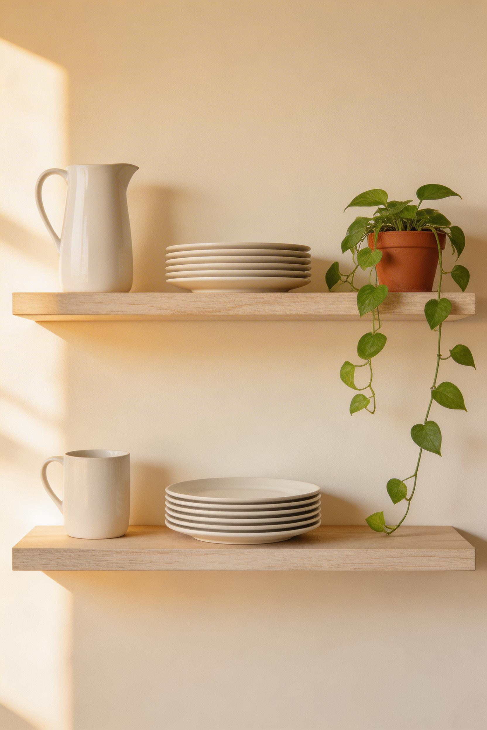
The principle I use from photography applies directly here: the eye needs rest. Leaving 30–40% of shelf space empty makes a shelf read as styled rather than stocked. Also, groups of odd numbers — three items, five items — look more natural than even groupings. It’s not superstition. It’s how the human eye perceives balance.
The Materials and Dimensions That Matter
Floating shelves in 1.5-inch thick solid wood — walnut, oak, or white oak — cost $60–$150 per shelf. They have significantly more visual weight than thin IKEA-style versions. That thickness creates a shadow line under the shelf that gives it presence. The Etsy market has custom-cut solid walnut floating shelves at $85–$140 for a 36-inch length. They look considerably more permanent than their cost suggests.
Shelf depth for kitchen use: 10–12 inches. That’s deep enough for dinner plates upright, but not so deep that items at the back disappear. Space between shelves: 12–14 inches minimum to clear standard plates.
The best items for open shelves are things you actually use daily. Daily-use items justify the dust exposure and keep shelves from becoming static decorative zones. A shelf of beautiful objects that no one ever touches begins to read as a display case rather than a kitchen. Stack the plates you eat off. Use the pitcher you fill with water every morning. The shelf should be working.
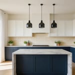
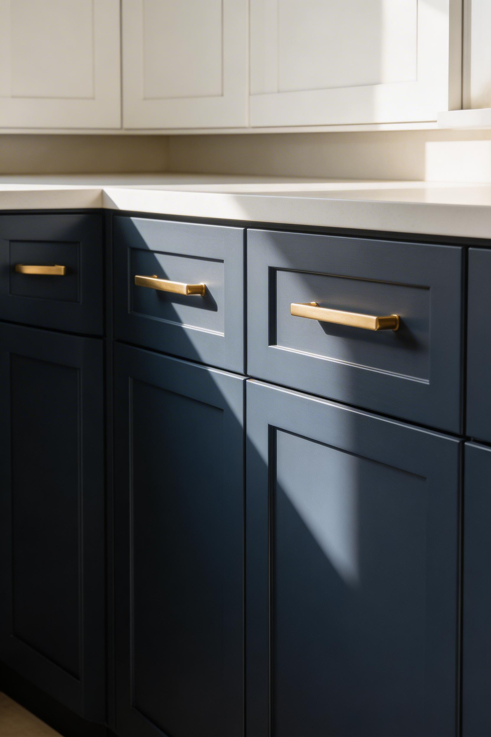
3. Cabinet Paint: The Highest-ROI Kitchen Decoration Idea
Among all the kitchen decoration ideas in this list, painting the cabinets returns more visual change per dollar than almost anything else. A kitchen that costs $30,000 to build can be transformed by a $600 paint job. The cabinets are typically 30–40% of the kitchen’s total surface area. Change that surface, and you change the room.
The prep work accounts for roughly 80% of the final result. Cleaning surfaces with TSP substitute, sanding lightly, and applying a bonding primer aren’t optional. Professional painters know this. That’s why a $3,000 professional cabinet paint job looks better than a $300 DIY project where someone skipped the prep.
The Paints and Colors That Actually Hold Up
Benjamin Moore Advance ($70–$80/gallon) and Sherwin-Williams Emerald Urethane ($78–$85/gallon) are the two most-specified cabinet paints among professional painters. Both are water-based alkyd formulas. They self-level to a smooth finish, cure hard, and clean up without flaking. You won’t find them at a big box store — go to a specialty paint dealer.
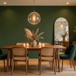
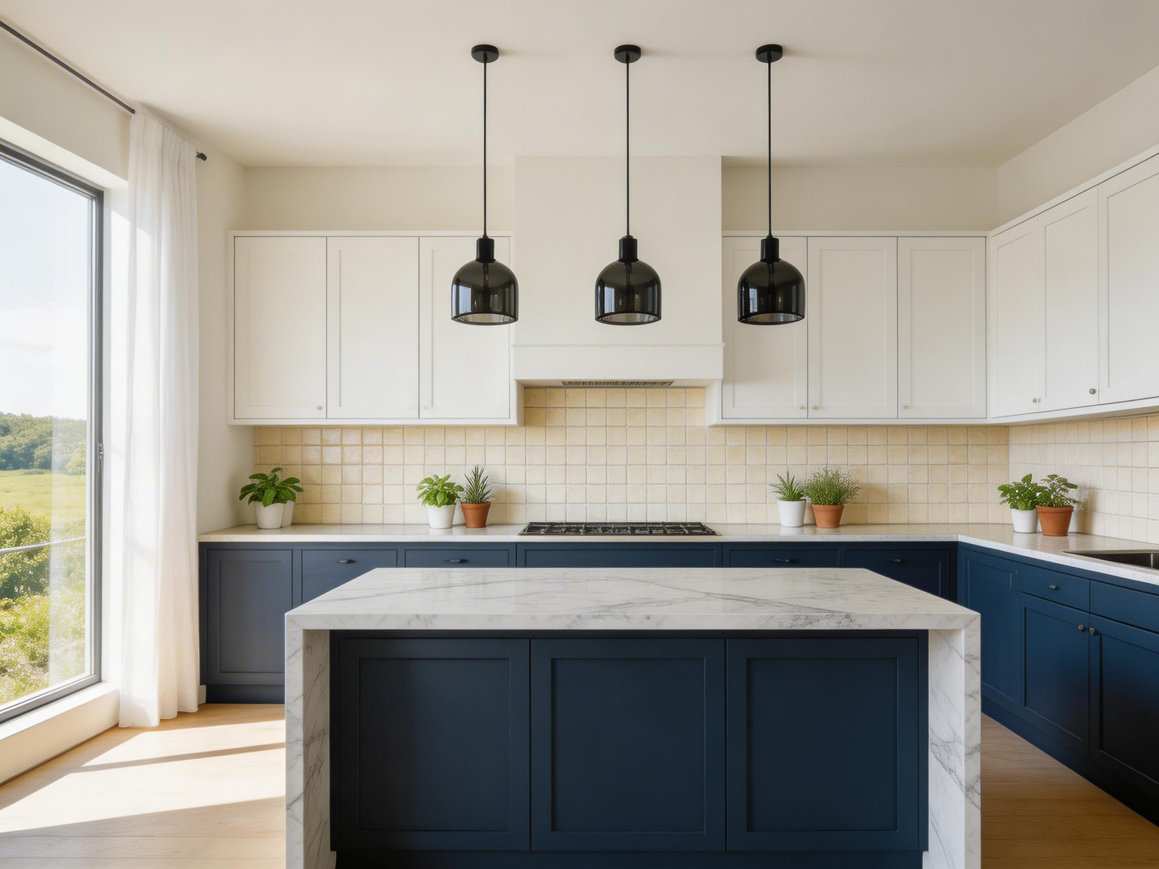
For color: navy, forest green, and charcoal are currently the most-searched cabinet colors. All three work best on lower cabinets while upper cabinets stay white or cream. The two-tone approach makes a kitchen feel visually larger. It’s now a design classic rather than a trend. A Zillow analysis of 4.6 million homes found that kitchens with navy blue islands sold for $1,547 more on average. Bold cabinet color has measurable market value, not just aesthetic value.
One practical note: remove the doors from their hinges before painting them. Paint them flat on sawhorses. Painting cabinet doors while they’re hanging on their frames creates runs almost every time, regardless of skill level. Gravity is always working.
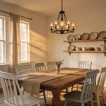
4. Pendant Lighting Over the Island or Table
Lighting is the one kitchen decoration decision that changes a space at every hour of the day. A backsplash looks the same at 9 AM and 9 PM. Pendant lighting creates a different atmosphere at noon, at dinner, and at late evening. It’s dynamic in a way that no painted surface or styled shelf can match. For that reason, pendant placement is among the most impactful choices in a broader set of kitchen lighting ideas.
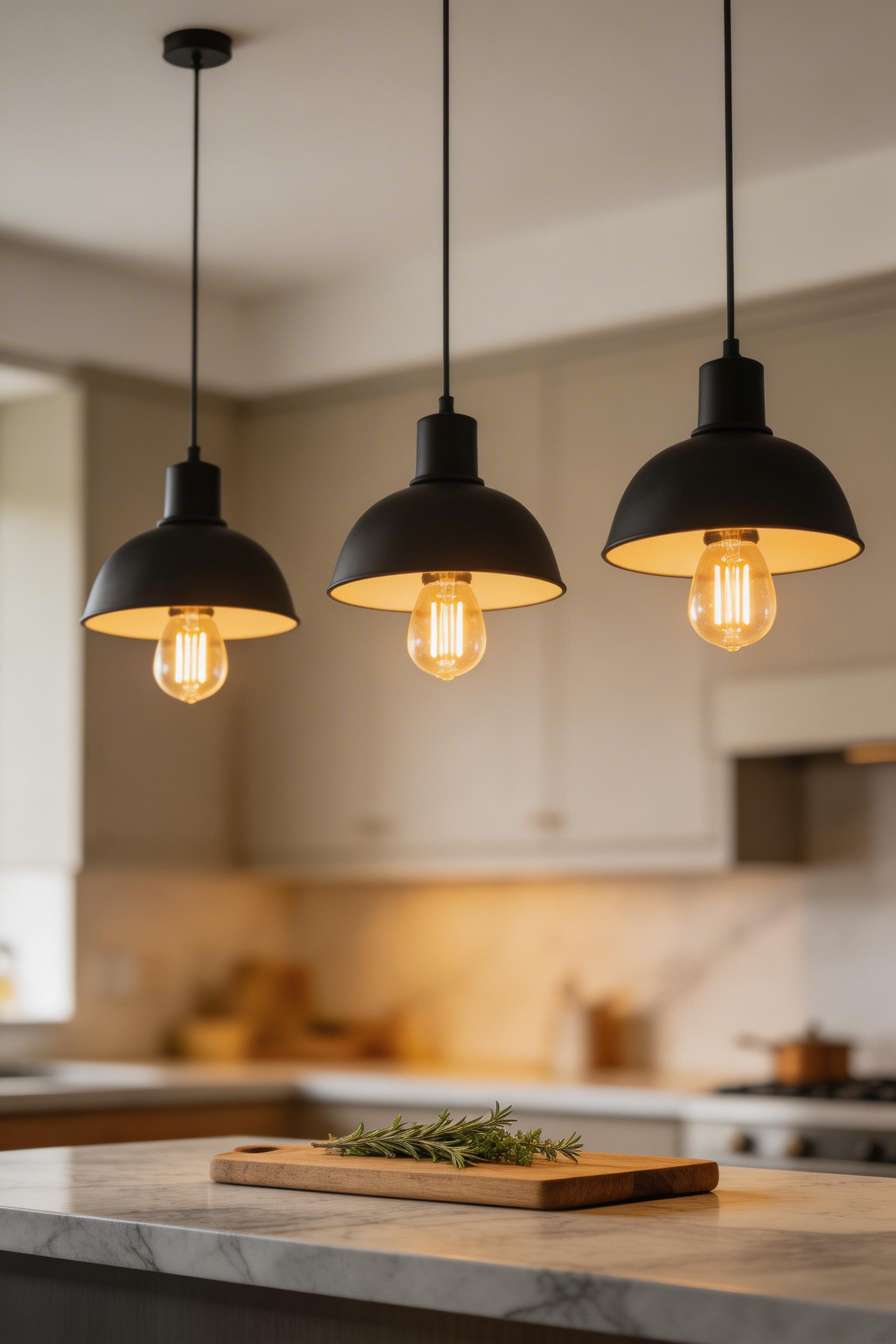
The standard mounting height is 30–36 inches from the bottom of the pendant to the countertop surface. Most people hang pendants too high — they worry about head clearance and overcorrect. A pendant that hangs at 30 inches above the counter creates a cozier, more intimate light pool than one at 36 inches. I’d always go on the lower end of that range.
Sizing, Spacing, and Light Temperature
Pendant diameter should be roughly one-third of the island width for a single pendant. For multiple pendants, space them 24–30 inches apart. Mini-pendants (8–12 inch diameter) look best in multiples of three over islands under 6 feet. Larger single pendants (18–24 inch diameter) work over islands 6 feet and above.
Color temperature matters more than most people realise. 2700K (warm white) is the standard for residential kitchens. It most closely resembles incandescent light. 3000K is slightly cooler and works better for task-heavy kitchens. Avoid 4000K and above over dining surfaces — it reads clinical. The American Lighting Association notes that kitchen lighting accounts for up to 35% of a home’s total lighting budget in new construction.
Rattan and woven pendants add organic texture in kitchens that are otherwise all hard surfaces — stone countertops, ceramic tile, metal appliances. A single material shift breaks that monotony. The West Elm Patchwork Rattan pendant ($129–$179) does this well. For a more architectural look, the Rejuvenation Henry pendant ($195–$295) comes in six finishes and adjusts to the exact height you need.
5. Cabinet Hardware as the Room’s Punctuation
If kitchen decoration ideas were ranked strictly by cost-to-impact ratio, cabinet hardware would come first. A full kitchen hardware refresh — replacing every pull and knob — typically costs $150–$600 for the hardware itself. That figure changes the room in a way that feels immediate. Hardware is the room’s punctuation: it doesn’t carry the main meaning, but without it the whole thing reads as a run-on sentence.
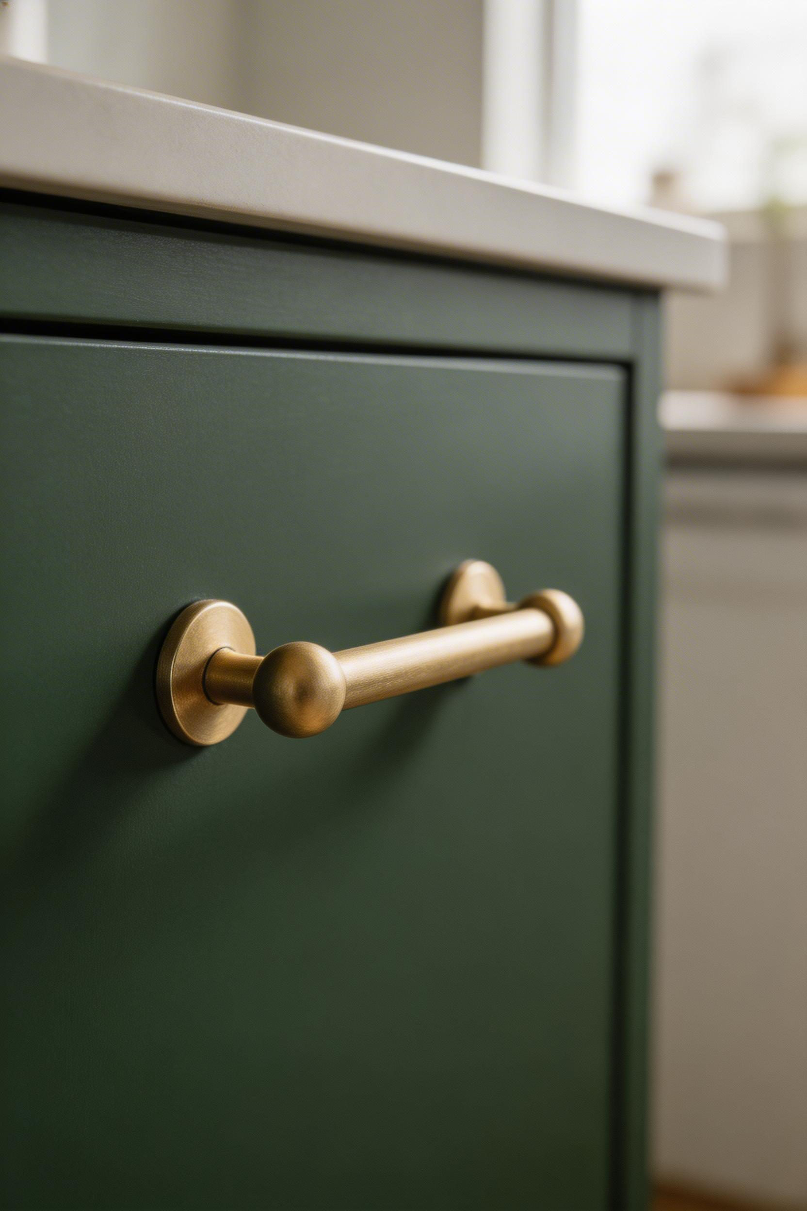
Bar pulls are the most popular hardware style for flat-front Shaker and slab cabinets. Cup pulls work best with inset and traditional cabinets. The sizing rule is simple: a bar pull should be roughly one-third the width of the cabinet door. A 5-inch bar pull on a 24-inch door looks proportionate; a 3-inch pull looks lost in the same door.
Mixed Metals and Finish Families
The mixed metals trend is now well established in kitchen design. Brass hardware paired with stainless appliances and chrome faucets is considered intentional rather than a mistake. The key is having an internal logic — all warm metals in one group, all cool metals in another. Consistency within each zone matters more than matching every metal in the room to every other.
Unlacquered brass develops a natural patina over two to three years. Some people actively want that aging; others find it unpredictable. Satin brass (lacquered) stays consistent. Decide before you buy. Cabinet hardware pulls are cited in 67% of home staging consultations according to the National Association of Realtors’ 2023 Profile of Home Staging. They’re the number one DIY upgrade recommended before a home sale.
One purchasing note: order one sample of each finish you’re considering and live with it for a week. Hardware finishes read completely differently at home than in a showroom or a product photograph. That one-week test has saved more than a few expensive mistakes.
6. A Kitchen Color Palette Built Around One Fixed Point
The most common color mistake in kitchens: choosing wall paint, cabinet color, and countertop in isolation. Then discovering they conflict once everything is installed. Most renovation regret stories start here. These are among the kitchen decoration ideas where planning upfront saves real money. Undoing a bad palette is expensive.
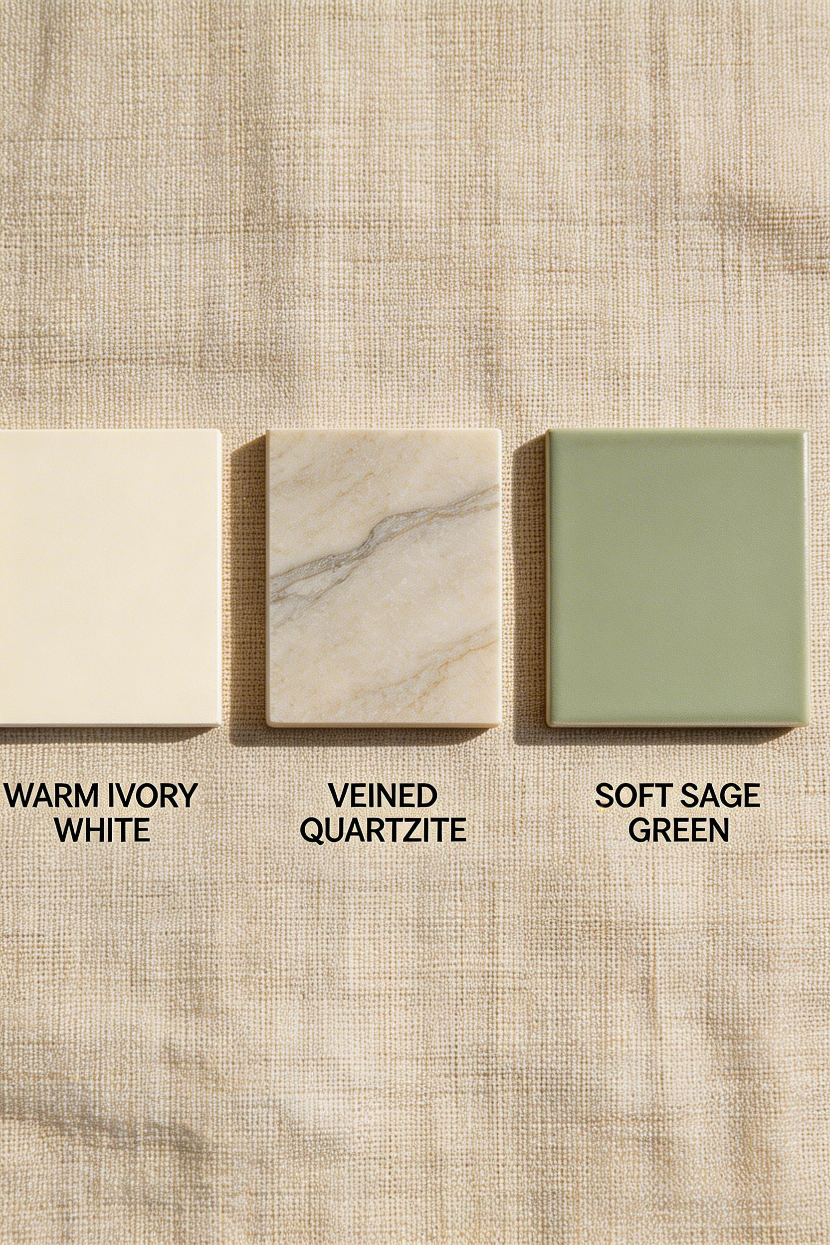
The fixed point is an element you cannot change cheaply: the countertop stone, floor tile, or existing appliances. Your palette flows outward from that point. Apply the 60-30-10 rule: 60% dominant color (cabinets and walls), 30% secondary (countertops and backsplash), 10% accent (hardware, textiles, plants).
Warm and Cool Tones — Where It Goes Wrong
Warm and cool tones conflict sharply in kitchens. The problem is that the conflict often isn’t obvious until everything is installed. Warm wood tones with cool grey stone look disconnected — they pull in opposite directions. Warm wood reads better with warm cream or beige stone. Cool white cabinets work better with cool grey or white stone.
LRV (Light Reflectance Value) matters in small or dark kitchens. Any LRV above 70 reads as light and open. Below 50 absorbs light. Benjamin Moore White Dove OC-17 (LRV 85.4) is the most popular kitchen white in North America. It reads warm without going yellow. Farrow & Ball Mole’s Breath No. 276 is a mid-tone warm grey with green undertones. It works well alongside timber floors and butcher block.
After photographing hundreds of kitchens, I can say this with certainty: when something looks wrong in a finished kitchen, it’s almost always a tonal conflict. Pull the dominant undertone from your countertop first. Then make sure everything else either matches it or deliberately contrasts it. Accidental warm-cool mixing is the number one source of ‘something just doesn’t feel right’ in kitchens that otherwise have good bones.
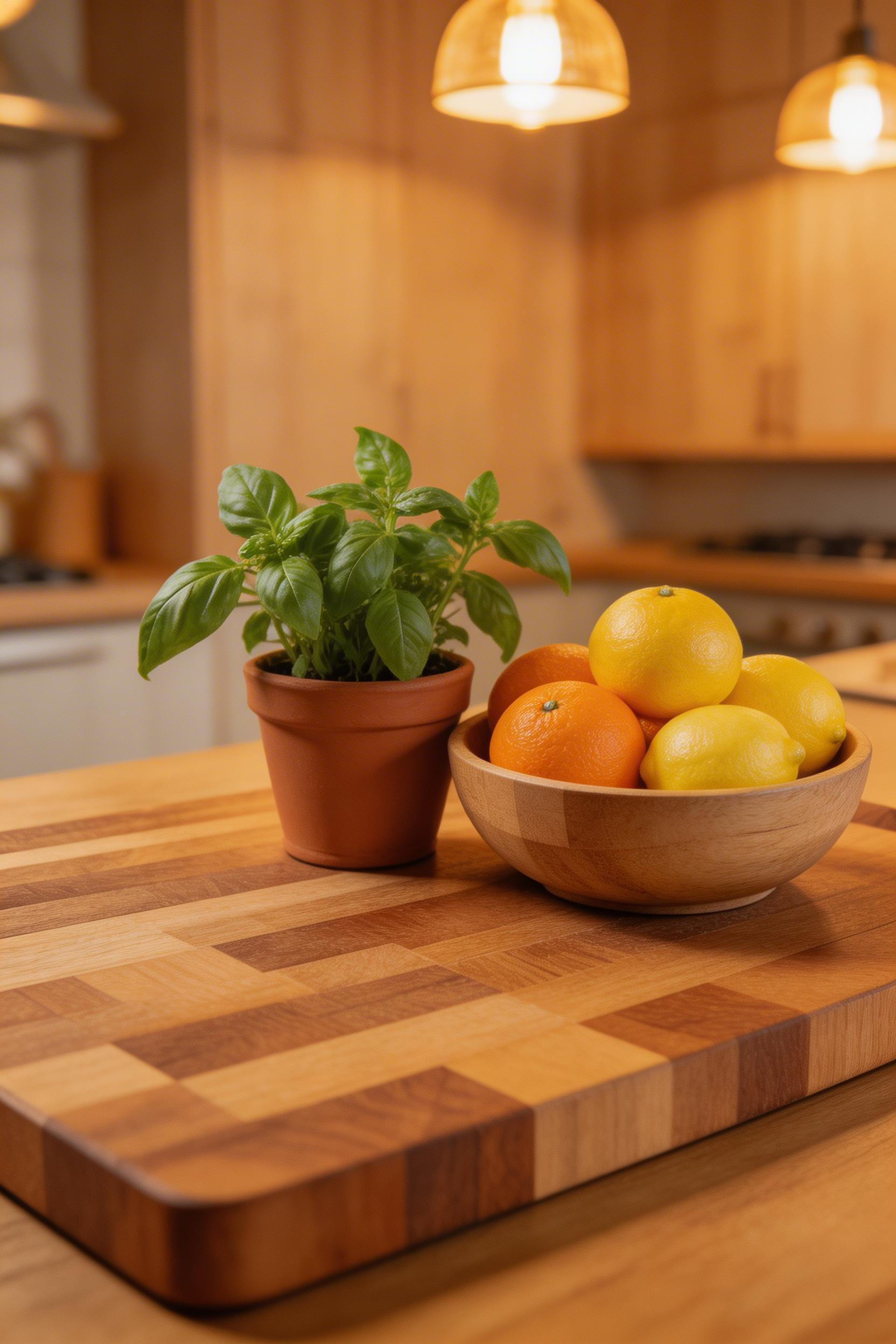
7. Countertop Plants and a Working Herb Garden
The kitchen is the only room in a home where living plants serve both decorative and functional roles. A working herb garden is both kitchen decor and usable produce. That dual purpose gives it a different character from a plant on a bookshelf. Also, plants are the only element in an otherwise hard-surface environment — tile, stone, metal, painted wood — that brings organic texture. That contrast matters.
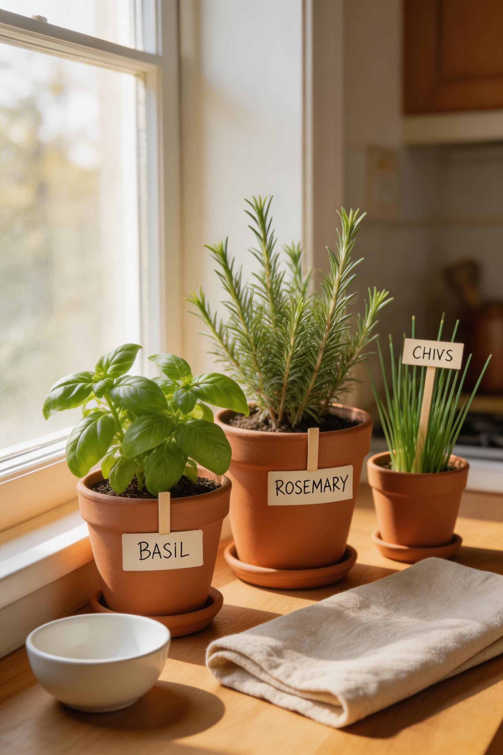
The best herbs for indoor kitchen conditions are basil, mint, chives, parsley, and cilantro. They tolerate indirect light and reasonable humidity. Rosemary and thyme need more direct light — place them near a south-facing window. For low-light kitchens, the AeroGarden Harvest ($89–$110) is a 6-pod LED growing system. It produces usable herbs year-round regardless of window conditions.
Choosing Plants as Kitchen Decor: Visual Balance Tips
For purely decorative plants, pothos, trailing ivy, and Chinese money plants (Pilea peperomioides) are the most resilient options. They tolerate irregular watering and lower light better than most. A 2021 study in the Journal of Environmental Psychology found that indoor plants in kitchens reduced self-reported stress by 37%. That makes plants one of the few decor elements with a measurable psychological effect.
Group three or four plants of different heights together rather than scattering single plants around the countertop. Vary the pot materials — one terracotta, one ceramic, one woven basket liner — for texture. A tiered plant stand ($40–$90 in oak or black steel) allows more plants without using more counter space. The styling rule is the same as for open shelving: odd-number groupings, varied heights, deliberate negative space.
8. Decorative Canisters and Container Collections
Canisters work beautifully when they’re right and look wrong when they’re not. The difference is almost always about material coherence. A canister set reads as a designed object when it forms a coherent collection — all ceramic, all glass, or all stainless — with variation only in size. It reads as clutter when it mixes three different materials in three different finishes.
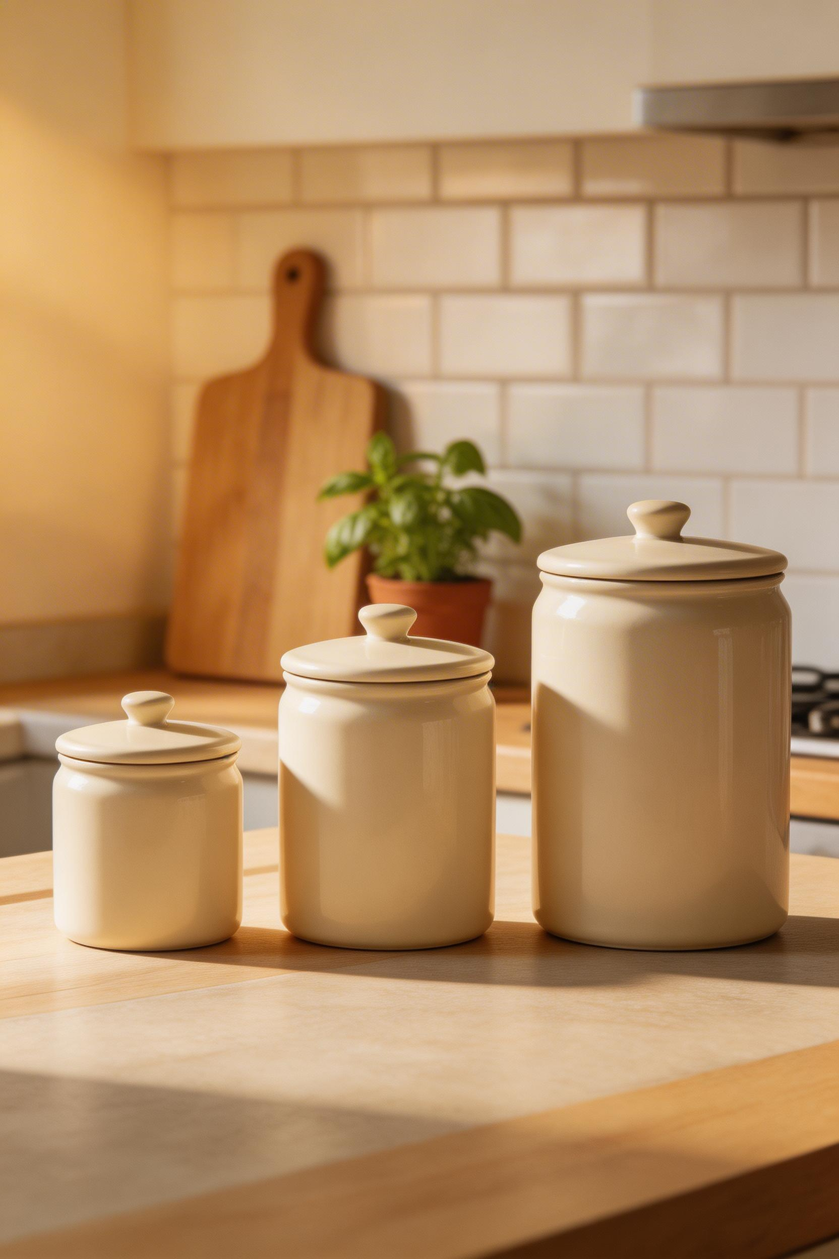
The classic three-canister progression — tall, medium, short — is safe because it works in almost any kitchen context. Four canisters in descending height can work. But the longer arrangement is harder to place without looking like a diner shelf. Matte finishes also photograph better than shiny glazed versions, since they don’t create reflective hot spots under kitchen lighting.
What to Actually Store in Them
Canisters displayed on the countertop should contain things you genuinely use daily: flour, sugar, coffee, tea. Empty canisters — or canisters filled with something you bought once and never opened — look hollow. Their function and their visual weight are connected. Our Place Ceramic Canisters ($90–$110 for a set of three) come in a matte minimal finish in seven colors. The Hearth and Hand with Magnolia stoneware canisters at Target ($18–$25 each) are a good-quality budget option with organic texture.
Before committing to a full set, buy one canister and place it on your actual counter for a week. The color, the height, the proportion — all of these read completely differently at home than in a product photo. A 2023 Apartment Therapy survey found that countertop containers ranked third among the most common kitchen decoration purchases, with 61% of respondents owning three or more. So most people are doing this already. The question is whether they’re doing it with a system or without one.
9. Kitchen Textiles: The Fastest Low-Cost Kitchen Decoration Ideas
Textiles are the fastest and cheapest way to add warmth, color, and seasonal variation to a kitchen. They’re also the most underrated among the kitchen decoration ideas that actually change how a room feels. A kitchen without textiles reads hard. Tile, stone, metal, painted wood — all of those surfaces are cold and reflective. A runner, a dish towel over the oven handle, a set of cafe curtains: these add material softness. And that softness balances the room’s otherwise industrial character.
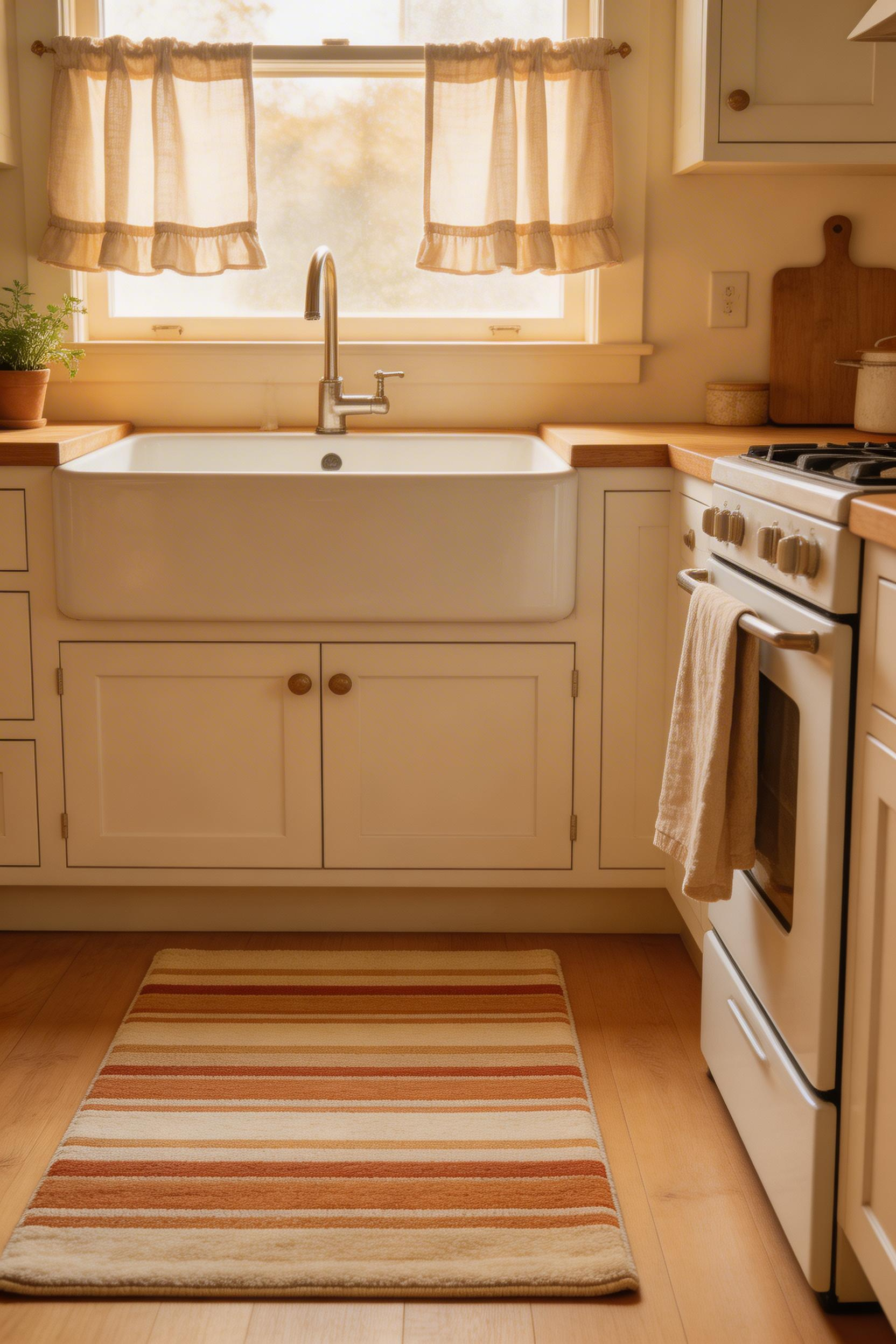
A kitchen runner in front of the sink reduces standing fatigue and adds pattern without a permanent commitment. Ruggable’s machine-washable runners ($129 for a 24×72-inch kitchen size) are the practical choice. They come in dozens of patterns and the covers go in the washing machine. For window treatments, cafe curtains (half-window length) preserve light while adding privacy. They’re more useful and more visually interesting than full curtains or nothing at all.
The Rule for Pattern in Kitchen Textiles
Pick one patterned item and keep everything else solid. A patterned runner and solid-color dish towels reads as designed. Three different patterns in the same kitchen reads as a craft fair. The Coyuchi Organic Waffle Weave Dish Towels ($32 for a set of two) are good enough to use as actual towels, not just as decoration. A towel that’s clearly too nice to actually dry dishes looks silly on display. Also: fold them in thirds and hang them over the oven handle or a drawer pull. A quality hanging towel does visible work as kitchen decor without taking up any counter space.
10. Wall Art and Prints That Work in a Kitchen Context
Most wall art fails in kitchens for reasons that have nothing to do with the art itself. Scale is the most common problem: a single 8×10 print on a large blank wall looks lost. Humidity and cooking grease are real environmental hazards that most print buyers don’t think about until it’s too late. And the subject matter that works in a living room — abstract art, portraiture — often reads oddly in a kitchen context.
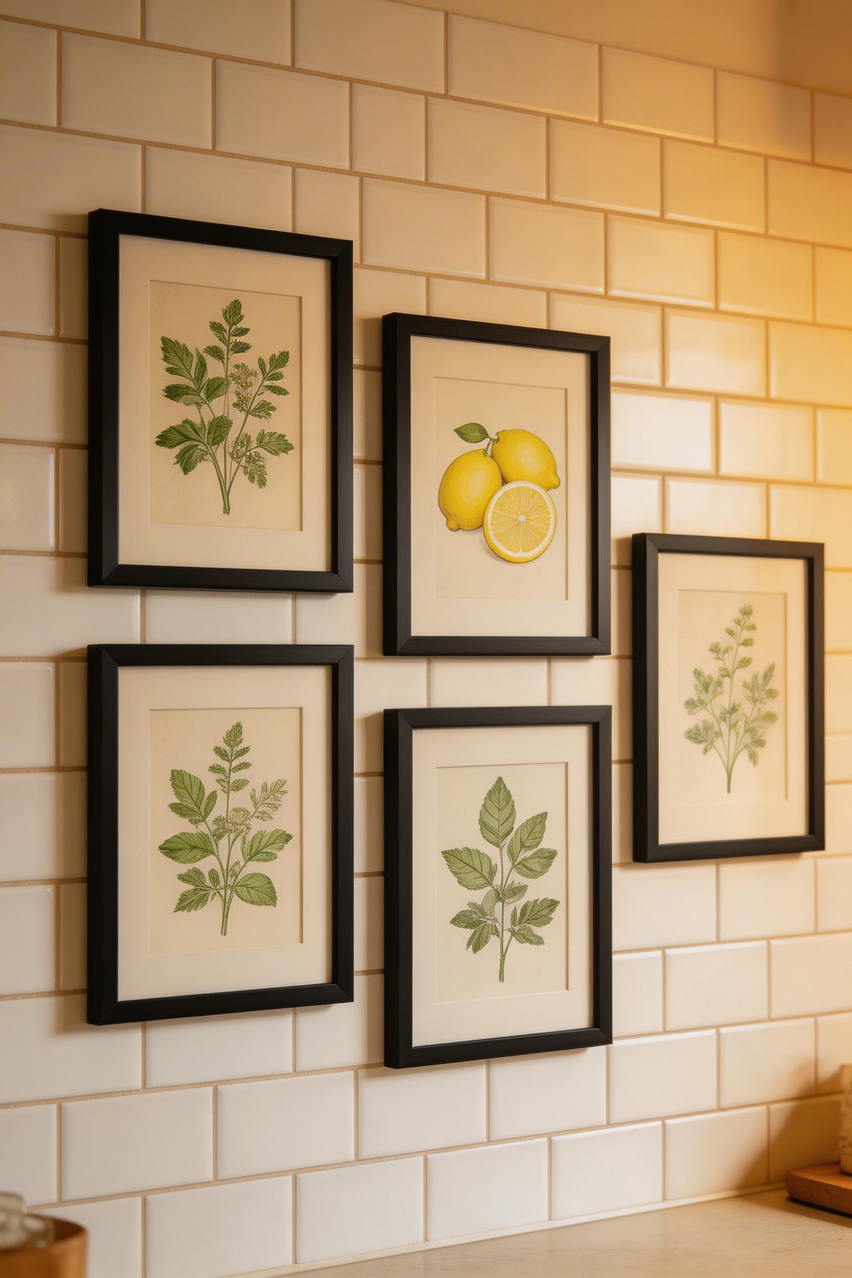
Food and botanical prints — vintage fruit lithographs, herb illustrations, market prints — are the most contextually appropriate wall art for a kitchen. They connect to the room’s purpose in a way that makes them feel right rather than transplanted. Society6 and Etsy both offer digital downloads in this category for $15–$45 per print. Print them at a local shop on cardstock for better results than home printing.
Framing and Placement for Kitchen Conditions
Framed prints in kitchens should be behind UV-protective acrylic rather than glass. Also keep them away from the range wall, where humidity and grease are highest. IKEA RIBBA frames (white or black, $5–$10 each) are the de facto standard for kitchen gallery walls. They’re consistent, clean, and cheap enough to buy in quantity.
For placement: a gallery of four to six small prints reads better in kitchens than a single large piece. Center the arrangement at eye level (57–60 inches from floor to the visual center of the grouping). Etsy reported an 89% increase in searches for ‘kitchen wall art’ between 2021 and 2023, with botanical and food-themed prints leading. People are getting clearer about what works. The most common mistake I see: one small print centered alone on a large wall. It always reads as unfinished. Go big or go in multiples.
For more kitchen decorating inspiration beyond wall art alone, the range of options is wider than most people initially consider.
11. The Kitchen Island: A Kitchen Decoration Idea That Costs Nothing
The island countertop is the most photographed surface in a kitchen. Yet most people use it as a landing zone for mail, keys, and random appliances. Among all the ideas on this list, rethinking the island surface costs nothing and requires no purchases. It requires only editing.
A well-styled island has three zones: a functional zone (cutting board, knife block, or fruit bowl), a decorative zone (flowers, plant, or candle in a vessel), and clear negative space. At least 30–40% of the surface should be empty. The John Boos maple end-grain cutting board ($120–$160, 18×12-inch) is both a genuine working surface and a visually strong base layer.
The Island Kitchen Decor Restraint That Makes It Work
Fresh flowers or a potted plant are the most effective objects on an island top — they soften the hard lines of cabinets and stone countertops in a way that ceramic objects alone can’t. Candles work on islands only if they’re in a vessel (hurricane glass, ceramic holder) — a naked pillar candle looks dated in most current kitchen contexts.
According to Houzz’s 2024 Kitchen Trends Report, kitchen islands are present in 45% of all renovated kitchens, up from 31% in 2015. But presence isn’t the same as good styling. The rule I use when photographing a kitchen: remove everything from the island, then put back only what you’d be comfortable seeing in a magazine. That’s usually one cutting board, one plant, and one functional item. Deliberate restraint beats fifteen pieces of good individual taste every time.
If you’re working with small kitchen decor constraints, a scaled-down version works the same way. One small cutting board and one small plant, proportionately placed.
12. Vintage and Antique Accents in a Modern Kitchen
A single antique object prevents a modern kitchen from looking like a showroom floor. It introduces history, imperfection, and specificity that factory-produced objects lack. That contrast is what makes a kitchen feel inhabited rather than installed. This is one of the kitchen decoration ideas that costs almost nothing but requires a specific kind of attention to work.
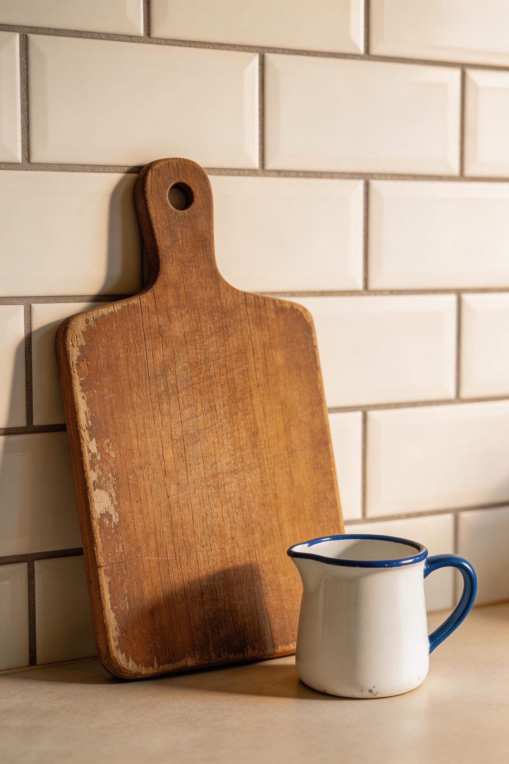
The best antique kitchen accents are items that were originally functional: breadboards, crocks, cast iron skillets, ceramic pitchers, wooden bowls. These objects have a history encoded in their surfaces — wear patterns, patina, visible repairs. Modern reproductions never fully replicate that. Antique wooden breadboards (pre-1950s, with a hole for hanging) cost $15–$80 at estate sales or on eBay. Search ‘primitive breadboard’ or ‘antique cutting board with hole’ to find them.
How to Place Antique Objects Without Overdoing It
My rule for vintage accents in a kitchen: one per zone. One antique item near the range, one on the island, one on open shelving. More than that, and the kitchen starts to read as a collection rather than a home. The single-piece-per-zone approach is how you get the warmth of vintage without the cluttered feeling that undermines it.
Pinterest Predicts reported 134% growth in searches for ‘vintage kitchen decor’ between 2022 and 2024. The trend makes sense. The more mass-produced everything becomes, the more a worn wooden breadboard earns its place by being different from everything around it. That said, keep antique wood pieces away from direct steam. The area directly above the range is too humid for them to survive long-term.
13. Cohesive Small Appliances: The Detail Designers Always Notice
This is the kitchen decoration idea that most homeowners overlook entirely. Professional designers and photographers, however, notice it immediately. Small appliances — toasters, kettles, coffee makers, stand mixers — occupy significant counter space. They’re impossible to visually ignore. And a kitchen with mismatched appliance finishes broadcasts a lack of intention, even when the cabinets and countertops are genuinely well-designed.
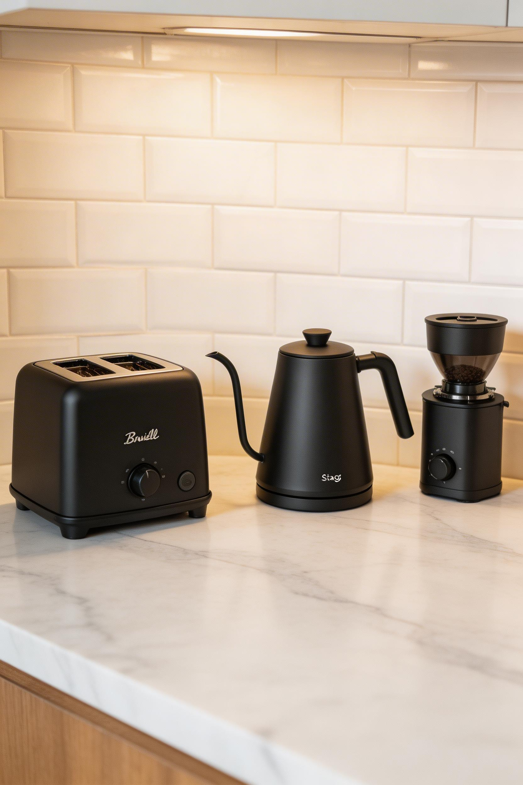
The three dominant appliance finish families are stainless (cool, professional), matte black (modern, bold), and white or cream (traditional, farmhouse). Mixing within a family is fine — a brushed stainless toaster and a polished stainless kettle can coexist. But mixing across families reads as unplanned, even if each individual piece is well-made. One chrome toaster, one matte black kettle, one white stand mixer — that combination announces that no one made a decision. The KitchenAid Artisan Stand Mixer ($400–$600) comes in over 25 colors, with cross-range coordination built into the brand’s lineup. Smeg offers the same logic in a retro Italian style. The TSF01 toaster ($250) and KLF03 kettle ($200) come in eight coordinated colors.
The Edit as Kitchen Decoration Strategy
Where full replacement isn’t in the budget, editing is the alternative. Put mismatched appliances in a cabinet or appliance garage. Display only the pieces that belong to your finish family. A custom appliance garage costs $400–$1,200 installed. But an IKEA base cabinet with a pull-up door insert is a $150–$300 DIY approach that achieves the same result. A 2023 Williams Sonoma consumer survey found that 58% of respondents would consider a coordinated appliance set for a kitchen update — up from 34% in 2019. The awareness is there. The follow-through is the gap.
For a broader system approach, the guide to kitchen organization hacks covers counter management as part of a whole-kitchen strategy.
14. Under-Cabinet Lighting: An Underrated Kitchen Decoration Idea
Under-cabinet lighting is the single most underused kitchen decoration idea in this list. It costs $25–$200 to add with plug-in LED strips. Installation takes under an hour. And it changes how every countertop surface reads. It also changes how the kitchen feels at different times of day — in a way that almost nothing else at this price point can match.
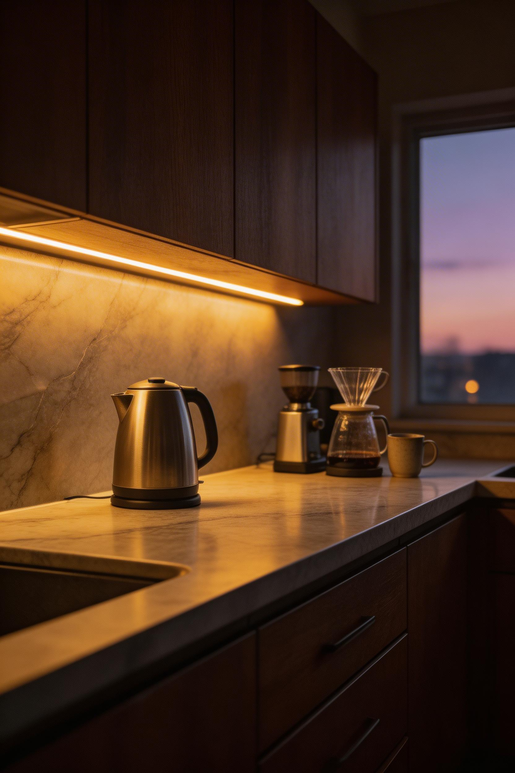
LED strip lights like Govee ($25–$45 for a plug-in kit) offer color temperature adjustment. Run warm 2700K at night for atmosphere, cooler 4000K for food prep during the day. For a more permanent installation, WAC Lighting’s InvisiLED under-cabinet lights ($60–$120, 24-inch hardwired) are dimmable and sit nearly flush against the cabinet underside.
Installation Details That Change the Result
Position LED strips at the front edge of the cabinet underside, not the back. Mounting at the back throws light against the wall rather than onto the work surface — the most common installation mistake. A diffuser channel (aluminum extrusion with a frosted lens, $20–$40 for a 6-foot run) makes strip lights look finished rather than improvised.
The NKBA 2024 Design Trends Report found that under-cabinet lighting is specified in 43% of kitchen renovations, up from 28% in 2019. Install a dimmer switch if you’re hardwiring the system. The lighting that makes early morning coffee feel genuinely good: under-cabinet strips at 20–30% brightness. Warm, soft, and focused on the counter. It’s one of the kitchen decoration changes that improves how a kitchen feels to be in, not just how it photographs.
15. A Chalkboard, Corkboard, or Gallery Wall for the Kitchen Command Center
The kitchen is the most used room in a home by functional necessity. It becomes a command center whether you plan for it or not. The question is whether the result is organized and intentional, or a sprawl of papers, magnets, and random notes that undermines everything else you’ve done in the space.
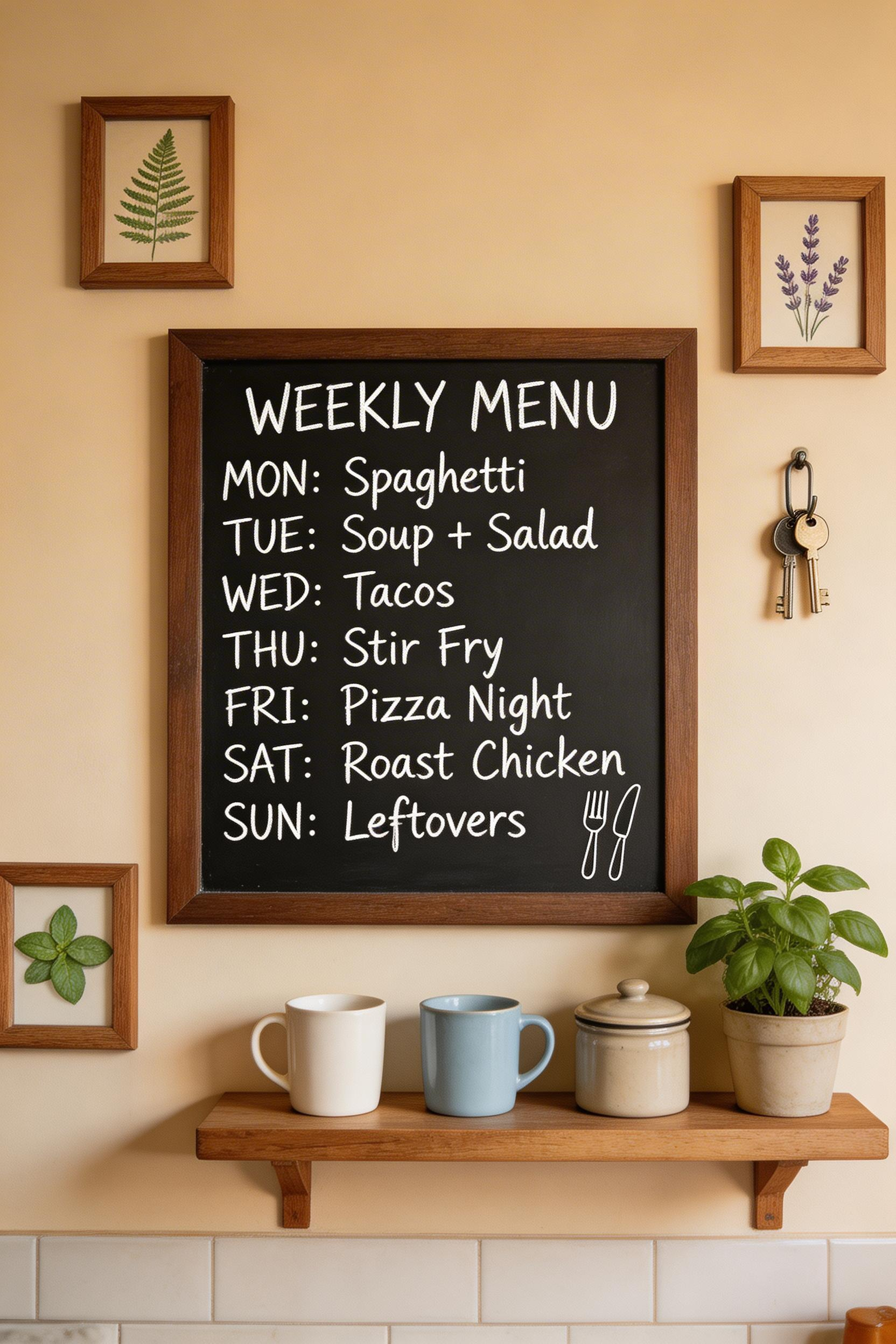
A framed chalkboard — a chalkboard surface in a wood or metal frame, hung like art — is the most versatile option. It works as a weekly meal planner, a shopping list, a household note surface, and a visual anchor for the wall. The Nielsen Bainbridge Black Gallery Frame with chalkboard insert (18×24 inches, $35–$55) looks like art from across the room. Up close, it’s a writing surface. For a wall-applied version, Rust-Oleum Chalkboard Paint ($14–$18) can be applied to any primed surface.
Making It Function and Look Good Simultaneously
The command center only works if it’s given a dedicated, visible space — not squeezed beside the refrigerator or half-hidden behind a door. It should be visible from the main work area. One detail that makes a significant difference: use a chalk pen (chalk marker, $8) rather than regular chalk for regular-use boards. It writes more cleanly, lasts longer, and produces a more polished finish.
A 2022 Architectural Digest reader survey found that 44% of respondents used their kitchen wall as a functional organization area. Of those, 78% said an organized wall display made them feel ‘more in control’ of the home. That psychological benefit is real. The kitchen wall that works as both a kitchen decoration idea and a functional system is the highest-efficiency use of vertical space in the room. For the decorative side of kitchen vertical surfaces, these kitchen backsplash ideas cover the complementary ground.
Which Kitchen Decoration Ideas Should You Start With?
The fifteen kitchen decoration ideas in this guide aren’t equally weighted. Some return more visual impact per hour of effort. Others cost almost nothing. A few require a full weekend. If you’re choosing where to begin, start with the decisions that have the highest fixed cost of getting wrong: the backsplash, the cabinet color, and the lighting.
Those three elements — surface, color, and light — account for the majority of what the eye reads when entering a kitchen. Get them right, and everything else layers on top cleanly. Get them wrong, and no amount of good canisters or styled shelving compensates. The Remodeling Magazine 2024 Cost vs. Value report puts a number on this: a minor kitchen remodel returns 96.1% of its cost at resale. That’s the highest return of any interior renovation category.
From there, work through the mid-tier changes: pendant lighting over the island, cabinet hardware, open shelving, and textiles. These kitchen decoration ideas shift a room’s character without touching its structure. Finally, the object-level decisions — plants, canisters, island styling, vintage accents — add personality on top of a framework that already works.
The difference between a kitchen that looks put-together and one that looks like a collection of objects is almost always this sequencing. Build the visual foundation first. Then layer the details. The specific choices matter, but the order in which you make them matters just as much.