The Curatorial Promise: Why Cabinet Color is Your Kitchen’s Most Defining Investment
I constantly remind clients that choosing kitchen cabinet colors means looking past fleeting Pinterest trends. Your cabinetry acts as the visual foundation of the room. In fact, cabinets occupy nearly 70% of your visible vertical space. Therefore, they are the anchor tenant for your entire design scheme. Specifically, this massive footprint dictates every other material choice you make. This rings especially true if you are planning a flawless kitchen cabinet makeover.
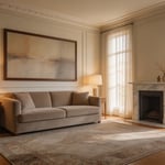
For years, sterile white kitchens were the clinical standard. However, I much prefer today’s shift toward deep, moody atmospheres. Instead of feeling like an operating room, your space becomes a genuine sanctuary. For instance, saturated forest greens create a grounded, calming effect. Naturally, your cabinet finish is also a major technical investment. Premium luxury manufacturers use intense pigment loading. Therefore, these automotive-grade formulas resist fading under harsh sunlight. Yet, cheaper DIY paints often flatten and yellow over time.
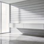
Choosing a rich, curated color signals bespoke elegance. In fact, recent market data shows that moody tuxedo kitchens actively boost resale value. Buyers simply recognize this intentional design as a premium upgrade. Next, consider how the physical finish changes how a color feels. For example, a dead-matte navy finish mimics soft velvet. Alternatively, a high-gloss surface projects sharp, modern energy. Ultimately, the right hue balances classic beauty with smart financial returns.
Understanding Undertones: The Secret Language of Luxury Color Palettes
Nailing the undertones in a luxury kitchen requires more than picking a basic paint swatch. Specifically, high-end paints blend up to 12 different pigments to create a single neutral. Mass-market brands, on the other hand, usually mix just three or four cheap minerals. This extreme pigment density creates a deliberate metameric effect. As a result, your cabinet color actually shifts alongside the daily lighting. For example, a complex gray feels wonderfully crisp in cool morning light. Later, warm evening light pulls out hidden red pigments. Indeed, the kitchen suddenly feels enveloping and richly atmospheric. Designers actively curate this shifting quality. Mastering these principles for contemporary kitchen cabinets remains the true mark of a bespoke space.
Iconic historical shades like Farrow & Ball’s Elephant’s Breath perfectly capture this quiet luxury. It is a highly complex, warm purple-gray with a delicate hint of magenta. Therefore, it vibrates beautifully next to unlacquered brass hardware. Similarly, many high-end neutrals contain grounding drops of black or burnt umber. These earthy additions deliberately lower the color’s overall visual intensity. Thus, the paint gently absorbs light rather than bouncing it harshly around the room. I love how these whispering colors let natural kitchen textures shine. In fact, they highlight Calacatta marble veining and white oak grain perfectly. Today, deep heritage shades represent incredibly smart, lasting investments. Ultimately, these grounded geological tones make spaces feel permanently sophisticated.
Luminosity and Perception: How Lighting Architecture Dictates Color Selection
Designing a luxury kitchen means accepting that light completely controls color. Specifically, a phenomenon called metamerism causes colors to change under different bulbs. Take a complex greige cabinet containing red, yellow, and black pigments. Under warm incandescent lighting, those red tones create a cozy atmosphere. However, cool LED lighting suppresses the red entirely. Consequently, that same luxurious greige might suddenly look stark or muddy. Therefore, I always insist on large-format vertical paint sampling. Indeed, this mimics how light actually hits the cabinet faces in your home.
Next, we have to consider the inter-reflection effect. This happens when light bounces between your countertops and vertical cabinetry. For instance, highly reflective white marble counters wash out the saturation of lower cabinets. Meanwhile, dark granite absorbs light. As a result, upper cabinets often appear much darker underneath. Your cabinet finish also dramatically impacts luminosity. In the past, ultra-modern designs relied heavily on high-gloss finishes. But misplaced lighting creates harsh veiling glare on glossy surfaces. Instead, modern luxury leans into super-matte velvet finishes. These textures scatter light evenly. Thus, they provide a sense of architectural stillness and consistent color.
Finally, color temperature physically alters perceived material weight. Naturally, warm lighting adds visual mass to wood grains. Alternatively, modern transitional kitchens favor high-Kelvin cool lighting for crisp whites. Today, high-quality LEDs allow us to use complex neutrals. Previously, older lighting made these subtle tones look dingy. Now, tunable white technology offers human-centric lighting. Accordingly, your cabinets can shift from energizing morning hues to rich evening gold. Therefore, investing in sophisticated lighting architecture ensures your color selection remains flawless.
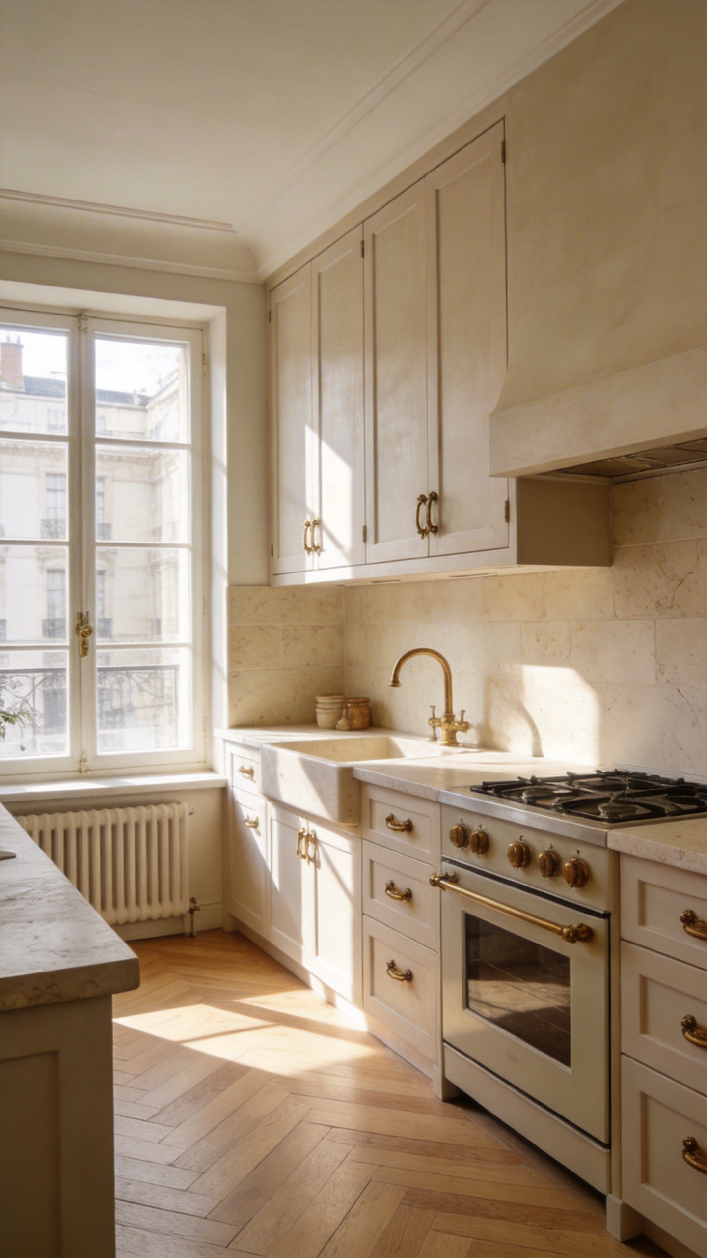
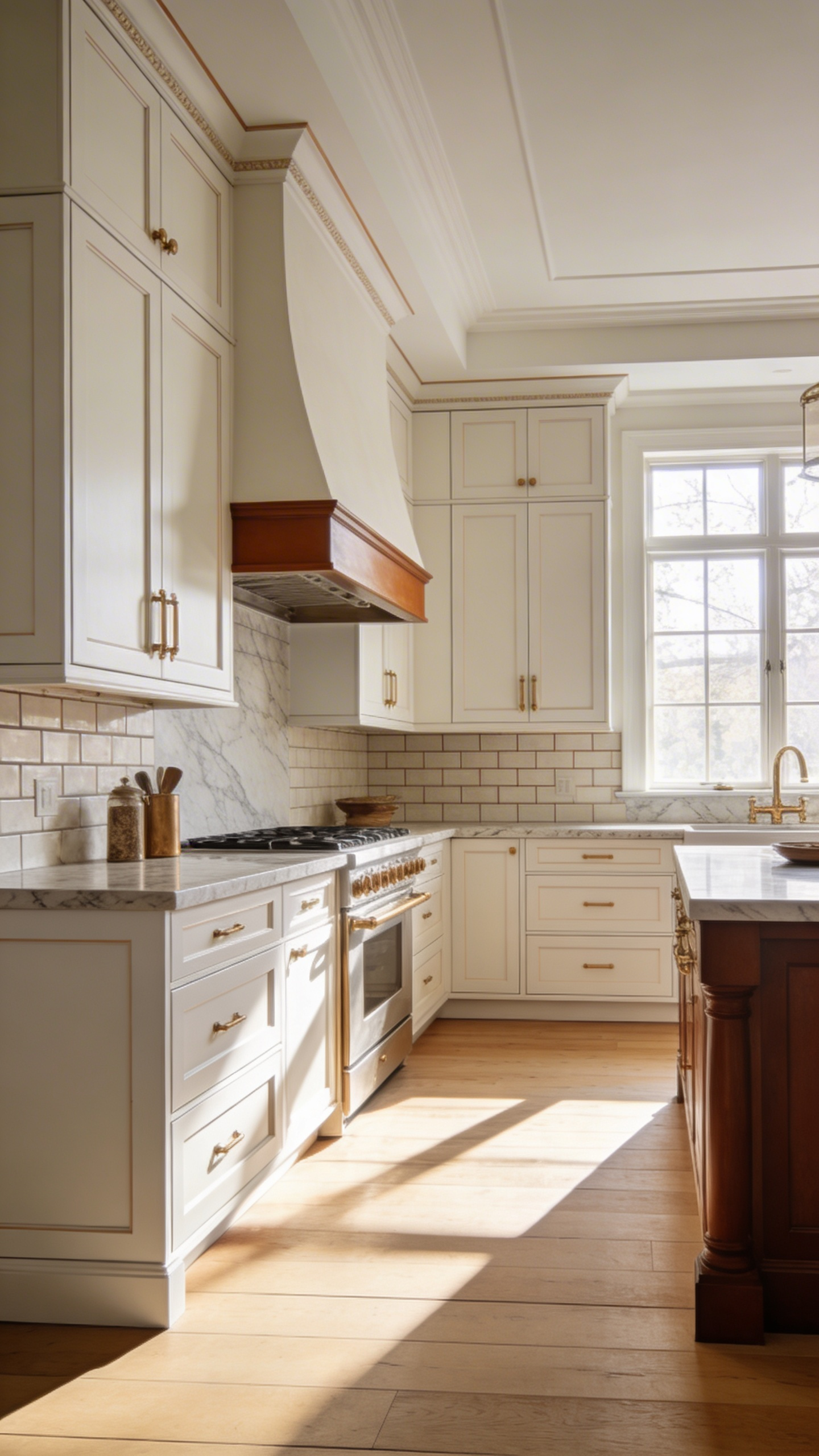
Alabaster & Warm Whites: The Evolution from Stark White to Bespoke Warmth
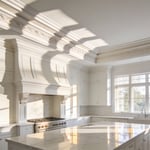
For nearly two decades, the stark white kitchen symbolized contemporary luxury. However, these clinical spaces often triggered severe visual fatigue. Homeowners also felt a subconscious pressure to constantly sanitize everything. In fact, owners of all-white kitchens spend roughly 23% more time cleaning. Consequently, the design world shifted toward bespoke warmth around 2016. Specifically, Sherwin-Williams named Alabaster its chosen color of the year. This rejuvenating shade has a light reflectance value (LRV) of 82. Therefore, it retains an airy feel while introducing subtle beige undertones. Unlike pure hospital whites, Alabaster acts as a versatile design chameleon. Naturally, it bridges the gap between stark perfection and a personal sanctuary.
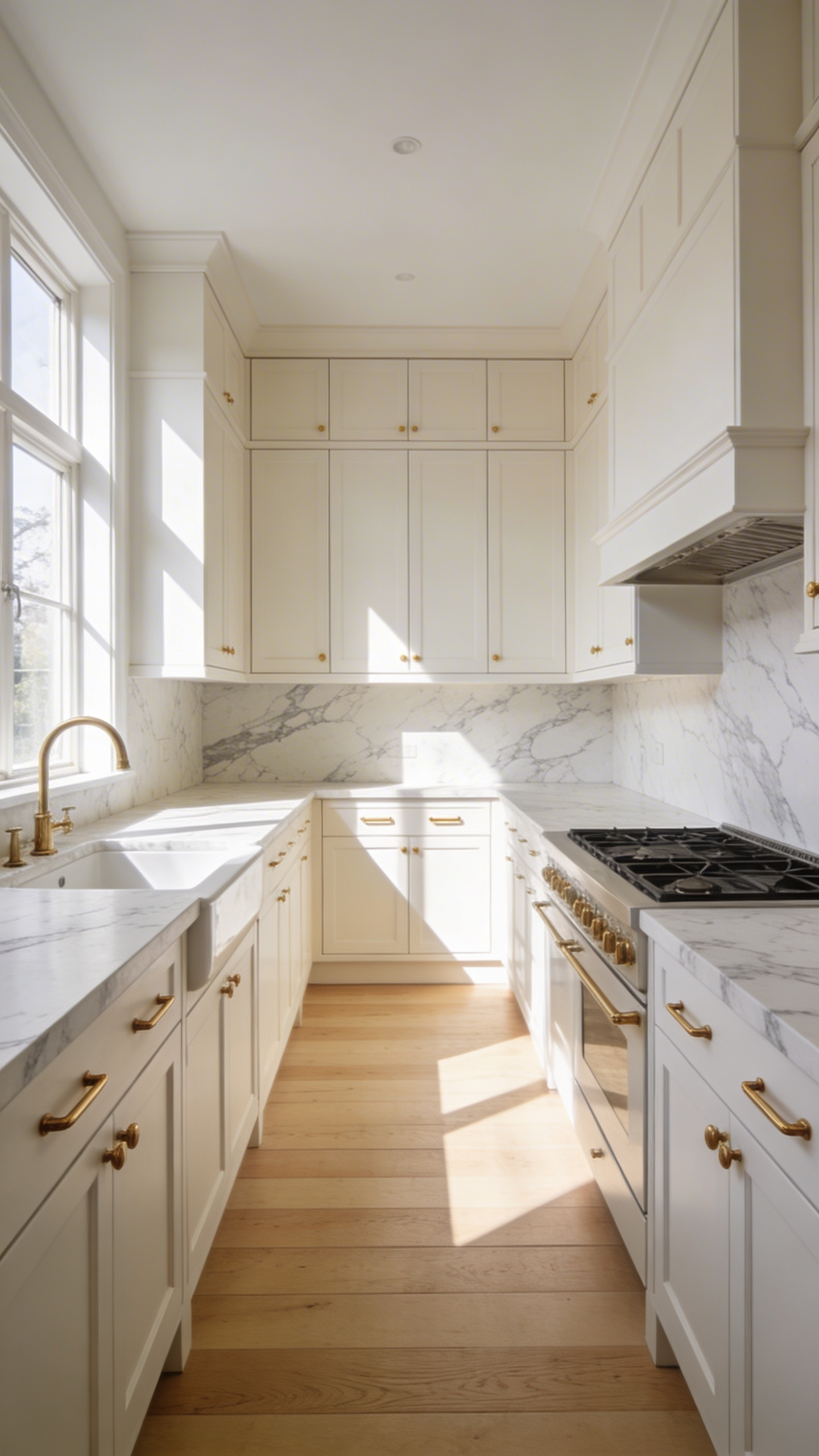
Cinematic design trends also popularized an unpretentious, lived-in luxury style. Indeed, creamy shades like White Dove pair seamlessly with organic materials. Together, matte marble and aged brass create a beautifully grounded atmosphere. Scientifically, these warm whites adapt perfectly to your unique environment. Specifically, metamerism causes Alabaster to shift depending on your window orientation. For instance, cool northern exposures make the paint read crisp. Conversely, southern lighting draws out a cozy, golden cream glow. Designers frequently pair these warm cabinets with soft 3000K LED bulbs. Thus, the lighting evokes a romantic candlelight ambiance after sunset. Practically, satin-finished warm whites are highly forgiving of daily chaos. Ultimately, nature-inspired tones offer a smarter, long-lasting investment for modern homes.
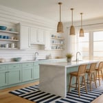
Mushroom & Tailored Greige: The Ultimate Chameleon Tones for Transitional Spaces
Kitchen design is finally shifting away from sterile millennial grays. Instead, homeowners are embracing a sophisticated modern heritage aesthetic. Specifically, mushroom and tailored greige lead this elegant transition. These hues are not simply lighter versions of basic tan. Rather, they root themselves deeply in classic Shaker traditions. Consequently, they offer an immediate sense of historical permanence.
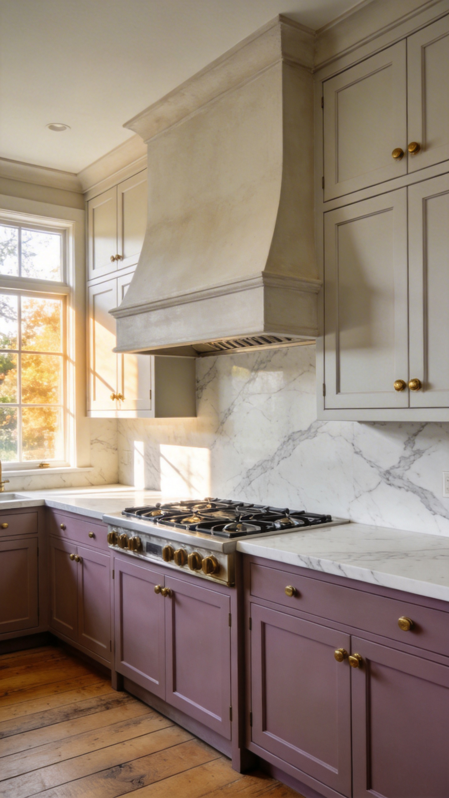
Designers frequently call these complex shades true chameleon tones. Technically, their metamerism allows them to shift under varied lighting. For instance, northern light highlights a sophisticated taupe-gray hue. Conversely, southern exposure pulls forward rich, earthy stone qualities. Furthermore, their violet or green undertones prevent a dated appearance. This technical alchemy maintains a crisp look under modern LEDs. Smart investments often utilize colors in the 45-60 LRV range. Importantly, this specific value prevents spaces from feeling cave-like.
Tactile finishes transform these colors into velvety poured clay. Therefore, matte surfaces are universally preferred over synthetic high-gloss options. Material harmony naturally follows this soft-focus foundation. Indeed, mushroom cabinets perfectly bridge unlacquered brass and Carrara marble. Ultimately, both shades serve as low-arousal psychological breathing pauses. As a result, your cabinetry gracefully recedes into the home’s architecture.
While similar, experts distinguish between these two highly popular tones. Naturally, mushroom heavily favors an organic, expensive country feel. Meanwhile, tailored greige provides a polished, contemporary metropolitan look. For a collected aesthetic, I recommend layering these elegant tones. Specifically, use a darker mushroom on your main kitchen island. Then, apply a lighter tailored greige to the perimeter cabinets.
French Canvas: Subtle Beige Variations That Project Quiet Luxury
The term “French Canvas” represents a specific family of complex, sophisticated neutrals. Specifically, these subtle beiges are the cornerstone of the quiet luxury movement. Fundamentally, a shade like Benjamin Moore’s OC-41 evokes a clean, artistic slate. It also nods directly to the historic Lutetian limestone of Parisian architecture. Therefore, using these mineral-toned beiges gives your kitchen a sense of historical permanence.
Technically, the secret to this expensive look lies in chromatic complexity. Luxury hues typically sit at a Light Reflectance Value around 70 to 75. Consequently, they feel perfectly airy while holding their own against bright windows. Additionally, French Canvas acts as a brilliant color chameleon. Hidden green and gray pigments allow the paint to beautifully shift with the light. For example, north-facing light brings out a sophisticated, weathered stone appearance. Conversely, south-facing light warms the beige into a sun-drenched glow.
Ultimately, quiet luxury requires pairing these paints with high-end, tactile materials. Design experts favor low-contrast layering for a truly wealthy feel. Pairing these canvas cabinets with honed Calacatta marble creates an expansive, elegant wash. Similarly, adding unlacquered brass hardware pulls inviting warmth from the beige base. Finally, you can explore deeper, earthy variations like Farrow & Ball’s Drop Cloth or deVOL’s Mushroom. Thus, you achieve a timeless space balancing classic restraint with modern comfort.
Deep Charcoal: The Softer, More Sophisticated Alternative to Pure Black
The shift from pure black to deep charcoal marks a transition toward livable elegance. Specifically, the secret lies in the Light Reflectance Value. Pure black absorbs nearly all light. Consequently, this creates a flat, harsh effect on classic Shaker cabinets. However, elite shades like Iron Ore provide a critical visual buffer. Thus, charcoal retains enough reflectance to highlight architectural shadows beautifully.
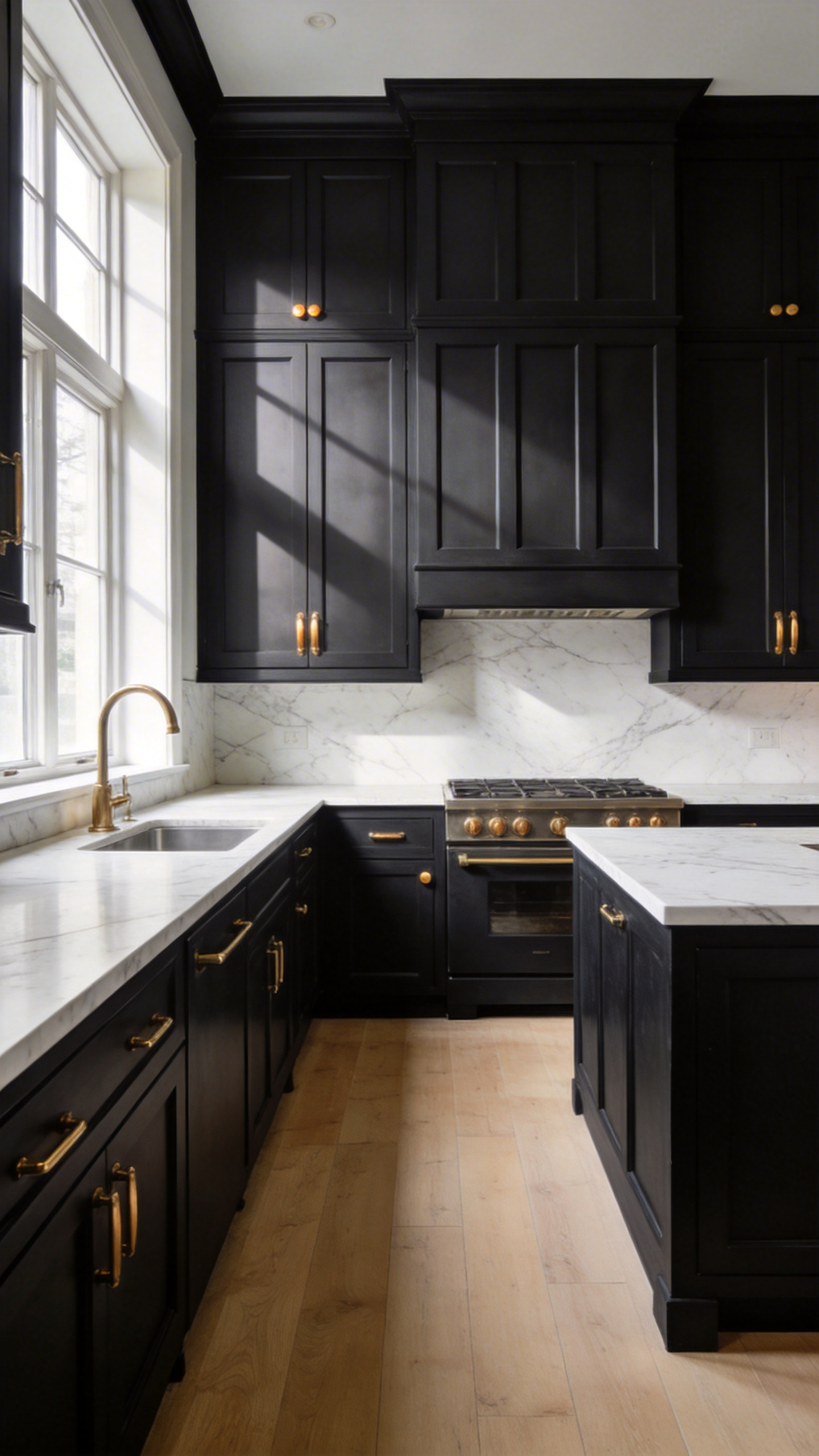
Pure black remains a notoriously static and cold hue. Conversely, deep charcoal acts as a living, organic neutral. It relies on complex green or blue undertones. Therefore, the paint reacts beautifully to your kitchen’s natural lighting. For example, a green-based charcoal pairs harmoniously with organic walnut wood. Additionally, this nuanced hue references historical British scullery styles. Indeed, it offers a profound sense of heritage over fleeting modern trends.
Practically, this softer shade serves as an exquisite gallery backdrop. In fact, the muted tone allows unlacquered brass hardware to gently glow. Similarly, charcoal pulls the delicate grey veining out of Calacatta marble. Pure black, on the other hand, often washes out these luxurious stone details.
Beyond aesthetics, the final choice comes down to daily kitchen maintenance. Naturally, pure black matte surfaces highlight oils, fingerprints, and dust. Meanwhile, charcoal cleverly diffuses these inevitable everyday imperfections. As a result, the darker hue creates a sophisticated, intimate cocoon for dining. Ultimately, this grounded color remains a smart investment for high-end homes.
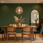
Muted Olive & Soft Sage: Bringing Biophilic Serenity to the Heart of the Home
Modern kitchens are finally leaving the sterile white era behind. Instead, muted olive and soft sage have emerged as the definitive luxury neutrals. Historically, these shades reclaim the kitchen with a sense of organic permanence. Specifically, soft sage draws from Scandinavian interiors to provide an airy, elegant feel. Conversely, muted olive reflects the rich Mediterranean landscape. Furthermore, it grounds the space with profound visual weight.
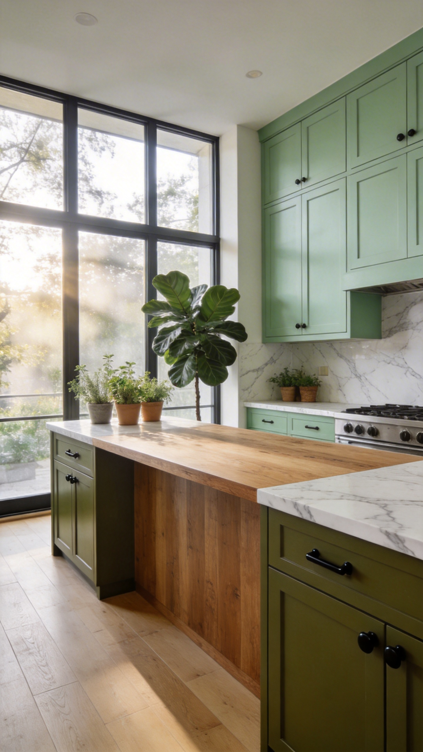
Technically, the success of these colors relies on their light reflectance values. For example, sage acts as a cool neutral that softens beautifully under evening light. Meanwhile, olive absorbs light through its complex yellow and brown undertones. Therefore, olive creates a seamless transition when paired with raw natural woods. Psychologically, these hues act as natural analogues to effectively lower daily stress levels. Thus, a color-drenched olive kitchen creates a sophisticated, comforting sense of refuge.
Achieving high-end elegance requires thoughtful material investments. High-gloss textures rarely succeed with these earthy tones. Rather, I favor velvet matte finishes that mimic the physical texture of sage leaves. Additionally, unlacquered brass hardware oxidizes beautifully to mirror this organic aging process. Similarly, honed soapstone offers deep charcoal tones that enhance this lived-in luxury.
Some critics worry that sage might eventually feel overused. However, muted olive represents a brave, grounded evolution for modern homes. Ultimately, a two-tone cabinetry strategy secures your long-term design investment. Indeed, placing olive on base cabinets with sage above mimics a natural forest gradient.
Washed Terracotta: Earthy Warmth for Mediterranean-Inspired Sophistication
To understand modern terracotta cabinetry, we must look beyond the bright orange tones of the 1990s. Today’s washed finish relies on artisanal clay glazes and slaked limewash. Consequently, this application creates a tactile, suede-like texture. This finish anchors the trending tactile calm movement in luxury design. The multidimensional surface actually breathes visually throughout the day. For instance, the millwork shifts from soft peach at noon to grounded clay at dusk. Ultimately, this sun-bleached spectrum provides hearth-like warmth without overwhelming the space.
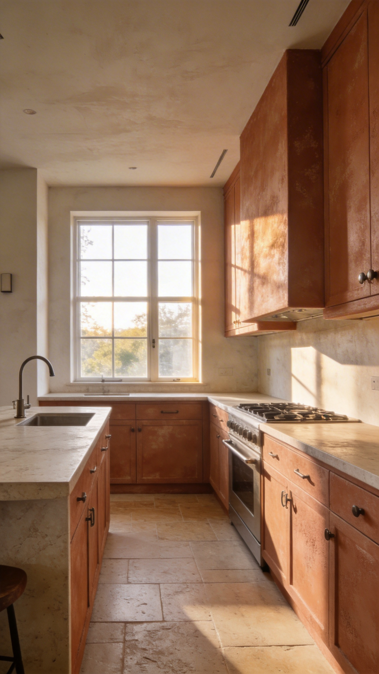
Therefore, washed terracotta acts as a sophisticated new neutral. Particularly, it pairs beautifully with high-contrast textured soapstone or honed travertine. Indeed, this raw-meets-refined aesthetic elevates the kitchen instantly. Expert designers usually recommend unlacquered brass or patinated bronze hardware here. Naturally, these living finishes gracefully age alongside your cabinetry. Thus, choosing authentic materials represents a smart long-term investment. Wide-plank light oak floors also keep the Mediterranean look wonderfully airy.
Interestingly, pairing these earthy cabinets with slate blue creates an iconic color palette. Historically, the term terracotta simply translates to cooked earth. Applying this ancient wash to modern slab cabinetry creates heritage-inspired innovation. Consequently, the resulting space feels both remarkably fresh and centuries-old.
Deep Forest Green: Heritage Richness That Grounds Expansive Floor Plans
Expansive open-concept floor plans often suffer from a drifting, untethered feeling. A light-colored kitchen can feel visually flimsy inside a massive great room. Deep forest green solves this architectural dilemma by establishing a visual gravity well. Specifically, dark colors advance toward the eye to create a distinct focal center. Therefore, this rich shade anchors the kitchen zone without needing physical walls. Black-based greens offer an architectural weight that literally grounds the entire space. Conversely, blue-based greens often feel coastal and energetic rather than silent and settled.
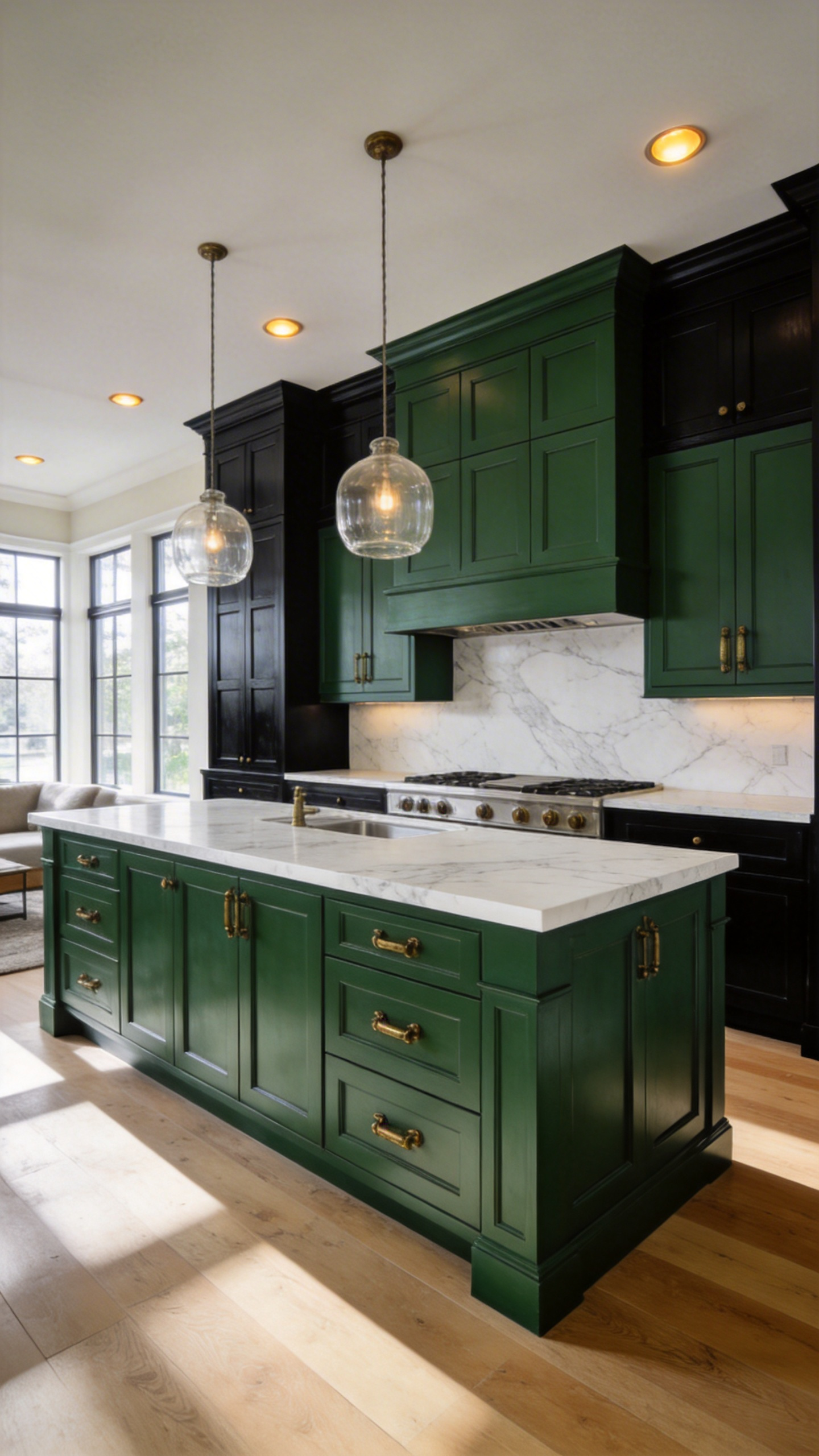
Forest green features a remarkably low light reflectance value between 7 and 12. As a result, it absorbs light to prevent the harsh glare of white kitchens. Instead, the shade creates a soft, velvety atmosphere that feels incredibly luxurious. This chameleon color also changes beautifully depending on the ambient room lighting. For instance, morning light highlights crisp, almost black cabinet silhouettes. Later, evening light pulls out warm yellow pigments for an organic coziness.
Naturally, this historically rooted hue pairs perfectly with unlacquered brass hardware. Dark walnut wood also disappears seamlessly into the rich green background. Ultimately, this creates a curated, furniture-like aesthetic visible from the living area. High-movement marble acts as a bright, organic contrast against the dark cabinetry. Humans evolutionarily find deep comfort in these rich, biophilic environments. Thus, the kitchen gracefully transforms from a simple utility space into an established, sophisticated refuge.
Stormy Blue-Gray: The Coastal Classic Elevated for the Modern Estate
Stormy blue-gray serves as a deliberate architectural bridge in modern luxury estates. Specifically, this chameleon hue balances casual coastal energy with grounded permanence. Its identity shifts beautifully depending on lighting conditions and room scale. For example, sunlit spaces reveal blue-green tones evoking misty morning atmospheres. Conversely, evening light transforms the color into a formal, deep slate. Therefore, this dynamic neutrality prevents massive floor-to-ceiling cabinetry from overwhelming large rooms. Visually, the grayed-out pigment recedes to provide essential breathing room. Consequently, architectural details like coffered ceilings can stand out without competition.
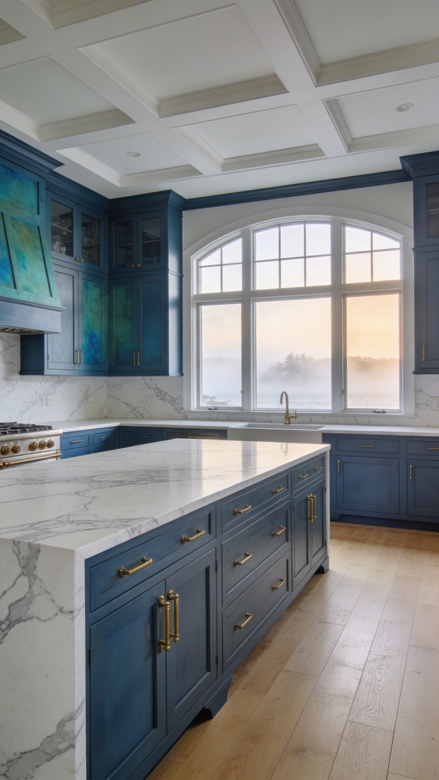
Historically, these shades evolved from durable Colonial palettes used in historic manor houses. Today, designers elevate this heritage look through bespoke, hand-painted application techniques. Subtle brushstrokes following the wood grain create a lived-in sensory contrast. Moreover, this soft-touch texture elegantly offsets cold, hard surfaces like marble countertops. Practically, hand-painted finishes also allow for easy on-site touch-ups in busy estate kitchens.
Ultimately, stormy blue-gray achieves true material alchemy alongside premium luxury finishes. For instance, unlacquered brass hardware develops a dark patina matching the paint’s complexity. Additionally, these muted cabinets perfectly highlight cool veining in luxury Calacatta Gold marble. Thus, the resulting estate space feels incredibly cohesive, sophisticated, and deeply timeless.
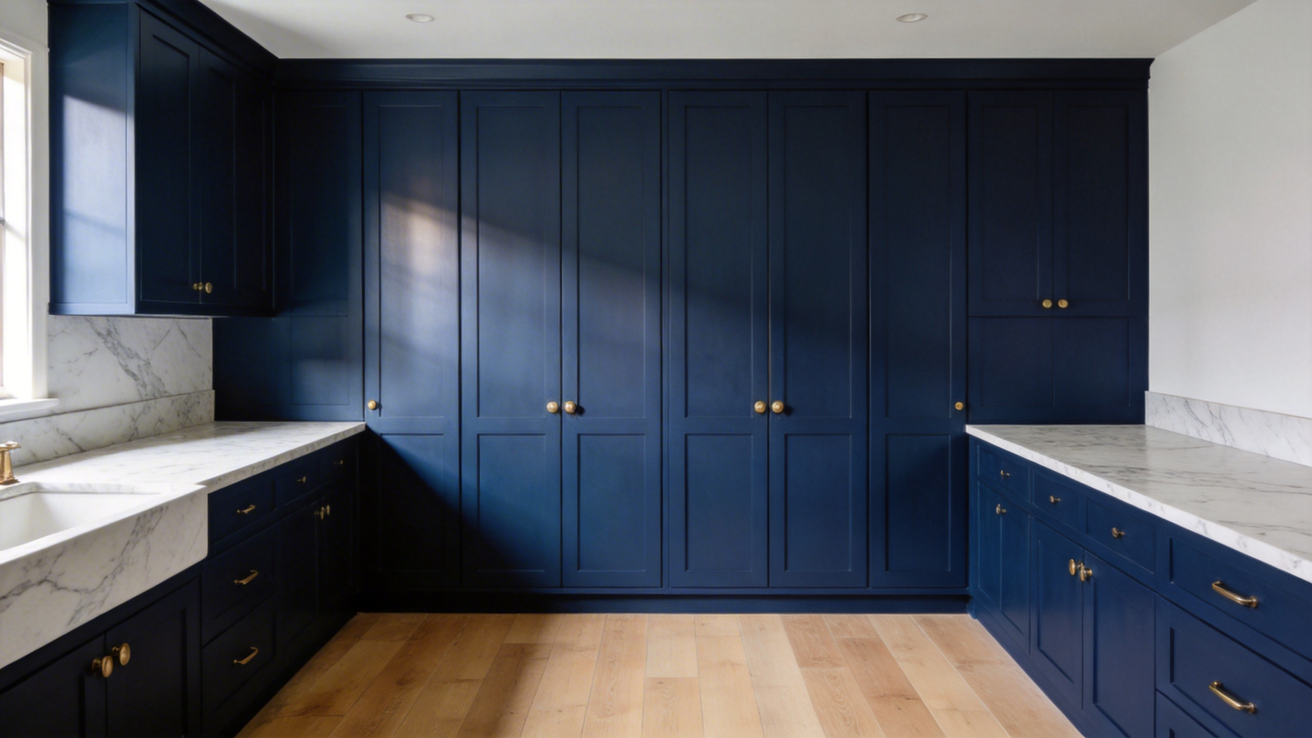
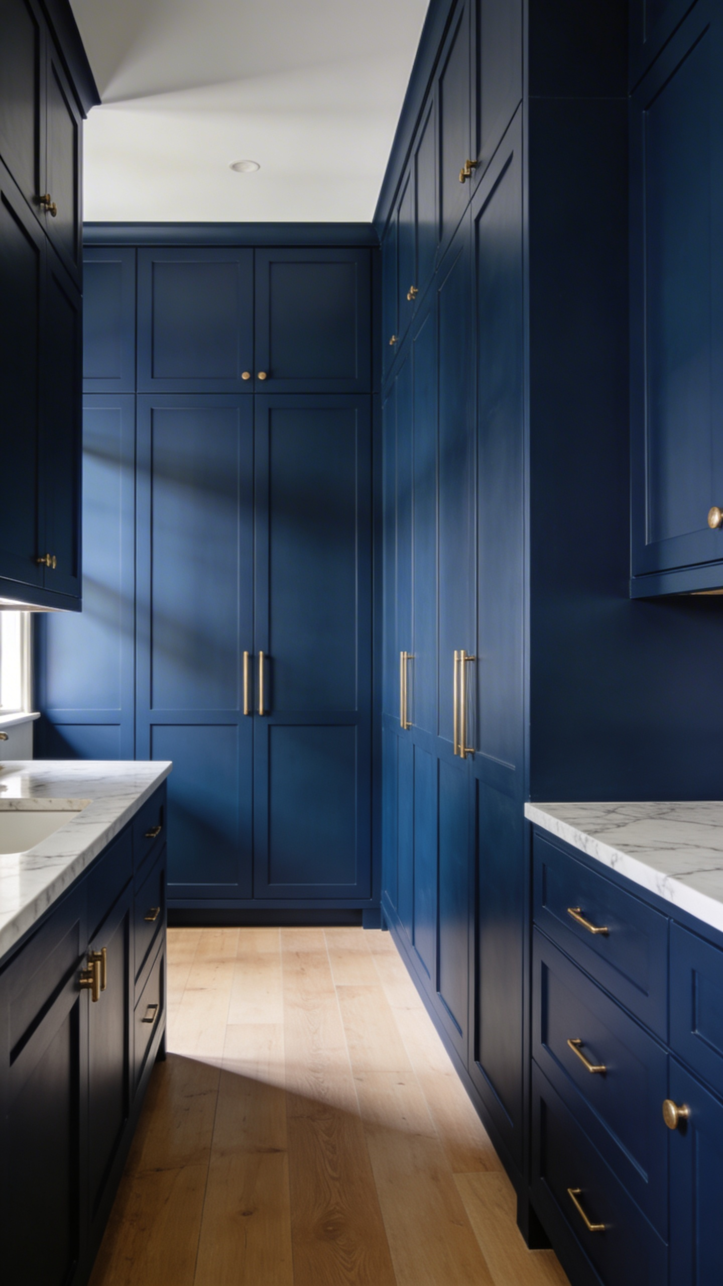
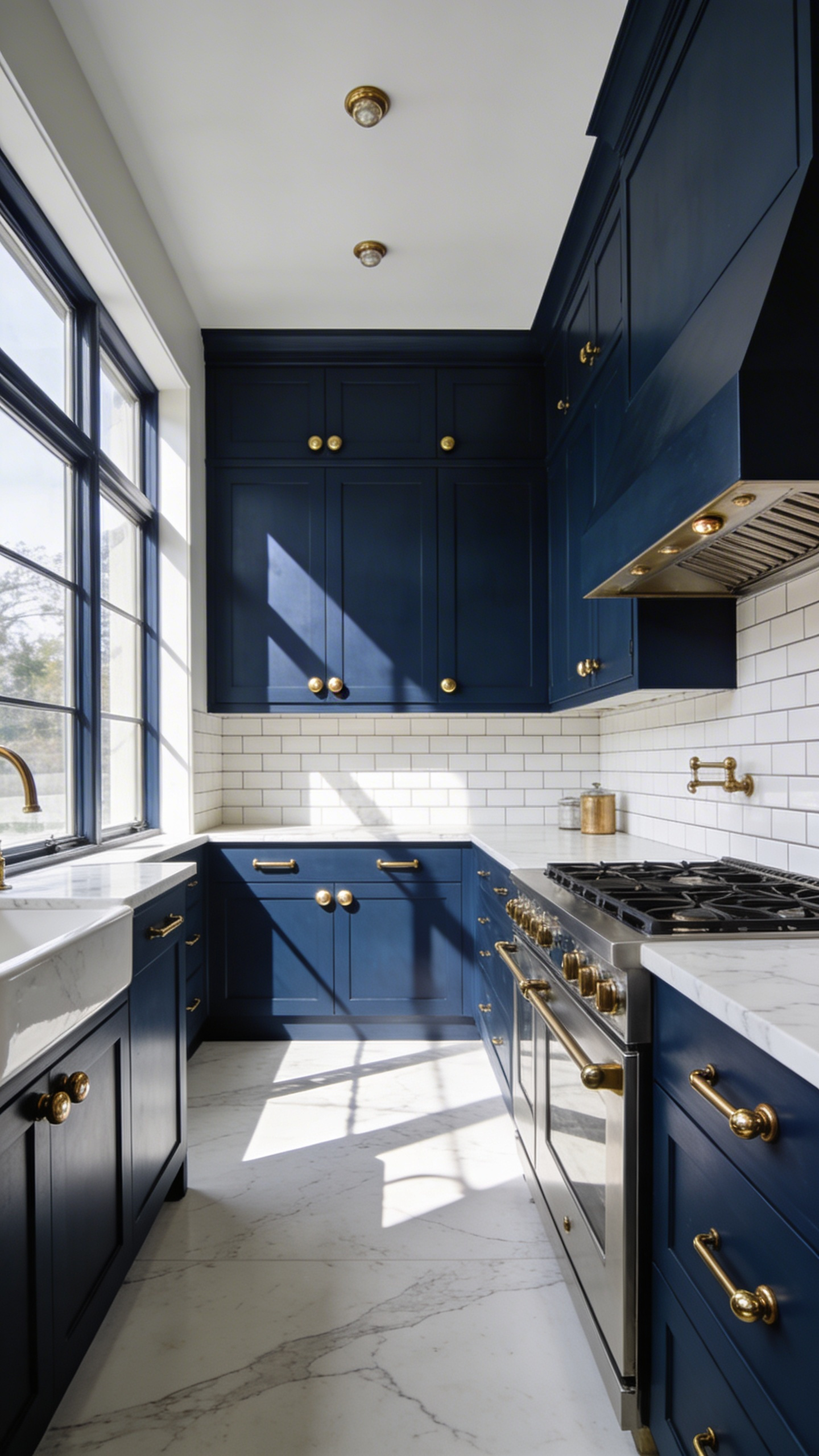
Midnight Navy: The Executive Choice for Formal, Entertaining-Centric Kitchens
Midnight Navy has evolved into the definitive executive neutral for formal kitchens. Specifically, this deep hue offers exceptional gravity and warmth. It transforms the room into a sophisticated stage for high-stakes entertaining. Historically, the inky shade signals stability and classic maritime tradition. Therefore, pairing navy cabinets with walnut interiors creates a private club aesthetic. Additionally, the color boasts a highly nuanced chameleon effect. Its low light reflectance value sits strictly between 6 and 9. Consequently, bright morning sunlight reveals subtle gray and green undertones. However, evening ambient light compresses the hue into a moody jewel box. This allows seamless transitions from morning coffee to elegant evening cocktails.
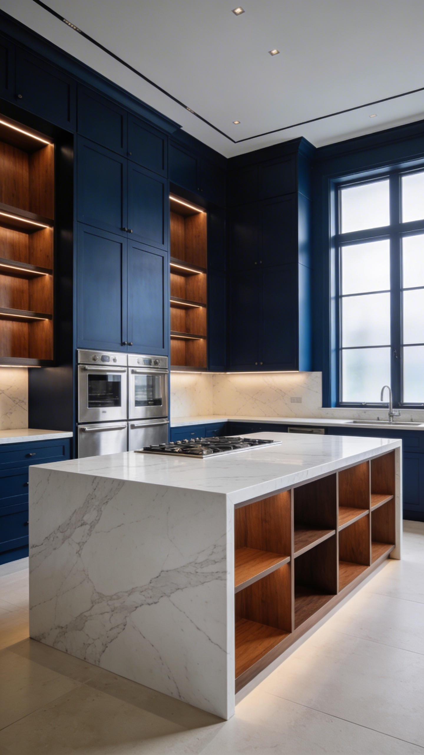
Fortunately, unlacquered brass hardware provides a warm, high-contrast spark against the blue. Furthermore, dramatic Calacatta marble beautifully mimics clouds against a night sky. Naturally, proper layered lighting prevents the dark cabinetry from feeling flat. Expert designers use cool 4000K lighting for clear executive food prep. Conversely, warm 2700K bulbs create a velvety shadow play during parties. Ultimately, Midnight Navy remains a brilliant, safe-yet-bold investment choice. Indeed, it hides entertaining wear perfectly while protecting long-term resale value.
Aubergine & Rich Plum: Unexpected Depth for the Discerning Collector
Aubergine and rich plum offer a true masterclass in chromatic depth. Historically, this deep violet pigment was highly valued in European country estates. Specifically, it appeared almost velvety black in candlelight. Today, choosing aubergine is an exercise in hushed luxury. Unlike royal purple, these shades possess grounding brown and red undertones. Therefore, I love treating this hue as an unexpected neutral.
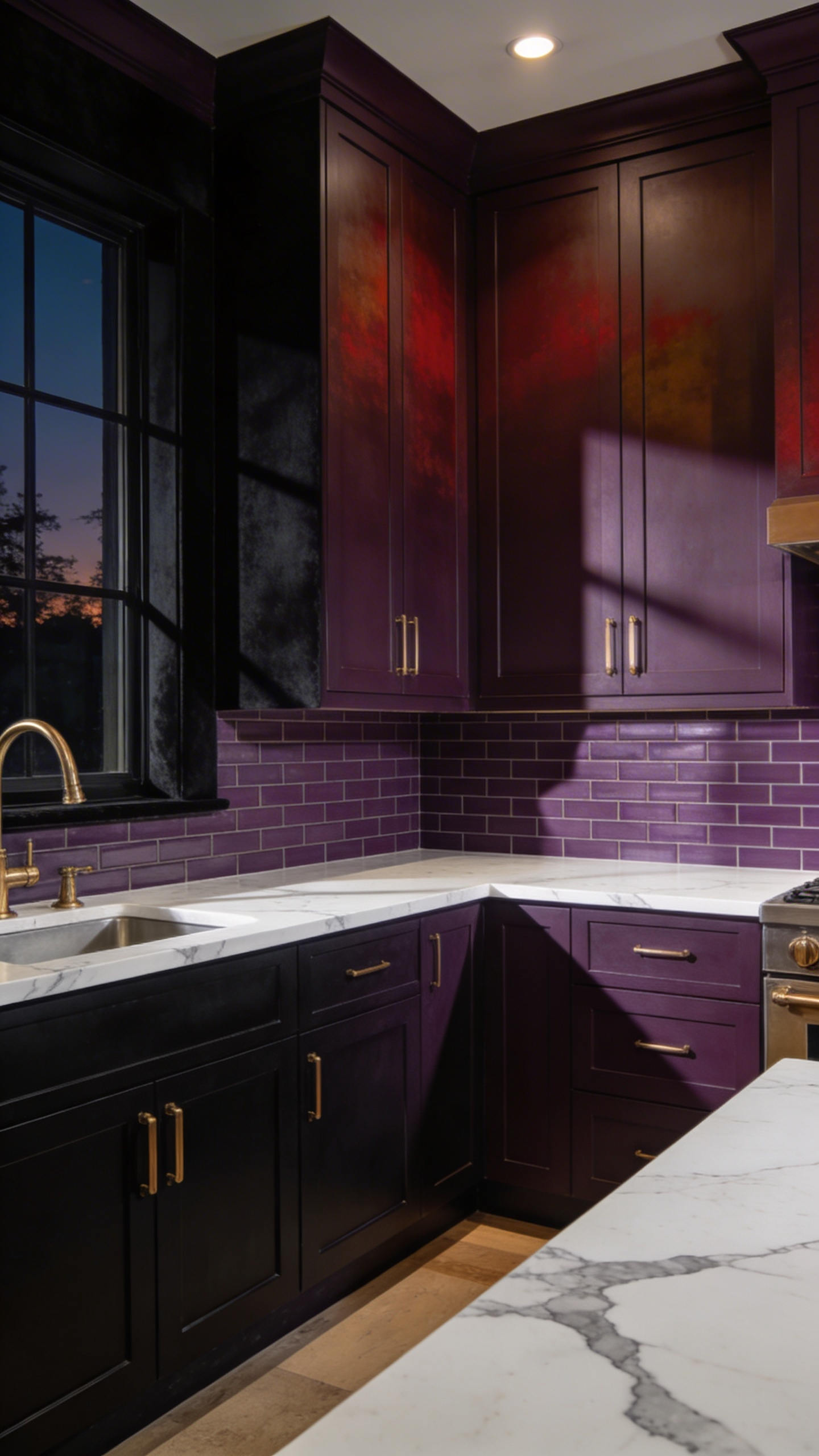
In smaller spaces, color-drenching cabinets and walls creates a jewel-box effect. Consequently, this enveloping atmosphere makes cabinetry feel like integrated furniture. This rich backdrop also beautifully frames heirloom collections. For instance, copper cookware and vibrant art pop aggressively against the plum.
Interestingly, the technical sophistication of aubergine lies in its metamerism. The color shifts dramatically under varying light temperatures. Under cool morning light, its vibrant berry heart emerges. Conversely, warm evening lighting collapses the hue into a deep chocolate-purple. Additionally, this profound depth emphasizes the physical shadows of Shaker joinery.
Ultimately, luxury materials activate these rich cabinetry colors. Naturally, Calacatta Viola marble is the quintessential pairing. Its burgundy veining perfectly echoes the plum cabinets. Unlacquered brass hardware also provides a warm, historical counterpoint. Over time, the aging brass adds a lived-in, collected soul. Finally, a high-gloss lacquer finish can elevate the space entirely. Indeed, it reflects light like fine Chinese Cloisonné for true collectors.
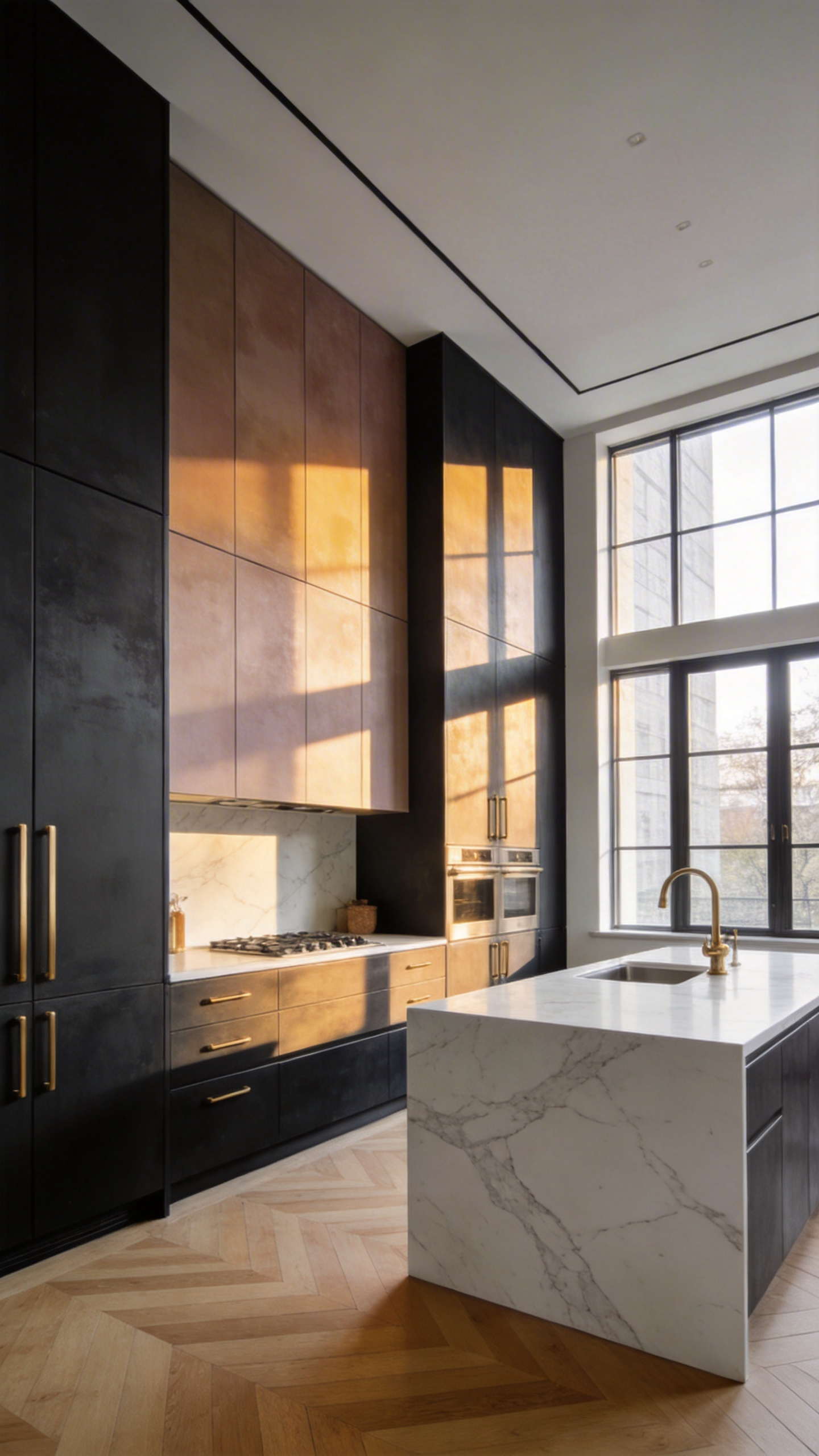
The Tuxedo Effect: Mastering the High-Contrast, Two-Tone Cabinet Strategy
The “tuxedo kitchen” feels distinctly modern today, but its origins are deeply practical. In the 1920s, designers used dark lower cabinets to hide daily scuffs. Conversely, white upper cabinets reflected limited light to signal absolute cleanliness. This simple cleaning tactic evolved into a high-end design statement. It thrives on kitchen color palettes that emphasize contrast.
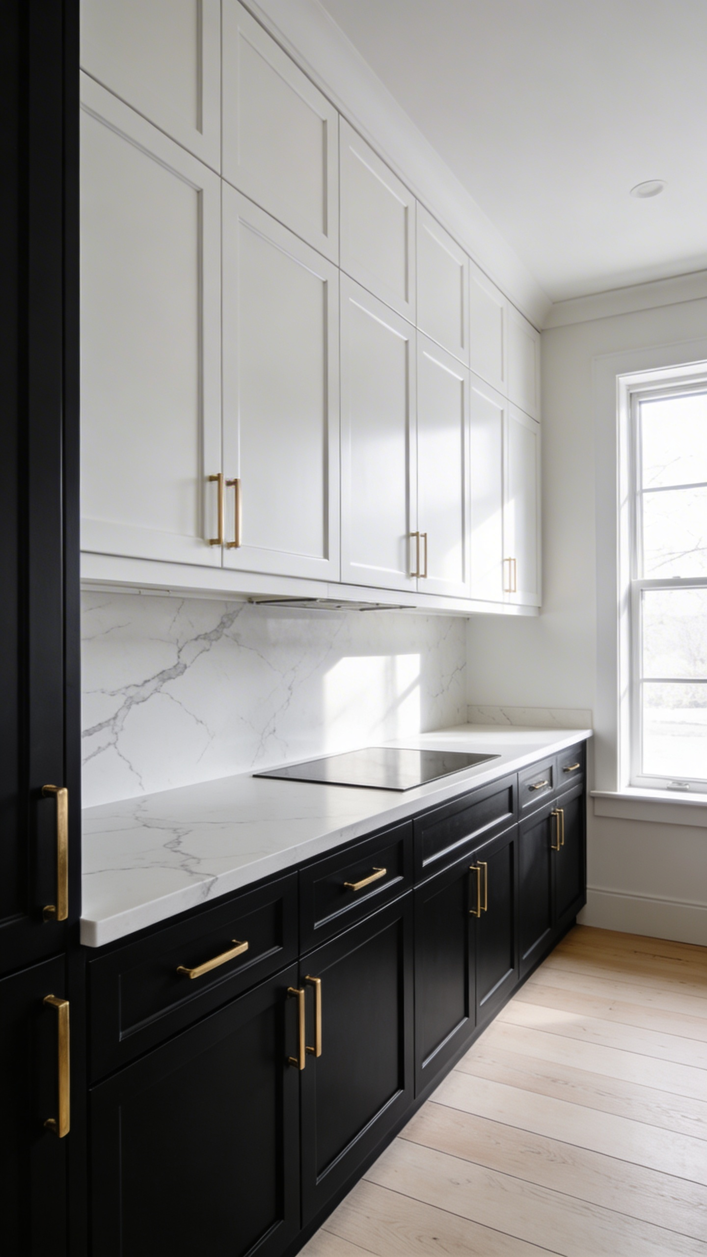
Today, mastering this elegant strategy relies on the physics of visual weight. Dark colors like rich charcoal appear heavier to the eye. Therefore, these deep shades ground the kitchen beautifully. Indeed, they make lower cabinetry feel like expensive, permanent furniture. Meanwhile, creamy white upper cabinets gently recede into the wall. Visually, this expands the room and creates the illusion of higher ceilings.
Luxury experts recommend avoiding a perfectly equal color split. Instead, achieving architectural harmony requires a smart 60/40 ratio. Usually, the lighter dominant tone covers the upper space to maintain airiness. Unified hardware finishes act as elegant jewelry to bridge this gap. For instance, unlacquered brass pulls neatly thread the two contrasting tones together.
Moreover, this two-tone approach defines invisible boundaries in open-concept homes. Specifically, a dark island serves as a rich, grounding visual landmark. Simultaneously, light uppers preserve expansive sightlines across your living areas. Some bold designers occasionally try a moody “reverse tuxedo” with dark uppers. However, this speakeasy aesthetic demands exceptional task lighting to prevent a dark, heavy feeling. Ultimately, the classic tuxedo style offers a sophisticated, enduring investment.
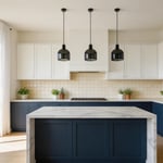
The Island Focal Point: Concentrating Bold Color in the Center of the Room
In modern open-concept homes, removing walls often creates a massive central void. Therefore, designers use saturated kitchen islands to establish visual gravity. This high-contrast feature anchors sprawling layouts beautifully. While neutral perimeter cabinets recede quietly, a dark island provides a psychological home base. Furthermore, this approach directs the gaze immediately toward the social hub. Historically, this design strategy evolved from standalone Victorian worktables. Today, treating the island differently signals it is a bespoke piece of furniture. Consequently, homeowners can embrace bold hues without overwhelming the entire room.
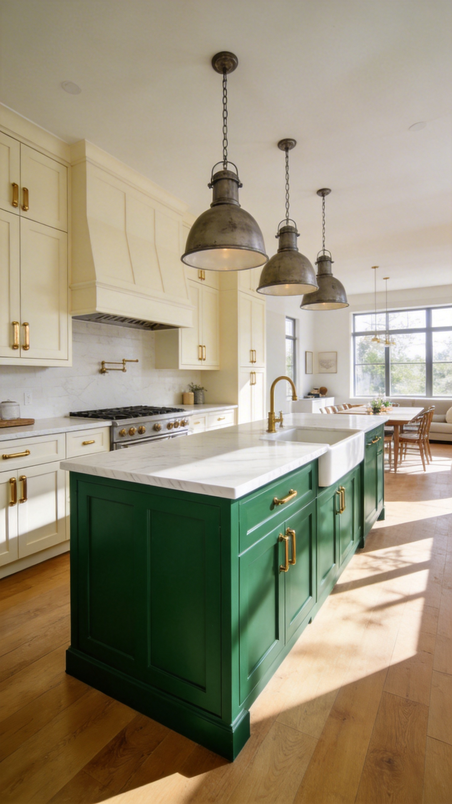
Balancing a loud island with a quiet perimeter follows the smart 70/30 rule. This prevents dark cabinets from shrinking the surrounding space. Practically, deeper shades like burgundy elegantly hide scuffs in this high-traffic kick zone. The concentrated footprint also creates a smart investment opportunity for luxury finishes. For example, you can allocate funds to statement brass hardware just on the island. Ultimately, this transforms the workspace into the jewelry box of the kitchen. A bold centerpiece often serves as a beautiful biophilic bridge, too. Finally, selecting an earthy moss green connects the interior spaces directly to outdoor landscapes.
The Texture of Color: How Matte, Satin, and High-Gloss Finishes Alter Hue
In luxury kitchen design, your cabinet finish acts as a physical filter. It fundamentally alters how our eyes perceive color. High-gloss finishes produce sharp, specular reflection. This mirror-like effect makes pigments appear highly saturated. However, glossy surfaces also absorb surrounding color casts. Conversely, matte finishes scatter light through diffuse reflection. Therefore, a matte cabinet stubbornly holds its true neutral hue.
Historically, the 1980s favored flashy, high-gloss melamine. Today, design leans heavily toward the super-matte era. This shift intentionally rejects visual noise for organic calmness. Modern velvet matte finishes offer a multi-sensory experience. Through advanced excimer technology, these surfaces feel like warm silk. Visually, a matte forest green feels like a cozy library. Meanwhile, the exact same green in high-gloss feels slick and cold.
Finishes impact deep tones most dramatically. Dark colors in high-gloss become a bottomless, reflective pool. Alternatively, matte acts as an equalizer on dark tones. It softens harsh edges and emphasizes beautiful cabinet geometry. Satin serves as the perfect chameleon middle ground. Specifically, it provides a slight glow without greasy reflections under harsh lighting.
Finally, sophisticated contemporary kitchens utilize intelligent lustre layering. Designers frequently use matte lowers to ground the room visually. Then, they pair them with bright, high-gloss uppers. This strategic contrast bounces light directly into the workspace. Ultimately, this creates a balanced, high-end luxury aesthetic. As a result, a single color plays two elegant roles effortlessly.
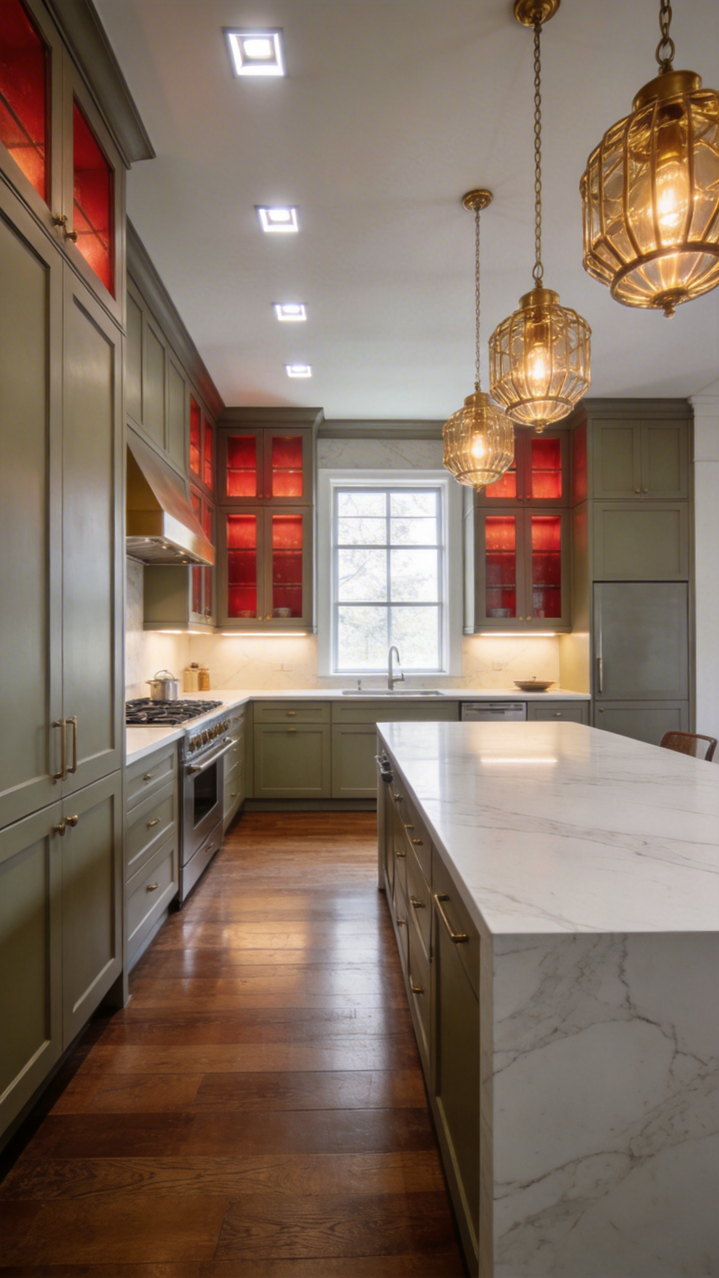
Hardware Harmony: Curating Brass, Nickel, and Bronze to Elevate Your Palette
Elevating kitchen cabinetry into a curated design statement requires understanding basic metallurgical behavior. True hardware harmony relies on balancing light, time, and tactile weight. For instance, you must choose between living and sealed metal finishes. Unlacquered brass and bronze are living metals that react to your touch. Therefore, they develop a rich, protective patina over time. This creates a unique narrative of use across your kitchen. Conversely, sealed metals like polished nickel remain frozen in time.
To avoid visual noise, experts utilize the strict 70/20/10 ratio rule. Typically, polished nickel serves as the dominant 70% anchor. It seamlessly bridges stainless appliances to provide a cohesive foundation. Next, brass should account for roughly 20% of the space. Generally, this warm metal creates stunning focal points on kitchen islands. Finally, dark bronze grounds the palette as a 10% accent. Naturally, this architectural weight prevents brighter metals from feeling flighty. Integrating timeless kitchen cabinet hardware trends ensures that your metal selections enhance your chosen hues.
Furthermore, luxury hardware serves as the tactile jewelry of the space. Solid brass and bronze hold ambient room temperature perfectly. They also provide a satisfyingly muted sound against the cabinet face. In fact, incorporating knurled brass textures adds an unexpected mechanical chic. Historically, this mixed-metal approach echoes classic Georgian interior design principles. Ultimately, you are tapping into a timeless language of functional elegance. Thus, your cabinetry transforms into a sophisticated, high-end investment.
The Decade Test: Foundational Color Choices That Appreciate in Aesthetic Value
I always run clients through the “Decade Test” to evaluate a color’s long-term viability. It simply asks if a shade will remain relevant 10 years from now. Passing requires architectural congruence and chemical stability. Soft off-whites consistently survive this rigorous evaluation. Unlike stark hospital whites, these living colors contain complex umber pigments. Consequently, they respond beautifully to shifting daily light temperatures. Over time, high-quality paint develops a soft ghosting near handles. Truly, this creates a warm, domestic patina rather than clinical wear.
Transparent wood stains also offer exceptional luxury and authenticity. Modern penetrating oils bond directly with oak or walnut fibers. As a result, normal wear looks elegantly distressed rather than broken. Wood tones also naturally amber and ripen over the decade.
Conversely, deep grounding hues like navy act as structural anchors. Because of low light reflectance, dark shades create infinite visual depth. Visually, cabinet faces recede to make the space feel expansive. At night, these colors feel incredibly inky and intimate.
Similarly, biophilic greens leverage our profound biological resonance. Muted sage perfectly mimics the dusty underside of a natural leaf. Historically, these earthy tones harmonize effortlessly with aged stone and brass.
Finally, muddy neutrals serve as the ultimate design chameleons. A warm greige beautifully bridges eras by adapting to room lighting. Ultimately, these complex background shades let your high-end marble countertops truly shine. By carefully selecting your kitchen cabinet colors, you ensure a legacy of style that easily withstands the passage of time.
Frequently Asked Questions
What are the most timeless kitchen cabinet colors for luxury homes?
Timeless selections typically include high-pigment neutrals like Alabaster white, tailored greige, and soft mushroom. These shades avoid the clinical feel of stark white. Instead, they provide a neutral backdrop that highlights organic textures like marble and wood. Deep heritage colors, such as forest green and navy, also stand the test of time. Indeed, they act as grounding architectural anchors.
How does lighting affect the perception of cabinet paint?
Lighting dramatically alters color through a phenomenon called metamerism. Warm incandescent or 2700K LED lighting pulls out red and yellow undertones. Therefore, a kitchen feels cozy and atmospheric. Conversely, cool morning light or high-Kelvin LEDs can make the exact same paint look crisp, gray, or muddy. I always recommend vertical sampling in your specific space. Ultimately, this lets you see how colors shift throughout the day.
Should kitchen islands be a different color than perimeter cabinets?
Using a contrasting color for the kitchen island establishes a distinct focal point in open-concept floor plans. This strategy often follows a 70/30 ratio. Specifically, it allows you to experiment with bolder, saturated hues on the island. Meanwhile, keeping the perimeter cabinets neutral maintains an airy, expansive feel.