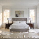
For a decade, the “white box” kitchen dominated luxury design. Designers prioritized high-gloss finishes and stark minimalism to achieve a clean, expansive aesthetic. However, this extreme focus on visual cleanliness often feels sterile today. In fact, the clinical atmosphere creates a space that feels more like a laboratory than a nurturing home. Therefore, the collective desire for soulful, livable interiors is driving a significant change. We are seeing a massive surge of interest in brown kitchen inspiration.
Consequently, the design world is experiencing a “Renaissance of Warmth.” Homeowners are seeking restorative environments over the stark showpieces of the past. Crucially, brown has emerged as the sophisticated anchor for this emotional shift. It offers a grounded, biophilic connection to nature that white simply cannot provide. Thus, rich walnut stains and deep, historical beiges are replacing cool, flat greys.
This guide traces the evolution from sterile surfaces to the sensory richness of earth tones. We will explore how natural wood cabinetry adds necessary texture and character to your space. Additionally, we analyze how to layer organic materials for a high-end, invested look. Ultimately, this approach ensures your kitchen balances classic elegance with modern emotional comfort.
The Psychology of the Cocoa Palette: Understanding how brown grounds a luxury space and fosters emotional connection.
The enduring appeal of the cocoa palette goes far beyond simple aesthetics. Fundamentally, this deep hue roots a home in biophilic stability. Specifically, brown acts as a psychological anchor, evoking the reliability of the earth. In the kitchen, this grounding effect offers a subconscious sense of refuge. Therefore, these tones serve as a soothing antidote to modern digital fatigue. Unlike the sterility of cool minimalism, rich espresso and walnut create a sanctuary.
Furthermore, brown signifies sophistication through the lens of “quiet luxury.” It does not rely on brightness or flash to make a statement. Instead, its value lies in depth, texture, and historical heritage. For instance, layering velvety matte cabinets with veined stone creates tactile opulence. Consequently, the space feels timeless rather than merely trendy.
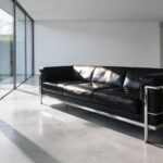
Finally, the “cocoa palette” effectively bridges visual design with culinary emotion. Shades like ganache and mocha trigger our olfactory senses immediately. Thus, the kitchen becomes a source of warmth before cooking even begins. Ultimately, dark tones absorb light to foster intimacy and communal belonging. This creates an environment that is cozy yet undeniably sophisticated.
Phase I: Material Integrity – The Return of Unpainted Timber
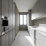
Contemporary kitchens are moving away from sterile, painted surfaces. Instead, high-end design is embracing a concept called “Material Integrity.” This philosophy prioritizes “Architectural Honesty,” where materials present themselves truthfully without disguise. Consequently, this shift aligns with the Japanese ethos of *Wabi-Sabi*. It finds deep beauty in natural imperfections. Therefore, knots and uneven grains are no longer flaws to be hidden. Rather, they contribute to a kitchen’s unique story. Over time, daily wear creates a rich *patina*, effectively enhancing the wood’s character.
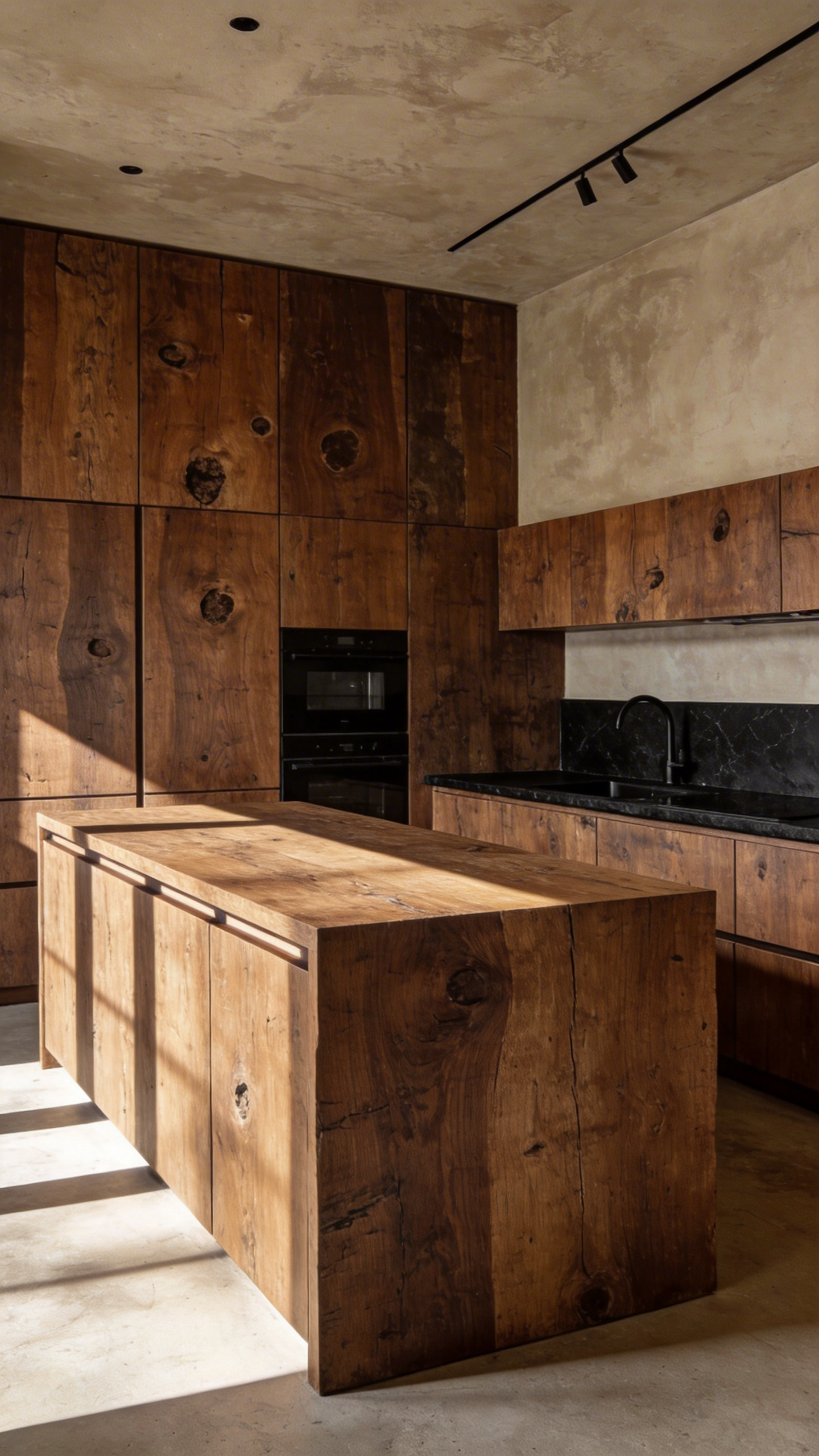
Specifically, natural Walnut has emerged as the definitive choice for this aesthetic. Its inherent chocolate tones offer luxury without needing heavy stains. Unlike the flat, mass-produced looks of the past, Walnut offers visual movement. This creates a restrained, elegant atmosphere that feels grounded in nature. In fact, this sensory richness supports Biophilic Design principles by connecting homeowners to the natural world. If you appreciate the look of natural wood grain and want more detailed specific examples, view our compilation of 24 Brown Kitchen Ideas That Create Warmth and Style.
However, preserving this raw look requires smart technical choices regarding the finish. Homeowners must choose between material connection and durability. For example, penetrating oils offer a matte, tactile finish that feels authentic to the touch. Unfortunately, they require regular maintenance to resist water. Conversely, lacquer provides a protective shell against moisture, making it practical for high-traffic zones. Ultimately, the goal is achieving a sophisticated balance between visual honesty and functional longevity.
1. The Authority of Walnut: Utilizing book-matched grains for architectural impact.
Walnut is not merely a material choice; it is a declaration of lineage. Historically, this timber defined the aristocratic “Age of Walnut,” symbolizing wealth and refined taste. Therefore, selecting it for your kitchen evokes a profound sense of architectural authority. To achieve this high-end look, designers rely heavily on a technique called book-matching. Specifically, a log is sliced and opened like the pages of a book. Consequently, this precise process reveals a perfectly mirrored, symmetrical grain pattern.
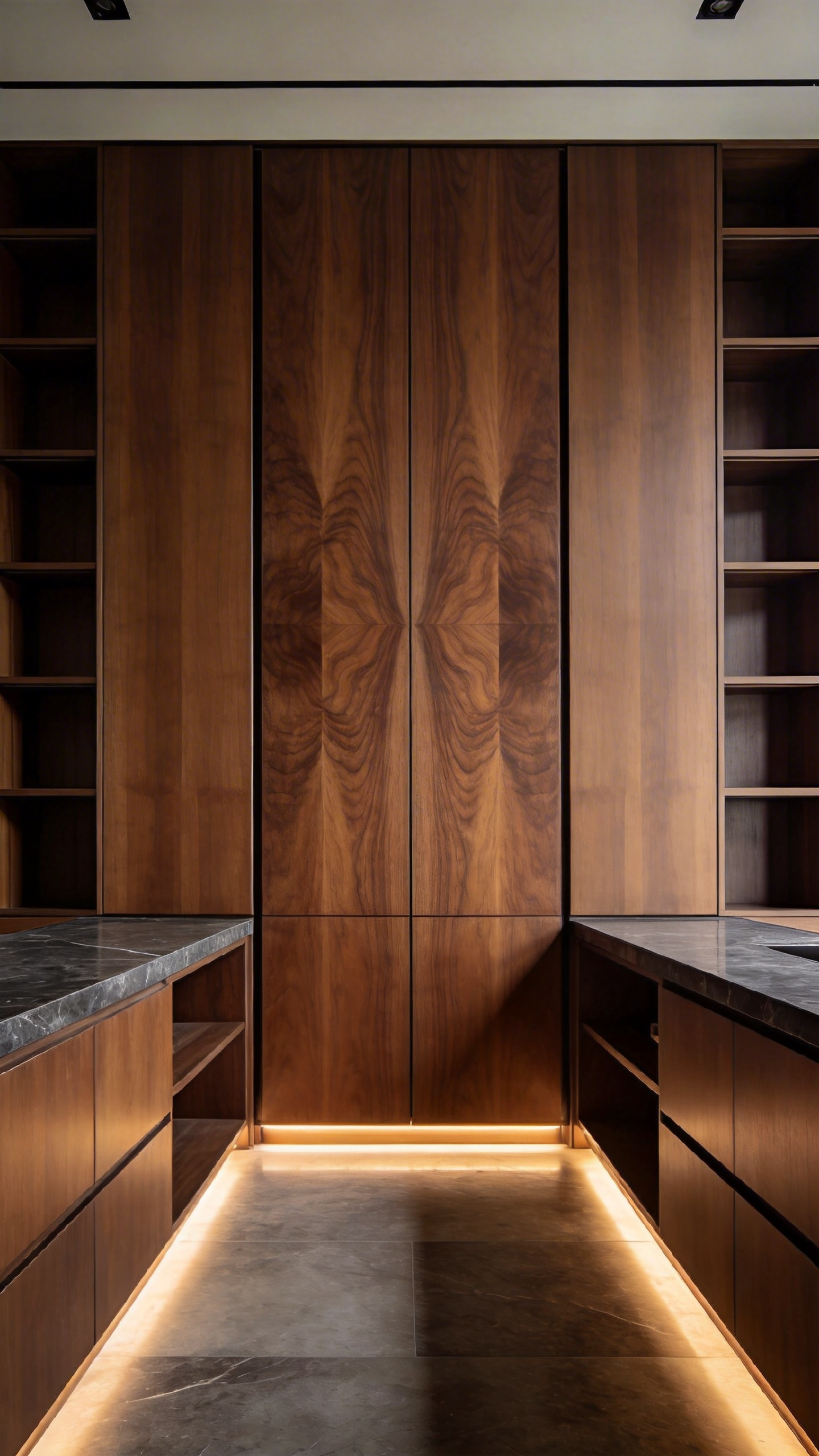
In terms of aesthetics, this transforms natural irregularity into disciplined geometric art. Furthermore, the effect is particularly powerful on large vertical surfaces, such as pantry walls. The “cathedral grain” flows continuously, creating a stunning sculptural impact. Resultantly, the cabinetry ceases to be simple storage and becomes a commanding monolithic feature. Moreover, the rich chocolate-to-golden hues absorb light, adding a sense of quiet gravitas. Ultimately, this approach balances historical authority with modern simplicity for a truly timeless investment.
2. Beyond Standard Oak: Exploring fumed and stained white oak for sophisticated depth.
Achieving true sophistication in a brown kitchen requires looking beyond basic, surface-level finishes. Therefore, designers often turn to fumed white oak for unmatched depth. Unlike traditional staining, fuming involves a chemical reaction inside a sealed chamber. Specifically, ammonia vapor reacts with the wood’s natural tannins to alter its color permanently. Consequently, this creates a rich, smoky, grayish-brown hue that penetrates deep into the wood fiber.
This process offers a significant functional advantage for high-traffic luxury spaces. Because the color exists throughout the wood structure, minor scratches do not reveal raw timber underneath. Furthermore, fuming enhances the wood’s natural beauty in unique ways. In fact, it darkens the distinctive “medullary rays” found in premium quartersawn oak to increase contrast. Conversely, standard stains often mask these elegant silver flakes by reversing the grain colors. Thus, fuming connects modern interiors to the solid, handcrafted heritage of Arts and Crafts furniture.
However, if a specific, consistent color is required, sophisticated staining remains a viable option. Yet, this demands a complex, multi-step application to match the visual depth of fumed wood. Typically, artisans layer translucent aniline dyes with heavy glazes. Subsequently, the dark pigment settles into the open pores, creating a shadowed patina effect. While this method lacks the “through-color” durability of fuming, it offers precise aesthetic control. Ultimately, choosing between these finishes determines the long-term character and resilience of your investment.
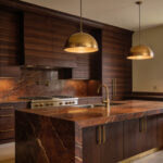
3. Exotic Veneers: Integrating Macassar Ebony and Rosewood for high-end statement islands.
Integrating Macassar Ebony with Rosewood creates a sophisticated visual dialogue for your kitchen island. Specifically, Macassar Ebony provides graphic authority. Its heartwood features dramatic, linear stripes of deep chocolate and caramel. Consequently, this wood anchors the design with a sleek, Art Deco sensibility. Conversely, East Indian Rosewood adds essential warmth. Its glowing, organic figure creates a luminous field that softens the Ebony’s sharp lines.
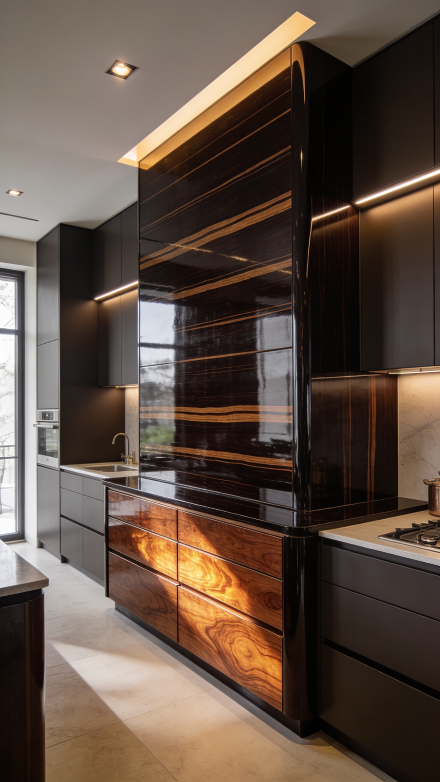
Beyond mere aesthetics, these materials hold a prestigious pedigree. Historically, craftsmen reserved the “Royal Wood,” Macassar, for monarchs. Furthermore, Rosewood offers a multi-sensory layer, famed for its subtle, sweet fragrance. However, modern luxury demands ethical consciousness. Both species are currently vulnerable and strictly regulated by global trade agreements. Therefore, specifying high-grade or reconstituted veneers is imperative. This approach respects environmental limits while maximizing the material’s visual impact. In fact, using veneers creates a more stable surface than solid wood. Ultimately, this choice ensures your investment remains both responsible and enduring.
Phase II: The Spectrum of Sophistication – Color Theory Applications
Brown has officially replaced cool grays as the design industry’s “new neutral.” Historically, artists like Rembrandt utilized this hue to create dramatic layers of depth. Today, specifically, it brings inherent warmth and stability to the heart of the home. Consequently, a brown kitchen feels welcoming rather than clinical. However, true sophistication requires mastering hue and value. For instance, lighter tones like honeyed wood create an airy, transitional aesthetic. Conversely, deep chocolate or mahogany fosters intimacy and a luxurious “cocooning” effect.
Furthermore, selecting complex undertones prevents a flat, dated look. Shades like “London Clay” offer a muddy, warm nuance that feels intentional rather than heavy. To balance this gravity, experts recommend applying the 60-30-10 rule. Here, brown cabinetry anchors 60% of the space as the dominant force. Subsequently, soft neutrals on counters or walls typically occupy the secondary 30%. Finally, the remaining 10% serves as a high-chroma accent. For more insights on blending warm and cool tones, explore our guide to the essential Kitchen Color Palettes that Pop.
Specifically, earthy olive greens or navy blues provide elegant, nature-inspired contrast. Alternatively, burnt orange accents can create a vivid, harmonious statement. Moreover, the choice of hardware acts as a final value-shifter. Brass details add a warm, metallic pop that elevates the entire palette. Ultimately, these calculated color choices transform a simple renovation into a timeless investment.
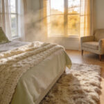
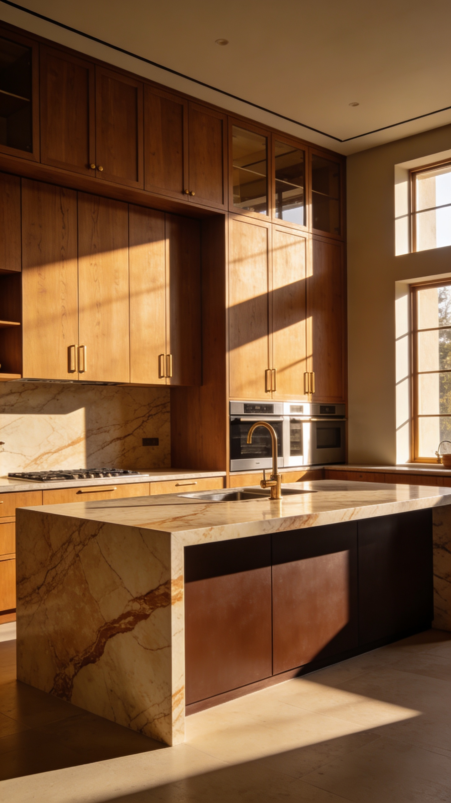
4. The ‘Latte’ Layer: Mastering tonal variations of beige, fawn, and caramel for a soft, airy ambiance.
The “Latte Layer” represents a sophisticated shift away from clinical white kitchens. Fundamentally, this design philosophy prioritizes psychological comfort and emotional warmth. Unlike stark minimalism, this palette feels relational and deeply flattering. Consequently, it creates a grounded sanctuary that remains surprisingly airy.
However, mastering this look requires careful tonal variation. Specifically, you must graduate colors to avoid a flat, one-dimensional appearance. To start, utilize pale creamy beiges on expansive walls to act as a light-catching base. Next, introduce fawn or taupe for main cabinetry to provide a smooth, mid-range transition. Finally, anchor the room with rich caramel or walnut accents for necessary depth.
In this low-contrast environment, texture becomes your primary tool for distinction. Therefore, you should embrace tactile finishes over flat, high-gloss surfaces. For instance, matte wood grains invoke organic luxury while softening the overall visual impact. Furthermore, incorporate brushed brass hardware to complement the honey tones elegantly. Ultimately, this approach yields a kitchen that feels both timeless and restorative.
5. The Espresso Anchor: Using deep chocolate hues to create moody, intimate dining nooks.
Fundamentally, deep chocolate hues act as powerful earth tones, conveying composure and emotional security. Consequently, using these saturated shades in a dining nook creates a deliberate “cocooning” atmosphere. Historically, “espresso” finishes suffered from ubiquity in early 2000s builder-grade kitchens. However, the modern “Espresso Anchor” breaks away from that dated, heavy aesthetic. Instead of generic pairings, today’s approach demands deliberate, maximalist choices. Surprisingly, dark colors do not always shrink a small space. In reality, a deep caramel or espresso stain allows surfaces to visually recede. Therefore, boundaries soften, making the nook feel cohesive rather than abruptly enclosed.
To achieve this sophisticated look, texture is paramount. Without it, dark finishes risk appearing flat or gloomy. Thus, incorporate exposed brick or rich wood grain to lend tactile depth. Additionally, hardware selection plays a critical role in modernizing this palette. Specifically, avoid the dark bronze of the past. Instead, utilize brass or gold fixtures. This contrast electrifies the deep brown backdrop, adding a necessary luxurious touch. Furthermore, correct lighting is essential to prevent a cave-like sensation. Ultimately, warm, layered illumination highlights the brown’s complexity, ensuring the mood remains intimate yet welcoming.
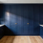
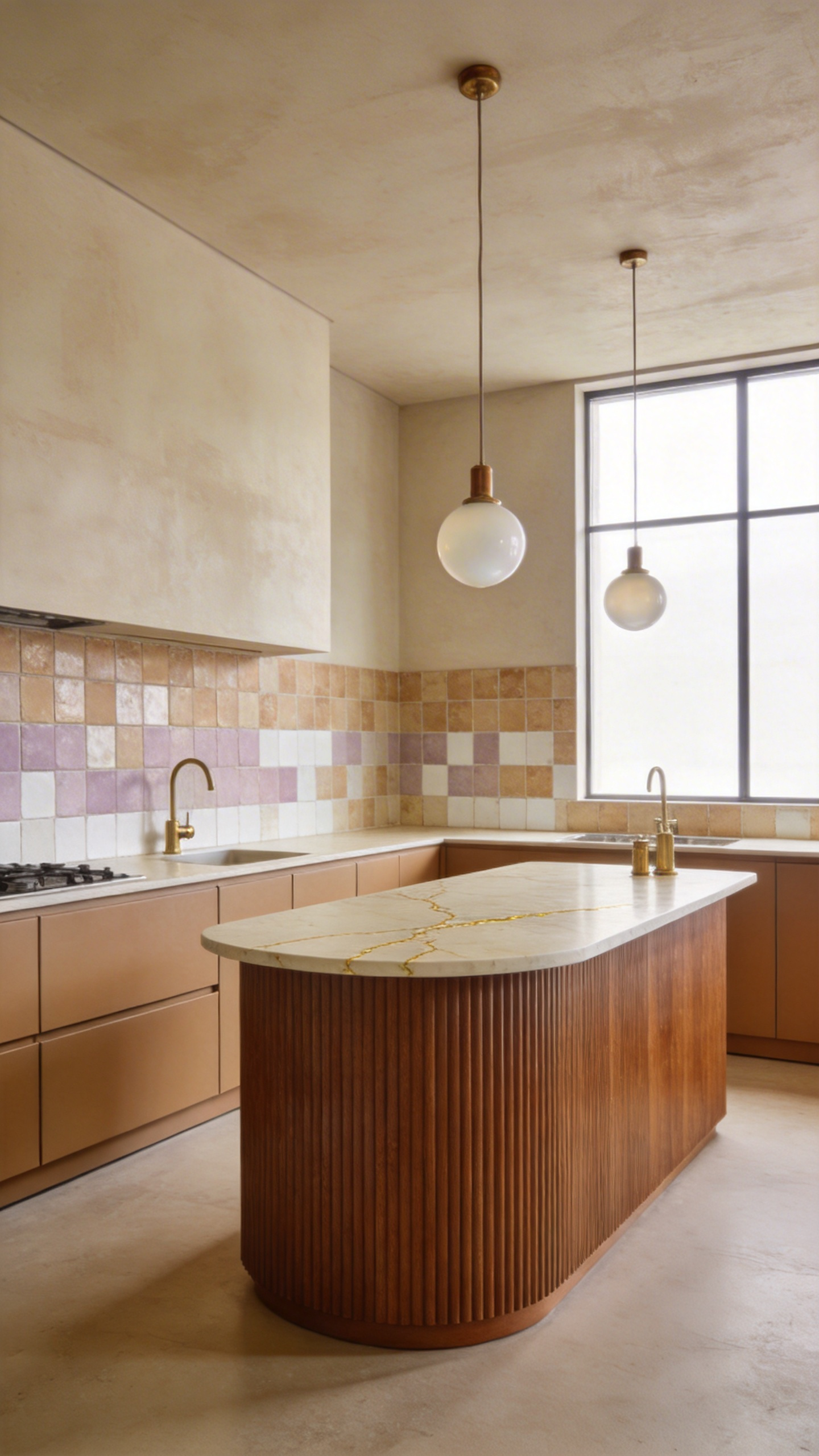
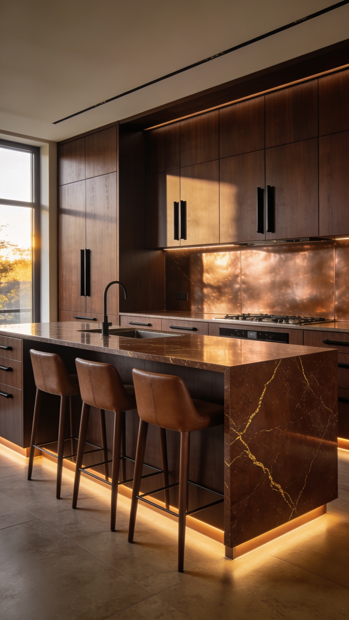
6. The Truffle Envelope: Painting walls and ceilings in saturated brown for immersive luxury.
The “Truffle Envelope” represents a sophisticated shift toward maximalist intimacy. Specifically, this technique involves “color-drenching” the entire kitchen architecture. You paint walls, trim, and ceilings in a single, saturated deep brown. Consequently, this creates a seamless visual experience that eliminates the starkness of white minimalism. Instead of a sterile box, the room becomes a cohesive, enveloping cocoon. Psychologically, deep cocoa hues evoke an immediate sense of calm and grounding.
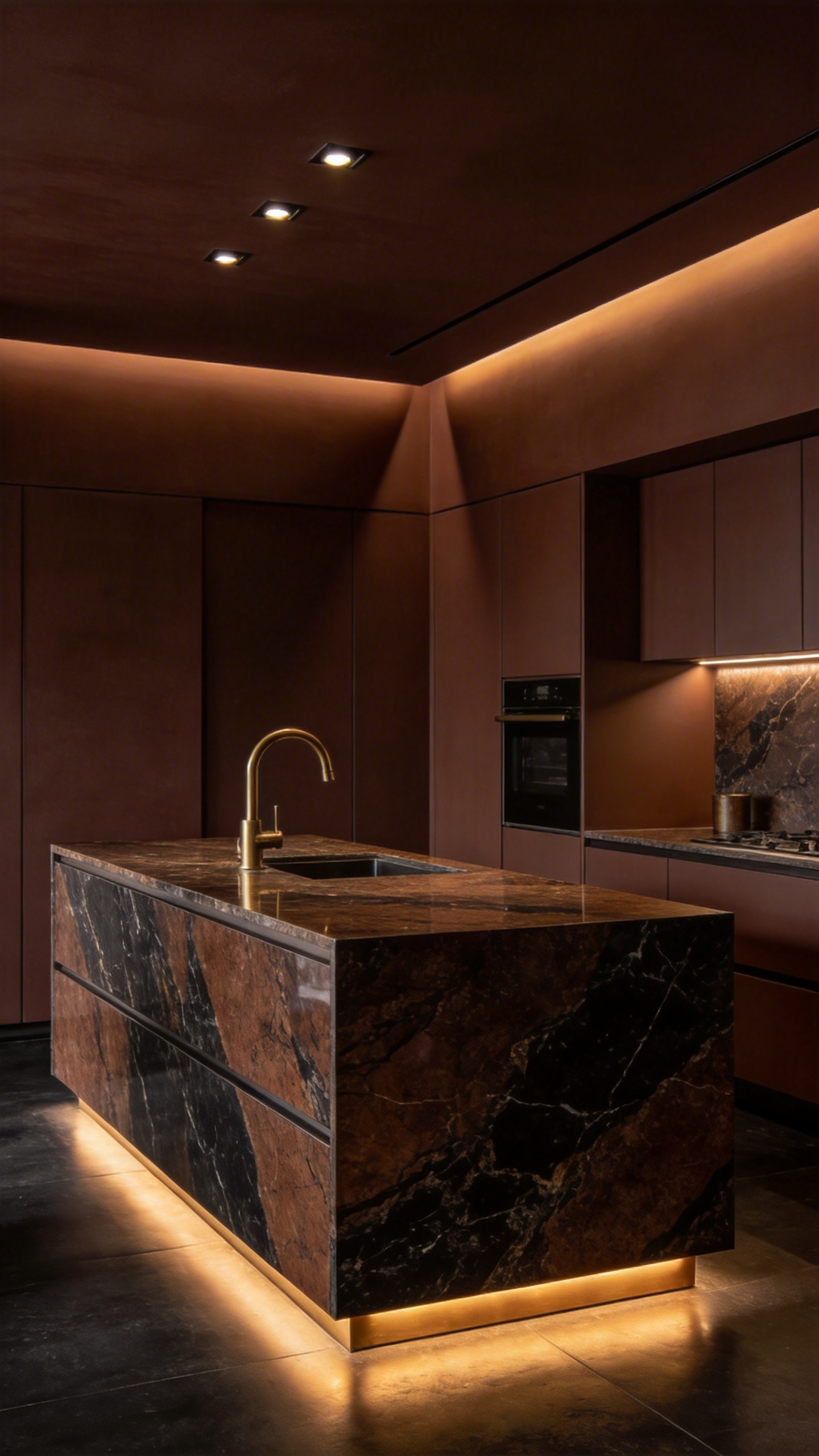
However, success relies heavily on selecting the correct undertone. Designers often favor complex shades like Benjamin Moore’s *Tarpley Brown* or Farrow & Ball’s *London Clay*. These colors possess warm red or yellow notes to ensure the space feels inviting. Furthermore, painting the ceiling the same dark hue effectively blurs architectural boundaries. This visual trick paradoxically makes small spaces feel boundless and taller. Conversely, it helps large, open-concept kitchens feel more contained and welcoming.
To achieve true luxury, this saturated backdrop requires deliberate contrast. The deep, matte brown envelope acts as a dramatic stage for reflective materials. For instance, unlacquered brass hardware glows intensely against a chocolate background. Similarly, light marble or quartz countertops provide a necessary visual break on horizontal planes. This reflection prevents the room from feeling oppressive or heavy. Ultimately, this juxtaposition of dark paint and gleaming accents defines the “Quiet Luxury” aesthetic.
7. Texture vs. Flatness: Why matte and velvet finishes outperform high-gloss in brown palettes.
When designing with deep brown palettes, the finish you choose dictates the final aesthetic. High-gloss surfaces reflect light directly, acting almost like a mirror. Consequently, this creates harsh white hotspots that wash out dark cabinetry. In contrast, matte and velvet finishes diffuse light evenly across the surface. Therefore, the eye registers the color’s full saturation without interruption. This approach unmasks the natural grain of woods like walnut or mahogany. Conversely, excessive shine often makes expensive timber look synthetic or plastic.
Beyond visual depth, texture significantly influences the room’s atmosphere. Specifically, matte finishes convey a tactile warmth described as “soft” rather than slick. This aligns perfectly with brown’s psychological role as a grounding, comforting color. Historically, authentic wood furniture relied on low-sheen wax finishes rather than high-gloss lacquers. Thus, choosing a velvet texture honors this timeless, organic tradition. It effectively creates a sense of luxury that feels understated rather than aggressive.
Finally, practicality plays a crucial role in protecting your investment. Dark, glossy surfaces are notoriously unforgiving. Unfortunately, they amplify every fingerprint, smudge, and fine scratch. However, matte and velvet finishes are far more visually forgiving. They effectively mask surface-level flaws in high-traffic zones. Ultimately, a low-sheen palette ensures your kitchen remains sophisticated and pristine day after day.
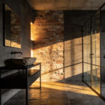
Phase III: Stone and Surface Curation
Curating the surfaces in a brown kitchen is an act of balancing visual weight with light. Therefore, the finish you choose dictates the room’s psychological atmosphere. Specifically, a honed finish offers a soft, velvety texture that absorbs light. This matte look creates a relaxed, lived-in warmth perfect for organic designs. Moreover, honed surfaces are forgiving, as they hide fingerprints and minor scratches effectively.
However, a polished finish serves a different functional purpose. Consequently, it acts as an essential light reflector. This is crucial because it prevents deep brown cabinetry from making the space feel heavy. Furthermore, the high-gloss shine enhances the stone’s natural depth, offering a sleek, luxurious aesthetic. Yet, this elegance comes with a trade-off, as etching is more visible on glossy surfaces.
Beyond the finish, the color selection requires a strategic eye. To provide a visual release, successful designs often leverage high-contrast pairings. For instance, pairing white marble or cream quartzite against dark wood creates necessary brightness. Ideally, select a stone featuring subtle brown veining. This detail intentionally links the countertop back to the cabinetry.
Finally, consider the longevity of your investment. While natural stone has a historical pedigree, engineered quartz has become a central part of modern curation. In fact, it offers the visual drama of marble with superior stain resistance. Ultimately, mixing these durable textures with the warmth of brown cabinets ensures a sophisticated, timeless kitchen.
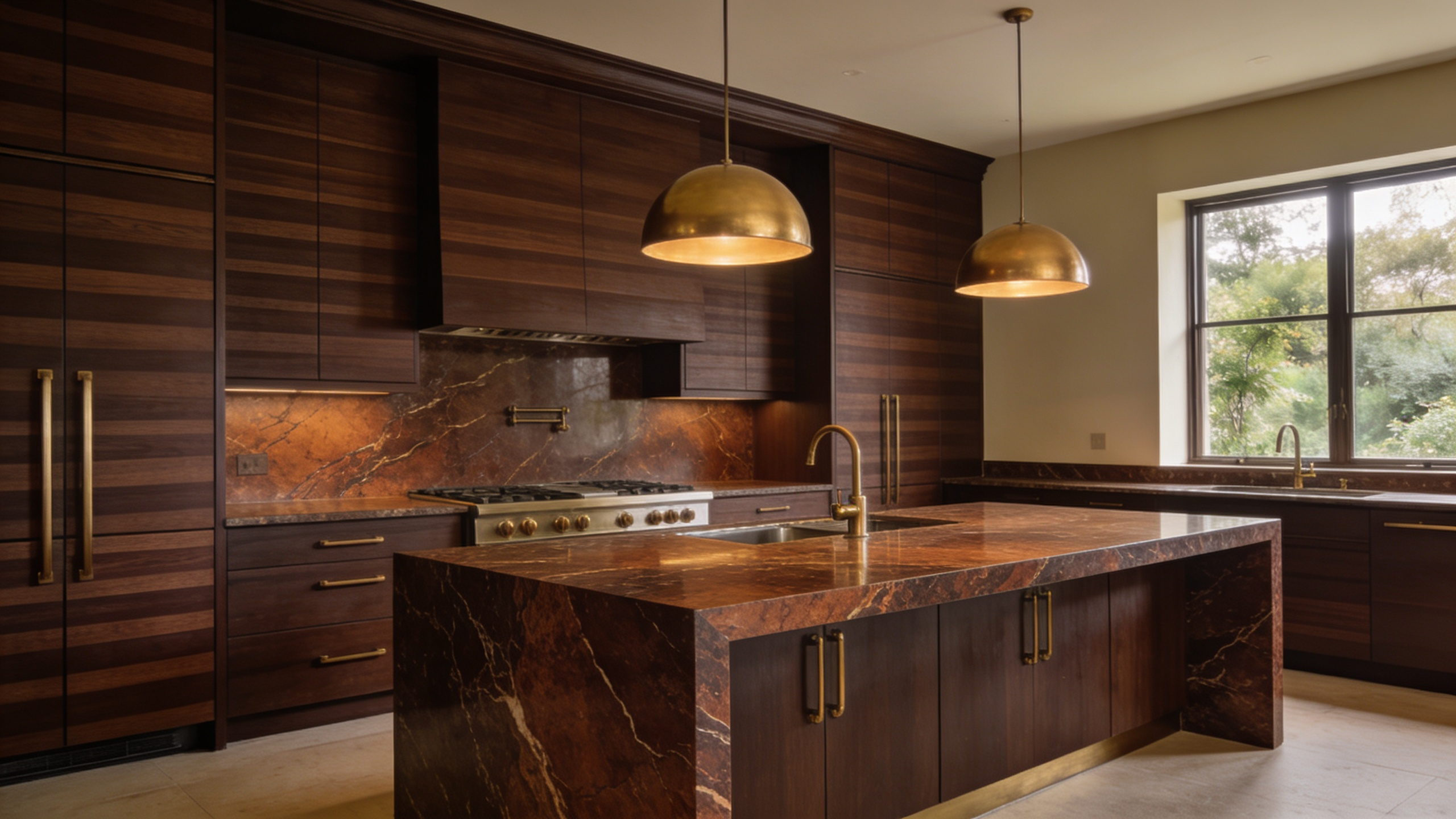
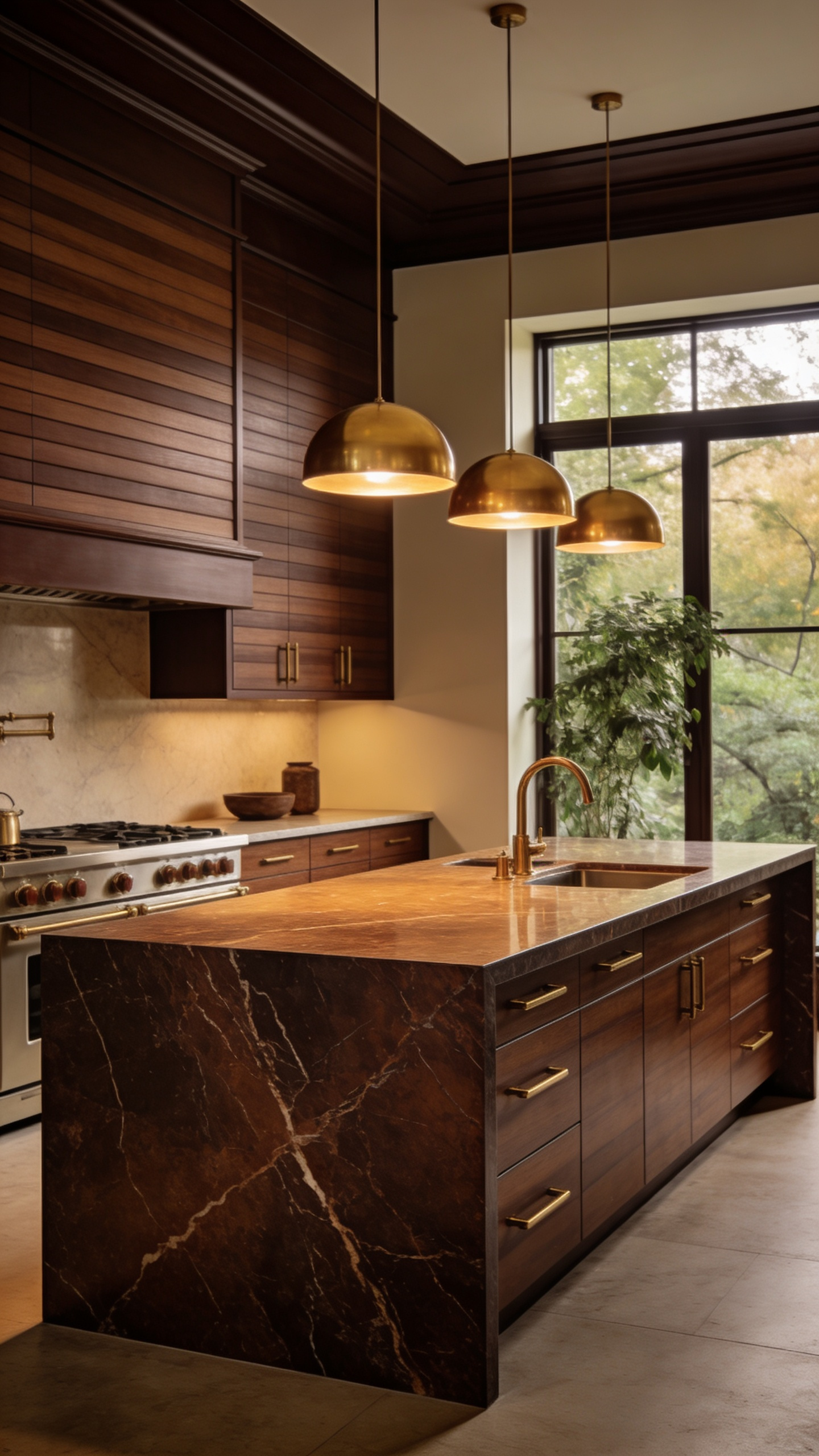
8. Veining with Intent: Selecting Breccia or Emperador marbles with warm, rust-colored striations.
Selecting natural stone is a deliberate exercise in geology and artistry. Specifically, discerning homeowners should seek out Breccia or Emperador marbles. These varieties notably feature warm, rust-colored striations. Interestingly, these rich tones originate from deep iron oxide deposits. Therefore, they offer a natural, metallic warmth unlike any synthetic material.
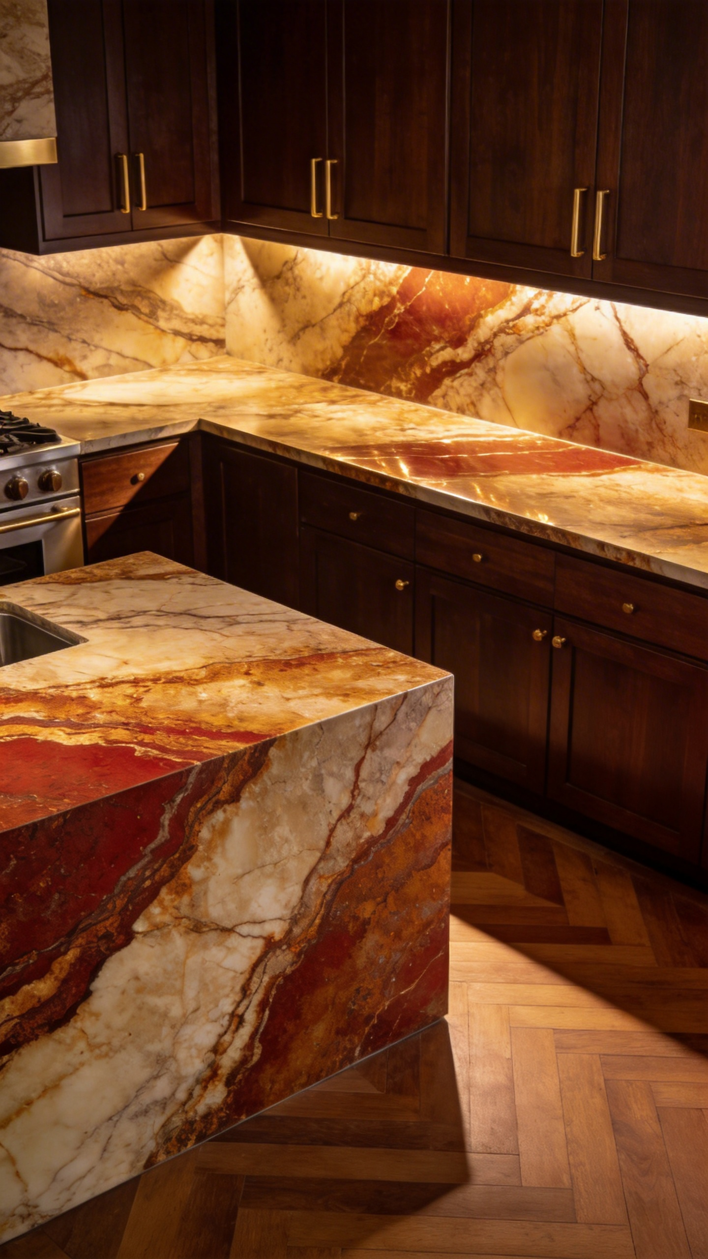
In a brown kitchen, this warmth serves a vital functional purpose. Primarily, it prevents the space from feeling monochromatic or heavy. Instead, the rust and golden veins actively capture ambient light. Consequently, the stone appears to glow, adding necessary visual lift. In fact, this prevents the dreaded “cave” effect common in dark interiors.
However, the structural pattern dictates the room’s final mood. For instance, Spanish Emperador Dark offers linear, flowing elegance. Typically, this suits minimalist or modern-classic aesthetics. Conversely, Breccia marbles are defined by “broken” rock fragments. Therefore, they create a dramatic, textured look perfect for rustic-luxe designs. Ultimately, choosing between flow and fragmentation defines your kitchen’s character.
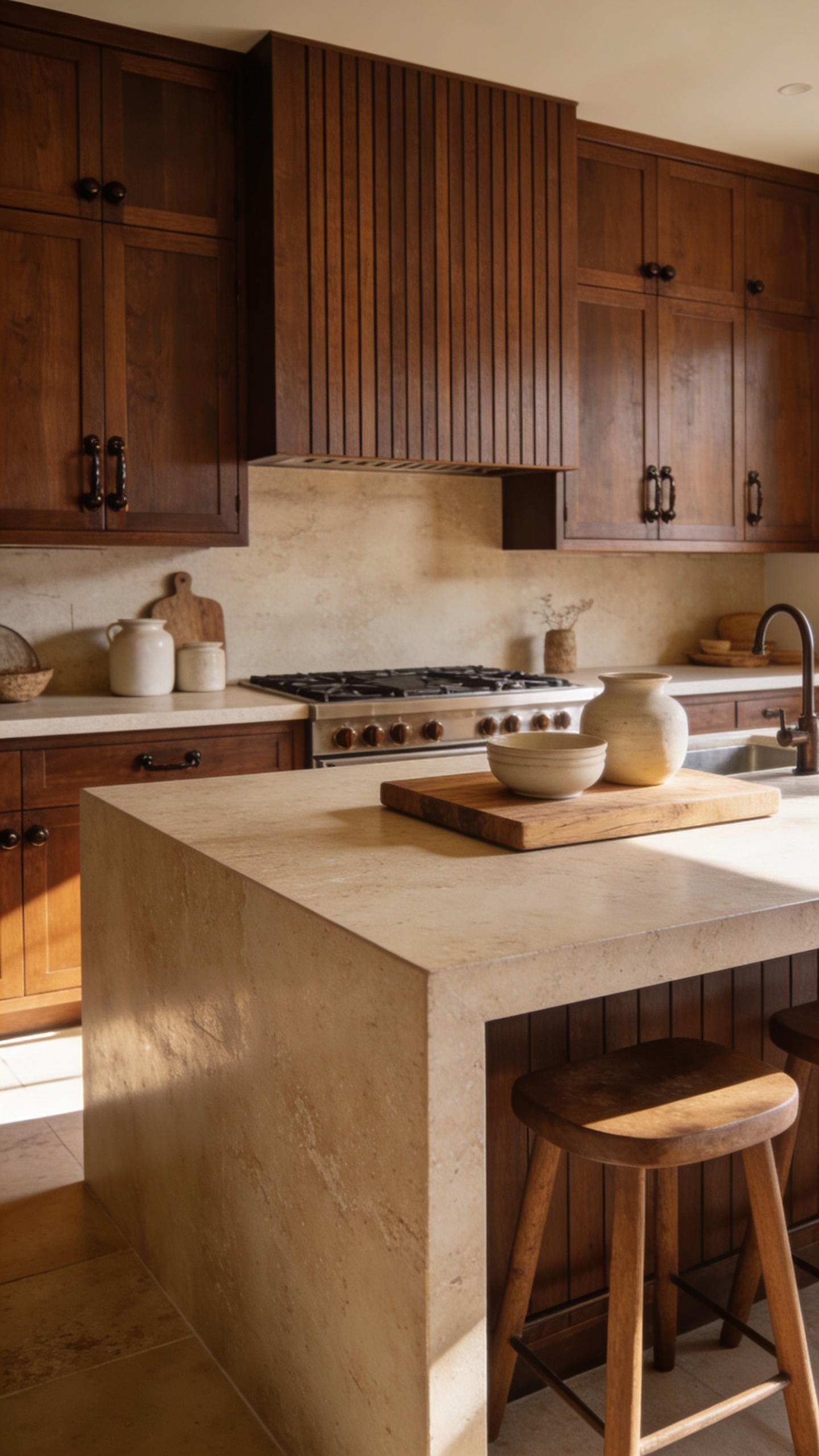
9. Travertine and Limestone: Pairing porous, organic stones with rich cabinetry.
Pairing travertine or limestone with deep brown cabinetry creates a profound textural dialogue. Specifically, this combination balances refined luxury with organic, earthen warmth. Deep walnut or dark-stained oak cabinets often possess a smooth, lustrous finish. In contrast, honed limestone or tumbled travertine offers a soft, matte surface. Consequently, this friction between sleek wood and rugged stone prevents the design from feeling flat. Instead, it adds a sophisticated, layered complexity to the room.

Furthermore, these sedimentary stones provide the perfect tonal anchor for dark joinery. Their natural palette of warm creams and soft tans harmonizes beautifully with rich wood undertones. Historically, materials like travertine carry immense architectural authority. In fact, they have been used in structures as significant as the Colosseum. Therefore, incorporating them brings a sense of permanence and stability to the kitchen. It elevates a simple renovation into a timeless investment.
Finally, one must consider the unique aging process of these calcium-based stones. Unlike synthetic surfaces, they develop a subtle patina over time. Ideally, this “wabi-sabi” aesthetic is embraced as part of the home’s narrative. Acidic foods may etch the surface, slowly marking the passage of time. Thus, the kitchen feels genuinely lived-in rather than sterile. Ultimately, this pairing offers an organic elegance that actually improves with age.
10. The Soapstone Counterpoint: Balancing warm wood with cool, matte natural stone.
Pairing soapstone with warm wood cabinetry creates a sophisticated, highly tactile experience. Specifically, this balance stems from the stone’s unique geological composition. High talc content gives soapstone a velvety texture, often compared to the feel of dry soap. Therefore, this softness creates a physical counterpoint to the rigid, hard grain of timber. Visually, the stone offers a distinct advantage through its understated finish. Unlike polished granite, architectural-grade soapstone typically features a deep, non-reflective matte surface. Consequently, it absorbs light instead of reflecting it. This visual “rest” allows the glowing warmth of cherry or walnut to truly shine.
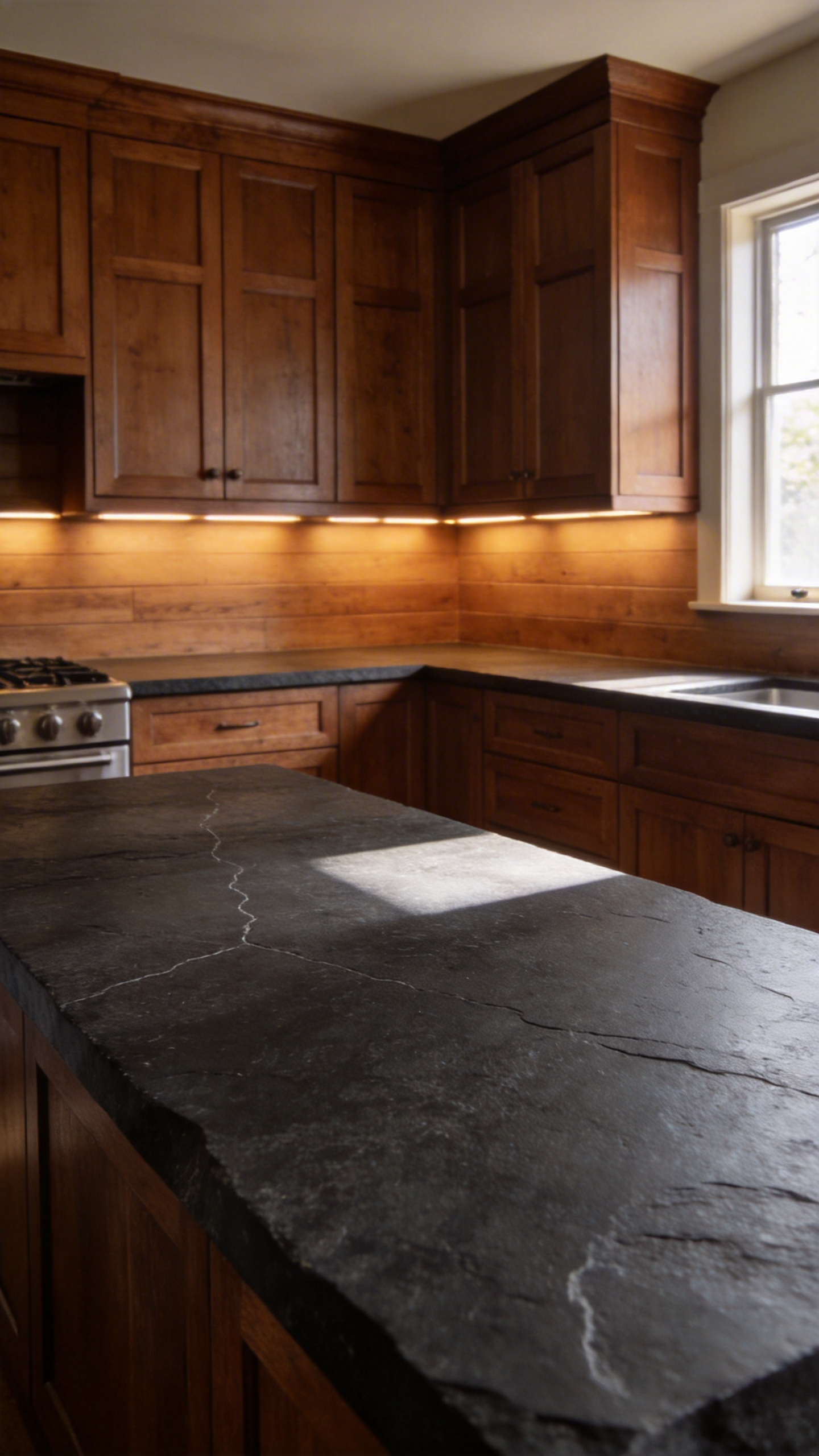
Furthermore, the term “cool” describes more than just the color palette. Due to high thermal conductivity, soapstone actively draws heat away from objects. As a result, the counters feel physically cool against the skin. This quality also provides exceptional heat resistance, effectively eliminating the need for trivets. Finally, the stone represents a long-term investment in character. Through natural oxidation or mineral oil application, the surface deepens to a rich charcoal. Thus, the dark patina anchors the lighter, earthy tones of the cabinetry. Ultimately, this pairing evokes a historic, lived-in elegance that modern materials cannot replicate.
Phase IV: Jewelry and Accreditation – The Details
In high-end kitchen design, Phase IV serves as the “accreditation” of the entire project. Much like the compulsory quality marks stamped onto fine jewelry, the hardware and fixtures you select act as the hallmark of your kitchen’s quality. Just as a gold hallmark guarantees purity to the investor, the tactile details of your cabinetry signal the authenticity of the design. These elements transform a functional space into a legitimate asset.
Accreditation in this context goes beyond simple design certification; it focuses on the integrity of the materials. When you touch a solid brass handle or a leather strap, the “purity” of that material communicates value immediately. In mass-market renovations, these touchpoints are often plated or synthetic. However, in a luxury brown kitchen, authentic materials are non-negotiable.
Modern tracking of design trends further supports this level of scrutiny. Discerning homeowners now demand transparency regarding the origin of their fixtures, much like tracking precious metals. Furthermore, this transparency offers a robust safety net for your investment. If a fixture is genuine living brass or solid bronze, it will age beautifully rather than chip or peel. Ultimately, Phase IV turns the “jewelry” of the room into a guarantee of enduring value rather than just a decorative detail.
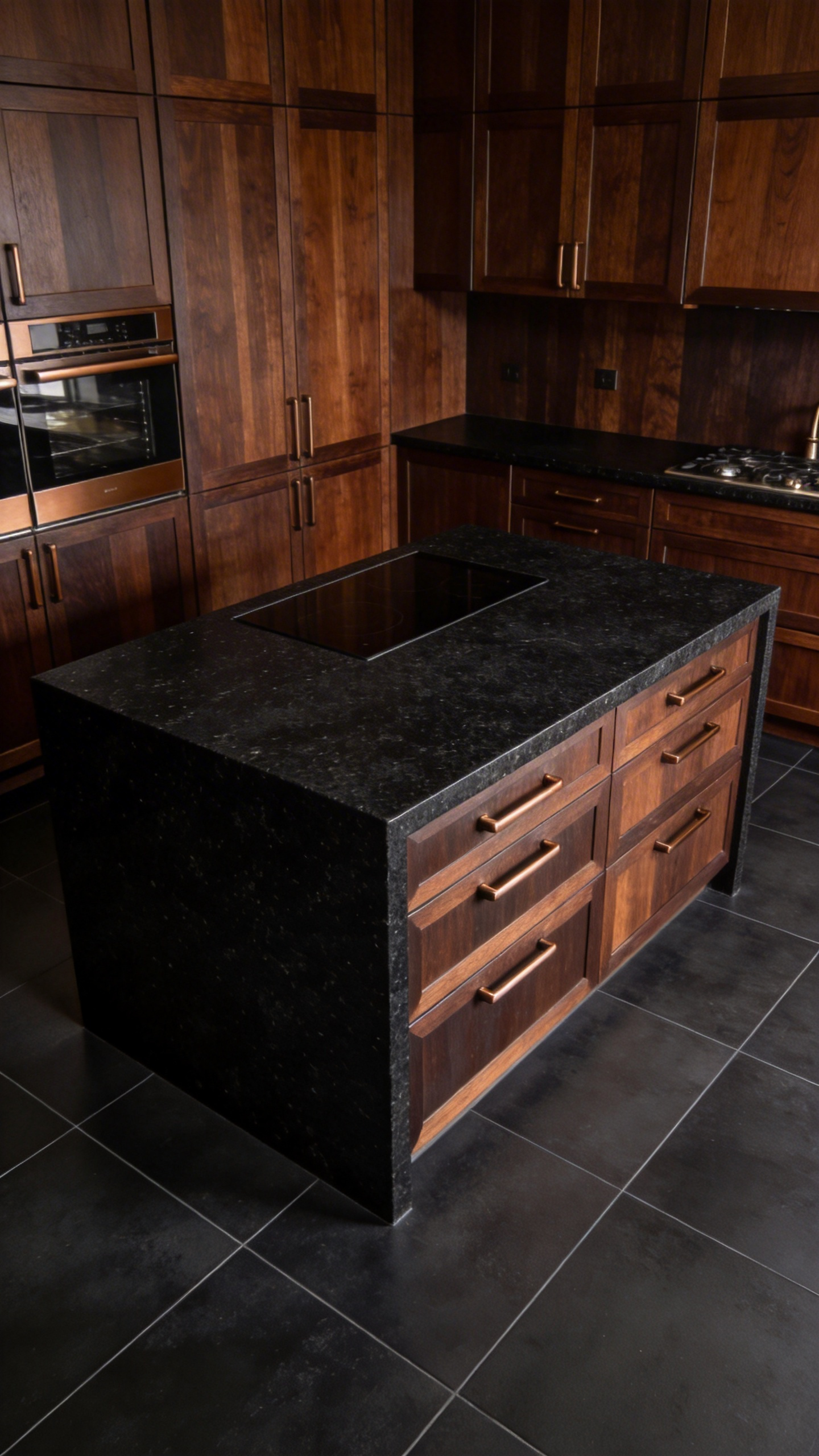
11. The Hardware Dialogue: Why unlacquered brass and antique bronze are the only true companions to brown.
Fundamentally, the relationship between brown cabinetry and specific metals is rooted in thermal cohesion. Unlike cool chrome or stark black matte, unlacquered brass and antique bronze possess inherent heat. Specifically, these copper-based alloys amplify the earthy, grounding qualities of natural wood grain rather than fighting against them.
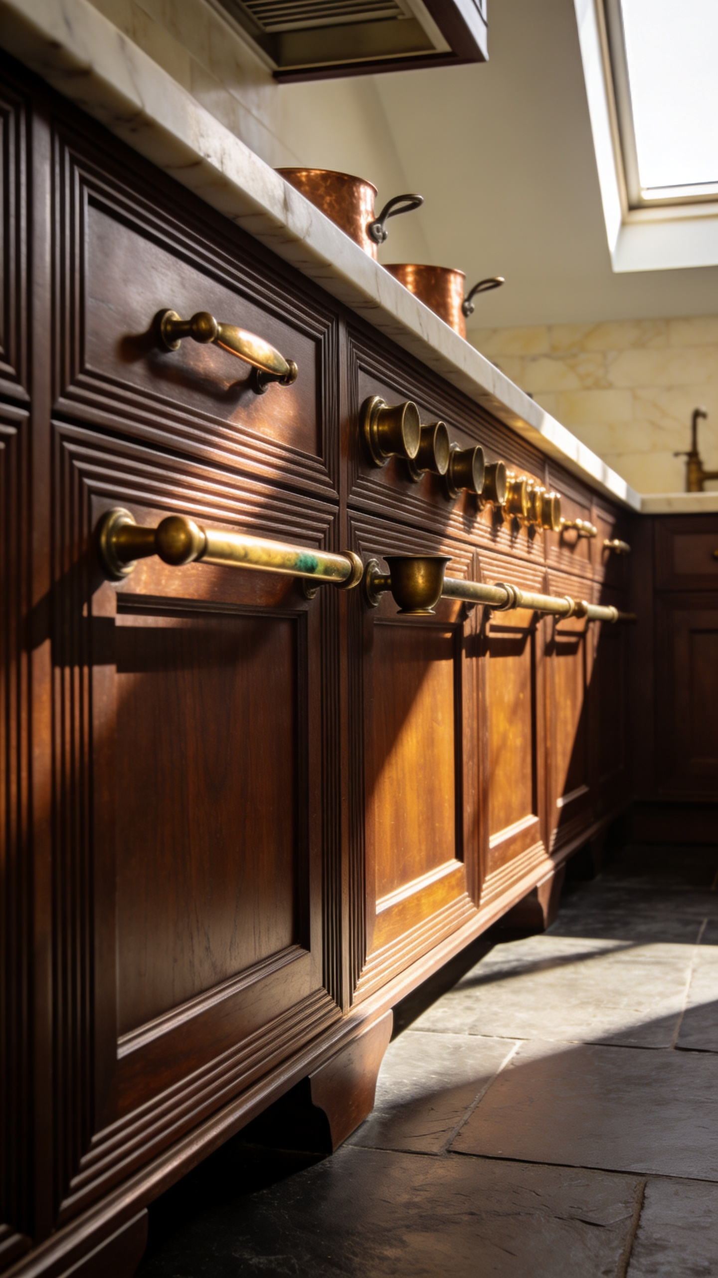
Most notably, unlacquered brass serves as a sophisticated “living finish.” Consequently, it creates a unique narrative link to organic materials like wood or stone. Over time, the raw metal oxidizes when exposed to air and touch. Therefore, the color shifts from bright gold to deep amber, bronze, or rich tobacco tones. In fact, this evolving patina directly mirrors the brown spectrum of the cabinetry.
Furthermore, this aging process tells a literal story of the home. The finish remains bright on frequently touched knobs but darkens on untouched surfaces. Thus, the hardware acquires a sense of history and authenticity that static, lacquered finishes cannot replicate.
Alternatively, antique bronze offers a more subdued, architectural presence. Instead of reflecting light, this matte finish absorbs it. As a result, it provides substantial visual weight that anchors heavy joinery. On dark brown cabinets, it creates a refined tonal-on-tonal look. Ultimately, these metals do not merely accessorize the space; they harmonize with it. Therefore, they remain the only true investment-grade companions for a warm, earthy palette.
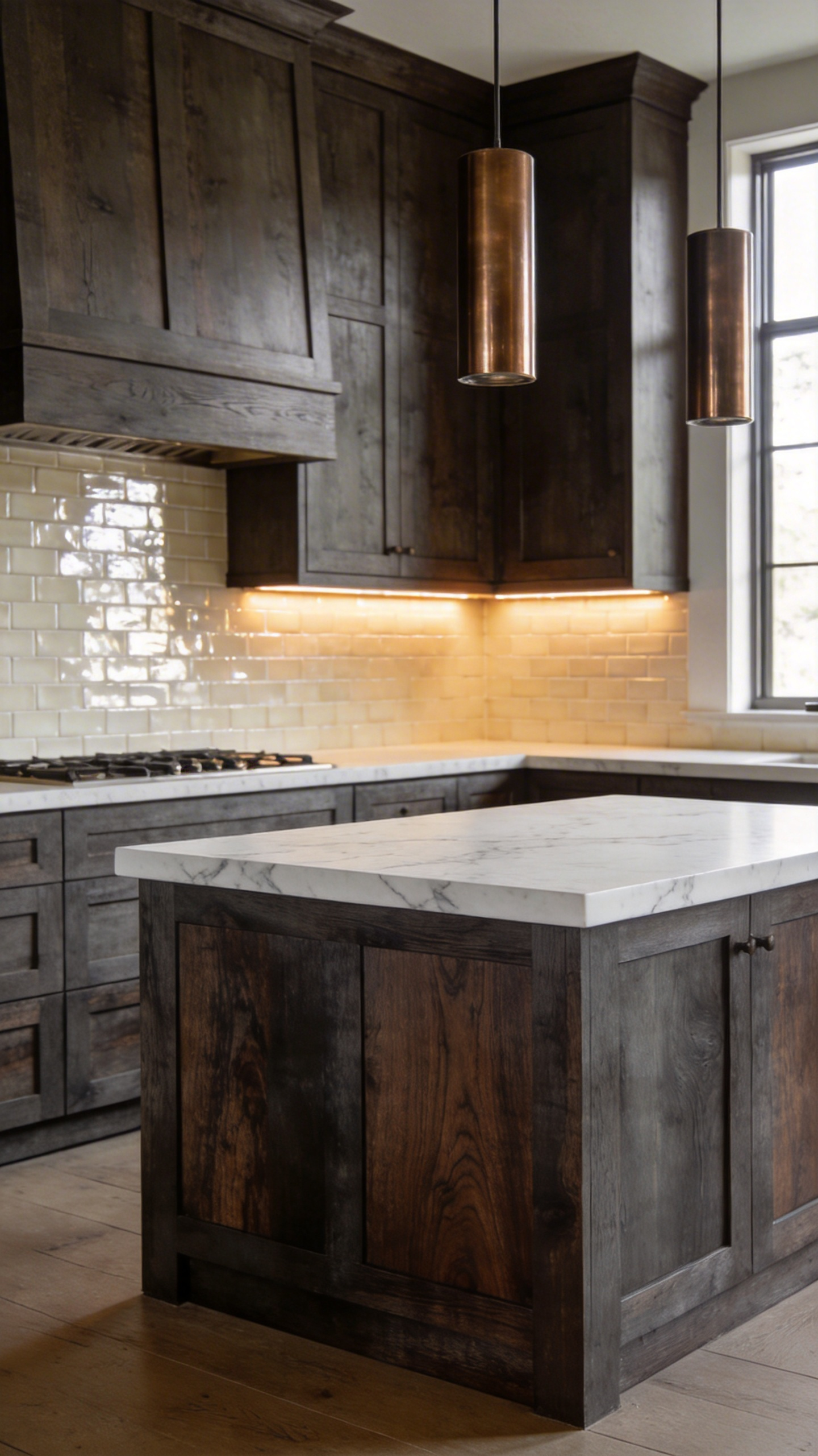
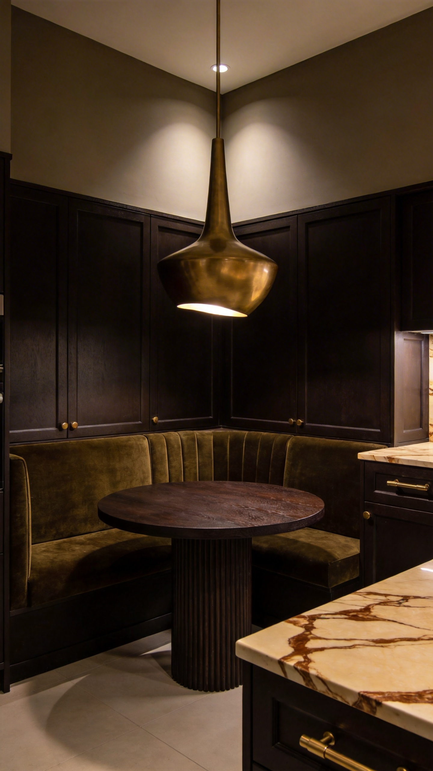
12. Lighting as Texture: Amber glass pendants and copper fixtures to enhance wood tones.
Lighting serves as a crucial textural layer in a brown kitchen. Specifically, it determines how rich and dimensional the cabinetry appears to the eye. Amber glass pendants are particularly effective for this purpose. Ideally, they cast a warm glow between 2000K and 3000K. Consequently, this spectrum amplifies the latent red and orange tones hidden within dark wood. Without this specific warmth, walnut or mahogany surfaces can appear flat or visually heavy. However, the amber filter actively saturates the wood, creating a golden, luxurious depth.
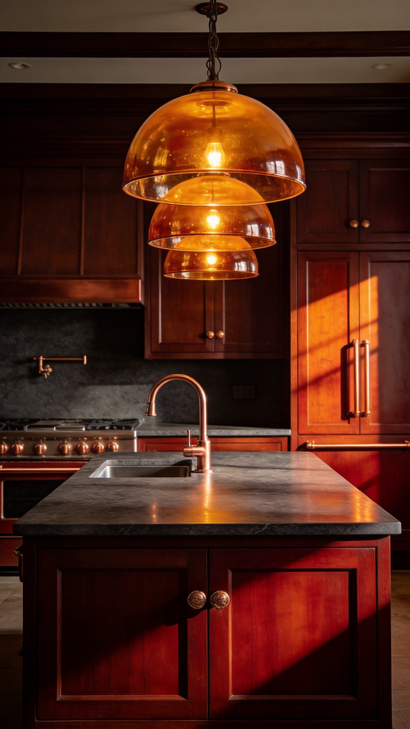
Furthermore, the fixture’s material plays a pivotal role in this aesthetic balance. Copper offers a luminous counterpoint to porous, matte wood grain. Unlike sterile chrome, copper reflects light with an inviting, earthy glow. Additionally, it creates a tactile narrative of authenticity and longevity. Over time, high-quality copper develops a subtle patina. Therefore, the fixture becomes a living element that records the home’s history.
Ultimately, this design choice profoundly impacts the room’s atmosphere. Scientifically, amber light mimics the soothing wavelengths of natural dusk and firelight. Thus, it evokes an evolutionary sense of safety and relaxation. Your kitchen island transitions from a functional workspace to an intimate, candlelit retreat. In essence, this lighting scheme offers a warm, emotional embrace for evening entertaining.
13. Leather Appointments: Integrating cognac leather pulls or bar seating for tactile luxury.
Incorporating cognac leather appointments introduces a vital sensory dimension to kitchen design. Specifically, leather pulls offer a soft, warm touchpoint unlike cold metal or stone. Consequently, this tactile difference elevates a mundane task into a moment of luxury. Visually, the reddish-amber hue of cognac functions as a sophisticated new neutral. Indeed, it pairs exceptionally well with various brown cabinet tones. Against deep walnut, the leather provides a brightening, golden contrast. Conversely, alongside lighter oak, it adds textural depth without harsh visual breaks.
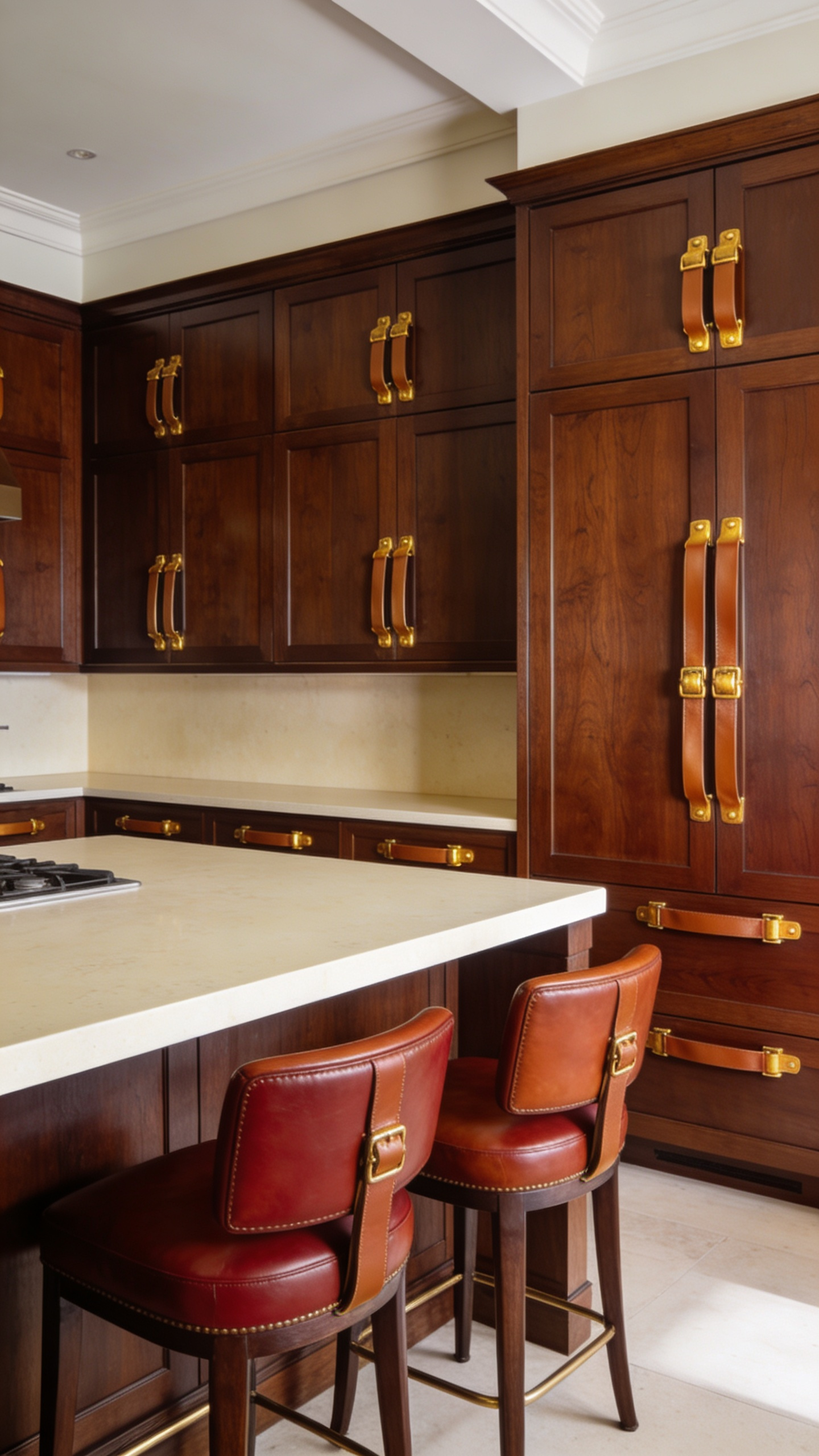
Furthermore, high-quality vegetable-tanned leather represents a smart long-term investment. Rather than degrading, this material develops a coveted patina over time. In fact, interaction with oils and sunlight deepens the color to a burnished finish. Therefore, these elements tell a story of authenticity and use. Historically, leather was chosen for dining chairs because it resists absorbing food odors. Thus, it remains perfectly suited for modern, high-traffic culinary spaces. Even maintenance is straightforward, requiring only a soft cloth and mild soap. Ultimately, leather balances practical durability with an unrivaled aesthetic appeal.
14. Ceramic and Clay Styling: Curating open shelves with artisanal terracotta and stoneware.
Styling open shelves with ceramics creates a profound design dialogue in brown kitchens. Specifically, this approach introduces a sophisticated tension by juxtaposing materials. For instance, the natural iron-oxide hues of terracotta act as a vibrant counterpoint to deep walnut cabinetry. Consequently, these warm, sun-baked tones prevent dark brown palettes from feeling monolithic or heavy.
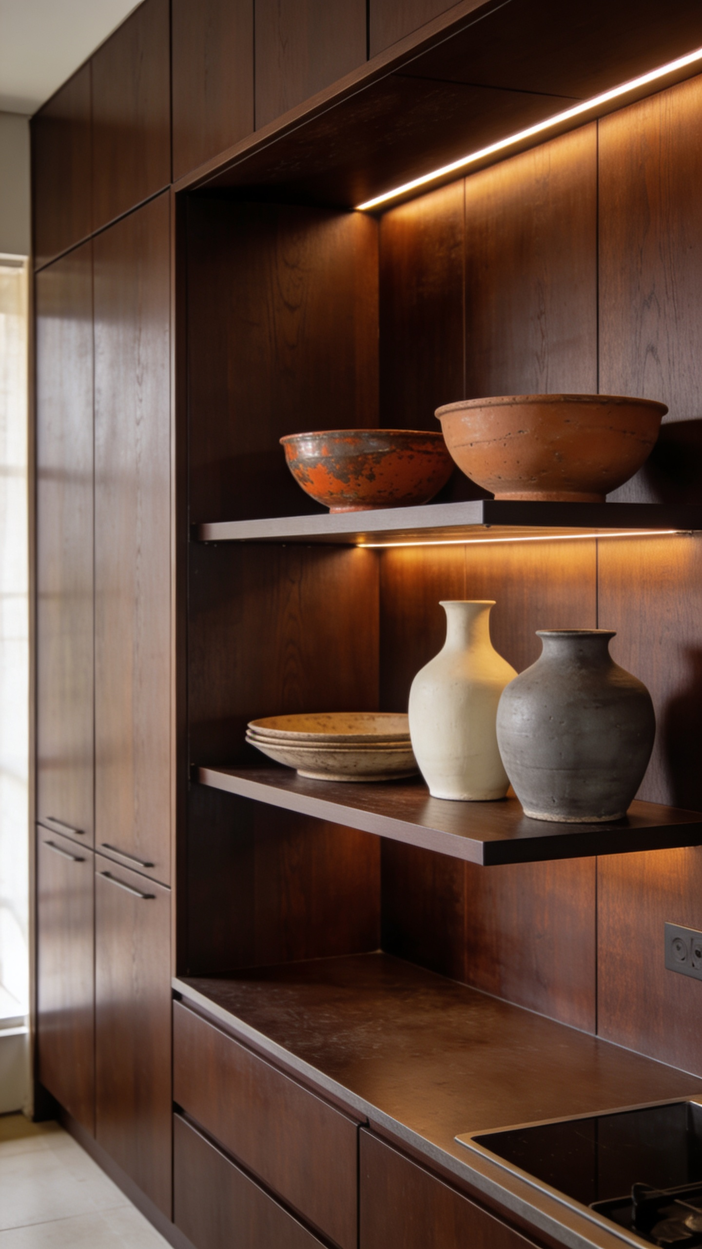
Furthermore, integrating unglazed stoneware introduces a tactile, raw element against polished wood surfaces. This contrast creates a sensory experience that champions handcrafted imperfections over modern sleekness. However, successful curation hinges on balancing finishes to avoid visual clutter. Therefore, intersperse matte, unglazed pieces with high-fired, glossy stoneware to catch the light.
Additionally, incorporate organic neutrals like clay taupe or sage green to harmonize the collection. Ultimately, this styling choice nods to Mediterranean traditions, elevating utilitarian objects to focal art. In fact, adding brass accents alongside these ceramics secures a truly luxurious, grounded aesthetic.
15. Rugs and Soft Goods: Grounding the floor plan with vintage Persian runners in rust and umber.
Integrating a vintage Persian runner creates an essential layer of warmth in a design. Specifically, runners featuring deep rust and umber tones effectively ground the floor plan. Historically, these brown umber hues represented the earth and soil. Sourced from natural materials like walnut husks, the dyes introduce an organic, raw element. Consequently, this visual weight anchors the sleek, fabricated surfaces of a modern kitchen.
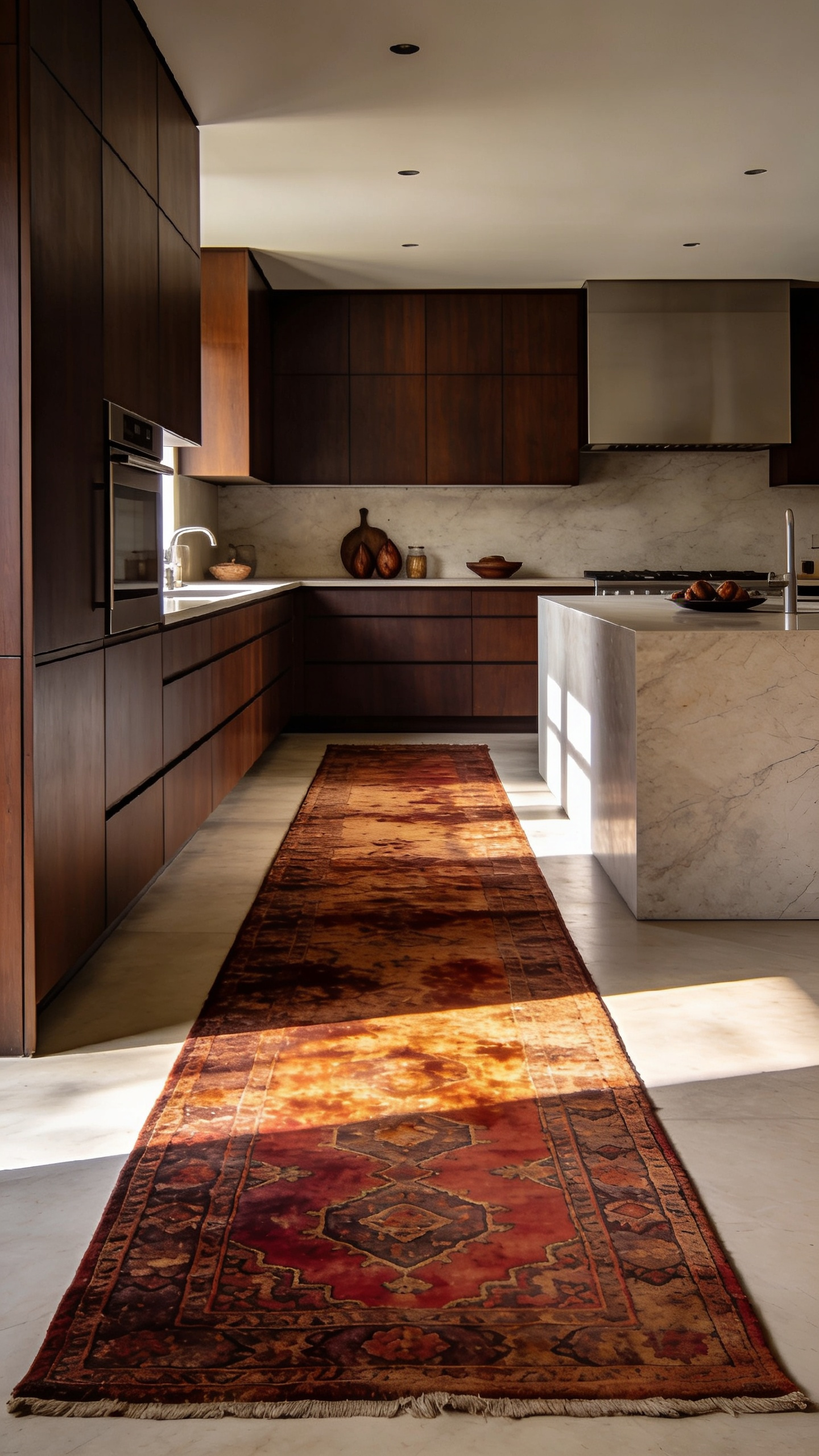
Meanwhile, the rust tones offer a mellowed vitality. Derived from madder root, this aged red complements walnut or mahogany cabinetry beautifully. It provides a subtle saturation shift rather than a jarring contrast.
Beyond color, the rug’s construction dictates its investment value. Ideally, look for Hamadan or Heriz varieties for the kitchen. These village rugs utilize rugged Turkish knots for immense durability. Therefore, they withstand the daily rhythm of high-traffic zones effortlessly. Furthermore, vintage wool creates a unique textural interplay. Often, older vegetable dyes wear unevenly, creating a tactile “relief” effect where dark wool sits lower. This matte, varying texture breaks up the monotony of high-gloss finishes. Ultimately, the thick wool pile softens hard flooring underfoot. It also dampens ambient noise, making the kitchen feel significantly more intimate and sophisticated.
Frequently Asked Questions
What colors should I pair with brown kitchen cabinets to avoid a dated look?
To ensure a modern, sophisticated aesthetic, pair brown cabinets with soft, nature-inspired contrasts and metallic accents. Avoid basic beige. Instead, opt for creamy taupes, warm greige, dusty olive greens, or deep navy blues on walls or surrounding surfaces. For hardware, use unlacquered brass or antique bronze to add necessary warmth and reflection, preventing the space from feeling heavy or monochromatic.
Does using dark brown cabinetry make a kitchen feel smaller or too heavy?
Not necessarily. Dark brown cabinetry, especially when applied with the “Truffle Envelope” or “Espresso Anchor” techniques, can actually create an enveloping sense of intimacy and sophistication. To prevent heaviness, balance the dark wood with high-contrast, light-reflecting horizontal surfaces, such as white honed quartz or light marble countertops. Additionally, layered, warm lighting is crucial for highlighting texture and adding dimension, preventing a cave-like effect.
Should I choose a high-gloss or a matte finish for a luxury brown kitchen?
For luxury brown cabinetry, a matte, low-sheen, or “velvet” finish is highly recommended. Matte finishes absorb light, allowing the eye to register the wood’s full, saturated color and natural texture (like grain and knots) without interruption. High-gloss finishes, conversely, create harsh white reflections that wash out dark colors and amplify fingerprints and scratches, often making the wood look less authentic.
Conclusion: Timelessness Over Trend – Why the brown kitchen is an investment in enduring style.
Choosing a brown kitchen is not merely selecting a color palette. In reality, it embraces the enduring power of natural materiality. Unlike synthetic trends, organic wood grains offer a depth that paint cannot replicate. Consequently, these spaces provide psychological grounding in our fast-paced world. Furthermore, this versatility ensures your home appeals strongly to future buyers. Thus, natural wood tones represent a financially smart and emotionally resonant investment. Ultimately, true luxury implies longevity.
As your personal style evolves, these neutral foundations will adapt effortlessly to new trends. You can simply update hardware or lighting to refresh the overall aesthetic. Therefore, the brown kitchen stands as a lasting legacy for your home. Start by requesting samples of matte, natural-toned woods like walnut or oak. Select a finish that creates a sense of permanent sanctuary. Ultimately, this approach—embracing wood grain, curated surfaces, and warm lighting—ensures your brown kitchen inspiration results in a space that is both visually rich and perpetually comforting.