Many homeowners view the kitchen tile backsplash simply as “kitchen jewelry.” They often treat it primarily as a decorative finishing touch. However, this aesthetic approach ignores a critical structural reality. Surprisingly, industry data reveals that improper material selection causes nearly 40% of early renovation failures. Prioritizing visual “pop” over substrate integrity invites disaster. If you are seeking broader inspiration for your next project, review our comprehensive guide unveiling 20 revolutionary kitchen backsplash ideas.
From a design perspective, the backsplash has evolved. It moved from a functional four-inch strip to a massive statement wall. Visually, it acts as the central anchor for the room’s lighting. Functionally, however, it must serve as a rigorous protective shield. Unfortunately, porous stones often act as sponges for hot cooking oils. Furthermore, standard grout lines frequently become weak links that funnel moisture into the drywall. True longevity requires looking beyond the surface gloss to the technical components.
This guide outlines the technical framework for a backsplash that endures. We examine the complete system, from non-porous porcelain to high-performance epoxy grout. Additionally, we analyze how to balance heat resistance with textural depth. Consequently, you will discover how to create a feature that serves as both a visual anchor and a watertight fortress.
1. Material Physics: Understanding Water Absorption Rates (Ceramic vs. Porcelain)
Fundamentally, the distinction between ceramic and porcelain relies on a single metric. Specifically, this defining factor is the water absorption rate. To legally earn the “porcelain” label, a tile must absorb 0.5% or less of its weight in water. This strict standard, verified by the ASTM C373 test, classifies porcelain as “impervious.” In contrast, traditional ceramic remains significantly more porous.
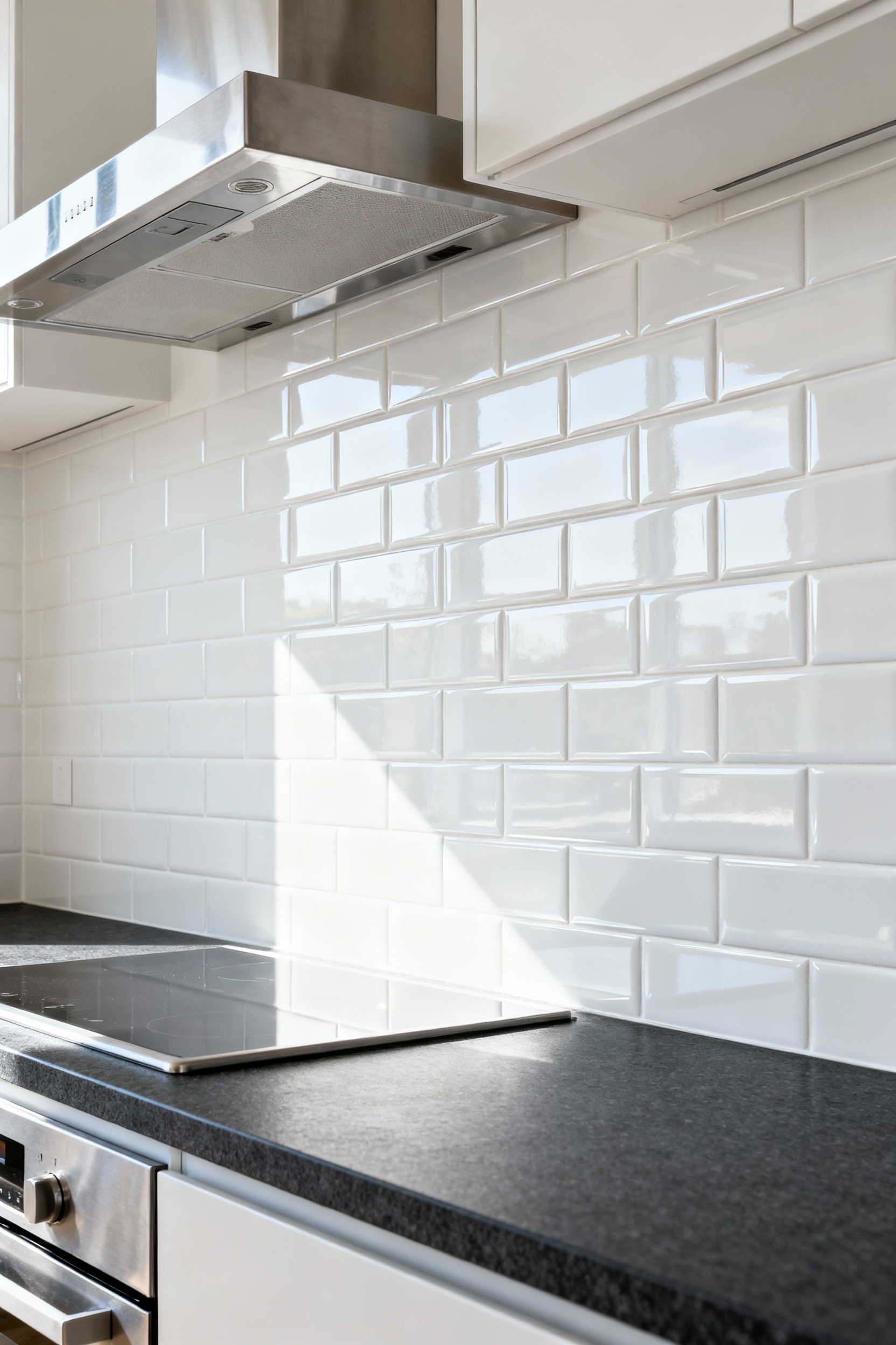
Scientifically, this impervious nature stems from vitrification. Manufacturers fire porcelain at extreme temperatures, often exceeding 2,200°F. During this intense heat, minerals like feldspar melt into a glassy liquid. This liquid fills microscopic voids within the clay. Upon cooling, the tile becomes a solid, homogeneous mass. Conversely, ceramic is fired at lower temperatures, preventing complete densification.
For a kitchen backsplash, this physics matters. Most ceramic tiles rely entirely on a top glaze to repel grease. If that glaze chips, the porous clay body underneath becomes exposed. In that scenario, liquids or cooking odors penetrate the tile itself. Porcelain avoids this liability entirely. Because it is vitrified throughout, even a deep scratch reveals dense, stain-resistant material. Therefore, porcelain offers superior long-term resilience.
Finally, you can physically feel this density. Porcelain carries a distinct, stone-like heft compared to lighter ceramic. However, this density presents a unique installation challenge. Because the tile rejects moisture, standard adhesives struggle to bond mechanically. Thus, installers must use specialized modified thin-set mortars to ensure a permanent hold.
2. The Transparency Trap: Why Glass Tile Requires Specific Substrate Preparation
Glass tile creates a unique visual challenge called the “transparency trap.” Unlike opaque ceramic, glass allows light to pass completely through the tile body. Consequently, light reflects directly off the bonding material underneath. If the installer leaves air pockets behind the glass, you see unsightly dark shadows. Specifically, these voids create a mottled aesthetic that ruins the design. Therefore, the substrate preparation must be optically flawless.
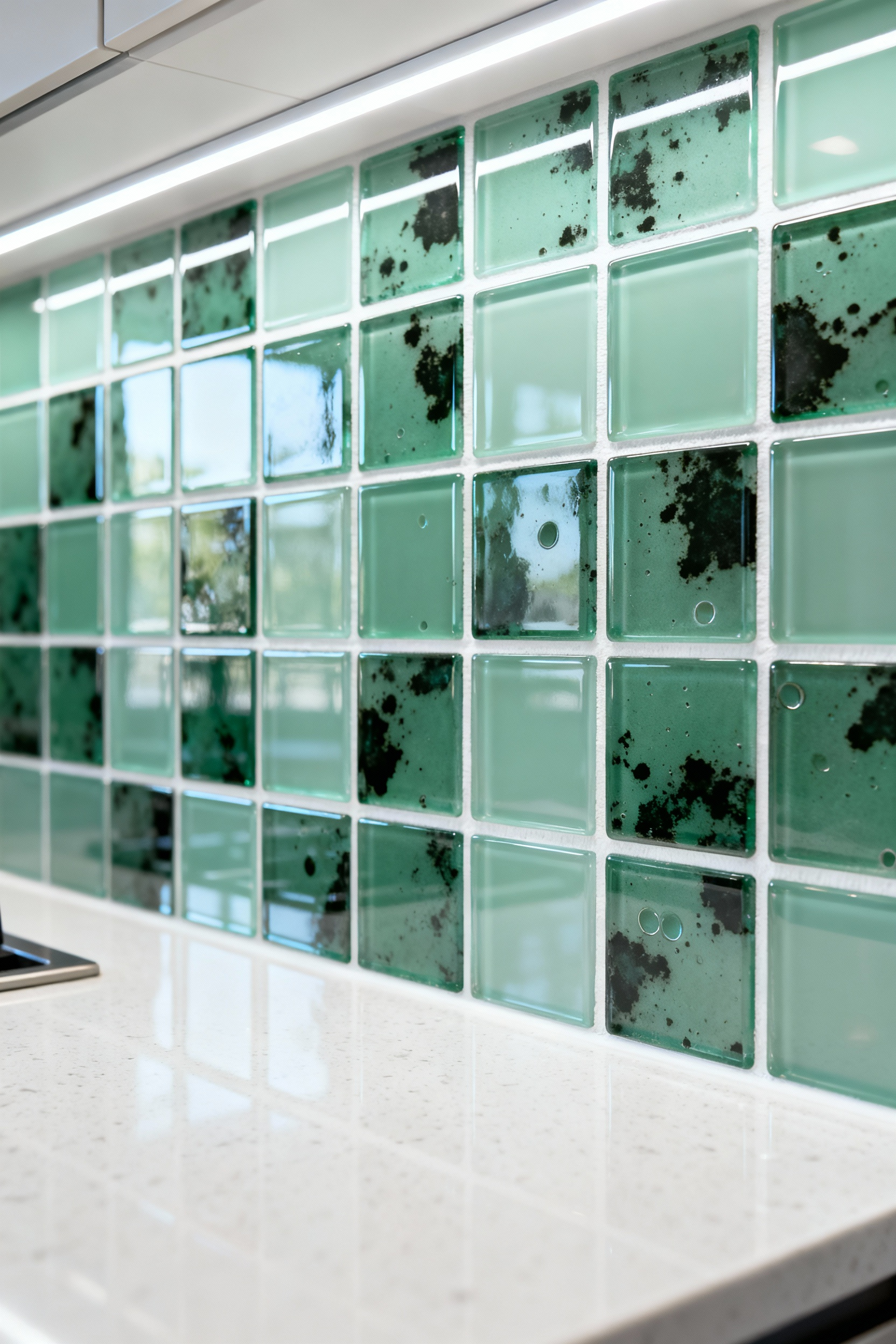
Furthermore, the adhesive’s color acts as the tile’s permanent backdrop. Standard gray mortar drastically dulls the vibrancy of translucent glass. To avoid this, you must insist on a bright white, polymer-modified thin-set. This specific mortar ensures the glass color remains true. Additionally, the high polymer content creates a strong chemical bond. Without this additive, the bond strength cannot support the glass over time.
Finally, application technique is critical. Standard trowel ridges leave gaps that become visible defects. Instead, professional installers utilize a “knock-down” method. After spreading mortar, they use the trowel’s flat side to collapse the ridges. Simultaneously, they “back-butter” the tile with a thin layer of mortar. This rigorous process guarantees full coverage, effectively eliminating the air pockets.
3. Natural Stone Realities: The Maintenance Cost of Marble and Travertine
Choosing marble or travertine for a backsplash involves more than the initial price tag. Primarily, you are signing up for significant vigilance and labor. These stones are porous, containing microscopic channels that absorb liquids like oil or wine. Consequently, sealing becomes a mandatory, recurring ritual.
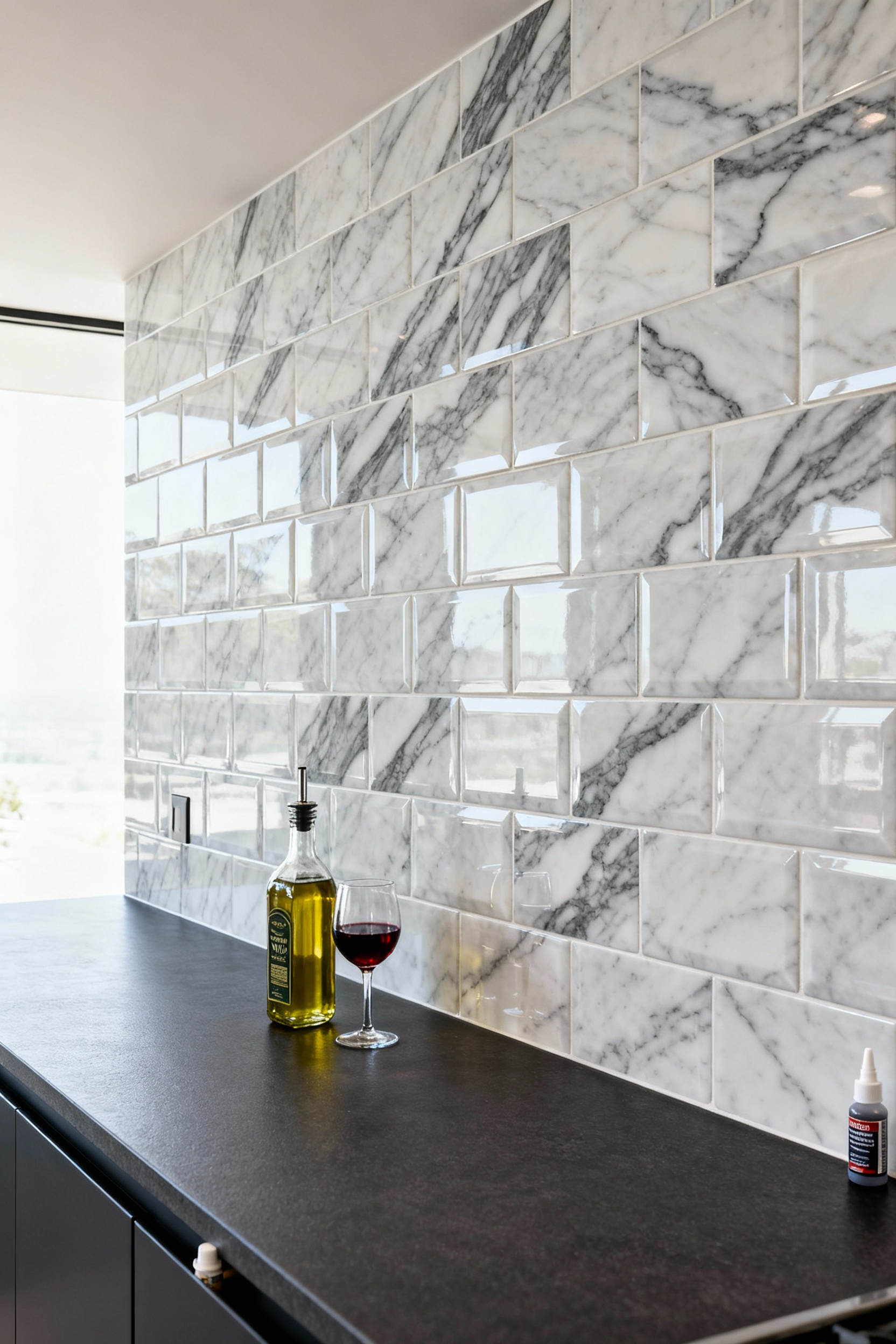
Think of sealant as an anti-stain insurance policy rather than an impenetrable shield. It simply slows absorption, giving you a window to wipe away splatters. Financially, a simple DIY bottle costs around $25. However, professional sealing services can reach $600 annually. If you are integrating materials, consider reading our guide on eco-wise kitchen backsplash and countertops tips to ensure material harmony.
Unfortunately, sealing cannot prevent the most significant threat: etching. Because marble is calcium-based, it reacts chemically with common acids. A splash of lemon juice eats away the calcium carbonate instantly. As a result, the surface becomes dull and rough. Unlike stains, etching is physical damage that requires expensive professional re-polishing.
Therefore, your daily cleaning habits must change. You must strictly use pH-neutral, stone-safe cleaners. Standard acidic sprays will degrade the stone and strip your sealant. Ultimately, this creates a “vigilance tax” where you constantly monitor for splashes. For this reason, many homeowners prefer honed finishes. The matte texture hides inevitable etch marks better, reducing visual stress.
4. Grout Engineering: Why Epoxy Outperforms Cement in High-Splash Zones
To understand performance differences, we must look at the chemistry. Traditional cement grout mixes sand, water, and cement. Consequently, it cures into a porous structure filled with microscopic capillaries. In a kitchen, this porosity acts like a hard sponge. Unsealed cement actively absorbs grease splatters and acidic tomato sauces. Therefore, deep staining and bacterial growth become inevitable risks.
In contrast, epoxy grout utilizes a two-part resin system. When mixed, these components react to form a dense, impermeable solid. Effectively, this creates a waterproof barrier between your tiles. Instead of soaking in, liquids simply bead up on the surface. Cleanup becomes a matter of a single wipe rather than scrubbing.
Furthermore, the kitchen is a zone of chemical warfare. Common ingredients like vinegar can etch cement binders over time. However, epoxy is engineered to resist such degradation. It maintains its color consistency without fading. Additionally, this resin-based material offers superior structural strength. While water-based mixes may shrink, epoxy cures into a rigid, non-shrinking seal. Consequently, it withstands thermal heat from cooktops without fracturing. Choosing epoxy transforms a high-maintenance surface into an “install it and forget it” feature.
5. Optical Illusions: Using Vertical Stacking to Raise Perceived Ceiling Height
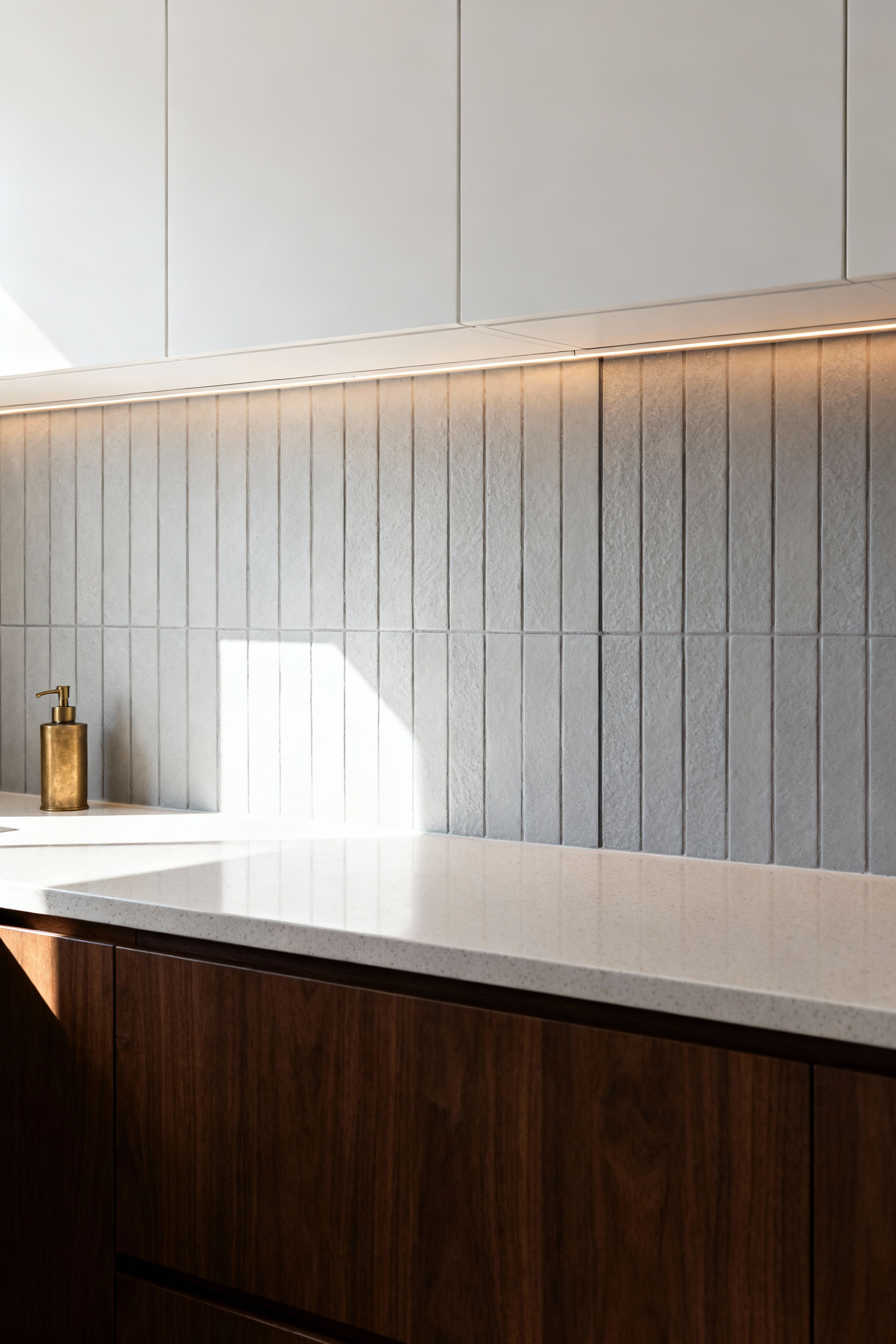
Interior design often relies on visual trickery. Specifically, the “Vertical-Horizontal Illusion” acts as a powerful tool in compact kitchens. In this phenomenon, vertical lines appear significantly longer than horizontal ones. Consequently, vertically stacked backsplashes force the eye to travel upward. This vertical movement counters the heavy, horizontal lines created by countertops. Therefore, the room feels significantly more spacious.
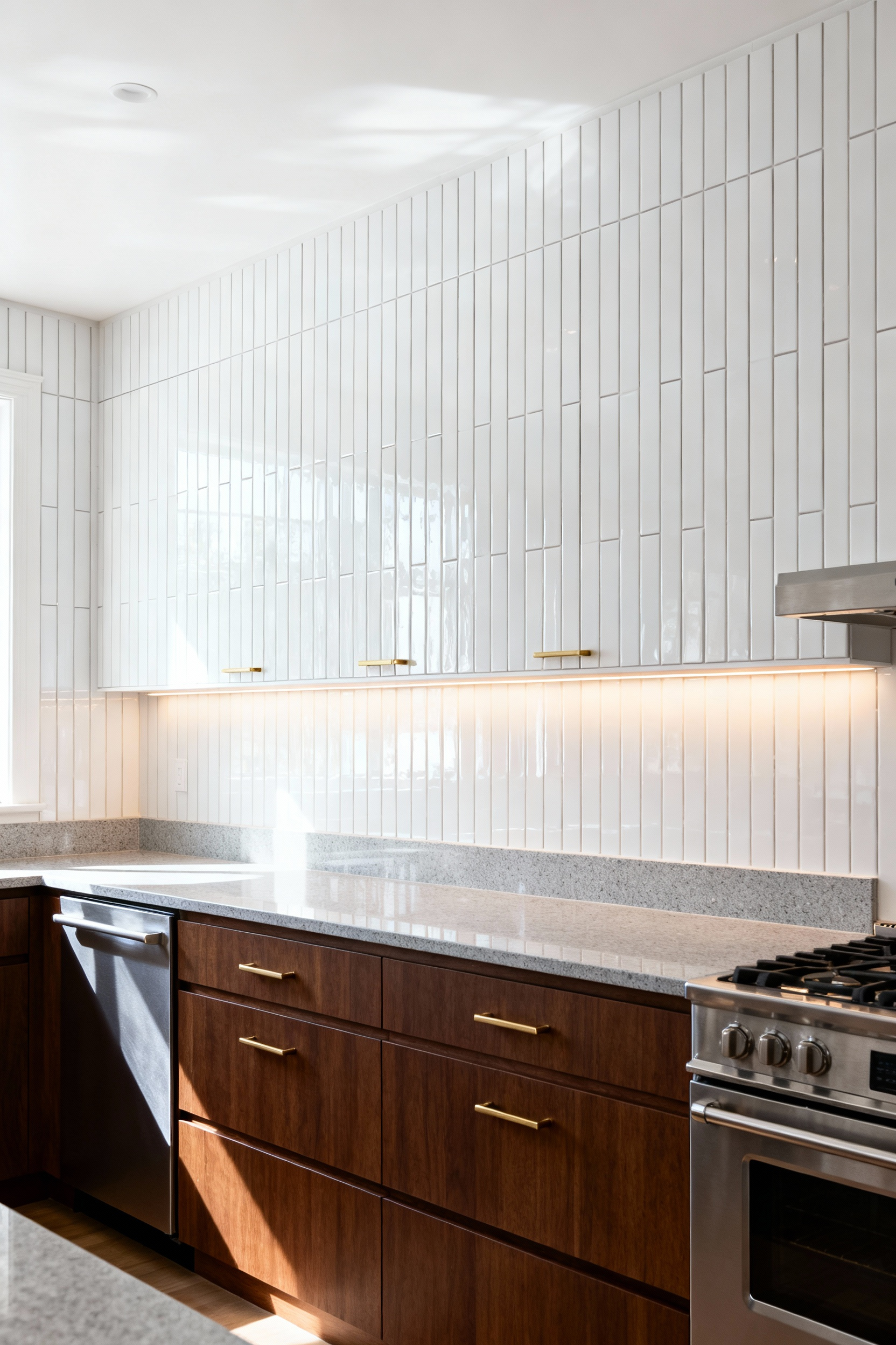
Historically, horizontal subway tiles symbolized sanitation. However, rotating these tiles ninety degrees creates a distinctly modern aesthetic. To maximize this optical illusion, the installation strategy is critical. You must extend the tile from the countertop all the way to the ceiling. Stopping at the bottom of upper cabinets creates a harsh visual “chop.” In contrast, a full-height installation dissolves the boundary between wall and ceiling.
Furthermore, the physical proportions of the tile play a role. Ideally, opt for slimmer, elongated formats like 2″x10″ tiles. These high length-to-width ratios naturally enhance the vertical “waterfall” effect. Additionally, your choice of grout defines the final impact. High-contrast grout emphasizes every vertical stripe for a dramatic look. Conversely, matching grout creates a seamless backdrop. This approach relies on texture rather than color to suggest height.
6. The Modern Subway: Transitioning from 50/50 Offset to the 1/3 Offset Layout
The classic 50/50 brick pattern defines traditional kitchen design. Historically, this layout mimics the original 1904 New York City Subway architecture. However, modern tastes now favor elongated, plank-style tiles. Unfortunately, these longer formats introduce a critical technical challenge known as lippage.
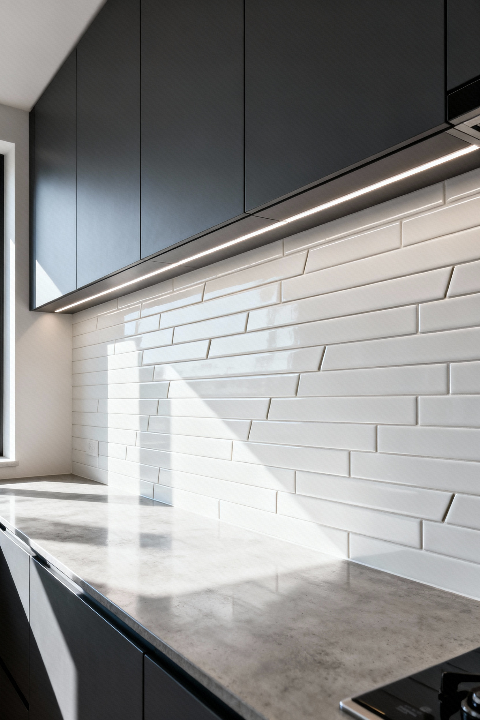
Specifically, the kiln-firing process causes a subtle curvature or “bow” in long tiles. Therefore, aligning the high center of one tile with the low edge of another creates unevenness. In raking light, this height difference casts unsightly shadows. To solve this, manufacturers specify a 1/3 offset layout for tiles with a 2:1 aspect ratio.
Technically, this method distributes natural curvature over a greater distance. This ensures a flat, polished installation. Beyond mechanics, this shift offers a distinct visual advantage. It creates a cascading, dynamic effect that feels softer than the rigid 50/50 grid. Consequently, the eye flows gently over the wall rather than stopping at every joint. To see how this fits into current home styling, explore 7 kitchen backsplash trends that will transform your space.
Furthermore, this subtle stagger allows the material’s texture to take precedence. High-variation glazes or stone veins shine without visual competition. Ultimately, the 1/3 offset bridges the gap between vintage charm and modern minimalism.
7. Complex Geometry: Calculating Waste Percentages for Herringbone and Chevron
When calculating material for V-patterns, standard math rarely applies. Typically, a 10% overage suffices for straight-lay tiles. However, herringbone and chevron demand significantly more buffer. Industry standards suggest 15% to 20% waste for these intricate layouts. In fact, within the obstacle-filled environment of a kitchen, professionals often recommend 25%.
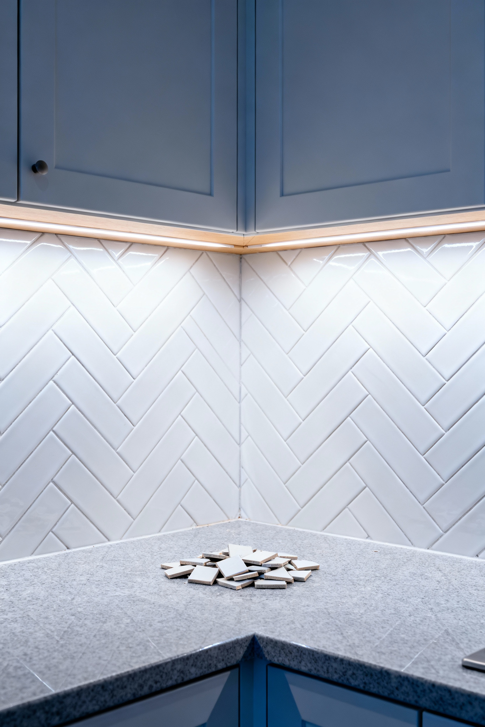
This steep increase is due to the “Irregularity Tax.” Unlike open flooring, backsplashes navigate tight corners, outlets, and cabinets. Consequently, cutting around a single switch plate can consume an entire tile.
Furthermore, the cut geometry defines the true cost. Herringbone tiles remain standard rectangles. Therefore, a skilled installer can often flip a triangular off-cut to fill a gap elsewhere. This process, known as “cut and return,” maximizes reusability. Conversely, chevron requires an inherent material sacrifice. To achieve the mitered point, the ends of every plank are trimmed. Unfortunately, this removed material is unusable waste. Thus, chevron intrinsically generates more scrap than herringbone.
Additionally, maintaining visual symmetry increases waste. Centering the pattern perfectly over a range often forces aggressive cuts at the walls. Ultimately, that extra percentage serves as an insurance policy. It accounts for inevitable breakage and guarantees matching dye lots.
8. Visual Weight Distribution: Balancing Large Format Tiles in Compact Kitchens
Using large-format tiles in a compact kitchen often feels contradictory. However, this design choice fundamentally alters spatial perception by minimizing visual interruption. Traditional small tiles create hundreds of high-contrast grout lines. Consequently, these breaks visually chop up the surface, adding “noise” to a small room. In contrast, large tiles allow the eye to glide across a vast, unbroken plane. Therefore, the backsplash feels like one continuous element.
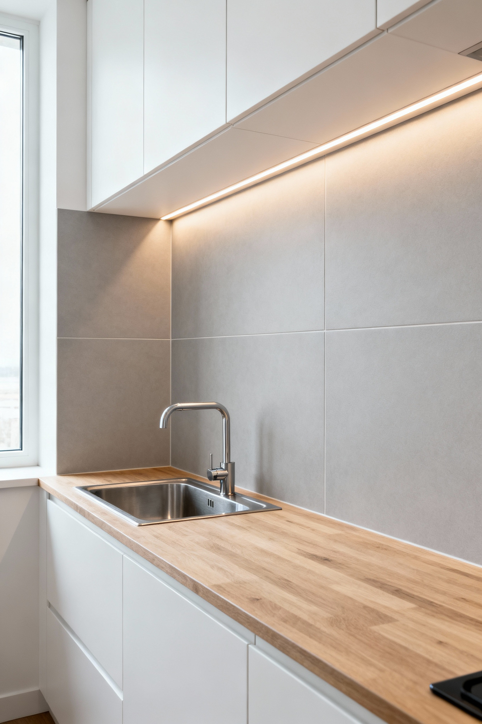
Furthermore, balancing visual weight requires a strict tonal strategy. Ideally, select light, neutral palettes to maximize light reflection. In fact, glossy or polished finishes actively mitigate the heavy appearance of large slabs. Simultaneously, these reflective surfaces add depth and movement. Crucially, the grout color must match the tile tone almost perfectly. Otherwise, dark contrasting lines effectively negate the seamless benefits.
Finally, proper scaling ensures the installation looks intentional. A tile must fit the standard backsplash height without resulting in tiny, jagged off-cuts. Instead, aim for full-height courses that look bespoke. Additionally, stacking rectangular tiles vertically can play a trick on the eye. Specifically, this draws the gaze upward. Ultimately, this technique adds a sense of volume, combating the enclosed feeling typical of compact kitchens.
9. The Focal Point Strategy: Designing the ‘Range Feature’ Without Overwhelming the Space
The cooking area is the natural successor to the traditional hearth. Consequently, it anchors the room visually and deserves specific attention. However, making this zone a focal point requires restraint. Successful designs often rely on a monochromatic shift rather than a bold color explosion.
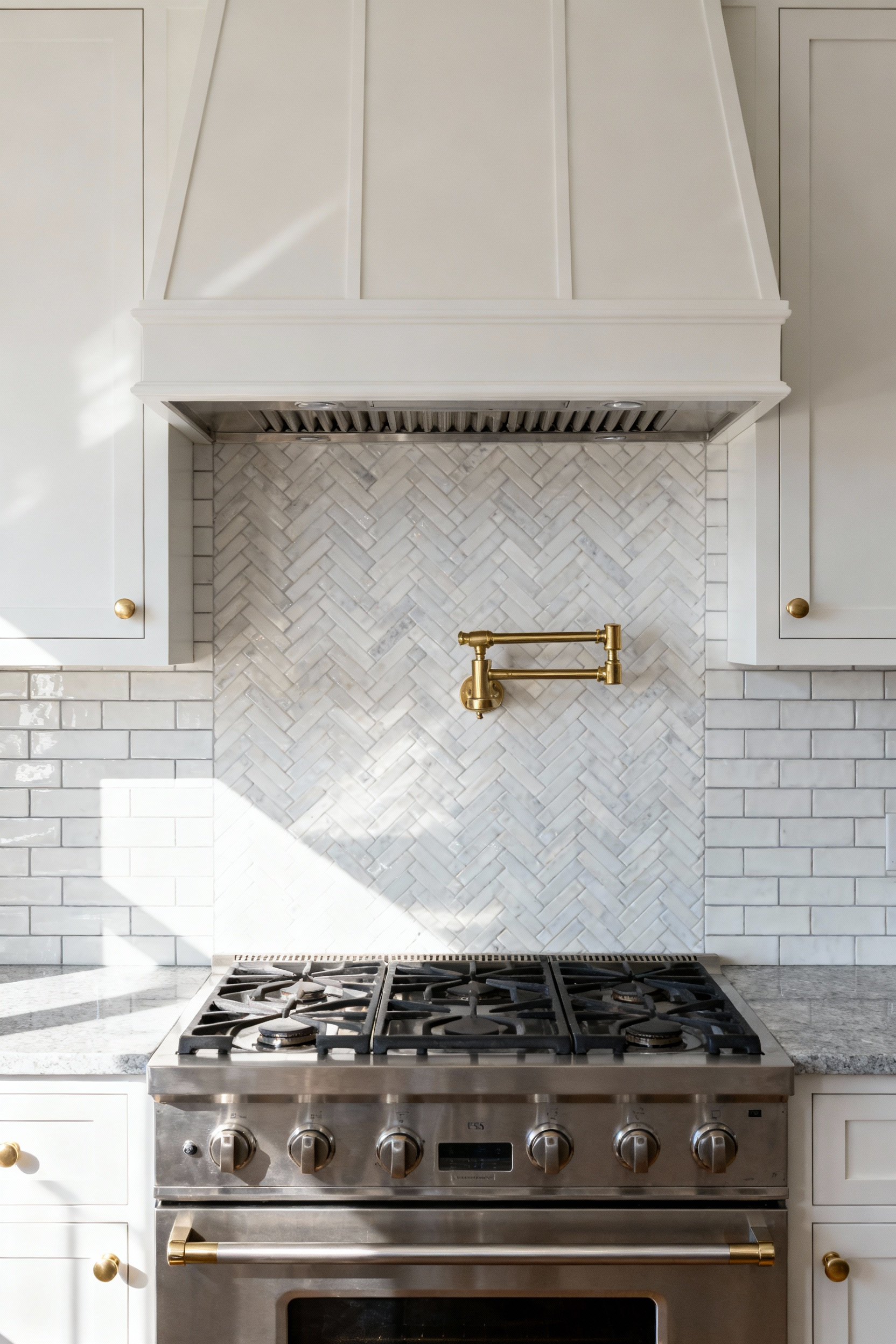
Instead of introducing a jarring new hue, simply alter the texture or scale. For example, transition your perimeter subway tile into a herringbone pattern behind the cooktop. This creates a subtle, woven “rug” effect. Because the color remains consistent, the result is harmonious. Yet, the complex pattern catches the light differently, drawing the eye naturally. Alternatively, you might shift the scale by moving from large tiles to a smaller mosaic.
Structurally, clear boundaries are essential. Therefore, treat this zone like a framed piece of art. Use a “pencil tile” or distinct border to contain the pattern formally. This technique prevents the design from bleeding visually into the rest of the kitchen. It mirrors the architectural containment of a historic stove alcove. Ultimately, this strategy creates a clear hierarchy of focus.
10. Electrical Integration: Horizontal Outlet Placement within Tile Grids
Standard outlets often disrupt the carefully planned visual rhythm of a backsplash. Specifically, a vertical cover plate creates an abrupt, jarring break in horizontally set patterns. Consequently, this interruption creates visual noise that pulls the eye away from the material’s texture.
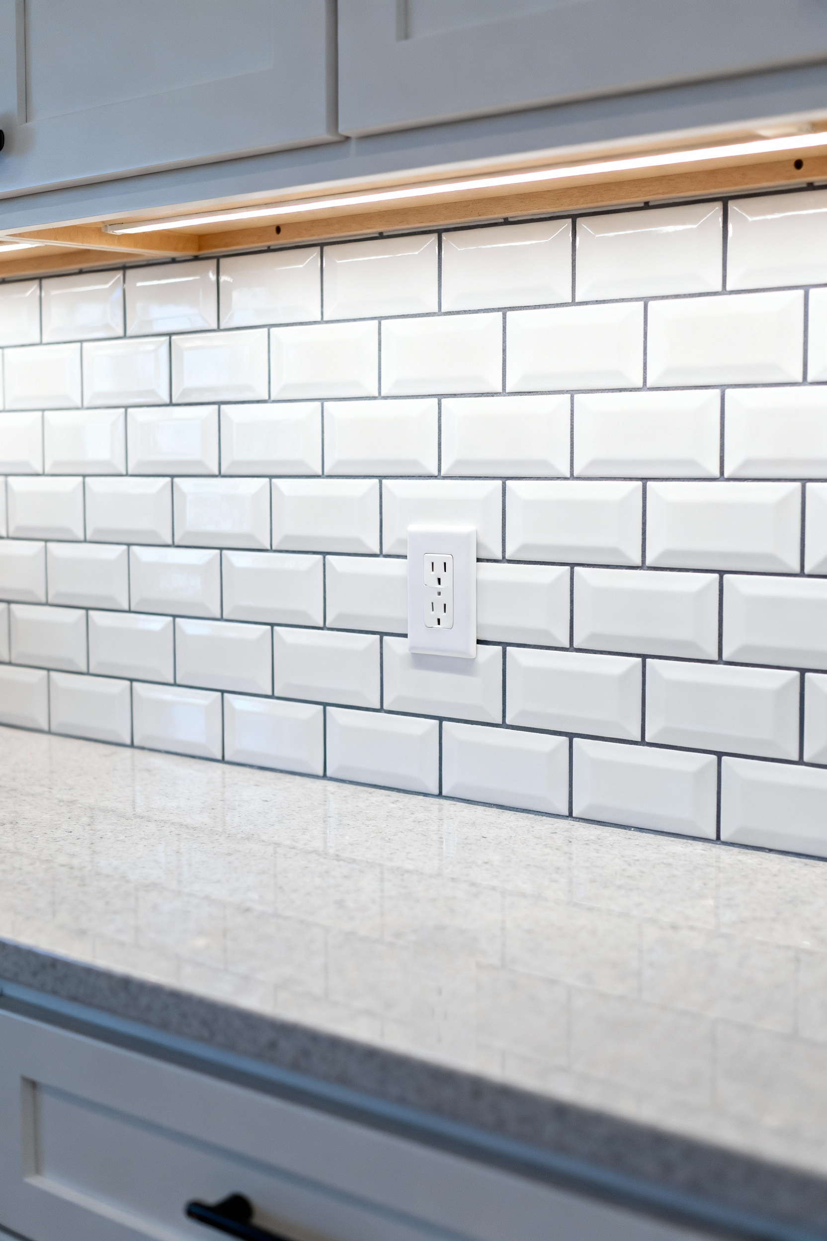
However, rotating the outlet horizontally effectively harmonizes the fixture with the design. By aligning the long axis with the tile rows, the plate mimics the flow of a thick grout line. Furthermore, this simple orientation shift allows the eye to glide across the surface uninterrupted. Ideally, position these outlets low near the countertop to hide them behind appliances.
Naturally, achieving this look requires precise coordination. Since standard boxes attach to vertical studs, vertical placement is the default. Therefore, you must specify horizontal orientation during the rough-in stage. Crucially, this allows for “layout mapping,” ensuring the tile cuts fall cleanly around the box.
In addition to alignment, proper depth management is essential. Because mortar and tile add thickness, the electrical box becomes recessed. To comply with NEC standards, the box edge cannot be deeply recessed from the surface. Thus, your electrician must utilize box extenders. Ultimately, bringing the receptacle flush with the tile ensures a safe connection.
11. Lighting Dynamics: Managing Glare and Reflection from Under-Cabinet LEDs
Lighting design creates the mood, but interaction determines the visual quality. Specifically, the “Dot Effect” creates a distracting reflection on glossy backsplashes. This occurs because polished surfaces act like mirrors for the individual diodes. Therefore, choosing the right materials is critical. Matte or textured tiles naturally scatter this light, creating a soft glow. However, you can still manage glare on glossy tiles with smart positioning.
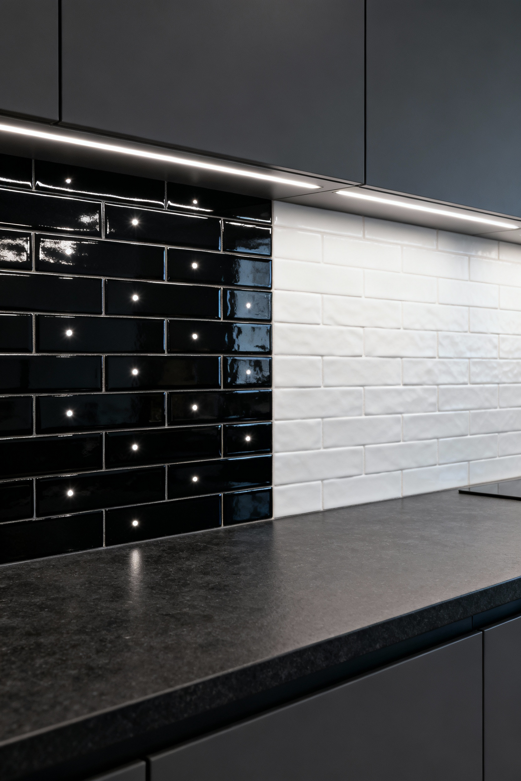
For example, try adhering LED strips to the inside of the cabinet’s front lip. Angle them toward the backsplash rather than straight down. Consequently, the tile acts as a secondary reflector, bouncing a gentle “wall wash” onto your counters. Additionally, hardware selection plays a massive role. Always install strips within aluminum channels featuring frosted diffuser covers. These covers blur separate dots into a single line of light. Alternatively, newer Chip-on-Board (COB) strips provide a continuous glow without visible diodes. Finally, keep your color temperature warm. Lights around 3000K feel inviting, whereas cooler tones often exacerbate harsh reflections.
12. The Termination Dilemma: Exact Alignment with Countertop Edges and Cabinetry
In kitchen design, a subtle conflict often arises where the backsplash ends. Base cabinets and countertops usually extend deeper than upper cabinets. Consequently, you must choose which vertical boundary to follow. Ideally, professional designers align the tile edge strictly with the upper cabinetry. This approach establishes a clean, architectural line at eye level. Conversely, extending tile to the countertop edge looks unintentional. It creates an awkward, unsupported stub of tile on the wall. Therefore, accept the small exposed strip of painted wall below.
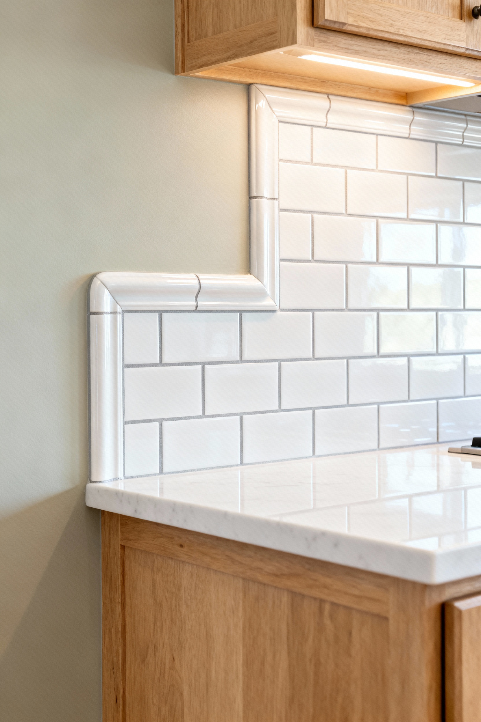
Next, consider how to finish this raw vertical edge. For traditional spaces, bullnose trim creates a soft, rounded conclusion. Alternatively, metal Schluter profiles offer a crisp, modern definition. These metallic edges can even coordinate with your hardware. However, beware of the common “utility trap.” Frequently, electrical outlets sit just outside the upper cabinet line. Rather than extending tile to encompass them, simply move the box. Hire an electrician to shift the outlet inward before tiling begins.
Finally, address the horizontal joint where the tile meets the counter. Because materials expand differently, do not use rigid grout here. Instead, apply a flexible, color-matched caulk bead. This movement joint prevents cracking and blocks moisture.
13. Edge Architectonics: Choosing Between Bullnose, Pencil Liners, and Schluter Strips
Selecting the right trim represents a critical architectural decision. Indeed, this final detail defines the aesthetic era of your kitchen. Traditionally, homeowners relied on bullnose trim for a seamless finish. Specifically, its rounded edge creates a soft, timeless visual transition. It makes the wall appear to curve naturally away from the tile. Therefore, it remains the preferred choice for classic subway tile installations.
However, material limitations often dictate a different approach today. Many modern, large-format porcelain tiles lack matching bullnose options. Consequently, Schluter strips have risen in popularity. These metal profiles create a sleek, minimalist definition. Furthermore, they allow for cohesive design integration. You can easily match the trim’s finish to your plumbing fixtures. For example, a brass profile beautifully complements brass cabinet hardware.
Conversely, the pencil liner serves a distinct visual purpose. Rather than blending in, this molding stands proud of the surface. In fact, it acts as a frame for your tilework. Thus, it adds significant depth and visual weight to the backsplash. Ultimately, you must decide between heritage softness, modern definition, or decorative framing.
14. Full-Height Logic: The Architectural Impact of Counter-to-Ceiling Installation
Fundamentally, taking tile from the counter to the ceiling is an architectural sleight-of-hand. Standard backsplashes create a sharp horizontal break in your sightline. Conversely, extending materials upward forces the eye to travel along an uninterrupted vertical plane. This vertical emphasis adds immediate visual drama. In fact, it makes compact rooms feel significantly taller. This transforms the wall from a simple boundary into a gallery-like element.
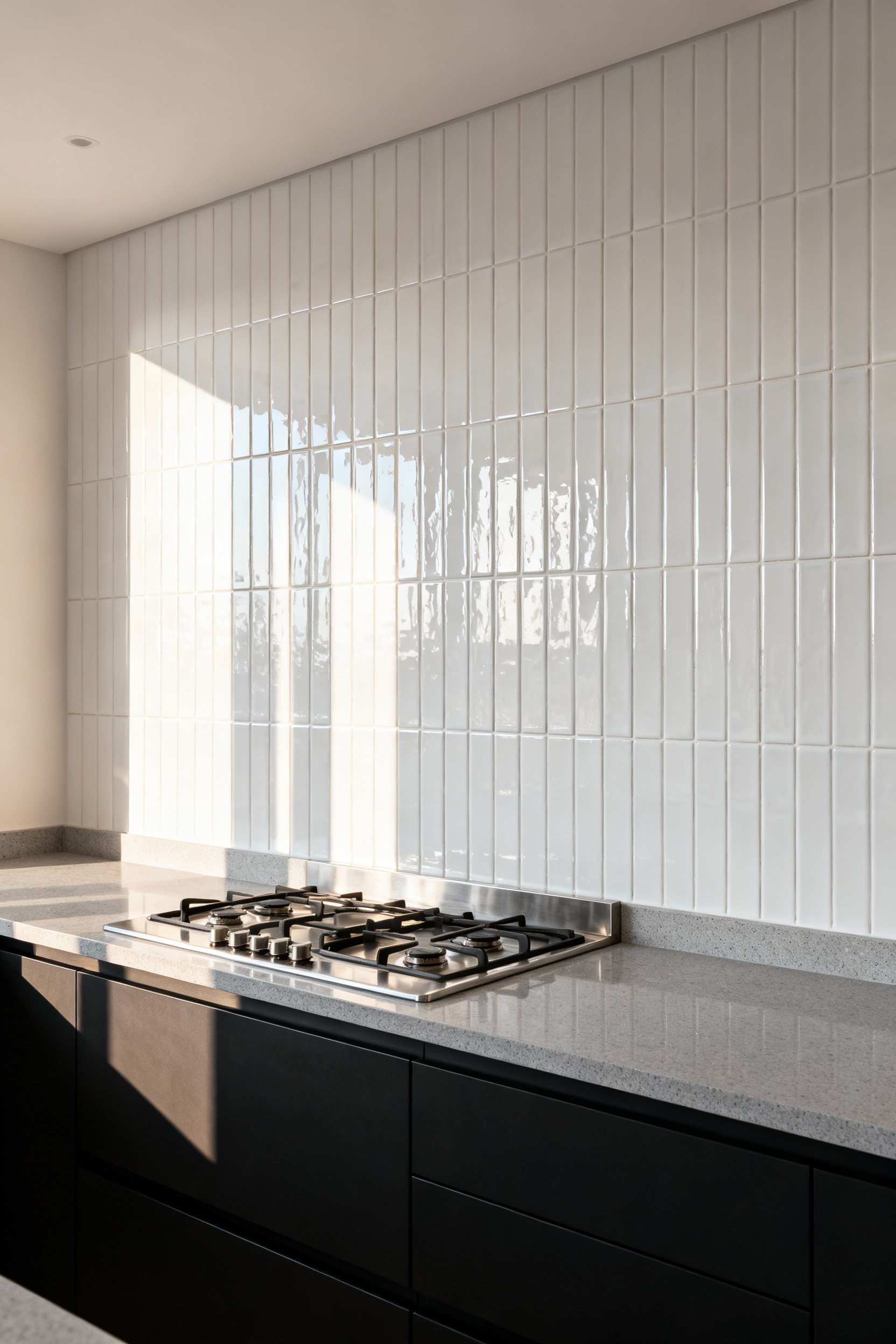
Beyond simple geometry, this technique creates a cohesive feature wall. The continuous expanse allows natural stone veining or textured glazes to act as art. Moreover, glossy finishes reflect light effectively, enhancing airiness. Whether using luxury slabs or large-format tiles, the material becomes a bespoke centerpiece. Therefore, even cost-effective tiles look luxurious on this scale.
Furthermore, this approach aligns perfectly with open shelving trends. Instead of clutter, the tile provides a sophisticated backdrop. Finally, large-format installations offer a practical hygienic benefit. They significantly reduce grout lines. Thus, you eliminate the crevices that typically trap grease. Ultimately, full-height logic merges high-impact aesthetics with streamlined maintenance.
15. Substrate Stability: When to Use Cement Board vs. Moisture-Resistant Drywall
Selecting a backsplash substrate creates a tension between durability and ease. Primarily, the decision hinges on moisture exposure. According to industry standards, most backsplashes are classified as “damp” rather than “wet” areas. Therefore, moisture-resistant drywall is technically permissible for drier zones away from the sink.
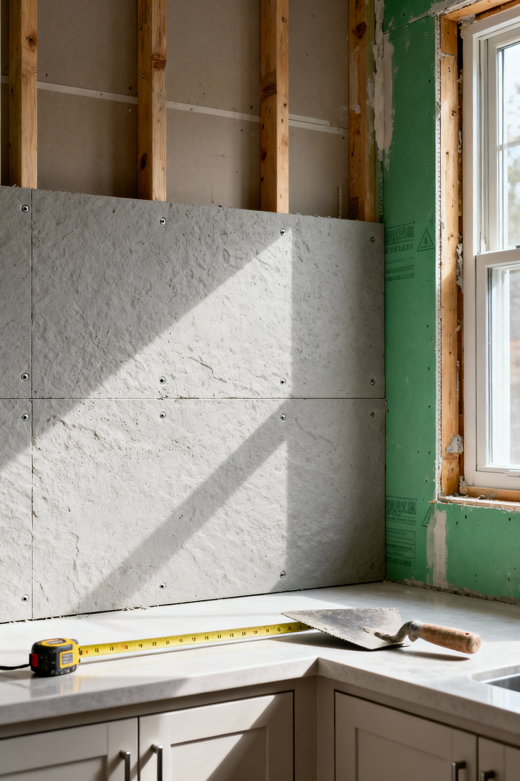
However, seasoned professionals often prefer cement backer board. This preference stems from structural stability. Specifically, cement board offers the rigidity to support heavy stone or large tiles. Furthermore, thinset mortar forms a powerful chemical bond with porous cement. Conversely, mortar only bonds to the paper facing of traditional drywall.
If moisture penetrates that paper, the gypsum core softens into a mushy consistency. Consequently, the tile bond fails, leading to hidden mold growth. Thus, cement board provides a critical margin of error. Fortunately, modern glass-mat gypsum boards offer a middle ground. These panels utilize water-resistant fiberglass mats instead of paper. Ultimately, choosing the right base ensures your design remains structurally sound.
16. Lippage Control: Using Leveling Spacer Systems for a Perfectly Flat Plane
Modern kitchens universally employ linear under-cabinet LED lighting. Consequently, this design choice creates an unforgiving visual challenge. The light casts a grazing illumination directly across the vertical tile. As a result, this “wall-wash” effect magnifies microscopic variations. Specifically, any raised edge, or lippage, casts long, sharp shadows on glossy finishes. Therefore, using leveling spacer systems becomes an aesthetic necessity.
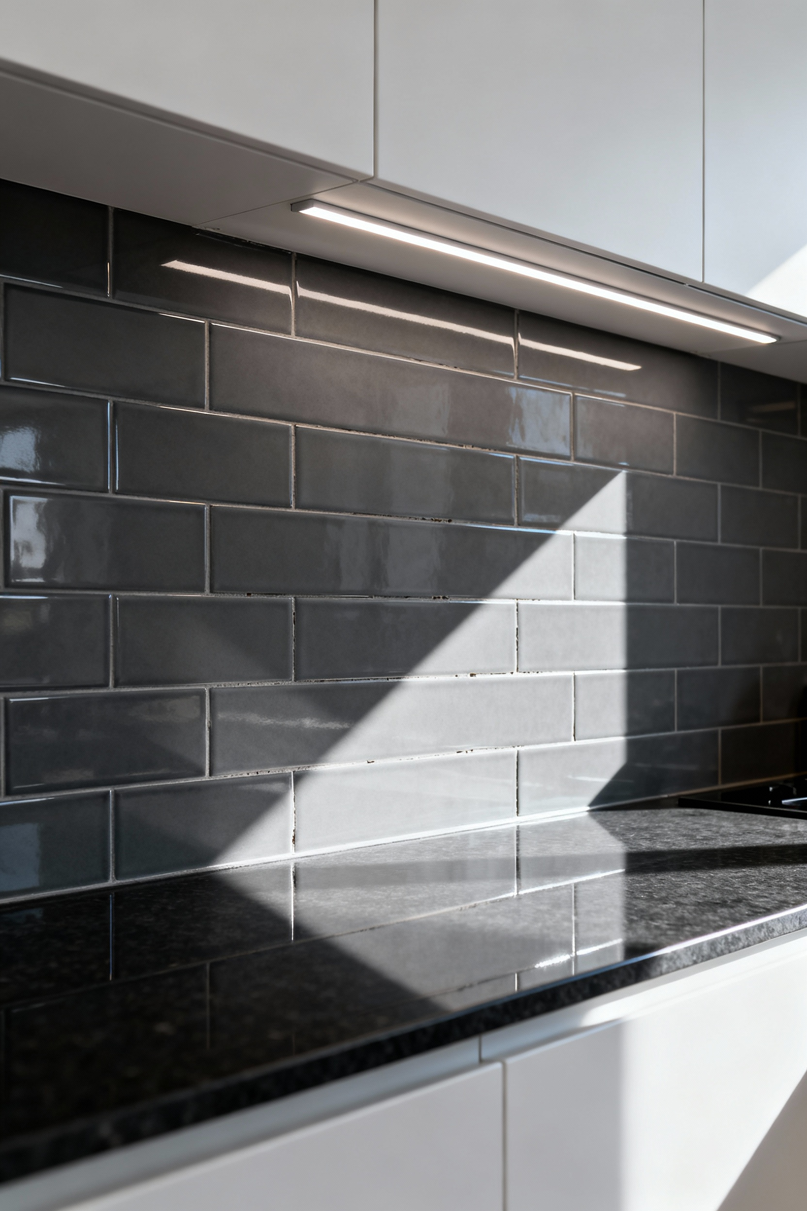
These mechanical systems work by interlocking adjacent tiles. Essentially, they hold the surface true while the thinset mortar shrinks. However, experts warn against the “leveler fallacy.” These clips are an aid, not a substitute for proper wall preparation. Forcing a tile flush against a warped wall creates dangerous voids. Subsequently, the tile lacks support and may crack. Thus, the substrate must be flat before installation.
Furthermore, backsplashes present unique constraints. The wall is often peppered with outlets and switches. Placing a clip base incorrectly can obstruct the future faceplate. Therefore, strategically avoid the screw paths of electrical boxes. Finally, the system relies on the disposable clips breaking off cleanly. If mortar dries on the plastic, removal becomes difficult. Keep grout lines meticulously clean to avoid chipping your new tile.
17. The ‘Soft Joint’ Necessity: Caulk vs. Grout at the Countertop Seam
Technically, the seam where a backsplash meets the countertop requires a “soft joint.” Specifically, this junction must be filled with a flexible sealant, never rigid grout. Fundamentally, this rule addresses differential movement. The countertop rests on cabinetry, while the tile adheres to a wall. Consequently, these two planes expand and shift at different rates.
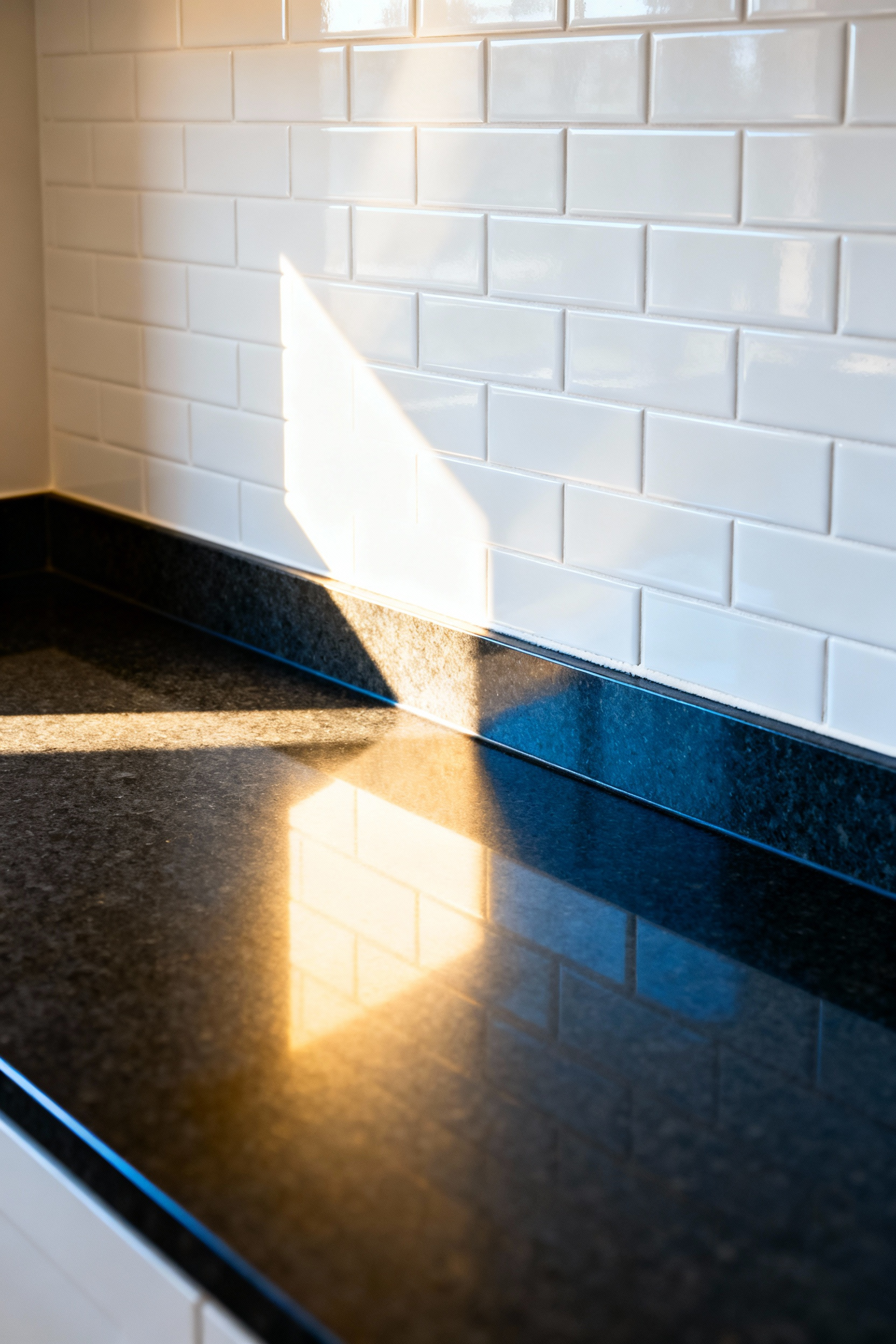
Grout dries into a brittle, rock-hard material. Therefore, it lacks the elasticity to handle these opposing forces. Inevitably, the stress causes a hairline fracture running along the seam. Visually, this creates a jagged shadow line. Moreover, that physical crack becomes a gateway for water intrusion.
To prevent this failure, industry standards mandate 100% silicone caulk. Unlike grout, silicone is an elastomer designed to compress and stretch. Thus, it acts as a shock absorber for the building’s settling. Additionally, it provides a waterproof barrier against sink splashes. Fortunately, modern manufacturers offer color-matched silicone that blends with your grout. Ultimately, this simple switch protects your cabinetry from hidden water damage.
Conclusion
The kitchen tile backsplash has evolved far beyond a decorative focal point. In fact, it now serves as a critical, engineered defense system. Modern surfaces with antimicrobial technology actively fight hidden bacteria. Moreover, selecting large-format slabs eliminates porous grout lines to create a seamless barrier. Therefore, the priority shifts from choosing colors to ensuring architectural integrity.
Fundamentally, this high-performance approach secures your investment against heat and moisture. A durable backsplash reduces long-term maintenance costs while preserving your kitchen’s lifespan. Thus, viewing your walls as functional assets changes how you design. Begin by prioritizing material specifications for water absorption before finalizing your aesthetic samples.
Frequently Asked Questions
H3: Should I use cement board or moisture-resistant drywall behind my kitchen backsplash tile?
While moisture-resistant drywall is technically permissible for most dry backsplash areas away from direct sink exposure, high-end installations often mandate cement backer board (CBU). CBU offers superior structural rigidity to support heavy materials like natural stone or large-format tiles and bonds chemically with thinset mortar, offering a much greater margin of error against water damage and mold growth.
H3: What is the most durable material for a high-performance kitchen tile backsplash?
Porcelain tile is considered the most durable material for a kitchen backsplash. Due to the high-temperature firing process (vitrification), porcelain is classified as impervious, meaning it absorbs 0.5% or less of its weight in water. This makes it highly resistant to stains, grease penetration, and etching, unlike porous natural stones like marble.
H3: How often should natural stone backsplashes be sealed to prevent staining?
Porous natural stone like marble or travertine should be sealed periodically, typically every six to twelve months, depending on the sealant quality and the stone’s exposure to cooking splatters. Sealing acts as a temporary barrier against liquids, providing a critical window for cleanup, but it does not prevent physical damage like etching from acidic materials (vinegar, lemon juice).

