A friend of mine just sent me a frantic text message with a picture of three different, splotchy paint samples on her dining room wall. “Which one?!” she asked, “I’m losing my mind!” I get it. We’ve all been there, standing in the paint aisle, overwhelmed by a wall of a thousand slightly different shades of beige, trying to pick The One.
I have a confession to make: The very first time I painted my own dining room, I had to do it three times. Three! And I was an art teacher! I thought, “How hard can this be? You just pick a color you like and roll it on.” Oh, how wrong I was. The beautiful slate blue from the chip looked like baby blue under my lights. The sophisticated greige looked like… well, mud.
What I learned the hard way is that picking a paint color isn’t really about the color. It’s about your room. It’s about the light, the furniture you already own, the feeling you want to create, and how it connects to the rest of your home. It’s a recipe, and the paint is just one ingredient. So let’s skip the corporate speak and the overwhelming design jargon. I’m going to walk you through this, step-by-step, just like we’re sitting at my kitchen table with a cup of coffee. You can do this. I promise.
Foundational Planning & Strategic Considerations
Before you even think about prying open a can of paint, we need to do a little homework. I know, I know, it’s the boring part, but trust me on this—ten minutes of planning now will save you ten hours of frustration later. This is where we set the stage for a paint job that looks professional, intentional, and perfectly you.
1. Align Dining Room Paint with Its Core Purpose
You know the first question I always ask a client? It’s not “What’s your favorite color?” It’s “What happens in this room?” Is this where you host fancy holiday dinners with the good china? Or is it where the kids do their homework while you’re making spaghetti on a Tuesday? The answer changes everything. A room for lively, loud, and sometimes messy family meals needs a completely different vibe than a quiet, formal space for adult conversation.
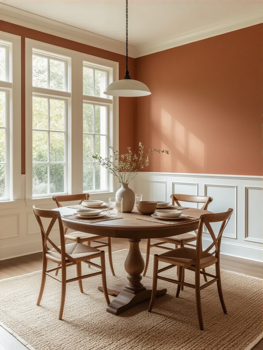
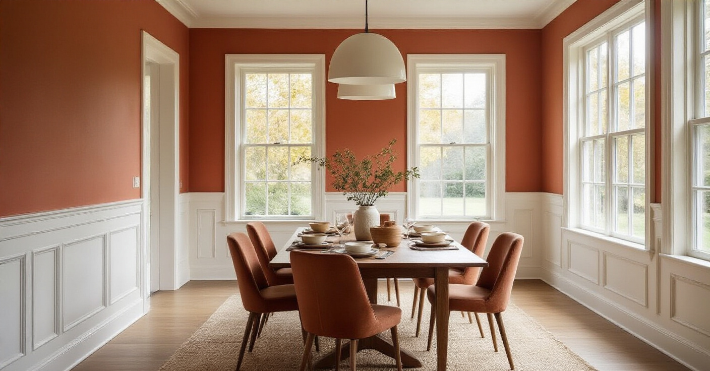
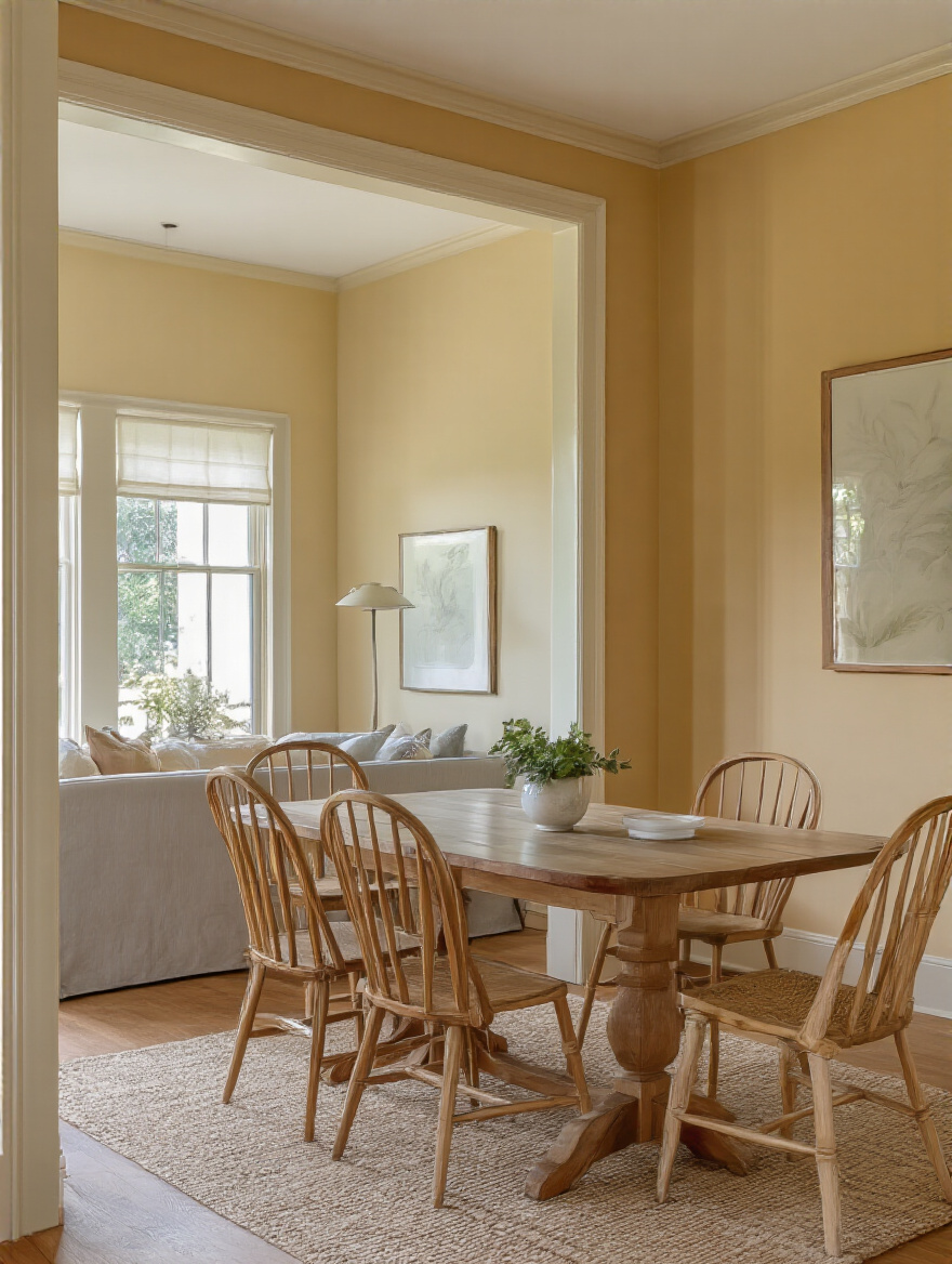
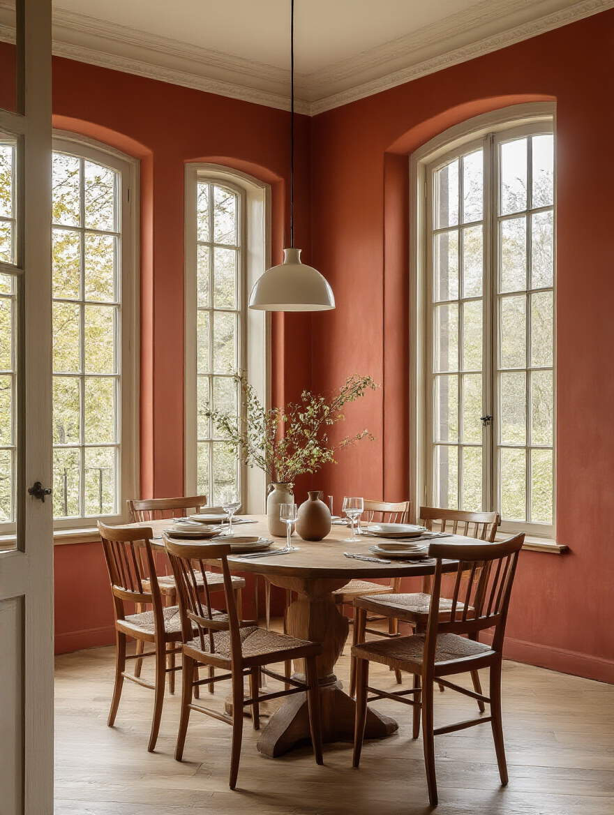
Think of it this way: your paint color is like the background music for the room. A warm, energetic terracotta or a deep, cozy red can actually encourage conversation and appetite. It’s true! Restaurants have used that trick for years. But if you want a more calm, serene space for quiet breakfasts, a soft green or a gentle blue will set a much more relaxed tone. So before you do anything else, grab a notebook and jot down a few words that describe how you want the room to feel. Energetic? Cozy? Elegant? Calm? Start there. The color will follow.
With your room’s purpose clearly defined, the next step is to look at what you’re not changing: the big, expensive stuff that’s already in there.
2. Harmonize Paint Choices with Existing Furniture & Decor
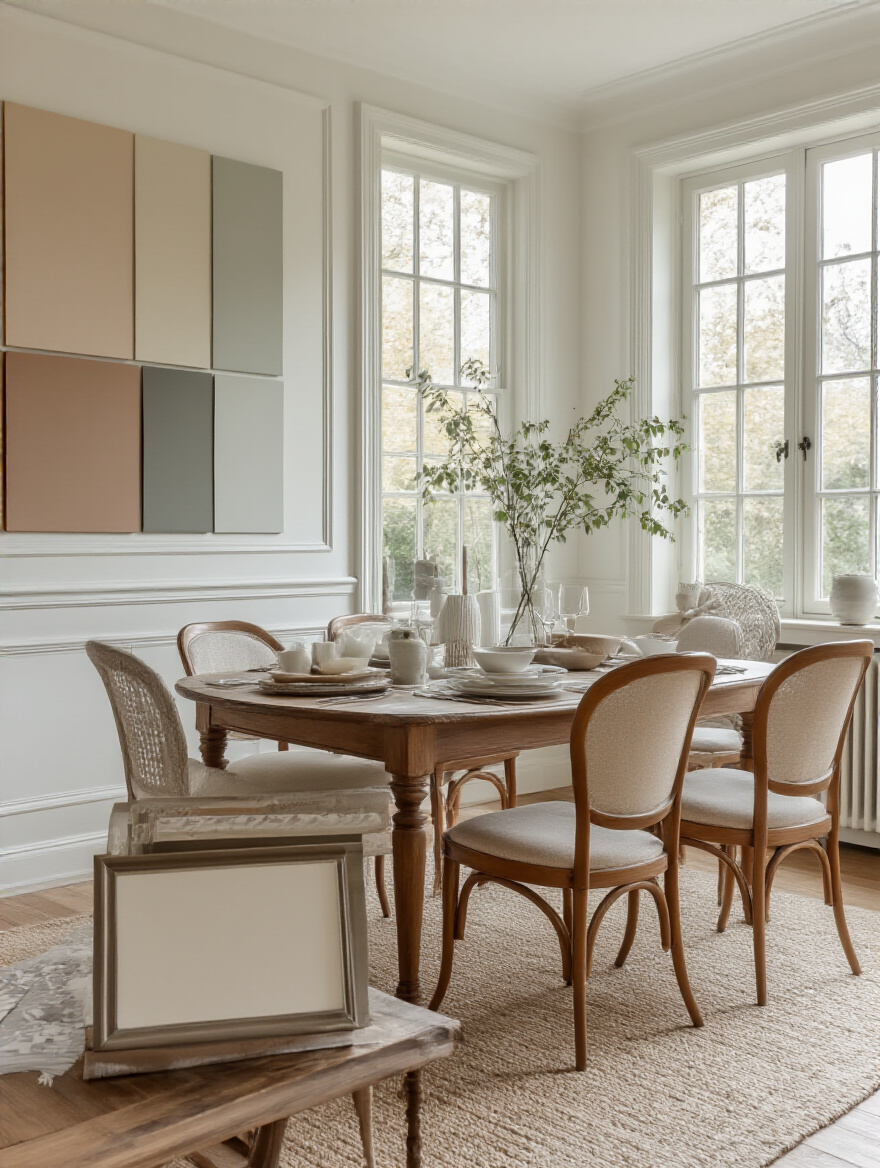
Okay, can we talk about the biggest mistake everyone makes? They fall in love with a paint color in a vacuum. But your walls don’t live in a vacuum—they live with your dining table, your chairs, your rug, and that buffet you inherited from your grandmother. You have to make sure your new paint color is going to be friends with your existing decor, not sworn enemies. The secret to this is understanding undertones, which is just a fancy way of saying the subtle hint of color hiding inside another color.
Look at your wood furniture. Is your table a warm, honey-colored oak (yellow/orange undertone)? A rich, red-toned cherry? Or a cooler, grayish driftwood? If you pair warm wood with a paint that has a cool, blueish-gray undertone, it can feel jarring and “off.” You want colors that speak the same language. A great shortcut is to create a little mood board. You don’t need fancy software—just snap a photo of your dining table, your rug, and your curtains, and then hold up your paint swatches next to them on your phone screen. You’ll see instantly which ones play nicely together.
Now that your walls and furniture are on speaking terms, we need to make sure they’re getting along with the neighbors.
3. Ensure Seamless Color Flow with Adjoining Spaces
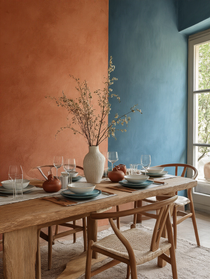
Picture this: you’re standing in your beautifully painted new dining room, and you look out into the living room… and the color change is so abrupt it feels like you’ve walked into a different house. Visual whiplash is a real thing in design! You want your home to feel connected, like each room is part of a larger, cohesive story. The easiest way to do this is to think of your home’s color palette as a whole, not just room by room.
You don’t have to paint every room the same color, not at all! But the colors should feel related. An easy way to do this is to pick a “unifying neutral”—often a shade of white, cream, or soft gray—for all your trim and doors throughout the house. This creates a common thread. Then, you can choose colors for each room that share a similar undertone or intensity. If your living room is a soft sage green, maybe the dining room could be a deeper, moodier forest green, or a complementary warm terracotta. They feel different, but related. It’s like a family of colors.
So we’ve thought about what’s next door. Now let’s turn our attention back to the dining room itself and consider its size.
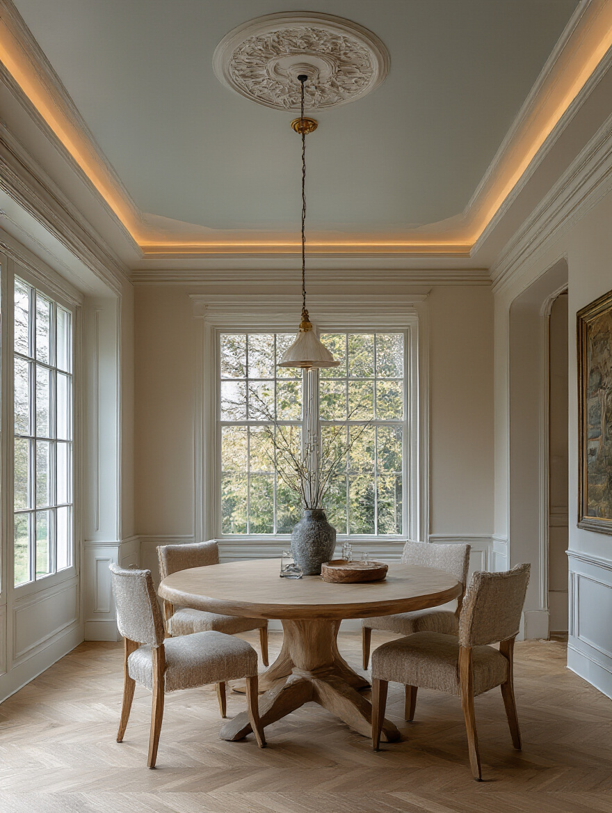
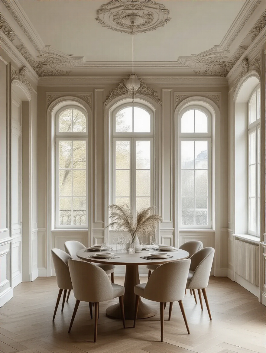
4. Account for Room Size and Ceiling Height for Visual Impact
Here’s where we get to play with a little magic. Paint is the ultimate optical illusionist. It can make a tiny room feel bigger, a giant room feel cozier, a low ceiling feel higher, and a awkwardly tall ceiling feel more grounded. This is one of my favorite parts because it’s pure, problem-solving fun. It’s all about tricking the eye with light and color.
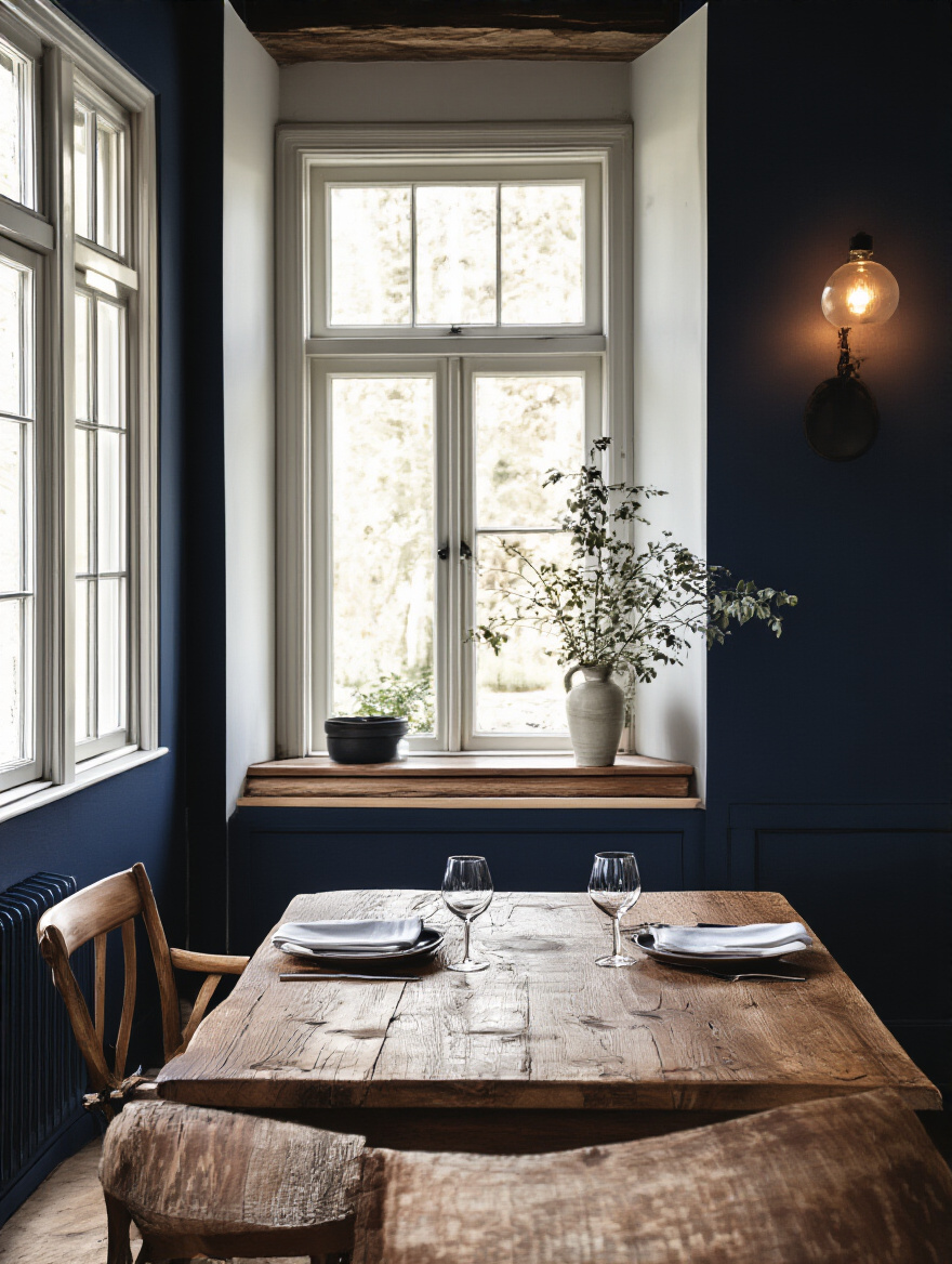
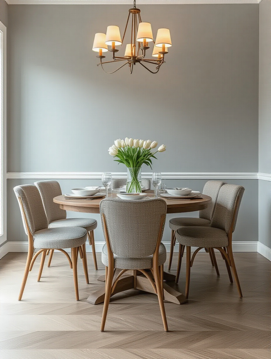
The basic rule is simple: Light colors expand, and dark colors contract. If you have a small dining nook, painting it a light, airy color like a pale blue, a soft off-white, or a cool gray will make the walls feel like they’re receding, creating a sense of space. Conversely, if you have a huge, cavernous dining room that feels impersonal, wrapping it in a deep, saturated color like navy, charcoal, or rich green will make the walls feel like they’re giving you a cozy hug. For low ceilings, painting the ceiling a shade or two lighter than the walls (or just crisp white) draws the eye up. For super-high ceilings, you can paint the ceiling a darker color to bring it down visually and create more intimacy.
This decision about making the room feel bigger or cozier is directly tied to the overall mood you want to create, which is our next checkpoint.
5. Pinpoint the Desired Emotional Mood Before Selecting Hues
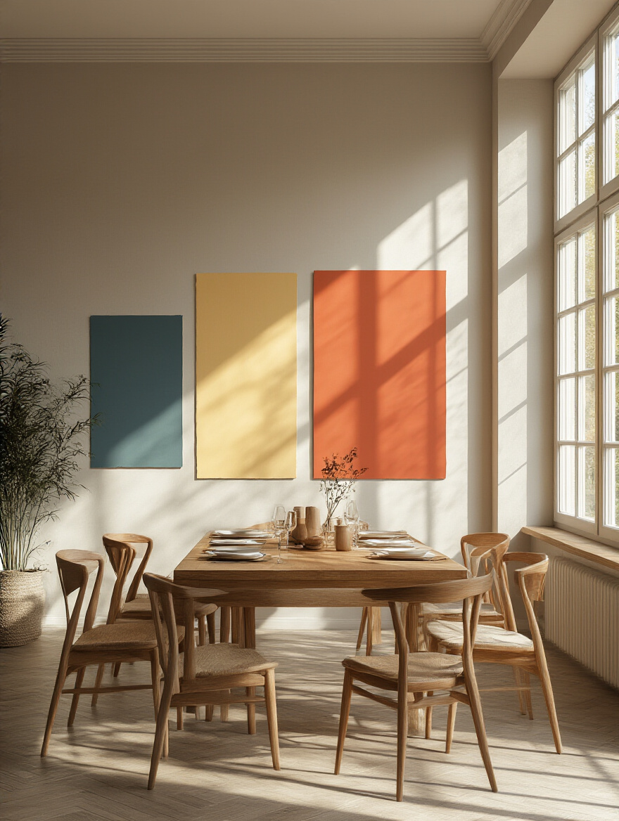
I know we touched on this in the first step, but it’s so important it deserves its own moment. Before you get bogged down in a million shades of gray, close your eyes and envision your ideal dinner party. What’s the vibe? Is it bright, laughing, and full of energy? Or is it intimate, candlelit, with low music and deep conversation? The mood you want is your true North Star for color selection.
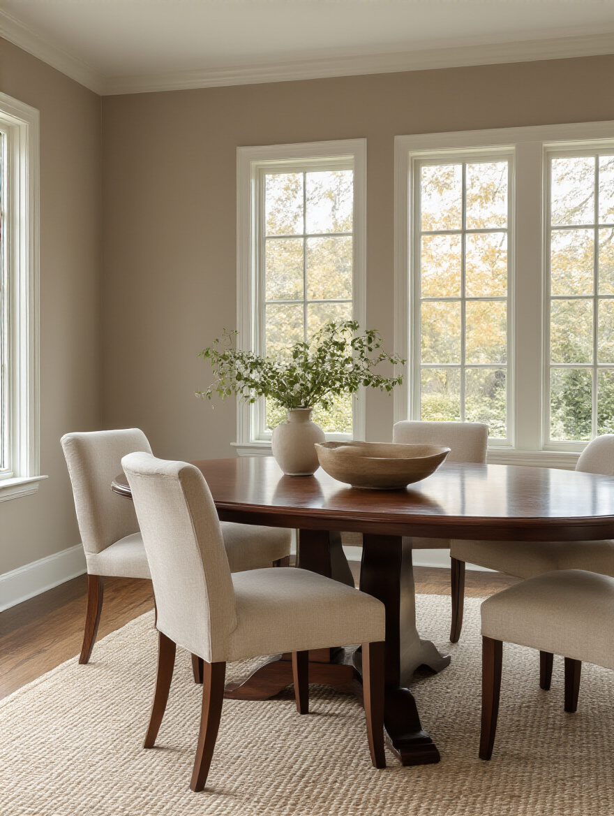
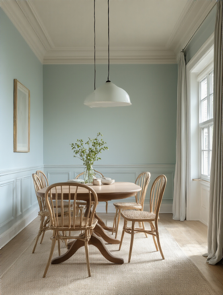
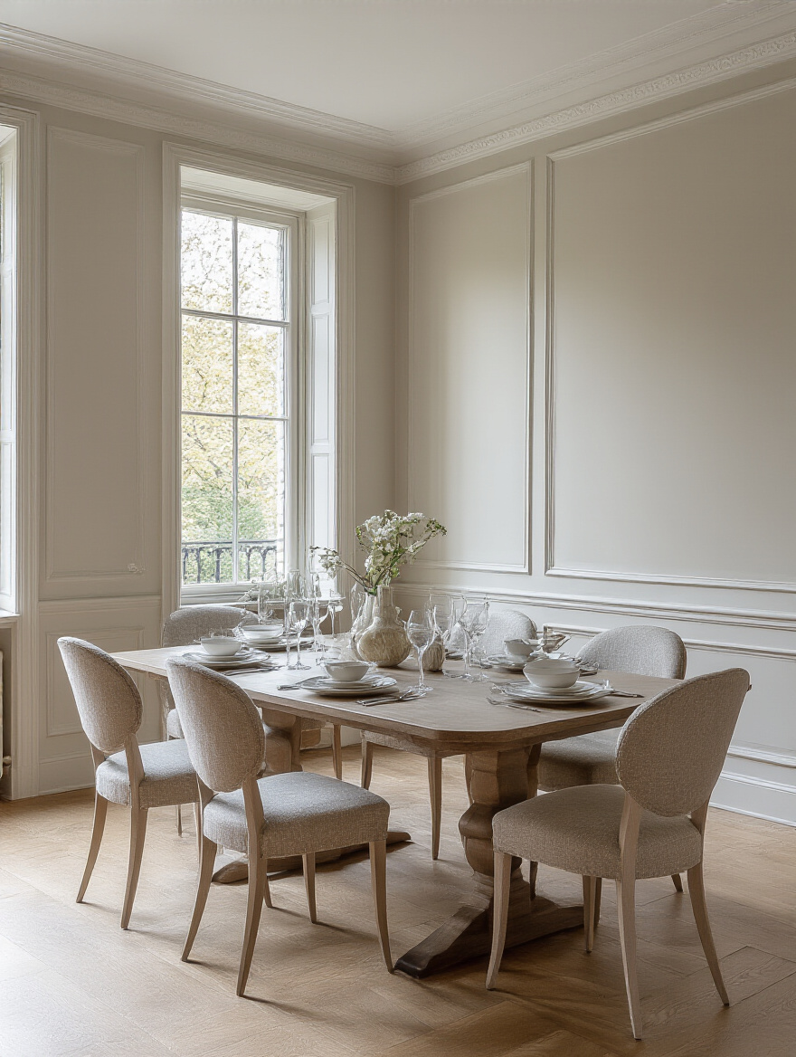
If you’re craving energy and liveliness, you’ll naturally gravitate towards warmer colors—think of sunny yellows, vibrant corals, or rich, earthy terracottas. These colors are stimulating. They get people talking. If you’re after a more formal, elegant, or tranquil mood, you’ll want to explore the cooler end of the spectrum—moody blues, sophisticated greens, and calming purples. And don’t forget neutrals! A beautiful warm white or a soft greige can create a serene, minimalist backdrop that lets your food, your art, and your guests be the stars of the show.
Once you have that feeling locked in, you’re ready to dive into the nitty-gritty of choosing the actual colors.
Mastering Color Psychology & Selection Techniques
Okay, Art Teacher Paula is putting on her glasses for this part. This is where we go beyond just “I like that color” and start thinking like a designer. Don’t worry, there won’t be a pop quiz, but understanding a few key concepts will give you the confidence to pick the perfect shade and know why it works.
6. Understand Warm Versus Cool Tones for Optimal Ambiance
Remember the color wheel from grade school? Let’s do a quick refresher. Colors are basically divided into two families: warm and cool. Warm tones are your reds, oranges, and yellows—the colors of sunshine and fire. They are energetic, inviting, and they actually make a space feel cozier and more intimate because they visually “advance” or come toward you. They’re fantastic for large dining rooms that you want to feel more welcoming, or for any space where you want to ramp up the social, convivial energy.
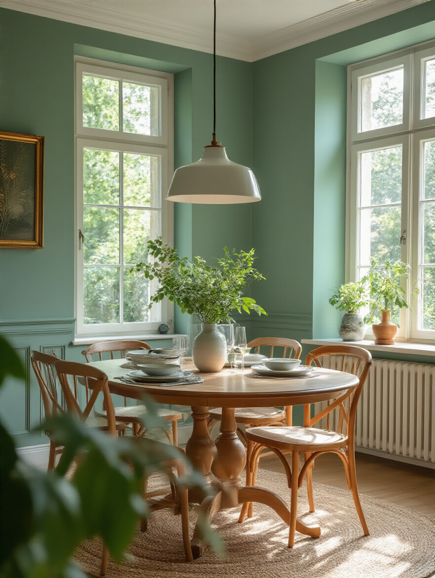
Cool tones are your blues, greens, and purples—the colors of the sky and water. They are calming, serene, and relaxing. They visually “recede,” meaning they make walls feel farther away, which is a brilliant trick for making a small dining room feel more spacious and airy. Think about which “temperature” aligns with the mood you identified earlier. Are you aiming for a warm, cozy hug or a cool, refreshing breath of air? This simple decision will immediately cut your paint chip options in half.
Knowing the temperature is step one. Now, for the real pro move: spotting the color within the color.
7. Decode Undertones to Prevent Paint Color Clashes
This is it. This is the secret handshake of paint selection. Almost every color, especially neutrals like gray, beige, and white, has a secret undertone—a hint of another color. A gray might have a blue, green, or purple undertone. A beige might have a pink, yellow, or green undertone. This hidden color is what causes all the trouble. It’s why that “perfect neutral gray” on the chip suddenly looks lavender on your wall next to your warm oak floors.
I once had a client who painted her dining room a popular greige, hoping for a warm, neutral backdrop. But the greige she chose had a strong pinky-beige undertone that clashed horribly with her golden oak trim. It just looked wrong. We had to repaint with a different greige that had a subtle green undertone, and boom—instant harmony. The shortcut? Take your paint chip and hold it up against a sheet of pure white printer paper. The undertone will usually reveal itself. Then, hold that chip right up against your floor, your countertops, your big furniture pieces. You’ll see which ones clash and which ones sing.
Once you think you’ve found a winner, you absolutely must do this next step. No excuses!
8. Utilize Large Swatches & Test Patches for Accurate Previews
Can we please talk about the paint chip lie? Those tiny 2×2 inch squares are not your friends. They are convenient fictions. A color can look completely different when it’s covering a huge wall compared to a tiny little swatch. The color of your existing walls, the light in the room, and the other colors around it will all influence how you perceive the final color. This is non-negotiable: You have to test your top choices in a large format, in the actual room.
Here’s the best way to do it. Don’t just paint splotches on your wall; the old color will throw off the new one. Instead, get a couple of cheap white poster boards and a sample pot of your paint. Paint two coats on the poster board, let it dry, and now you have a giant, movable swatch! You can tape it to different walls, see how it looks in the morning light versus the evening lamplight, and check it next to your dining table and your art. This single step will save you from 99% of paint regrets. I wish I could shout this from the rooftops.
Now that you’re testing properly, let’s circle back to that idea of making your room feel bigger or smaller.
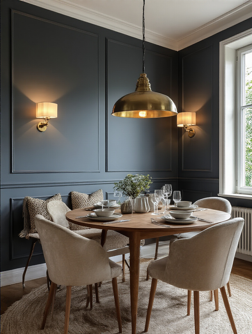
9. Leverage Darker Hues for Intimacy or Lighter for Spaciousness
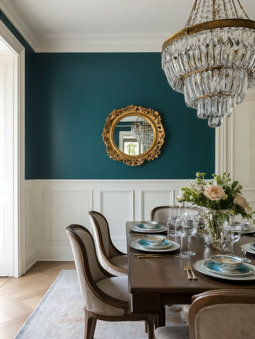
Don’t be afraid of the dark! I’ve seen so many people with small dining rooms automatically assume they have to paint them white or a super pale color. And you can! It will make the space feel bigger. But sometimes, leaning into the smallness is the more dramatic and effective choice. Painting a small dining room a deep, jewel-toned color like a moody teal or a rich charcoal can create an incredibly intimate, sophisticated, “jewel box” effect. It feels intentional, cozy, and perfect for candlelit dinners.
On the other hand, if your main goal is an open, airy, casual feel, light colors are your best friend. A soft white, a barely-there gray, or a pale pastel will bounce light around the room, making it feel bright and expansive. This is especially effective in open-concept homes where you want the dining area to feel connected and flow seamlessly with the rest of the space. It’s all about deciding what you want to achieve: do you want to push the walls out or pull them in for a hug?
Your choice here is hugely influenced by the biggest personality in your room: the windows.
10. Adapt Paint Choices to Maximize Natural Light (or Lack Thereof)
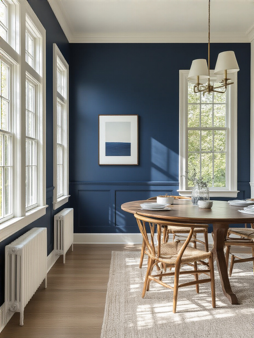
The type of natural light your dining room gets is a huge deal. It’s like a filter that’s permanently applied to your walls. A north-facing room gets cool, indirect light all day, which can make some colors look flat or even chilly. To counteract this, you’ll want to choose colors with a bit of warmth in them—a gray with a beige undertone (greige!), a creamy white instead of a stark white, or warm, earthy tones.
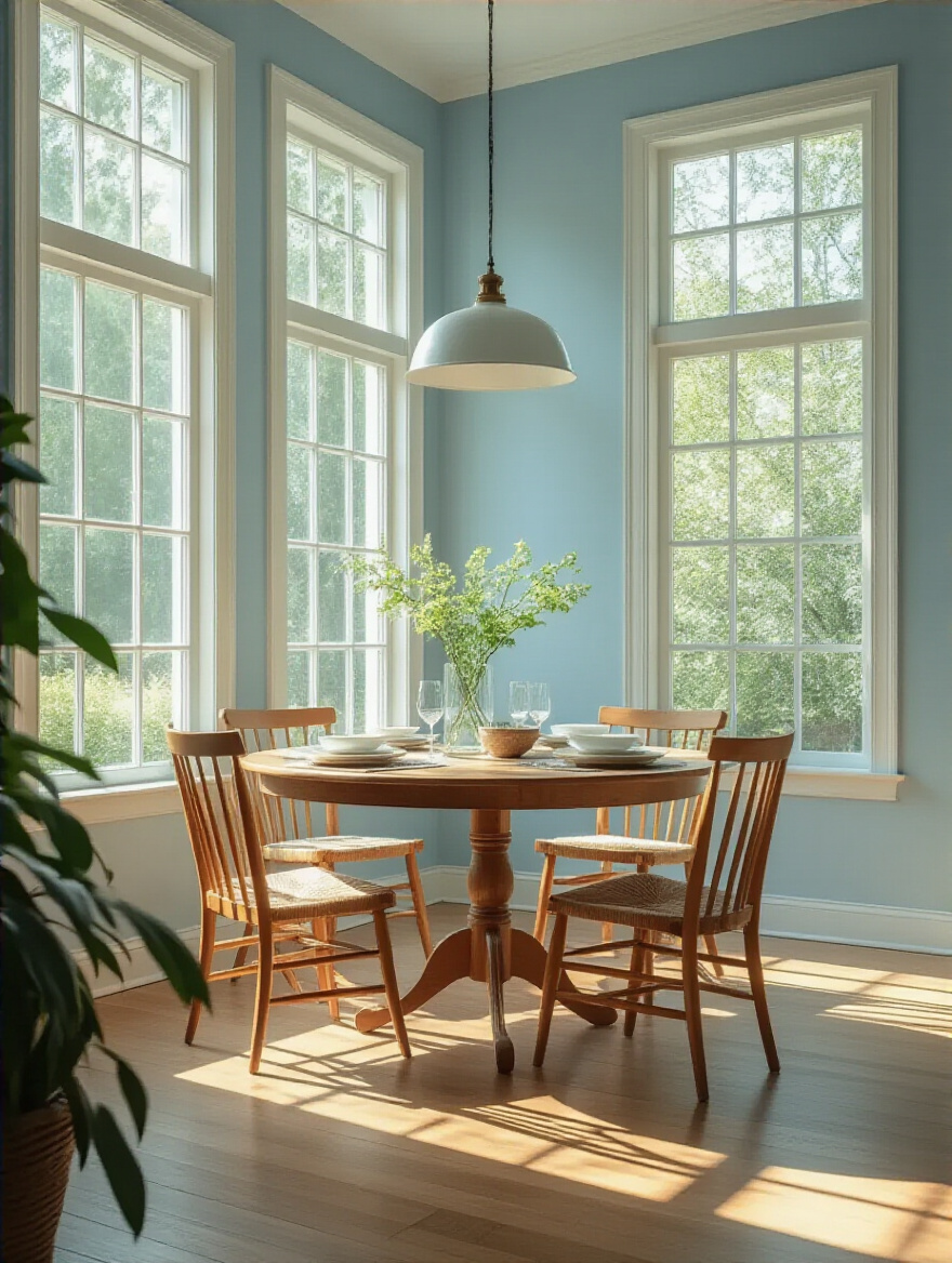
A south-facing room, on the other hand, gets a lot of bright, warm light. It can handle cooler colors beautifully, as the warm light will balance them out. A west-facing room gets that gorgeous, golden “magic hour” light in the late afternoon, which will intensify any warm color. And an east-facing room gets bright, clear light in the morning. My best advice? Follow that poster-board trick from before and watch how your color choices change throughout the day as the light shifts. It’s the only way to know for sure how your paint will truly look in your unique space.
Speaking of a singular focus, let’s talk about the elegant power of sticking to just one color family.
11. Explore Monochromatic Schemes for Elegant Simplicity
A monochromatic scheme sounds fancy, but it’s actually one of the easiest ways to get a super sophisticated, high-end look. It just means you’re using different shades, tints, and tones of one single color. Think a room done in varying depths of green: medium sage green on the walls, a deeper forest green on the trim, and pale, almost-white green on the ceiling. It’s a beautifully layered and calming effect.
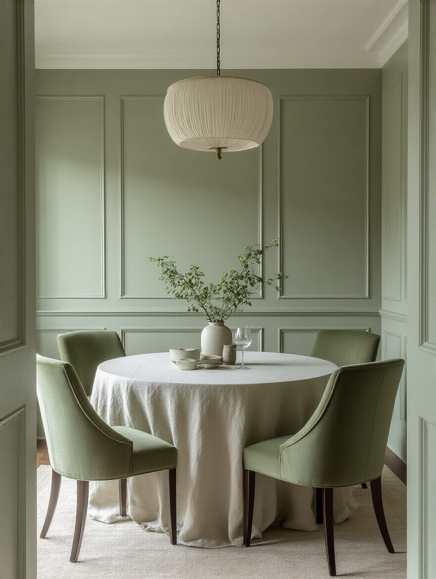
This approach is fantastic for making a space feel larger because there are no harsh, contrasting lines to break up the room. Your eye just flows seamlessly from one surface to the next. The trick to keeping it from feeling flat or boring is to bring in lots of different textures. If your walls are a matte gray, maybe your chairs are a velvet gray, your rug has a shaggy gray pile, and your curtains are a silky gray. The variation in texture creates all the interest you need. It’s quiet luxury at its best.
Now that we’ve covered the core color choices, let’s talk about the finishing touches that make all the difference.
Optimizing Finishes, Lighting & Strategic Accents
You’ve picked your color, you’ve tested it, and you love it. Hooray! But we’re not quite done. The details from here on out are what separate a “nice” paint job from a “wow, that looks professionally done” paint job. Let’s dig in.
12. Select the Ideal Paint Sheen for Durability and Reflectivity
Paint sheen is just a way of saying how shiny the paint is. It ranges from “flat” (no shine at all) to “high-gloss” (super shiny, like a car). This choice matters for two reasons: durability and looks. A dining room is a high-traffic area. There will be chairs bumping against walls, fingerprints, and the occasional flying meatball. You need a paint that can be wiped down.
Here’s the simple breakdown: Flat or matte finishes look velvety and rich, and they’re great at hiding wall imperfections, but they are the least washable. Save them for low-traffic rooms or ceilings. For dining room walls, I almost always recommend an egg-shell or satin finish. They have a subtle, soft glow, they’re much more durable than flat, and you can easily wipe them clean without scrubbing the paint off. Semi-gloss is even more durable and is perfect for trim, doors, and wainscoting—all the areas that take a real beating.
The sheen you pick also plays a huge role in how the room feels under your lights, both natural and artificial.
13. Account for Artificial Lighting’s Effect on Paint Color Perception
I once helped a friend who painted her dining room a lovely soft gray. It looked perfect during the day. But at night, when she turned on her chandelier with its warm, yellowish incandescent bulbs, the walls looked sickly green. She hated it. The culprit? Her artificial light. The color temperature of your lightbulbs can completely change how your paint color looks.
Here’s the quick and dirty guide. Lightbulbs are measured in Kelvin (K). Lower Kelvin (2700K-3000K) is “warm white” and has a yellowish cast, which enhances warm paint colors but can muddy up cool ones. Higher Kelvin (4000K-5000K) is “cool white” or “daylight” and has a bluer cast, which makes cool colors look crisp but can make warm colors look a bit stark. The best thing you can do is test your paint samples at night, with the lights on that you actually use for dinner. Better yet, invest in dimmable LED bulbs where you can adjust the warmth; it’s a game-changer.
Let’s keep the drama going and talk about making a single, bold statement.
14. Strategically Implement an Accent Wall for Dramatic Impact
An accent wall is a fantastic, budget-friendly way to add a major dose of drama and personality without committing to a bold color on all four walls. It’s a focal point, an anchor for the room. But please, please, choose the right wall. An accent wall should be the first one you naturally look at when you walk into the room, or the one that has a natural focal point already, like the wall behind your dining table or a wall with a beautiful fireplace.
Don’t just think about paint, either! An accent wall is a great opportunity to play with texture or pattern. A beautiful, bold wallpaper, a wall covered in tactile grasscloth, or even a section of modern Wood Paneling can have a stunning effect. It creates a ‘wow’ moment that makes the whole room feel more designed and intentional. It’s like a statement necklace for your dining room.
While we’re on the topic of accents, let’s not forget the room’s built-in jewelry: the trim.
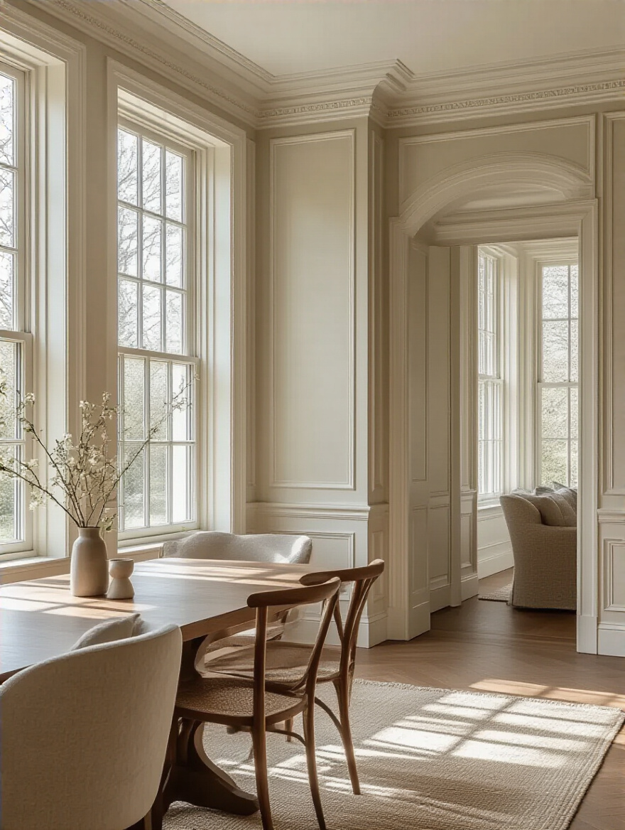
15. Elevate Trim & Moulding with Contrasting or Complementary Hues
For decades, the default for trim has been plain old white. And there’s nothing wrong with that! Crisp white trim against a colored wall is a classic for a reason. But painting your trim a different color is one of the most effective ways to make a room feel custom and architecturally interesting. It highlights the “bones” of the house.
For a bold, dramatic look, try a high-contrast approach: deep charcoal or black trim against light gray or white walls. It’s incredibly chic and sophisticated. For a softer, more layered feel, try a monochromatic approach: if your walls are a medium sage green, paint the trim a deeper forest green. It adds depth and a sense of thoughtful detail. Even if you want to stick with one color, a fun trick is to use a different sheen—paint the walls in an eggshell finish and the trim in a semi-gloss of the same color for a subtle, elegant contrast.
You can also add interest with the texture of the paint itself, a move that really adds a layer of depth.
16. Explore Textured Paint Finishes to Add Depth & Dimension
If you want a look that feels truly special and custom, consider exploring textured paint finishes. This goes beyond simple color and adds a tactile quality to your walls that’s incredibly inviting. These aren’t the spiky popcorn ceilings of the 70s! Modern options are sophisticated and beautiful. A limewash or Roman clay finish can give your walls a soft, cloudy, Old-World patina that’s full of movement and character. It’s perfect for creating a warm, organic, and rustic vibe.
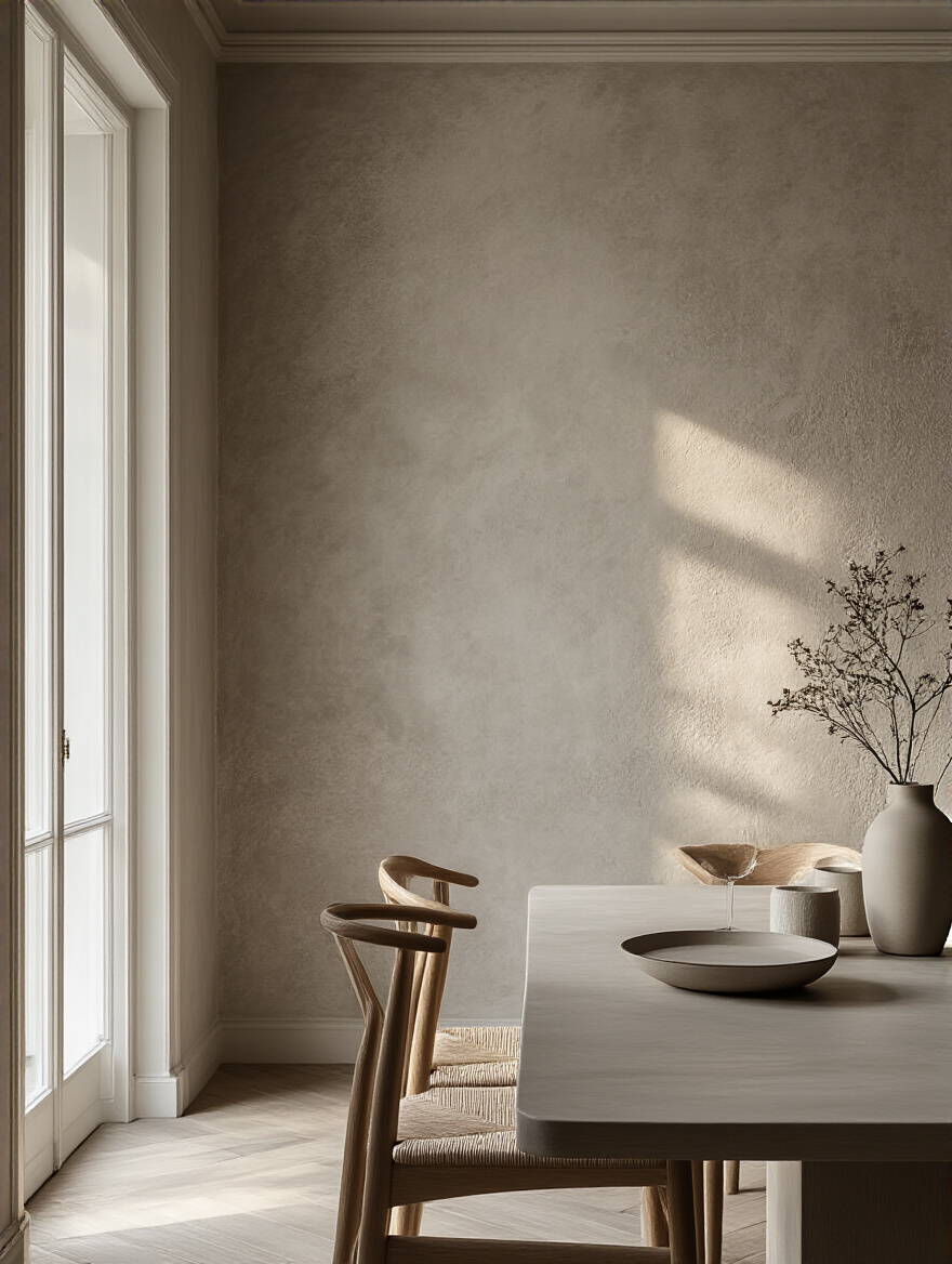
You can also find paints with fine sand or metallic particles mixed in to add a subtle grit or shimmer. This is especially effective on an accent wall where light can catch it and create a dynamic, changing surface. While some of these are DIY-friendly, more complex finishes like Venetian plaster are best left to the pros. But even a simple textured finish can elevate your dining room from a painted box to a sensory experience.
With all these beautiful finishes, practicality is still key, especially in a room built around food.
17. Prioritize Washable Paint Finishes for Long-Term Maintenance
Let’s be real. Life happens. And in a dining room, life often involves spaghetti sauce, red wine, and sticky fingerprints. Choosing a paint finish that you can actually clean is not just a nice-to-have, it’s a necessity for your long-term sanity. As I mentioned when we talked about sheen, durability is your best friend.
Always opt for paints that are marketed as “washable” or “scrubbable,” especially for a dining room. Premium paint lines like Benjamin Moore’s Aura or Sherwin-Williams’s Duration are specifically formulated to stand up to cleaning without the color fading or the finish getting shiny spots (a problem called “burnishing”). It might cost a few extra dollars per gallon upfront, but I promise you it is worth every penny when you can wipe away a wine splash from your light-colored walls in 30 seconds instead of having to do a touch-up paint job.
Advanced Techniques & Flawless Implementation
Alright, you’ve got the foundations down. Now let’s talk about a few more advanced tricks of the trade that can take your dining room to the next level, and how to make sure the execution is as good as your idea.
18. Experiment with Two-Tone Walls to Define Dining Room Zones
A two-tone wall, where the bottom half is one color and the top is another, is a classic look that’s making a huge comeback. It’s a brilliant way to add architectural interest to a room that doesn’t have any, sort of like a modern take on a chair rail. You can create a grounded, cozy feeling by painting the bottom third of the wall a darker, richer color and the top two-thirds a lighter, airier one.
The key to getting this right is a perfectly crisp, level line. A laser level is your best friend here. Mark your line lightly with a pencil, then use high-quality painter’s tape (like FrogTape) and press the edge down firmly with a credit card to seal it. Paint the lighter color first, let it dry completely, then apply your tape and paint the darker color. Pull the tape off while the second color is still slightly wet for the cleanest line. It’s a look that feels incredibly custom and chic.
As we get more custom, it’s also smart to think about the ingredients of our paint and their impact on our home.
19. Evaluate Eco-Friendly & Low-VOC Paint Options for Healthier Air
That “new paint smell” we’re all familiar with? It’s actually the smell of chemicals called VOCs (Volatile Organic Compounds) being released into the air. These can cause headaches and irritate people with asthma or allergies. For a room where you eat and spend a lot of time with family, choosing a paint with low or zero VOCs is a really smart move.
Luckily, almost all major paint brands now offer fantastic low-VOC and zero-VOC options that perform just as well as their traditional counterparts. Look for certifications like GREENGUARD Gold to be sure. One pro tip: the paint base might be zero-VOC, but the color tints they add at the store can contain VOCs. Ask the person mixing your paint to use zero-VOC tints to keep the whole can as healthy as possible. You get a beautiful new room without the headache-inducing fumes.
No matter what paint you choose, none of it will look good if you don’t do this next step properly.
20. Plan for Proper Wall Preparation to Ensure a Flawless Finish
I’m going to sound like a broken record here, but this is the most important, most-often-skipped step of the entire process. Proper prep is 80% of the job. You can buy the most expensive, fanciest paint in the world, but if you slap it on a dirty, bumpy wall, it’s going to look terrible. End of story. This is where patience pays off in a huge way.
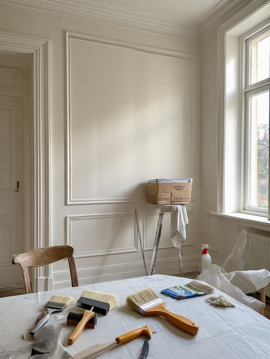
First, wash your walls. Use a sponge and a simple solution of TSP substitute or just mild dish soap and water to get off all the dust, grease, and grime. Then, fill every single nail hole and crack with spackling paste. Once it’s dry, sand the patches smooth so you can’t even feel them. Finally, prime! Primer is non-negotiable. It seals the wall, covers stains, and ensures your new paint color looks even and true, without patchy spots. It’s like putting on foundation before your makeup—it creates the perfect canvas.
Speaking of canvases, don’t forget the one above your head.
21. Don’t Neglect the Ceiling: How Ceiling Paint Influences Perception
The ceiling is the “fifth wall” of your room, and most people just slap some flat white on it and call it a day. That’s a huge missed opportunity! What you do with your ceiling can completely transform the feel of the room. Painting it a very light, cool color can make it feel higher. Painting it a deep, dark color can create a dramatic, cozy, enveloping feeling that’s incredible for an intimate dining space.
One of my favorite designer tricks for a room with beautiful crown molding is to paint the walls and the ceiling the same color. It blurs the edges of the room, making it feel more expansive and cocoon-like, and it makes the white of the crown molding pop beautifully. Even if you just stick with white, consider a white that’s tinted with a tiny bit of your wall color for a softer, more cohesive look than a stark, cold white.
With all these intricate ideas, there comes a time when DIY might not be the best path.
22. Consider Hiring a Professional for Complex Designs or High Ceilings
I am a huge advocate for DIY, but there are times when calling in a professional is the smartest, safest, and even most cost-effective decision. If you have soaring 18-foot ceilings, an intricate two-tone design with wallpaper, or want a specialized finish like Venetian plaster, it might be time to call in the pros. They have the right equipment (like scaffolding), the insurance, and the years of experience to get those razor-sharp lines and flawless finishes that are really tough for a novice to achieve.
Remember, your time is valuable. What might take you two full weekends of stressful, back-breaking work, a professional crew can often knock out in a day or two. Get at least three detailed bids, check their references, and make sure they’re insured. Sometimes, the best DIY decision is knowing when not to do it yourself.
Finally, once the paint is dry, it’s time for the really fun part: making it all come together.
23. Integrate Paint Colors with Dining Accessories for a Polished Look
This is the final step that ties the entire room together and makes it feel truly finished. Your paint color shouldn’t exist in isolation. It should be part of a conversation with everything else in the room. A great way to ensure this happens is to pull your paint color from an accessory, rather than trying to match accessories to your paint later.
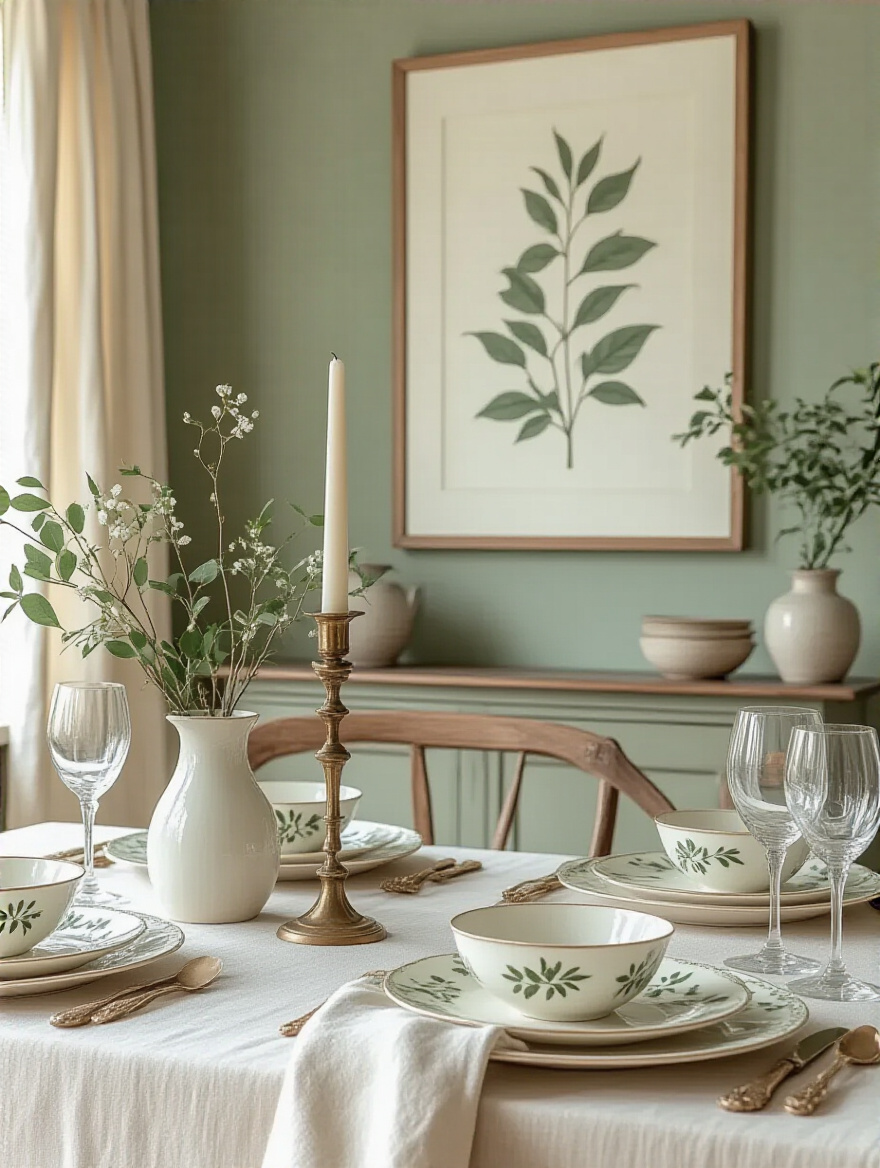
Find a piece of art, a rug, or even a set of patterned dishes that you absolutely love. Look at the colors within it. Maybe you can pull a muted green from the leaves in a botanical print for your wall color. Then, you can pick up the coral from a flower in the same print for your napkins, and the creamy background for your placemats. Using an inspiration piece as your color map ensures everything will feel harmonious and intentional. This is how you get that polished, designer look.
Conclusion
Whew! We’ve covered a lot of ground, from the big-picture planning to the nitty-gritty details. But I hope what you take away from all this is a sense of confidence. Painting your dining room isn’t just about changing a color; it’s about crafting an atmosphere. It’s about creating the perfect backdrop for future holiday feasts, late-night chats, and happy, everyday moments.
You have the power to completely transform your space with nothing more than a few cans of paint and a little bit of know-how. So take a deep breath, look at your dining room with fresh eyes, and trust your gut. Order those big samples, tape them to the wall, and see how they make you feel. Your perfect dining room is waiting for you. Now go on, go create a space that you’ll love for years to come. You’ve got this.