Many homeowners mistakenly view the bedroom merely as a functional sleeping quarter. As a result, paint selection often becomes a simple afterthought based on passing trends or matching textiles. Yet, true design wisdom suggests that modern bedroom paint schemes serve as the foundation for neurological restoration.
Gaston Bachelard argues that the bedroom serves as a protective “shell” for the dreamer. When you apply paint, you aren’t simply decorating a wall. Instead, you are defining the psychological boundaries of your “first universe.” Indeed, the right scheme acts as a crucial barrier against the world’s chaos.
When considering the best bedroom color schemes for every sleep style, look beyond aesthetics toward biological impact. Historically, the bedroom shifted from a public theater to a private “boudoir.” Today, it must function as a restorative “landscape of the mind.”
Selecting the right palette involves more than just picking a pleasing shade. For instance, the “melatonin paradox” complicates the use of traditional blue hues. Similarly, the “emotional temperature” of a room relies heavily on technical Light Reflectance Values (LRV). A smart investment in design requires understanding these subtle sensory nuances while exploring bedroom wall ideas that emphasize depth over decoration.
This guide explores the architecture of a restful soul. We analyze how low-reflectance colors create a necessary “cocooning” effect for deep rest. We examine “Full Spectrum Paints” that effectively mimic the natural world’s depth. Additionally, we discuss the Japanese philosophy of *Wabi-Sabi* for reducing visual anxiety through texture. Ultimately, creating a high-end sanctuary requires balancing scientific insight with sensory comfort and incorporating cozy bedroom decorations to complement the palette.
Philosophy: Why pigment selection is emotional engineering, not just decoration
Selecting a bedroom pigment involves much more than simply picking a favorite hue. In reality, high-end design treats color selection as emotional engineering. This process deliberately manipulates the nervous system to trigger specific hormonal states.
Neuro-aesthetics reveal that color stimulates the limbic system—our emotional headquarters—before reaching the visual cortex. You actually “feel” a shade before you consciously recognize it.
Architects utilize low-wavelength pigments, such as deep blues or greens, to bypass rational thought. These tones physically tax the eye’s photoreceptors less. As a result, the brain transitions from an alert state to a restorative mode without conscious effort.
Beyond biology, light management is critical. Professional designers analyze Light Reflectance Value (LRV) to control circadian rhythms. High LRV paints amplify ambient light, which can trick the brain into thinking it is midday. Conversely, colors with an LRV below 20 act as neurological anchors. They absorb excess glow. Thus, the room signals the brain to initiate melatonin production.
The finish itself impacts perceived safety. Advanced matte paints use microscopic flatting agents to create a “velvety” visual texture. This softness suggests physical comfort, even if you never touch the wall. Darker pigments also create a “cocoon” effect. Evolutionarily, this mimics our instinct for secure, cave-like enclosures. A well-engineered wall color does not just decorate a room; it actively regulates your peace of mind and provides actionable ways to turn your bedroom into a serene sanctuary.
Phase I: The Psychology of Sanctuary (Foundational Concepts)
True luxury design is deeply rooted in evolutionary biology. The “Prospect-Refuge Theory” suggests humans naturally crave protection to feel secure. Modern high-end bedrooms are moving away from clinical, alert whites. Instead, we prioritize enveloping, desaturated tones. These darker colors mimic the primal safety of a cave. They signal the nervous system to relax, effectively reducing cognitive load before sleep.
Creating a sanctuary requires more than just darkness. Pure, flat grays can often feel stark or lifeless. Alternatively, sophisticated designs utilize “chromatic grays.” These complex hues contain hidden undertones of blue, violet, or green. Thus, the room feels alive, shifting subtly as the natural light changes. This creates a soothing “visual hum” rather than a stimulating shout.
The sensation of sanctuary is also tactile. Glossy finishes reflect sharp light, signaling hardness. In contrast, super-matte or mineral finishes absorb light. This creates a velvety, soft texture known as a “haptic” quality. Effectively, the walls become an inviting atmosphere rather than a flat barrier.
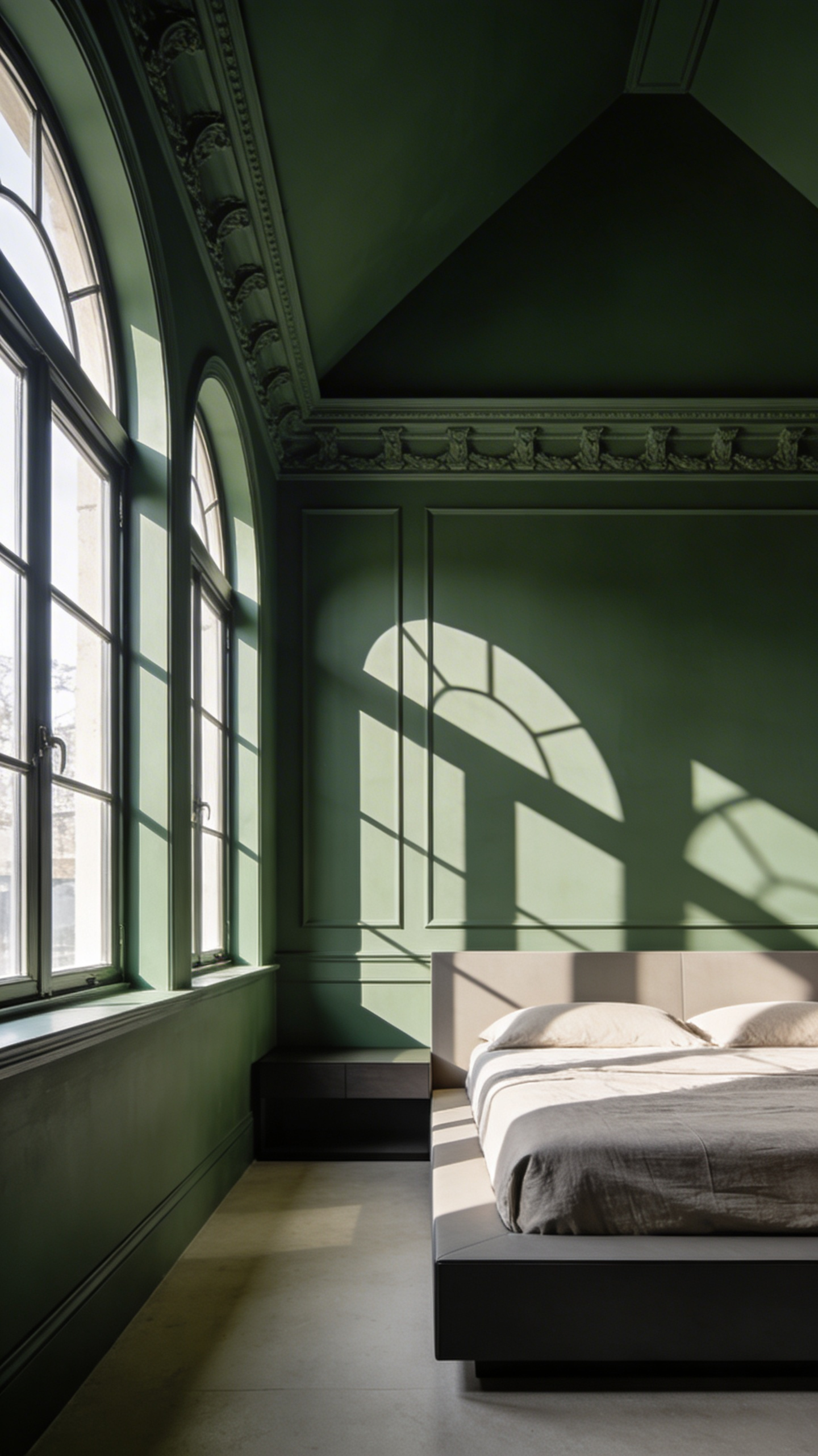
Finally, we must consider the ceiling, or the “fifth wall.” A white ceiling in a dark room creates a jarring “lid effect.” To counter this, paint the ceiling to match the walls. This “color drenching” technique mimics a natural forest canopy. It allows the eye to rest, helping you simply exist within the space.
1. The Monochromatic Retreat: Lowering cognitive load through single-hue layering
The primary appeal of a monochromatic bedroom lies in processing efficiency. Neuroscientific studies suggest that high-contrast paint schemes tax the visual cortex. The brain works harder to map the “edges” where colors meet. Conversely, a single-hue environment utilizes “preattentive processing.” The brain filters out the background quickly, lowering cortisol levels.
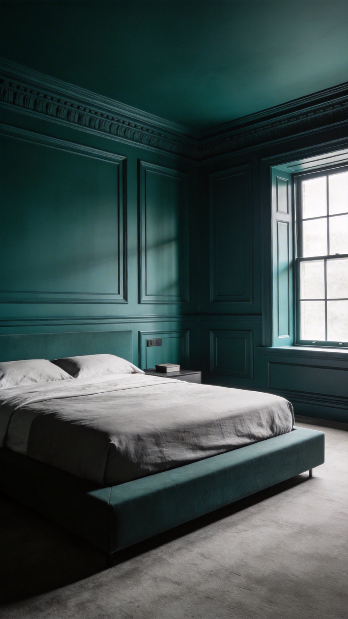
In high-end design, we achieve this calm through a technique called “Color Drenching.” This involves painting walls, molding, and ceilings the exact same hue. By removing traditional white trim, the room’s rigid boundaries disappear. The space feels expansive rather than boxy. This creates an atmospheric blur that signals safety to the nervous system.
A single color must never feel flat or sterile. To prevent this, authoritative design employs “spectral variance.” Designers layer the same color using different paint sheens. You might pair flat walls with light-reflecting satin baseboards. Texture essentially becomes the color in these spaces. The visual weight of a chunky wool throw provides necessary depth.
This approach mirrors the current shift toward “Quiet Luxury.” It serves as a physical antidote to digital overstimulation. Rather than demanding attention, the room invites a state of chromatic rest.
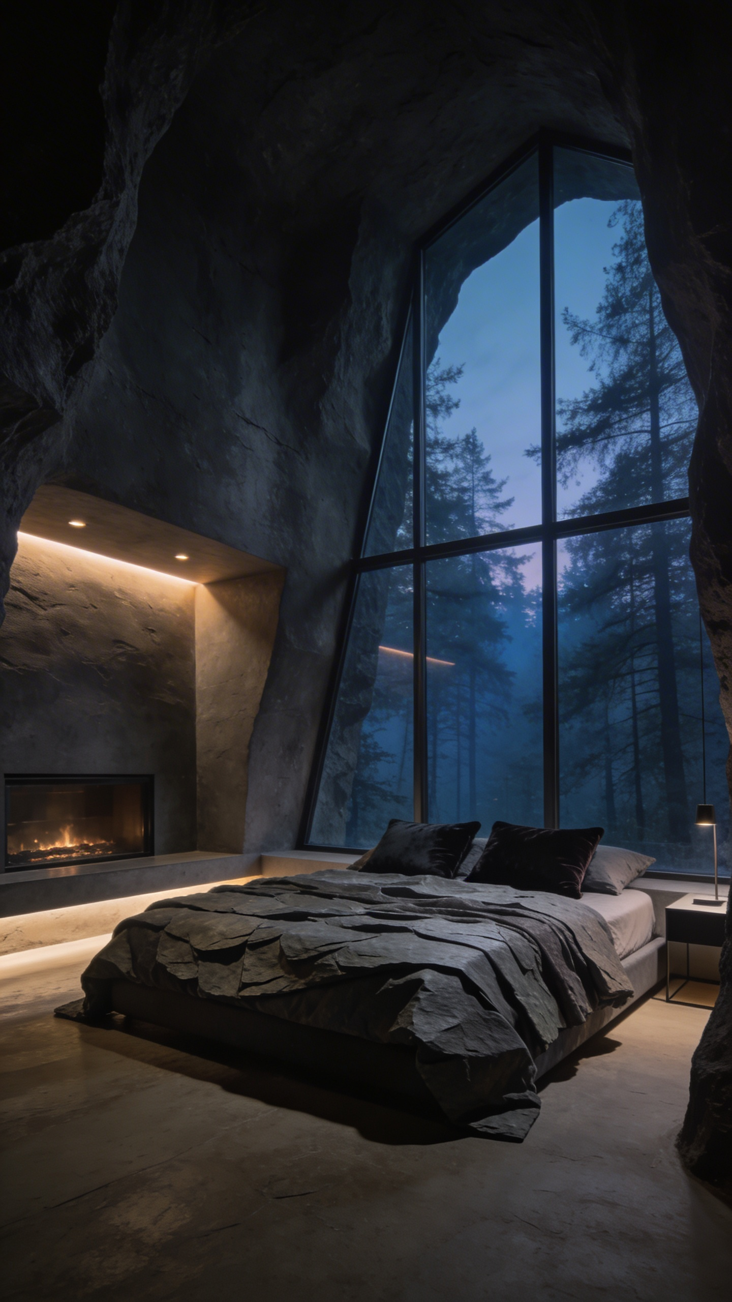
2. The ‘Cocooning’ Effect: Utilizing deep saturation to create spatial intimacy
The concept of “cocooning” dates back to the 1980s trend forecaster Faith Popcorn. Originally, it described a domestic retreat from Cold War anxieties. Today, designers utilize this strategy to combat modern digital noise. We treat the bedroom as a psychological landing place, shifting focus from objects to the atmosphere itself. To achieve this, successful schemes target a Light Reflectance Value (LRV) of 10 or below. These surfaces absorb nearly 90% of visible light.
Deep saturation creates “spatial elasticity” rather than cramping the room. Because the eye cannot define where walls meet ceilings, the boundaries essentially disappear. Texture becomes the new contrast in these monochromatic spaces. Ideally, select “Dead Flat” or “Ultramatte” finishes to act as a visual “velvet anchor.” Alternatively, materials like limewash add organic movement without breaking the immersive color spell.
Deep colors require a specific lighting strategy to avoid feeling oppressive. Experts rely on warm-dim technology to prevent a “black hole” effect. Additionally, maintaining a “light aperture,” like a clear window view, ensures the space feels like a sanctuary rather than a cage. Walking into a color-drenched room feels like sinking into a warm bath. The walls don’t just surround you; they hold you.
3. Biophilic Undertones: Selecting colors that align with natural circadian rhythms
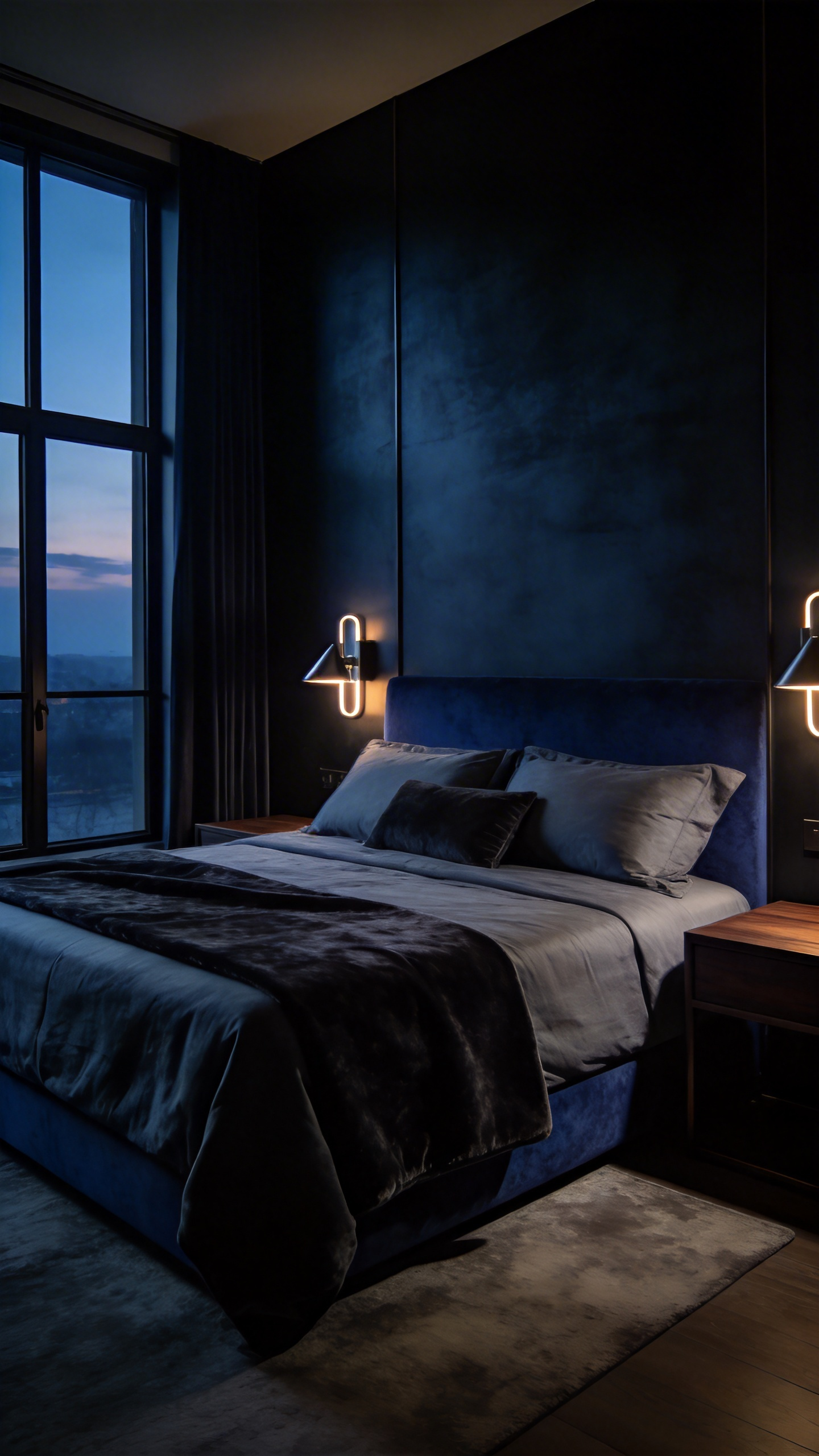
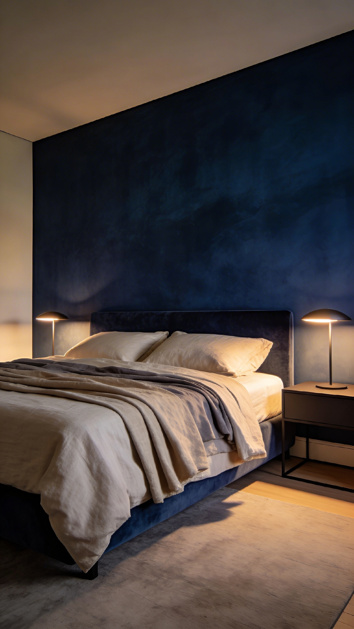
Common design advice often suggests painting bedrooms blue for relaxation. However, from a circadian perspective, the specific shade matters immensely. Bright, “electric” blues mimic high-noon skylight, which stimulates alertness. Conversely, to encourage sleep, you should select “low-chroma” hues like blackened indigo or charcoal-blue. These deep, desaturated tones mimic the twilight sky, effectively triggering the brain’s natural melatonin release.
Alternatively, you might prefer the warmth of the “Firelight Spectrum.” For millennia, humans ended their days beside glowing embers rather than blue screens. Selecting earthen pigments creates a biological safety cocoon. Think of colors like dusty terracotta or raw umber. When lit by warm lamps, these walls absorb stimulating light waves. The room feels like a prehistoric hearth, promoting deep rest through evolutionary familiarity.
The paint’s finish plays a critical role in this sensory experience. Standard satin sheens create “specular glare,” or distracting hot spots of reflected light. In contrast, high-end mineral-based paints offer an “ultra-matte” texture. This dead-flat finish diffuses light softly, significantly reducing visual noise.
Finally, do not overlook the ceiling’s impact on your internal clock. Surprisingly, a stark white ceiling can reflect too much ambient light, disrupting the brain’s “power-down” sequence. Instead, apply a muted, receding shade overhead. This technique, known as atmospheric perspective, effectively “lowers the sky.” It creates a visual signal telling your body that the day has truly ended.
Phase II: Light and Architecture (Spatial Application)
In professional design, a color swatch is merely a suggestion, but the physical room is the reality. This phase bridges the gap between abstract theory and technical application. Architects often view light as a spatial sculptor, similar to Luis Barragán’s concept of an “architectural striptease.” To replicate this sophisticated fluidity, we frequently employ “color-drenching.” By painting walls, trim, and ceilings the same hue, we effectively remove visual breaks. The bedroom feels boundless and fluid rather than like a boxed-in series of rigid planes.
True luxury requires balancing aesthetics with biological health. While blue is psychologically calming, it creates a physiological paradox. Surprisingly, cool tones reflect blue-spectrum light that can disrupt your circadian rhythm. Authoritative design favors “dirty” neutrals, such as sage or warm greige. These hues provide tranquility without suppressing melatonin production.
Investing in high-pigment paints creates “metameric depth.” Unlike flat synthetic dyes, mineral pigments react dynamically to changing light. A wall might appear as a crisp gray at noon yet shift to a warm, grounding violet by evening.
We must also address the “fifth wall.” Standard flat white is rarely the strategic choice for a high-end aesthetic. Instead, analyze the room’s vertical luminance. For low ceilings, a high-gloss finish acts as a mirror to reflect light and lift the space. Conversely, a dark, low-reflectance charcoal creates a protective “night sky” effect. This technique grounds the bed, ensuring the suite feels cozy rather than claustrophobic.
4. Mastering the Light Reflectance Value (LRV) for mood regulation
To truly curate a restful sanctuary, one must look beyond simple color selection to Light Reflectance Value (LRV). Fundamentally, your bedroom walls function as secondary light sources. The paint’s reflectivity determines how much energy reaches your retinas, directly influencing sleep cycles. High-LRV surfaces bounce blue-spectrum light, which can suppress melatonin production in the evening. Therefore, for a sleep-first environment, experts often recommend a mid-to-low LRV between 30 and 55.
In this range, walls absorb visual noise effectively. They prevent the harsh glare typical of titanium whites while maintaining a sophisticated atmosphere. Historically, artisanal materials like limewash managed this balance through chemistry. Because limewash contains microscopic calcite crystals, it refracts light in duplicate. The walls emit a soft, diffuse “glow” rather than a sterile, flat reflection.
Selecting the perfect shade requires navigating the “Metamerism Trap.” Surprisingly, a color that looks soothing on a small swatch often feels aggressive on a large wall. As the field size increases, the total volume of reflected light amplifies exponentially. A “calm grey” can quickly become a “bright silver” source of anxiety. To counter this, savvy designers typically choose a shade one to two steps darker than their initial preference. This adjustment accounts for the cumulative reflectance of four walls facing one another. Mastering these nuances ensures your investment creates a space that feels biologically restorative.
5. The ‘Fifth Wall’ Strategy: enveloping the space by painting the ceiling
For decades, builders treated white as the default ceiling color. However, modern designers view this “Fifth Wall” as a crucial architectural opportunity. Leaving a ceiling stark white creates a harsh visual break. The room feels like a box with a distinct lid. Instead, painting the ceiling to match or complement your walls creates a sophisticated, immersive environment.
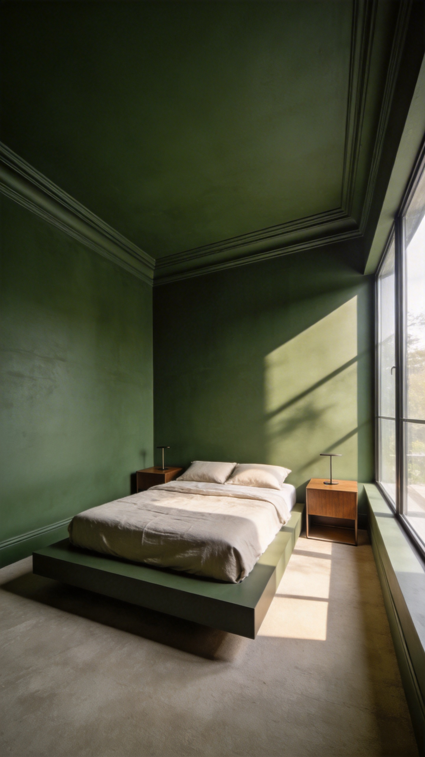
Psychologically, this technique fosters a deep sense of calm. Blurring the boundary between wall and ceiling reduces visual noise. The brain perceives the space as a safe “cocoon,” helping lower cortisol levels for better sleep. Surprisingly, this strategy often makes small rooms feel larger. Because the corner lines disappear, the eye cannot define where the walls end. Thus, the space achieves a sense of infinite height through visual continuity.
Proper execution requires the right finish to maintain this luxury look. Ideally, select a flat or ultra-matte sheen for the ceiling. Since ceilings often have structural imperfections, a matte finish absorbs light to hide bumps. Alternatively, if a full color match feels too intense, use the “50% rule.” Simply mix your wall color with white to soften the hue while keeping the palette cohesive. This investment creates a seamless, high-end narrative that white paint simply cannot match.
6. Architectural Camouflage: Drenching trim and millwork to expand perceived space
Traditionally, contrasting white trim acts as a rigid frame within a space. This draws a literal box around your bedroom’s physical boundaries. However, a technique known as “color drenching” effectively eliminates this visual noise. This involves saturating walls, baseboards, and millwork in a single, continuous hue. As a result, you perform “edge erasure,” removing the hard stop between the wall and the floor. The eye perceives the space as an expansive, singular volume rather than cramped segments.
This monochromatic approach implies a high-end, custom aesthetic. It creates a “cocooning” effect that feels secure and private. Nevertheless, a common misconception is that single-color rooms look flat. To prevent this, successful designs rely on the interplay of sheen. Designers often apply a flat finish to walls to soften edges. Conversely, they use a satin or semi-gloss finish for the trim. Thus, architectural details catch the light differently, creating depth through texture rather than color.
This method also offers strategic camouflage for structural inconsistencies. Painting bulkheads, radiators, or awkward angles the same color makes them disappear. The room’s flaws recede into the background. This allows your investment pieces, like textiles and furniture, to truly take center stage.
7. Managing Morning vs. Evening Light: Correcting for cardinal direction (North vs. South facing rooms)
To master a sophisticated bedroom scheme, treat your walls as active filters for natural light. Managing the shift from morning to evening requires correcting for your room’s inherent color temperature.
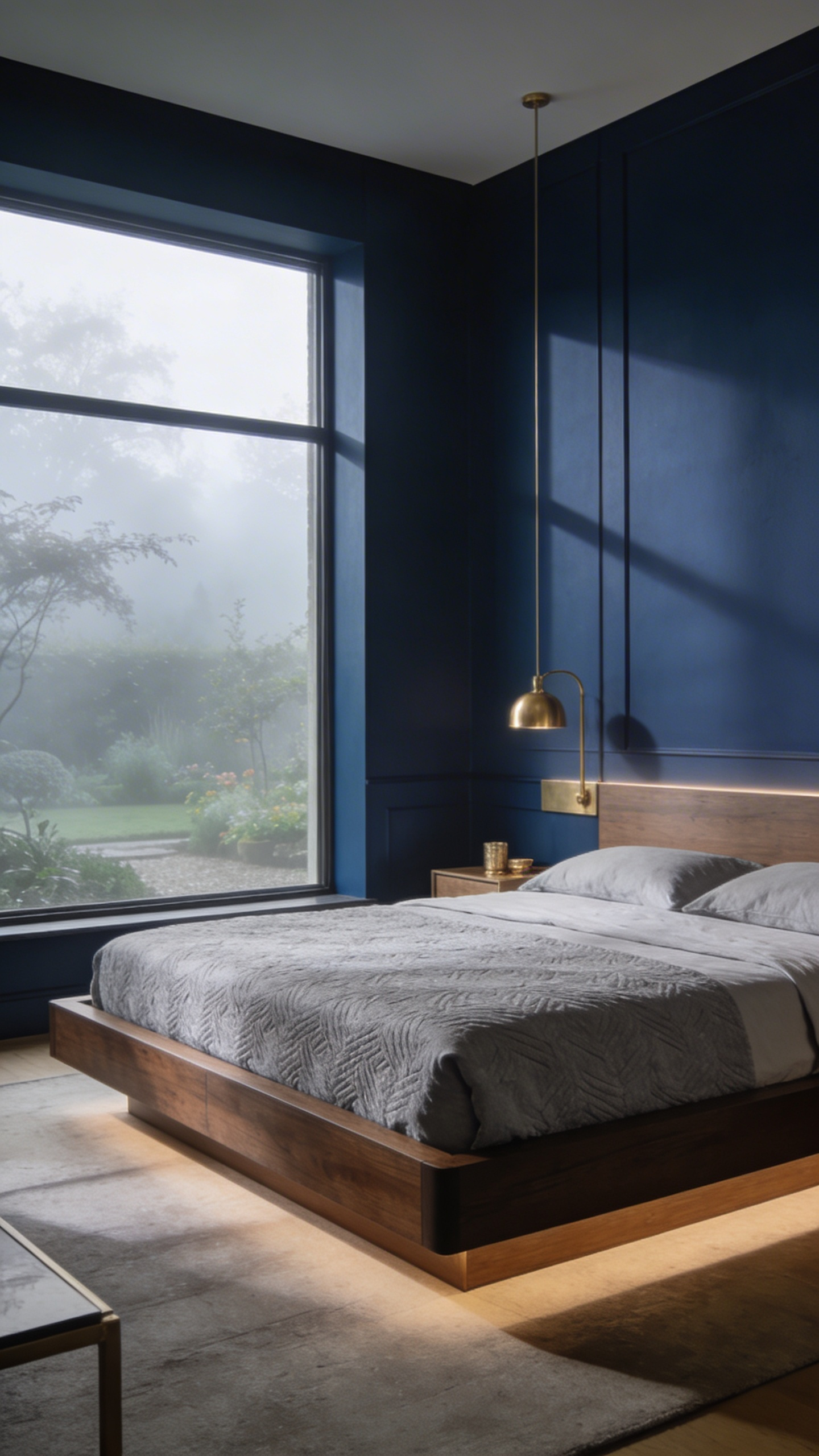
North-facing rooms present a unique challenge due to their cool, indirect illumination. Historically, architects counteracted this “gloom” with amber tints to simulate sunlight. Today, a more sophisticated approach involves “working with the shadow.” Deep, moody tones like Farrow & Ball’s *Stiffkey Blue* provide a velvety embrace rather than looking dingy. Because Northern light is consistent, these dark colors provide stability without shifting into murky shades.
In contrast, South-facing spaces require a “cooling agent” to manage intense midday glare. Without correction, this strong golden light often turns warm whites into sickly, sour yellows. Select colors with cool blue or violet undertones to neutralize the amber glow. Furthermore, opt for matte finishes in these bright rooms. This texture absorbs harsh reflection, allowing walls to glow softly during the evening transition.
Consider the biological impact of your palette. While blue is often deemed calming, “complex neutrals” with terracotta undertones offer better sleep hygiene in cool northern light. Prioritizing these warmer hues prevents the room from feeling physiologically “alerting” at night. By aligning paint choices with cardinal directions, you ensure the space feels luxurious at every hour.
Phase III: Texture and Materiality (Surface Depth)
In Phase III, we transition from abstract color theory to the architecture’s physical skin. This stage prioritizes “Surface Depth” to transform how light behaves within the room. Standard latex paint absorbs light uniformly, often making bedrooms feel sterile or closed-in. Conversely, textured finishes like Limewash or Roman Clay introduce microscopic variation. When bedside lamps provide “raking light,” these surfaces cast tiny, dynamic shadows. This creates a “visual vibration” that prevents the room from feeling flat.
Beyond aesthetics, this texture acts as a neuro-aesthetic “visual lullaby.” The brain finds these fractal, stone-like patterns inherently restorative compared to high-glare surfaces. To achieve this luxury look, consider the “internal luminosity” of Venetian Plaster. Historically, artisans layered translucent materials to let light glow from within the wall. Therefore, the surface gains a perceived depth impossible to achieve with standard pigments.
For technical execution, select paints with a high Pigment Volume Concentration. Essentially, high-quality mineral paints maximize color refraction, giving the hue distinct “soul.” Finally, utilize a “gloss-matte” duality to define the space’s volume. Pair “Dead Flat” walls with “Satin” trim to create sophisticated architectural tension. Thus, the room feels enveloped in a velvety, tactile embrace.
8. The Velvet Effect: Choosing dead flat matte finishes to soften harsh shadows
The “Velvet Effect” relies on ultra-matte finishes to dramatically transform a bedroom’s atmosphere. These “dead flat” paints possess a sheen level as low as 2%. Unlike glossy alternatives, they interact with light to mimic heavy, absorbing fabrics. Consequently, they neutralize visual noise effectively.
The magic lies in optical physics. Glossy surfaces create sharp, high-contrast shadows known as specular highlights. Conversely, dead flat finishes scatter incoming light in every direction. Shadows become a gradual, smoky transition rather than a hard edge. This soft-focus effect essentially blurs the lines where sunlight meets darkness.
Historically, this aesthetic signals understated luxury. In fact, it revives the 18th-century “flatted lead” technique used in grand estates. To maximize this, consider the “color drenching” technique. By painting walls, ceilings, and trim in the same matte shade, you eliminate reflective boundaries. Thus, the room feels enveloping and secure.
This finish offers distinct psychological benefits. Matte textures generally perceive as warmer and safer, significantly reducing cognitive load. Previously, such beauty required fragile maintenance. However, modern formulations now utilize nano-particle technology to prevent burnishing. You achieve a delicate, high-end look that remains surprisingly scrubbable and scuff-resistant.
9. Old World Patina: Implementing limewash and Roman clay for organic texture
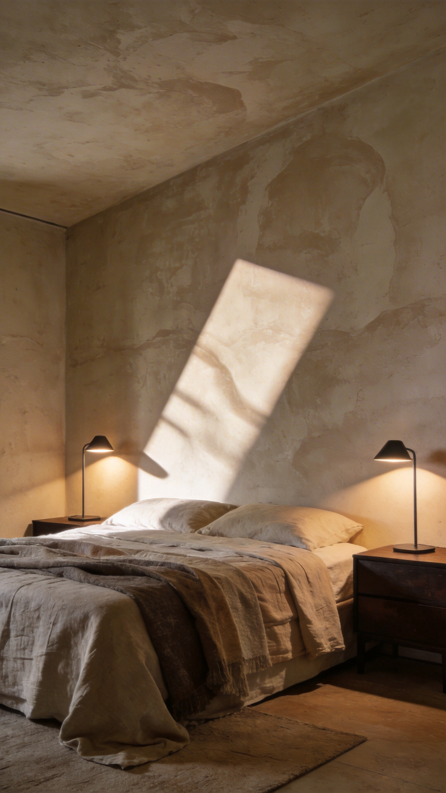
In the realm of high-end design, standard bedroom paint often acts as a mere plastic film. Conversely, mineral-based finishes like limewash and Roman clay create “living walls.” These materials possess a high pH, allowing moisture to evaporate rather than trapping it. The bedroom feels crisp and breathable, devoid of the harsh chemical smells associated with synthetic options.
Beyond health benefits, these finishes offer unique light refraction essential for a restful atmosphere. Unlike uniform eggshell paint, Roman clay mimics the soft, sophisticated look of honed stone or suede. Light scatters across the microscopically uneven surface instead of reflecting a flat glare. During the “golden hour,” the walls appear to glow from within, adding depth to the space. Ideally, this aesthetic aligns perfectly with modern “Quiet Luxury.” It embraces *wabi-sabi*, where slight variations in texture add a sense of history and soul.
Achieving this Old World patina requires precise execution to avoid looking artificial. You cannot apply these minerals directly over modern latex paint without a specialized mineral primer. Furthermore, authenticity lies in the application technique. Roman clay demands a stainless steel spatula to compress and “burnish” the material. Similarly, limewash requires a cross-hatch brush stroke to create cloudy, ethereal movement. These investments in organic texture transform a simple box into a sophisticated, restorative sanctuary.
10. Strategic Sheen: Using high-gloss accents on doors to bounce candlelight
High-gloss paint serves as much more than a simple aesthetic finish. Actually, it functions as a strategic lighting tool within a bedroom. Unlike matte surfaces that absorb illumination, high-gloss paint creates specular reflection. The door acts like a mirror, bouncing light back into the room.
This dynamic is particularly transformative when paired with candlelight. Specifically, the focused beam of a candle flame hits the glossy surface. Then, the door reflects that flicker, effectively doubling the light’s warmth. In essence, a static architectural element becomes a dynamic, moving feature.
This finish introduces necessary textural friction. Bedrooms are typically dominated by soft materials like linen sheets and wool rugs. Therefore, a “glassy” door provides a sophisticated counterpoint to these muffled textures. Think of it as architectural jewelry that prevents the room from feeling flat.
Proper execution is critical for this high-end look. Ideally, select a waterborne alkyd paint, which levels out to eliminate brushstrokes. Also, consider the underlying color carefully. Deep hues like navy or ebony absorb ambient light beautifully. Simultaneously, they reflect the amber candle flame, creating a cinematic, liquid-like depth that feels incredibly luxurious.
Phase IV: Curated Palettes (The Color Schemes)
Phase IV moves beyond abstract mood boards into chemically precise specifications. This technical audit ensures your bedroom facilitates restorative sleep. First, we conduct an “Undertone Audit” to find complex neutrals. For example, a north-facing room often requires a “Warm Greige” with violet undertones. This counteracts cool, blue-tinted light, preventing a clinical atmosphere.
Next, we apply the structural 60-30-10 rule to avoid monotony. Specifically, 60 percent of the room anchors the space, usually in a low-sheen matte. Meanwhile, high-energy colors are strictly relegated to the 10 percent “spark” category. Therefore, the nervous system remains calm before bed.
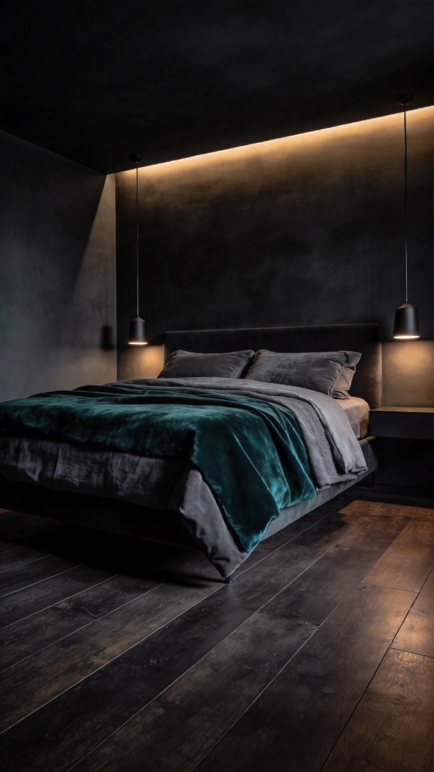
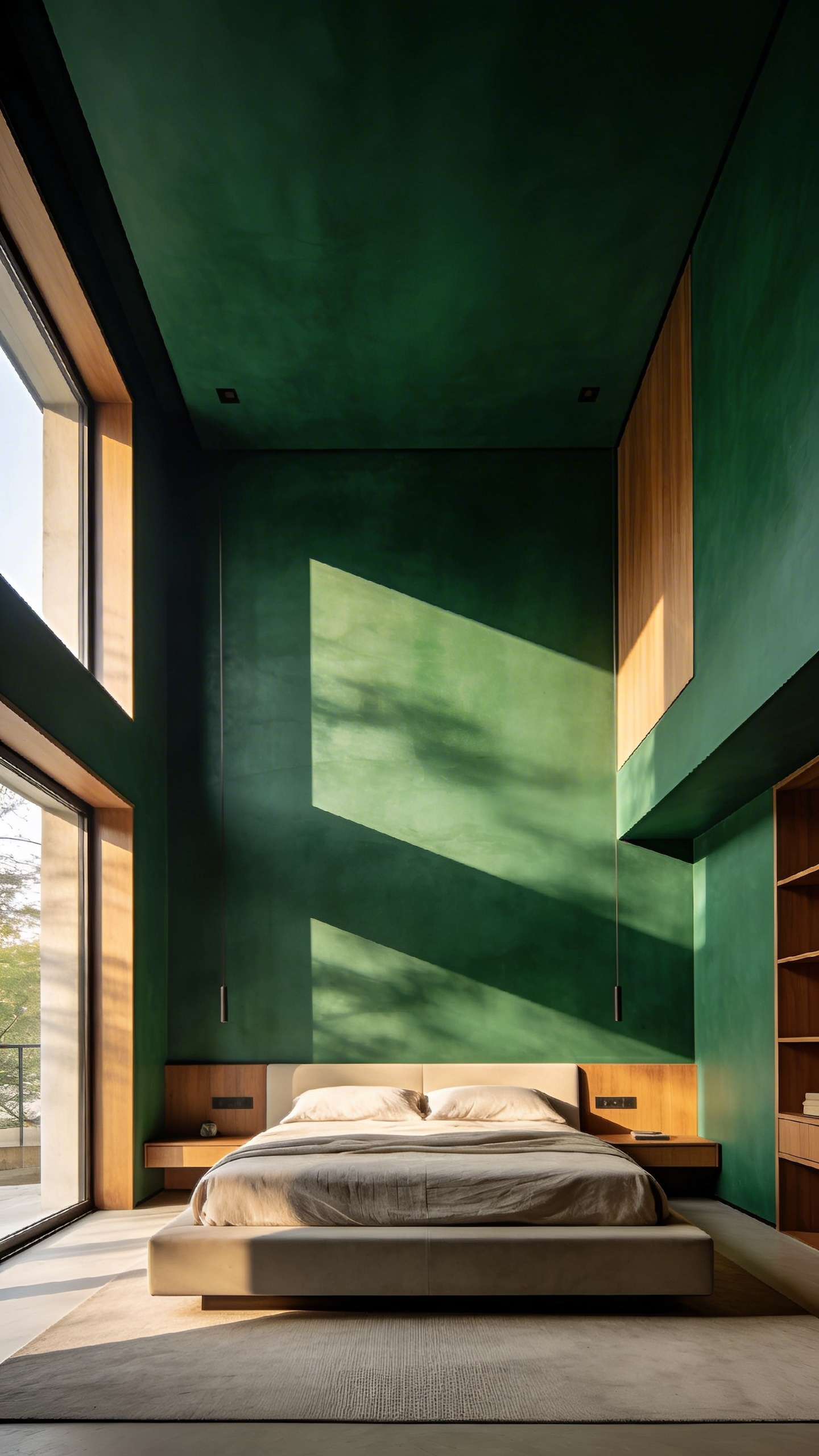
We often utilize deep hues to create a “Cocoon Effect.” Historically, dark teals and forest greens created a necessary sense of enclosure. Physiologically, these light-absorbing shades signal the pineal gland to begin melatonin production.
However, a palette must survive the “Metabolic Light” test. We specifically test paints during the “Golden Hour” to check for metamerism. Basically, a serene blue must not turn muddy under warm artificial lamps. True luxury treats texture as a color. For instance, we pair matte walls with lustrous silk to create haptic depth. This interaction ensures the room feels grounded and expensive.
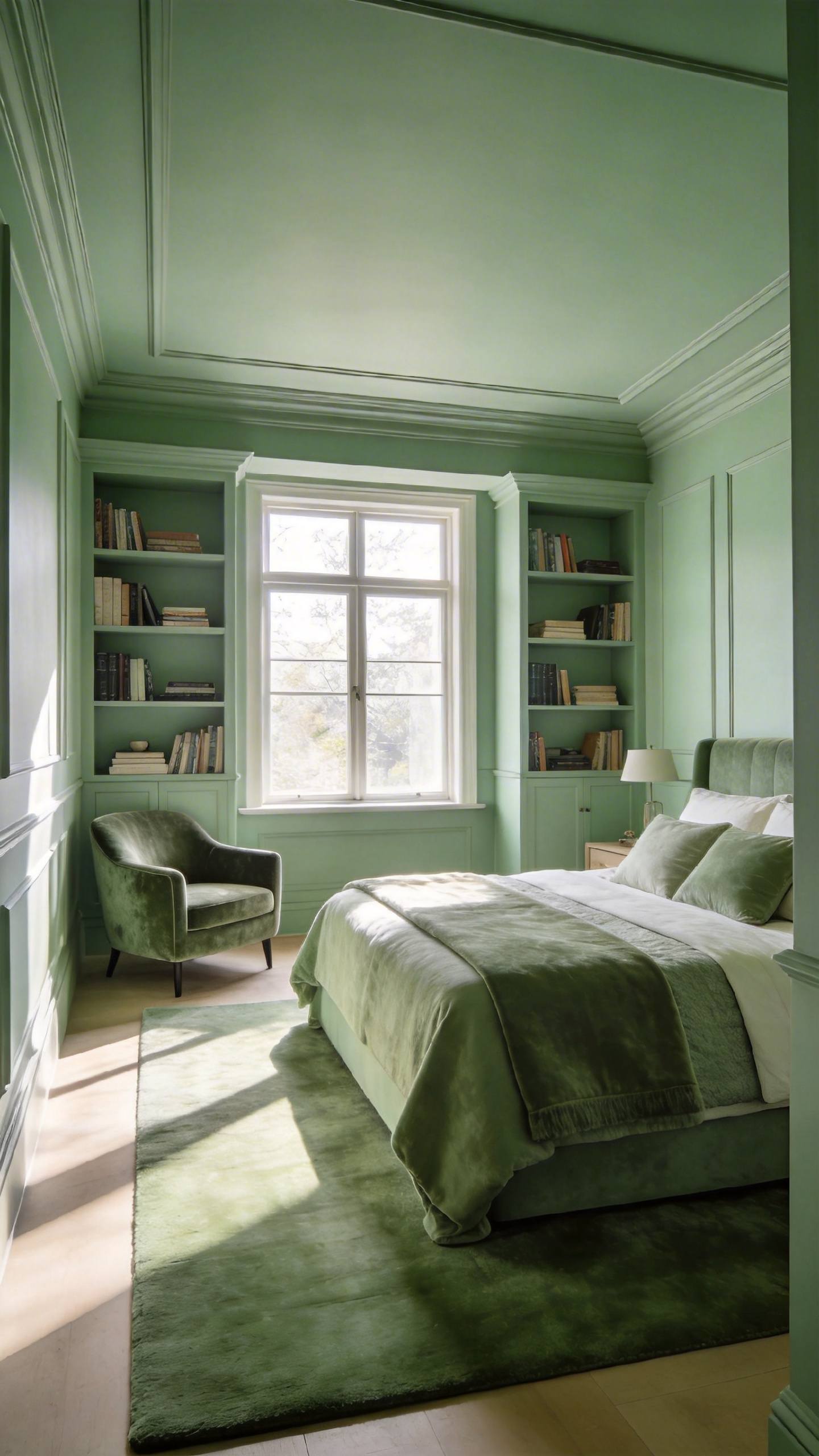
11. ‘Quiet Luxury’ Neutrals: Moving beyond greige into cashmere, taupe, and stone
The era of flat, functional greige is fading. Sophisticated interiors are embracing a palette defined by depth and materiality. We are moving toward the rich warmth of cashmere, taupe, and natural stone. Historically, this shift represents a return to classical architectural foundations. Rather than looking like factory pigment, these shades mimic raw limestone and lime plaster. Therefore, they lend a sense of permanence and “legacy” to a home.
Technically, these “quiet luxury” neutrals offer superior complexity. Unlike simple gray-beige mixes, a true taupe carries muddy violet or mushroom undertones. As a result, the color shifts beautifully, creating a cocoon-like shadow in evening light. Furthermore, this depth fosters a “warm sanctuary” atmosphere. While cool grays can feel sterile, cashmere tones visually “hug” the inhabitant. In fact, this mimics the low-contrast environment of a dimly lit library.
To fully master this aesthetic, consider the finish carefully. Ideally, you should opt for “dead flat” or chalky textures. In doing so, the wall ceases to look painted and begins to resemble soft fabric. Additionally, designers increasingly recommend “color drenching.” By painting the ceiling and trim the same hue, you remove visual boundaries. Ultimately, this removes visual noise, allowing the mind to fully decompress.
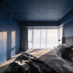
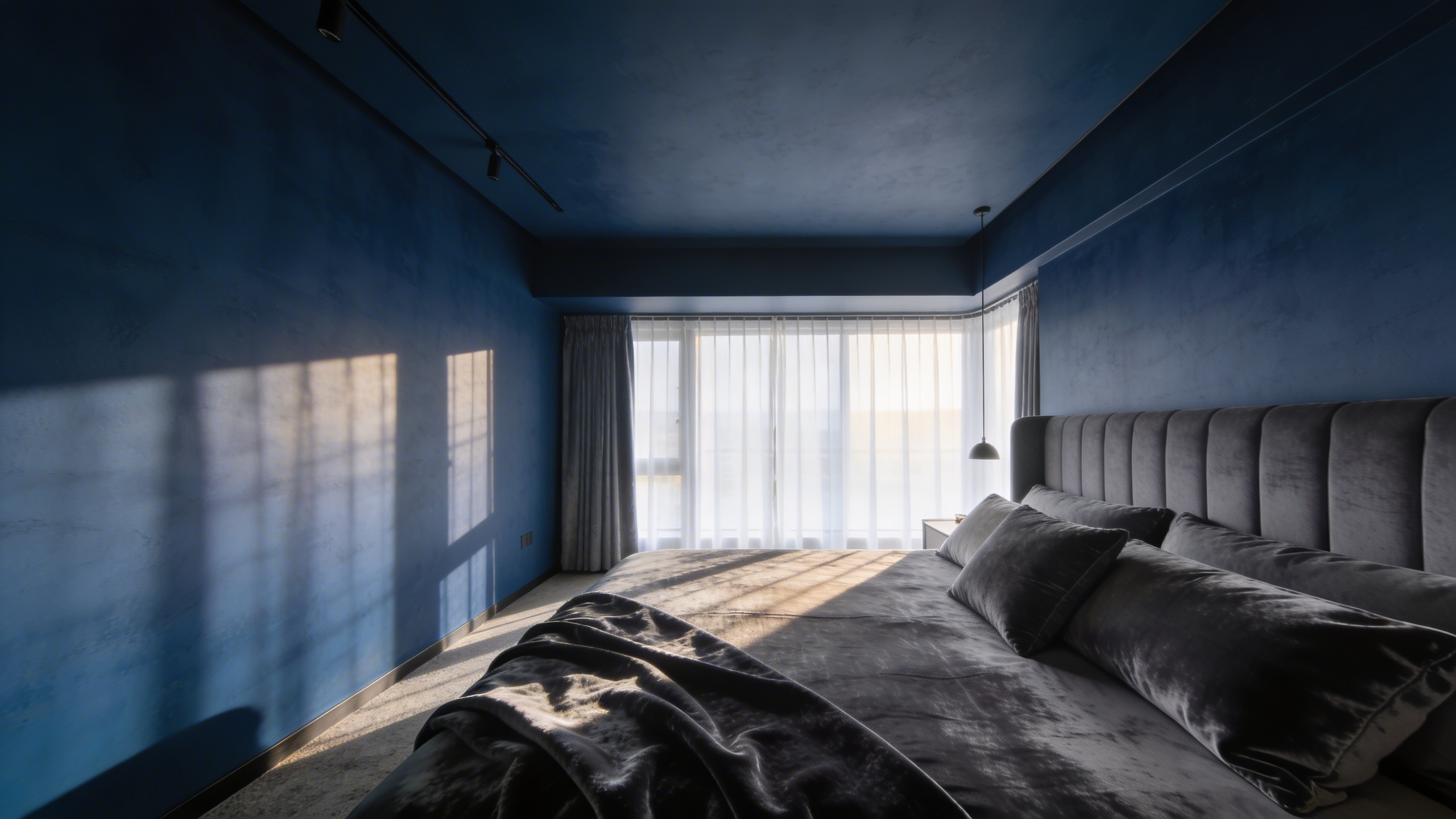
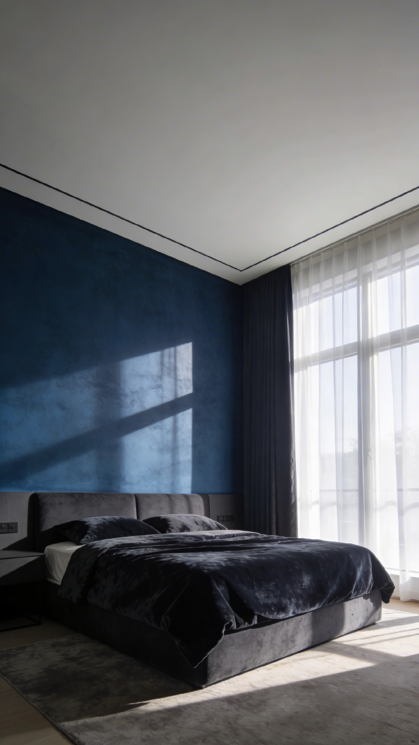
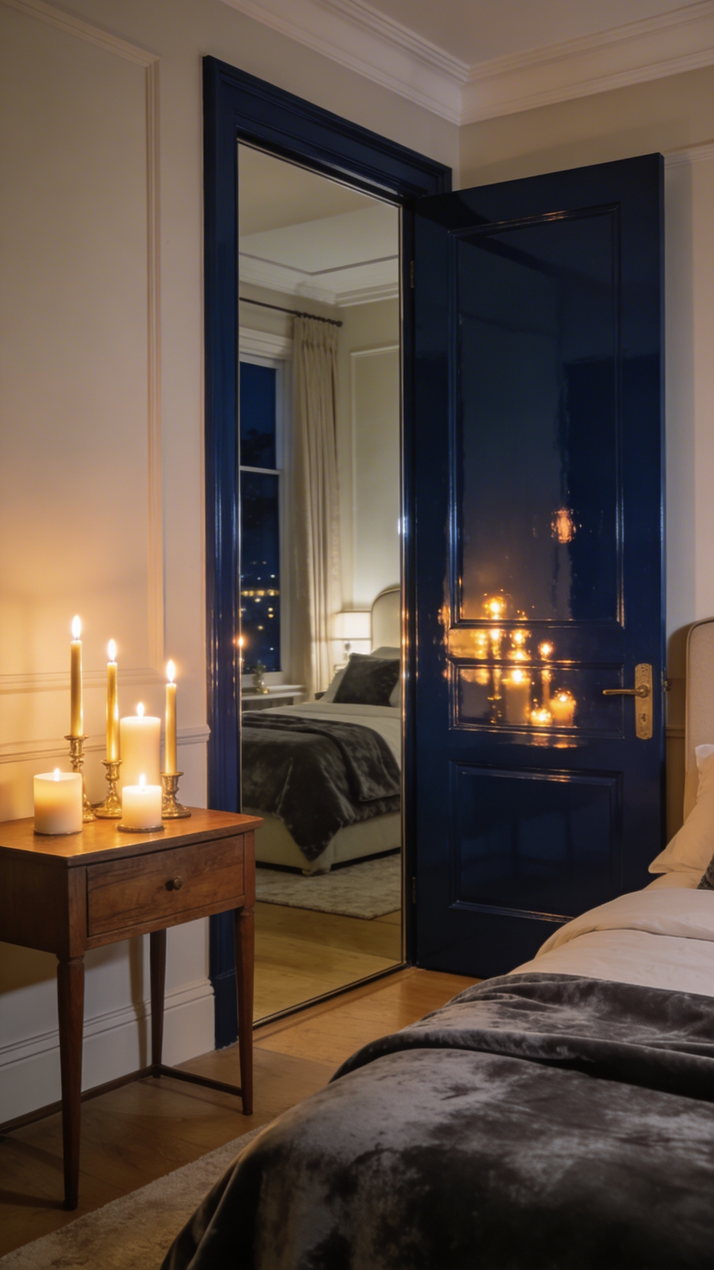
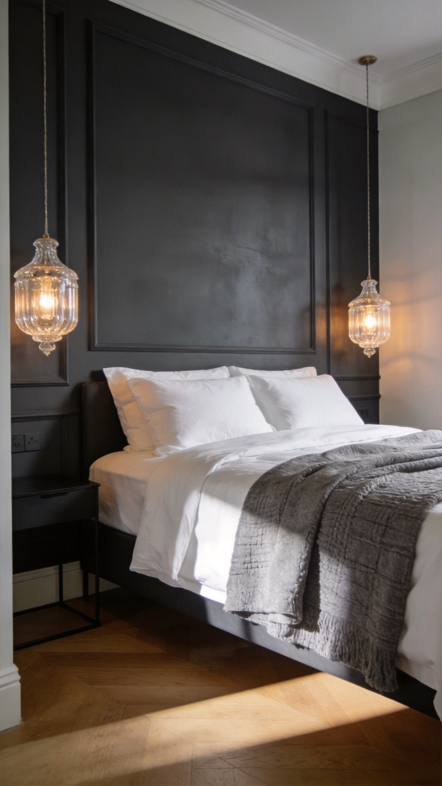
12. The Midnight Library: Ink blues and charcoals for deep restorative sleep
The “Midnight Library” aesthetic offers more than just visual drama; it provides a psychological design strategy known as “cocooning.” This approach utilizes deep ink blues and heavy charcoals to trigger restorative sleep. Unlike airy Scandinavian styles, these saturated tones possess a very low Light Reflectance Value (LRV). Consequently, the walls absorb light rather than bouncing it, allowing the optic nerve to fully relax.
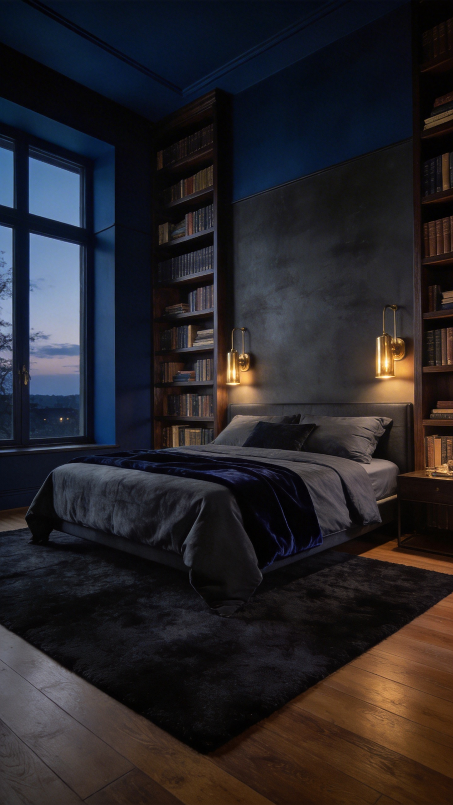
To achieve this sophisticated look, you must prioritize the correct undertones. For instance, high-end ink blues often contain a subtle hint of red or violet. Under warm bedside lamplight, these undertones vibrate, preventing the room from feeling cold or clinical. Conversely, quality charcoals should feature green or blue bases to mimic natural elements like weathered stone.
The most authoritative application of this scheme is a technique called “color drenching.” By painting the walls, trim, and ceiling the same hue, you create a seamless envelope. Surprisingly, a dark ceiling does not shrink the room. Instead, it creates an “infinite sky” illusion that recedes like the night itself. The finish is critical to your success. You must use a “Dead Flat” or “Ultra-Matte” paint to avoid distracting light reflections. Contrast this visual silence with warm, tactile elements like brass hardware or cognac leather. This friction between deep walls and rich textures creates a sense of “intellectual safety” that promotes deep rest.
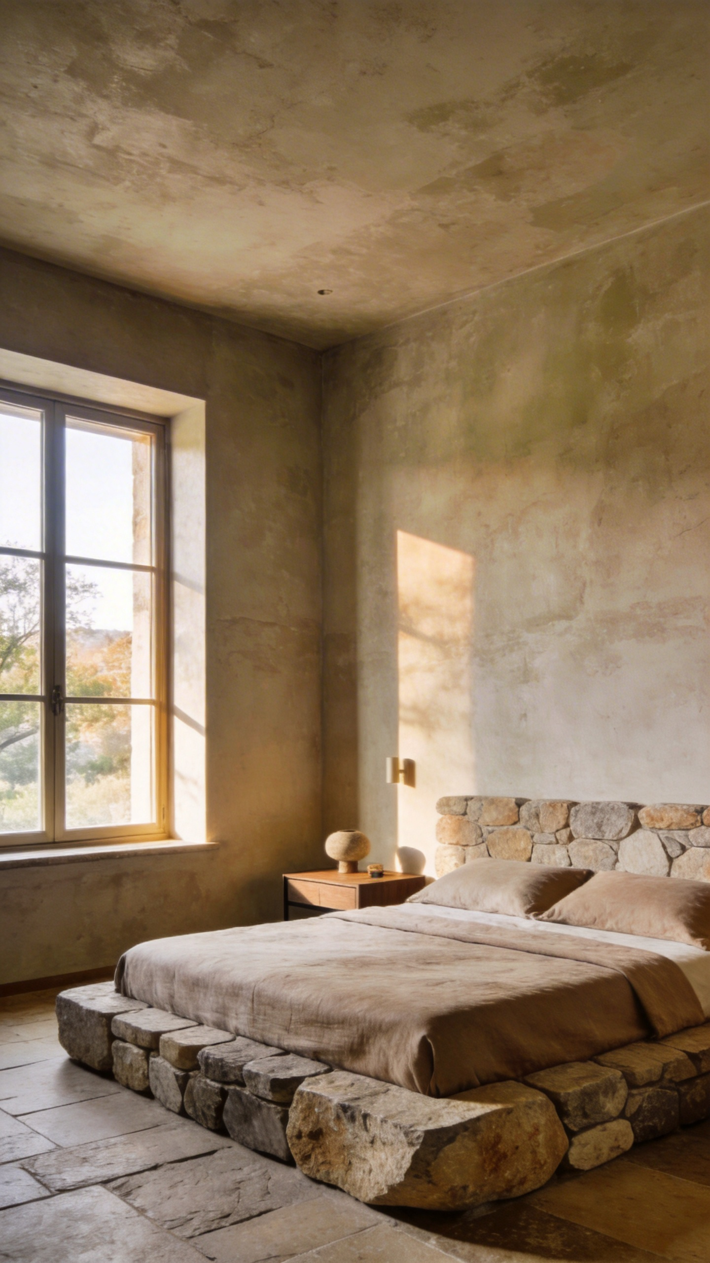
13. Grounded Earth: Terracotta and warm clay tones for emotional stability
Moving away from clinical grays, modern design now embraces the “nurturing haven” of warm clay tones. Terracotta offers more than just a trend. In fact, it serves as a powerful tool for emotional stability. Research indicates that inhabitants perceive clay-toned rooms as 3 to 5 degrees warmer. Therefore, this psychological shift lowers the threshold for true relaxation.
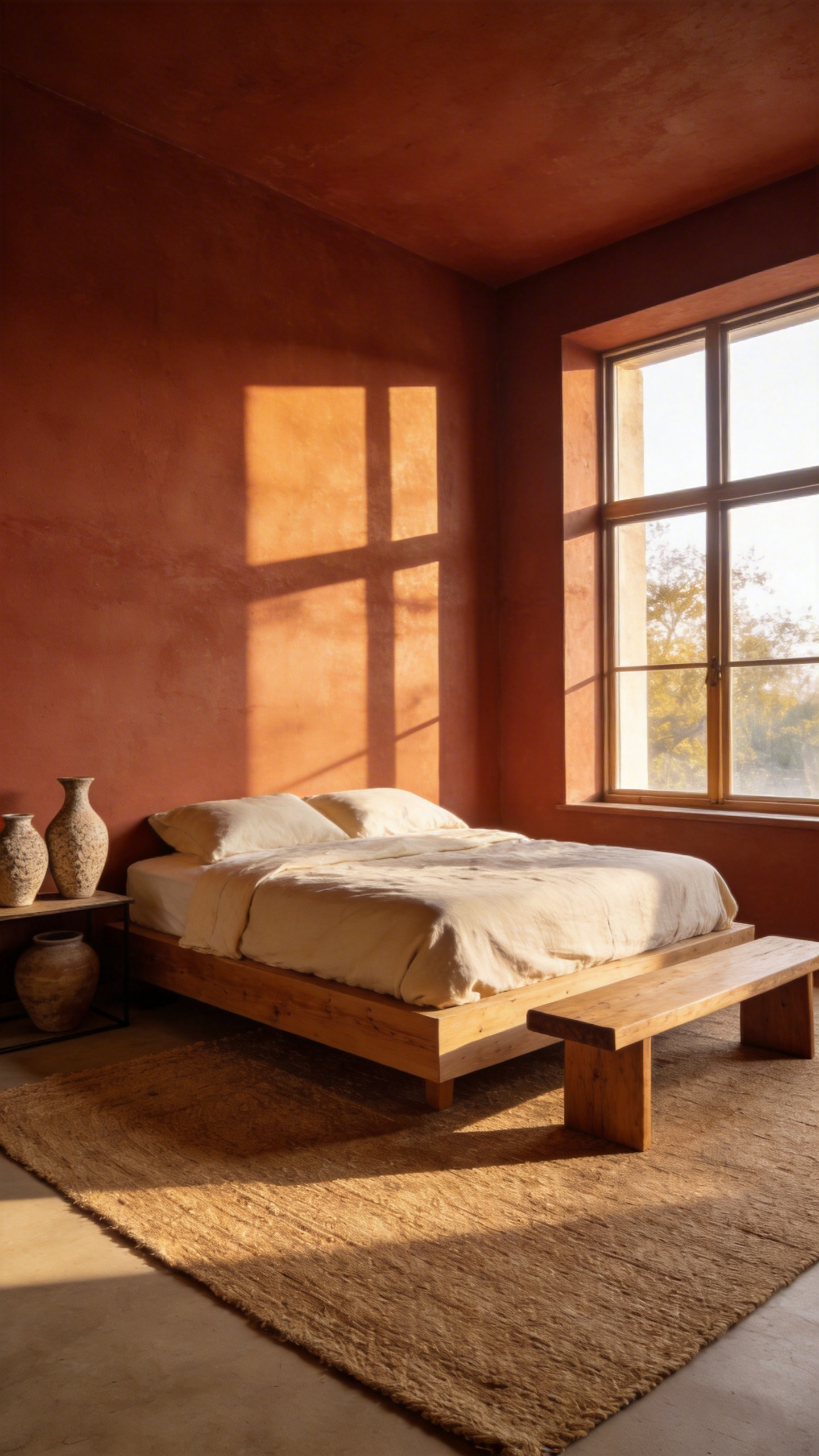
Evolutionarily, this hue sits at a perfect psychological sweet spot. It tempers the stimulating urgency of red with the grounded security of brown. As a result, this combination fosters safety without triggering a “fight or flight” response. Furthermore, terracotta acts as a corrective lens for natural light. In north-facing bedrooms, it neutralizes cool, blue tones effectively. Conversely, south-facing spaces benefit from a golden, “sunset effect” that supports circadian rhythms.
To achieve a sophisticated aesthetic, the paint finish is critical. Avoid high-gloss sheens that feel artificial. Instead, opt for matte or “dead-flat” finishes to mimic raw earth. Additionally, techniques like limewash create a multi-tonal, “cloud-like” texture. This approach provides a visual anchor, transforming your bedroom into a sanctuary of “soft fascination.”
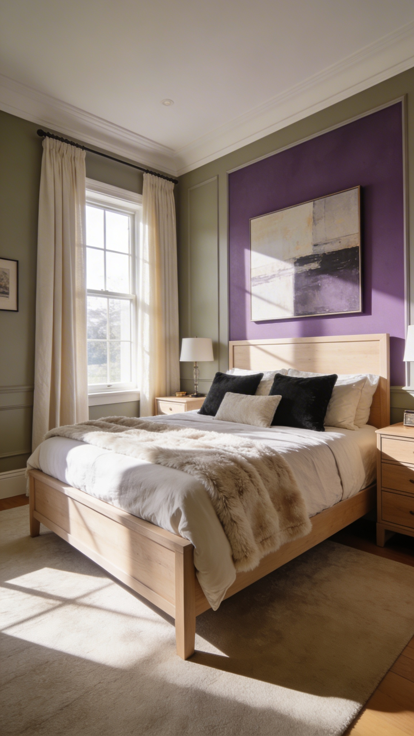
14. The New Romantic: Dusty mauves and aubergine for sophisticated warmth
Shift your focus away from the stark “Industrial Grays” of the past decade. Instead, embrace the “New Romantic” aesthetic for a truly high-end bedroom. This design scheme utilizes dusty mauves and deep aubergines to create sophisticated warmth. Fundamentally, this marks a return to Chiaroscuro-style interiors, using light and dark contrasts to build emotional depth.
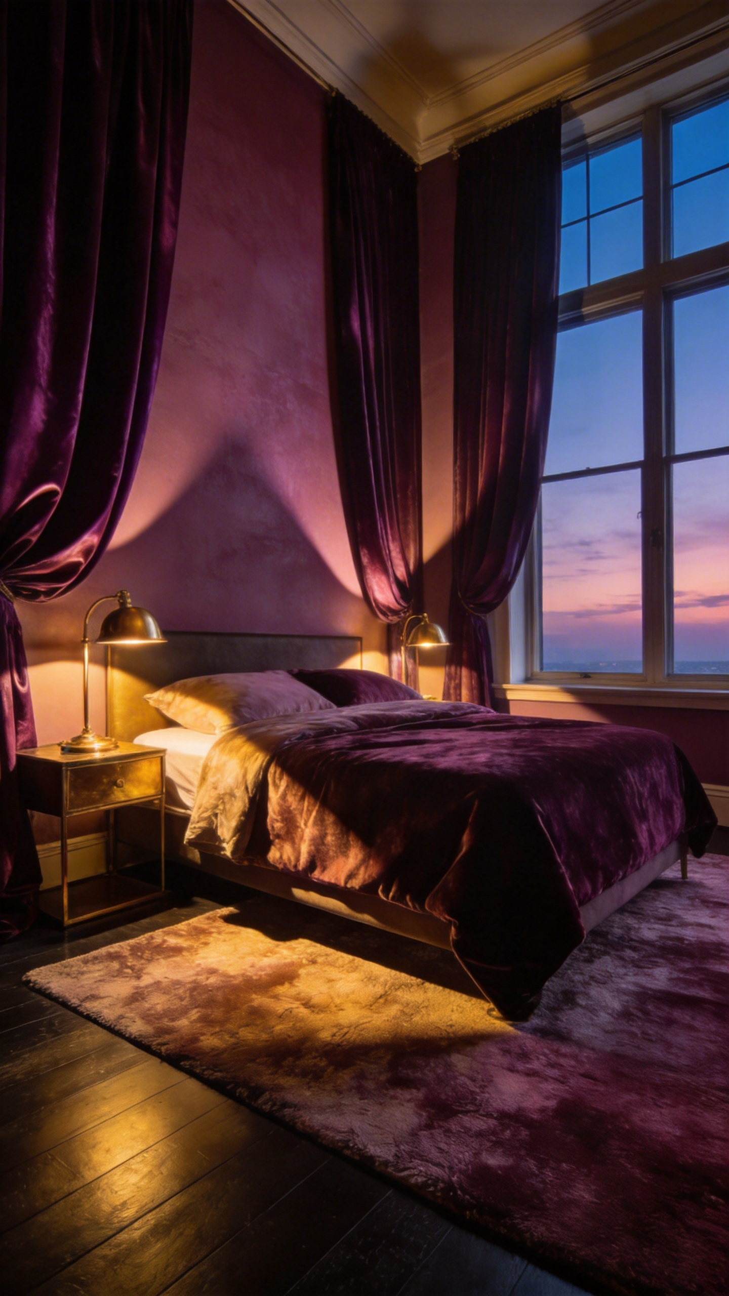
Unlike juvenile lavenders, a dusty mauve functions effectively as a “chromatic neutral.” Its significant gray and brown content allows it to behave like a complex greige. It provides a sense of safe enclosure without feeling claustrophobic. To ground this lightness, incorporate aubergine as an anchor. Ensure your aubergine paint has a red-brown base rather than a blue one. Consequently, the walls will glow warmly under evening lamps instead of turning cold.
Texture is equally vital for this investment-worthy look. Experts almost exclusively recommend a “dead flat” matte finish for these pigments. A matte surface absorbs light, creating a suede-like texture reminiscent of a 19th-century salon. Furthermore, you must select the right accents to prevent visual heaviness. Introduce unlacquered brass or burnished gold hardware. The metal’s yellow tones sit across the color wheel, lifting the room. Consider “color drenching” by extending the mauve to the ceiling. You eliminate the horizon line, turning your bedroom into an infinite, cozy sanctuary.
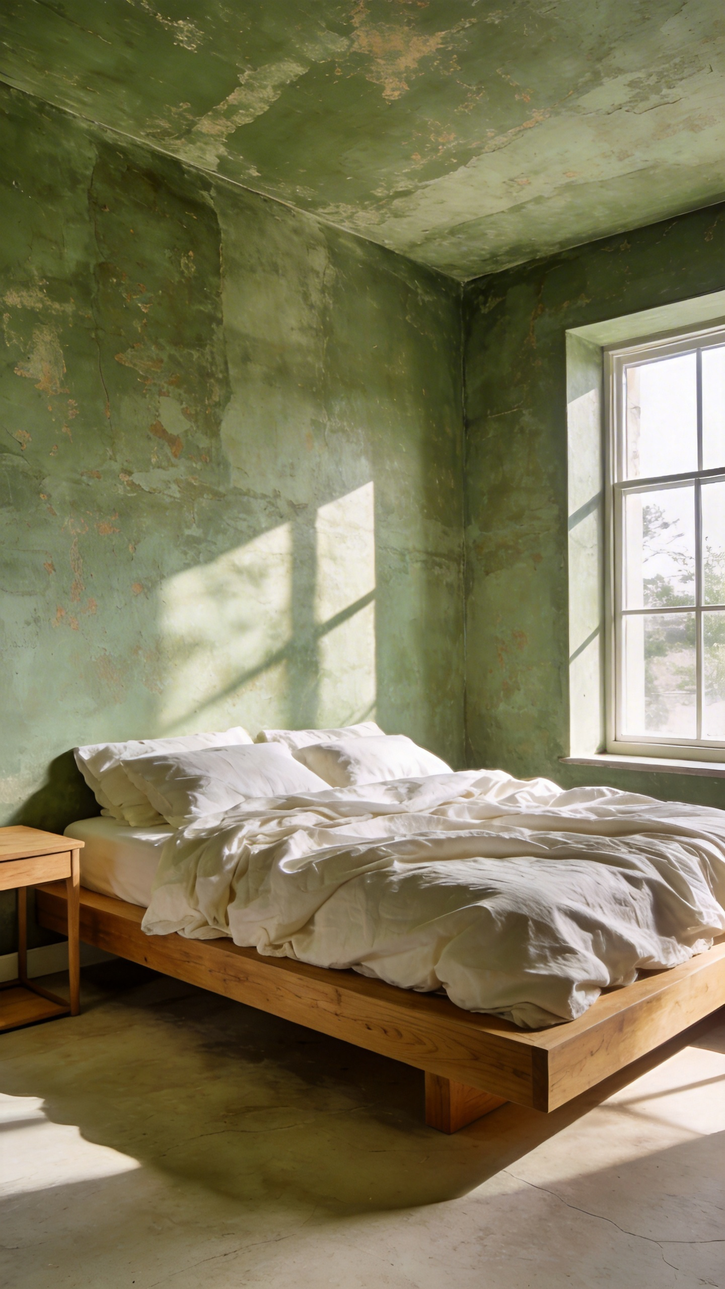
15. Restorative Greens: Sage, olive, and eucalyptus for nervous system regulation
Restorative greens act as a powerful neurological “off-switch” for the modern, overstimulated brain. Shades like sage, olive, and eucalyptus require minimal retinal effort to process. This visual ease signals the parasympathetic nervous system to initiate a “rest and digest” state. Research suggests these hues mimic our evolutionary environments, such as fertile groves. Therefore, the amygdala perceives the space as safe, effectively lowering cortisol levels.
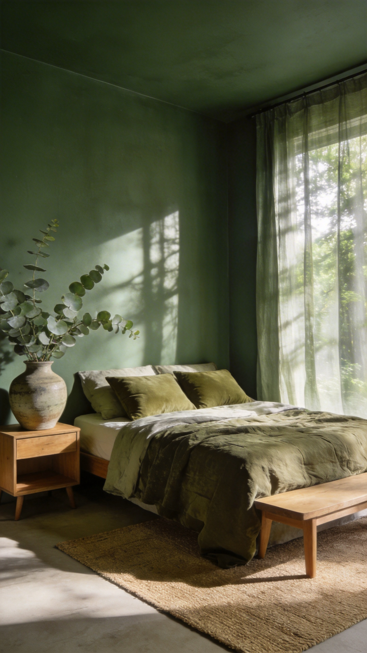
However, each shade offers a distinct emotional temperature. Sage acts as an introspective neutral with its muted, gray undertones. It creates a “hushed” atmosphere that feels like the quiet of a library. Olive provides a heavy, grounding effect. With its warm, earthy notes, it offers stability similar to the weight of a wool blanket. Alternatively, eucalyptus introduces a rejuvenating coolness. This silver-edged green evokes deep breathing, making it ideal for soothing sleep-onset insomnia.
To maximize this restorative power, the finish is just as critical as the color. Notably, these greens perform best in matte or eggshell textures. High-gloss finishes create sharp light reflections, which can be visually overstimulating. Instead, a velvety matte surface absorbs light, mimicking the depth of natural foliage. Furthermore, these muted tones hold their character under warm evening bulbs. Thus, they ensure your wind-down routine remains free from chromatic confusion.
Phase V: Implementation Wisdom
True luxury design relies heavily on precise execution. Implementation is less about painting and more about stewardship. The “lay-off” technique is critical for bedroom ambiance. Here, professionals run an unloaded roller vertically over wet paint. Microscopic particles align uniformly. Without this step, low-angle bedside lighting highlights chaotic textures. The walls create visual noise rather than calm.
The “hand” of the wall matters immensely. In fact, a matte finish offers a velvety tactile quality. This finish absorbs sound, whereas gloss reflects it. So, the right sheen actually quiets the room.
A common error is rushing the process. Although paint dries in hours, it requires 14 to 30 days to “cure.” During this time, the molecular structure hardens. Avoid placing heavy furniture against fresh walls. Otherwise, you risk permanent indentations in the finish.
Finally, you must manage metamerism through “light tuning.” A warm 2700K bulb might turn a chic grey into muddy yellow. The design isn’t finished until the lighting matches the paint’s undertones. These details ensure your investment yields a truly restorative sanctuary.
16. The 24-Hour Test: Observing swatches under natural and artificial illumination
The “24-Hour Test” is a critical technical procedure, not merely a suggestion for the indecisive. Fundamentally, it accounts for metamerism. This phenomenon occurs when colors appear to match under one light but differ significantly under another. For instance, a “perfect gray” often manifests a “pink ghost” once the sun sets. Warm LED bulbs emit a yellow-skewed spectrum. This artificial light “starves” blue pigments and pulls red undertones to the surface.
A bedroom’s orientation dictates these shifts. East-facing rooms, for example, receive soft, warm light at dawn. However, they transition to cool, gray shadows by mid-afternoon. A paint must maintain its warmth even when the natural light turns blue. Ideally, the color should support your circadian rhythm. It must transition from a morning motivator to a soothing evening backdrop.
To observe this properly, experts now advocate for “Movable Swatches” rather than painting directly on walls. Using large foam-core boards allows you to move the color around the room. Crucially, this prevents “simultaneous contrast,” where the old wall color alters your perception of the sample.
Note that high-end paints often shift the most. Brands like Farrow & Ball utilize high pigment densities. Thus, their mineral structures refract light in complex ways. In contrast to flat, cheaper paints, these investments “breathe” with the light. Ultimately, this test ensures you enjoy the room’s atmosphere during every distinct mood of the day.
17. The 60-30-10 Rule: Balancing dominant wall color with bedding and textile accents
The 60-30-10 rule is not merely a styling suggestion; it is a visual recipe for harmony rooted in the Golden Ratio. This principle aligns with Gestalt psychology, satisfying the brain’s desire for order. In a master suite, the walls typically establish the dominant 60%. This hue acts as a soothing anchor. Specifically, calming tones like blue mimic the sky, effectively triggering a physiological relaxation response.
Once the backdrop is set, textiles must create a dialogue. The secondary 30% generally comprises the duvet, curtains, or a large area rug. This layer adds essential structure and visual weight to the room. If your walls are a muted sage, a warm oat duvet provides a sophisticated bridge. Then, the final 10% serves as the room’s “jewelry.” This small percentage is the ideal place for high-energy accents, such as a terracotta velvet pillow or a navy cashmere throw.
A truly high-end aesthetic requires looking beyond flat color. Sophisticated designs often substitute texture for hue to create depth. For instance, a monochromatic scheme might balance matte walls with high-sheen silk accents. You must consider the “lighting variable.” Because artificial light creates metamerism, colors can shift drastically at night. Thus, testing paint and fabric samples together under evening lamps is critical. Consider the modern “60-30-10-10” variation. By adding a second accent of natural wood or rattan, you achieve a warm, collected atmosphere.
Conclusion: Designing for the Subconscious
Designing for the subconscious transcends simple aesthetics. We are engineering a physiological response, not just picking a shade. The choice between matte and gloss becomes a critical tool for sensory regulation. Selecting deep, “den-like” tones actively signals safety to our ancient limbic system. Consequently, a bedroom transforms from a static room into a functional sanctuary for rest. We bypass fleeting visual trends to prioritize biological needs and deep recovery.
Looking forward, true luxury lies in spaces that nurture our mental well-being. Smart investment design creates an environment where the mind can truly disengage. As a result, your home becomes a restorative asset rather than just a visual statement. To begin, audit your current bedroom’s finish and “visual volume.” Consider swapping high-gloss surfaces for velvet-matte textures to immediately lower the room’s energy. Selecting sophisticated bedroom paint schemes is about engineering a physiological response for long-term well-being.
Frequently Asked Questions
What are the best bedroom paint schemes for a good night’s sleep?
The most effective schemes for sleep utilize low-chroma, desaturated tones like deep indigo, charcoal-blue, or sage green. These colors mimic natural twilight, signaling the brain to produce melatonin and transition into a restorative state.
How does Light Reflectance Value (LRV) affect bedroom color choice?
LRV measures the percentage of light a color reflects. For bedrooms, an LRV below 50 is ideal to reduce visual stimulation. Low-LRV paints (under 20) act as neurological anchors, absorbing light and creating a “cocoon” effect that promotes deeper sleep.
Can dark paint schemes make a small bedroom feel bigger?
Yes, particularly when using a technique called “color drenching.” By painting the walls, trim, and ceiling the same dark hue, you eliminate visual boundaries. This makes corners disappear, creating a sense of infinite, atmospheric depth that can make a small space feel more expansive and intimate.