Welcome to the concrete jungle, where the kitchens are small but the style is mighty! As a born-and-bred New Yorker, I’ve seen more cramped culinary spaces than I’ve had hot dinners. But fear not, fellow urban dwellers – I’m about to spill the beans on how to turn your shoebox kitchen into a culinary catwalk.
In this guide, we’re diving into nine sizzling design trends that’ll make your tiny kitchen feel like a penthouse suite. From minimalist magic to bold backsplashes, we’re covering all the bases. So grab your MetroCard and let’s embark on a journey to transform your kitchen from drab to fab, faster than you can say “dollar slice.” Trust me, by the time we’re done, your kitchen will be serving looks hotter than a fresh bagel from your favorite deli.
Embrace Minimalism for Maximum Impact
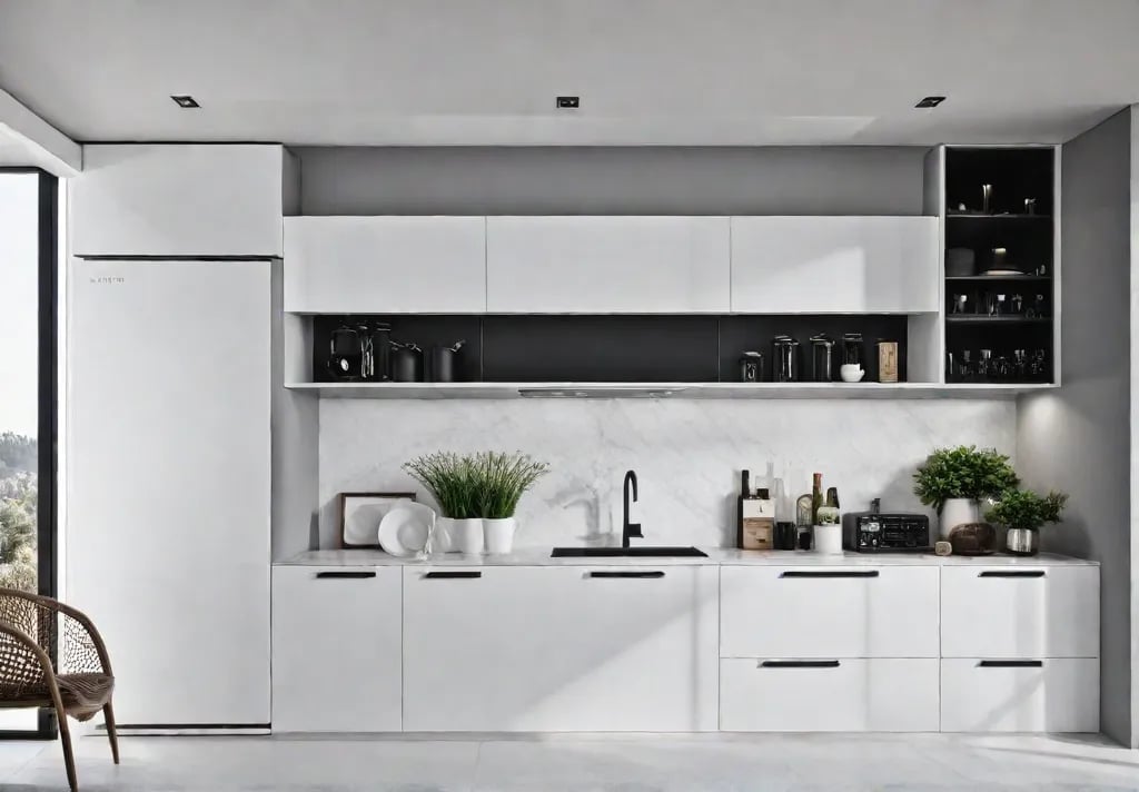
Let’s face it, New Yorkers: our kitchens are often more shoebox than chef’s paradise. But fear not, urban dwellers! It’s time to channel your inner Marie Kondo and embrace the art of minimalism. Trust me, it’s not just another fleeting trend – it’s a game-changer for small spaces.
Streamlined Storage Solutions
In the concrete jungle where square footage is as precious as a cab during rush hour, every inch counts. Here’s how to make your kitchen work smarter, not harder:
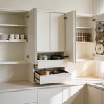
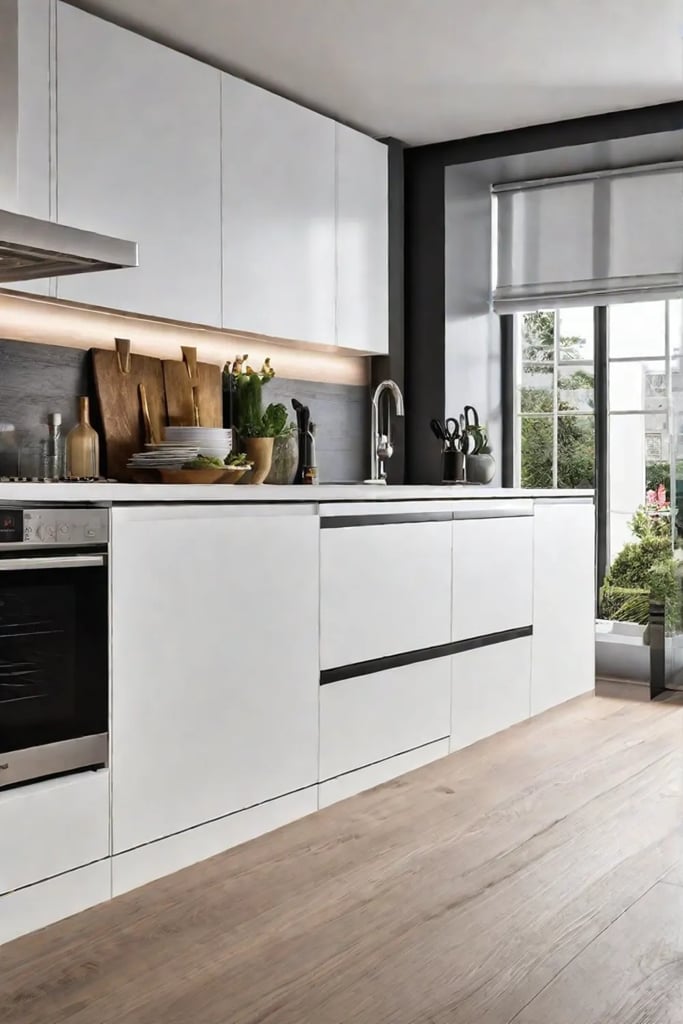
- Go handleless: Opt for push-to-open cabinets or sleek, integrated handles. It’s like Botox for your kitchen – smooth and wrinkle-free.
- Vertical virtuosity: Think upwards, not outwards. Install floor-to-ceiling cabinets or use that awkward space above the fridge for wine storage (because let’s be honest, we all need a drink after navigating the subway).
- Drawer dividers: These are the unsung heroes of kitchen organization. Suddenly, your utensil drawer isn’t a game of high-stakes Jenga anymore.
Pro tip: A clutter-free kitchen isn’t just easy on the eyes – it’s a stress-buster. Studies show that a tidy space can improve focus. So, that chaotic junk drawer? It might be the reason you can’t remember where you left your MetroCard.
The Power of a Monochromatic Palette
Now, let’s talk color – or rather, the lack thereof. A monochromatic scheme in your kitchen is like a well-tailored black suit: timeless, elegant, and makes everything look bigger (yes, even that galley kitchen in your fifth-floor walkup).
White, cream, or light gray are your new best friends. They reflect light, creating an illusion of space that’ll make your real estate agent do a double-take. But remember, monochromatic doesn’t mean boring:
- Add texture: Think glossy subway tiles, matte cabinet fronts, or a sleek marble countertop.
- Play with shades: Use different tones of the same color for depth and interest.
- Accent wisely: A pop of color in your accessories can be as refreshing as finding a $20 bill in your winter coat.
The result? A kitchen that feels as spacious and airy as Central Park on a crisp autumn morning.
Remember, minimalism isn’t about deprivation – it’s about curating your space to include only what you love and what serves a purpose. It’s the Marie Kondo philosophy that meets New York’s practicality. By embracing this style, you’re not just designing a kitchen; you’re creating a sanctuary in the heart of the urban chaos.
As we move from the sleek and streamlined to the open and accessible, let’s explore how open shelving can take your small kitchen from cramped to capacious. Get ready to tear down those walls (or at least, those upper cabinets) as we dive into the world of “Open Shelving: Airy and Accessible.”
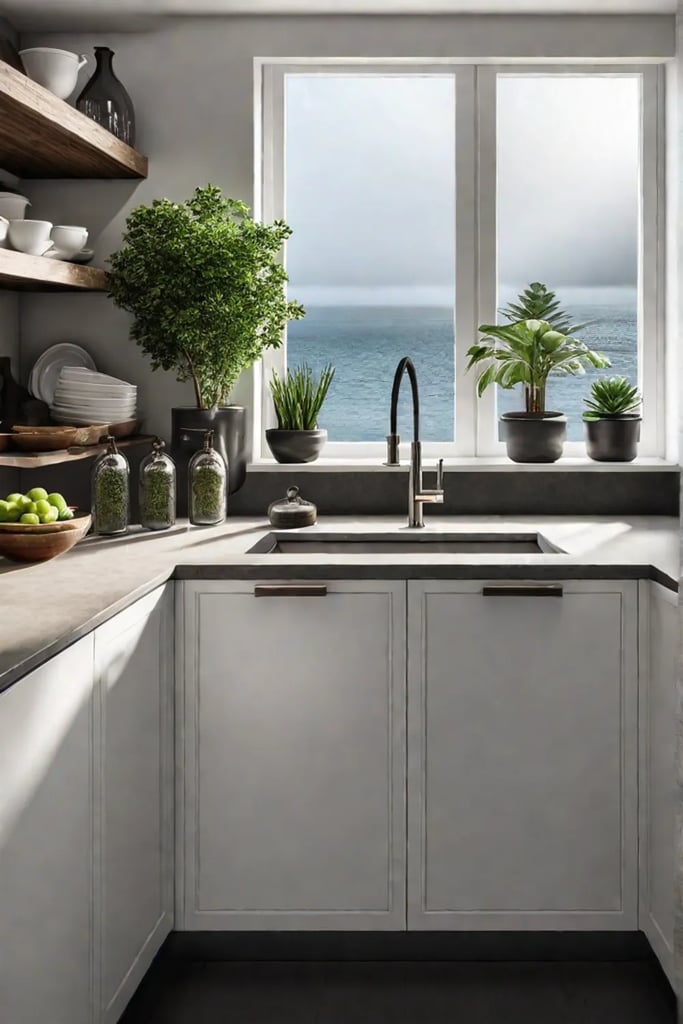
Open Shelving: Airy and Accessible
Open shelving is the urban dweller’s secret weapon for kitchen design. As a longtime city slicker, I’ve seen countless cramped kitchens transformed into airy, inviting spaces with this simple yet effective trick. Let’s dive into how you can make open shelving work in your compact culinary corner.
The Illusion of Space
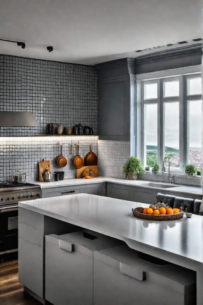
Open shelving is like a magic trick for small kitchens. It creates an optical illusion, making your space feel larger and more open. By removing bulky upper cabinets, you’re essentially pushing back the walls of your kitchen, allowing light to bounce freely and your eyes to travel further. It’s the design equivalent of taking a deep breath in a crowded subway car.
Styling Your Shelves for Maximum Impact
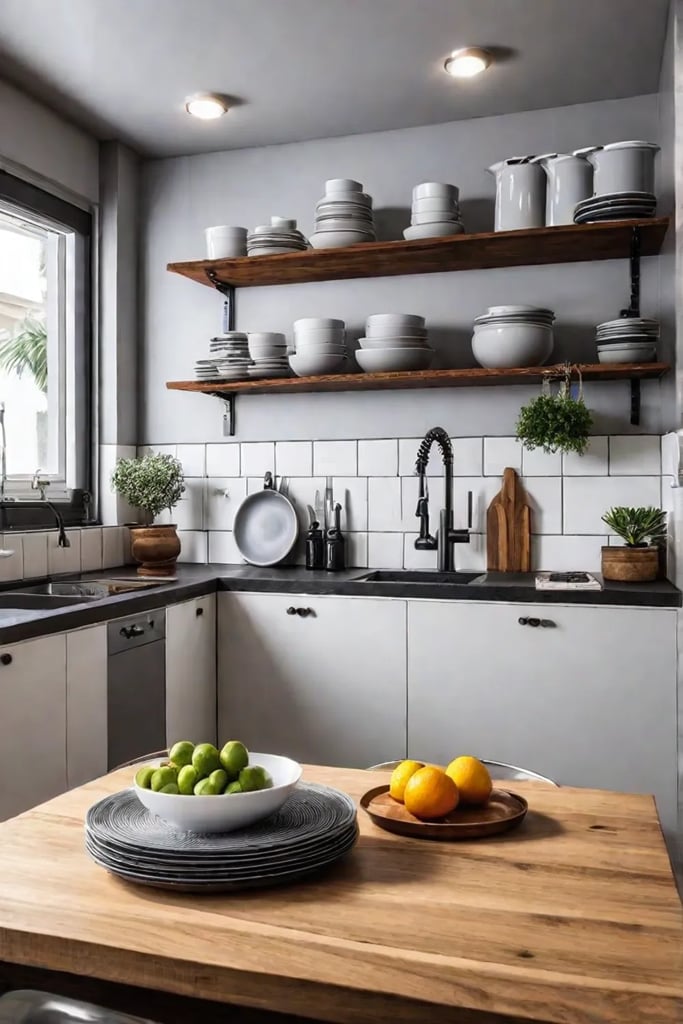
Now, let’s talk about turning those shelves into your gallery. Here’s how to curate your display:
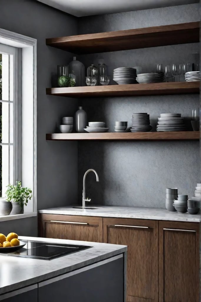
- Color coordinate: Arrange dishes by color for a visually striking look. It’s like creating your urban rainbow.
- Mix and match: Combine everyday items with decorative pieces. Think sleek coffee mugs next to that quirky ceramic vase you picked up at the Brooklyn Flea.
- Go green: Add small potted herbs or succulents. It’s a nod to sustainability and adds a touch of nature to your urban oasis.
- Play with height: Vary the height of your items to create visual interest. Stack plates, stand up cutting boards, and let taller items like pitchers or wine bottles stand proud.
Balancing Open and Closed Storage
While open shelving is fantastic, even New Yorkers need a place to hide their takeout containers. The key is balance:
- Keep frequently used items on open shelves for easy access.
- Use closed cabinets below counters for less attractive essentials.
- Invest in stylish baskets or containers for open shelves to corral smaller items and reduce visual clutter.
Materials Matter
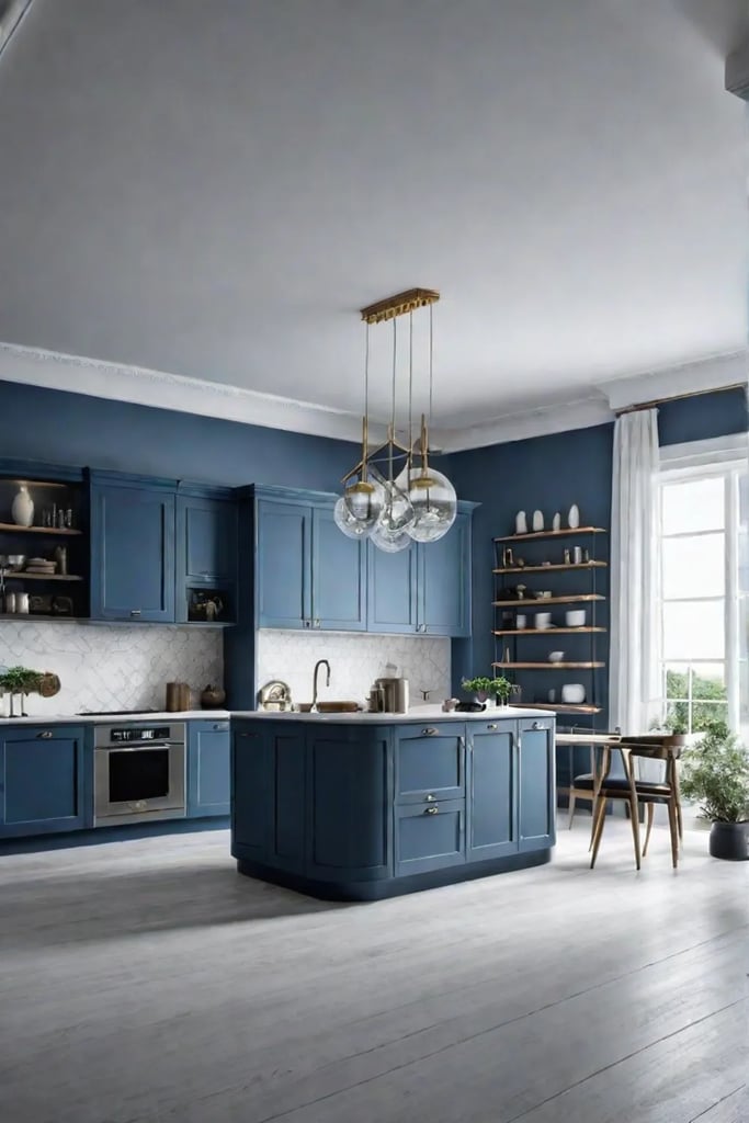
In the world of open shelving, materials can make or break your design. Here are some NYC-approved options:
- Industrial chic: Metal shelving for that converted warehouse loft vibe.
- Warm and inviting: Reclaimed wood for a touch of Brooklyn brownstone charm.
- Sleek and modern: Glass or acrylic shelves for that Manhattan high-rise feel.
Keeping It Clean (Literally and Visually)
Let’s address the elephant in the room – dust. Open shelving means your dishes are on display, including any dust they might collect. But fear not fellow urbanites. This setup encourages tidiness. When everything is visible, you’re more likely to keep things clean and organized. It’s like having your own curated museum display – you wouldn’t let the MoMA get dusty, would you?
To prevent your shelves from looking like a chaotic bodega display:
- Adopt a minimalist approach. Less is more, just like in a chic SoHo boutique.
- Rotate your display seasonally. Think of it as your kitchen’s fashion week.
- Keep everyday items at eye level and less-used pieces up high.
- Stick to a cohesive color scheme or theme. It’s like coordinating your outfit – everything should work together.
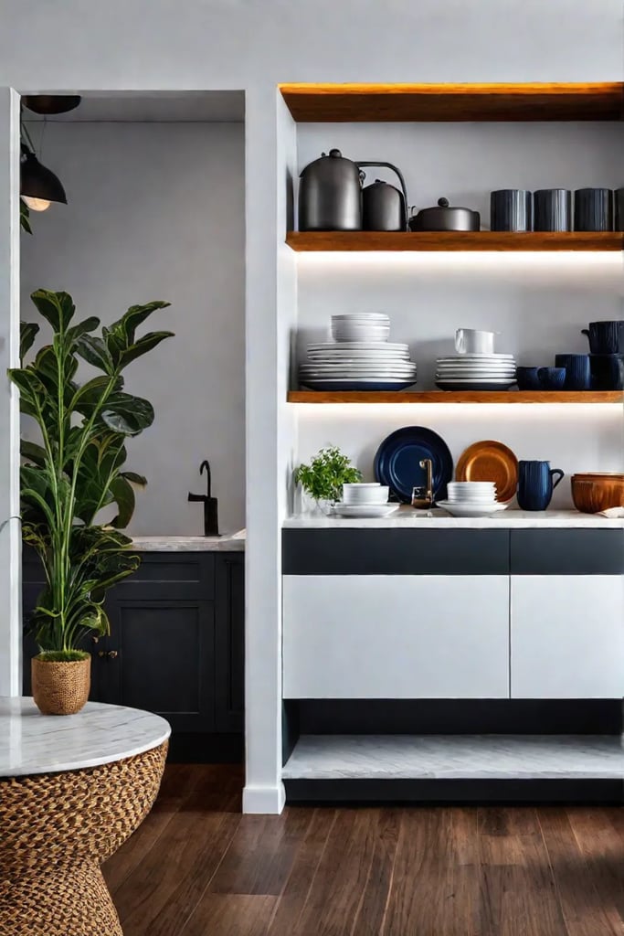
Open shelving is more than just a storage solution; it’s a statement about your lifestyle. It says you’re organized, you’ve got style, and you’re not afraid to put it on display. It’s the kitchen equivalent of the New York attitude – confident, a little bit bold, and always ready for impromptu entertaining.
As we move from the airy openness of shelving to our next design trend, get ready to focus on a feature that can truly illuminate your space. Let’s shine a light on how the right fixtures can transform your kitchen from functional to fabulous in our next section, “Statement Lighting: Shine Bright.”
Statement Lighting: Shine Bright
When it comes to lighting, my fellow urbanites, we’re not just talking about illumination – we’re talking about transformation. Let’s dive into how the right lighting can turn your cramped cooking corner into a beacon of style and functionality.
Choosing the Right Fixture for Your Space
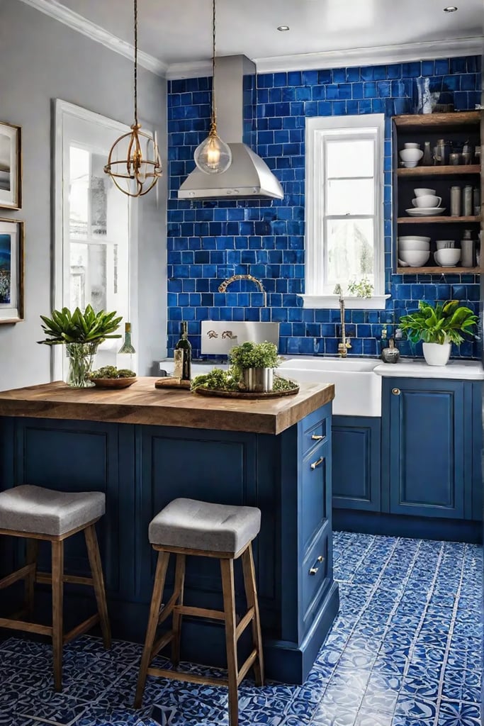
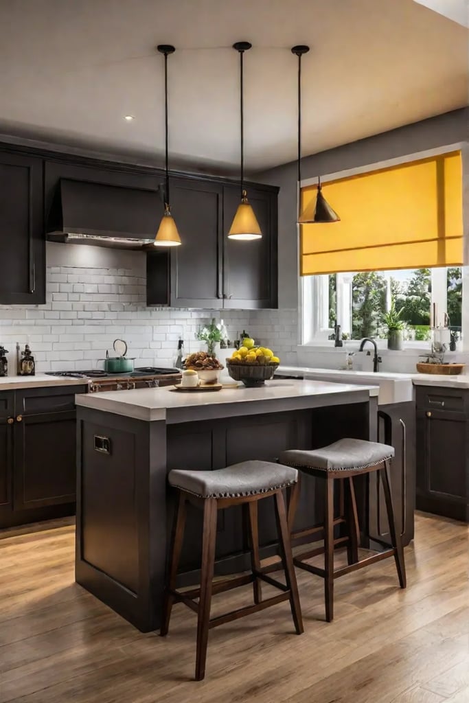
Listen up, city dwellers: your kitchen lighting isn’t just about seeing what you’re chopping. It’s about making a statement. Pendant lights are having a moment, and for good reason. Hang a sleek, modern pendant over your kitchen island, and boom – you’ve got an instant focal point that screams “I’ve got style, and I know how to use it.”
But don’t stop there. Consider these trendy options:
- Geometric chandeliers for a touch of industrial chic
- Vintage-inspired Edison bulbs for that Brooklyn loft vibe
- Minimalist LED strips for the tech-savvy cook
Remember, in a small kitchen, your lighting fixture is like that one designer piece in your wardrobe – it needs to work hard and look good doing it.
Layering Lighting for Functionality and Ambiance
Here’s a pro tip from someone who’s seen more tiny NYC kitchens than he cares to admit: layering is key. Just like you layer your clothes for that perfect street-to-office look, you need to layer your kitchen lighting. Here’s how:
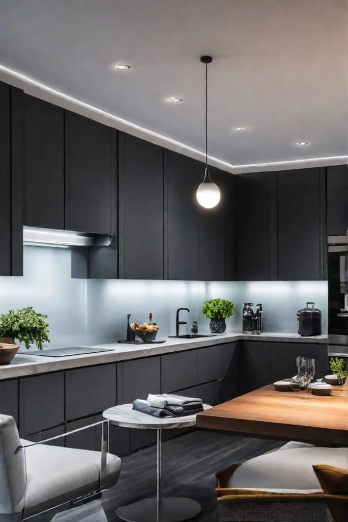
- Task lighting: Under-cabinet LEDs to illuminate your workspace
- Ambient lighting: Recessed lights or a central fixture for overall brightness
- Accent lighting: A well-placed sconce or two to highlight your best features (the kitchen’s, not yours)
And for the love of all things urban, install dimmer switches. They’re the lighting equivalent of noise-canceling headphones – essential for adjusting to the ever-changing moods of city life.
Zoning with Light
In a small kitchen, every square inch counts. Use lighting to create distinct zones without putting up walls:
- A pendant light over the dining area creates an intimate dinner spot
- Track lighting aimed at open shelving showcases your curated collection of artisanal hot sauces
- A statement fixture over the sink turns dish duty into a spotlight moment
The Latest in Kitchen Illumination
What’s hot in kitchen lighting right now? I’m glad you asked. Here’s what’s lighting up the scene in the city that never sleeps:
- Smart lighting systems that sync with your circadian rhythm
- Colorful glass pendants for a pop of personality
- Oversized fixtures that make small spaces feel grand
- Matte black finishes for an edgy, contemporary look
Remember, New Yorkers, the right lighting can make your kitchen feel larger. It’s like a magic trick, minus the smoke and mirrors (although a strategically placed mirror can work wonders too).
As we dim the lights on this illuminating topic, let’s shift our focus to another element that can make your small kitchen pop. Get ready to splash some personality onto your walls, because we’re about to dive into the world of bold backsplashes. These focal points are about to turn your kitchen from basic to breathtaking faster than you can say “subway tile.”
Bold Backsplashes: A Focal Point for Small Kitchens
Who says compact can’t be chic? Let’s dive into one of the hottest trends that are transforming tiny cooking spaces into style powerhouses: bold backsplashes.
Exploring Different Backsplash Materials
When it comes to making a statement in your pint-sized kitchen, the backsplash is your canvas. Here’s the scoop on materials that pack a punch:
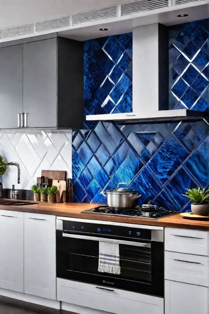
- Glass tiles: Sleek, reflective, and easy to clean – perfect for the urban dweller.
- Mirrored backsplash: A game-changer for small spaces, creating an illusion of depth and bouncing light around the room.
- Reclaimed wood: For that coveted Brooklyn loft vibe, without the Brooklyn loft price tag.
- Exposed brick: Channel your inner SoHo artist with this timeless look.
Pro tip: For the eco-conscious New Yorker, consider recycled glass tiles. They’re sustainable, stylish, and conversation starters at your next dinner party.
Creating Visual Interest with Patterns and Textures
Who needs a big kitchen when you’ve got a big personality? Here’s how to make your backsplash the star of the show:
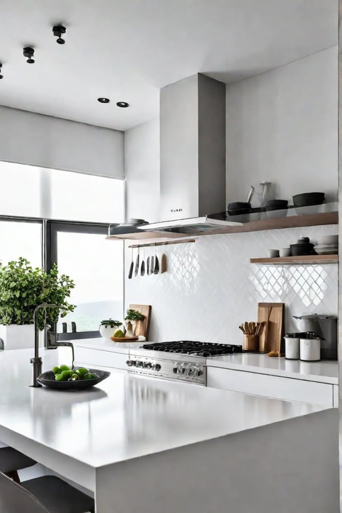
- Geometric patterns: Think bold hexagons or herringbone layouts for a modern edge.
- Mosaic magic: Create a mini masterpiece with colorful tiles that reflect your vibrant city life.
- Textured tiles: Add depth with 3D tiles that catch the light (and the eye) of your guests.
Remember, in a small kitchen, your backsplash isn’t just functional – it’s the focal point that ties the whole room together.
Durability Meets Style: Practical Choices for City Living
Let’s face it, New Yorkers: between the constant hustle and the occasional kitchen dance party, your backsplash needs to withstand some wear and tear. Here are some options that can handle the heat:
- Porcelain tiles: Tough as nails and available in endless designs.
- Stainless steel: Industrial chic that can take a beating.
- Quartz: Elegant, durable, and resistant to stains – perfect for those red wine spills.
Making a Bold Statement Without Overwhelming the Space
The key to a show-stopping backsplash in a small kitchen? Balance. Here’s how to go bold without going overboard:
- Limit your bold backsplash to a specific area, like behind the stove.
- Pair a vibrant backsplash with neutral cabinets and countertops.
- Use large-format tiles to create a sleek look that doesn’t overwhelm the space.
Remember, it’s all about creating that wow factor without making your kitchen feel claustrophobic. Think of it as curating an art gallery in your own home – every piece should have room to shine.
As we wrap up our backsplash bonanza, let’s turn our attention to another crucial element in small kitchen design. Just as a bold backsplash can transform your space, the right color palette can create depth and dimension, making your compact kitchen feel like a TARDIS – bigger on the inside. In our next section, “Color Palettes: Creating Depth and Dimension,” we’ll explore how to use hues to your advantage in tight quarters.
Color Palettes: Creating Depth and Dimension
As an urban dweller who’s seen more cramped kitchens than I care to count, I can tell you that color is your secret weapon in the battle against claustrophobia. Let’s dive into how you can use hues to your advantage, making your kitchen feel like it’s had a spatial growth spurt overnight.
Light and Airy Color Schemes
When it comes to small kitchens, going light and bright is like giving your space a shot of espresso – it instantly perks things up. White, cream, and pastel shades are your best friends here. They reflect light, making your kitchen feel more open and inviting. But don’t think you’re limited to boring beige:
- Soft blues can create a sense of calm, perfect for those hectic morning rushes
- Pale greens bring a touch of nature indoors, ideal for city dwellers craving a connection to the outdoors
- Light grays offer a modern, sophisticated look without closing in the space
Pro tip: Paint your ceiling the same color as your walls to create an illusion of height. It’s like giving your kitchen a facelift without the hefty price tag.
Bold and Dramatic Color Choices
Now, for those of you who think neutrals are a snooze fest, fear not. You can still go bold in a small kitchen – it’s all about balance. Dark hues, when used strategically, can add depth and drama to your space. Here’s how to pull it off:
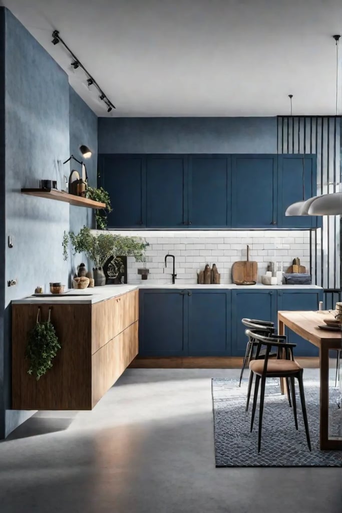
- Consider painting lower cabinets in a deep navy or emerald green, while keeping upper cabinets light
- Use a dark color on a feature wall to create a focal point and add dimension
- Incorporate bold colors through accessories like bar stools, artwork, or even a vibrant rug
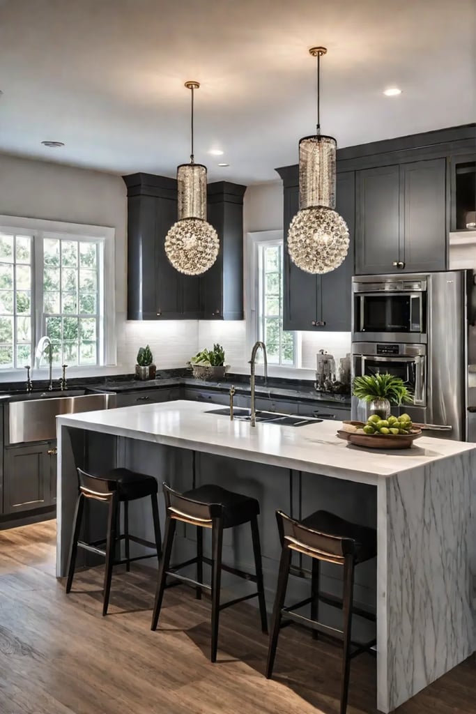
Remember, it’s all about creating contrast. A pop of color against a neutral backdrop can be just as impactful as an all-out color explosion.
Creating Mood and Atmosphere
Colors aren’t just about aesthetics – they can influence your mood. Want to feel energized while you’re whipping up your morning smoothie? Incorporate warm yellows or oranges. Craving a zen vibe for your after-work cooking sessions? Cool blues and greens can help you unwind.
Here’s a quick mood guide:
- Red: Stimulates appetite (use sparingly unless you want to constantly raid the fridge)
- Blue: Promotes calm and relaxation
- Yellow: Boosts energy and happiness
- Green: Encourages balance and harmony
Practical Tips for Choosing Your Palette
- Consider your lighting: Natural light? Fluorescent? LED? Your light source will affect how colors appear.
- Test before committing: Paint swatches on your wall and observe them at different times of the day.
- Think about your style: Are you a minimalist? Eclectic? Choose colors that complement your overall aesthetic.
- Don’t forget about finishes: Glossy finishes can reflect light and make a space feel larger.
Remember, there’s no one-size-fits-all solution. The best color palette for your small kitchen is one that makes you feel at home and inspired to cook up a storm – even if that storm is confined to a tiny urban galley.
As we wrap up our color conversation, let’s turn our attention to the grand finale. In our conclusion, we’ll tie together all the design trends we’ve explored, giving you a roadmap to transform your small kitchen into a style powerhouse. Get ready to put these ideas into action and create a space that’s as vibrant and dynamic as the city itself.
Conclusion
There you have it, folks – nine game-changing design trends to turn your pint-sized kitchen into a powerhouse of style and functionality. From embracing minimalism to making bold color choices, we’ve covered all the bases to help you create a space that’s as fabulous as it is functional. Remember, in a city that never sleeps, your kitchen should be working just as hard as you do.
As you embark on your kitchen transformation journey, keep in mind that it’s not about the size of the space, but how you use it. Whether you’re whipping up a gourmet meal or just reheating last night’s takeout, these design tips will ensure your kitchen is always ready for its close-up. So go ahead, channel your inner New York attitude, and give your kitchen the makeover it deserves. After all, if you can make it here, you can make it anywhere – and that goes for killer kitchen design too!
