Picture this: you’ve spent weeks, maybe months, picking the perfect cabinet color. You’ve held that tiny paint chip up to the light a hundred times. The painters finish, you walk in, and… it’s wrong. The sophisticated gray you chose looks weirdly purple. The warm white feels sterile and cold. Your stomach drops. I’ve seen this happen more times than I can count. As an architectural photographer, my job was to understand light—how it behaves, how it changes, how it lies. And the biggest lie in the design industry is that a color on a chip will look the same on your cabinets.
So you asked me for some real talk on kitchen cabinet color ideas. Forget the corporate blog posts. This is the stuff that actually matters—the stuff that separates a good-enough DIY job from a professional, jaw-dropping kitchen. We’ll talk about color, sure, but more importantly, we’ll talk about how to make that color work in the real world. We’ll cover the non-negotiable prep work, the subtle details that make a design look expensive, and the shortcuts I wish I’d known 15 years ago.
Let’s get this right from the ground up.
Laying the Groundwork: Planning Your Cabinet Color Transformation (Part 1)
Before you even think about a specific color, we need to do some detective work. This part is what I call “reading the room.” It’s about understanding the existing conditions of your space so you’re making an informed choice, not a blind guess. Get this right, and the rest is easy.
1. Assess Existing Kitchen Lighting and Natural Light Exposure
This is, without a doubt, the most important step. As a photographer, I can tell you that light is color. A paint color doesn’t exist on its own; it’s a reflection of the light that hits it. A north-facing kitchen gets cool, indirect light all day, which will bring out the blue and green undertones in paint. A south-facing kitchen gets warm, intense light, which will amplify reds and yellows. And that’s before we even talk about your lightbulbs, which can cast a warm (yellow) or cool (blue) hue on everything.
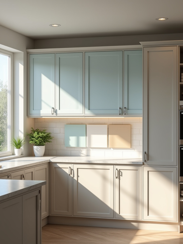
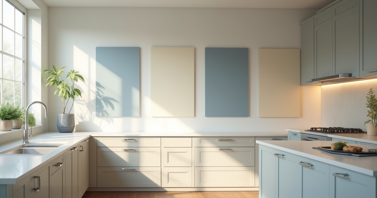
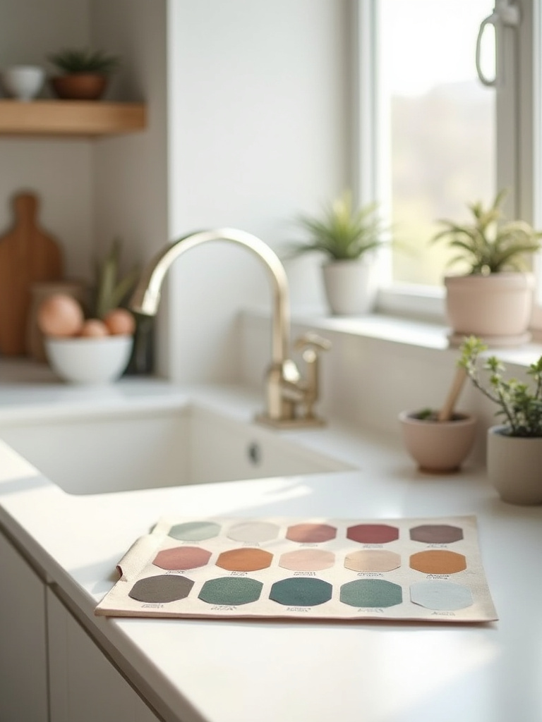
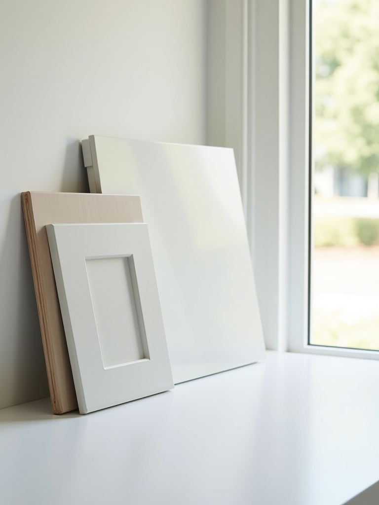
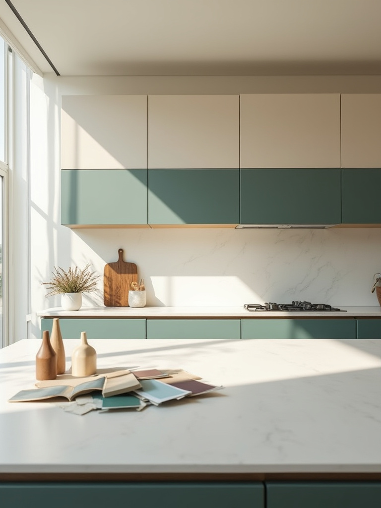
I once watched a client’s beautiful, neutral light gray cabinets turn faintly lavender every afternoon. Why? Their west-facing window cast a warm, reddish light that mixed with the cool blue undertone in the gray paint, creating a purple hue. To avoid this disaster, you have to test colors in your actual kitchen. Get large sample boards (at least 12″x12″) and watch them in the morning, at noon, in the afternoon, and at night with the lights on. It’s the only way to see the color’s true character.
Now that we know how light shapes color, let’s talk about the permanent features in your kitchen that your new color has to live with.
2. Analyze Your Kitchen’s Current Architecture and Overall Style
Your kitchen isn’t a blank canvas. You have “design constants”—the flooring, countertops, and backsplash that are expensive and difficult to change. These elements have their own colors and, crucially, their own undertones. Your new cabinet color must get along with them. I’ve seen homeowners fall in love with a cool, crisp gray cabinet color, only to install it in a kitchen with warm, honey-oak floors and a beige granite countertop with brown flecks. The result is a jarring clash that feels off, even if you can’t put your finger on why.
So, here’s your shortcut: take high-quality photos of your floor, countertop, and backsplash. Better yet, get physical samples if you can. Create a “mood board” of these fixed elements before you even look at cabinet colors. This becomes your reference guide. Every potential cabinet color must be held up against this board to see if it complements the existing family of colors. Your home’s style—be it modern, craftsman, or traditional—also provides guardrails that help narrow down your choices.
With the technicals covered, it’s time to factor in the most important piece of the puzzle: you.
3. Identify Personal Color Preferences and Desired Kitchen Mood
The technicals are about avoiding mistakes, but this step is about creating a space you actually love. The question isn’t “what color is in style?” The real question is, “How do you want to feel in your kitchen?” Do you want it to feel calm and serene, like a quiet retreat? Then you might lean toward soft greens, muted blues, or earthy greiges. Do you want it to be an energetic, happy hub for the family? Maybe a sunny yellow or a vibrant teal on an island is the way to go.
Forget trends for a second and look in your closet or at the art you own. What colors are you naturally drawn to? These are your colors. Color psychology is real; cool tones tend to recede and calm, while warm tones advance and energize. Your kitchen’s mood is set by the color you choose. This is where you bring your personality into the project, ensuring the final result feels like your home, not a page from a catalog.
Of course, your personal taste still has to operate in the real world, which brings us to the balancing act between what’s trendy and what’s timeless.
4. Research Trending Cabinet Colors and Timeless Design Options
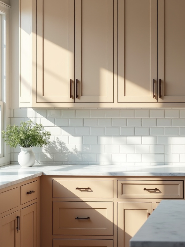
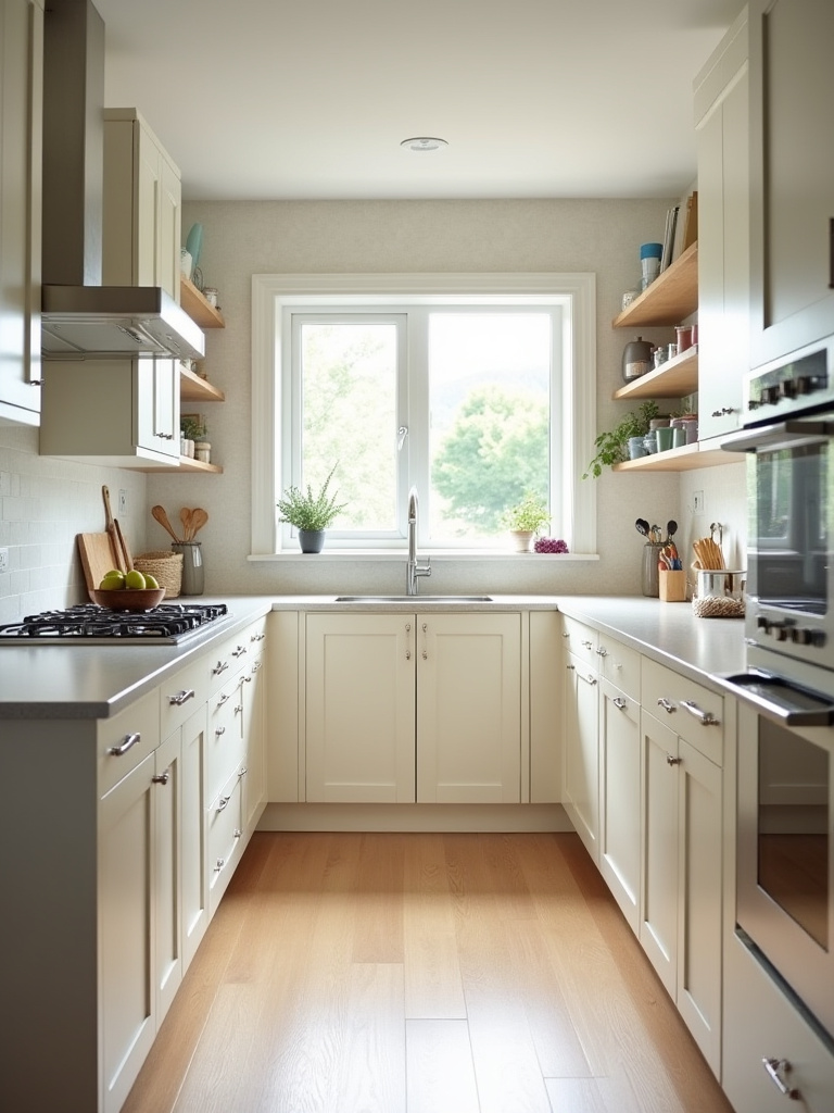
Everyone wants a kitchen that feels current, but nobody wants one that feels dated in five years. This is the great balancing act of design. The key is to understand that you can have both. Timeless choices—like classic white, off-white, light gray, and natural wood—provide a versatile and long-lasting foundation. They have broad appeal, which is great for resale value, and they won’t feel obsolete quickly.
But trends are fun, and they can add personality. Right now, we’re seeing a lot of deep greens, sophisticated navy blues, and warm, earthy tones like terracotta and mushroom. Here’s the shortcut everyone should know: if you love a trendy color, don’t commit your entire kitchen to it. Instead, use it strategically. Paint the kitchen island the trendy color. Use it on a small section of cabinets, like a butler’s pantry. This gives you a huge dose of style without the risk. It’s much cheaper and easier to repaint an island in five years than to redo an entire kitchen.
Now, let’s get into the nitty-gritty of color theory to ensure whichever direction you go, it looks professionally executed.
Laying the Groundwork: Planning Your Cabinet Color Transformation (Part 2)
We’ve covered the big-picture stuff. Now we’re getting into the details that professional designers obsess over. Getting these right will elevate your project from good to great.
5. Understand the Nuance of Color Undertones for Perfect Pairing
If there’s one secret that separates amateurs from pros, it’s a deep understanding of undertones. The undertone is the subtle color lurking behind your main color. That “greige” might have a pink undertone, that “off-white” might have a yellow one, and that “gray” might have a blue or even a purple one. These undertones are what cause colors to clash. If you pair a paint with a green undertone next to a countertop with a pink undertone, your space will feel chaotic and jarring.
Here’s how to see them: grab a sample of your potential cabinet color and place it on a piece of pure white paper. The white background will help your eye detect the subtle hue underneath. Do the same with your countertop, flooring, and backsplash samples. The goal is to choose a cabinet color with an undertone that is in the same family as your fixed elements. If your countertop has warm, creamy veins, you need a white with a warm, creamy undertone—not a stark, cool white. Mastering this is the key to a harmonious, cohesive kitchen.
Once you’ve got a handle on undertones, it’s time to confirm your choice in the real world.
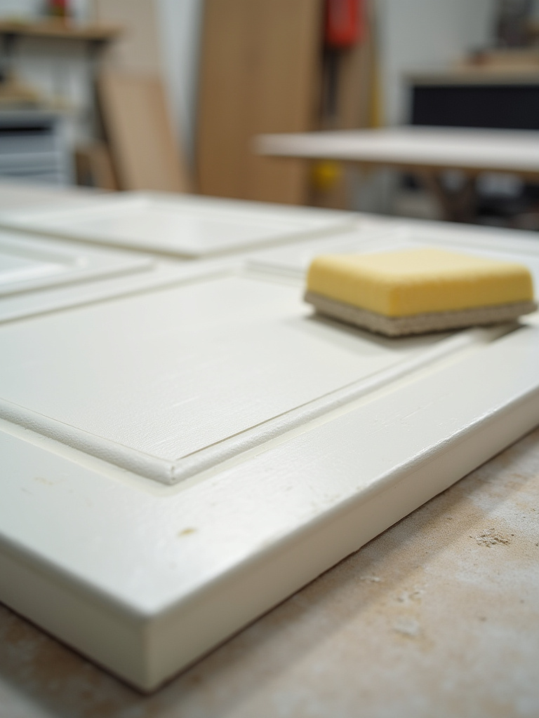
6. Test Large Color Swatches on Cabinets in Varying Light Conditions
I know I’ve mentioned this before, but it’s so critical it deserves its own step. The tiny 2-inch paint chip is a lie. It’s a suggestion of a color, not the color itself. On a large surface like a bank of cabinets, that color will intensify and its undertones will become much more prominent. You absolutely must test a large sample before you commit.
Don’t paint swatches directly on your cabinets, as the existing color will influence how you perceive the new one. Instead, get a couple of large foam boards or pieces of cardboard from a craft store. Paint your top two or three color choices on these boards (two coats!). Then, use painter’s tape to move them around your kitchen over a 48-hour period. Place one next to a window, one in a dark corner, one next to your backsplash, and look at them at all times of the day and night. This is the only way to be 100% sure you’ll love the color once it’s everywhere.
With the planning phase complete, let’s move on to the practical decisions that bring it all to life.
Mastering Selection and Application: Bringing Your Vision to Life (Part 1)
This is where the vision starts to become a reality. We’re moving from theory to tangible choices about finishes, materials, and color combinations.
7. Choose the Optimal Cabinet Finish for Durability and Aesthetics
The finish—or sheen—of your paint is just as important as the color. It affects how the color looks, how easy it is to clean, and how durable it is. For kitchen cabinets, which take a beating, you need durability above all else. Avoid matte or eggshell finishes; they look lovely but are difficult to clean and will show every scuff and fingerprint. Your best bets are satin or semi-gloss.
A satin finish offers a soft, subtle glow that’s durable and easy to wipe down. It’s very forgiving and hides minor imperfections well. A semi-gloss finish has more shine, which makes it incredibly durable and scrubbable, but it will also highlight any dings, dents, or unevenness in the cabinet surface. My general rule of thumb is to use satin for a sophisticated, modern look and semi-gloss for high-traffic, traditional kitchens where ultimate cleanability is the priority.
The finish choice goes hand-in-hand with selecting the other major surfaces in your kitchen.
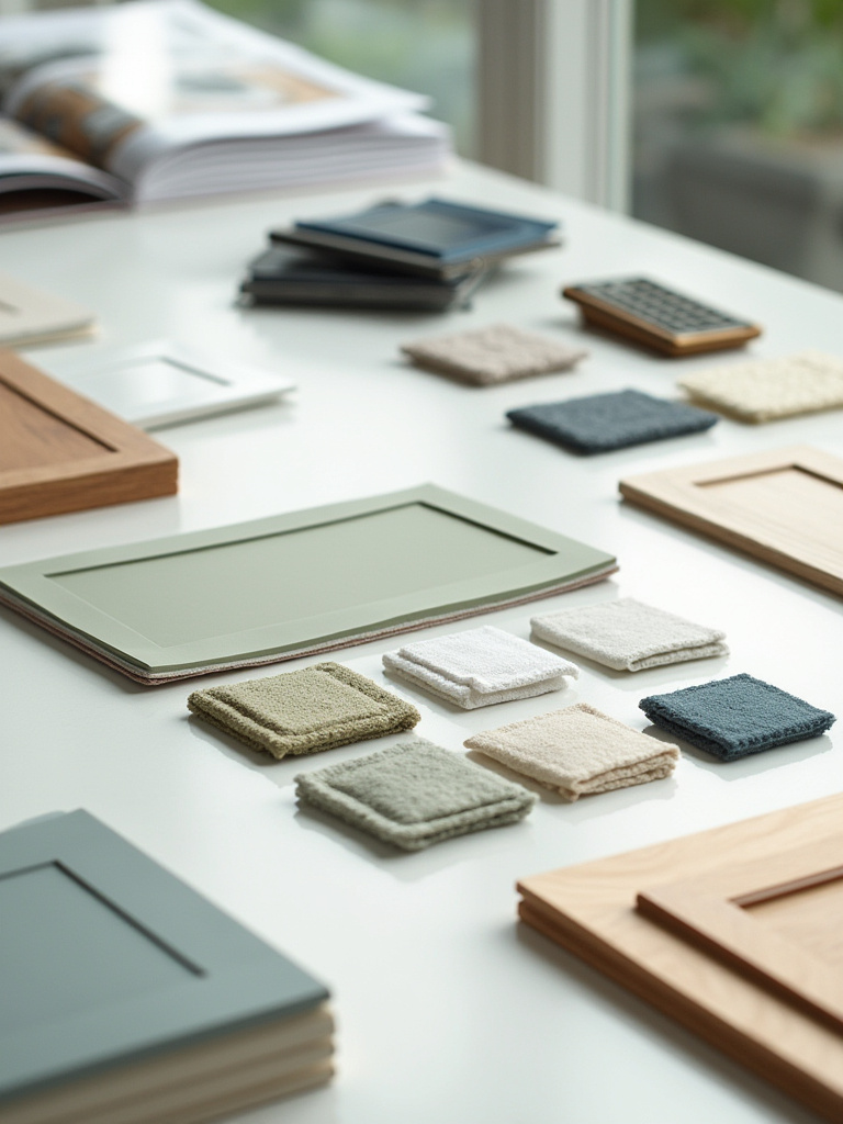
8. Select Harmonizing Countertop and Backsplash Color Schemes
Your cabinets, countertops, and backsplash form the visual core of your kitchen. They have to work together as a team. Typically, one of these elements should be the “star,” while the other two play supporting roles. If you choose a bold cabinet color, opt for a quieter countertop and backsplash so they don’t compete for attention. If you have a dramatic, heavily-veined countertop, let that be the focal point and choose a more subdued cabinet color and simple backsplash.
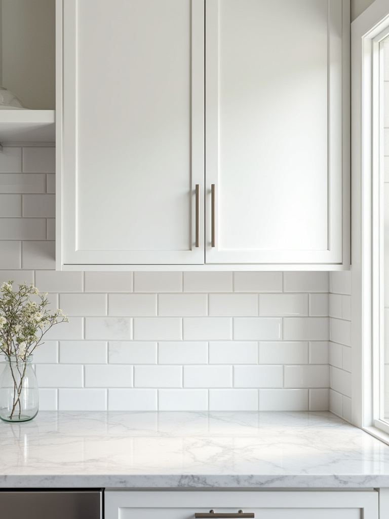
When making selections, bring samples of all three materials together. A countertop that looks great in the showroom under fluorescent lights might have weird undertones in your kitchen next to your cabinet choice. The key is harmony, not necessarily matching. A common professional strategy is to pull a subtle color from the veining in the countertop and use a version of that for the cabinet color. This creates a cohesive, custom look without being too obvious.
Next, let’s build on this idea of harmony by defining the overarching color strategy for your space.
9. Decide Between Monochromatic, Complementary, or Analogous Palettes
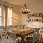
This sounds technical, but it’s actually pretty simple. You’re just deciding on the relationship between your colors. A monochromatic palette uses different shades of the same color (e.g., dark green lowers, light green uppers, off-white walls). This creates a very serene, sophisticated look. An analogous palette uses colors that are next to each other on the color wheel (e.g., blue cabinets, green backsplash, and hints of teal). This is harmonious and pleasing to the eye.
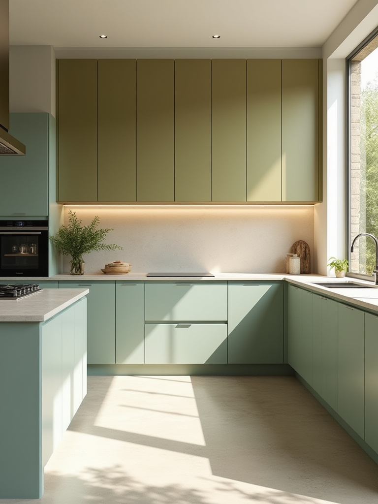
A complementary palette uses colors opposite each other on the color wheel (e.g., blue cabinets with orange-toned wood accents). This creates high contrast and energy. There’s no right or wrong answer, but deciding on a strategy will make all your other choices easier. It provides a clear roadmap and ensures your kitchen feels intentional and thoughtfully designed, not like a random collection of things you liked on Pinterest.
One of the most popular ways to apply these palettes is with a two-tone scheme.
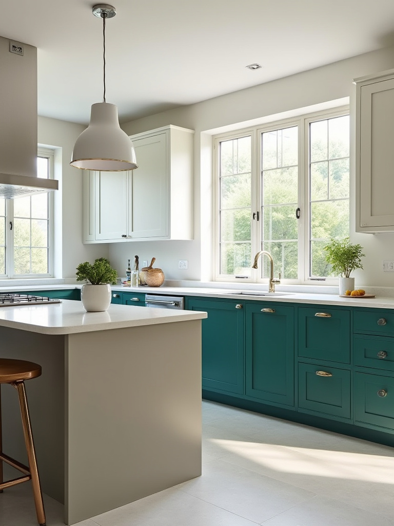
10. Explore Striking Two-Tone Cabinetry Combinations for Depth
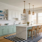
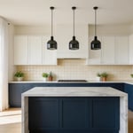
The two-tone kitchen is incredibly popular for good reason: it adds instant depth, character, and visual interest. The most common—and foolproof—approach is to use a darker color for the lower cabinets and a lighter color for the uppers. This grounds the space and makes the ceiling feel higher, preventing the room from feeling top-heavy. This is a fantastic strategy for smaller kitchens.
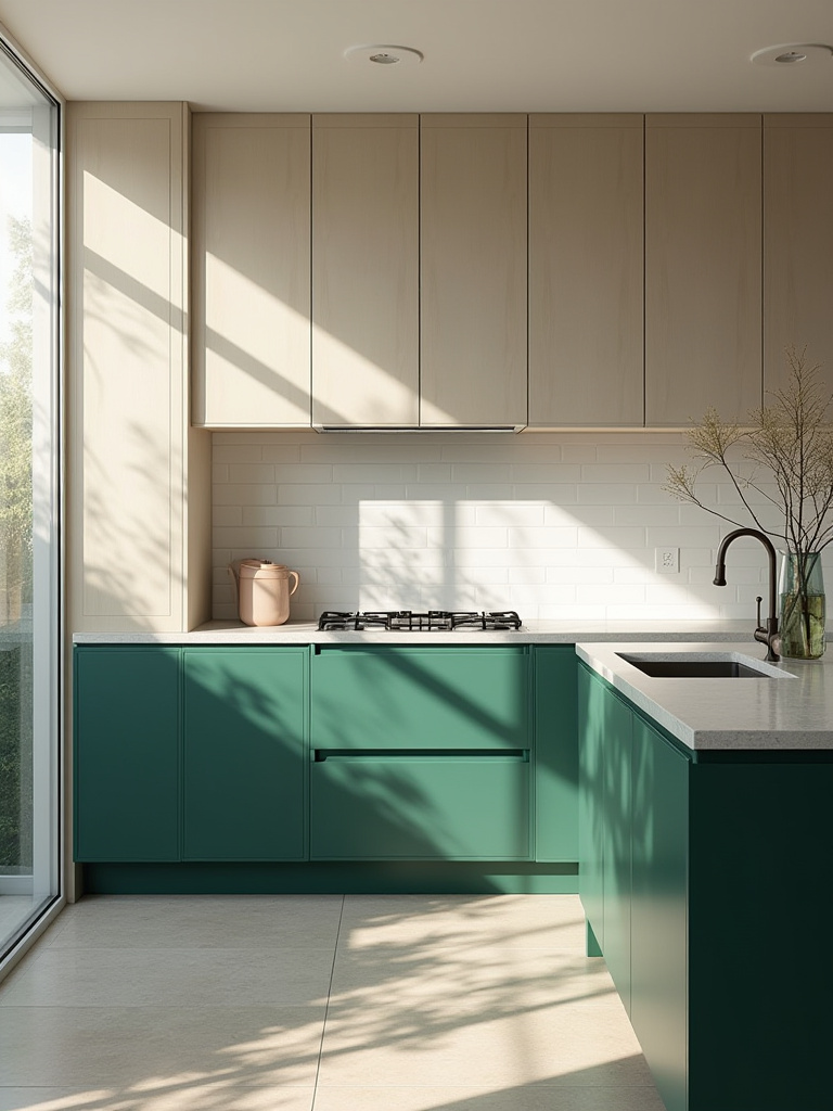
Another great option is to keep all the perimeter cabinets one color (often a light neutral) and then paint the island a bold, contrasting color. The island becomes the centerpiece, the jewel of the kitchen. This allows you to experiment with a daring color without committing it to the entire room. When choosing your two tones, make sure they share a common undertone to ensure they feel connected, even if they are high-contrast.
Now that we’ve decided on the colors, let’s discuss how to apply them for a finish that lasts.
Mastering Selection and Application: Bringing Your Vision to Life (Part 2)
All the planning in the world means nothing if the execution is sloppy. This section is about the hands-on work that ensures a durable, professional-looking finish.
11. Understand Surface Preparation for Flawless Paint Adhesion
Let me be blunt: prep is 90% of the job. You can buy the most expensive cabinet paint in the world, but if you put it on a poorly prepped surface, it will fail. It will chip, it will peel, and you will have wasted all your time and money. Do not cut corners here. Every single cabinet surface must be thoroughly cleaned with a degreaser (like TSP substitute), then rinsed, and then allowed to dry completely. Kitchens are greasy environments, and paint will not stick to grease.
Once clean and dry, every surface needs to be lightly sanded (scuff-sanded) with 180-220 grit sandpaper. The goal isn’t to remove the old finish, but to rough it up just enough to give the primer something to grip onto. This microscopic “tooth” is essential for adhesion. After sanding, vacuum all the dust and wipe every surface down with a tack cloth. Finally, use a high-quality bonding primer. This is the glue that holds your entire system together. Skipping any of these steps is a recipe for disaster.
With prep out of the way, you face a major decision: do you do this yourself, or hire a pro?
12. Evaluate Professional Painting Services Versus DIY Cabinet Refinishing
There is a huge difference between a professional cabinet finish and a typical DIY job. Professionals use spray equipment (usually an HVLP—High Volume Low Pressure—sprayer) in a controlled environment to apply multiple thin, even coats of industrial-grade paint. The result is a rock-hard, perfectly smooth, factory-like finish. You cannot replicate this with a brush and roller. You just can’t.
That said, you can get a very good DIY result if you are meticulous and patient. A high-density foam roller and a high-quality brush can yield a decent finish, but you will likely see some texture. For the ambitious DIYer, renting an HVLP sprayer is a game-changer. It has a learning curve, but it’s the key to a pro-level finish. So be honest with yourself about the quality you expect, the time you have, and your budget. Hiring a pro costs thousands, but it guarantees a durable, flawless result. DIY saves a ton of money, but it requires immense patience and the right tools.
Now for the fun part—adding the finishing touches that will elevate your newly painted cabinets.
Styling and Enhancements: Elevating Your Cabinetry Beyond Color (Part 1)
The paint is on, and it looks great. But the job isn’t done. The details are what make a kitchen feel truly custom and complete. This is like adding the right tie and shoes to a great suit.
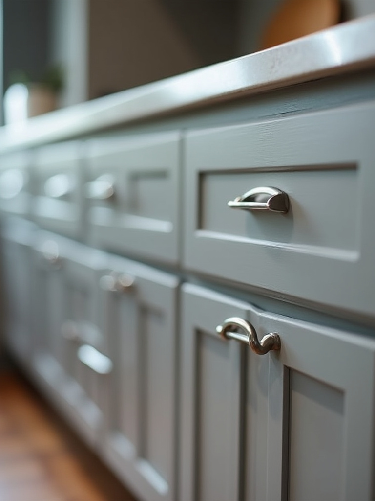
13. Integrate Hardware Finishes that Complement Cabinetry Hue
Hardware is the jewelry of the kitchen. It can completely change the vibe of your cabinets. The right hardware finish should complement the undertone of your cabinet color. For cool-toned cabinets (like a cool gray or a crisp white), silver-toned hardware like brushed nickel, polished chrome, or matte black looks fantastic. For warm-toned cabinets (like a creamy white or a warm greige), warmer metals like brass, champagne bronze, or oil-rubbed bronze are a natural fit.
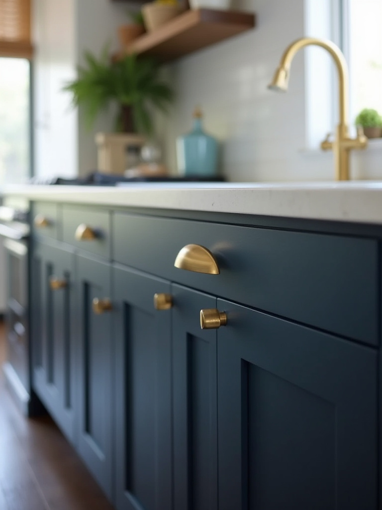
Don’t be afraid to mix metals, but do it with intention. A common strategy is to use one finish for your cabinet hardware and faucet, and another for your lighting fixtures. This creates a layered, sophisticated look. And always consider the scale. Dainty knobs can get lost on large pantry doors, and oversized pulls can overwhelm small drawers. Hold a sample of the hardware up to your painted cabinet door before you buy a full set.
The hardware needs to work in concert with the other colors in the room, starting with the walls.
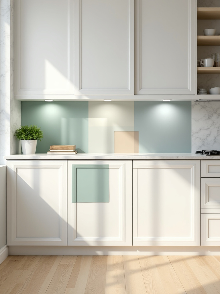
14. Coordinate Wall Paint to Accentuate Your Chosen Cabinet Color
The relationship between your cabinet color and your wall color is critical. If your cabinets are the star of the show—especially if you’ve chosen a bold color—the walls should be a quiet, neutral backdrop. The biggest mistake I see is people picking a wall color that competes with the cabinets. This makes the space feel busy and chaotic.
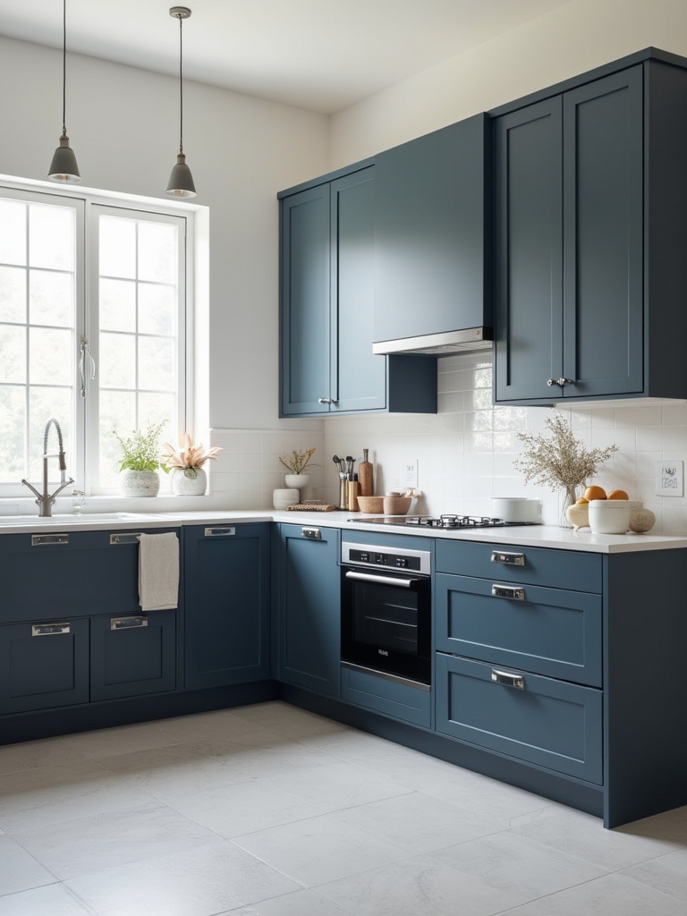
A safe and effective strategy is to choose a wall color that is a lighter shade of your cabinet color, or an off-white that shares the same undertone. For example, with sophisticated navy blue cabinets, a very light gray wall with a subtle blue undertone would be beautiful. This creates a cohesive, harmonious look where the cabinets are clearly the intended focal point. Always test wall paint samples next to your painted cabinet samples to ensure they play nicely together.
Now let’s talk about a design move that can break up the visual weight of all that color.
15. Utilize Open Shelving to Break Up Extensive Cabinet Runs Visually
A long, unbroken run of upper cabinets can feel heavy and monolithic, especially in a smaller kitchen. Introducing a section of open shelving is a fantastic way to break up that visual mass. It makes the kitchen feel more open, airy, and personalized. You can replace a single upper cabinet with a couple of shelves, often next to a window or the range hood.
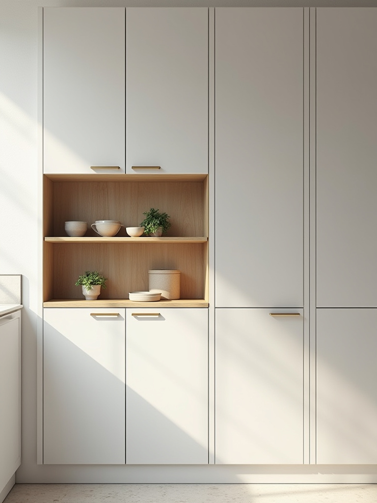
The key to successful open shelving is twofold. First, the shelf material should complement your overall design—warm wood for a farmhouse or transitional feel, metal for an industrial look, or painted the same color as the wall for a minimalist vibe. Second, you must curate what you display. Open shelving is not for your mismatched coffee mugs and Tupperware. It’s for your prettiest dishes, glassware, cookbooks, and a small plant or two. Keep it simple and styled to avoid a cluttered look.
For another way to add a personalized touch, let’s look inside the cabinets.
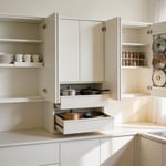
16. Add a Pop of Color with Interior Cabinet or Drawer Liners
This is one of my favorite high-impact, low-commitment design tricks. Adding a fun, unexpected pop of color or pattern to the inside of your cabinets or drawers is a delightful surprise every time you open them. It makes the kitchen feel custom and thoughtfully designed. This is a perfect place to use a bold color or a busy pattern that you love but wouldn’t want on your cabinet exteriors.
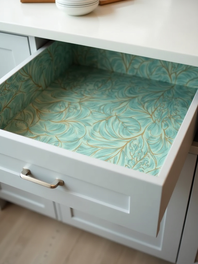
You can paint the inside of your cabinets a contrasting color, but an easier, less permanent solution is to use high-quality peel-and-stick wallpaper or drawer liners. This not only adds a dose of personality but also protects the cabinet surfaces. Imagine opening a classic white cabinet to find a vibrant floral or a sharp geometric pattern inside. It’s a small detail that brings a lot of joy to the everyday act of putting away dishes.
With the styling elements in place, let’s turn our attention to how we light them.
Styling and Enhancements: Elevating Your Cabinetry Beyond Color (Part 2)
We’ve built the foundation and added the stylish details. Now we illuminate it. Lighting is the final layer that brings everything together and makes your design shine.
17. Leverage Lighting Fixtures to Highlight Cabinet Color and Texture
Great lighting can make good design look spectacular. Bad lighting can make spectacular design look flat and uninviting. In the kitchen, you need layers of light. This includes ambient (overhead) lighting, task lighting (for workspaces), and accent lighting (to highlight features). Under-cabinet lighting is the single most effective way to elevate your kitchen. It’s both task lighting, illuminating your countertops, and accent lighting, making your cabinets and backsplash glow.
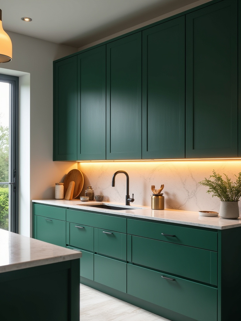
When you have beautiful new cabinets, you want to show them off. Puck lights inside glass-front cabinets can turn your dishware into a display. LED tape lighting installed on top of your cabinets can cast a beautiful, ambient glow toward the ceiling, making the room feel taller. The finish of your lighting fixtures should also tie in with your hardware for a cohesive look. Always choose bulbs with a high Color Rendering Index (CRI) of 90+ to ensure all the colors in your kitchen, especially your cabinet color, are rendered accurately.
Next, let’s pull all these accent pieces together into a unified whole.
18. Incorporate Decorative Elements that Tie Into Your Color Scheme
This is the final step in styling: pulling it all together. The decorative elements—your kitchen runner, window treatments, bar stools, canisters, and even your dish towels—should all speak the same language as your core color palette. You don’t need everything to match perfectly, but the pieces should feel connected.
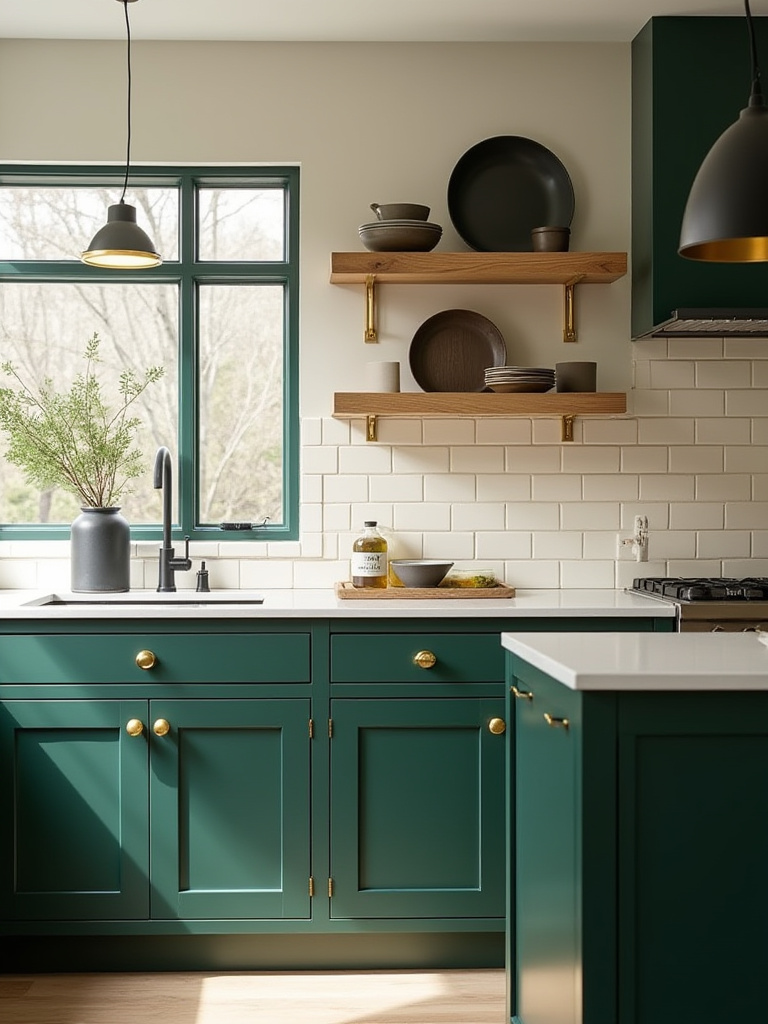
A great way to do this is to use your “accent” color from your palette. If you have navy cabinets (dominant color) and white countertops (secondary color), maybe you use touches of brass (accent color) in your hardware, your pendant lights, and even a small detail in the pattern of your roman shade. These repeated elements create a visual rhythm that guides the eye around the room and makes the entire space feel polished and complete.
Your kitchen is now complete. Let’s talk about how to keep it looking this good for years to come.
Maintenance and Futureproofing: Keeping Your Cabinet Colors Vibrant (Part 1)
You’ve put in the work, and your kitchen looks incredible. Now we need to protect that investment. Smart choices and simple routines will keep your cabinet colors looking fresh and vibrant.
19. Understand Paint Durability and Choose Chip-Resistant Formulas
The single best thing you can do for maintenance is to use the right paint in the first place. Do not use standard wall paint on your cabinets. It’s not designed to withstand the constant touching, bumping, and cleaning that kitchen cabinets endure. You need a paint specifically formulated for cabinets and trim.
Look for products labeled as an “acrylic-alkyd hybrid” or a “urethane enamel.” These paints are self-leveling (which helps minimize brush marks) and cure to a very hard, durable finish that resists chipping and scratching. Brands like Benjamin Moore Advance and Sherwin-Williams Emerald Urethane Trim Enamel are industry standards for a reason. They cost more than wall paint, but they are absolutely worth it for the longevity you’ll get.
With the right product chosen, daily care is the next line of defense.
20. Implement Proper Cleaning Techniques to Preserve Cabinet Finish
The enemy of a good cabinet finish is grease and abrasive cleaners. Wipe down your cabinets regularly with a soft, damp microfiber cloth. For greasy buildup (especially around the stove), use a mild solution of warm water and a few drops of dish soap. Never use abrasive scrubbers, steel wool, or harsh chemicals like bleach or ammonia, as they can permanently damage the paint finish.
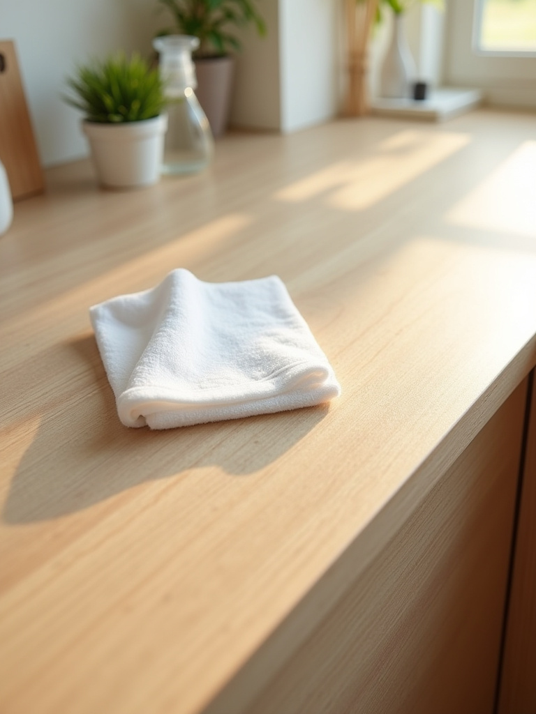
Always dry your cabinets thoroughly after wiping them down. Letting water sit on the surface, especially near the seams and joints of the doors, can cause damage over time. The key is gentle, consistent cleaning. It’s far better to wipe up a spaghetti sauce splash immediately than to let it sit and then have to scrub it off later.
But no matter how careful you are, accidents happen.
21. Plan for Efficient Touch-Ups and Minor Cabinet Color Repairs
Even the most durable paint job can get a ding or a scratch. The key is to be prepared. When you finish painting, save the leftover paint! Label the can with the color name/code, the sheen, and the room it was used in. Store it in a cool, dark place. For even better preservation, pour a small amount into a sealed glass jar, which will keep it fresh for years.
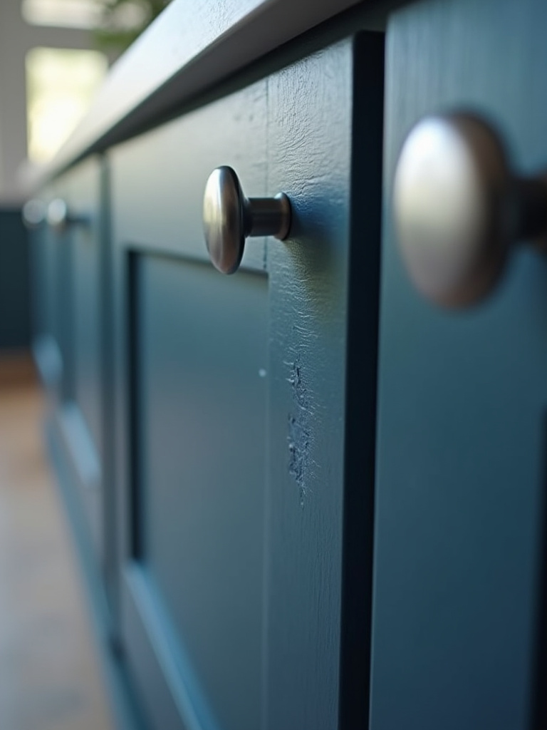
When a small chip happens, you can easily fix it. Clean the area gently, lightly sand the edges of the chip with a fine-grit sanding sponge, and then apply a very thin layer of paint with a tiny artist’s brush. It may take two or three thin coats to build it up, but this will look much better than a single glob of paint. Having a touch-up kit ready to go means you can fix damage immediately before it gets worse.
Looking further into the future, a smart initial design can make updates much easier.
22. Consider Accent Cabinets for Future Kitchen Refresh Cycles
This is one of the smartest long-term design strategies. By using a bold or trendy color only on a distinct, separate element like the kitchen island, you’ve future-proofed your kitchen. The majority of your cabinetry is a timeless neutral that won’t go out of style.
In five or seven years, when you’re tired of that emerald green island, you don’t have to redo the entire kitchen. You just have to prep and repaint the island—a much smaller, cheaper, and faster project. This allows you to keep your kitchen feeling current and fresh without a massive renovation, saving you thousands of dollars and a lot of disruption over the life of your home.
This forward-thinking mindset is key to staying ahead of the curve.
Maintenance and Futureproofing: Keeping Your Cabinet Colors Vibrant (Part 2)
We’re bringing it home with a look at the big picture: how to keep your design relevant and how to avoid the critical mistakes that can derail a project from the start.
23. Re-evaluate Your Kitchen’s Color Scheme with Evolving Trends
Your kitchen doesn’t exist in a vacuum. Design trends evolve, and what looks fresh today might feel a bit tired in a few years. It’s smart to do a quick “style check-in” every year or two. This doesn’t mean you need to repaint. Sometimes a refresh is as simple as updating your cabinet hardware, swapping out your pendant lights, or getting a new runner for the floor.
If you have used the accent cabinet strategy, this is when you might consider a color change. Check out the annual “Color of the Year” announcements from major paint companies not to copy them, but to get a sense of the direction color palettes are moving. Is the mood shifting toward warmer, earthier tones? Or brighter, more optimistic hues? Keeping a pulse on these shifts allows you to make small, strategic updates that keep your kitchen feeling modern and intentional.
Finally, let’s wrap with a checklist of the most common, and most avoidable, mistakes.
24. Avoid Common Cabinet Color Application Mistakes and Pitfalls
We’ve covered a lot, so let’s distill it down to the absolute deal-breakers. These are the mistakes that will ruin your project. Avoid them at all costs. First, skipping prep. I can’t say it enough: you must clean, sand, and prime. Period. Second, using the wrong paint. Use a cabinet-grade enamel, not wall paint. Third, rushing the process. Applying thick coats or not letting paint fully dry between coats will lead to a soft, gummy finish that never cures properly.
Fourth, painting in a dusty, poorly-ventilated area. Your finish will be full of specks and the fumes can be dangerous. Finally, putting hardware back on and using the cabinets too soon. Most modern paints take up to 30 days to fully cure and reach maximum hardness. Be gentle with them for the first month. Avoiding these five pitfalls is the surest path to a beautiful, durable, and long-lasting cabinet finish that you can be proud of for years to come.
Conclusion
So there you have it. Choosing a kitchen cabinet color isn’t a one-step decision; it’s a process. It starts with understanding the light and architecture of your home and ends with meticulous application and smart styling. The color you choose holds the power to completely transform the heart of your home, making it feel brighter, warmer, more sophisticated, and more you. Don’t be intimidated by the options; be empowered by them.
You now have the framework to make an informed, confident decision—one that avoids the common pitfalls and embraces the details that create a truly professional result. The most important thing is to create a space that you love walking into every single day. So collect those samples, create that mood board, and get ready. Your brilliant, personalized kitchen is well within your reach.