Through the viewfinder of my architectural camera, I have framed thousands of interiors over the last fifteen years. The most common anxiety I encounter among homeowners is the belief that black kitchen cabinets create a “cave,” instantly shrinking a room and swallowing natural light. Yet, my most striking photographs often feature these exact dark tones. When executed correctly, black doesn’t subtract light; it manipulates it.
This fear is what we call the ‘Cave Effect’ fallacy. Novices see black as a void, but design experts utilize it as an anchor. By selecting the right finish, such as a high-gloss lacquer, a black cabinet surface transitions from a light absorber to a strategic mirror. Consequently, deep tones make perimeter walls appear to recede rather than constrict, creating an illusion of expanded architectural depth and structural weight.
You do not need a professional design team to replicate this sophisticated aesthetic—you simply need a grasp of the mechanics. In this article, we will explore the essential 70/30 contrast rule and how to treat black as a neutral baseline for your palette. Let’s dismantle the myth and examine the technical reality of designing with the dark.
1. Mastering Light Absorption: The Photographer’s Guide to Lumen Output
Black cabinets act like aggressive light sponges. They possess a Light Reflectance Value (LRV) of barely 5%, meaning they absorb almost every photon thrown at them. Consequently, a standard residential lighting setup leaves dark joinery looking like a flat, featureless void. To capture the rich depth of a moody kitchen, you must apply the Lumen Compensation Rule: actively increase your ambient or studio lumen output by 1.5x to 2x compared to a white space. This surge in power overcomes absorption, ensuring the eye perceives detail rather than darkness.
However, raw power creates glare on polished finishes if uncontrolled. You must shape the light to reveal the architecture. Instead of pointing a flash or downlight directly at the cabinetry, refine your approach:
- Diffuse the source: Use large softboxes or indirect lighting to wrap illumination around the subject, eliminating harsh hotspots.
- Rake the angle: Position lights at a steep 45-60 degree angle to highlight texture and wood grain.
- Verify the CRI: Select bulbs with a Color Rendering Index of 90+ (ideally 4000K-5000K) to prevent the black finish from appearing muddy or greenish.
By combining higher output with precise control, you transform a dark abyss into a sophisticated, three-dimensional statement.
2. The Physics of Finish: Matte vs. High-Gloss Reflection Dynamics
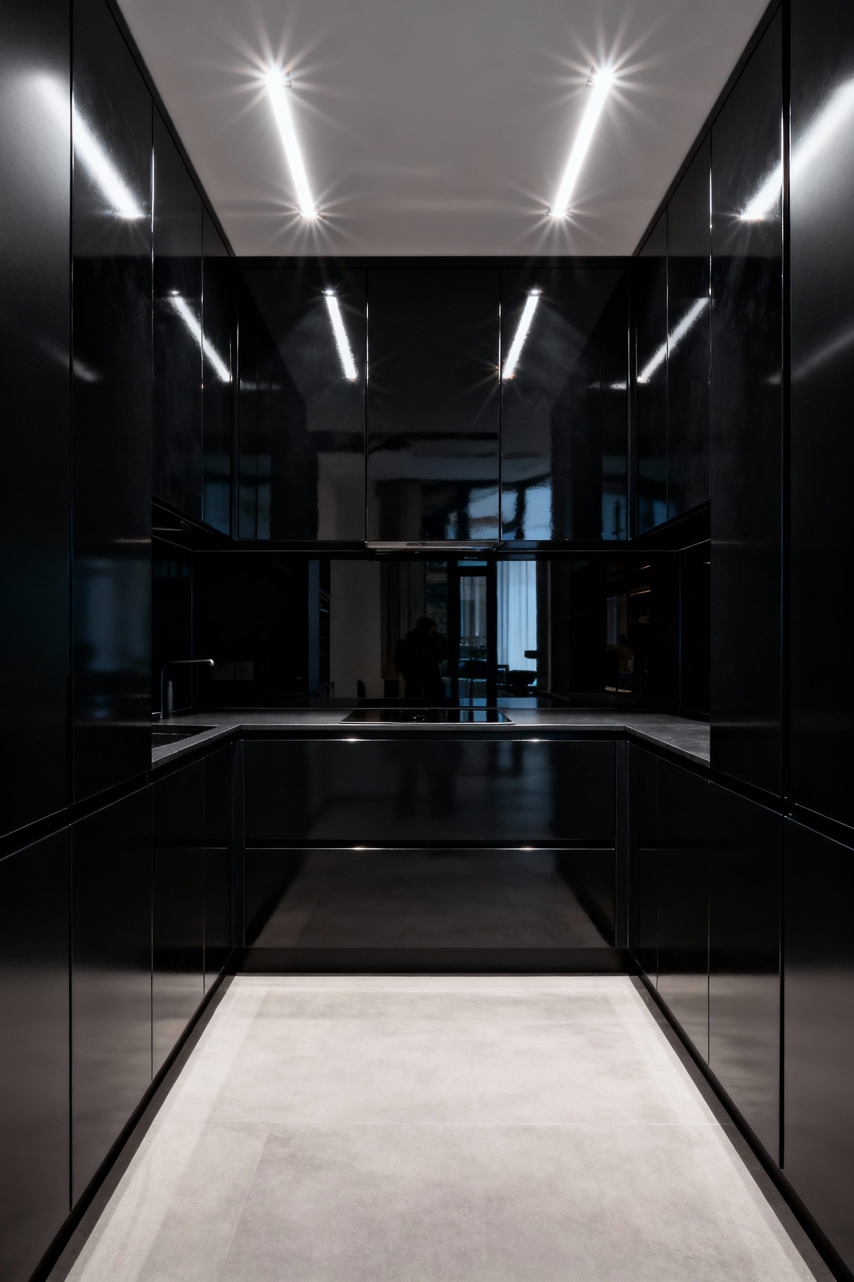
Capturing high-gloss black cabinetry always demands precise light management. This finish creates specular reflection, where light bounces off the smooth surface like a mirror. Gloss finishes visually expand cramped kitchens by reflecting the surrounding room, but they also amplify every flaw. Intense downlights create harsh glare points, and a single fingerprint interrupts the sleek aesthetic immediately.
Note the dramatic shift when you choose an ultra-matte finish. Here, the microscopic surface texture causes diffuse reflection, scattering light in multiple directions to create a soft, velvet-like absorption. This physics dictates the function:
- Visual Weight: Matte creates a heavy, monolithic “void” ideal for minimalism.
- Durability: The scattered light conceals oily smudges and micro-scratches.
- Lighting: Without reflection to aid visibility, you must increase layered task lighting to prevent the space from feeling too dark.
Choose gloss to manipulate space, but choose matte to manage maintenance.
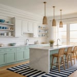
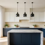
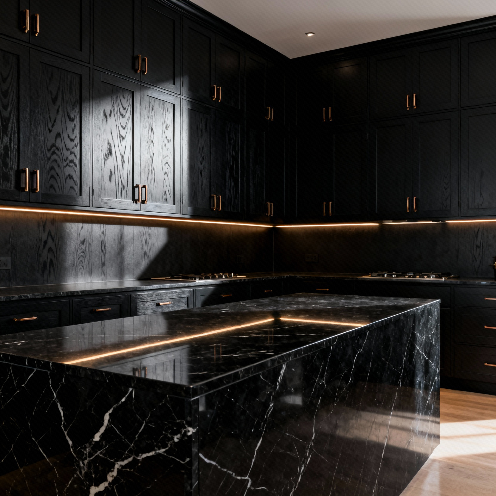
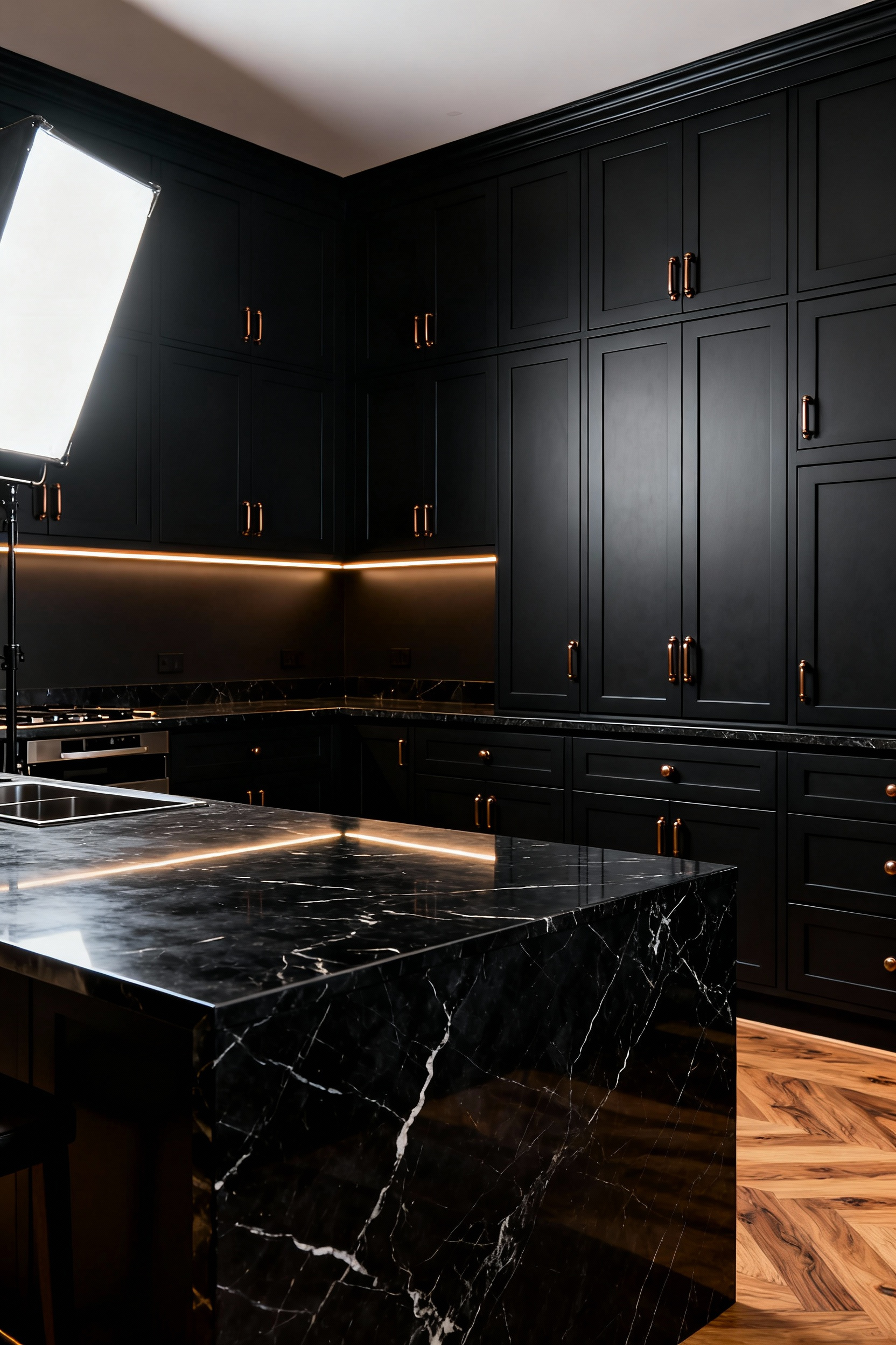
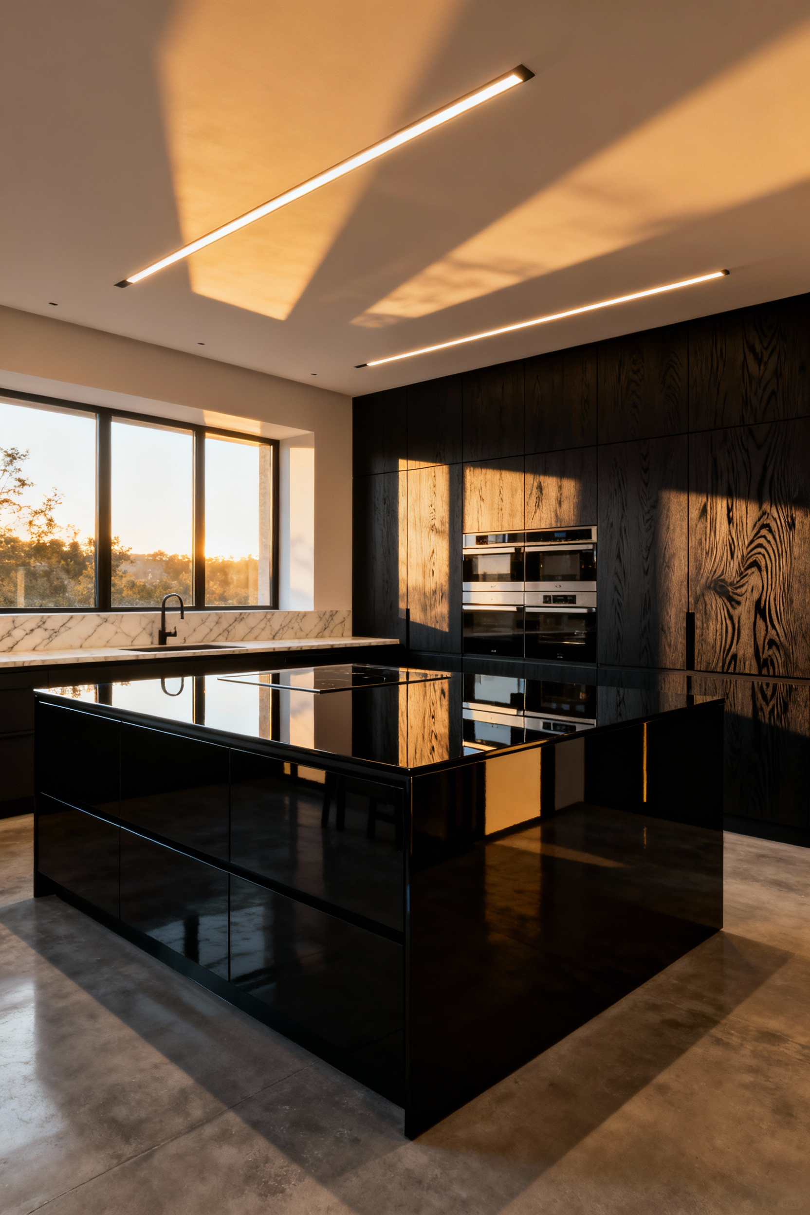
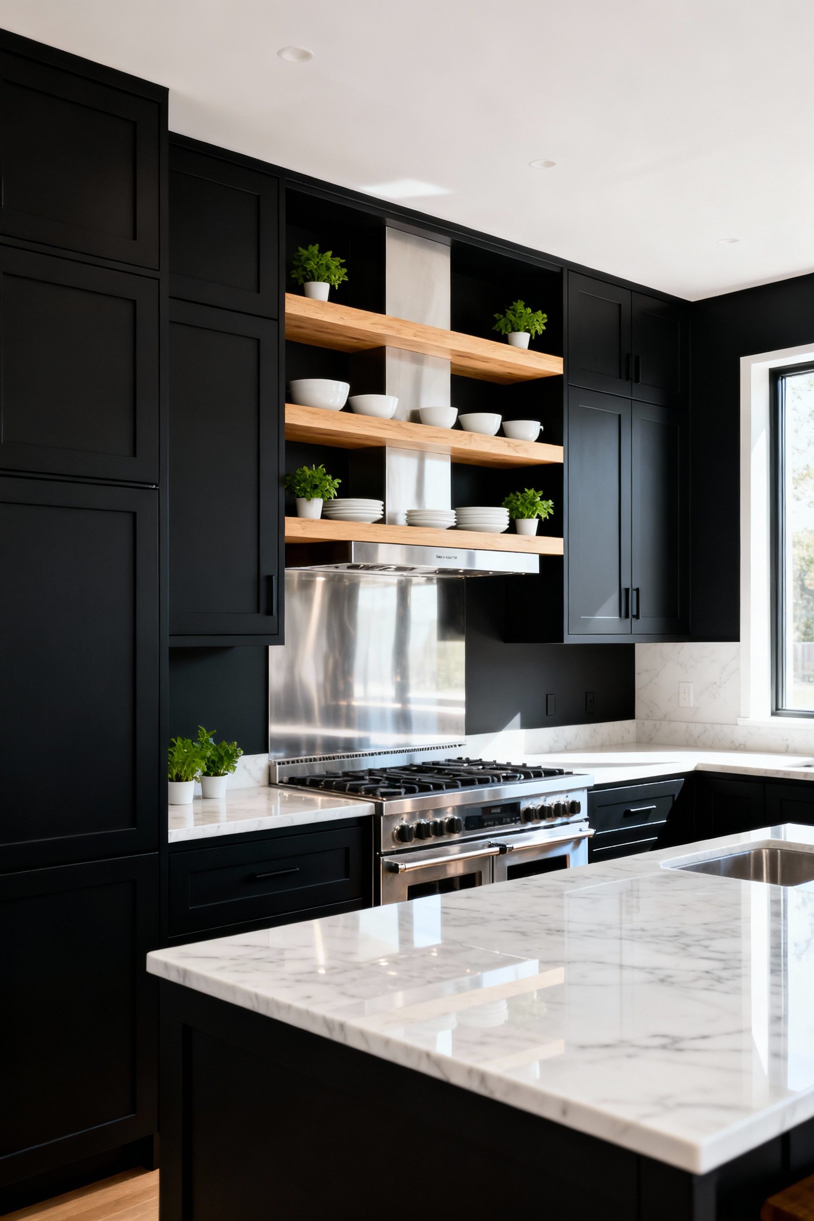
3. Architectural Anchoring: Using Black for Lower Cabinets (The Tuxedo Effect)
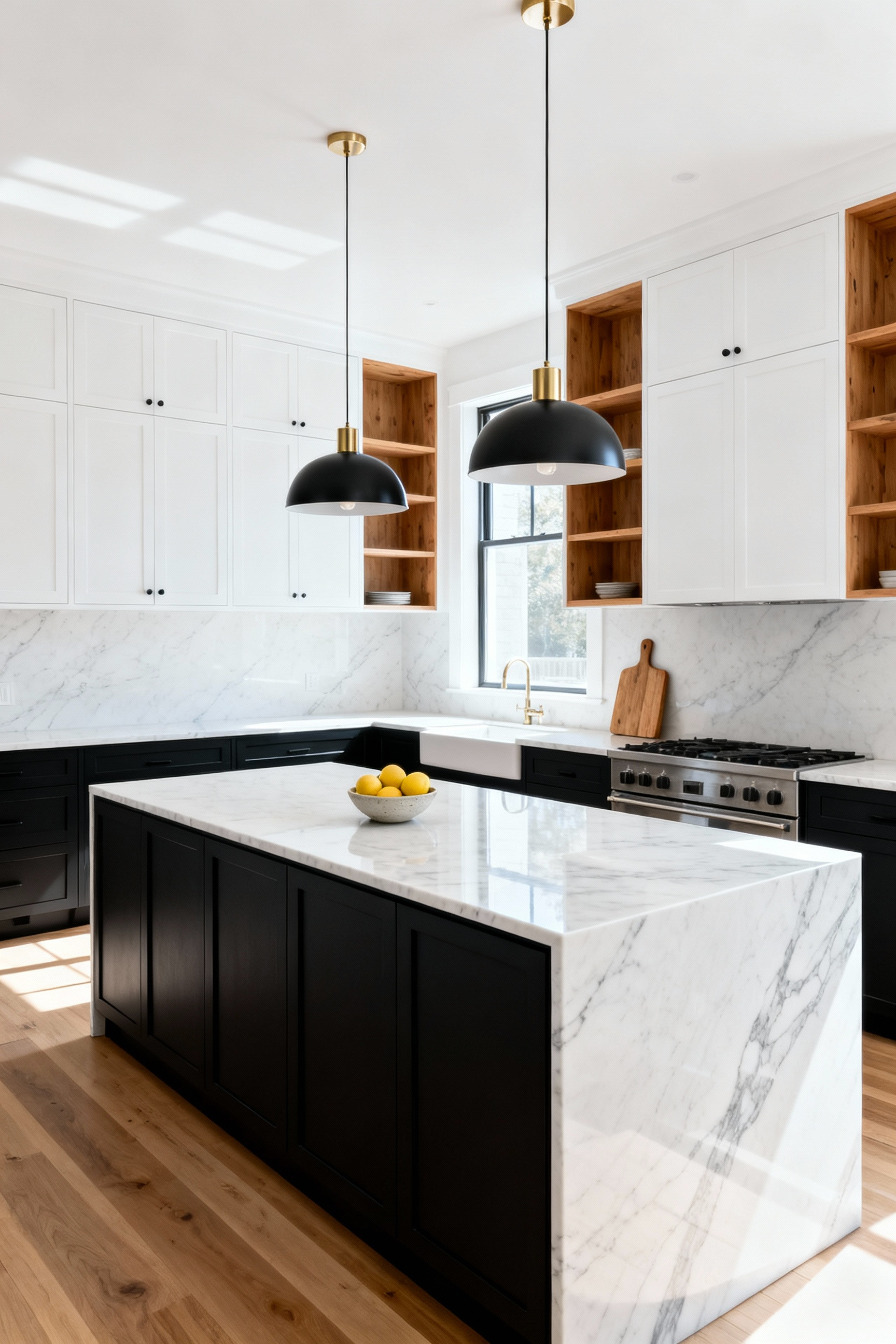
Dark tones possess immense visual weight. You can leverage this concept of “architectural anchoring” by installing black lower cabinets to ground the room’s composition. Keeping upper cabinets white or using open shelving creates an airy exposure, drawing the eye upward to simulate higher ceilings. This “Tuxedo Effect” offers more than just artistic balance; it acts as a pragmatic shield against the daily wear of a busy home, effortlessly concealing the scuffs and dust that inevitably accumulate near the floor line.
High contrast requires precise technical execution to avoid visually severing the room. Focus on these structural elements to bridge the gap effectively:
- The Countertop Bridge: Install a thick, light-colored surface like honed marble or white quartz to act as a horizon line, blending the heavy base with the lighter upper zone.
- Appliance Integration: Nest stainless steel units within the black base to let them recede into the shadows, creating a seamless, built-in appearance.
By managing these sightlines, you build a kitchen that feels both physically grounded and spatially expansive.
Achieving Depth and Contrast with Black Kitchen Cabinets
4. Texture as Color: Visible Wood Grain vs. Flat Lacquer
Pure black absorbs light, often creating a visual void. To counter this severity, choose black-stained wood grain, such as wire-brushed oak. The physical texture catches and scatters ambient light, softening the color into a dimensional charcoal or espresso. Conversely, flat lacquer delivers a stark, uniform pigment ideal for ultra-modern aesthetics. However, this purity comes with a cost; without texture to hide imperfections, high-gloss surfaces amplify smudges and demand perfect lighting.
For a sophisticated, layered design, I recommend mixing these finishes to define zones. This approach breaks up the visual weight of a dark kitchen and creates architectural interest:
- Perimeter Cabinetry: Use flat lacquer to create a seamless, receding backdrop.
- Kitchen Island: Apply black wood stain here to introduce “visual noise” and ground the room.
Be mindful of maintenance when making your final selection. While open-pore wood hides fingerprints effectively, it can trap dust. If you prefer the flat look but fear the upkeep of gloss, specify super-matte finishes with anti-fingerprint technology (AFP) for a durable, low-maintenance alternative.
5. Countertop Contrast: Balancing Visual Weight with Marble and Quartz
Black cabinetry acts as a “light sink,” absorbing visual energy and darkening a composition. To counterbalance this density, you must maximize light reflection on the horizontal planes. Prioritize the purest white surfaces available. While natural stone offers organic beauty, engineered quartz often delivers a brighter, crisper white base than natural Carrara, providing the necessary high-contrast “lift” to prevent the kitchen from feeling cave-like.
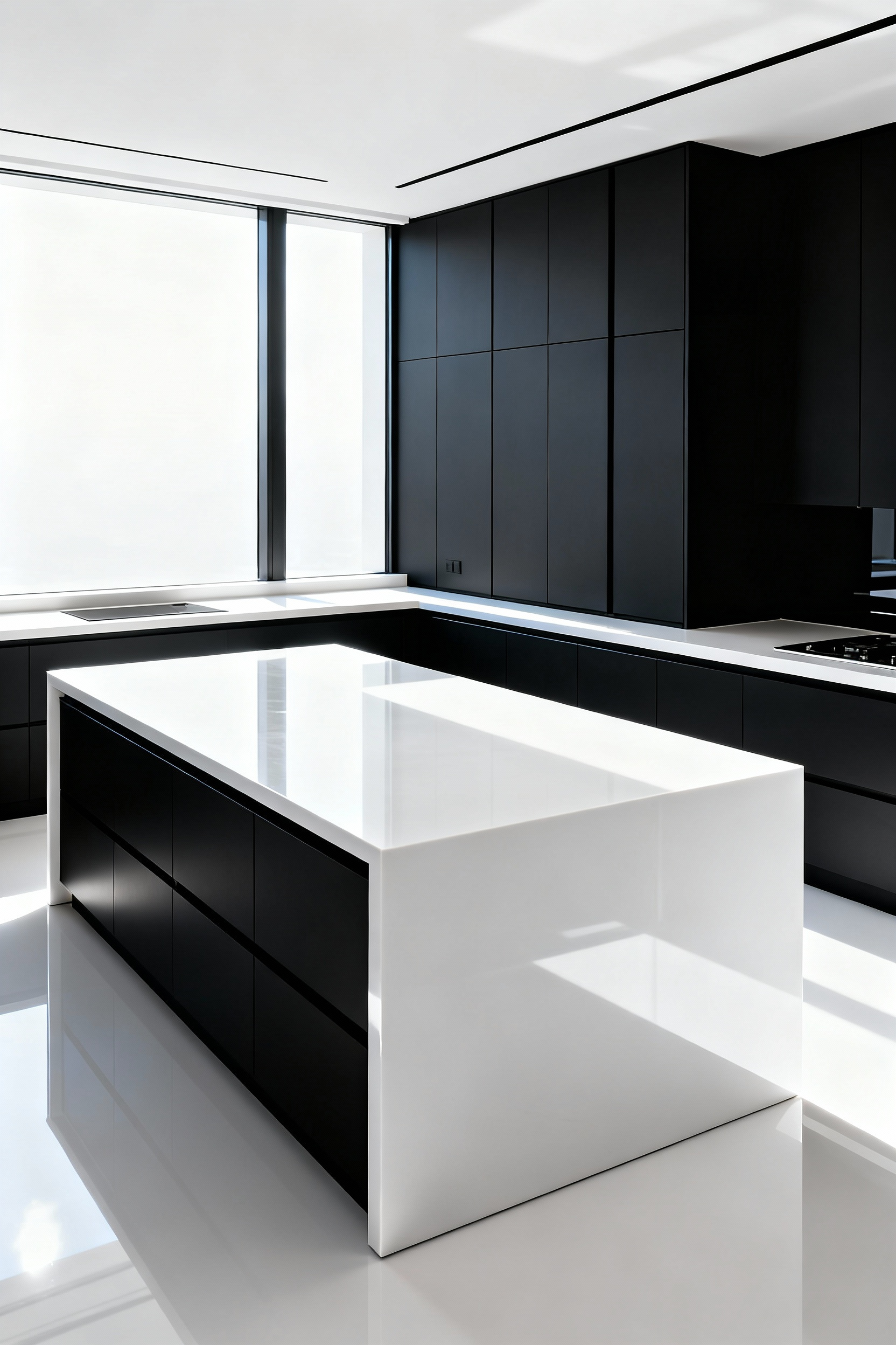
However, brightness alone is insufficient; you need movement to break up the visual weight. Avoid dense, small speckling, which frequently appears muddy against deep black tones. Instead, apply these composition techniques to ensure balance:
- Select bold veining: Opt for slabs with dramatic, large-scale grey or gold veins to interrupt the surface area without cluttering it.
- Ground the island: Use a deep green or charcoal quartz for the central island to anchor the workspace, allowing the white perimeter to keep the room airy.
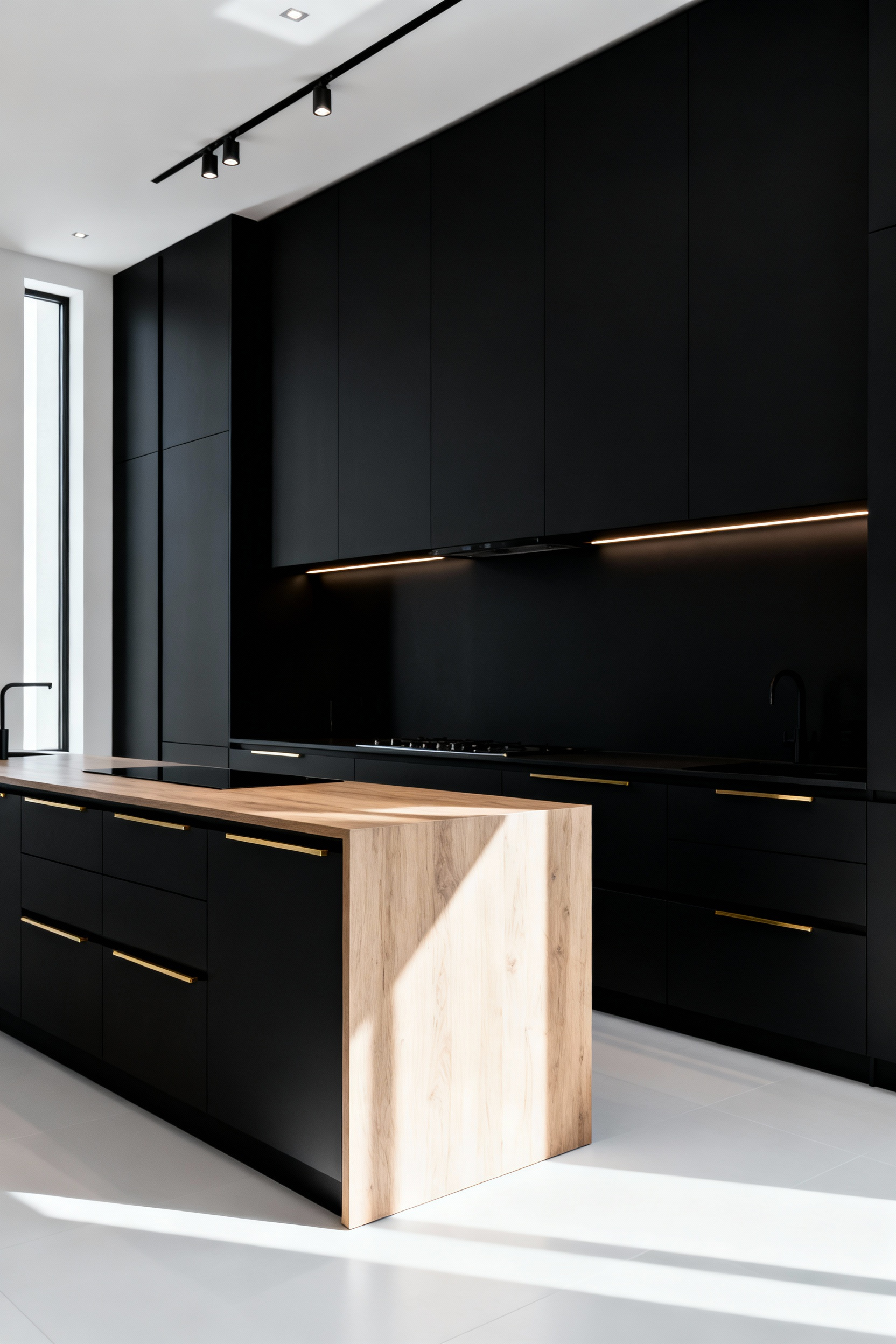
6. Metallic Temperature: Warming the Palette with Brass and Bronze Hardware
Because black cabinetry absorbs distinct amounts of light, it can often read as a cold void. To counter this, introduce elements that reflect luminosity and warm the space. Brass and bronze hardware act as essential thermal regulators. While the cabinetry remains cool and stark, the yellow and red undertones of these metals inject necessary heat and depth into the palette. The hardware stops being purely utilitarian and becomes the room’s focal point, creating a “jewelry effect” that draws the eye.
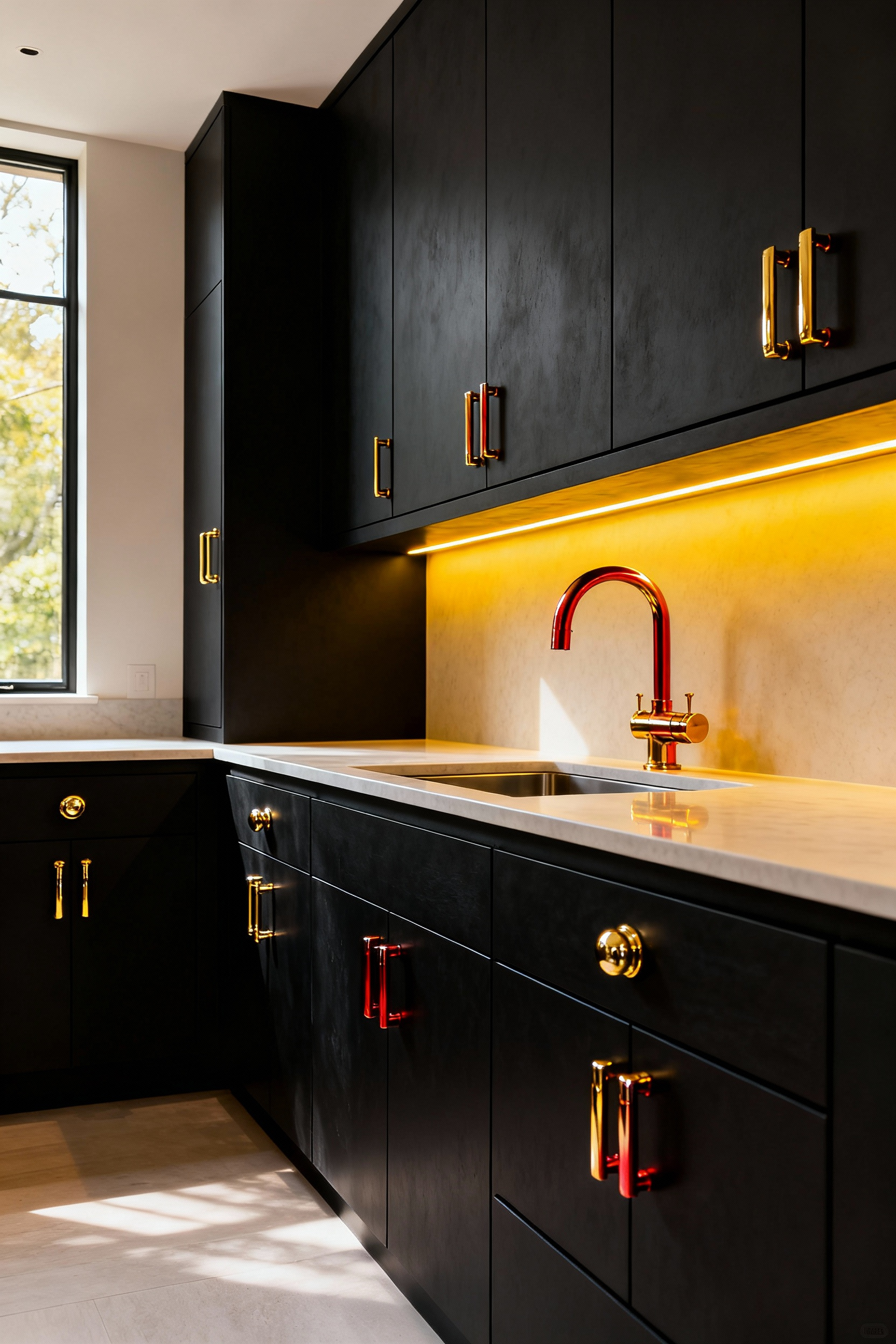
Execute this look with precision by focusing on specific finishes and forms. “Living finishes” like unlacquered brass or oil-rubbed bronze are superior because they develop a natural patina over time. This aging process adds organic texture that contrasts beautifully against the pristine, manufactured surface of modern cabinets. To maintain a clean composition:
- Select Streamlined Shapes: Distinct geometries, such as T-bar or long linear pulls, ensure the metal finish remains the primary decorative element.
- Coordinate Fixtures: Match your hardware temperature to the kitchen faucet or lighting to create visual continuity.
By balancing the starkness of black with the warmth of living metals, you ensure the kitchen feels sophisticated rather than sterile.
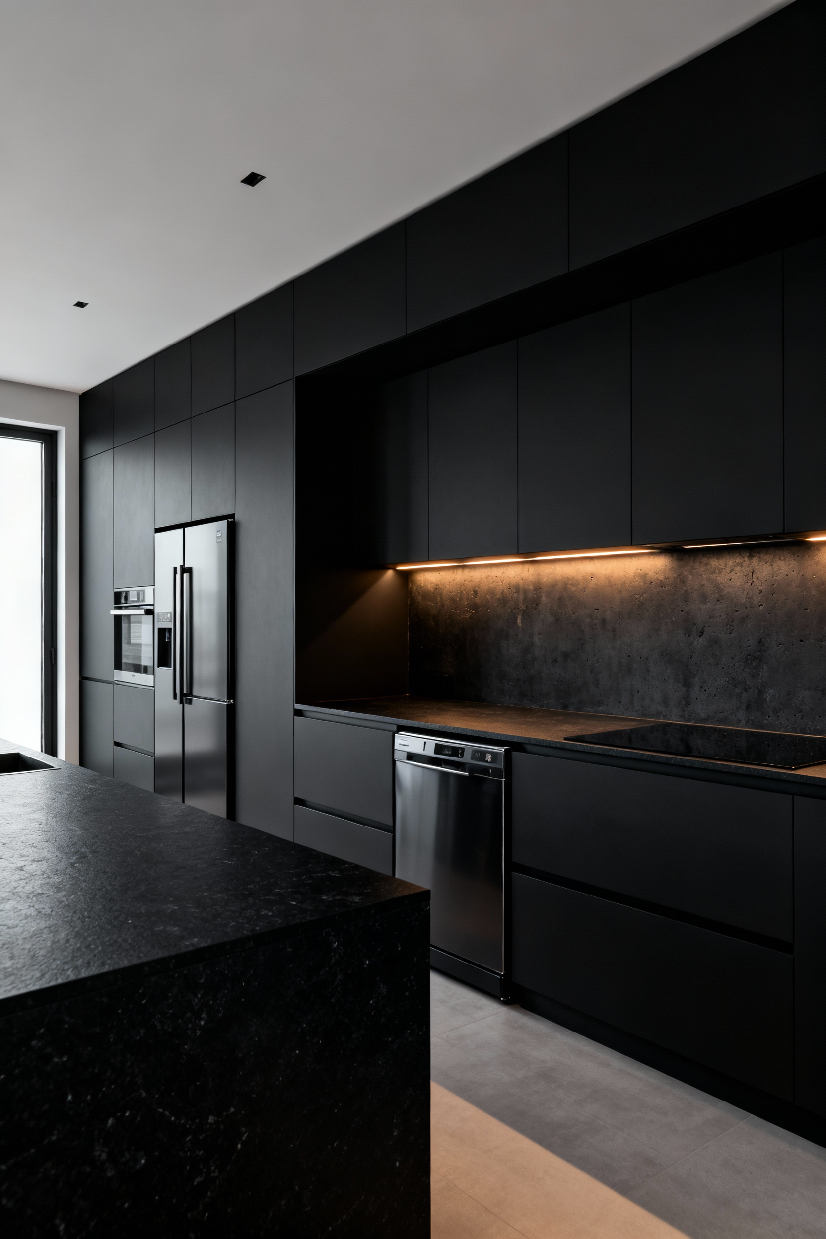
7. The Industrial Edge: Integrating Exposed Brick and Concrete Elements
The most compelling industrial kitchens rely on texture just as much as color. You must create intentional opposition to master this look. Pair ultra-sleek, matte black cabinetry directly against the rugged, porous surface of a sealed brick feature wall. This dramatic contrast highlights the raw masonry while keeping the design distinctly modern. Resist the urge to cover every surface; apply rough textures selectively to a single focal point to prevent the space from feeling dark or cramped.
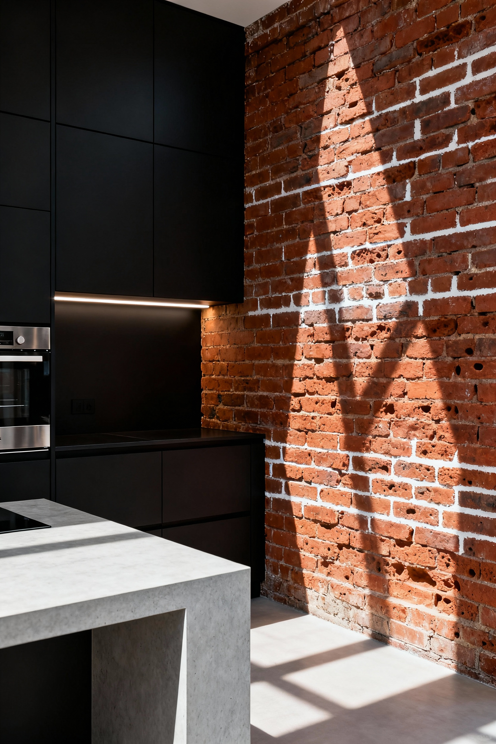
To balance the visual weight, utilize light gray polished concrete for flooring or countertops. This cool neutral acts as a reflector, bouncing light between the dark cabinets and warm brick to open up the room. Finally, tie the composition together with specific hardware choices:
- Install exposed metal piping for shelving brackets.
- Select matte black or oil-rubbed bronze pulls.
- Hang pendant lighting with dark cage shades.
These metallic elements bridge the gap between the cold concrete and rustic brick, ensuring a cohesive, loft-style aesthetic.
8. Spatial Relief: Utilizing Open Shelving to Break Visual Mass
Black cabinetry creates intense visual density. Wall-to-wall dark cabinets can turn a kitchen into a “black hole” on camera; the solution lies in introducing negative space. Swap a section of upper cabinets for open shelving to immediately break this monolithic effect. Ideally, position these shelves around focal points like the sink or range to force the eye to pause.
To execute this successfully, focus on three technical specifications that maximize spatial relief:
- Reduce depth: Use 8–10 inch shelves rather than the standard 12-inch cabinet depth to create a lighter, airier profile.
- Illuminate shadows: Install integrated LED strip lighting beneath each shelf to activate the negative space and highlight textures.
- Contrast materials: Select light oak, white marble, or brass supports to visually cut through the matte black surroundings.
Finally, style with intention. Curate high-contrast items like white ceramics or clear glass to bounce light back into the room. Avoid clutter, as overloading these shelves negates the visual break and reintroduces chaos to the composition.
9. Backsplash Strategy: Reflective Surfaces to Bounce Light
Think of black cabinets as “negative fill,” effectively absorbing ambient light and darkening the room’s exposure. Consequently, your backsplash must function as a reflector card, bouncing illumination back onto the countertop to compensate. Avoid matte finishes entirely for this vertical plane; they simply compound the darkness. Instead, prioritize materials with a high sheen coefficient, such as polished quartz, back-painted tempered glass, or glossy ceramic. These surfaces catch light rather than soaking it up, maintaining the visual balance of the space.
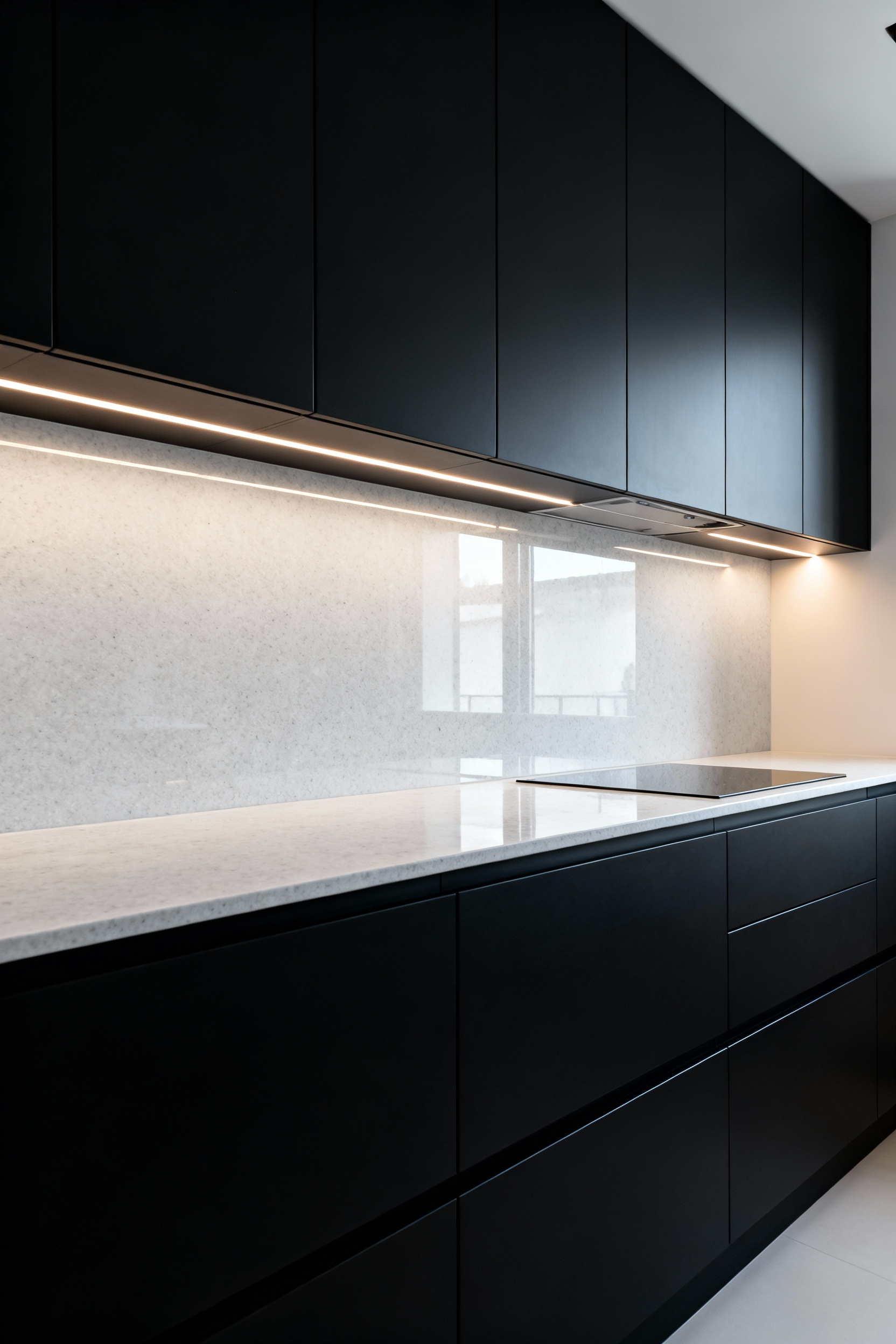
However, a reflective surface requires a source to be effective. Install 3000K–4000K under-cabinet LED strips and aim them directly at the backsplash to wash the surface with light.
- Polished Stone: Delivers a sharp, high-contrast bounce using optic white or cool gray tones.
- Antiqued Mirror: Expands perceived depth and scatters light without creating harsh glare.
By pairing high-sheen materials with targeted lighting, you convert a potential black hole into a bright, functional focal point.
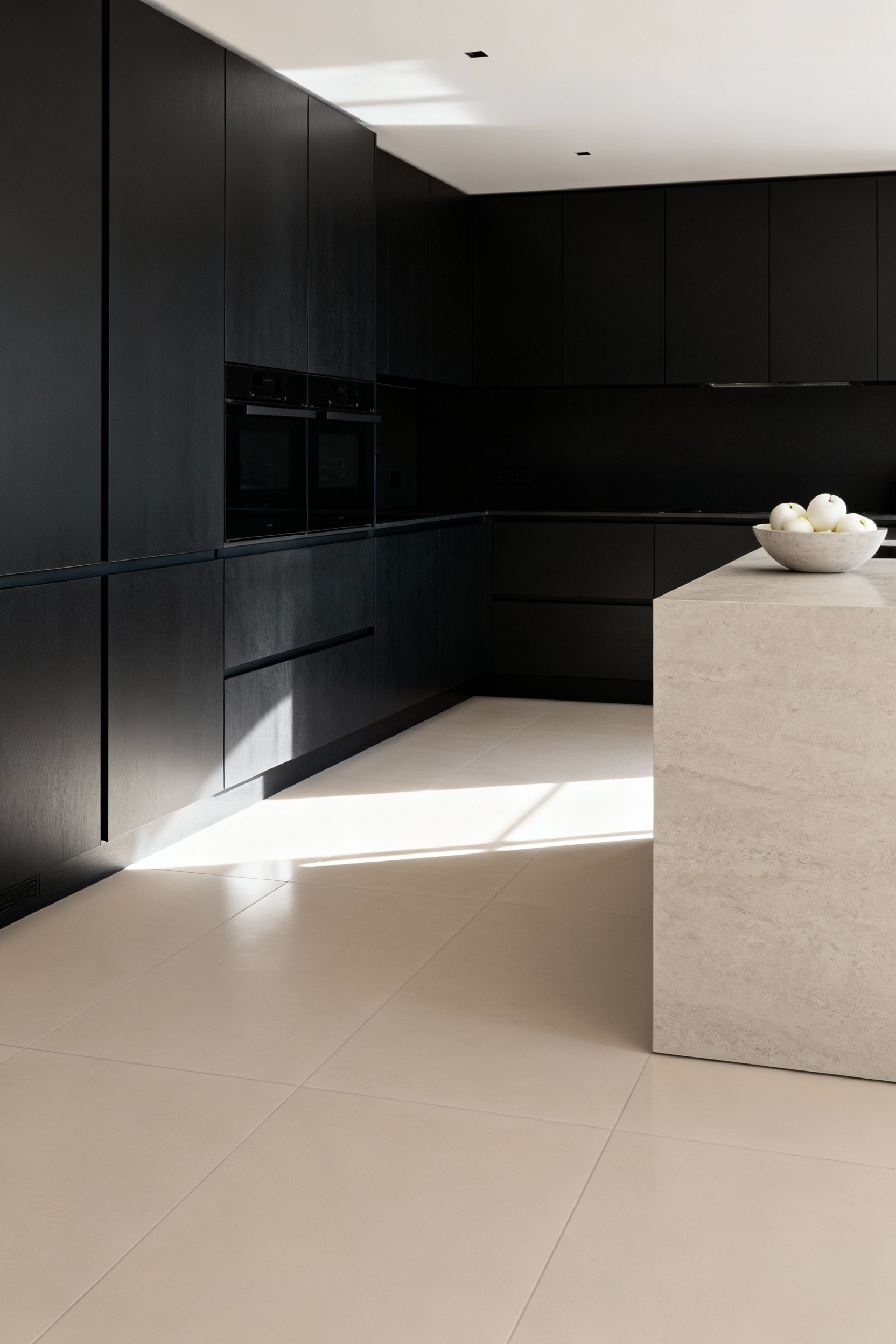
10. Flooring Continuity: Grounding the Space Without Darkening the Room
Since black cabinetry possesses immense visual density, your flooring must act as a reflector. It should bounce ambient light back onto the dark surfaces to reveal texture and detail rather than absorbing it. Therefore, avoid high-gloss finishes on the floor. As a photographer, I constantly battle the jarring glare created by glossy floors; they fragment the visual lines of a room and create erratic hotspots. Instead, select a matte or low-luster finish to diffuse light evenly, ensuring the room feels sophisticated rather than stark.
To ground the space without darkening it, focus on scale and tone:
- Wood: Choose wide-plank (6-8 inches) White Oak or Ash. These pale species provide warmth and continuity, directing light upward toward the cabinets.
- Tile: Install large-format porcelain (24×48 inches) in greige or warm gray. This minimizes grout lines and bridges the contrast between black joinery and white walls.
These specific choices anchor the kitchen physically while keeping the atmosphere optically light.
11. Appliance Integration: Panel-Ready vs. Stainless Steel Contrast
Appliances dictate the visual flow of a black kitchen. Standard stainless steel often acts as a mirror, creating hard visual stops that create glare and distract from a moody aesthetic. Therefore, prioritize panel-ready appliances for a seamless, monolithic look. This “stealth” approach allows the cabinetry to stand as a singular architectural feature, which remains essential for ultra-modern or minimalist designs.
Conversely, you may want to break up the darkness intentionally. Traditional stainless steel introduces bright, industrial texture that prevents the space from feeling cave-like. If full integration exceeds your budget, consider a hybrid approach to balance cost and composition:
- Panel the refrigerator to eliminate the largest visual interruption.
- Select black stainless steel for ovens to bridge the gap between texture and blend.
- Reserve bright silver for smaller hardware accents to maintain visual interest.
This strategy minimizes visual clutter while maintaining functional durability.
12. Natural Light Optimization: Positioning Cabinetry Relative to Windows
Treat your windows like a camera lens; aperture matters. Black surfaces create “negative fill,” absorbing light and flattening spatial depth. To counteract this, you must strictly manage the placement of heavy elements. Position tall pantry units perpendicular to the window wall to prevent the cabinet’s mass from casting long, intrusive shadows. Additionally, enforce a “buffer zone” by keeping black upper cabinets 18–24 inches away from the window trim. This spacing allows daylight to wrap around the room rather than hitting a dark, absorptive dead end immediately.
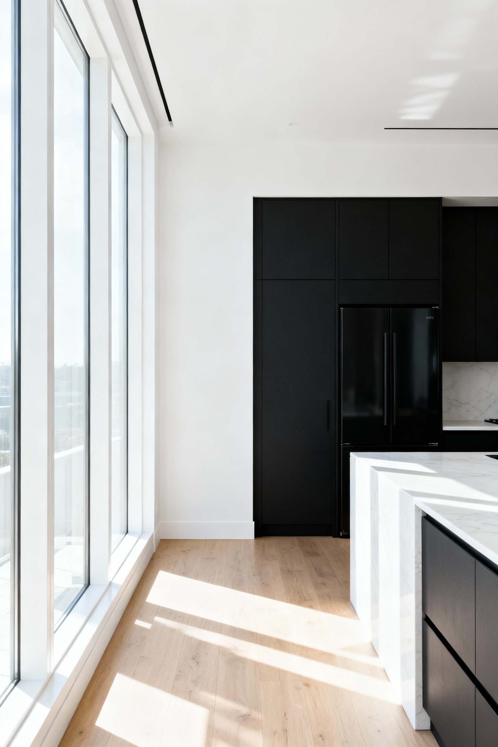
Once the layout is established, manipulate the light to maximize dimension:
- Reflect: Clad the wall opposite the window in high-gloss material or mirror to bounce light back onto matte finishes.
- Orient: Align the island so sunlight washes *across* the prep surface, highlighting texture instead of silhouetting the user.
These calculated adjustments ensure the black finish reads as sophisticated rather than somber, keeping the workspace practical and visually balanced.
13. The Maintenance Reality: Technical Solutions for Fingerprint Resistance
Nothing ruins a perfect architectural shot—or a pristine kitchen—faster than a greasy smudge on a black cabinet. To combat this, prioritize material science over simple cleaning habits. Demand nanotechnology surfaces, such as [FENIX NTM](https://www.arpa.it/en/products/fenix-ntm-en/) or specialized matte PET films. These materials utilize oleophobic engineering to actively repel skin oils rather than allowing them to settle. Crucially, insist on Anti-Fingerprint Laminates (AFL) where this resistance is built into the core layer, as superficial topcoats inevitably degrade over time.
Beyond material composition, you must control how light interacts with the surface to hide unavoidable contact. True maintenance ease relies on specific visual mechanics:
- Target Super-Matte: Ensure a gloss rating below 10 Gloss Units (GU) to effectively scatter light and mask oil reflectivity.
- Leverage Texture: Choose subtle wood grains or slate patterns to physically break the surface plane.
By manipulating the finish, you render light distortions virtually invisible. This structural approach keeps your kitchen looking editorial-ready without the constant need for a microfiber cloth.
14. Ceiling Height Perceptions: Using Vertical Lines to Counteract Heaviness
Black cabinetry generates substantial visual weight. This dark mass naturally anchors the eye low, often making a room feel squat. To counteract this, you must deliberately manipulate vertical lines to draw the gaze upward. Think of these elements as leading lines in a photograph; they guide the viewer’s perspective toward the ceiling. Start by installing elongated cabinet hardware. Select slim, 10-to-12-inch pulls in a contrasting finish like brushed brass. These repeating vertical strokes pierce the dark expanse and force the eye to travel up rather than across.
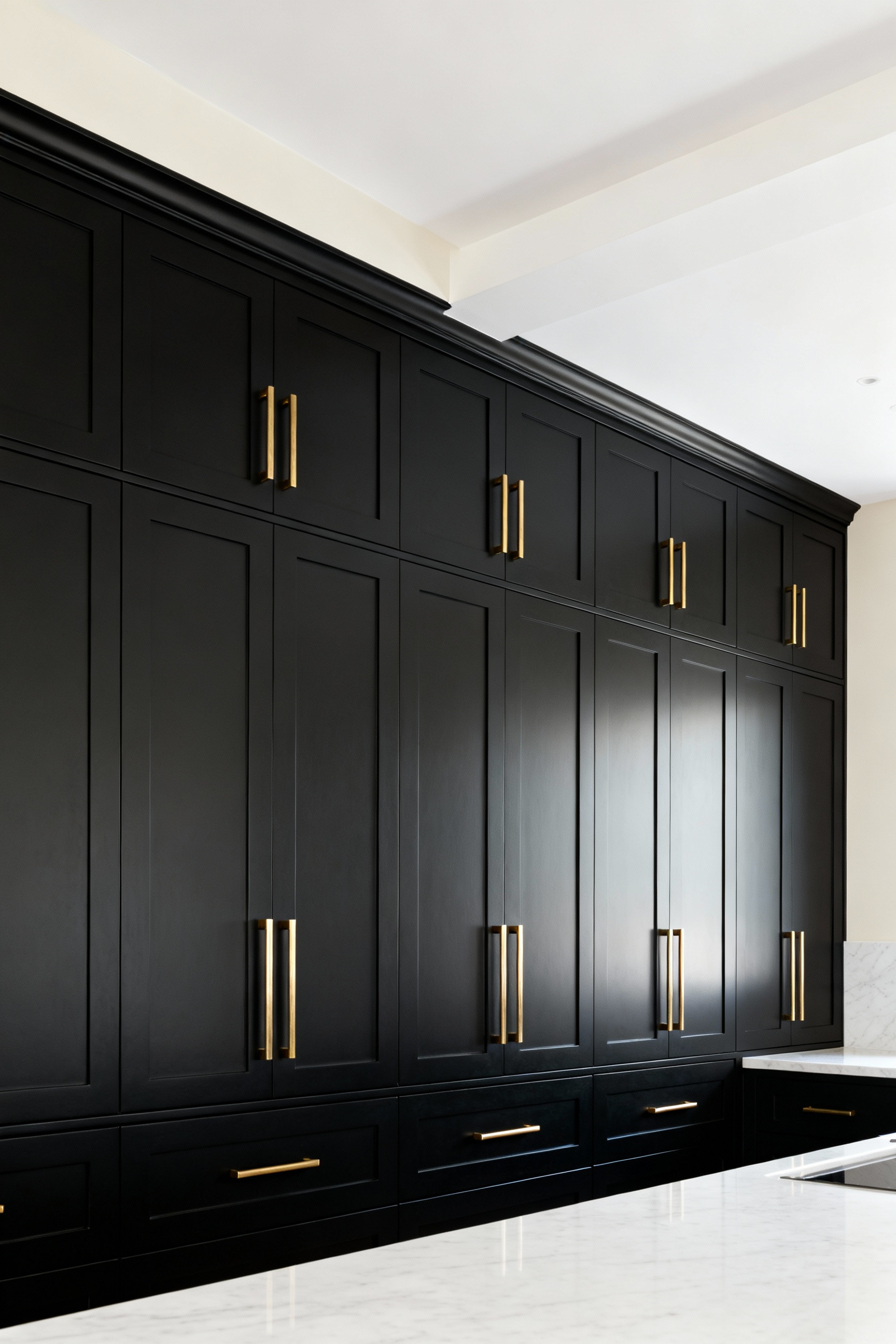
Furthermore, your structural finishes should reinforce this verticality. Avoid standard horizontal brick patterns for your backsplash. Instead, stack rectangular tiles—such as subway or kit-kat styles—vertically and run them continuously from the counter to the crown molding. This creates an uninterrupted lift. Implement these additional architectural tactics to maximize perceived height:
- Maximize Storage: Build pantry units floor-to-ceiling to prevent the ceiling line from appearing severed.
- Apply Texture: Use fluted or reeded wood on range hoods or island sides to add vertical rhythm.
By directing focus upward, you transform the black cabinetry from a heavy burden into a sophisticated, grounding foundation.
Frequently Asked Questions
Do black cabinets make a kitchen look smaller?
Black cabinets do not inherently make a kitchen look smaller, but they require careful light manipulation. If the kitchen lacks sufficient natural light or reflective surfaces (like a white backsplash or shiny countertop), the dark color can absorb light, creating the “Cave Effect.” To maximize space, consider high-gloss black finishes to reflect the room, and contrast the dark cabinets with very light walls and flooring.
What countertops look best with matte black cabinets?
The best countertops for matte black cabinets offer high contrast and reflectivity. Pure white engineered quartz provides the crispest, brightest surface to counteract the matte finish’s light absorption. For a warmer look, honed white marble with soft grey veining or butcher block wood surfaces provide essential visual separation and organic warmth against the dark base.
How do you keep matte black cabinets clean?
To keep matte black cabinets clean, focus on material selection first. Choose finishes treated with Anti-Fingerprint Laminates (AFL) or specialized nanotechnology surfaces that repel oil. For cleaning, use a mild soap solution and a soft microfiber cloth, wiping in the direction of the grain (if applicable). Avoid abrasive sponges or harsh chemicals, which can compromise the anti-fingerprint coating and increase visible smudging.
Are black kitchen cabinets going out of style?
Black kitchen cabinets have moved past trend status into a classic neutral, much like white or gray. While high-gloss black had a specific peak in popularity, modern kitchen design trends favor matte black or black-stained wood finishes. When paired with warm metals like brass and natural wood tones, the aesthetic remains sophisticated and enduring.
Conclusion: Designing for the Lens – Creating a Photogenic, Livable Space
Designing a black kitchen requires more than just a bold color palette; it demands a mastery of light absorption and surface texture. To prevent your space from appearing as a flat, dark void, you must treat lighting as a structural element. Invest in nanotech, anti-fingerprint finishes to ensure the camera captures rich matte textures rather than daily smudges. Then, rigorously apply the three-layer lighting rule. By balancing ambient glow with targeted accent lights, you carve out necessary depth, transforming a heavy block of color into a dimensional backdrop.
Furthermore, a photogenic space relies on the interplay of contrast and organic warmth. Use reflective elements, such as polished nickel hardware or glazed tiling, to catch the light and guide the eye through the frame. These highlights break up the visual mass and keep the room feeling expansive. Crucially, soften the starkness with natural wood tones. Whether through walnut shelving or oak flooring, these organic touches provide the essential “livability” factor, ensuring the design feels inviting rather than clinically cold.
Ultimately, the goal is to build a kitchen that performs as beautifully during a chaotic Sunday breakfast as it does in a curated photograph. When selecting black kitchen cabinets, treat your renovation like a photoshoot: consider every angle, control your highlights, and prioritize durability. Step back, check your composition, and commit to materials that serve both the lens and your life. Create a space that is boldly cinematic, yet undeniably home.