As a home decorator in Atlanta, clients frequently ask me, “What’s the best paint color for a peaceful and relaxing living room?”
It’s a great question! The living room is a central part of the home where we unwind, gather with loved ones, and create memories. The right paint color can transform it into a peaceful retreat from everyday stress.
If you want to give your living room a serene new look, you’re in the right place! Below I’ll share my top 4 paint color recommendations for a calm, tranquil atmosphere. These shades have a proven psychological impact – can lower blood pressure, reduce anxiety, and promote relaxation.
I’ll give you pairing tips and decor ideas to complement each color, so you can achieve a cohesive look. Let’s get started!
The Power of Color Psychology in Home Decor
Before discussing colors, it is important to understand how paint shades affect us psychologically. Psychology shows that different hues can shape our mood, energy, and emotions.
For example, cool blues and greens echo the colors of gentle waters and grassy meadows, triggering a relaxation response and lowering stress hormones. Warm neutrals like beige and ivory give off the warmth of sunlight, invoking a sense of well-being and security.
Some shades have unique impacts beyond their natural associations:
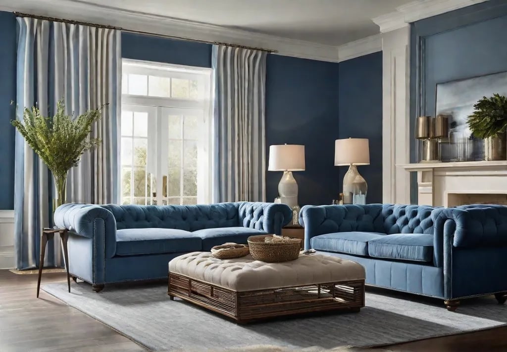
- Blue lowers blood pressure and slows heart rate, perfect for unwinding!
- Green boosts harmony and renewal – great for family spaces!
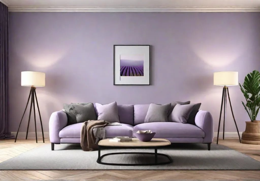
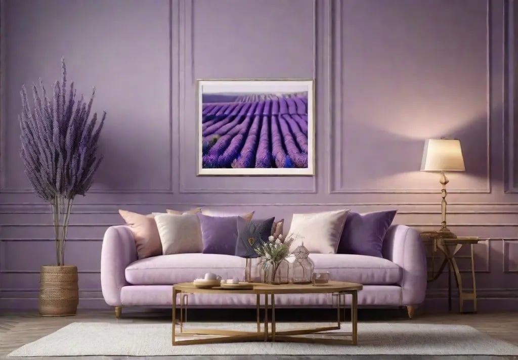
- Purple inspires creativity and spirituality – great for playrooms!
- White/Gray evokes purity, flow, and calm – ideal for minimalist lovers!
Color is a powerful design tool. You can transform a space from chaotic to tranquil, cold to cozy with a coat of paint!
Airy and serene: blue sky
I recommend a pale sky blue on the walls if you want your living room to feel like a breezy spring day – peaceful, refreshing, wide open.
This robin’s egg shade is instantly relaxing, evoking gentle sunshine, puffy clouds, and clear skies. Sky blue is a sought-after paint color for living rooms.
Stick to a minimalist look – too many knickknacks will clutter the airy ambiance. A few pieces in creams, whites, and lighter wood tones will enhance breathability. Add billowy curtains, a large mirror to reflect light, and a few potted plants for an indoor oasis.
Pro Decorating Tip: For north-facing rooms with little natural light, go one shade darker for balance. Benjamin Moore’s Breath of Fresh Air is a reliable sky blue for darker spaces.
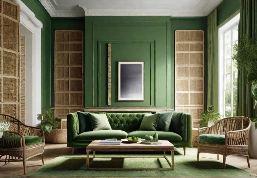
Natural & Renewing: Olive Green
If blue is too cool for you, I recommend infusing your living room with the tranquility of olive green. This rich tone brings nature into your home.
Olive has a subtler presence, darker and more muted than minty greens. But its impact is no less powerful – it has an innate ability to ground and renew. Olive green living rooms impart harmony and flow, stripping away daily stresses to reconnect with the present, like wandering through a shady forest.
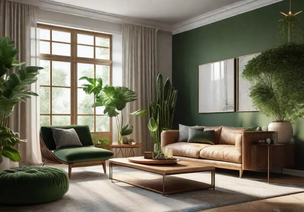
I’d style an olive green space with outdoor touches – rough-hewn wood furniture, woven accents, organic-shaped ceramics. I would add fresh greenery – frond prints, potted palms, hanging ivy wreaths. The theme reinforces a quiet, woodsy vibe.
Decor Tip: Choose an eggshell or satin finish for olive walls – the sheen enhances the color and shadows.
Cozy Warm Beige
For traditionalists, envelop your living room in warm beige. It’s the shade of hospitality – freshly baked cookies, old quilts, and tranquil days.
Beige with yellow undertones has warmth and familiarity. It reminds us of childhood homes and old sweaters, infusing rooms with coziness and nostalgic charm. Warm beige is timeless, unlike trendy grays. Its versatility with wood tones suits stately traditional to rustic modern spaces.
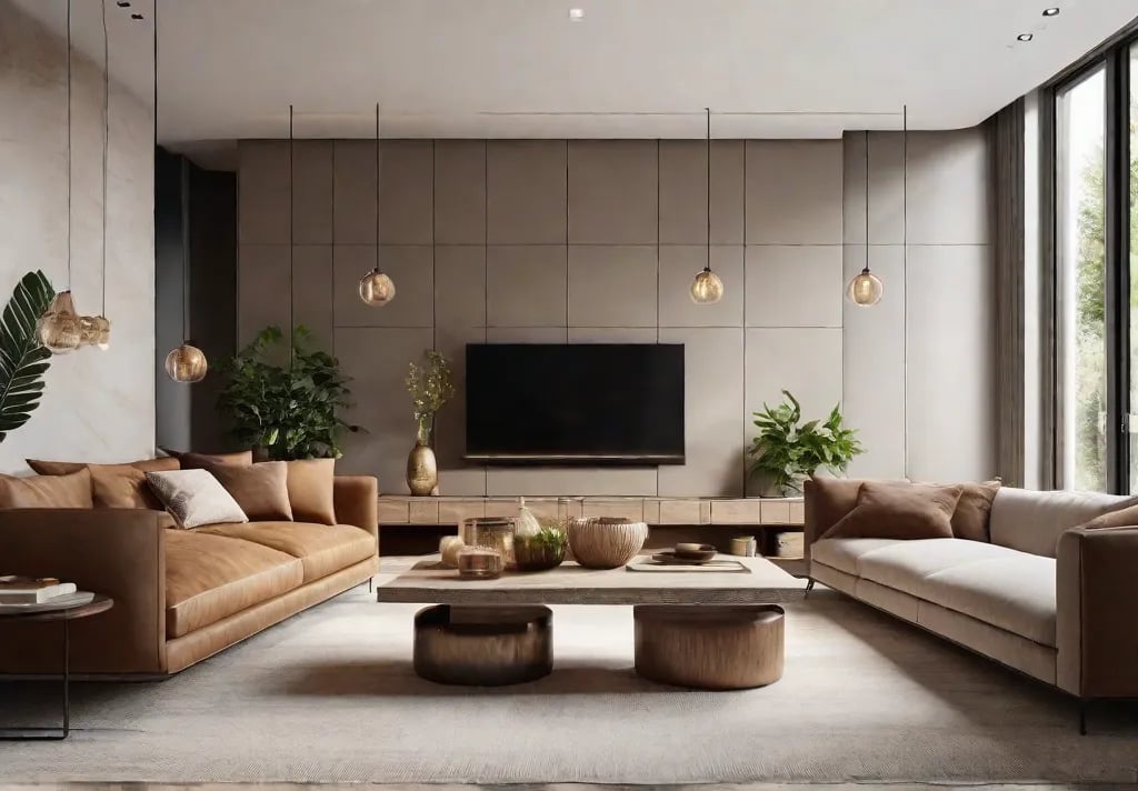
When working with beige walls, I add texture such as cable knit pillows, soft woven rugs, and draped blankets to enhance the enveloping nature of the color. I also complement it with darker neutrals via furniture and decor, such as charcoal throws, exposed wood beams, and black and white family photos, to create contrast.
Decor Tip: For north-facing rooms, use lighter and brighter colors to illuminate the space. sunny southern exposures, consider a deeper hue for maximum relaxation.
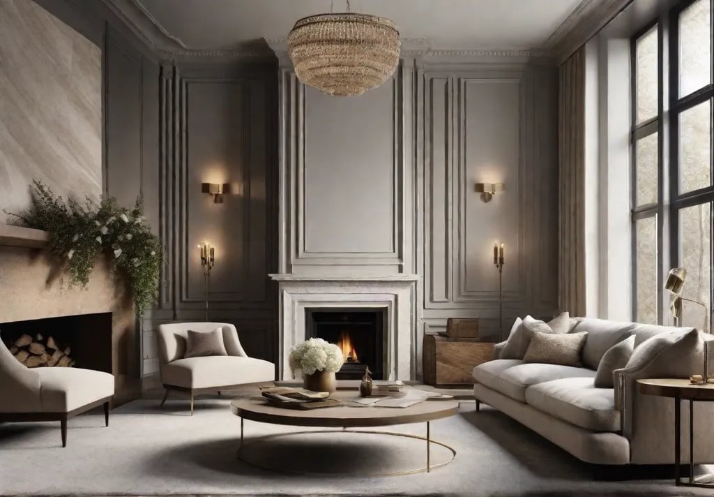
Grounded & Graceful: Gray
If you want your living room to embody modern and minimalist design, I recommend dove gray walls and accents – elegantly simple, gorgeously flowing, almost spa-like.
Dove gray is warmer than white and less austere than black. It strikes a balance between airy and cozy, providing a grounded yet weightless backdrop for decor and furniture. This allows a blend of modern and ornate pieces without visual chaos.
Pair dove walls with light oak or walnut wood tones, greenery for color, and decor in neutral taupes and tans. White molding along the ceiling will prevent the gray from feeling flat. Add faux fur throws and ambient lighting for a living room!
Decor Tip: Use various textures with gray for visual interest – stone accents, metallic finishes, nubby linens, and woven woods.
Now that you’ve got color inspiration, let’s dive into practical steps for choosing and applying paint…
Selecting soothing paint colors.
Feeling overwhelmed by endless paint swatches? Choosing a relaxing living room color doesn’t have to be stressful. Follow these tips:
Assess natural lighting.
Does the natural light in your space matter? Is your room flooded with sun or dim and shadowy? Cool-toned colors like blues and grays suit bright rooms, while warm shades like beige and olive green are cozy in low light.
Consider the direction your windows face. North light is cooler – play that up with sharper whites. Embrace southern exposures with shades like sky blue, as they are warmer.
Gather paint swatches and keep them handy.
Once you’ve narrowed your color search, order samples and place them around the room. View them at different times to see how they change. Cool tones recede in low light, while warm advance. Making test patches on the wall is ideal before committing.
Mind the Undertones.
Beware of sneaky undertones that can ruin a peaceful vibe. Whites with purple appear sterile in traditional decor. Beiges with green make rooms murky. Stick to base shades for clarity.
Mix & Match Interest
Each color creates serenity individually, but blending them in one space works too. Olive walls with sky blue accents, or a beige sofa with dove gray shelves. This adds depth without compromising the calm ambiance.
Answering Common Questions on Soothing Paint
Over the years, I’ve received every paint question from anxious clients. Below I’ll address some top living room color conundrums:
“How do I narrow down the paint options for my space?”
Great question! In addition to the tips above, I advise clients to focus on the feelings they want the new color to evoke. List adjectives – airy, welcoming, renewing, etc. Then look for corresponding shades. This helps narrow down the choices.
“Why does my white living room feel sterile instead of serene?
White looks clinical if not balanced. Infuse warmth with wood tones and textures while painting. Crisp molding warms up flat walls. Adding greenery brings an organic touch.
“How can I add bold colors without overwhelming?”
I don’t blame you – rich shades are gorgeous! The key is applying color in smaller splashes against a neutral backdrop. Try charcoal shelves instead of navy walls, or yellow pillows instead of lemon. This allows the eye to adjust and prevents visual chaos.
“Best sheen for maximizing calm vibe?”
Great question! I advocate for low to medium luster sheens in living relaxation zones. Flat hides imperfections but lacks depth. High-gloss feels too slick. The sweet spot is soft matte to subtle eggshell sheens – this evenly diffuses light for fluidity. Satin is another wonderful option.
Parting: Harmony Through Soothing Color
There you have it, friends – everything you need to infuse your living room with healthy, mood-enhancing colors!
Choose the shade that best suits your personality and style from the four featured shades.
The pairing ideas and decor tips help you create a cohesive, visually flowing, serene space. Feel free to reach out with any other color questions during your beautifying journey!
Wishing you many relaxing moments in your newly-painted wind-down palace.