Picture this: You’re standing in a kitchen. The countertops are a cluttered mess of mail, charging cables, and that small appliance you use twice a year. To get a glass of water, you have to shuffle past the open dishwasher, then pivot awkwardly to reach the cabinet. The only light source is a single, sad fixture in the middle of theceiling that casts shadows exactly where you need to chop. It’s a space you tolerate. Now, picture a different kitchen. Light pours in from a perfectly placed window over the sink, illuminating the clear, durable countertop. Every tool has a home. The flow from the fridge to the prep space to the stove is an effortless, intuitive dance. It feels… calm. Efficient. Good.
As an architectural photographer, I spent years looking at thousands of kitchens. I learned to see the difference between a kitchen designed for a magazine shoot and one designed for a real, messy, beautiful life. The latter is always better. People get so hung up on chasing trends they see online that they forget to design a room that actually serves them. It’s the single biggest mistake I see, and it’s a costly one.
So, let’s cut through the noise. This isn’t about fleeting fads. It’s about the foundational principles, smart material choices, and thoughtful details that create a kitchen you’ll love for decades. Here are the 23 things that truly matter.
Foundational Planning & Layout Strategies
This is the boring part that everyone wants to skip. Don’t. Getting the “bones” right is 90% of the battle. Mess this up, and no amount of fancy backsplash tile will save you.
1. Evaluate Your Lifestyle: Determine Essential Kitchen Zone Needs Precisely
You know what people always ask me? “What’s the best layout?” And I always answer, “How do you actually live?” A kitchen designed for a gourmet chef who entertains every weekend is useless for a busy family of four who needs a command center for homework and breakfast chaos. You have to be ruthlessly honest with yourself. For a week, just pay attention. Where does the mail pile up? Where do you trip over the dog? Where do you wish you had an outlet? This isn’t about designing for your fantasy self; it’s about solving the problems of your real self.
Categorize your needs into zones: a prep zone, a cooking zone, a cleanup zone, and maybe an “everything else” zone—coffee bar, kid’s snack station, charging hub. An audit I did with one family revealed their biggest morning bottleneck was the single path between the fridge and the toaster. We created a separate breakfast bar with its own small fridge and storage, and it completely changed their morning routine. Don’t copy a design from Pinterest; diagnose your own life and design a solution.
This hyper-personal audit gives you the data you need to start thinking about the mechanical flow of the space.
2. Mastering the Work Triangle: Optimize Flow for Peak Culinary Efficiency
Okay, the work triangle. Everyone’s heard of it. It’s the classic rule connecting your fridge, sink, and stove. And for good reason—it’s a solid starting point for creating an efficient path. The idea is to keep the total distance between these three points under 26 feet, with no single leg shorter than 4 feet or longer than 9. This minimizes the steps you take while cooking, which sounds trivial but adds up to miles over the years. But here’s the thing a lot of articles miss: it’s not a religion.
The modern kitchen often has more than one cook and more than three core functions. That’s why I prefer thinking in “work zones.” You might have a primary triangle for cooking, but then a secondary one between the prep sink on the island and the cutting board drawer. The key is to avoid placing major obstacles, like a big island, smack in the middle of a primary path. You don’t want to run a 100-meter dash around an obstacle just to get from the sink to the stove. Use the triangle as a guide, not a gospel.
With this principle of flow in mind, you can now look at the big picture and choose the right footprint for your room.
3. Demystifying Layout Options: Choose the Best Footprint for Your Specific Space
There are basically five core layouts: the One-Wall, Galley, L-Shape, U-Shape, and the Island. Don’t get married to one just because it looks good in a magazine. The shape of your room will dictate a lot of this. A long, narrow room is a natural galley kitchen. A small apartment is probably a one-wall. The L and U shapes are great for creating that tight work triangle and offering plenty of counter space. The key is to match the layout to your space and your zones.
My best advice here is painfully simple: get a roll of painter’s tape. Once you have a layout in mind, tape it out on your floor. I mean everything—the counters, the island, the fridge. Then, walk through the motions of making dinner. Unload imaginary groceries. Get a drink. You will immediately feel where things are too tight or too far apart. A client once fell in love with a massive island design, but when we taped it out, she realized she’d have less than 30 inches of walkway space. We caught it before a single dollar was spent on cabinetry.
Choosing the right footprint isn’t just about what looks good; it’s about creating a blueprint for smart spending.
4. Smart Budget Allocation: Prioritize Investments for Maximum Aesthetic & Functional Impact
Last Tuesday, I watched a client agonize over a $3,000 faucet while they had budgeted for cheap, particleboard cabinet boxes. This is insane. You have to put your money where the impact is. The rule is simple: invest in the things that are hardest and most expensive to change later. This means high-quality cabinet construction, durable countertops, and solid labor for your electrical and plumbing. These are the “good bones” of your kitchen. You can always change a faucet, a light fixture, or a paint color in a weekend. You can’t easily rip out and replace shoddily built cabinets.
A typical budget breaks down something like this: Cabinets (30-40%), Labor (15-25%), Countertops (10-20%), Appliances (10-15%). But the most important line item is one most people forget: the contingency fund. At least 15%. Because you will open up a wall and find something you weren’t expecting—funky wiring, hidden plumbing, a nest of squirrels. It happens. Planning for it keeps a surprise from becoming a crisis. A client of mine wisely chose semi-custom cabinets and bulletproof quartz counters, but saved money on a simple, affordable Subway tile backsplash and mid-range appliances. The result looks a million bucks because the core components are solid.
One of the best free investments you can make is maximizing what nature already provides.
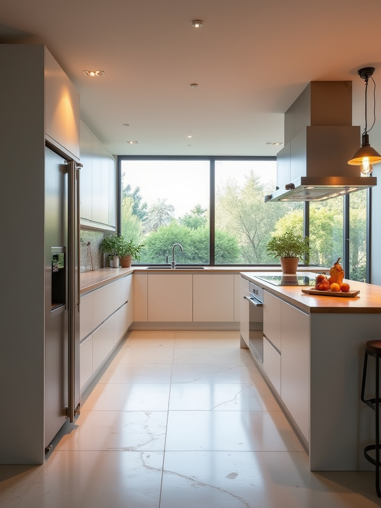
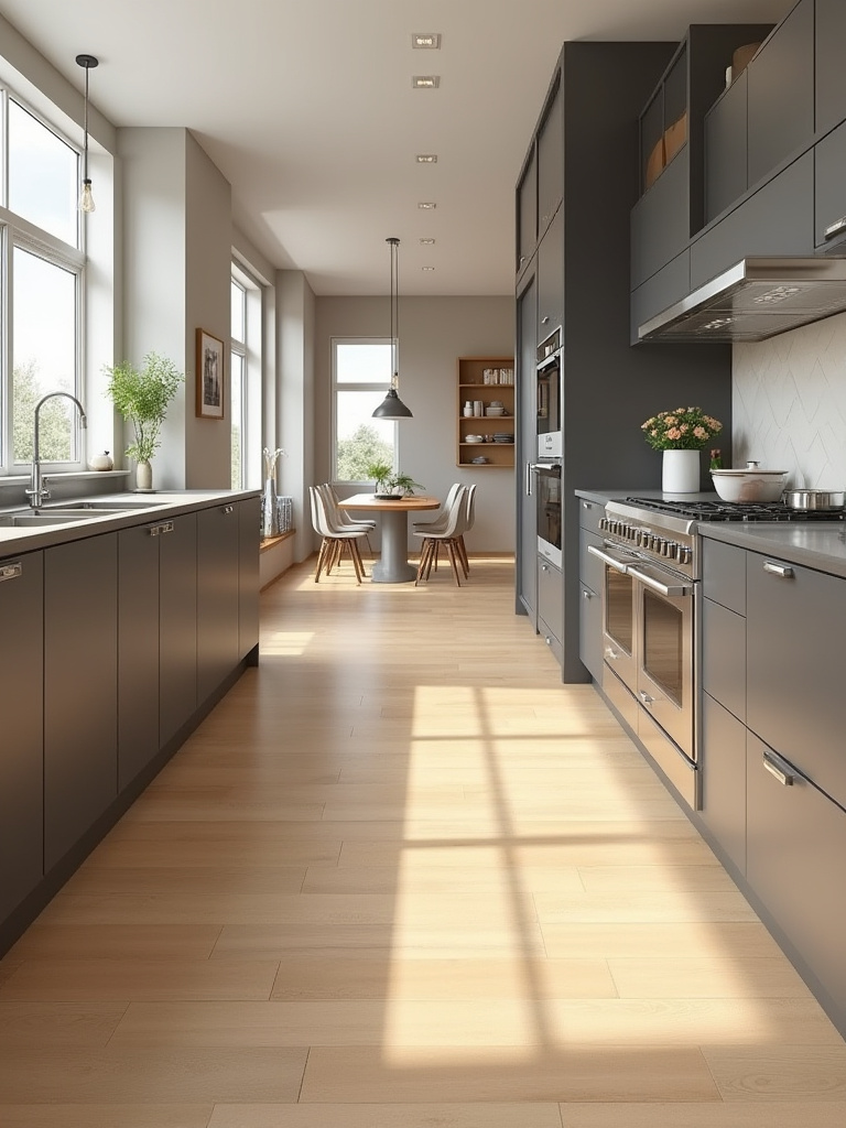
5. Natural Light Maximization: Strategically Position Windows for Brighter Kitchens
As a photographer, this one is close to my heart. Light is not just a utility; it’s a material. The quality and direction of natural light will completely change the feel of your kitchen. But “more light” isn’t always the answer. A giant, south-facing window with no shade will blast your kitchen with heat and glare all day, making it an unpleasant place to be. You have to be strategic. The goal is consistent, indirect, or controllable light.
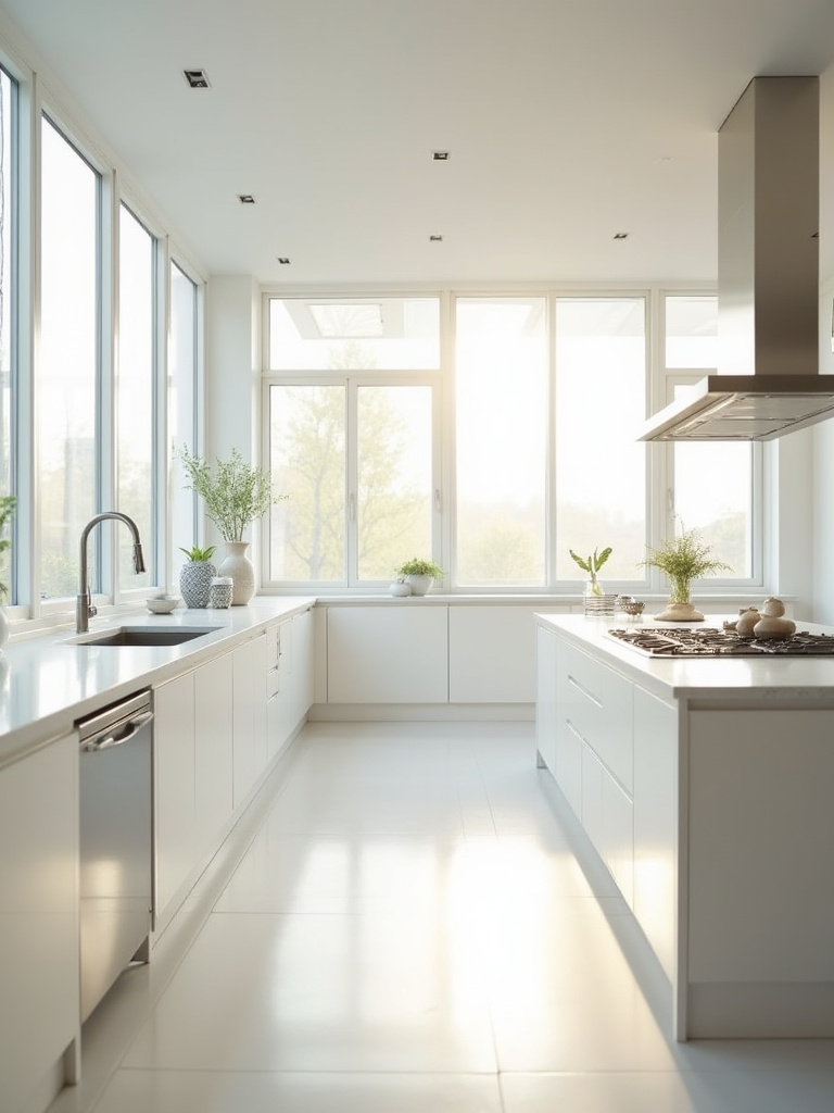
Start by observing your space. Where does the sun rise and set? A north-facing window gives soft, consistent light all day—perfect for a work area. An east-facing window is great for a sunny Breakfast Nook. If you can, place a window directly over the sink. It’s the one place you spend a ton of time standing still, and looking outside makes washing dishes infinitely better. If you can’t add a window, consider a solar tube. They are surprisingly effective at piping natural light into interior spaces. Pair this with light-colored surfaces—white cabinets, reflective backsplashes—to bounce that precious light all around the room.
Thinking about window placement naturally leads you to what’s inside the walls—the plumbing.
6. Strategic Plumbing Placement: Save Costs with Smart Pipe Rerouting Choices
Can we talk about the most expensive part of a Kitchen Renovation that nobody ever sees? It’s moving the plumbing. Moving water supply lines isn’t so bad, but moving the drain and vent stack is a whole different beast. Drains rely on gravity, which means they need a specific slope. Moving a sink from one wall to an island in the middle of the room can involve jackhammering your concrete slab or tearing up an entire floor. It can easily add thousands of dollars to your bill.
The shortcut here is simple: keep your “wet zone” (sink, dishwasher) as close to the existing plumbing as possible. Designing your new layout around the existing plumbing is the single biggest money-saver in a kitchen reno. If you absolutely have to move it, consult with a licensed plumber during the design phase. Don’t just give them a finished plan and expect a miracle. They can tell you what’s feasible and what’s going to cost a fortune, allowing you to make an informed decision before the demo crew shows up.
Once you’ve locked down the invisible infrastructure, you can focus on the visible structure.
7. Integrating Architectural Features: Enhance Kitchen Character with Existing Structures
Everyone seems to be ripping their homes down to the studs to create a sterile, white box. My pet peeve is watching people cover up the very things that give a house character. Got an exposed brick wall? An old structural beam? A weird archway? Don’t hide it—make it the star. Designing with these features instead of against them gives your kitchen a sense of history and personality that you can’t buy from a catalog.
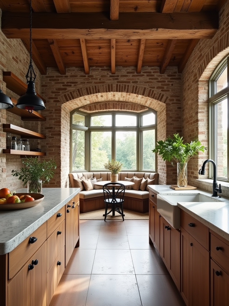
I once worked on a 19th-century townhouse where we uncovered a brick chimney stack during demolition. Instead of drywalling over it, we cleaned it, sealed it, and made it the centerpiece of the kitchen, wrapping the island around it. It became a stunning, textural focal point that grounded the entire modern design. You can build open shelving around a column, create a seating nook in a bay window, or use an old alcove for a dedicated coffee bar. It requires a bit more creativity, but the result is a kitchen that feels layered, authentic, and truly one-of-a-kind.
Elevating Core Elements & Finishes
With the layout locked, it’s time for the fun stuff—the materials and finishes that you’ll see and touch every single day. This is where style meets substance.
8. Selecting Durable Countertops: Match Materials to Your Style and Usage Needs
Everyone says to just get quartz because it’s “the best.” It’s an amazing material—durable, non-porous, and consistent. But it’s not the only answer. The “best” countertop is the one that fits how you live. If you’re a meticulous cook who never leaves a drop of red wine on the counter, then yes, go for that beautiful, dramatic marble you love. But if you have three kids who treat the kitchen like a science lab, you need something bulletproof.
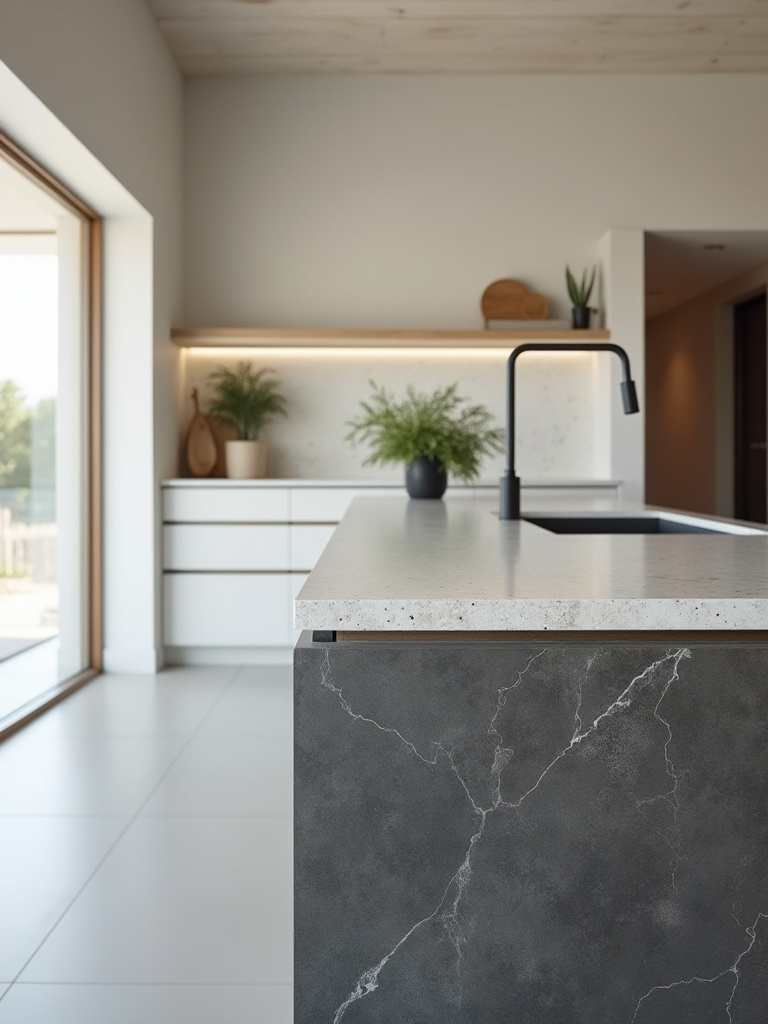
My shortcut for this is to get samples of your top 2-3 choices. Don’t just look at them. Abuse them. Leave a puddle of coffee on the quartz overnight. Put a hot pan (on a trivet, be reasonable) on the granite. Dribble some lemon juice on the marble and see what happens. How a material performs in the real world is far more important than how it looks under the perfect lighting of a showroom. Your countertops are the workhorses of your kitchen; choose them for their grit, not just their good looks.
The countertops sit on your cabinets, which are arguably the most important element in the entire room.
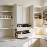
9. Modern Cabinetry Innovations: Explore Smart Storage Solutions Beyond Basic Doors
I used to think cabinets were just boxes with doors. Then I worked on a high-end custom kitchen and saw the light. The true magic of modern cabinetry is not the door style; it’s what’s inside. It’s about replacing deep, dark lower cabinets with full-extension drawers where you can see everything at a glance. It’s about blind corner pull-outs that magically retrieve every pot and pan from the abyss. It’s about appliance garages that hide your toaster and blender, keeping your counters blissfully clear.
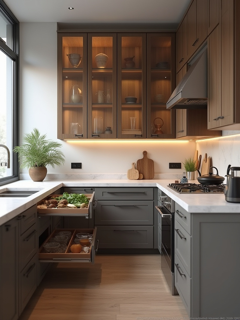
When you’re planning your cabinets, don’t just think about how many you have. Think about how they function. I always tell clients to opt for drawers over doors in lower cabinets whenever possible. It’s a game-changer for ergonomics—no more kneeling on the floor to find a lid at the back of a shelf. These internal solutions—from pull-out pantries to tiered spice drawers—are what transform a kitchen from a simple storage space into a highly efficient machine. This is where you should be spending your money, not on some elaborate crown molding.
Once you have your surfaces and storage sorted, it’s time to shine a light on them—literally.
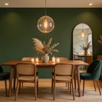
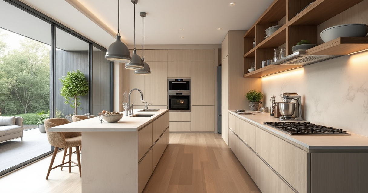
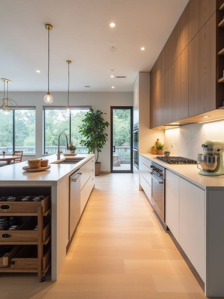
10. Illuminating with Layered Lighting: Create Ambiance and Targeted Functionality
The most critical and most often forgotten layer is task lighting. Continuous LED strips under your upper cabinets are non-negotiable. They light up your countertops perfectly, eliminating shadows and making prep work a breeze. Then, add pendants over an island for both task and accent lighting. Put everything on a dimmer. Everything. This allows you to go from “bright surgical suite” for cooking and cleaning to “moody wine bar” for entertaining, all in the same space. Good lighting is one of the most cost-effective ways to make your kitchen feel more luxurious and functional.
Now let’s look down. The surface you stand on for hours needs to be chosen just as carefully.
11. Flooring That Lasts: Choose Kitchen Floors for Enduring Style and Resilience
Can we talk about why so many people put the wrong floor in their kitchen? They fall in love with a material without considering that this is a high-traffic, high-spill, high-impact zone. Solid hardwood looks beautiful, but a leaky dishwasher can destroy it in a day. Some natural stone tiles are porous and will stain if you look at them wrong. Your kitchen floor needs to be, above all else, resilient.
For most people today, the best choices are high-quality porcelain tile or Luxury Vinyl Plank (LVP). Porcelain is nearly indestructible and waterproof. LVP has come a long way; it can look convincingly like real wood, it’s 100% waterproof, and it’s a bit softer underfoot, which is great if you spend a lot of time standing. I had a client with two large dogs and three kids who put LVP in their kitchen, and after two years of chaos, it still looked brand new. Whatever you choose, make sure your subfloor is perfectly level and properly prepped. The best flooring in the world will fail on a bad foundation.
From the floor, we move up to the walls, where you have a chance to make a real statement.
12. Backsplash as Art: Transform Walls with Creative Material Combinations & Textures
The backsplash isn’t just a functional splash guard anymore. It’s a prime opportunity to inject personality and act as the “art” of the kitchen. This is where you can take a risk or add a touch of luxury without breaking the bank, because it’s a relatively small area. Instead of a standard 4-inch lip of countertop material, consider taking the tile all the way to the ceiling. It creates a dramatic, custom look that makes the whole space feel taller and more finished.
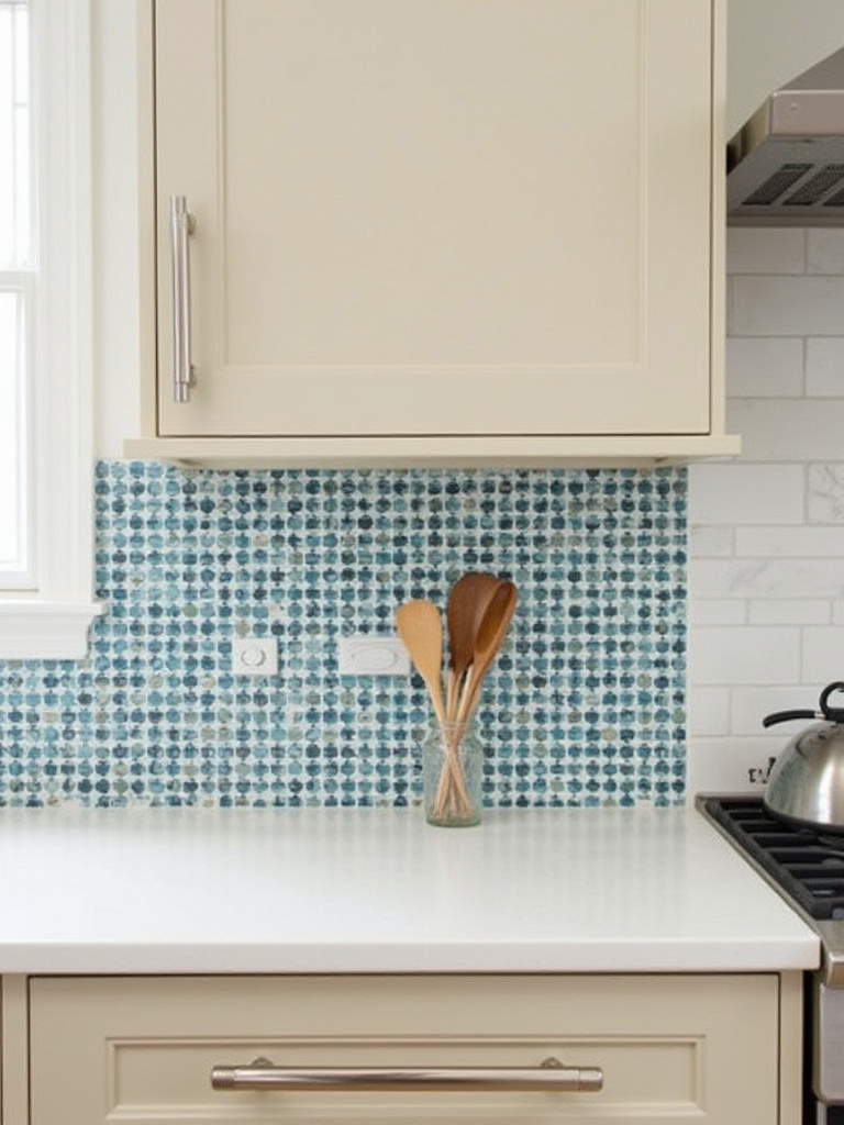
This is the place for that handmade Zellige tile you’ve been eyeing, a bold geometric pattern, or even a single, seamless slab of stone or quartz that matches your countertops. I saw a minimalist kitchen where the only color and pattern came from a floor-to-ceiling slab of beautifully veined Calacatta marble behind the range. It was breathtaking. Just remember to pair it with strategic lighting. A “wall-grazer” light—a recessed fixture placed close to the wall—will beautifully highlight the texture of any tile or stone, turning a flat wall into a dynamic feature.
This kind of bold, seamless look is a principle that extends to your appliances, too.
13. Appliance Integration Secrets: Achieve Seamless Built-In Looks for Modern Kitchens
You know those ultra-sleek European kitchens where you can’t even see the refrigerator? That’s the power of integration. It’s about using “panel-ready” appliances that allow you to put a custom cabinet front on them, making them disappear into the cabinetry. It creates a calm, uncluttered, and continuous visual line that makes a kitchen feel larger and more high-end. This is the secret to achieving that truly minimalist, architectural look.
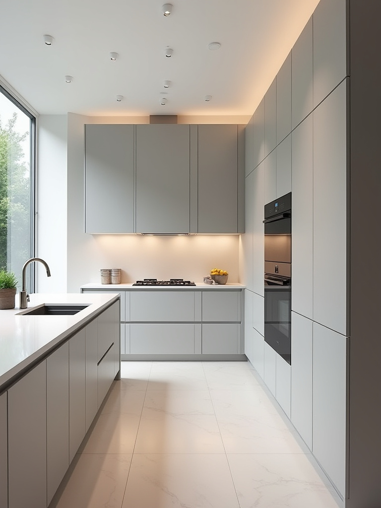
This requires meticulous planning from the start. You need to select your appliances before you finalize your cabinet order, as the cabinet maker will need the exact specs to ensure a perfect fit. And please, for the love of all that is holy, pay attention to ventilation. Built-in refrigerators and ovens need to breathe. Ignoring the manufacturer’s clearance and ventilation requirements is the fastest way to kill a very expensive appliance. The hallmark of a great job is the “reveal”—the tiny, consistent gap between the panels. Aim for 1/8 of an inch or less. That’s the difference between looking custom and looking like a mistake.
While some appliances should disappear, others can—and should—become a centerpiece.
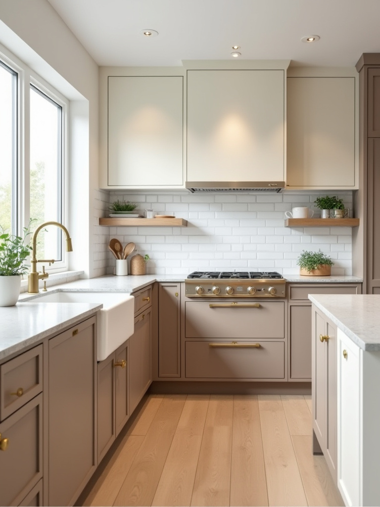
14. Vent Hood as a Statement: Select Design-Forward Exhaust Solutions with Impact
The vent hood is one of the most overlooked design opportunities in the kitchen. For years, it was just a clunky stainless steel box. Now, it can be the sculptural focal point of the entire room. Instead of trying to hide it, lean into it. A beautifully shaped hood in plaster, wood, or a burnished metal like copper or brass can anchor the whole design and create a powerful statement.
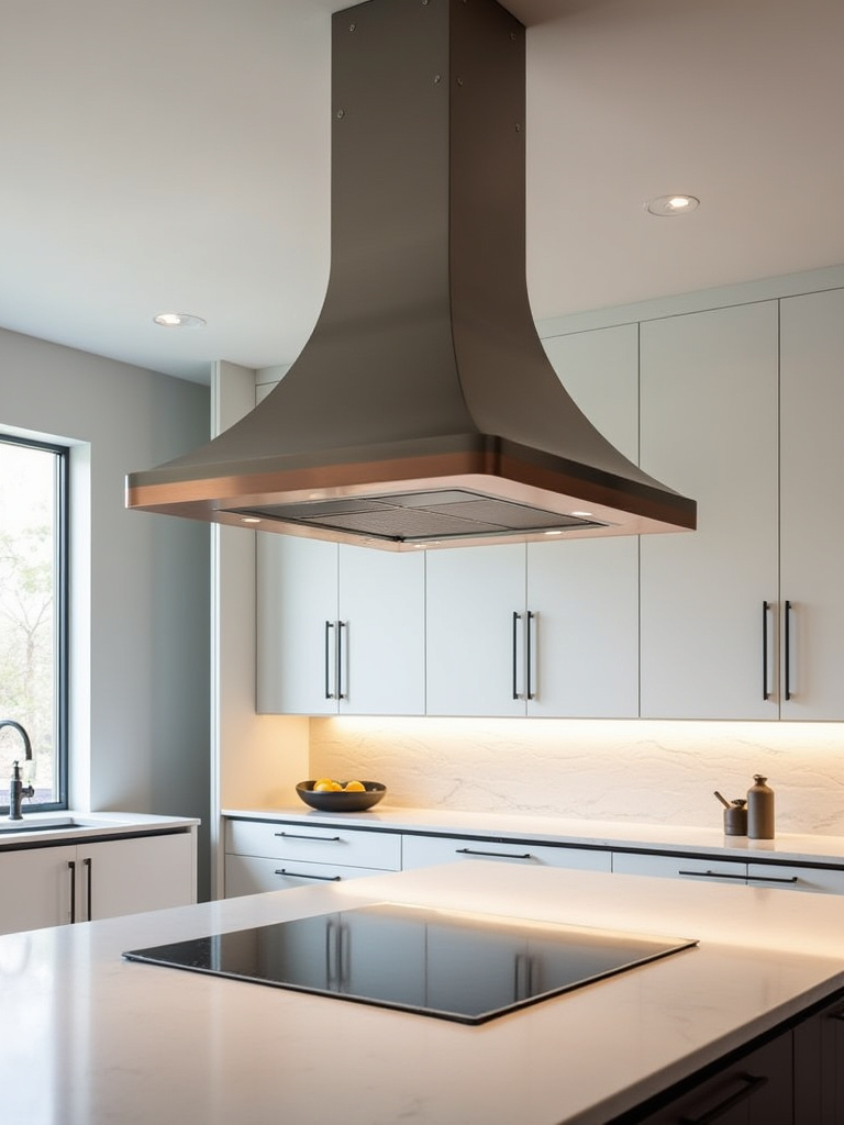
Function still comes first, of course. Make sure the hood is sized correctly for your range (it should be at least as wide as the cooktop) and has enough power (measured in CFM, or cubic feet per minute) for the way you cook. A gas range or a lot of high-heat searing requires more CFM. But beyond that, think of it as sculpture. A custom-clad hood, where you build a frame around a high-performance “insert,” gives you complete aesthetic freedom. It’s one of those elements that signals a truly custom, thoughtfully designed kitchen.
The hood often sits above the most multi-functional element in the entire kitchen: the island.
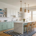
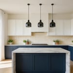
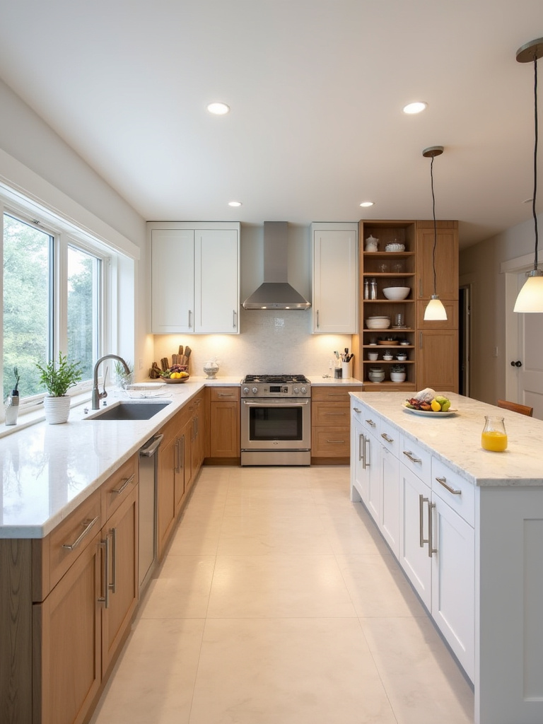
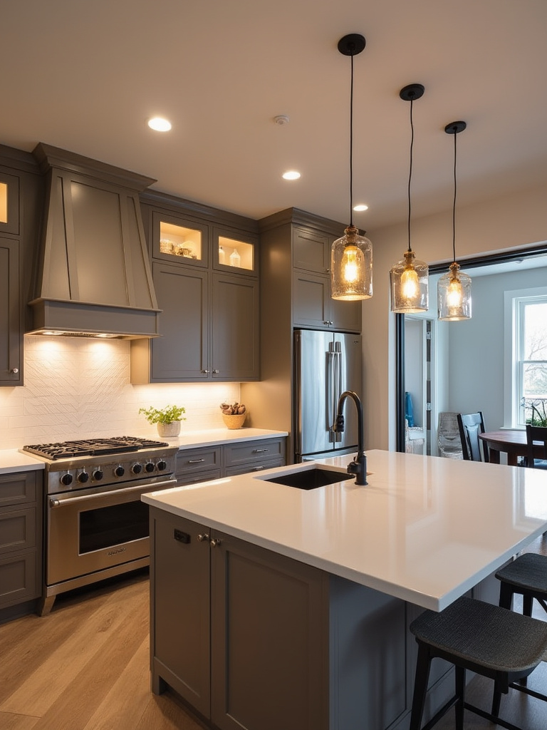
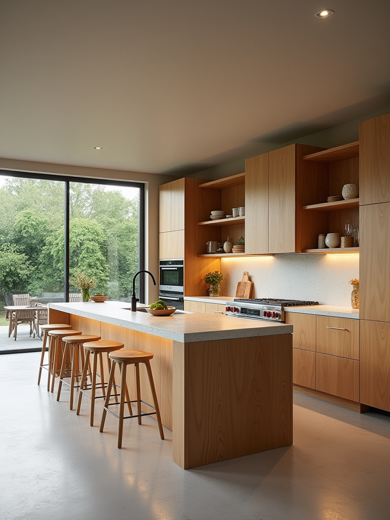
15. Rethinking the Kitchen Island: Maximize Multifunctional Workspaces and Social Hubs
The island is no longer just a place to chop vegetables. It’s the command center of the modern home. It’s a homework station, a breakfast bar, a buffet for parties, and a home office. Your island design needs to reflect this reality. This means thinking in zones. One side might be dedicated to prep work, with a sink and durable countertop, while the other side is for socializing, with comfortable seating and a warmer material like wood.
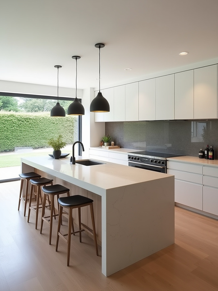
The biggest mistake people make is not planning for power. Integrate outlets—and lots of them. Include USB-C ports. Consider a pop-up outlet tower to keep the surface clean when not in use. I designed an island for a family that included a “tech drawer” with a built-in charging strip, so all the family’s devices could be charged out of sight, eliminating counter clutter. Also, think about seating. Ditching a row of single-file bar stools for an integrated banquette on one side can create a much more comfortable and conversational dining spot.
Smart Solutions & Personal Touches
You’ve got the bones and the body. Now it’s time for the soul—the clever solutions and personal details that make a kitchen uniquely yours.
16. Unlocking Pantry Potential: Implement Highly Organized Storage Systems for Efficiency
I am convinced a well-organized pantry is the secret to a happy life. A chaotic pantry where you can’t find anything leads to food waste, duplicate purchases, and frustration. This isn’t about buying a hundred matching plastic bins (though they can help). It’s about visibility and accessibility. The goal is to be able to see everything you have at a glance.
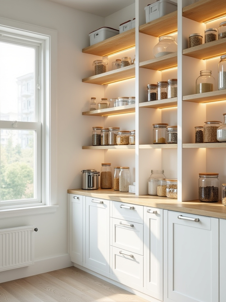
This means replacing deep, fixed shelves with pull-out drawers or trays. It means using tiered risers for cans so you can see the back row. It means using the back of the door for spices or shallow items. One of the best systems I’ve ever implemented for a client was a simple zone-based approach: all baking supplies on one shelf, all pasta and grains on another, all snacks in labeled bins. They reported cutting their grocery bill by nearly 20% simply because they stopped buying things they already had but couldn’t find.
While the pantry is about hiding things beautifully, some storage is meant to be seen.
17. Open Shelving Showcase: Curate Displays for Personalized Style and Accessibility
Open shelving is beautiful. It can also be a nightmare. Everyone loves the light, airy look, but they forget the reality: you have to be disciplined and tidy. If you’re not the kind of person who enjoys curating and organizing, it will quickly become a magnet for clutter. That said, if you’re up for it, open shelving can be a fantastic way to break up a long wall of upper cabinets and display your most beautiful and frequently used items.
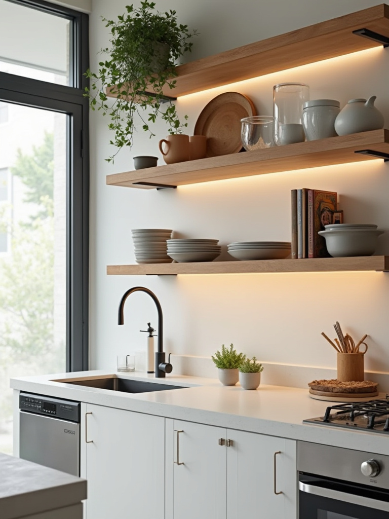
The key is to treat it like a composition. This is where my photography background really comes in handy. Don’t just line things up. Mix heights, textures, and shapes. Use the “Rule of Three”—grouping items in odd numbers is more visually pleasing. Mix your everyday dishes with a small plant, a stack of cookbooks, and a piece of art. And please, leave some empty space. The “negative space” is just as important as the objects themselves. It gives your collection room to breathe and keeps it from looking like clutter.
Speaking of clutter, let’s tackle the biggest source of it in the modern kitchen.
18. Integrated Charging Stations: Hide Tech Clutter for a Cleaner, More Functional Counter
The kitchen island has become the family charging station, and it’s a mess. Wires, power bricks, phones, tablets—it’s a constant visual distraction. The solution is to design a dedicated, hidden home for all this tech. It can be as simple as installing a power strip in the back of a deep “appliance garage” cabinet or as slick as a dedicated “charging drawer.”
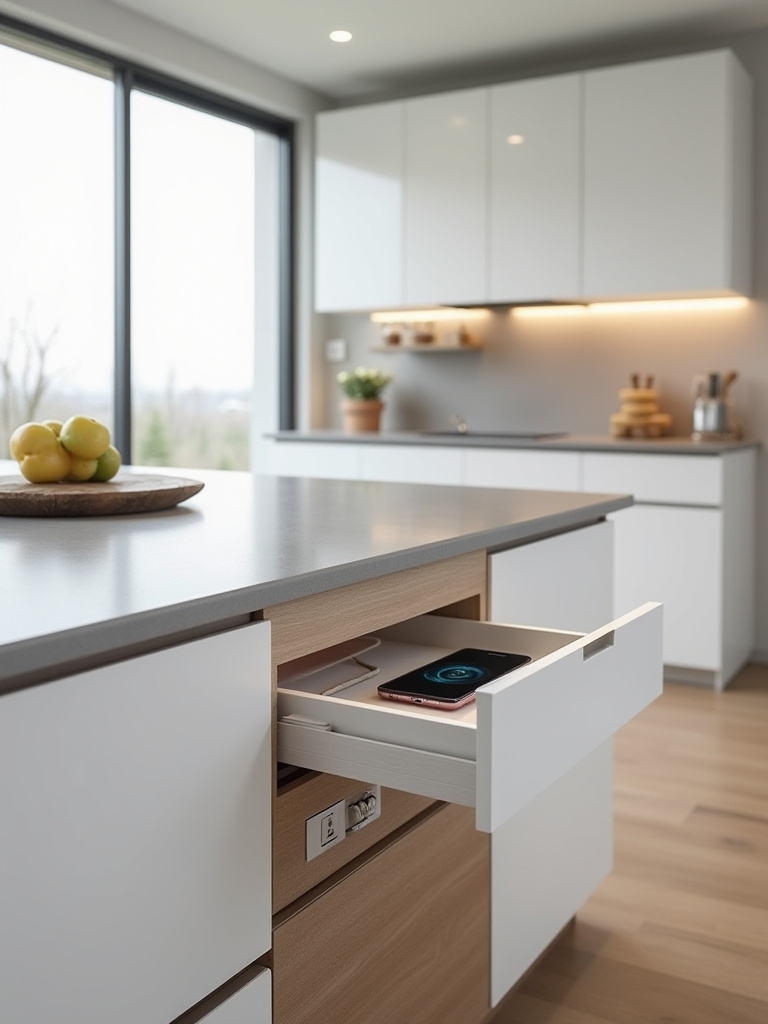
I had a client who was adamant about having a completely clear island. We designed a shallow drawer near the edge with a built-in power strip and dividers for all their devices. They could drop their phones in, close the drawer, and forget about them. Some companies even make wireless charging pads that can be integrated invisibly under the surface of your countertop. You just place your phone on the spot, and it starts charging. It’s a small detail that has a huge impact on the daily serenity of the space.
From hiding tech, we move to highlighting another daily ritual: your morning coffee or evening drink.
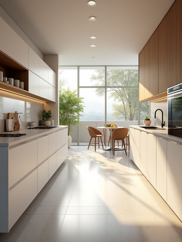
19. Designing the Beverage Bar: Create a Dedicated Coffee or Drink Nook Effortlessly
Moving all your beverage-related activities to one dedicated spot is one of the biggest functional upgrades you can make. A coffee bar or beverage nook frees up prime real estate near your main sink and stove, and it decongests traffic during busy mornings. It can be a small stretch of counter between the fridge and a pantry, or an entire built-in unit with its own mini-fridge and sink.
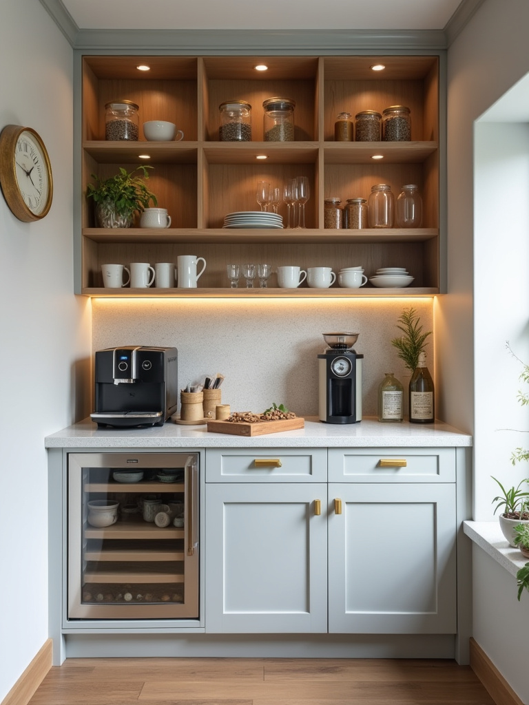
The key elements are dedicated storage for mugs, glasses, coffee, and tea; a durable, easy-to-clean countertop; and, most importantly, sufficient power for all your appliances (coffee maker, grinder, kettle, etc.). Add some good task lighting, and you’ve created a self-sufficient station that feels like a little luxury. It streamlines your routine and makes entertaining a breeze, as guests can help themselves without getting in the cook’s way.
Creating these thoughtful zones is a major step toward creating a cohesive, unified feel.
20. Color Palette Cohesion: Achieve Harmony Across All Kitchen Elements Visually
A beautiful kitchen isn’t just a collection of nice things; it’s a cohesive whole where everything works together. The color palette is the glue that holds it all together. The easiest way to achieve this without hiring a designer is to follow the 60-30-10 rule. It’s a classic for a reason.
The 60-30-10 Rule:
- 60% is your dominant color. This is usually your cabinets or your walls. It’s the main backdrop of the room.
- 30% is your secondary color. This could be your countertops, your island (if it’s a different color), or your flooring. It’s there to add contrast and interest.
- 10% is your accent color. This is the fun part. It’s your hardware, your light fixtures, your bar stools, or a piece of art. It’s the pop of personality.
The most common mistake is ignoring undertones. That “greige” cabinet you picked might have a green undertone, while your “white” countertop has a yellow one. When you put them together, something will just feel off. Get physical samples of everything—paint chips, cabinet doors, countertop swatches, floor tiles—and look at them together in your kitchen’s actual light. This is the only way to ensure your palette is truly harmonious.
As you choose those colors and materials, think about their impact beyond just the visual.
21. Sustainable Material Choices: Build an Eco-Friendly and Healthy Kitchen Environment
Building a “healthy” kitchen goes beyond the food you cook in it. It’s about the air you breathe. Many standard building materials—like paints, adhesives, and particleboard—can off-gas volatile organic compounds (VOCs) for years, impacting your home’s air quality. Making sustainable choices isn’t just about being eco-friendly; it’s about creating a healthier environment for your family.
Look for materials with third-party certifications. For wood, that’s FSC (Forest Stewardship Council). For low-emission products, look for a GREENGUARD Gold label. Choose zero-VOC or low-VOC paints and finishes. Opt for cabinetry made with NAUF (No Added Urea Formaldehyde) plywood instead of standard MDF or particleboard. Materials like bamboo or cork for flooring, or countertops made from recycled glass or paper composite, are also fantastic choices. It’s about being conscious of the entire lifecycle of a product, from how it’s made to how it will live in your home.
Once you’ve built that healthy, beautiful canvas, it’s time to add the final, personal brushstrokes.
22. Artwork & Accessories Curation: Inject Personality and Warmth Beyond Pure Function
Your kitchen should not feel like a laboratory. It’s the heart of your home, and it should have a soul. This is where artwork and accessories come in. Please, hang some real art in your kitchen. It doesn’t have to be expensive. It could be a print from a local artist, a kid’s drawing in a nice frame, or even a beautiful photograph. It instantly elevates the space and injects personality.
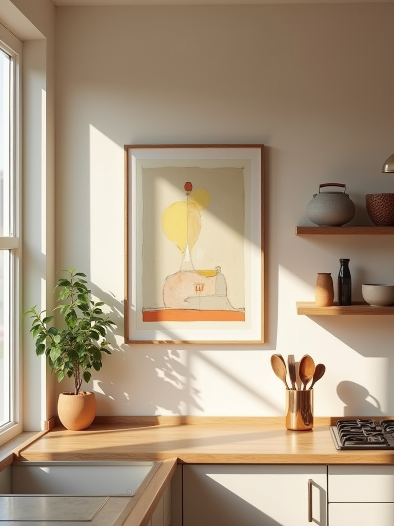
Accessorize with things that are both beautiful and useful. A gorgeous wooden cutting board leaned against the backsplash, a crock of well-worn wooden spoons, a small but vibrant ceramic bowl for salt. The key is curation. Don’t clutter every surface. Pick a few meaningful items and let them shine. A small, well-tended plant or a vase of fresh branches can add life and color more effectively than a dozen cheap trinkets. This is the final layer that transforms a well-designed kitchen into your kitchen.
This final layer of comfort extends to where you and your guests will actually sit.
23. Embrace Unique Seating: Incorporate Comfort and Style at Islands and Breakfast Nooks
For the love of God, stop buying uncomfortable bar stools. Just because a stool is the right height doesn’t mean it’s the right choice. Your kitchen seating will be used for lingering conversations, long homework sessions, and casual meals. It needs to be comfortable. This means looking for stools with a back, a footrest, and maybe even a bit of upholstery.
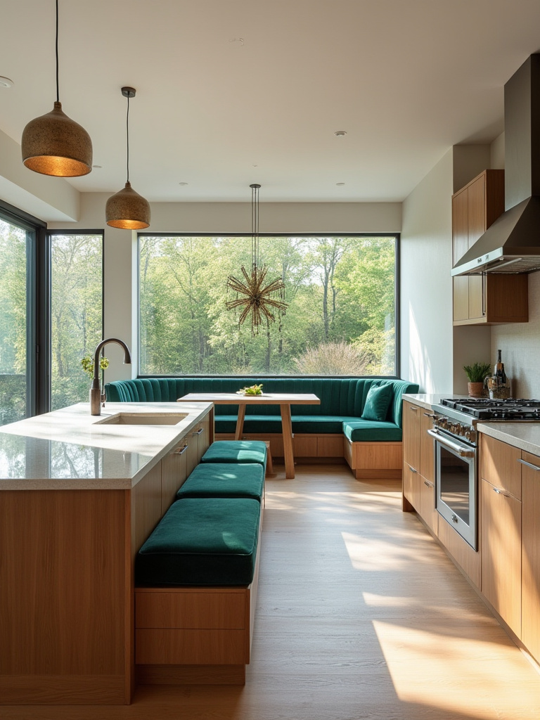
Better yet, think beyond the stool. A built-in banquette is one of the most brilliant solutions for kitchen seating. It can wrap around a corner, making incredibly efficient use of space, and it’s far more comfortable and social than a row of stools. You can also build a ton of storage into the base of the banquette. Whether it’s a bench integrated into the back of your island or a cozy nook with an upholstered seat, choosing unique and comfortable seating is what truly transforms your kitchen from a work zone into a living space.
The Takeaway
Look, a successful kitchen remodel isn’t about having the trendiest tile or the most expensive faucet. It’s a game of millimeters, a study of light, and an honest look at how you live your life. It’s about creating a machine that works so beautifully you don’t even notice it—freeing you up to enjoy the cooking, the conversations, and the connections that happen there.
So take these ideas. Sketch them out. Tape them on your floor. Challenge the assumptions and forget what the magazines tell you is “in.” Design a space that serves you, that solves your problems, and that brings you a little bit of joy every time you walk into it. That’s a kitchen worth investing in.