A common misconception in interior design is that a luxurious coffee table requires an abundance of accessories to feel complete. However, mastering the art of coffee table styling for a high-end aesthetic is not about volume; it is about intentional selection. Homeowners often saturate surfaces with extensive collections, assuming that maximizing display space equates to high design.
In reality, filling every available inch creates visual chaos rather than sophistication. This tendency transforms potential elegance into clutter, making the living space feel disorganized and overwhelming. The secret to refined design lies in intentional curation.
The distinction between clutter and true curation lies in the shift from a random collection to a purposeful display. This transition establishes “Curatorial Confidence,” where every object serves a distinct role in elevating the room’s design. Instead of scattering items, a curated approach prioritizes negative space to ensure specific pieces breathe and are fully appreciated. It involves strategic choices, such as using trays to corral small items into intentional zones and layering objects of varying heights and textures to create necessary depth.
This guide reveals the essential strategies for achieving that polished, professional look. We explore how to utilize the rule of odds to create balanced vignettes and how to arrange visual triangles that draw the eye naturally. By focusing on smart investment pieces and structural harmony, you will learn to style a coffee table that balances classic elegance with modern comfort. Master these principles to turn a flat surface into a sophisticated centerpiece.
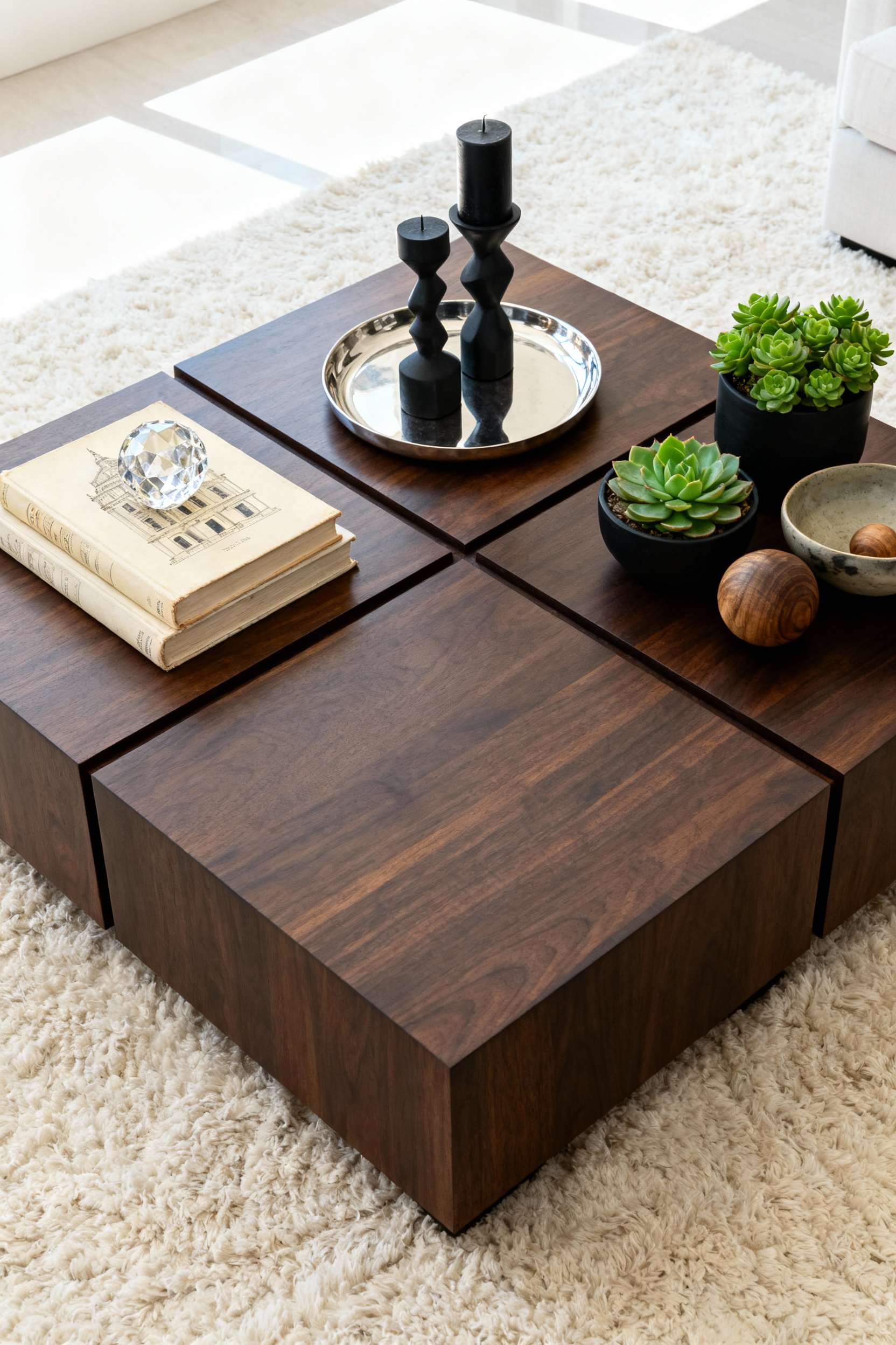
1. The Foundation: Using Trays as Architectural Framing Devices
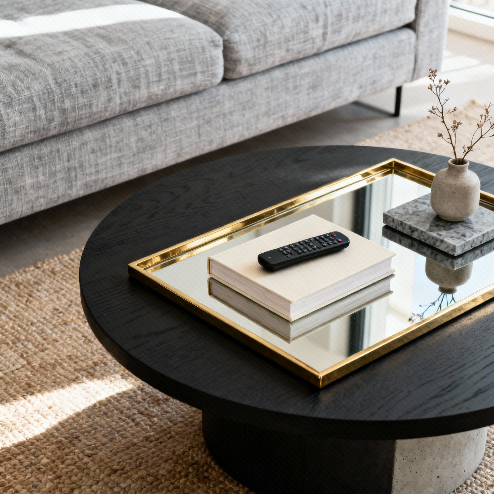
Think of a decorative tray as an architectural framing device for your living space. It acts as a visual anchor that defines a designated area on your coffee table, transforming a collection of items into a cohesive design vignette. This perimeter contains your styling efforts and prevents small necessities, such as remotes or coasters, from looking scattered.
To establish a clear boundary, select a tray material that contrasts with the table underneath. A sleek mirrored tray creates a sharp definition against warm wood, while a textured woven piece softens the look of a glass surface.
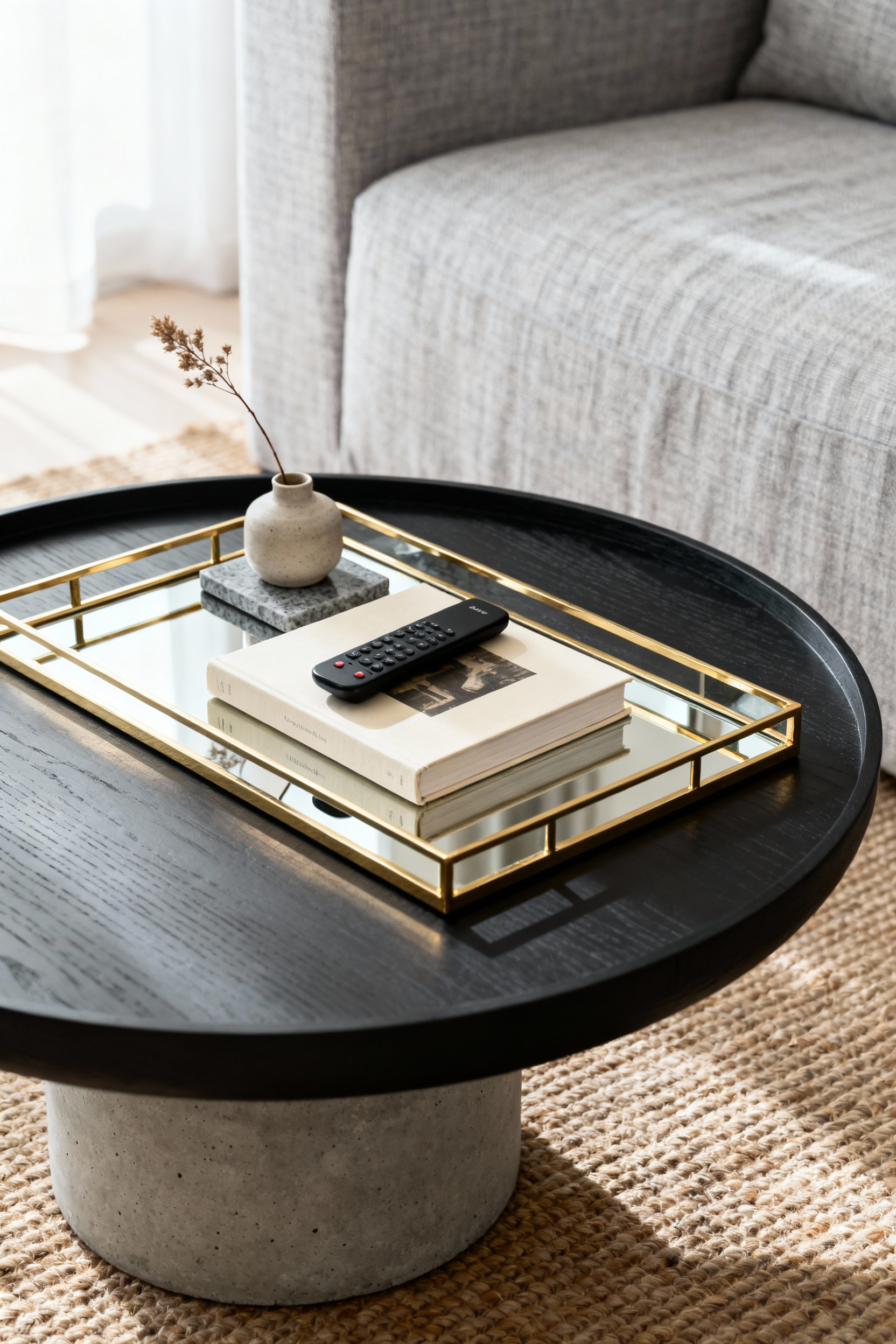
Once you establish this foundation, use the tray to build dimension and visual interest. Avoid a flat display by incorporating objects of varying heights and textures within the frame. A reliable styling formula is the “3-Element Rule,” which creates a balanced composition:
- Height: Introduce verticality with a candlestick or vase.
- Filler: Ground the arrangement with a low bowl or a stack of art books.
- Personal Touch: Finish with a unique souvenir or small framed photo to add character.
While styling is essential, the table must remain functional. Select a tray size that leaves ample negative space and does not dominate the entire surface area. Positioning the tray slightly off-center often works best. This arrangement preserves room for guests to set down drinks and ensures the coffee table retains its primary utility while looking effortlessly curated.
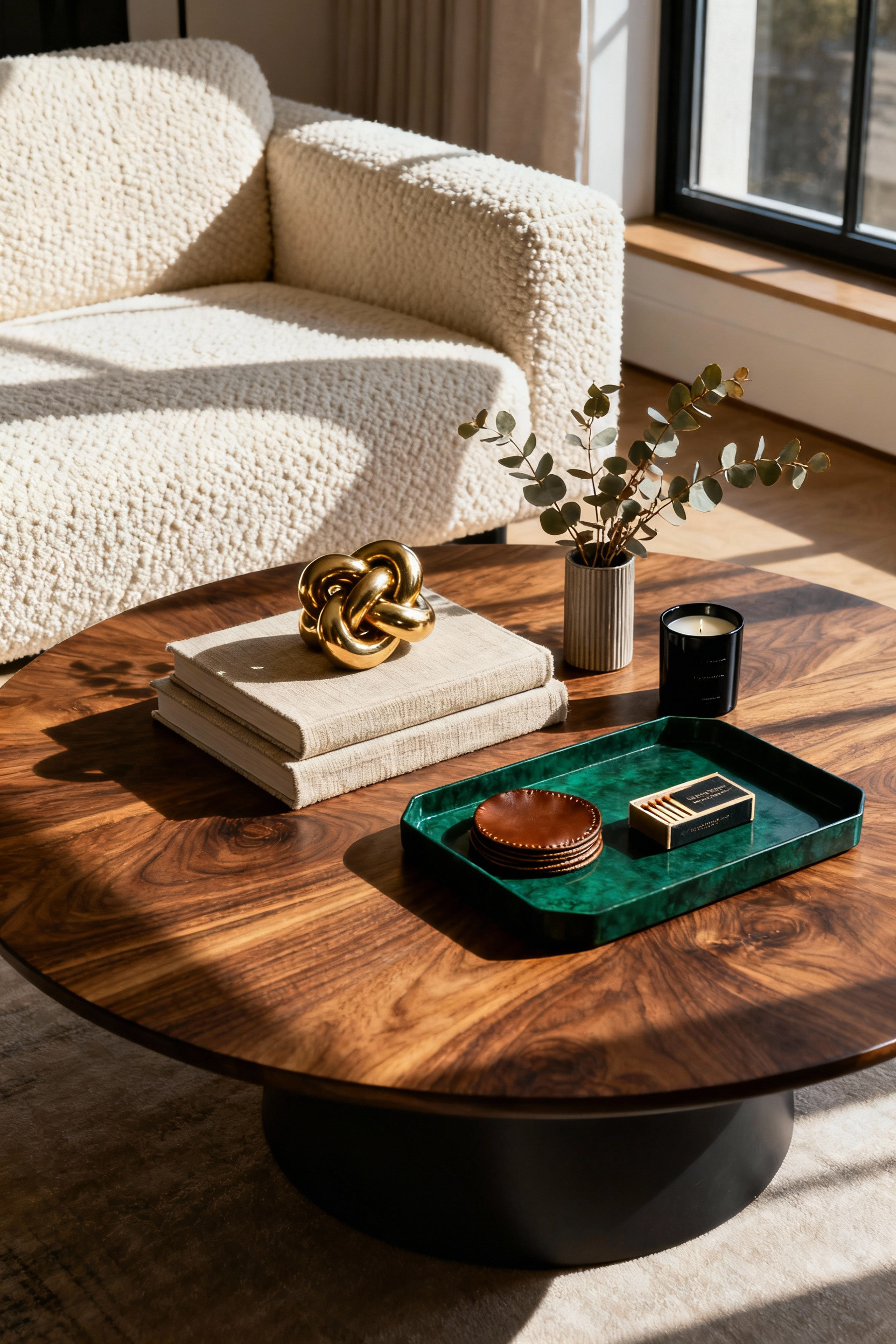
2. The Literary Base: Principles of the Book Stack
Coffee table styling begins with a strong foundation, and selecting the right volumes is crucial for a sophisticated look. Curate titles that genuinely reflect your personal interests, such as art, travel, or fashion, to serve as elegant conversation starters. For a cohesive aesthetic, ensure the cover colors complement your room’s existing palette.
When arranging these volumes, always stack from largest to smallest. Place the heaviest, widest book at the bottom to create a stable base and a pleasing visual taper. This pyramidal structure guarantees stability and ensures the title of every book remains partially visible.
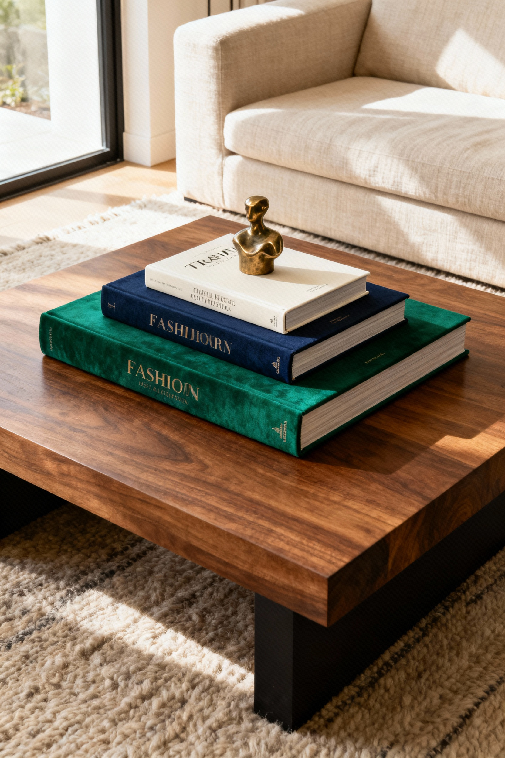
Achieving visual balance relies heavily on the number of books you employ. While a stack of two to four books creates a neat arrangement, designers often recommend the “Rule of Three.” Groupings of odd numbers, such as three or five, generally appear more dynamic and visually pleasing to the eye than even pairings. This approach prevents the display from looking rigid and adds an organic flow to the tabletop composition.
Beyond their literary value, view your book stacks as functional architectural tools. Use the stack as a riser to create varying levels of height across the table. Top the arrangement with one to three small decorative objects, such as a sculptural piece, a decorative dish, or a candle. This adds necessary texture and dimension to your vignette, transforming a simple collection of reading material into a curated, high-end pedestal.
3. Visual Architecture: Establishing High, Medium, and Low Planes
Visual architecture transforms a cluttered surface into a curated display. Think of your coffee table arrangement like a city skyline. If every object sits at the same level, the result appears flat and two-dimensional.
By purposefully mixing varying heights, you break up the horizontal plane and guide the eye through the arrangement. This variation creates essential depth and prevents the styling from feeling monotonous or accidental. For more comprehensive strategies on maximizing your overall space, explore our collection of Essential Tips for Stunning Living Room Styling.
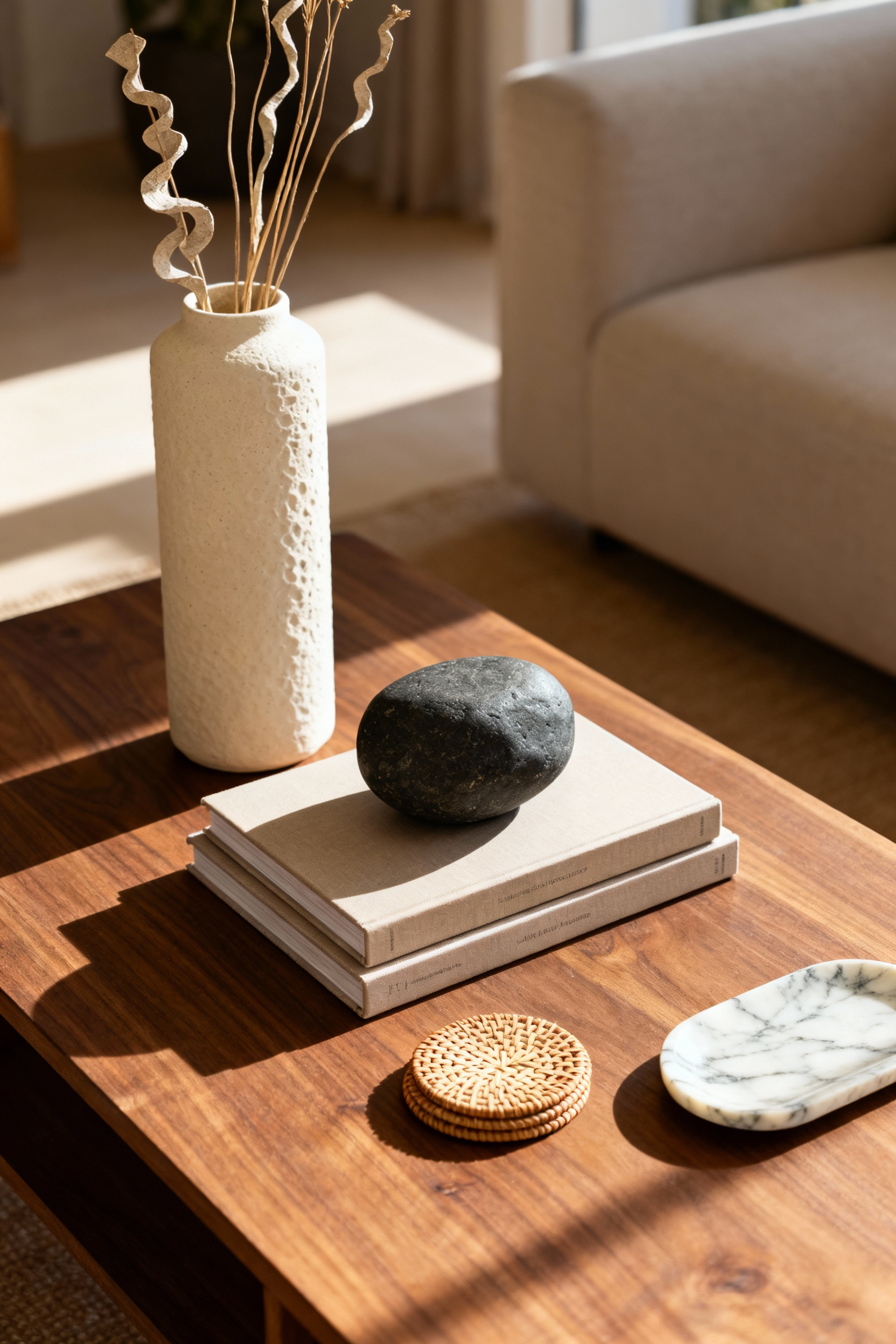
To achieve this professional, layered look, structure your groupings to include one element from each vertical tier. This formula ensures balance without overcrowding the surface:
- Low Plane: Establish a foundation with base-level items. A sleek decorative tray, a low-profile bowl, or a stack of two coffee table books serves as the anchor for the vignette.
- Medium Plane: Create a bridge with mid-sized transitional pieces. A stack of three to four books, a sculptural object, or a chunky candle holder adds necessary mass and texture.
- High Plane: Draw the eye upward with a focal point. A vase featuring fresh greenery or an elegant taper candle provides the vertical lift needed to finalize the composition.
While elevation creates drama, functionality remains paramount. Your tallest element must never obstruct the sightline between guests seated on opposite sides of the sofa. As a general rule, cap the height of your focal point at comfortable eye level. This creates a sophisticated aesthetic that encourages conversation rather than blocking the view of the fireplace or interrupting the flow of the room.
4. The Rule of Threes: A Mathematical Approach to Sophisticated Arrangements
The human eye naturally gravitates toward odd numbers. In design, the Rule of Threes serves as a fundamental principle because it prevents the static, overly symmetrical look that often accompanies even-numbered pairings. Grouping items in threes forces the eye to move around the display, creating a dynamic energy that feels curated rather than staged. This mathematical approach transforms a flat surface into an engaging visual landscape.
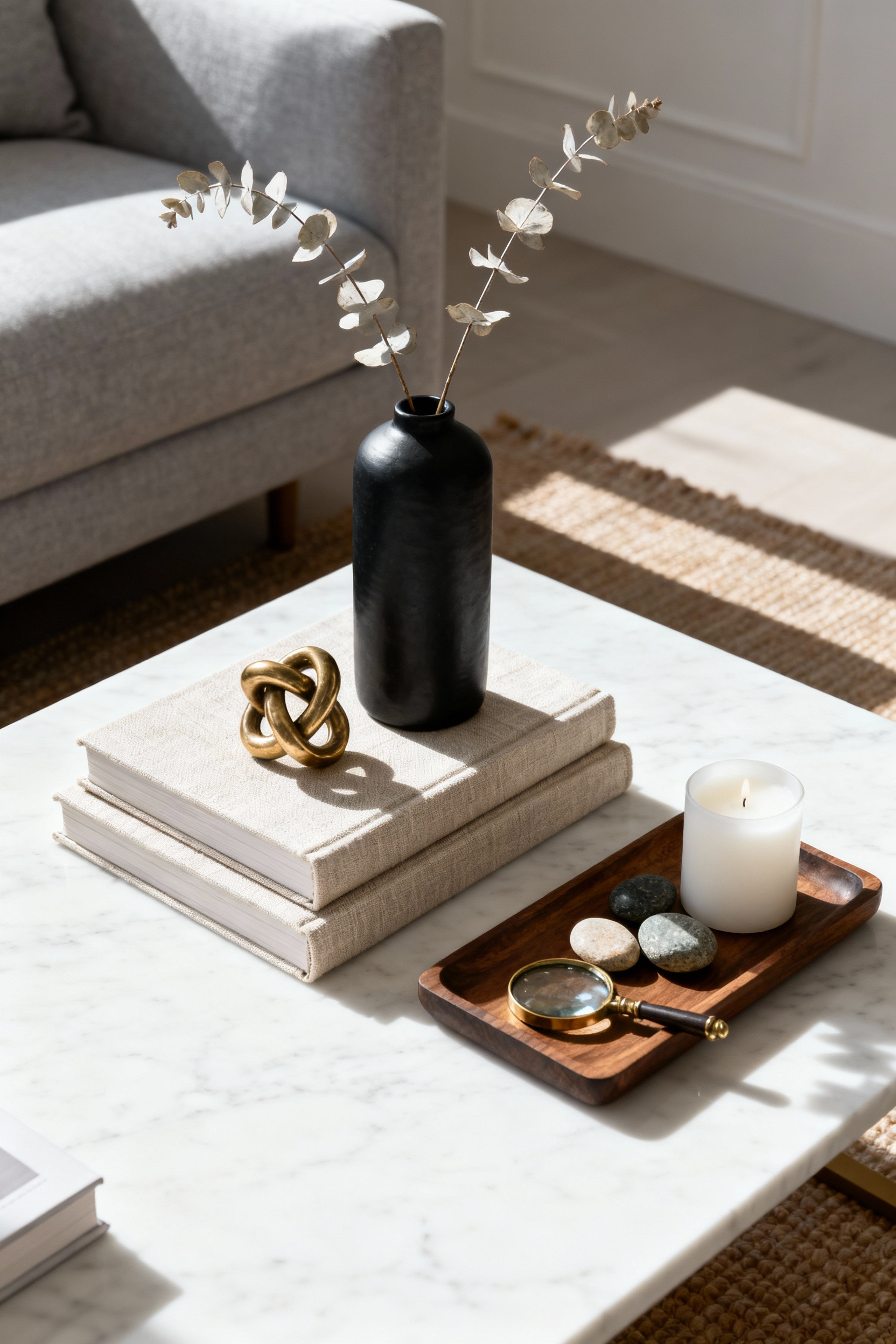
To master this on your coffee table, structure your layout around three distinct “footprints” rather than simply lining up three small objects. For example, anchor the space with a large decorative tray, a stack of books, and a sculptural vase, each occupying its own zone.
Within these groupings, apply the “Pyramid Effect” by varying the physical dimensions of the objects. Arrange tall, medium, and short items to form a triangular silhouette. This height variation adds architectural interest and prevents the arrangement from looking one-dimensional.
While the arrangement creates structure, material selection provides depth. Use a foundational unifier, such as a tray or a stack of books, to corral smaller items and reduce visual clutter. Ensure the group shares a common thread, like a specific color palette or metal finish, to maintain sophisticated cohesion. For a truly professional finish, mix these three material categories within your vignette:
- Natural: Incorporate organic elements like fresh florals, a small plant, or wooden accents to bring life to the space.
- Reflective: Add shine and light with metal or glass items, such as a brass candle holder or a crystal bowl.
- Textural: Ground the look with soft or matte surfaces, like linen-bound books or matte ceramic sculptures.
5. Organic Softness: Introducing Sculptural Botanicals and Blooms
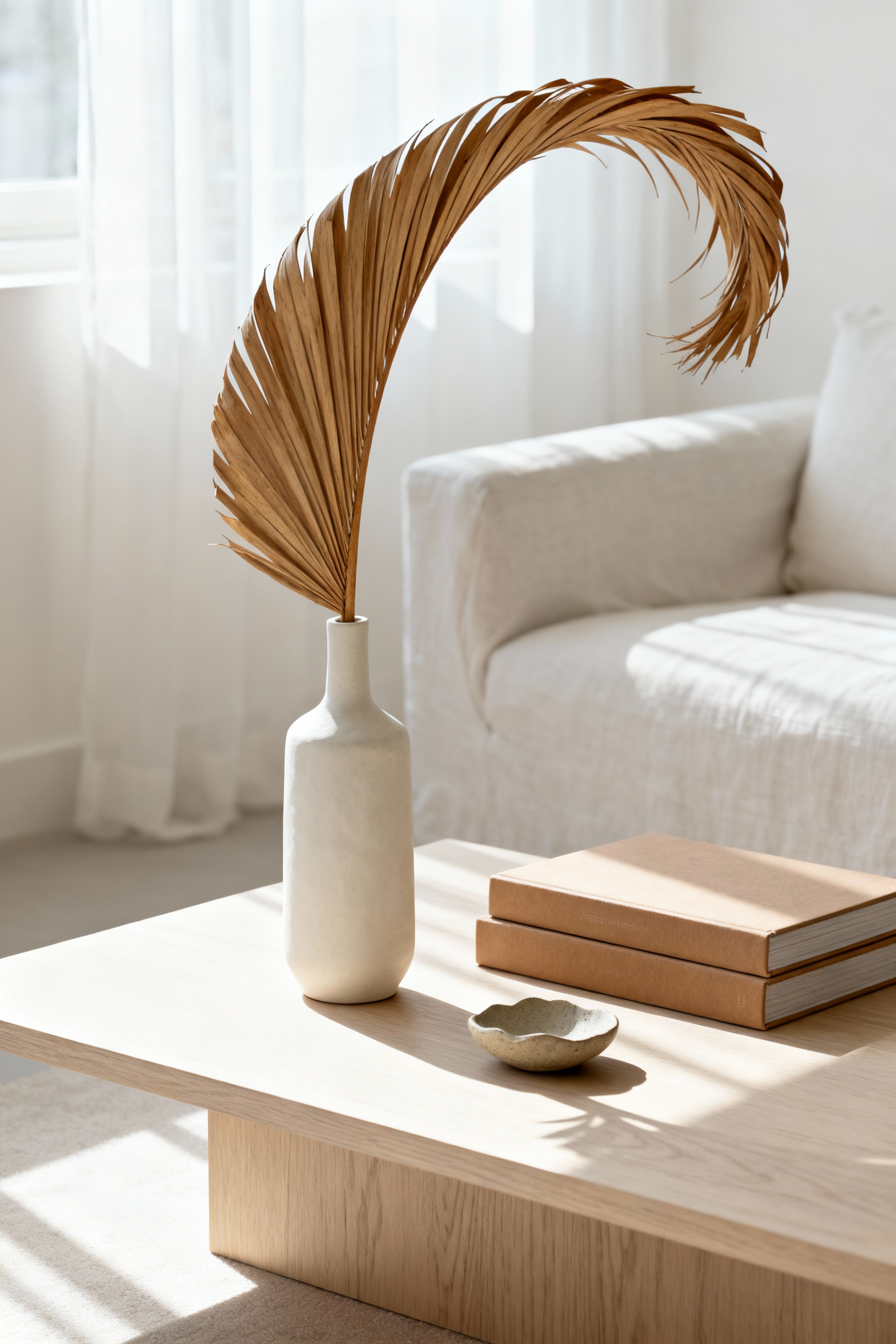
To achieve a high-end look, view your botanicals as living sculptures rather than simple decoration. Prioritize silhouette over abundance when selecting your natural elements. Instead of dense, traditional bouquets, choose single, high-impact pieces like dramatic curving branches or dried palms.
This approach utilizes negative space to create visual breathing room on your coffee table. By using restraint and avoiding an overfilled vase, you allow the unique lines and shapes of the stems to stand out, emphasizing movement and architectural form.
Introduce texture contrast to elevate the arrangement further. Pair the organic roughness of willow branches with a sleek ceramic or glass vase. This juxtaposition enhances the visual appeal of both the vessel and the plant. For a more permanent solution, incorporate architectural greenery. A single striking orchid or a sculptural potted succulent adds a lively touch without the daily maintenance of fresh cut flowers. These options hold a strong shape, ensuring your design remains crisp and sophisticated over time.
Finally, master the composition by applying the rule of varying heights. Use your tall, sculptural botanical as the anchor and high point of the vignette. Artfully clip stems at different lengths to let them lean or sprawl naturally. From there, layer shorter items, such as a stack of art books or a low bowl, underneath the greenery. This layering creates visual depth and transforms a flat surface into a dynamic, curated display.
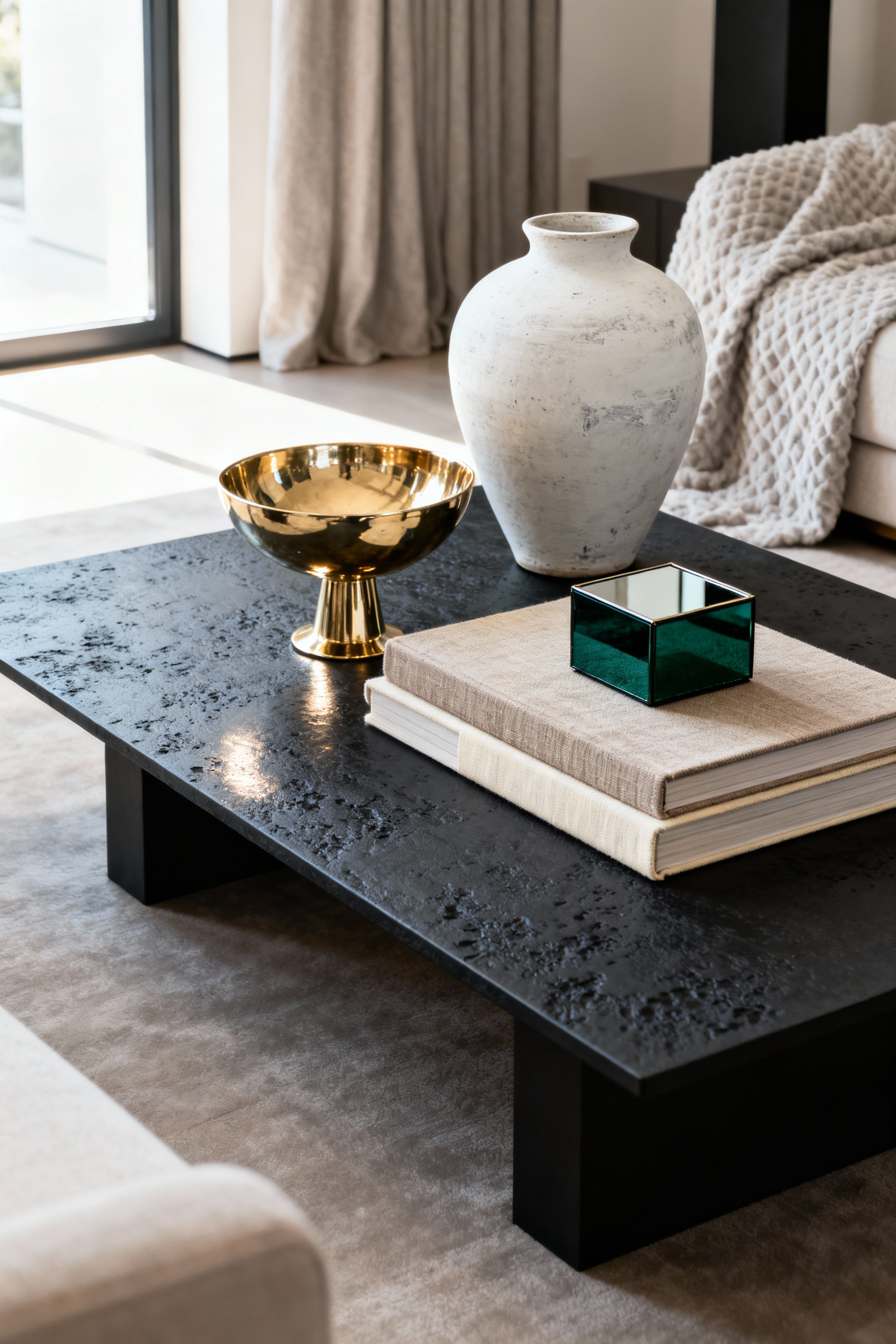
6. Material Contrast: The Art of Mixing Brass, Marble, and Wood
Mastering the mix of brass, marble, and wood elevates a coffee table from simple furniture to a curated centerpiece. The secret lies in balancing temperature and texture. Marble offers a cool, polished foundation that feels luxurious but can sometimes appear stark.
By introducing brass, you inject metallic warmth and a reflective shine that catches the eye. Wood acts as the grounding force, supplying an organic texture that softens the composition and bridges the gap between the sleek stone and the glowing metal.

Start your styling by anchoring the surface with a contrasting tray. Place a rich wooden tray directly onto a marble table to instantly “warm up” the cool stone and create a deliberate, layered look. Within this arrangement, incorporate brass sparingly to maintain sophistication.
Use the metal for small accessories, such as a sculptural candle holder, a decorative bowl, or the frame of a coaster set. This adds an Art Deco-inspired golden gleam without overwhelming the space or competing with the table’s primary material.
Finally, soften the hard lines of stone and metal with organic elements. The polished nature of marble and brass benefits significantly from a natural counterpoint. Introduce fresh flowers, a low-maintenance succulent in a simple ceramic pot, or a small driftwood sculpture. These additions break up the rigidity of the hard surfaces, ensuring the high-end materials feel inviting and lived-in rather than purely distinct.
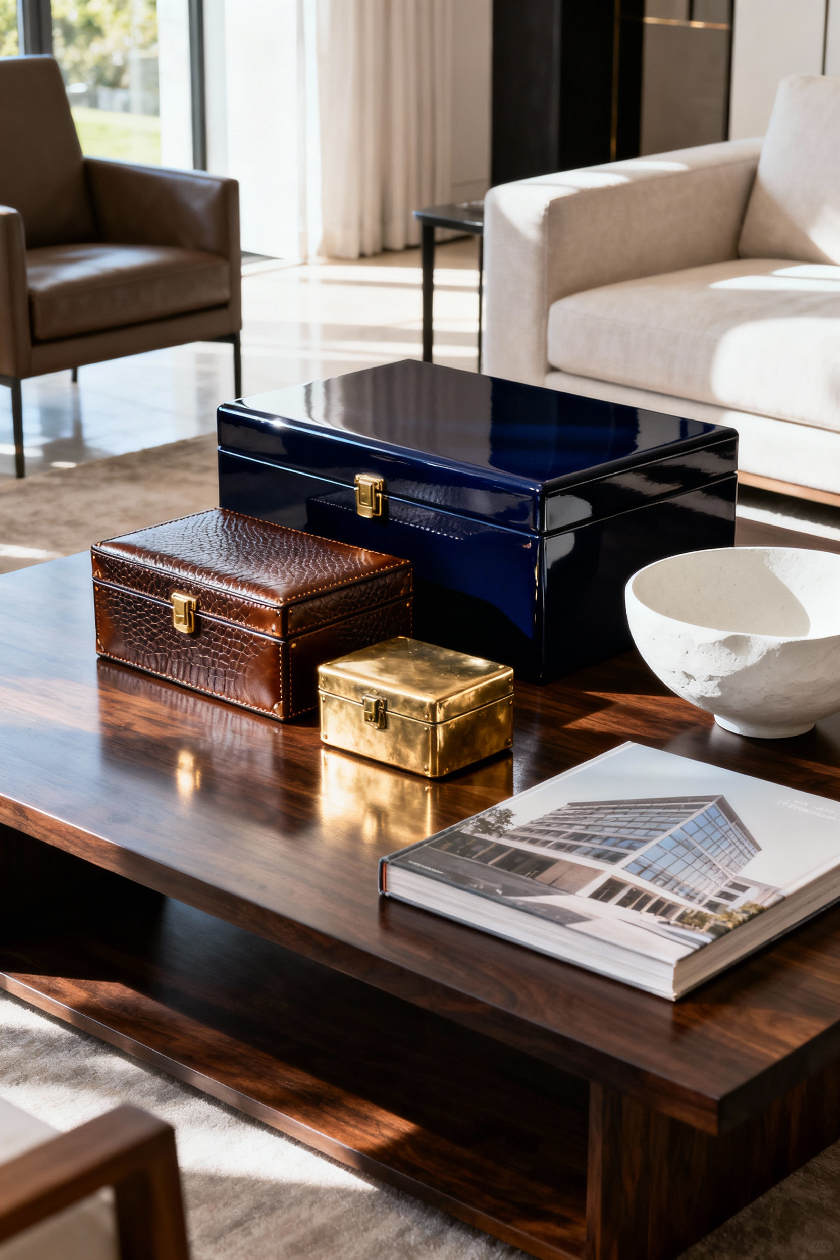
7. The Conversation Piece: Integrating Rare Objets d’Art and Antiques
Integrating rare antiques or *objets d’art* elevates a living space from a mere showroom to a home rich with history and character. However, successful styling relies on curation rather than accumulation. Select a few key pieces that reflect your personal passions or travels to tell a concise story, limiting your selection to one thoughtfully composed vignette.
To prevent the arrangement from looking dated, anchor these historic items with modern elements. Placing a weathered artifact against a sleek coffee table book or a minimalist metal tray creates an intriguing contrast, ensuring the antique stands out as a piece of fine art.
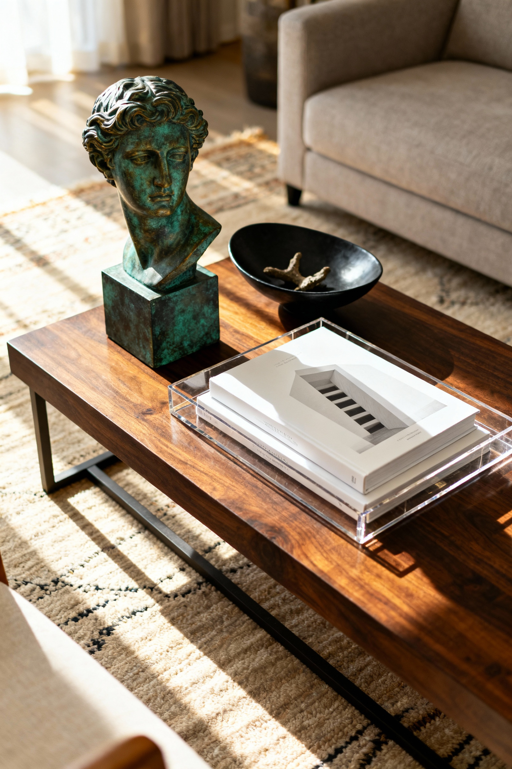
Achieving visual balance requires attention to scale and composition. Employ the rule of three to layer your collection, combining items of varying heights and textures. Pair a tall, sculptural object with a mid-height stack of books and a small, functional vessel to guide the eye naturally across the table.
For delicate or high-value investments, incorporate protective display methods. Use a glass display box or a clear acrylic stand to showcase fragile items; this ensures their safety while drawing attention to their craftsmanship and provenance.
8. The Olfactory Element: Luxury Candles as Design Anchors
A truly sophisticated living space engages more than just the eyes; it must also appeal to the senses. Scent acts as an invisible architectural element, instantly defining the atmosphere of your room. When selecting a luxury candle for your coffee table, consider the specific mood you wish to cultivate.
Warm, gourmand notes invite relaxation and welcome guests, while deeper, moodier notes like leather or wood establish a refined, serious aesthetic. By choosing a fragrance that aligns with your design intent, you create an immersive experience that elevates the furniture around it.
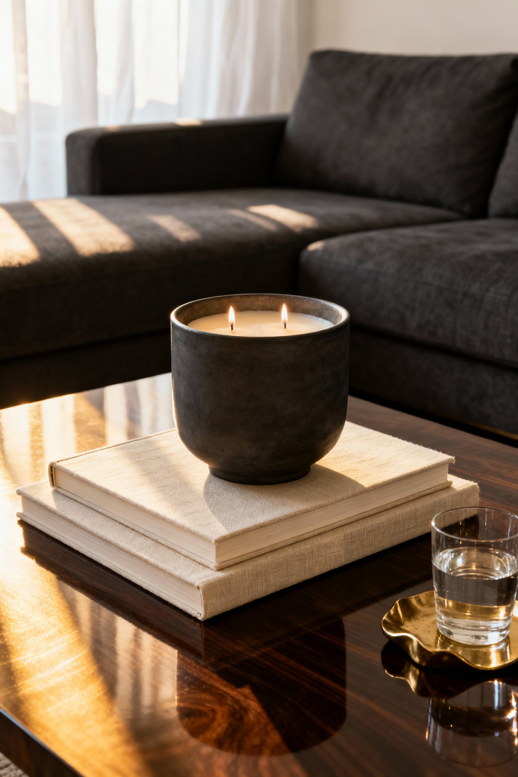
Beyond the fragrance, the vessel itself serves as a critical sculptural anchor. Treat the candle as a permanent piece of decor rather than a disposable item. Invest in vessels crafted from high-end materials such as heavy marble, sleek glass, or polished brass that complement your existing color palette.
To prevent the candle from looking like an afterthought, ground the arrangement with a decorative tray. This technique corrals the candle with other curated items, such as stacked books or small objects, creating a deliberate visual boundary that feels organized and intentional.
Finally, leverage your coffee table arrangement to reflect the changing seasons without overhauling your decor. A simple olfactory swap refreshes the entire room’s character. Rotate in fresh citrus or floral notes during the spring and summer months to lighten the space. As the weather cools, transition to rich, spicy fragrances to introduce warmth. This strategy allows you to maintain a consistent visual foundation while subtly shifting the home’s energy to match the time of year.
9. The Glass Dilemma: Specific Strategies for Transparent Surfaces
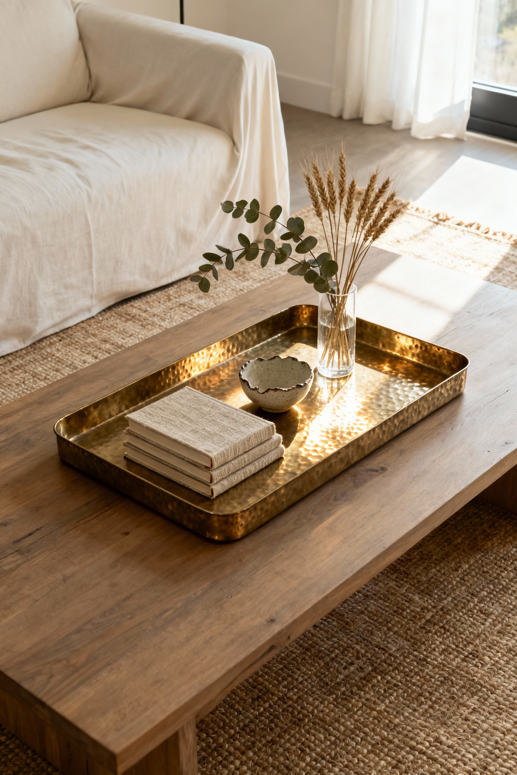
Glass coffee tables provide a sense of openness, yet they often face the “dilemma” of feeling too visually lightweight or inadvertently highlighting clutter. To counteract this, you must anchor the surface with a substantial decorative tray.
Choose solid materials like dark wood, concrete, or heavy metal to establish a strong focal point. This technique corrals smaller items into a cohesive vignette and provides the necessary visual weight to ground the piece, preventing your decor from appearing as if it is floating aimlessly.
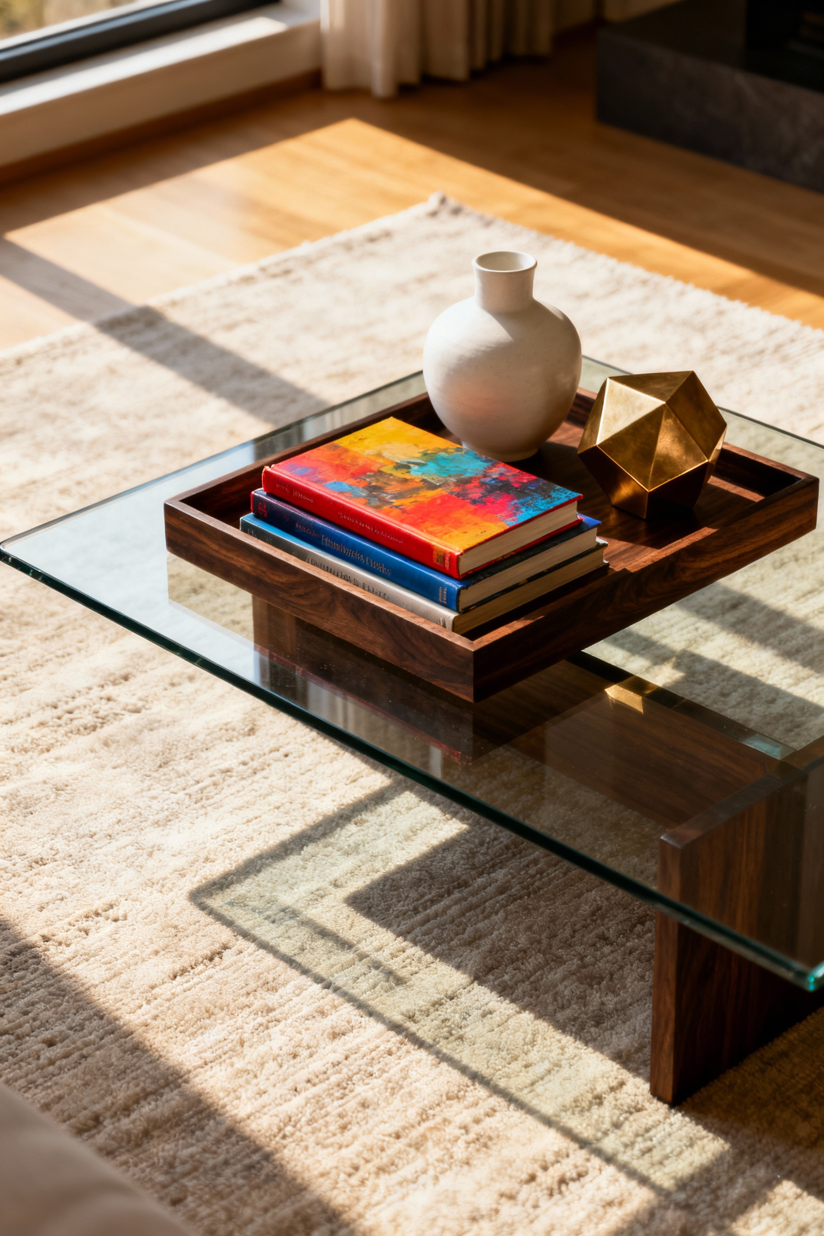
Balance the cool, smooth nature of glass by introducing contrasting textures. Warm materials prevent the table from feeling lost or sterile within the room’s design. Consider these elements to add depth:
- Organic Accents: Use woven bowls or wooden objects to soften the glass’s sharp edges.
- Matte Finishes: Stack hardback books or place ceramic vases to provide a solid, tactile counterpoint to the transparency.
- Reflective Details: Add small metallic touches, such as brass or chrome, to catch the light and enhance the table’s airy quality without overpowering the sleek surface.
Finally, remember that the transparency of the glass makes the floor underneath a critical part of the visual display. Leverage this by placing the table over a rug with a bold pattern or rich texture. You can also maximize the vertical space by tucking large woven baskets or chic poufs beneath the table. This adds color and warmth while offering practical storage for blankets or magazines, ensuring the table feels fully integrated into the living space.
10. Zoning the Expanse: Grid Systems for Large Square Tables
Styling an expansive square coffee table often presents a unique challenge due to the sheer amount of surface area. To avoid a cluttered or sparse appearance, you must treat the surface as a curated landscape rather than a single landing pad.
Start by mentally dividing the table into a 3×3 grid, applying the classic Rule of Thirds. The four intersection points of this grid represent the most visually impactful zones for your primary decor. Rather than placing a solitary object in each section, which can look disconnected, occupy these zones with cohesive groupings. A cluster of two to four items—such as a stack of books topped with a candle—creates necessary visual weight and ensures the arrangement feels substantial enough for the furniture’s scale.
To execute this structure effectively, you need tools that define these boundaries. A large, heavy tray is essential for anchoring a specific zone within your grid. It corrals smaller items like remotes or beads, instantly making the grouping feel intentional and proportionate.
If you struggle to visualize the spacing, do not hesitate to use a temporary guide. Apply painter’s tape directly to the tabletop to outline your quadrants or grid lines before placing objects. This practical step trains your eye to maintain appropriate negative space and ensures your styled zones feel connected to one another rather than scattered aimlessly across the expanse.
11. Circular Dynamics: Creating Flow on Round Surfaces
Round coffee tables require a deliberate approach to prevent the surface from appearing static or cluttered. Without corners to anchor your decor, you must establish your own structure using the Rule of Threes.
Imagine a triangle on the tabletop and arrange your decor into three distinct vignettes at the points of this shape. This asymmetrical spacing encourages the eye to travel across the surface rather than fixing on a stiff, centered grouping. To further ground this layout, place a square or rectangular tray beneath one of your anchor points. This contrasting geometry breaks up the continuous curves and instantly corrals smaller items for a more intentional, curated look.
Building depth within this triangular layout is essential for achieving a sophisticated flow. Avoid placing matching items directly opposite each other. Instead, embrace asymmetry by mixing varied forms, such as pairing an organic sculptural piece with a linear stack of books and a round bowl.
Layer these objects vertically and radially, using varying heights—like a tall vase next to a medium candle—arranged in a subtle arc or spiral. This technique prevents the design from feeling flat and keeps the visual energy moving outward from the center.
Finally, true luxury styling creates a sense of ease through the use of negative space. You must ensure at least one-third to one-half of the surface remains empty. This open space allows the arrangement to “breathe,” preventing the table from looking chaotic. It also serves a vital practical purpose, leaving ample room for guests to set down a drink. By prioritizing this balance, you transform a simple round table into a dynamic, functional centerpiece that highlights your investment pieces without overwhelming the room.
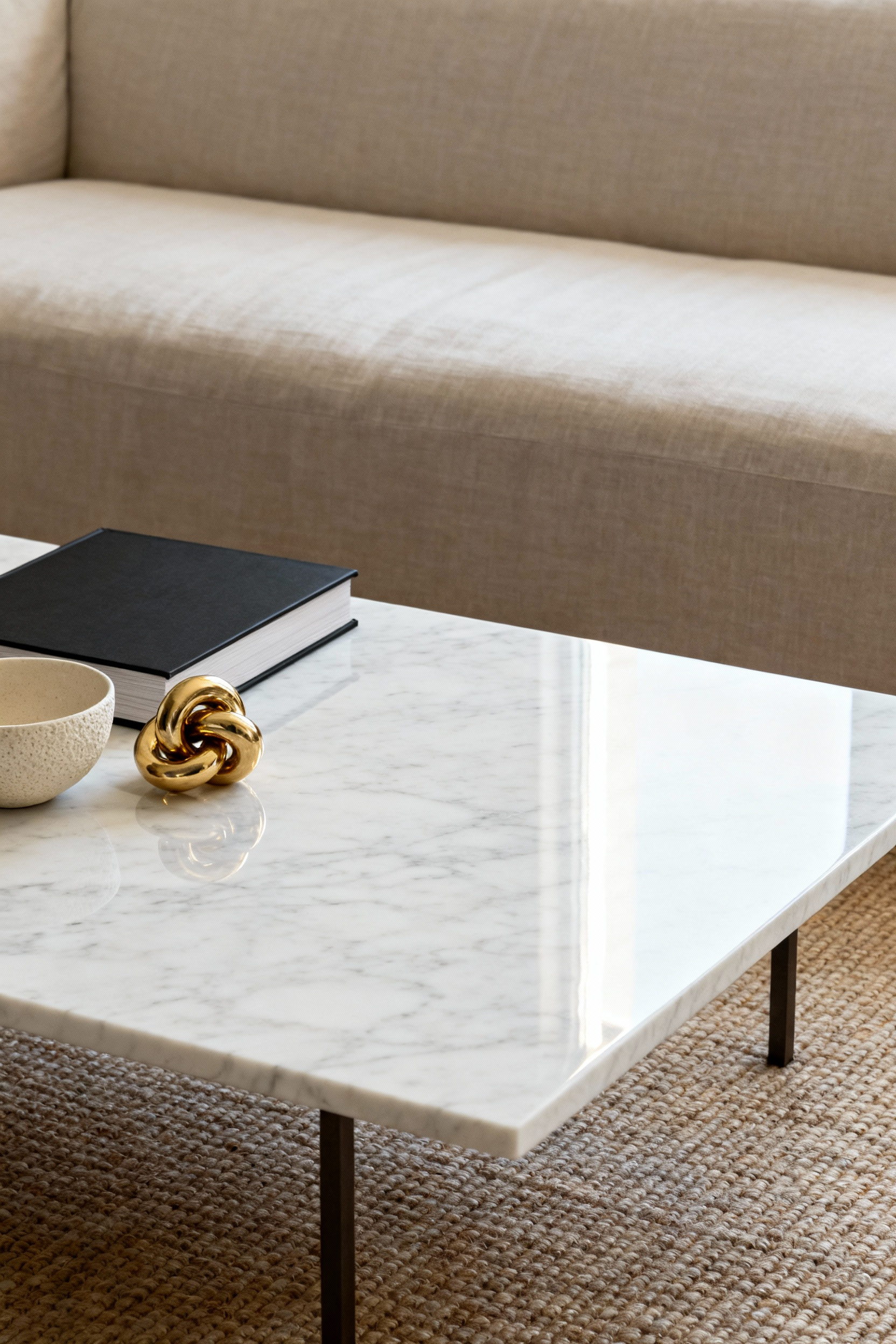
12. Texture Theory: Balancing High-Gloss with Matte Finishes
Mastering the interplay between high-gloss and matte finishes elevates a coffee table from simple furniture to a curated vignette. This balance dictates how light moves across the room and influences the perceived warmth of the space.
When a surface is entirely reflective, it can feel cold or sterile; conversely, an abundance of matte finishes often renders a design flat and uninspired. The goal is to create a visual dialogue where opposites attract and enhance one another.
Your styling strategy should directly oppose the table’s primary finish. For high-gloss surfaces like polished marble or lacquer, you must introduce light-absorbing textures to ground the look. Stacked matte books, honed stone vessels, or woven trays add necessary weight and prevent the aesthetic from appearing overly slick.
If your table features a matte finish, such as natural wood or flat paint, inject luster with reflective accents. A metallic candle holder, clear glass vase, or mirrored tray provides the sparkle needed to create visual depth and sophistication.
Beyond the objects themselves, consider the room’s natural light as a design tool. In dim or north-facing rooms, utilize high-gloss accessories to bounce diffused light and create a luminous focal point. In contrast, south-facing rooms with abundant sunshine benefit from matte finishes, which minimize harsh glare during peak hours. For a smart investment that transcends trends, consider hybrid furniture designs that pair matte tops with metallic legs, offering a built-in balance that remains timeless.
13. Color Echoing: Connecting the Vignette to the Broader Room Palette
A sophisticated vignette acts as an integral part of the living space rather than a standalone display. To achieve this seamless integration, identify one or two accent colors already present in your throw pillows, drapery, or artwork.
Repeat these hues within your coffee table arrangement using small accessories like a decorative box, a sculptural vase, or a vessel for a candle. Coffee table books also serve as powerful tools for this purpose; intentionally display spines or covers that mirror the room’s dominant or secondary shades to establish a cohesive visual thread. This integration is key to ensuring your coffee table complements your broader strategy for Smart Living Room Styling Ideas That Work.
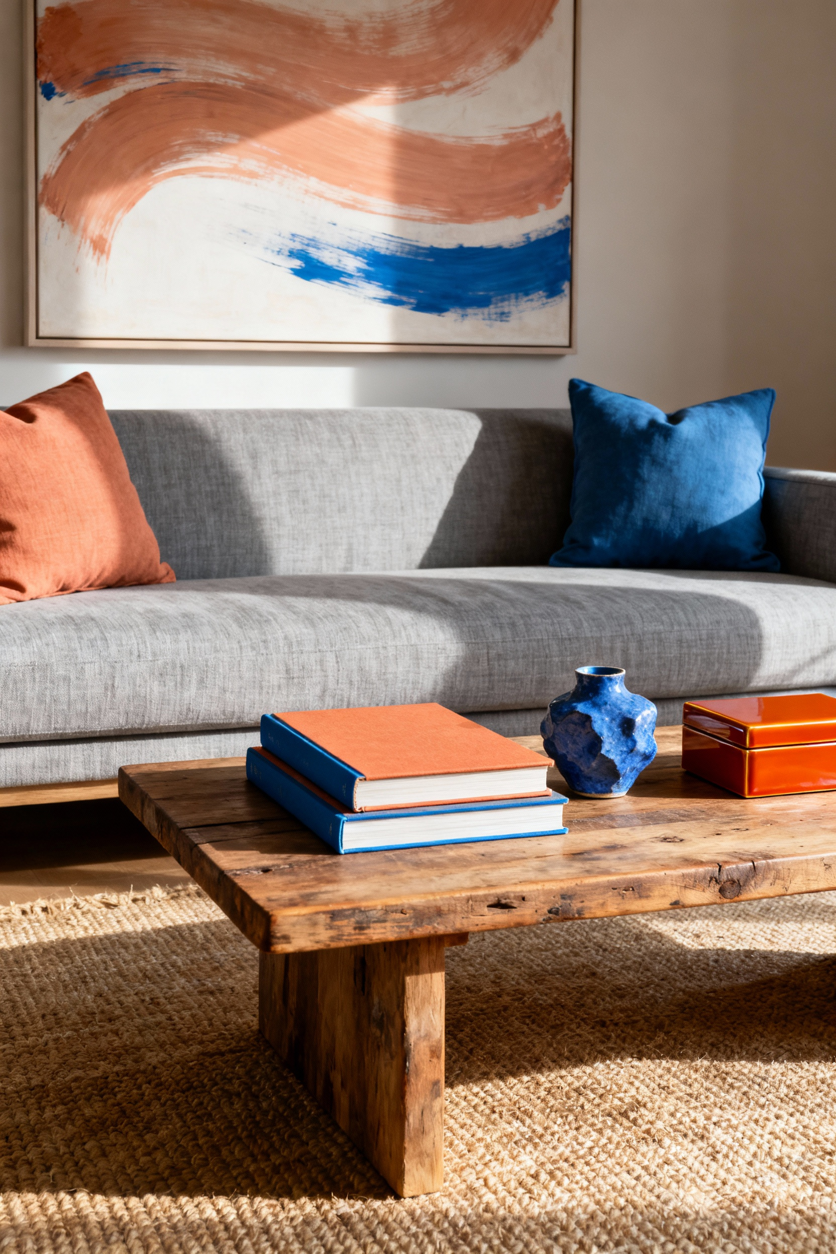
When working with a complex or busy color scheme, balance is essential to prevent visual clutter. Utilize a unifying neutral base, such as a sleek wooden, white, or metallic tray, to ground the display. This approach allows the smaller objects within the tray to provide a color echo without overwhelming the eye.
While harmony is the primary goal, a dynamic design requires a spark of the unexpected. Introduce a single item in a contrasting color to serve as a deliberate focal point. This splash of divergence draws attention and adds depth, ensuring your styled surface remains elegant rather than predictable.
14. Functional Luxury: Elevating Necessities (Coasters, Boxes, Bowls)
The difference between a cluttered surface and a curated display often comes down to how you manage daily necessities. Elevate your storage by employing chic, lidded boxes as stylish “catch-alls.” Choose investment-worthy materials like glossy lacquer, rich leather, or brass to conceal visual noise such as remote controls, reading glasses, or matches. This simple addition instantly transforms a collection of loose items into a clean, architectural accent.
Treat smaller functional items as intentional decor rather than afterthoughts. Replace basic drink mats with coasters crafted from elevated materials like polished marble, agate, or natural wood. These pieces should introduce new shapes or textures, functioning as small works of art even when not in use. Similarly, utilize decorative bowls as sculptural anchors for your arrangement. Select vessels with unique silhouettes—such as pedestal or scalloped designs—to hold keys or simply stand alone as a sophisticated statement.
To achieve a truly high-end aesthetic, focus on combining luster and texture. Contrast creates visual richness, so aim to pair materials that offer reflective shine against those with tactile finishes. Place a smooth marble coaster set beside a textured ceramic bowl, or style a metallic-edged box atop a natural rattan tray. This interplay adds depth and ensures your practical items contribute to the overall sophisticated atmosphere.
15. The Narrative Arc: Telling a Personal Story Through Curios
Treat your coffee table arrangement as a small-scale, three-dimensional visual memoir. To build this narrative effectively, you must first establish the exposition with a strong anchor piece. Select a substantial coffee table book that reflects a major chapter of your life, such as a passion for travel, art, or fashion. This book acts as the physical setting, while the objects you place upon it become the characters that detail your specific theme.
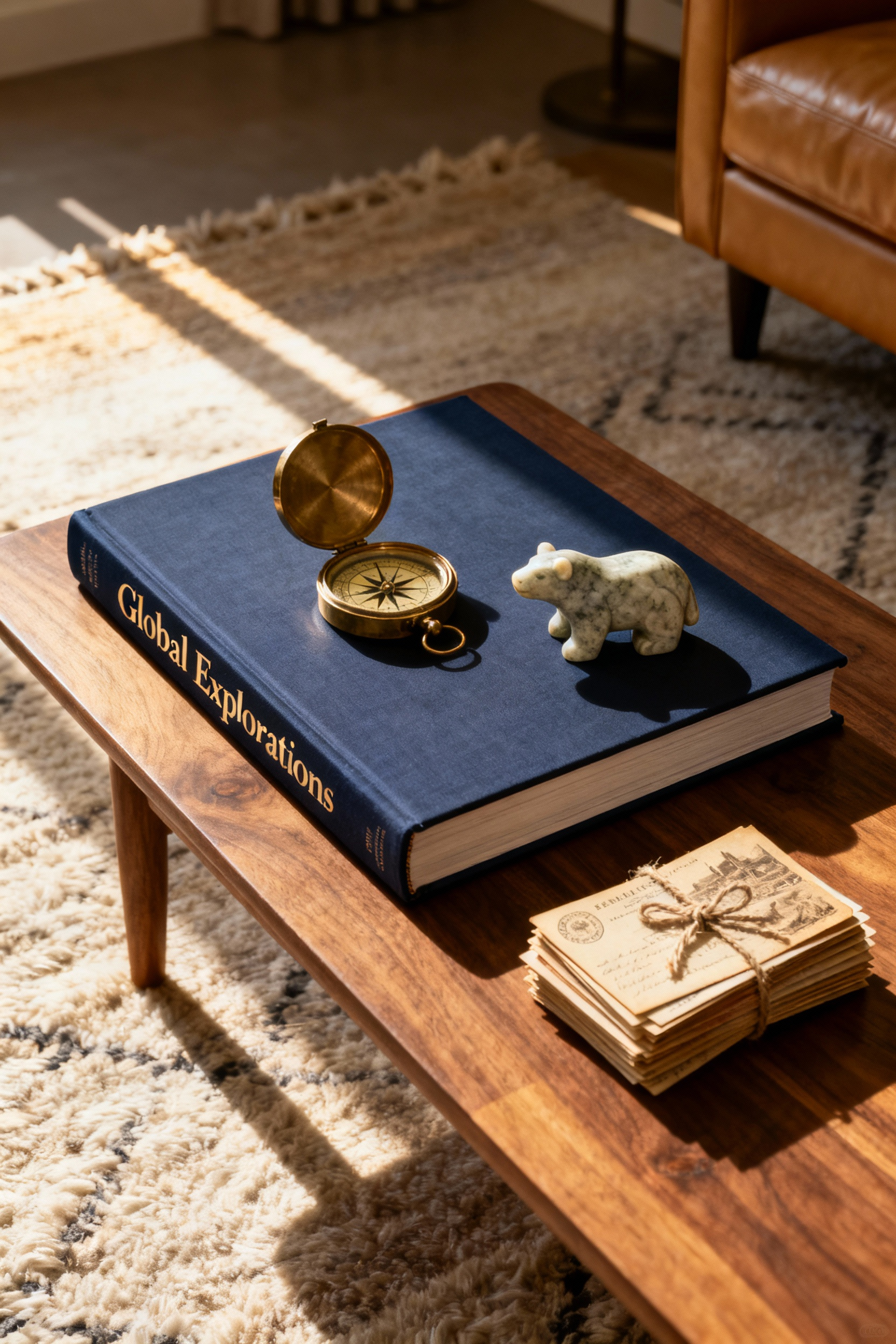
Once the stage is set, create visual interest through contrast and layering. Group your curios into sets of three or five to mimic the dynamic dialogue of a developing story. Ensure these pieces offer varying heights, textures, and scales to generate visual intrigue. Within this grouping, designate one specific curio as the climax of your display. Position your most meaningful piece—perhaps a cherished heirloom or a unique souvenir—as the highest or most central element to serve as the undisputed focal point of the vignette.
Every good story needs a satisfying resolution. Achieve this by incorporating a sense of cohesion that prevents the collection from appearing cluttered. Utilize a high-quality tray or a consistent color palette to physically contain and unify your diverse objects. This provides a tidy framework which signals that the story is complete, ensuring your display remains an elegant, curated statement rather than a chaotic collection of items.
16. Seasonal Metamorphosis: Strategies for Rotating Collections
Embracing a “Seasonal Metamorphosis” allows you to keep your living space dynamic without the need for constant renovation. The secret lies in curating a vignette that reflects the current time of year while maintaining functionality.
Start by employing a stylish, substantial tray to house the majority of your display. This acts as a portable stage, defining the aesthetic zone and allowing you to swap the entire collection in minutes. Crucially, restrict this arrangement to roughly 70 percent of the surface area. By reserving the remaining 30 percent for practical necessities like drinks or remotes, you achieve a look that is curated rather than cluttered.
To execute the visual shift, focus on updating the “Core Three” elements: color, natural accents, and texture. Instead of a total overhaul, simply swap accessories to match the season’s palette—think pastels for spring or rich earth tones for autumn—and introduce corresponding natural elements, such as replacing fresh tulips with coastal shells or pinecones. You should also perform a “literary refresh” by rotating your coffee table books to showcase spines that complement your new theme. This simple adjustment provides a fresh structural foundation and immediately alters the room’s mood.
While rotation keeps the design fresh, continuity is key to a sophisticated interior. Maintain one permanent, non-seasonal item—such as a sculptural vessel or a cherished heirloom—as the consistent anchor of your arrangement. By rotating your seasonal elements around this fixed piece, you ensure the display always reflects your personal style. This strategy creates a high-end, evolved look that balances novelty with timeless elegance.
17. The Final Edit: The Luxury of Negative Space
True luxury often lies in restraint. Treat the bare surface of your coffee table as a crucial design element, not merely a canvas to be filled. This concept, known as negative space, allows the eye to rest and ensures your carefully curated objects receive the attention they deserve.
If your display feels busy, practice the art of the final edit. Ruthlessly remove one or two items until the arrangement feels intentional rather than cluttered. This subtraction creates an elevated atmosphere where quality outshines quantity.
Usability remains the ultimate sign of sophistication. Always preserve a clear border or open section where guests can comfortably place a drink or a phone without disrupting your vignette. To achieve this balance, reference the Rule of Thirds. Instead of centering a massive cluster, arrange your decor into distinct groupings with significant breathing room between them. This separation defines a single focal point, such as a sculptural vase or a stack of art books, while maintaining a sophisticated, gallery-like aesthetic.
Conclusion: The Coffee Table as a Microcosm of Your Design Philosophy
Your coffee table acts as the final punctuation mark of your living space. It is more than a functional surface; it is a curated vignette that marries foundational proportion with personal narrative. By anchoring your display with meaningful heirlooms and adhering to a disciplined color palette, you transform a necessity into a sophisticated statement of identity. This small area proves that true luxury lies not in abundance, but in the intentional layering of textures and shapes that mirror your broader design ethos. When you balance practical constraints with aesthetic discipline, you create a focal point that is both usable and beautiful.
As your lifestyle evolves, allow this central display to act as a dynamic expression of your changing taste. View the surface as a living canvas that invites engagement and sparks conversation, rather than a static museum exhibit. To master high-end coffee table styling, begin by auditing your current collection today. Remove generic items that lack purpose or sentiment, and reintroduce only those pieces that bridge the gap between utility and art. When you treat this microcosm with the same respect as your architecture, you elevate the entire room’s atmosphere.
Frequently Asked Questions
What is the Rule of Threes in coffee table styling?
The Rule of Threes is a design principle suggesting that groupings of odd numbers (like three or five) are naturally more pleasing and dynamic to the human eye than even groupings. When styling a coffee table, this means grouping items into three distinct visual footprints, using varying heights (high, medium, low) within each grouping to create depth and movement across the surface.
How do I style a coffee table without making it look cluttered?
To avoid clutter, focus on intentional curation and maximizing negative space. Use decorative trays to contain smaller items (remotes, coasters) and anchor your vignettes. Crucially, aim to keep at least one-third to one-half of the table surface completely clear. This restraint ensures your investment pieces stand out and allows the arrangement to breathe.
Should a coffee table arrangement always be centered?
No, professional designers rarely center the entire arrangement. Centering can feel static and staged. Instead, use asymmetrical placement, such as positioning your primary vignette slightly off-center or anchoring it to one corner (especially for rectangular tables). For round tables, use the Rule of Threes to create three distinct groupings around the edge, establishing visual flow rather than a stiff center point.