Most people think of a Kitchen Backsplash as a simple, functional shield—a last-minute decorative choice made from a handful of predictable tile patterns. Home improvement shows repeat it. Big box stores stock the aisles with it. Here’s what they aren’t telling you: After 15 years in this industry, first framing kitchens through a camera lens and now breaking down their design, I’ve seen that the backsplash isn’t an accessory. It’s an architectural element.
My work documenting hundreds of high-end projects reveals a simple truth: a backsplash can dictate the entire visual and spatial narrative of a kitchen. It’s not just about what material you choose, but how you deploy it. Forget the myth that you’re just picking a pattern. These 20 techniques will show you how to use your backsplash to manipulate light, create depth, and command a room’s entire aesthetic. We’re going to move from foundational principles to the kind of integration tricks that define professional-level work.
Getting Started with Backsplash Brilliance: Essential Material Fundamentals
Before we get into complex layouts, you need to unlearn a few things. The real work begins with understanding the materials themselves—not as decorations, but as tools for shaping space. This section breaks down the foundational concepts that will set your project on the right course.
1. The ‘Tile is Your Only Option’ Myth: Exploring Alternative Materials
For decades, the default answer to “backsplash” has been “tile.” It’s an easy, safe choice, but frankly, it’s a failure of imagination. Limiting yourself to ceramic or porcelain is like a photographer choosing to only ever shoot with one lens. You miss the entire spectrum of possibilities, and with it, the chance to create something truly distinctive.
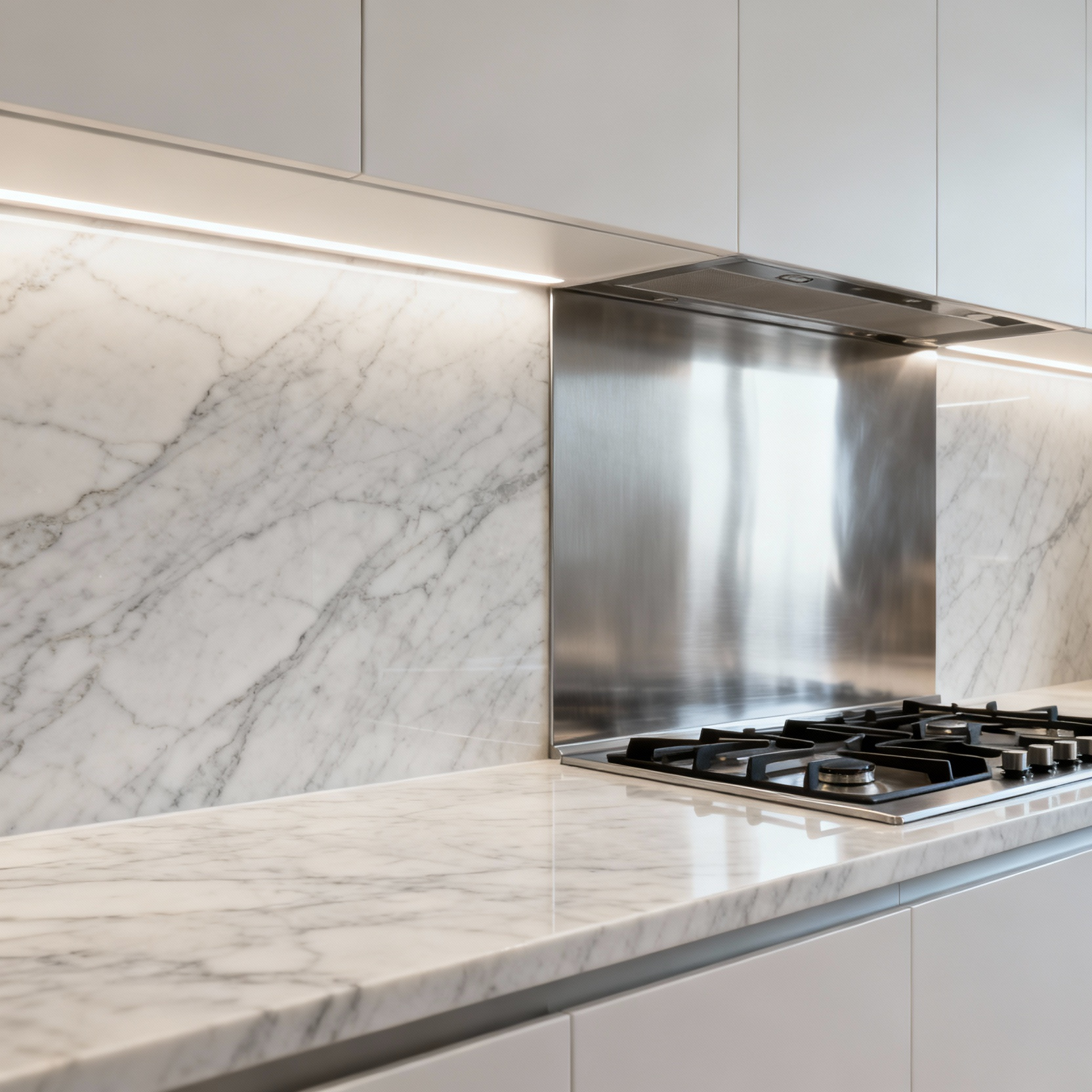
 Under-cabinet lighting. Showcasing kitchen backsplash alternatives.” class=”wp-image-13032″/>
The world of materials has expanded far beyond the tile aisle. Think about metal—a sheet of brushed stainless steel provides a tough, industrial backbone, while hammered copper introduces warmth that develops a rich patina over time. Glass, especially back-painted for a seamless block of custom color, creates a sleek, reflective surface that can visually double the light in a small kitchen. You can even use engineered quartz or natural stone slabs—materials you’d normally see on a countertop—to create an uninterrupted flow from horizontal to vertical plane. Mastery here means looking beyond aesthetics to performance, maintenance, and your overall design intent. Are you building a seamless, quiet backdrop or a textured, dynamic focal point?
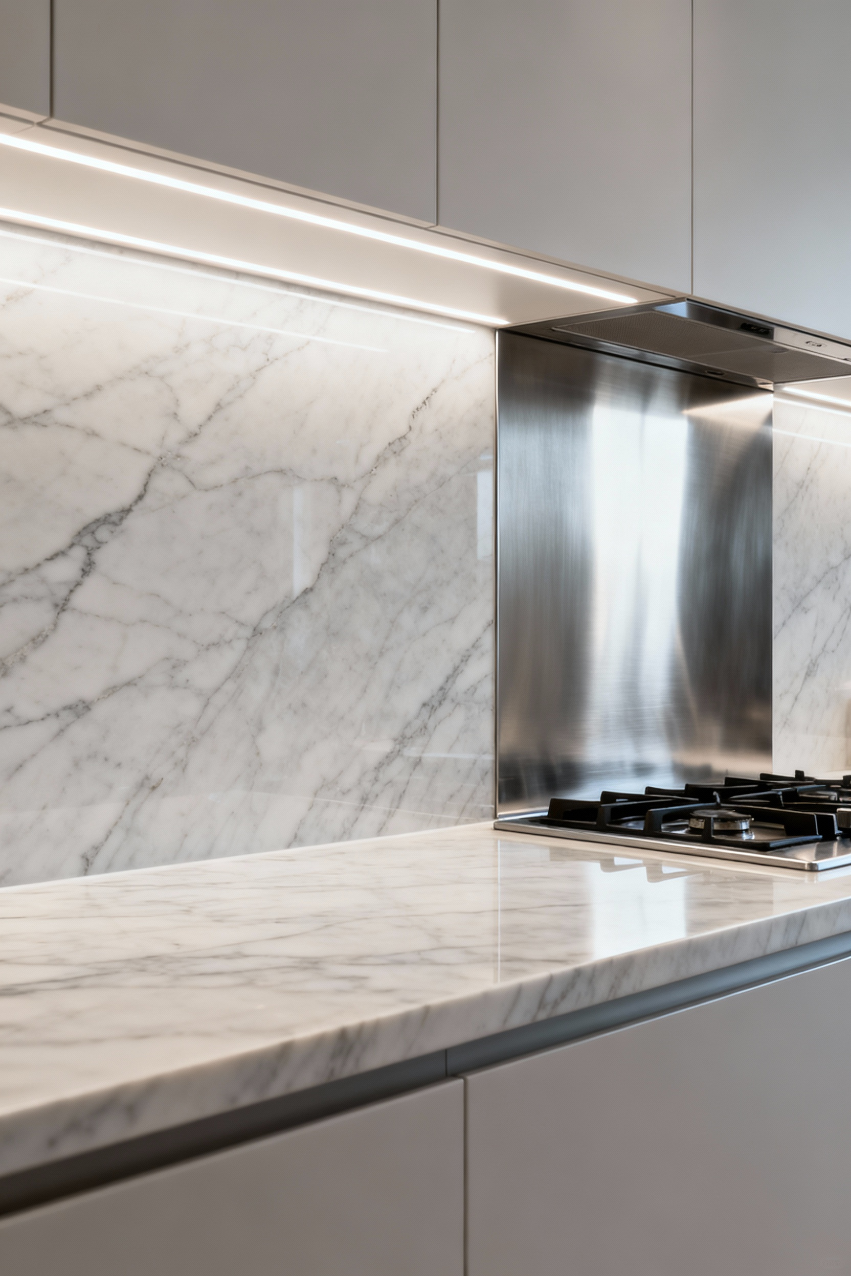
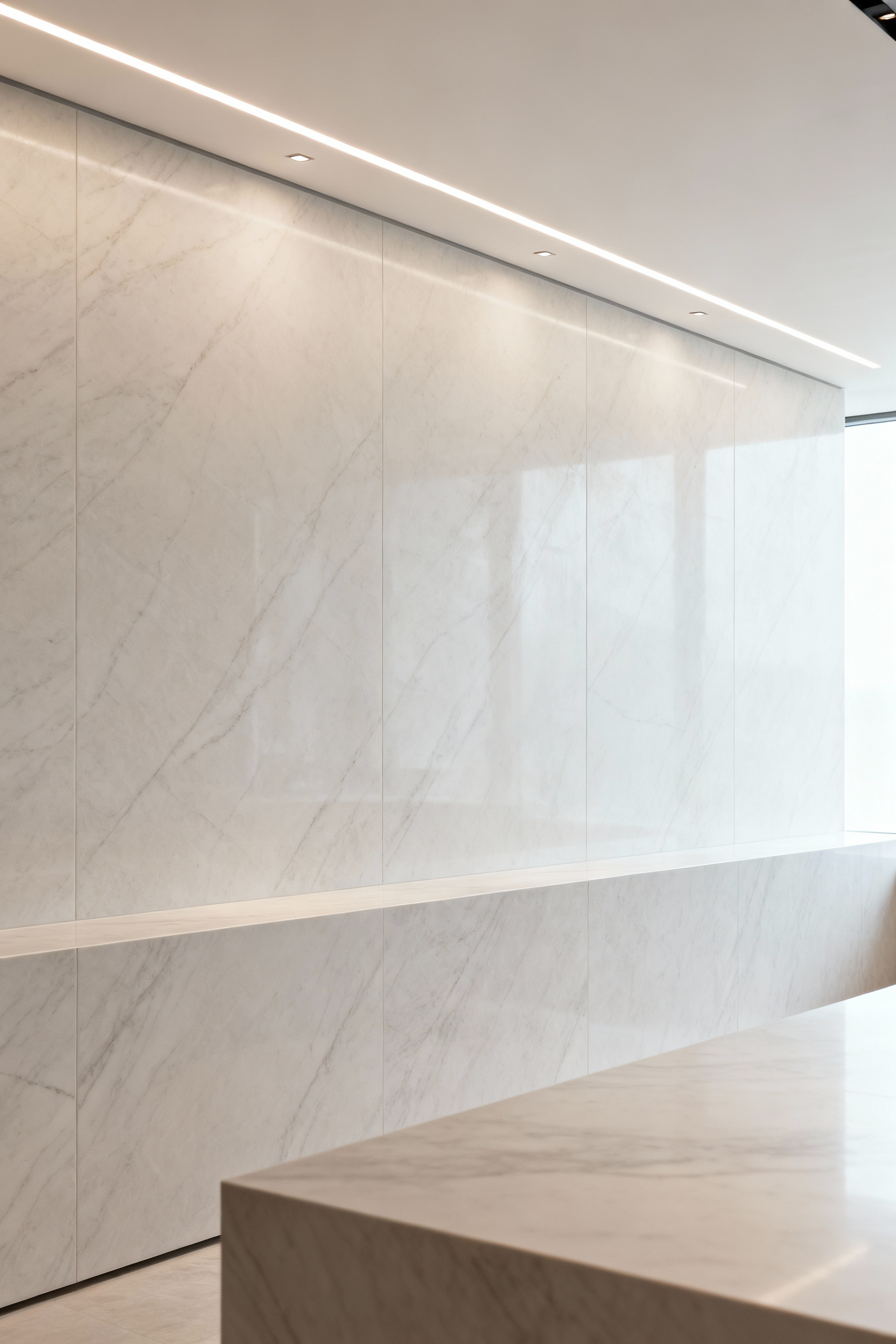
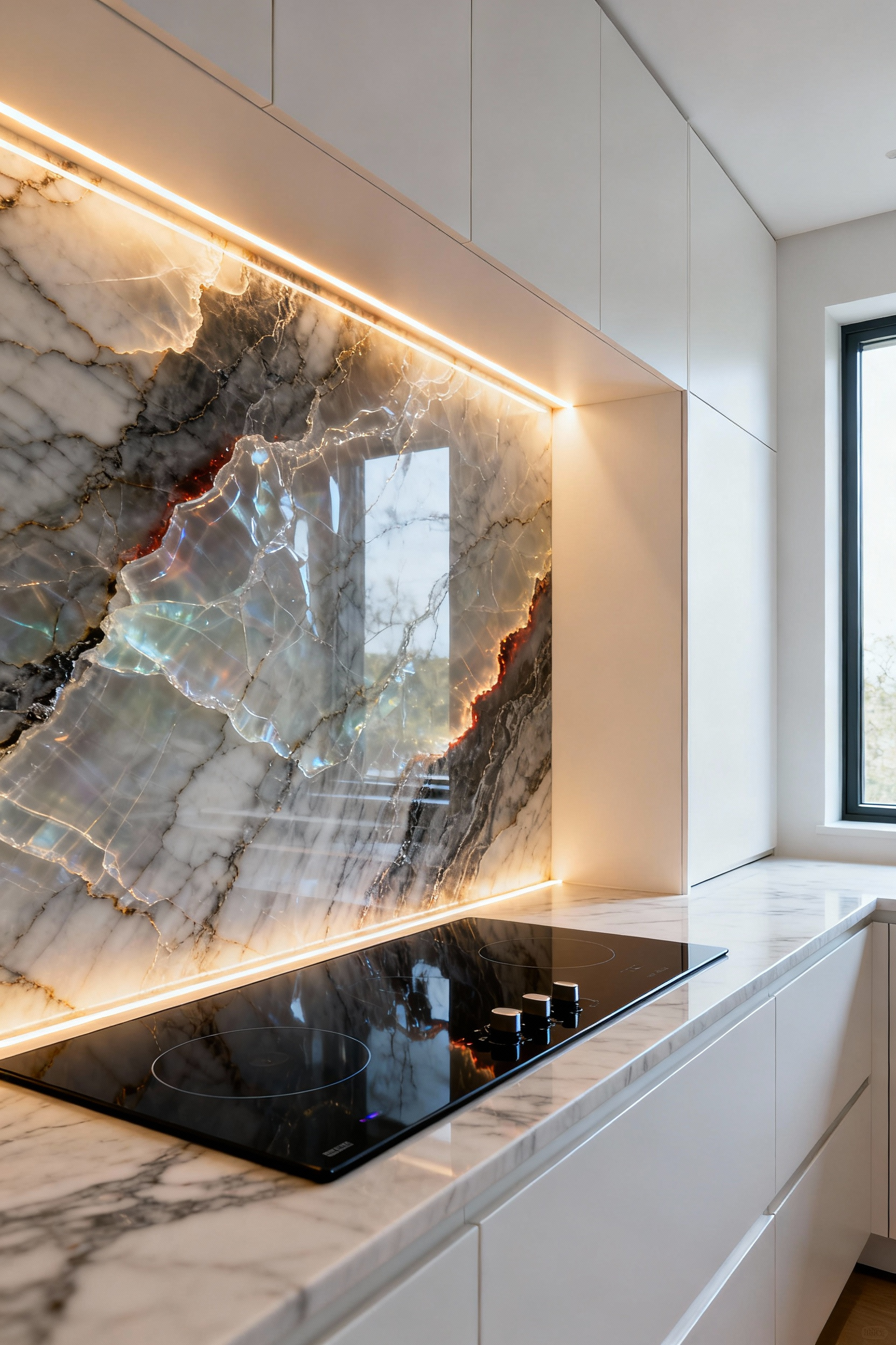
2. The Strategic Power of the Full-Height Slab Backsplash
If you want to make an immediate, high-impact statement, the full-height slab is your answer. This isn’t just about covering more wall; it’s a strategic move that erases visual noise. Instead of a grid of tiles and grout lines that chop up the wall, you get one continuous, monolithic surface that runs from countertop to cabinet, or even all the way to the ceiling.
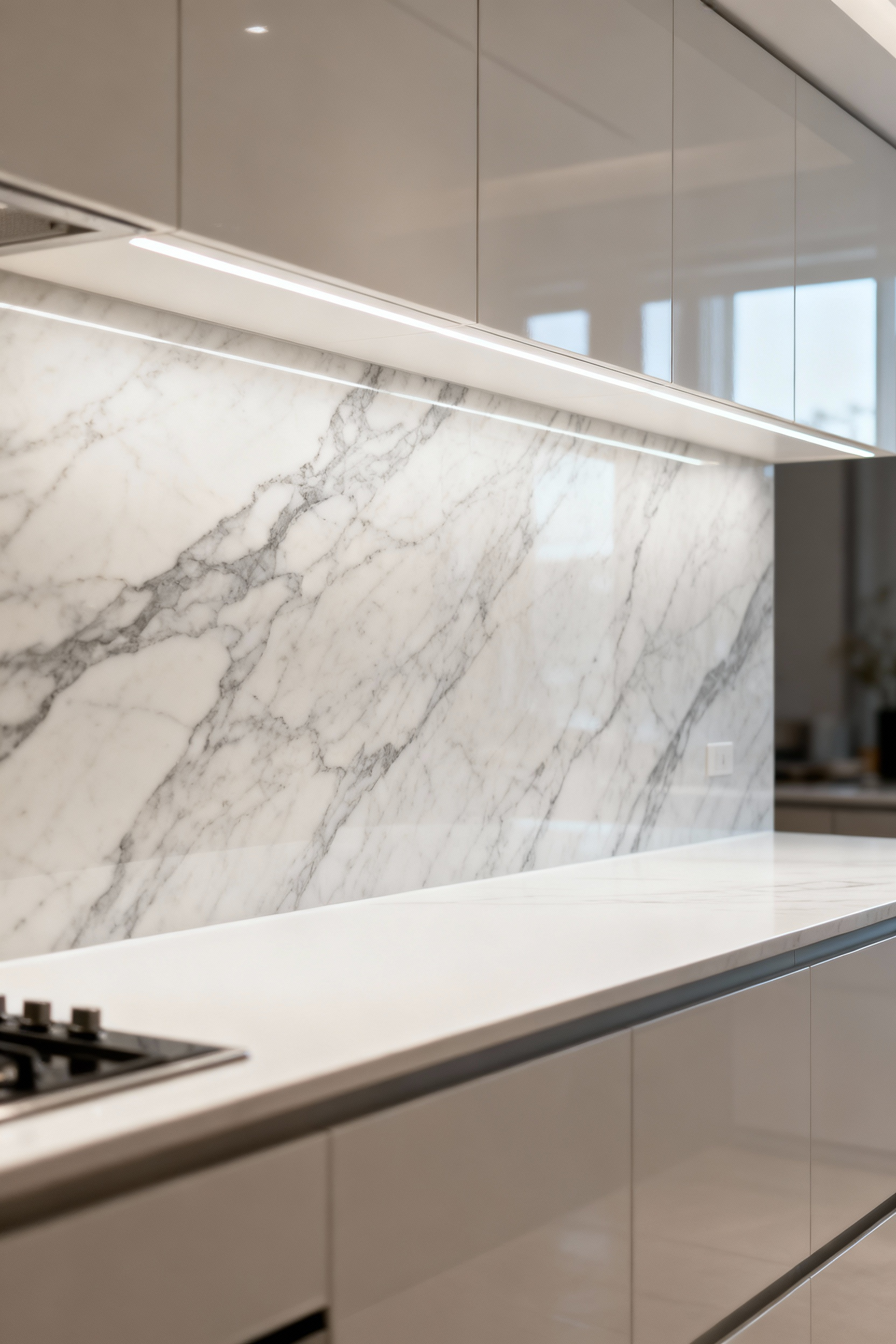
From my photographer’s eye, the effect is profound. It creates a clean, uncluttered visual plane that feels incredibly sophisticated and luxurious. Materials like quartz, marble, or large-format porcelain are perfect here. When the slab matches the countertop, it creates a waterfall effect that feels custom and intentional, blurring the line between surfaces. This is how you turn a utilitarian wall into a piece of art. It’s a powerful move that quiets the visual chaos, allowing the material’s natural beauty—the veining in the marble, the subtle shimmer in the quartz—to become the star.
3. Demystifying Grout: The Power of Thin, Color-Matched Lines
When I photograph kitchens, one of the first things that can cheapen the look of a tile job is thick, sloppy, or poorly chosen grout. Most people see grout as a necessary evil, but that’s the wrong way to think about it. Grout is a design choice. And most of the time, the best choice is for it to disappear.
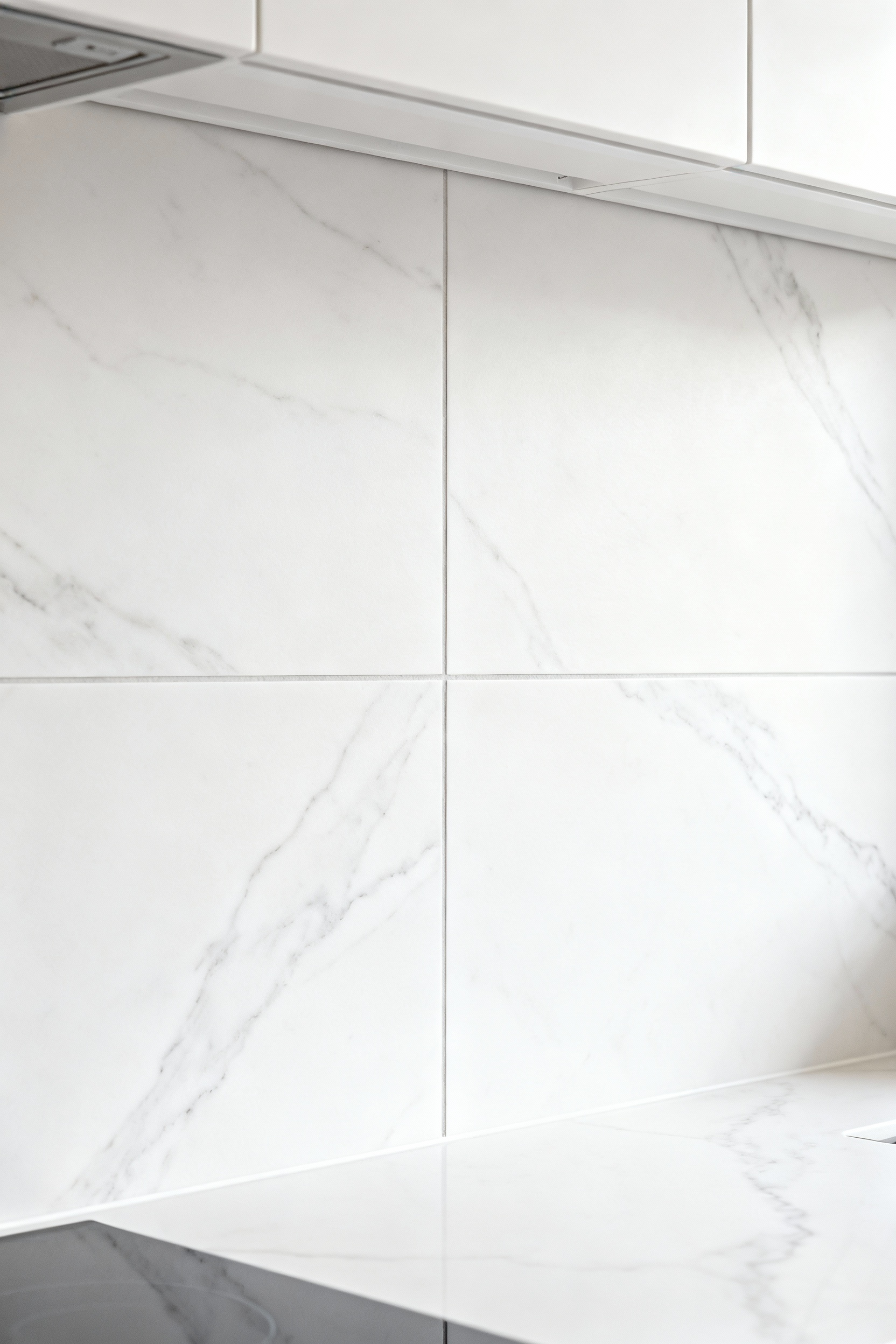
Unless you’re going for a very specific, graphic look, the goal should be continuity. Opt for the thinnest grout lines your tile allows (rectified tiles are cut precisely for this) and meticulously color-match the grout to the tile itself. The idea is to make the individual tiles blend into a single, cohesive surface. This technique tricks the eye into seeing a more monolithic plane, giving you the feel of a solid slab without the cost. What I tell my design clients is that this small detail is one of the clearest signals of a high-quality installation. It elevates the entire project from a standard tile job to a professional, considered design.
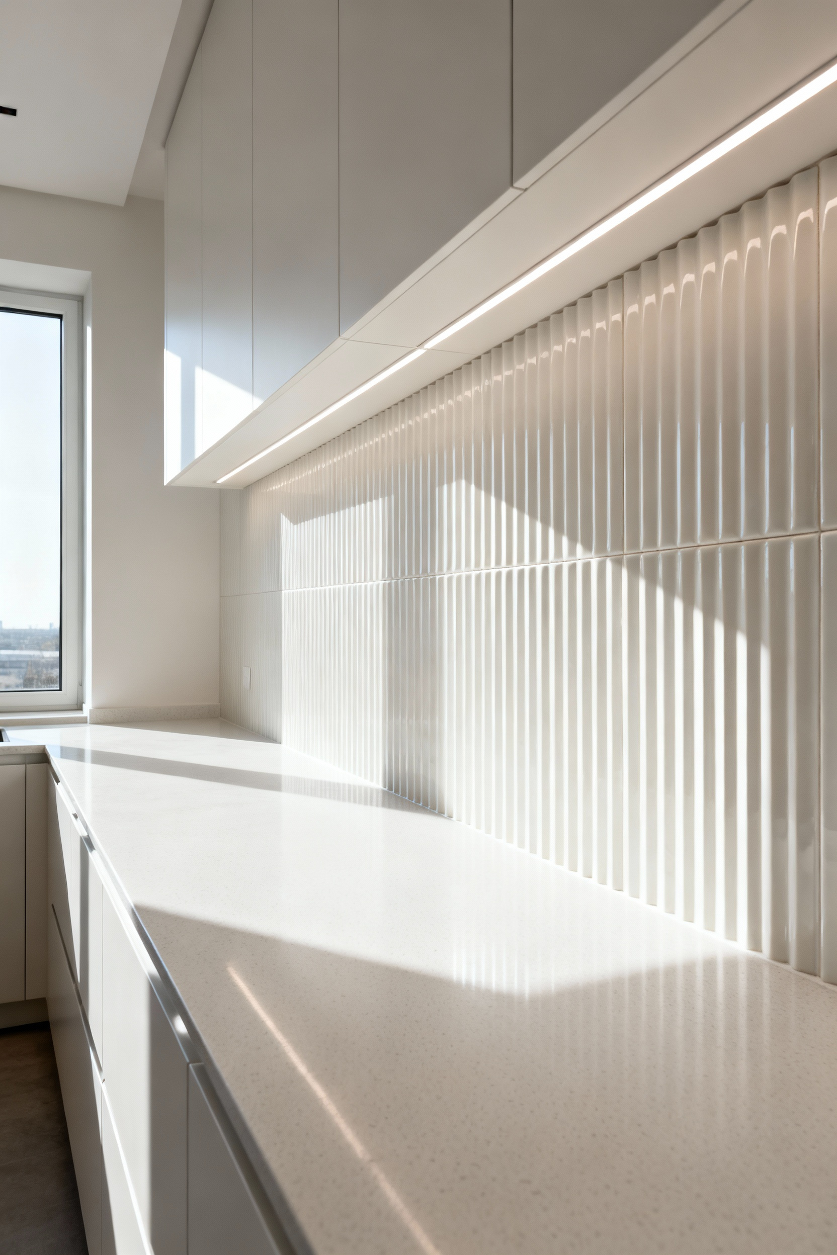
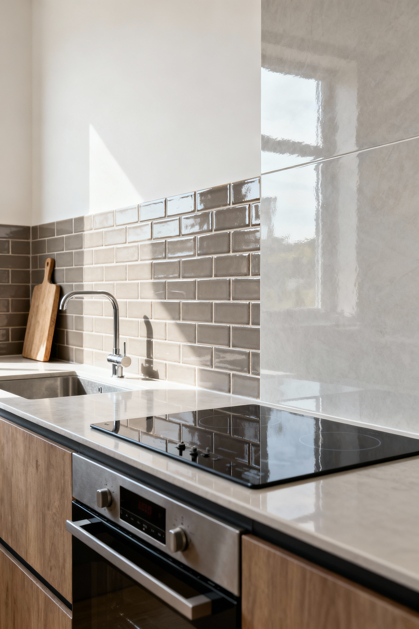
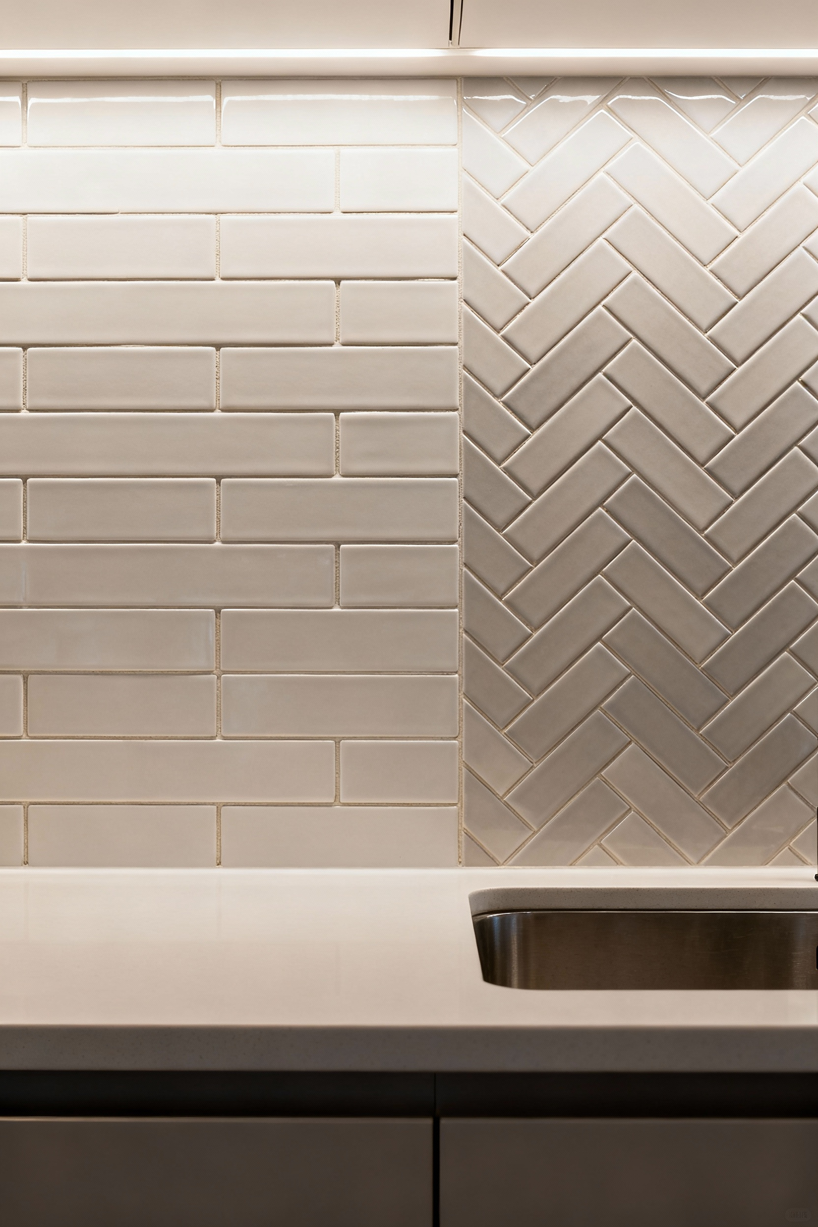
4. Beyond Subway Tile: Embracing Subtle Patterns for Visual Interest
Look, there’s nothing wrong with a classic subway tile. It’s the white t-shirt of the design world. But its ubiquity has made many kitchens feel aesthetically predictable. The myth is that anything beyond a simple running bond pattern will look busy or dated. That’s simply not true. You can add tremendous depth and character with subtle shifts in pattern.
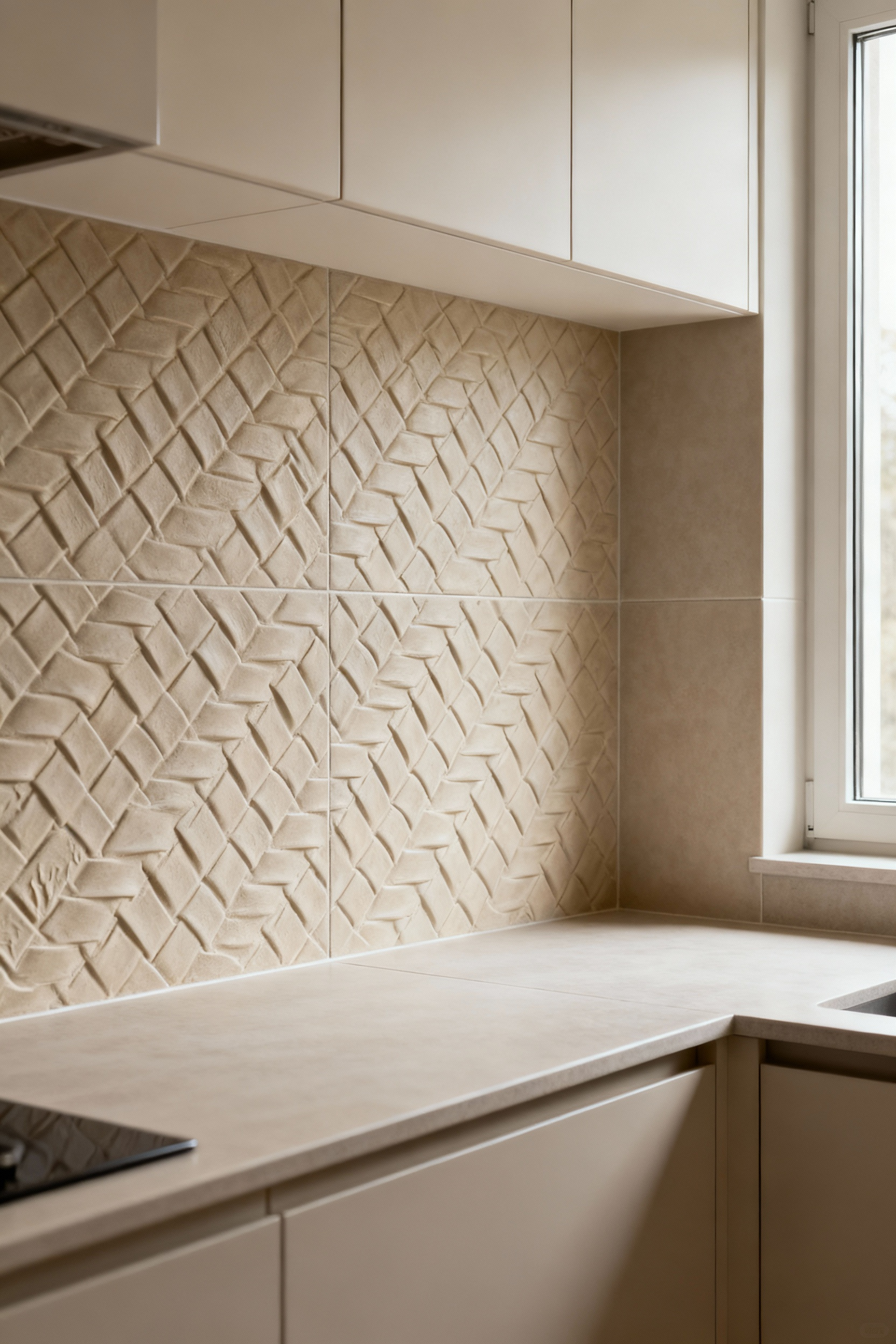
Instead of defaulting to the classic offset, consider a herringbone lay for sophisticated texture or a simple stack bond (where tiles align perfectly in a grid) for a more modern, clean effect. Even just changing the scale—using a larger format tile or a long, narrow one—can dramatically alter the feel. What really gets me is when designers use geometric tiles but keep them in a single, muted color. You get this incredible visual texture from the play of light and shadow across the pattern, but without the color contrast that can feel overwhelming. The goal is a complementary texture, not a competing one.
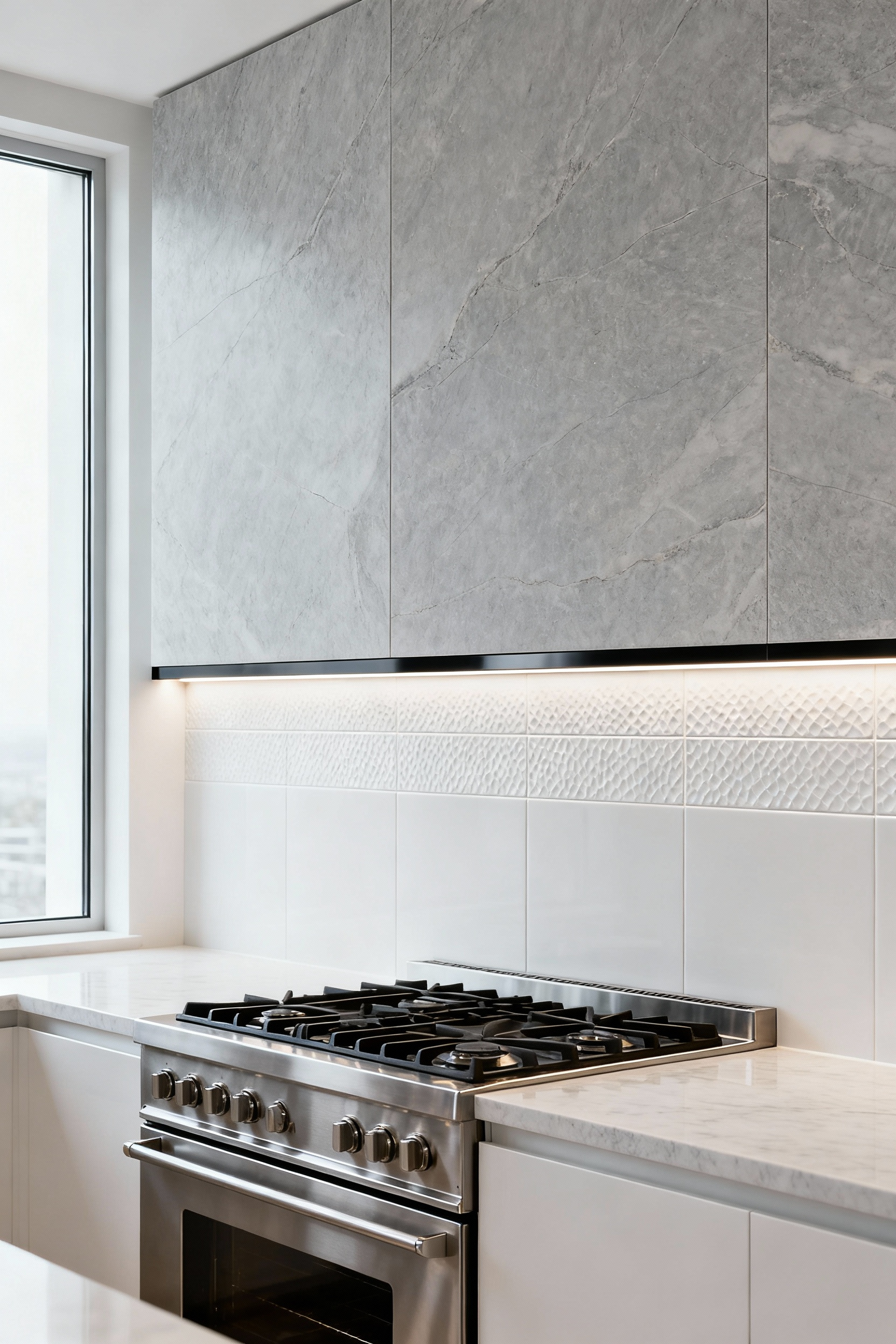
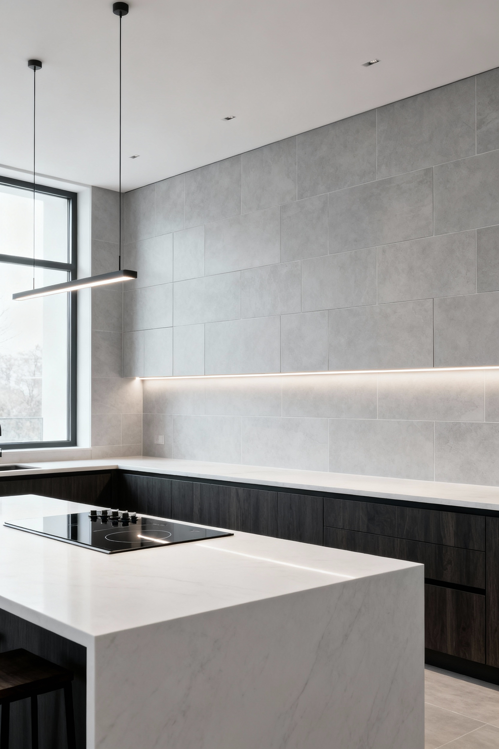
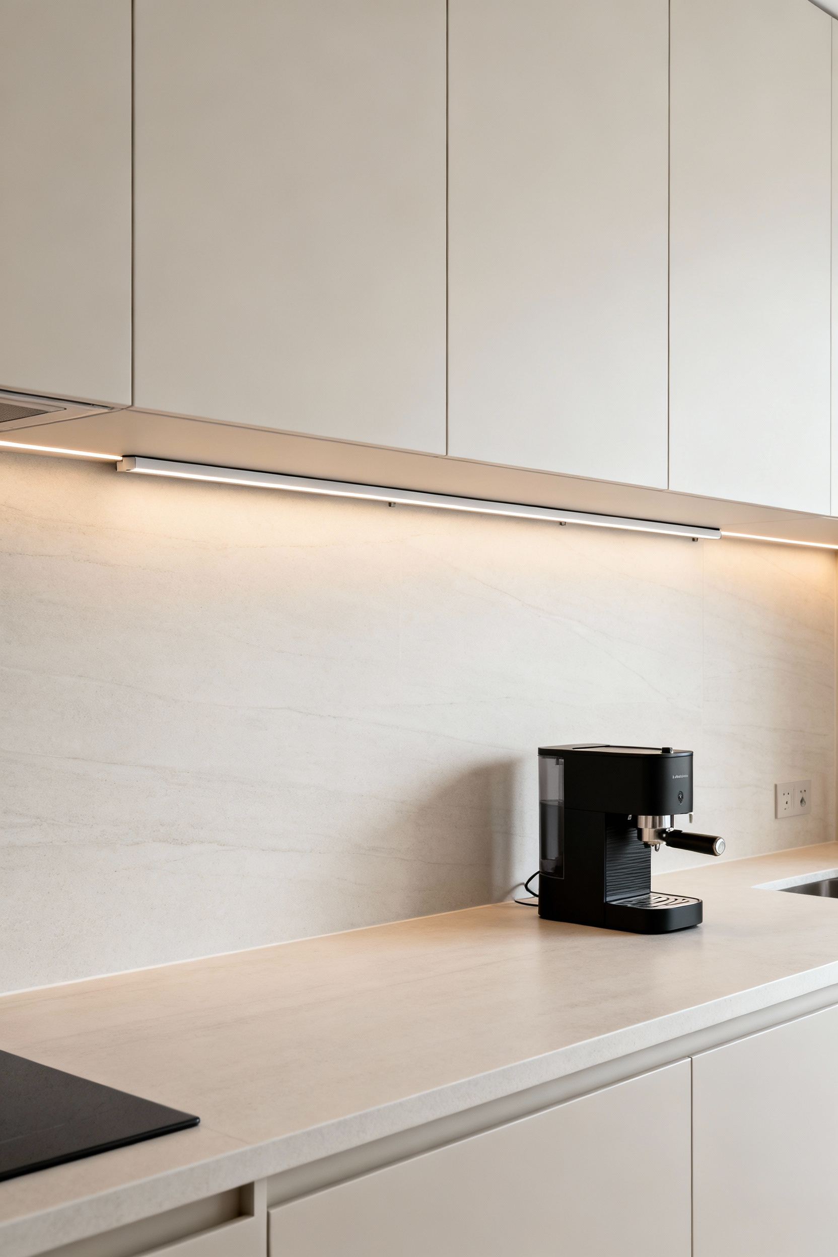
5. Illuminating Your Work: Integrating Under-Cabinet Lighting
You can spend a fortune on a beautiful backsplash, but if you don’t light it properly, it will fall flat. I’ve seen it happen time and again on photo shoots. Under-cabinet lighting isn’t just for task illumination; it’s a design tool. It’s what brings your backsplash to life. Without it, the upper cabinets cast the entire area in shadow, muting colors and obscuring textures.
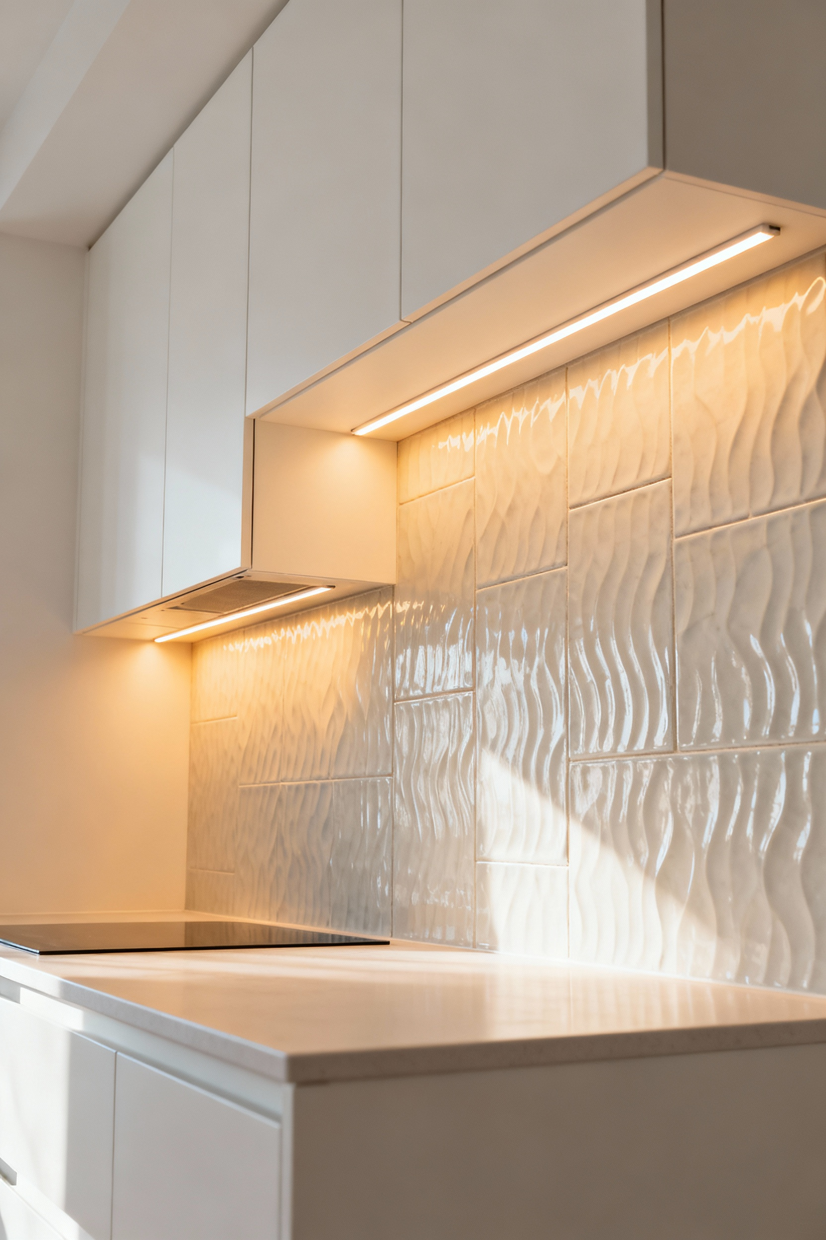
To do it right, position your lights toward the front of the cabinets, angled slightly back toward the wall. This creates a “grazing” effect, where light skims across the surface, pulling out all the rich detail—the subtle crackle in a glaze, the rustic edges of a zellige tile. LED tape lights are fantastic for providing a continuous, even glow. And make sure your system is dimmable. Bright for chopping vegetables, but a soft, ambient glow for when the kitchen is quiet. Forgetting this step is like buying a great piece of art and hanging it in a dark closet. It’s a complete waste of your investment.
Elevating Your Approach: Intermediate Design Harmonization
Once you’ve mastered the basics, it’s time to think about how the backsplash interacts with the rest of the room. This is where we move beyond selecting a material and start designing with a more holistic, architectural mindset.
6. Mastering the ‘Seamless Edge’: Extending Backsplash Beyond Cabinetry
The standard practice is to stop the backsplash where the upper cabinets end. It’s clean, it’s simple, but it’s an arbitrary boundary that often makes a kitchen feel smaller. By extending your backsplash material beyond the cabinetry—to the edge of a doorway, the frame of a window, or even wrapping a corner—you break out of that visual box.
This technique dissolves those hard stops, creating a more fluid and expansive feel. Your eye is drawn across the wall, creating a sense of continuity. From my experience with visual composition, this is a subtle but powerful way to manipulate the perception of space. It’s especially effective in smaller kitchens, where those extra inches of continuous material can make the entire wall feel wider and more intentional. We’re busting the myth that the backsplash is just a gap-filler; here, it becomes an architectural element that defines the room’s edges.
7. The Art of Contrasting Textures: Pairing Smooth with Textured
Designers often play it too safe, matching a smooth countertop with an equally smooth backsplash. The result is coherent, yes, but it can also be incredibly one-dimensional and flat. A kitchen with only smooth, uniform surfaces lacks the tactile depth that makes a space feel rich and engaging.
A more sophisticated approach is to deliberately juxtapose textures. Pair a sleek, honed quartz countertop with a rough-hewn, textured backsplash—like handmade zellige tiles with their imperfect surfaces, or a three-dimensional stone mosaic. The smooth countertop provides a clean, calm work surface, while the textured backsplash catches the light, creating subtle shadows and highlights that shift throughout the day. This interplay invites both the eye and the hand, adding a layer of sensory interest that a single-texture palette just can’t achieve.
8. Industrial Chic Integration: Using Metals and Exposed Elements
Many people are drawn to an industrial aesthetic but stop short of a true commitment, thinking it requires exposed brick and concrete floors. They end up with a few metal Bar Stools and call it a day. The real opportunity, though, lies with the backsplash. It can serve as a powerful anchor for the entire industrial narrative.
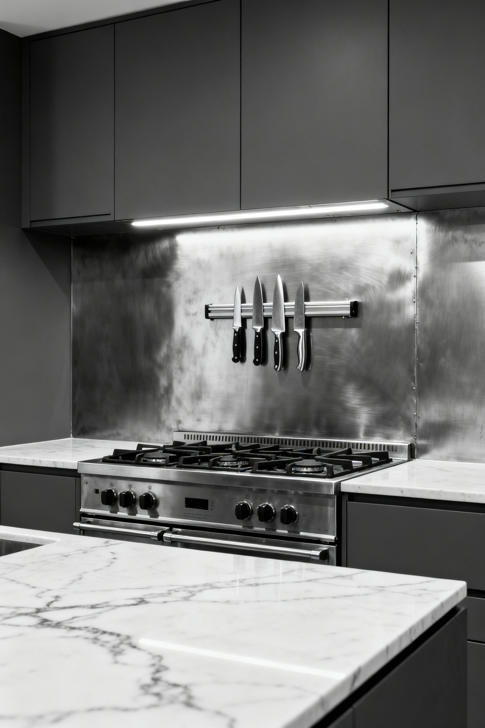
Think beyond stainless steel appliances. A full backsplash of stainless steel—or better yet, something with more character like zinc, distressed copper, or even diamond plate—makes an unapologetic statement. For an even bolder move, I’ve seen exposed concrete panels used as a backsplash. The effect is raw, honest, and incredibly chic when paired with refined cabinetry. It’s about celebrating the beauty of utilitarian materials and creating a purposeful aesthetic that feels both rugged and sophisticated.
9. Strategic Zoning: Defining Areas with Varied Materials
The idea that one backsplash material must cover all the walls is a convention worth breaking. A kitchen isn’t a single-function room; it has distinct zones for cooking, prepping, and cleaning. Why should the backsplash treat them all the same?
Instead, use different materials to define these zones. Behind the range, where you need something robust and easy to clean, a sheet of stainless steel or a large porcelain slab makes perfect sense. In a nearby prep area or a coffee nook, you could switch to a more delicate or decorative tile to signal a shift in function and mood. The key to making this work is ensuring the materials speak to each other through a complementary color palette or similar undertones. This approach transforms the backsplash from a passive backdrop into an active tool for organizing your kitchen both visually and functionally.
10. The Myth of the Monochromatic Kitchen: Employing Subtle Color Gradients
When people hear “monochromatic,” they often picture a flat, boring space. But true monochromatic design isn’t about a single color; it’s about exploring the full range of shades, tints, and tones within one color family. Applying this concept to your backsplash can create a breathtaking, dynamic effect.
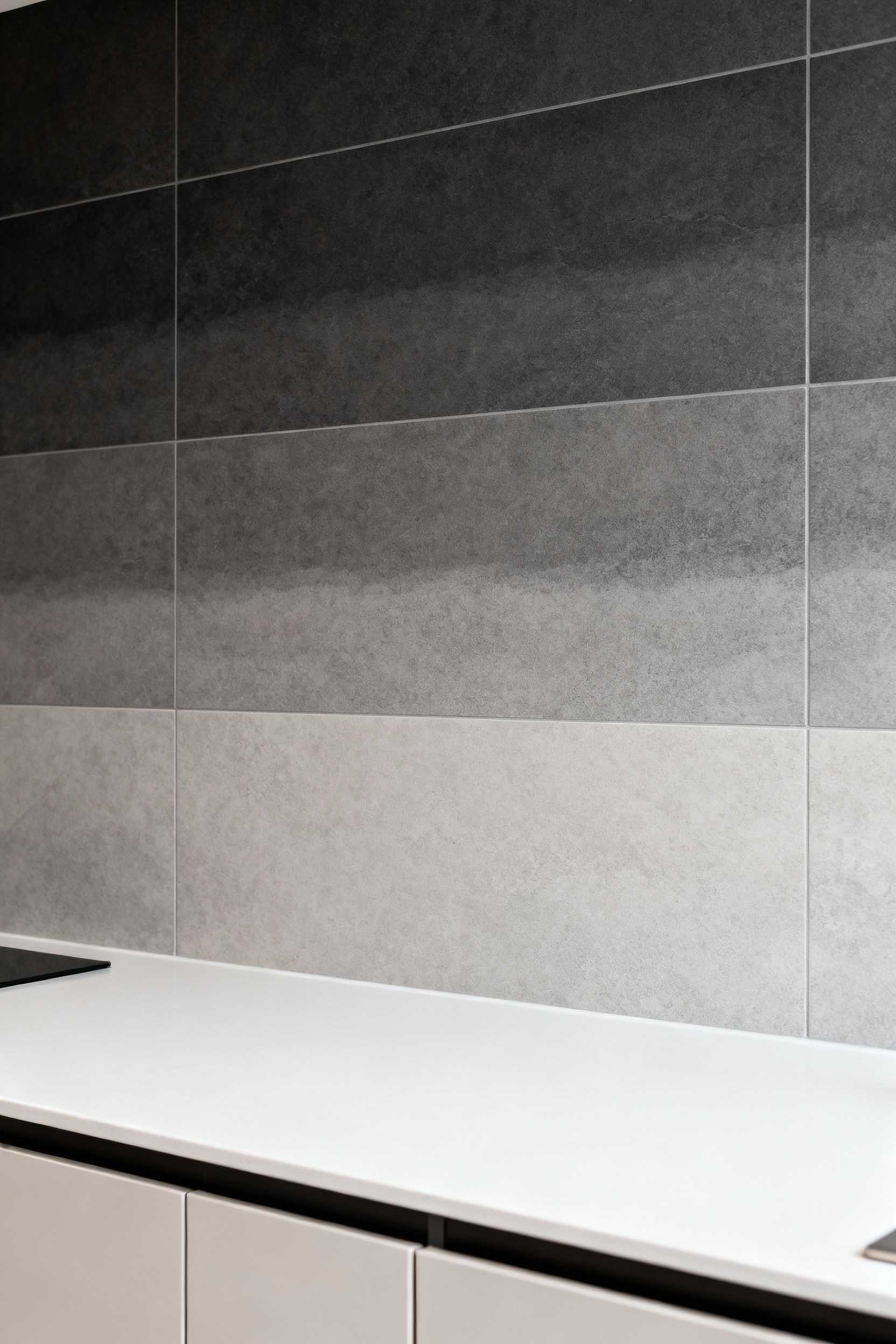
Imagine arranging tiles in a subtle gradient, moving from a darker shade near the countertop to progressively lighter tones as they climb the wall. You can also achieve this with different finishes in the same color—a mix of matte, satin, and gloss tiles will reflect light differently, creating a gradient of its own. It’s a sophisticated way to add depth and movement without introducing competing colors, creating a nuanced, living surface that feels both calm and visually intriguing. This technique dismantles the myth of the sterile monochromatic kitchen entirely.
Advanced Strategies: Professional-Level Integration
This is where we transition from decoration to architecture. These strategies involve thinking about the backsplash not as a surface applied to a wall, but as an integral part of the kitchen’s structure and flow.
11. Extending the Horizon: Applying Material to Adjacent Walls
Taking the concept of the ‘seamless edge’ a step further, consider applying your backsplash material to an entire adjacent wall. Confining your backsplash to just the area behind the counters is a functional choice, but it can make a kitchen feel disconnected from the rest of the home, especially in an open-plan layout.
By wrapping a beautiful tile or slab around a corner and onto a full feature wall, you create a powerful sense of immersion and cohesion. This move visually links the kitchen to an adjoining dining or living space, making the entire area feel like one thoughtfully designed volume. From a composition standpoint, it provides a dramatic, unifying backdrop that can anchor the whole open-concept space. It’s a bold statement that says the kitchen isn’t just a work zone; it’s a central part of the home’s design narrative.
12. The Illusion of Height: Using Vertically-Oriented Tiles
The default for rectangular tiles is a horizontal installation. It follows the line of the countertop and feels stable. But in a kitchen with standard or low ceilings, it’s a massive missed opportunity. Simply orienting the same tiles vertically can completely change the perception of the room.
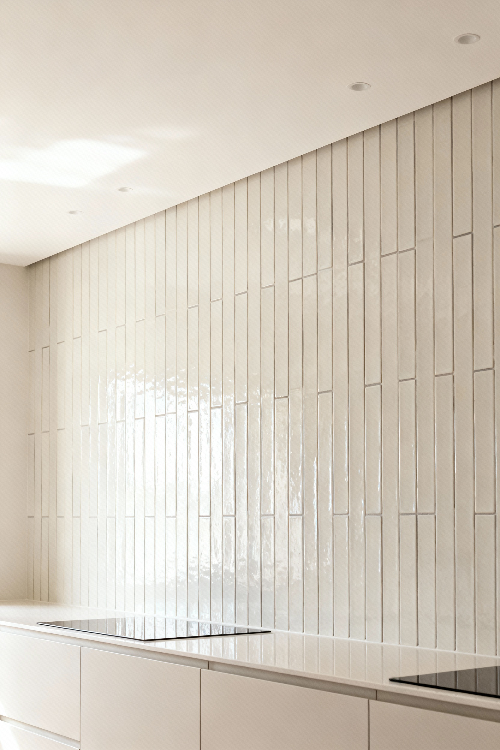
Just like vertical stripes in fashion, a vertical stack bond visually stretches the wall, drawing the eye upward and creating a powerful illusion of height. For maximum effect, use long, narrow tiles—a 2×8 or 3×12 format, for example. The stronger vertical lines have a more dramatic lifting effect. In my architectural photography work, this trick is one of the most effective ways to make a space feel grander and more open without any structural changes. It’s a simple shift in layout with a disproportionately large impact.
13. Precision Layouts: How Patterning Directs the Eye
Most people think of a backsplash pattern as a purely decorative choice. That’s a fundamental misunderstanding of its power. A pattern is a tool for directing attention. Where you place a pattern, and what kind you choose, is a way of controlling where a person looks.
A dynamic herringbone or chevron pattern, for instance, naturally creates movement and draws the eye. When you place that behind the range, you’re essentially putting a giant arrow on the wall that says, “Look here.” This is your focal point. A simple grid pattern can feel calming and contemporary, while a more complex mosaic can create a sense of handcrafted luxury. A true professional understands this and uses pattern not just to decorate, but to establish a clear visual hierarchy and define zones within the kitchen.
14. Curated Combinations: Juxtaposing 2-3 Distinct Materials
The fear of mixing materials on a backsplash often leads to safe, predictable choices. But the truth is, a carefully curated combination of two or three materials can look incredibly bespoke and sophisticated. The myth is that it will look cluttered; the reality is that it just requires a plan.
The key is to establish a clear hierarchy. One material should be the dominant, primary surface, while the second acts as a strategic accent. For example, use a simple porcelain tile for the majority of the wall, but create a framed “rug” behind the cooktop with a panel of dramatic, veined marble or an intricate mosaic. Another technique is to introduce a thin band of contrasting material—like a line of brass inlay or a strip of textured stone—that runs horizontally through the primary field tile. This creates a moment of interest without overwhelming the senses. It’s about thoughtful composition, not random chaos.
15. Rethinking Functionality: Incorporating Integrated Shelving and Recesses
Why should a backsplash be just a flat plane? I’ve photographed so many stunning kitchens where the designer has pushed the functionality further by building directly into the wall. Incorporating recessed niches or integrated shelving into the backsplash itself is a game-changer.
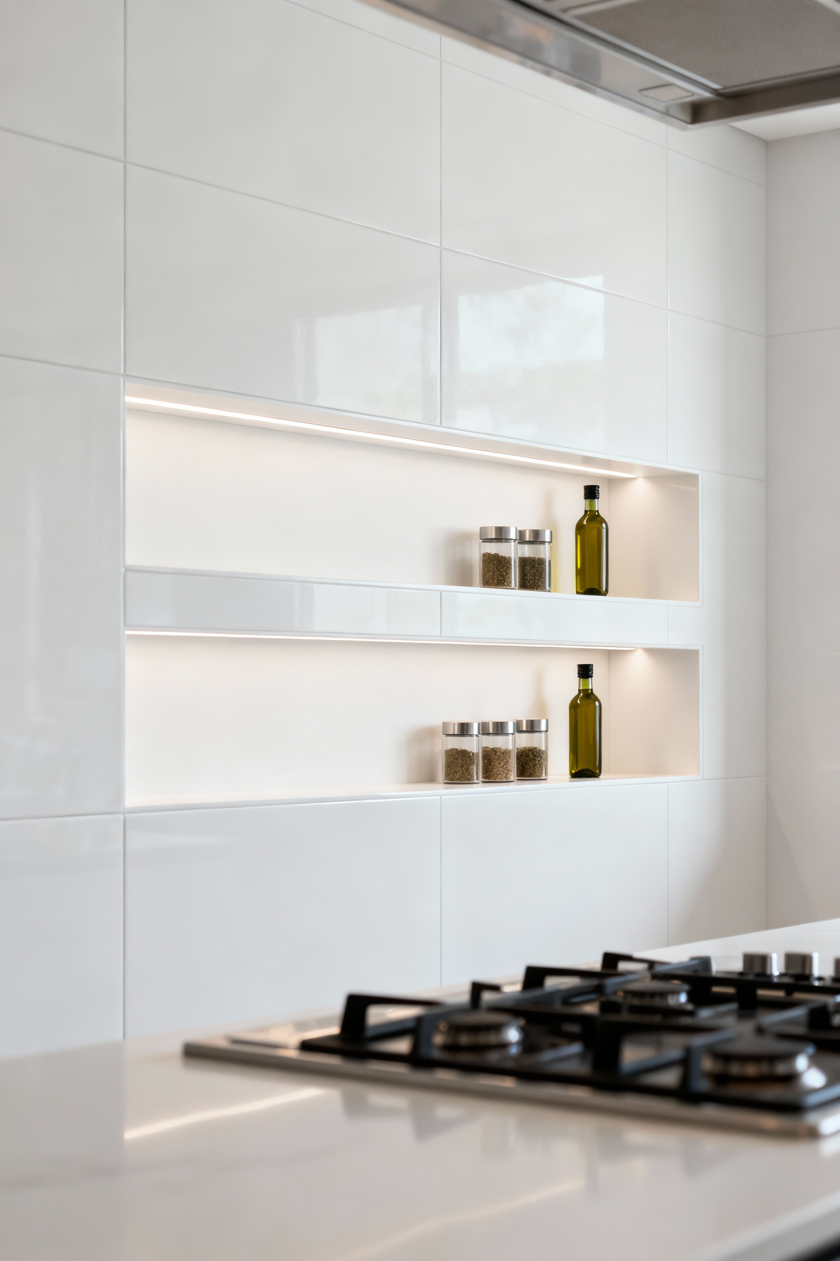
Imagine a shallow niche behind the range, clad in the same stone as the backsplash, perfectly sized to hold cooking oils and spices. Or a slender floating shelf of the same material for small plants or decorative objects. This transforms the backsplash from a passive surface into an active, three-dimensional element. It declutters your countertops and adds incredible custom detail. It requires more planning with your contractor, but the result is a seamless, architectural feature that feels incredibly high-end and intentional.
Mastering Backsplash Integration: Expert Philosophies and Applications
This final set of ideas represents a total commitment to the backsplash as a primary design element. These are not accents; they are foundational statements that define the entire kitchen.
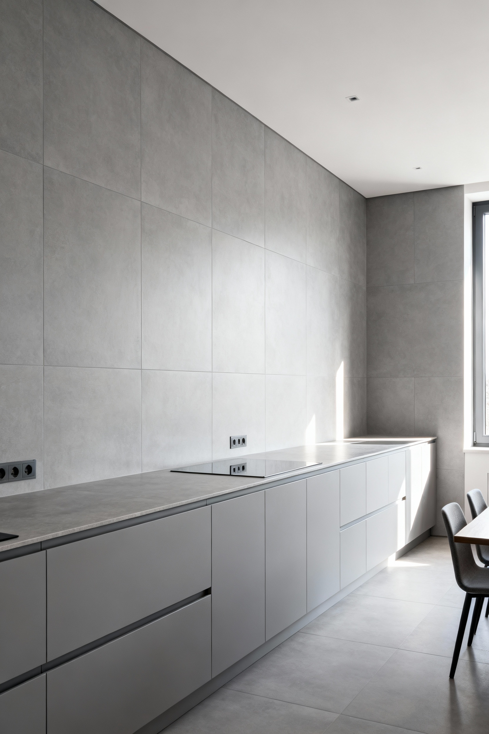
16. The Full-Wall Statement: Extending from Counter to Ceiling
This is the ultimate expression of material commitment. Instead of stopping at the cabinets, you take your chosen material all the way to the ceiling line. It’s a move I’ve seen in countless high-end architectural projects, and the impact is always staggering.
This technique creates a singular, dramatic canvas that completely unifies the wall. It makes ceilings feel higher and the room more expansive. Large-format tiles or a full stone slab are ideal, as they minimize visual breaks from grout lines. The myth is that this is only for huge kitchens. I’ve found the opposite can be true; in a small kitchen, a single, uninterrupted surface can make the space feel larger and less chopped-up than a traditional, banded backsplash. It turns the entire wall into a feature, providing a powerful, cohesive backdrop for the whole room.
17. Myth-Busting Budget Constraints: Leveraging High-Impact Small Areas
It’s a common misconception that luxurious materials are off-limits for a normal budget. The trick isn’t to find a cheaper look-alike; it’s to use the real thing, just in smaller, high-impact doses. A few square feet of an exquisite material, placed strategically, can elevate the entire kitchen.
The area behind the range is the perfect spot for this. Frame out this zone and splurge on that hand-painted ceramic tile, intricate marble mosaic, or sheet of hammered brass that you love. Because it’s a defined focal point, your eye goes straight to it, and that one moment of luxury elevates the perception of the entire space. It’s a design principle I learned from photography: a single, perfectly lit detail can define the entire image. You get all the aesthetic credit without the prohibitive cost of doing the whole wall.
18. Seamless Smart Integration: Concealing Outlets and Tech
Nothing ruins the clean line of a beautiful backsplash faster than a series of poorly placed, glaringly white plastic outlets. It’s a detail that can make an otherwise expensive-looking kitchen feel cheap. The professional approach is to make them disappear.
This requires planning before the walls are even closed up. There are incredible solutions now, from outlet strips that tuck up under the cabinets to pop-up outlets on the countertop. My favorite solution is having outlets color-matched to the backsplash material itself, or integrated into flush-mounted systems that sit perfectly level with the tile or stone. This seamless approach preserves the integrity of your backsplash, ensuring that a functional necessity doesn’t become an aesthetic compromise. It’s about insisting on a clean, uninterrupted visual plane.
19. Reflective Narratives: Using Mirrored or Polished Finishes
In kitchens that are small or lack natural light, the backsplash can be your most powerful ally. Using mirrored or highly polished materials is a classic architectural trick for amplifying light and expanding perceived space. It’s not about vanity; it’s about optical physics.
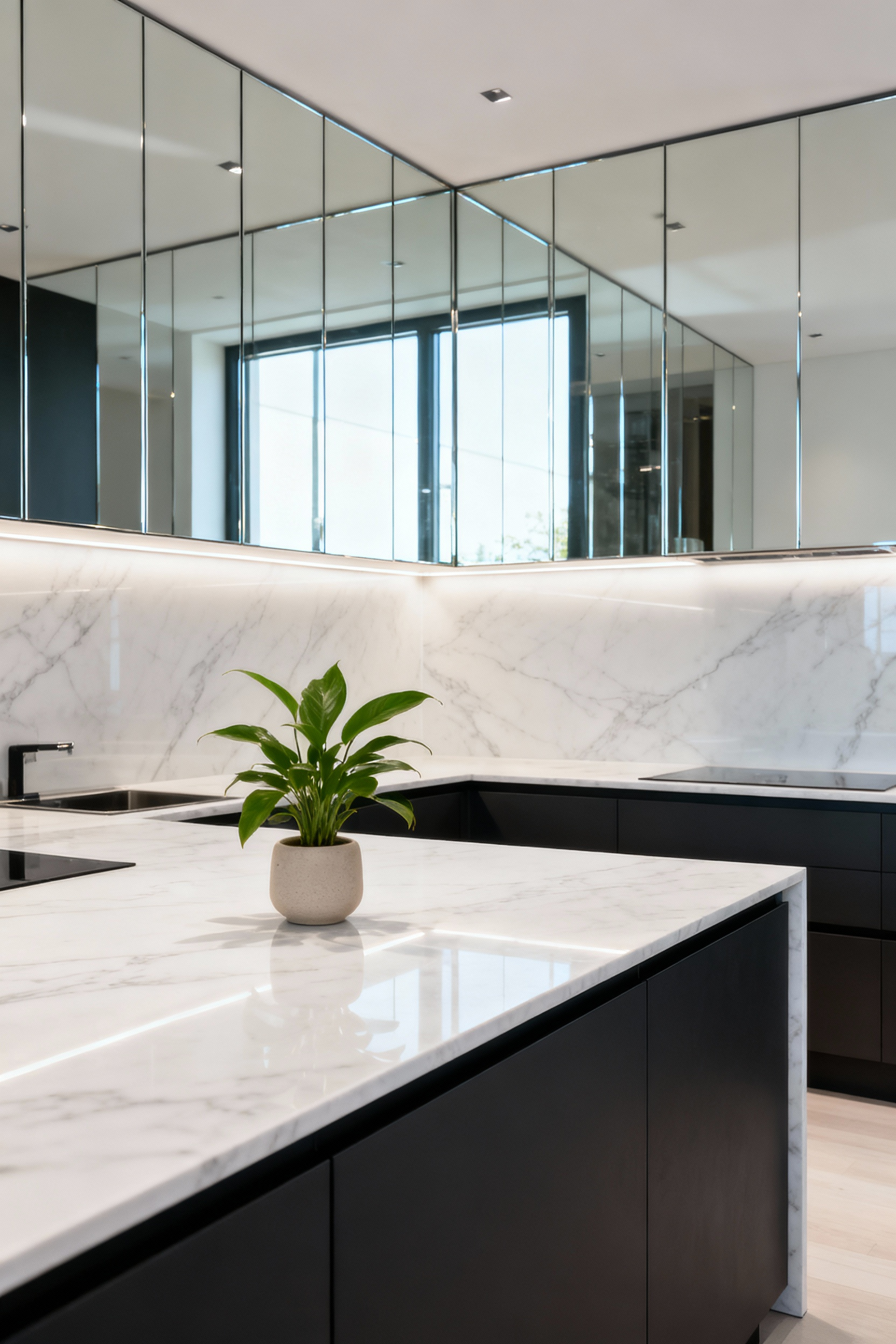
An antiqued mirror tile can add a soft, glamorous glow without the harsh reflection of a standard mirror. A high-gloss ceramic tile or a back-painted glass panel will bounce light around the room, making it feel brighter and more open. From my work, I’ve noticed it’s crucial to consider what the surface will reflect. Ideally, you want to position it opposite a window or an open space to double a beautiful view, not a cluttered countertop. This turns the backsplash into an active participant in the room’s lighting design.
20. The Backsplash-as-Art Piece: Custom Murals or Irregular Patterns
Finally, let go of the idea that a backsplash must be a repeating pattern. Why can’t it be a singular piece of art? This is the ultimate expression of a bespoke kitchen. Think of the entire backsplash area behind the range as a canvas for a custom tile mural or a mosaic.
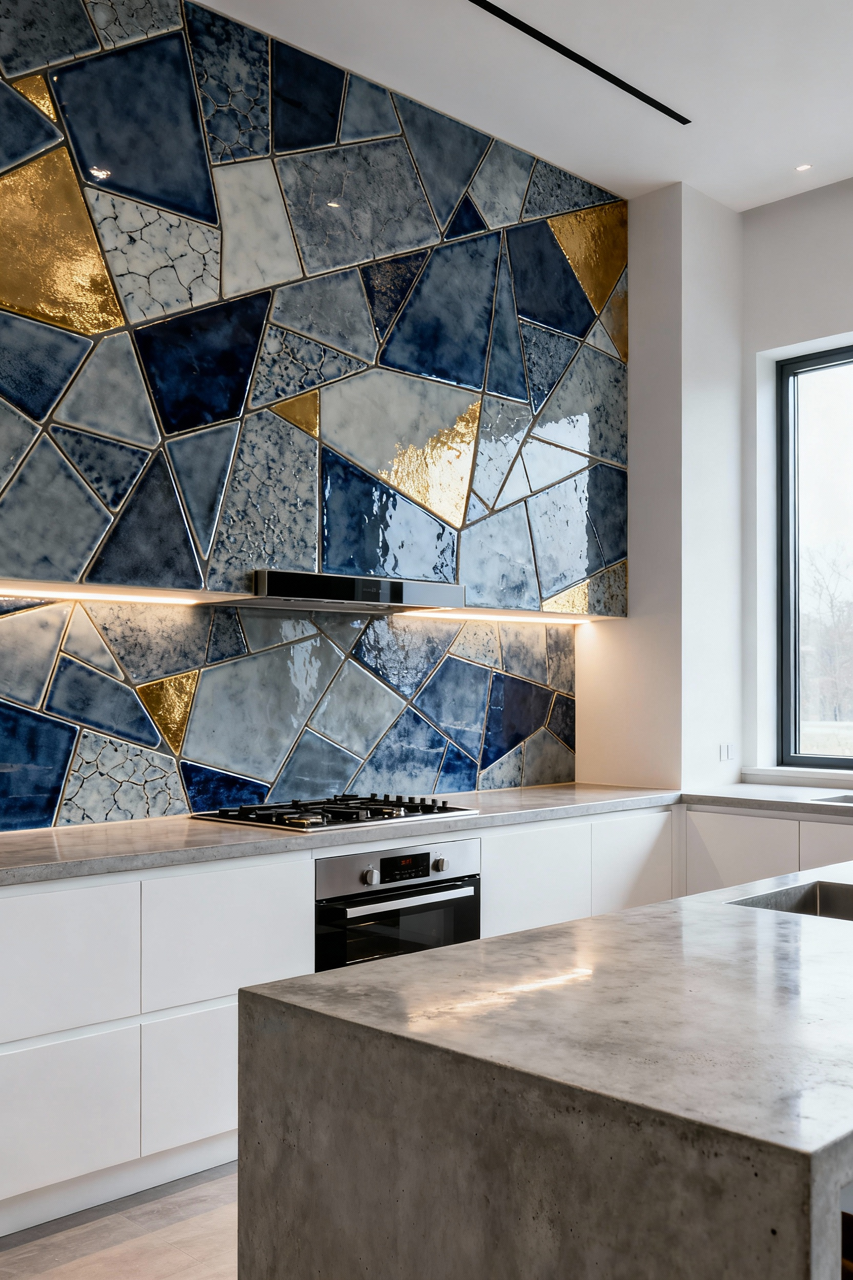
This could be an abstract composition, a subtle landscape, or a bold geometric design. Alternatively, you can achieve an artistic effect with irregular tile patterns—using varied shapes and sizes to create a free-flowing, organic installation. I learned this when I photographed a home where the artist owner had created her own tile mural; it wasn’t just a kitchen, it was a gallery. This approach ensures your kitchen is utterly unique. It makes a bold statement that the backsplash is not an afterthought, but the heart and soul of the room’s design.
Conclusion
So, we’ve moved through 20 ideas, each one challenging the old, tired rules of what a kitchen backsplash should be. The journey from basic materials to full artistic integration proves one thing definitively: this isn’t just a functional surface. It’s a strategic asset. The myths that limited your vision—about budget, about materials, about layout—are now busted, replaced by an evidence-based framework for making powerful design choices.
You now have the technical and visual vocabulary to move beyond just picking a pretty tile. You understand how to use your backsplash to shape space, direct light, and create a narrative. I’ve spent years behind a camera learning how composition and detail can make or break a room, and now that knowledge is yours. It’s time to stop imitating and start designing. Take these principles and craft a backsplash that isn’t just beautiful, but intelligent—a true centerpiece that proves you understand the art and the science of modern design mastery.